 September 8th
 February 22nd
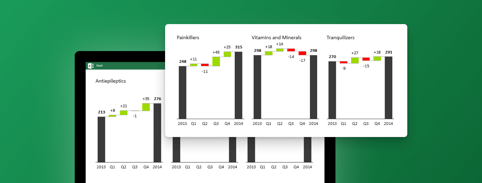
Watch our 2nd webinar on data visualization next Tuesday
Next Tuesday, Apr 14, 2015 at 7pm CEDT we'll be running our second webinar. If you want to learn from Andrej Lapajne (Zebra BI CEO) about data visualization in depth, make sure to go here and save your spot!
Most reports, presentations and dashboards fail because of inappropriate or simply bad visualization: wrong choice of charts, nonfunctional colors, confusing data structures, illegible labels, etc.
In this webinar, we’ll talk about efficient methods of data visualization. We’ll explain the data ink theory and how to apply it in practical examples to achieve maximum clarity. You’ll learn how to avoid the “lie factor” to prevent any misinterpretations and always draw the proper picture of your data. We’ll present examples of small multiples in several business cases so that you’ll be able to increase the information density on a single page of your reports or dashboards.
We will illustrate the details of advanced charts in many practical examples: when and how should you use the waterfall chart, which variance chart is most appropriate for different data sets, how to replace pie chart with more efficient visualizations, how to label the values in charts for the highest legibility, and more.
What you'll learn in the webinar
- The key methods of data visualization
- 7 must-learn visualization rules
- The details of waterfall and other advanced charts
- Many practical examples of data visualization in business reporting