September 8th
 February 22nd
When creating reports it is essential to understand that report viewers don't have time to go through all the details and a lot of data. They need to know immediately what decisions need to be made to drive the business forward.
This is also a fundamental part of Actionable Reporting - a new paradigm in business reporting adopted by more than 3,000 market-leading companies.
Rachel Guthrie, Customer Success at Microsoft (and ex-Program Manager) shared her approach to designing internal reports that satisfy everyone: from top-level management to specific teams that need more detail.
''What I love about Zebra BI's philosophy and approach is that they keep reporting simple and scalable. This helps tell the story and guides users to what they need to know.''
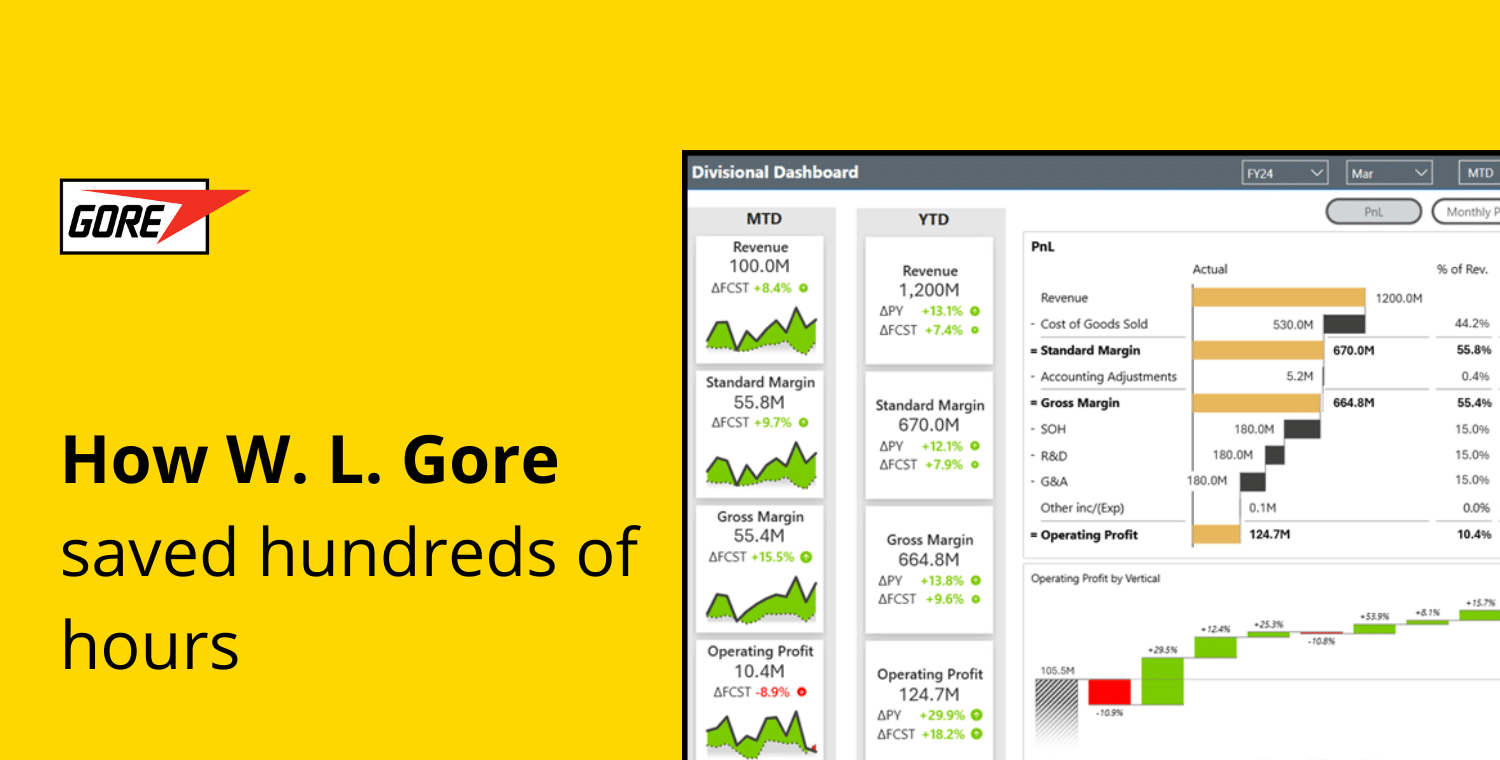
Rachel was tasked with developing a Gross Margin report in Power BI. The idea was to implement allocation logic on large data sets to gain insights into profitability at a more granular level. In addition, it was to understand historical data for revenue and cost at a team level. It was to use these insights to create action plans to cover gaps to target.
The main objective was to create a breakdown of variances and see which workloads (= the lowest level needed to be able to manage their financial statements but modified for the purposes of this presentation) impact the financials at which level of the P&L statement. With this information, teams can understand their performance better and manage their business.
Before learning about Zebra BI, the Microsoft team had various challenges approaching this project.
The biggest one was scope. How to create a report that is actionable and scalable at any level, from the highest level of management to finance partners and individual teams? This led the team to think about the design. It needed to be simple enough to be understandable yet still enable users to drill down to more details.
Rachel also confessed that she was not a big expert in building Power BI dashboards and using DAX at the time. So she searched for the most suitable tool that would help her achieve her goal without too much development involved.
After extensive research, the team at Microsoft decided to create her report with Zebra BI visuals for Power BI.
''In my research, there was no better visualization for a P&L format than the Zebra BI Tables.''
Another reason was that they wanted to compare the actual data to the budget, forecast, and prior year. The chosen visual let her do everything within one visual.
One key point to highlight according to Rachel is to not forget to keep referring back to the people who ordered the report. They can help you with their ideas about how to represent data and give you additional inspiration. By including them in the process you will also avoid unnecessary changes at the end due to miscommunication or different expectations.
After watching many videos and following the guides in Zebra BI's Resources Hub, Rachel created her Gross margin report in Power BI. She decided to create it with a color-blind friendly style available in Zebra BI custom visuals to improve the report's accessibility for people with visual impairments.
The first page (referred to as a landing page), shows the highest level of data as it is intended for top management.
The P&L with Zebra BI Tables takes center stage. Why? This helps decision-makers understand which expenses impact profit margins. With Zebra BI Tables, you can add custom calculations (e.g., gross margins) inside the table or add calculated columns to display different values. They added a column to display the % of revenue for each line item. Another great feature for them was also the ability to decide which variance you want to show.
Rachel's tip 💡: For the top-level overview, only include variances that are necessary. The variance to the budget was the only one she kept.
On the left, they added the Zebra BI Cards visual that was used to reduce the number of slicers due to the visual's cross-filtering functionality. This means that if you click on any of the cards, the P&L data will adjust to show just the numbers for the chosen workload. You can also select multiple cards, and the P&L will adjust. The best part according to Microsoft's team? It looks like many cards, but it's actually just one visual that speeds up the loading and rendering time of the report.
On the right of the P&L, small multiples created with Zebra BI Charts show trends. They are scaled to show trends for the highest cost lines by % of revenue. Scaled in this sense means that the larger the impact, the larger the chart.
''This makes it very clear to see which line item matters most because they’re visually represented that way.''

She also included some additional elements to this page to make the report easier to understand.
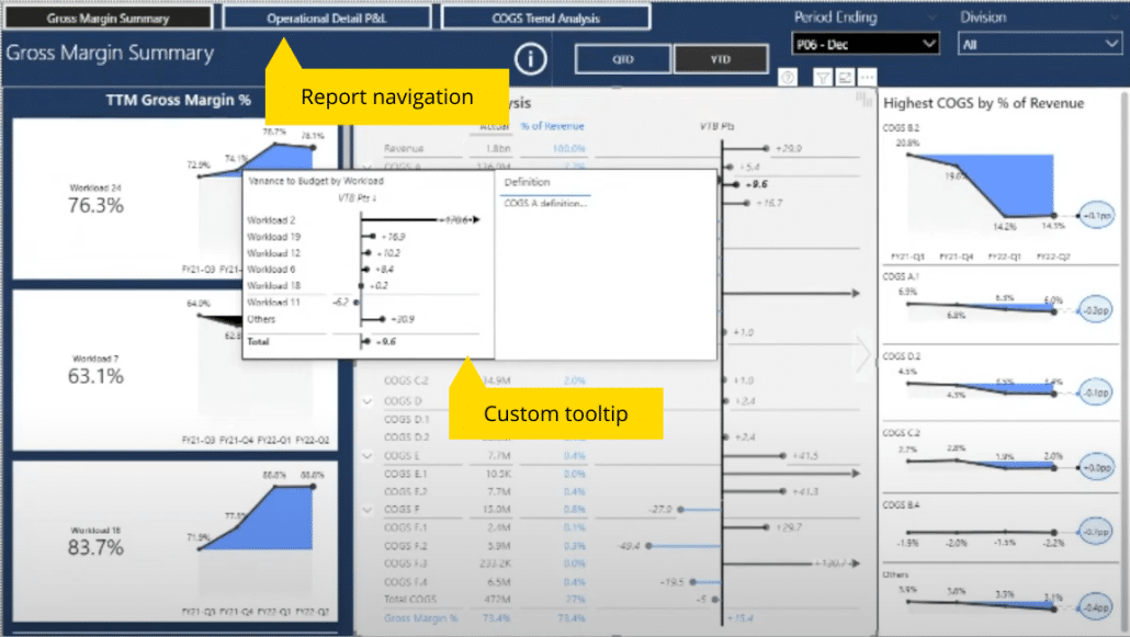
The navigation pane at the top helps users move around the dashboard. It's nothing more than a simple button that captures all the report tabs and allows you to toggle between the pages in any order. The report pages are displayed in order from highest to lowest detail level.
The custom tooltip is another useful addition for this audience. When the user hovers over the variance another chart pops up showing the breakdown and a description of the line item.
''Users don't have to click through slicers to see what makes up the variance – it's highlighted for them.''
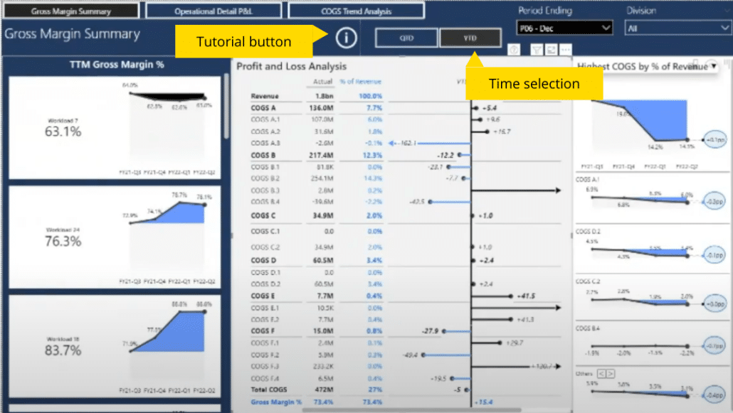
The time selection allows users to toggle between a year-to-date and quarter-to-date view. These are just slicers with horizontal orientation as Rachel learned from Zebra BI's Resources hub.
The tutorial is hidden under an info icon. When clicked, it takes the user to the report page and highlights the most significant elements. It consists of buttons and bookmarks whose actions are specified in button settings.
This is the second page of the report and as the name implies, it contains more operational detail. Teams responsible for each product & finance team can see historical data in table format.
It's important not to include too many visuals on such a page so they can identify key data instantly, emphasizes Rachel.
To gain more insights, they can select their division and/or workload and filter to a monthly or quarterly view.
With Zebra BI Tables you also get a table slider that lets you change views with a click. This helps you get all the information you need.

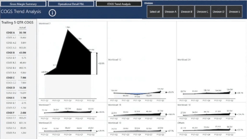
On the third report page, viewers can observe a breakdown of cost lines with scaled small multiples charts showing workloads that are the largest contributors.
They can also observe each's historical trend. The chart dynamically adjusts to any cost line selected from the table on the left.
Since creating such a report can be a daunting task, Rachel shared her key learnings and suggestions to apply when creating your own Power BI dashboard.
''Don’t just display the data in a series of colorful graphs. Play around with the visuals and consider what new insights can be gained that might be helpful to your audience.''
Ready to create reports that go from overview to root cause in a click?