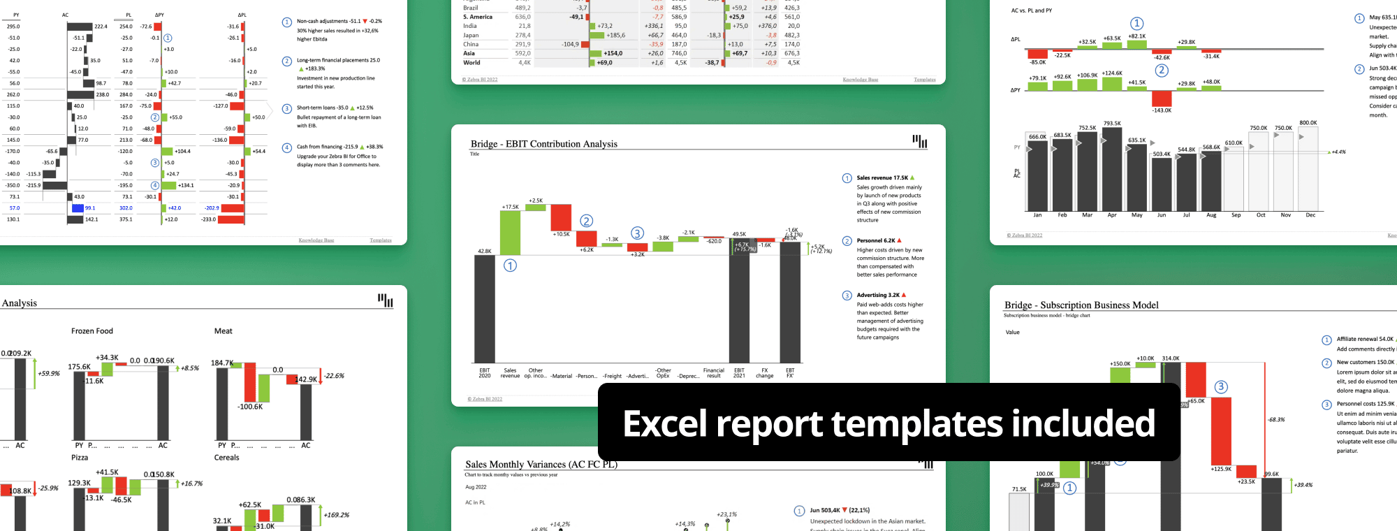
Excel Report Templates: Build Better Reports Faster
You can create better reports. And you don’t have to use complex and borderline incomprehensible tables to make it happen. If you take just a couple of minutes, you can rethink your approach to creating and designing your business reports. To help you in this endeavor, we've created templates for the most commonly used ones. Building advanced storytelling reports has never been simpler!
In this article, you will find 20 Excel report templates:
- cash flow statement
- income statement (4 different templates)
- monthly sales variance (4 different versions)
- sales variance (3 different ones)
- EBIT contribution analysis
- price-volume-mix analysis
- cost variance tables (3 different versions)
- marketing budget variance analysis
- subscription business model
- balance sheet
Ditch plain tables and create visual Excel reports from templates
Report design is the most crucial part of any report. If a report is poorly designed, no amount of data saves it from being difficult to understand.
Actionable Reporting consists of generating reports that provide more value to businesses than the tables and charts we often see. It not only makes it easier for designers to create advanced reports but also for non-designers to understand the data, saving time and money on both sides.
To read more about why old-school native tables and charts visualizations in Excel are a thing of the past, check out our Examples of bad reports and how to make them better guide.
Instead of standard Excel-based tables (normally used by companies across the world) or gaudy charts, you can design eye-catching, easy-to-understand visual reports that drive engagement and deliver value to you and your business. All of that in seconds instead of hours of your time! Give it a try – you'll never want to go back to making reports from scratch every time.
Cash Flow Statement
The Cash Flow Statement template is a feature-rich report that relies on a combination of waterfall charts and absolute variance charts to show how different categories affect cash flow and how actual results differ from previous year and planned data.
This is a hierarchical chart that shows how individual components make up larger categories. It includes subtotals and calculations to facilitate the understanding of your data.
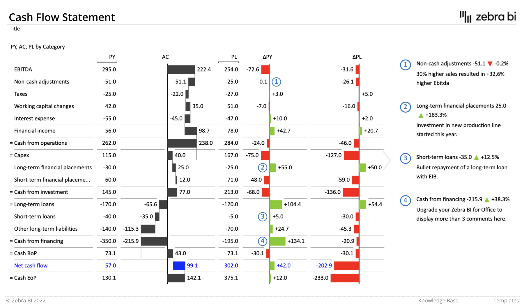
Who it's for: Cash flow forecasts are important for business owners, management, and external audiences, such as banks.
Why you need it: Having a clear picture of your cash flow allows you to gauge the overall financial health of your business and make better decisions when it comes to hiring, equipment purchases, expansion or salaries.
The report's home page shows the following:
- cash flow data – actual, previous year, plan
- categories that make up the cash flow
- absolute variance for PY and PL data
- comments
Zebra BI advantage: This report is based on waterfall charts which show how individual months contribute to the overall result in each individual chart.
Income Statement
The Income Statement report helps you visualize your profit and loss data for the current and previous year or compared to plans and forecasts. This is done with the use of vertical waterfall charts with advanced features, including subtotals and subcalculations.
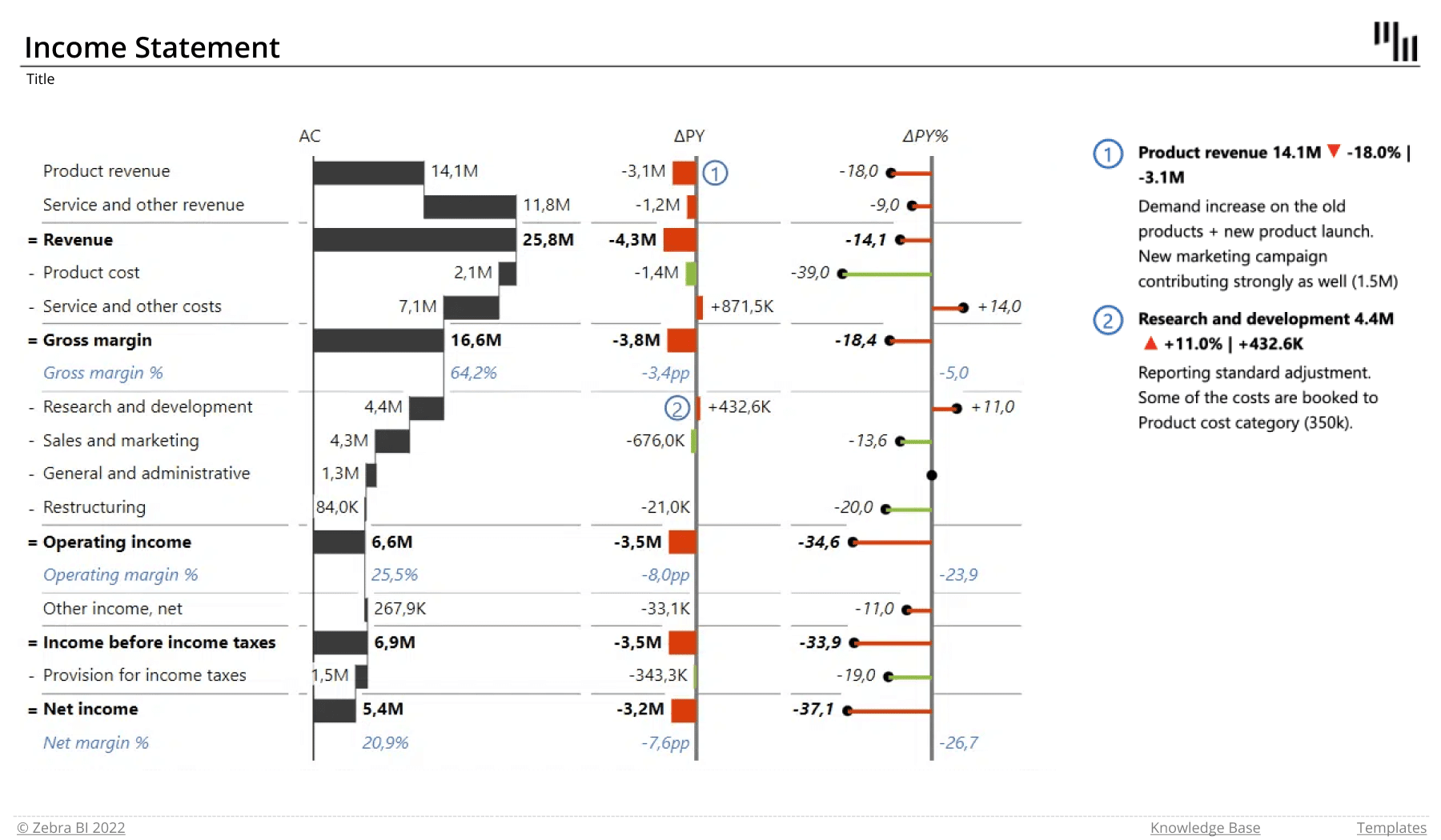
Who it's for: Income statements communicate your financial performance during a specific period, and are as such invaluable to shareholders, investors, owners, management and external users, including banks and government institutions.
Why you need it: You need an income statement to gain insight into the structure of your company's revenues and expenses. This dashboard clearly shows how individual sources of revenue and expenses impact your profit.
Zebra BI advantage: These visuals offer several useful features, such as calculations of subtotals (revenue, expenses) and interim results. Another cool thing about it is the integrated absolute and relative variances that help you make sense of the data.
Since use cases vary, we prepared different types of Excel report templates for income statements. Feel free to download all of them or read on to select the ones that suit you best.
Income Statement (AC vs PY and AC vs PL)
This report shows absolute and relative variances between actual and previous year's results, or actuals and plans. It uses waterfall charts to showcase how individual categories contribute to the overall result, and features subtotals and calculations such as gross margins and gross margin percentage.
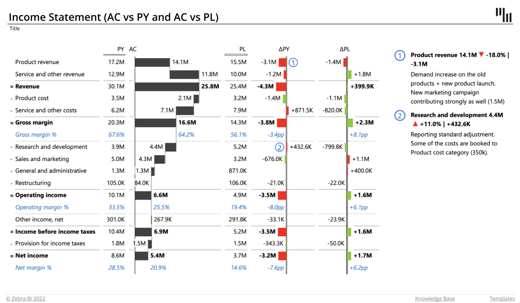
The report's home page shows the following:
- actual values
- previous year
- relative and absolute variances
- comments
- subtotals and calculations
Income Statement (AC vs PY vs PL)
This report shows absolute and relative variances between actuals and previous year's results or plans in the same dashboard. It has two different views which focus on different data. The first one uses waterfall charts to showcase how individual categories contribute to the final result, along with absolute variances:
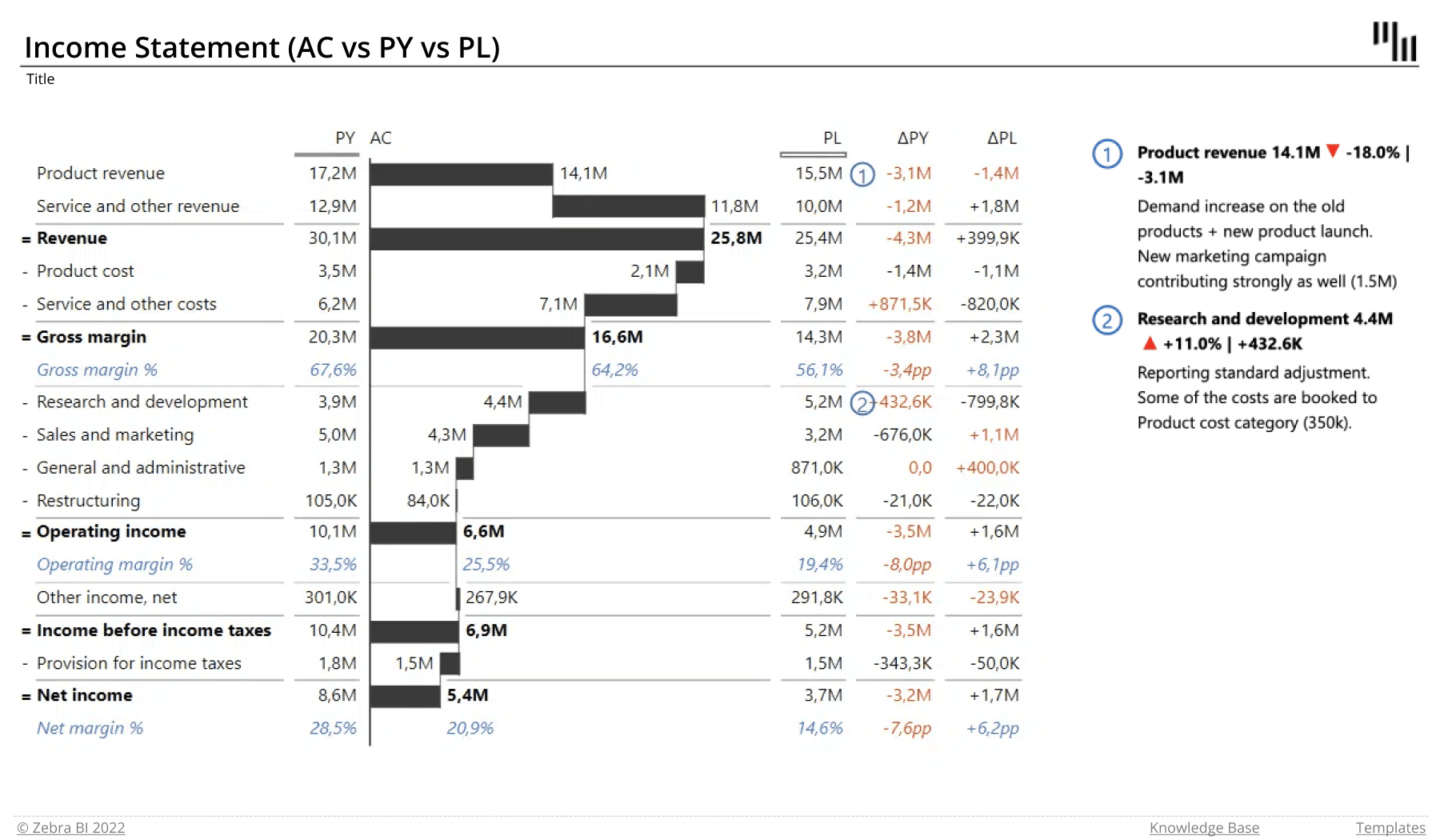
The second view emphasizes variances and shows both absolute and relative variances for previous years and plans.
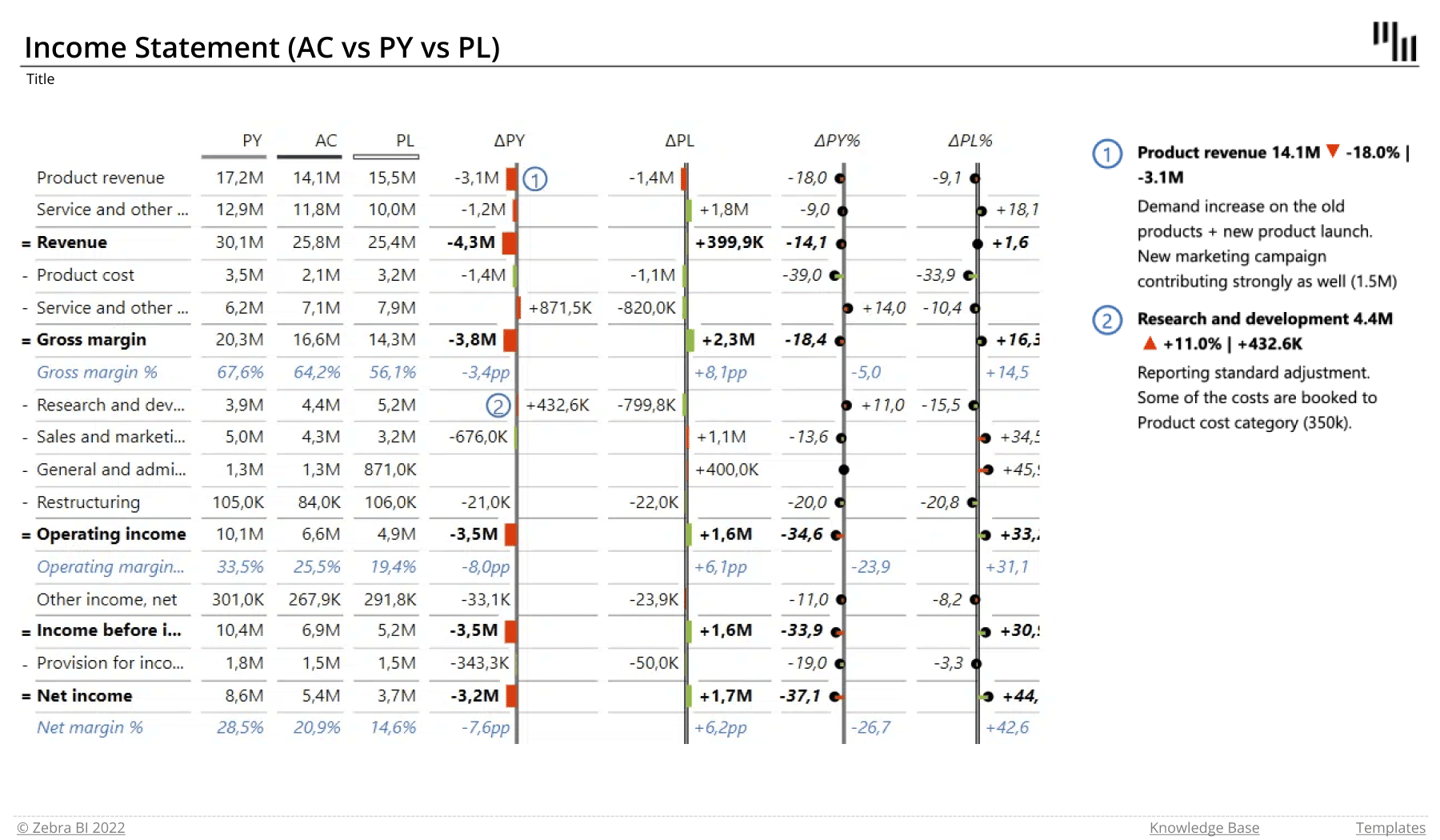
The report's home page shows the following:
- actual values
- previous year and plan data
- relative and absolute variances
- comments
- subtotals and calculations
Income Statement (AC vs PY vs PL vs FC)
This report is very similar to the one in the previous template, except it also contains forecast data. It features two views with different focuses: the waterfall charts and absolute variances that can tell a complex story in a very limited space.
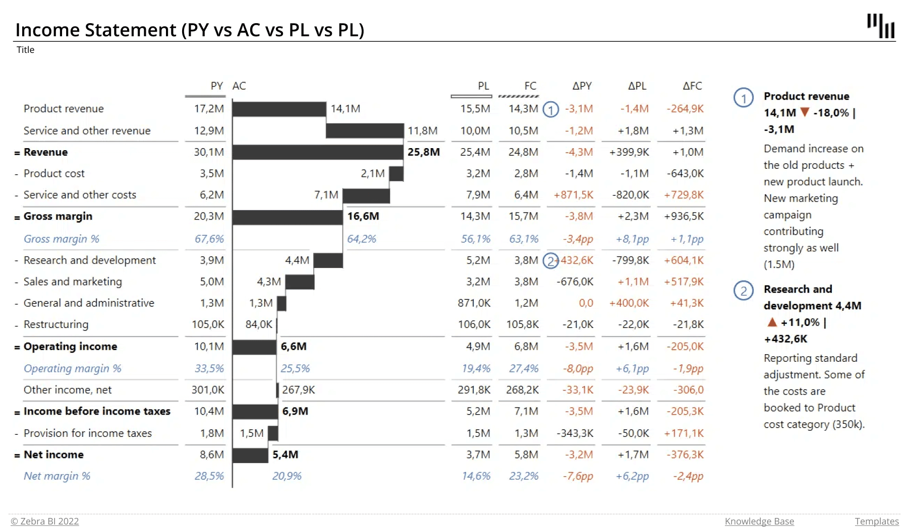
The report's home page shows the following:
- actual values
- previous year and plan data
- forecast
- relative and absolute variances
- comments
- subtotals and calculations
Income Statement (bridge chart)
You can also present your income statement with Zebra BI Charts. By doing so, you can visualize your data with a single-measure waterfall chart or bridge charts instead of a table.
The main categories are on the x-axis, which allows you to keep track of the trends. The variances are automatically calculated, and you can define custom calculations such as 'Invert' and 'Result' to define the subtotals.
When using this functionality, you can apply the scenario pattern to clearly distinguish between the actuals, forecast, plan, and previous year. The differences between individual subtotals are also highlighted for better visibility. Additional context is available in integrated dynamic comments.
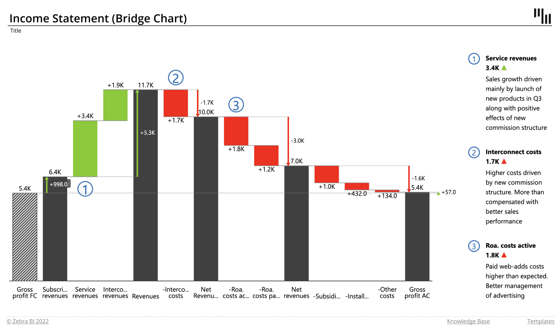
The report's home page shows the following:
- actual value
- forecast value
- subtotals and calculations ('Result', 'Invert')
- categories that make up the income statement
- difference highlights between subtotals
- comments
Monthly Sales Variances
This series of Office templates visualizes monthly and year-to-date actuals, forecasts, previous year's results and budgets.
Who it's for: Monthly sales variance reports are used whenever you want to compare your planned or forecasted results to your actual financial outcomes. It comes in handy in financial departments as well as sales and other parts of your company that need to perform against specific targets.
Why you need it: You turn to the monthly variance report when you need to see whether what was supposed to happen actually happened. Variance reporting is used in budgetary analysis, sales target analysis, trend reports, and spending analysis.
Zebra BI advantage: This series of visuals is a fine example of how IBCS standards can be used to communicate in a clear and simple way. Actual results are shown in a solid color, while forecasted values are shown in dashed columns. The relative variance is shown with the use of lollipop charts, whereas the absolute variance is displayed with integrated variances.
Since use cases vary, we prepared a series of Excel report templates for monthly sales variances. Feel free to download all of them or read on to select the ones that suit you best.
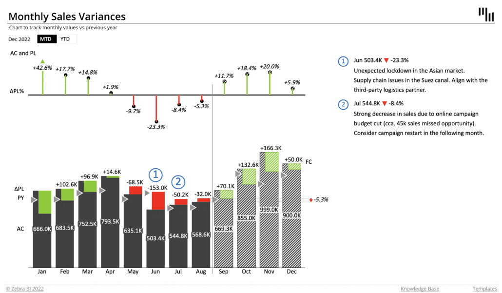
Monthly Sales Variance (AC vs PY and AC vs PL)
These two templates are used to show monthly variances between the actual sales results and previous year's or planned results. You can switch between monthly and year-to-date views for a greater insight into your data.
The report's home page shows the following:
- actual values
- previous year or planned values
- relative variances as a lollipop chart
- absolute variance as an integrated variance
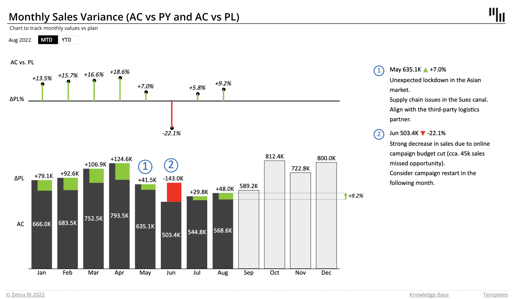
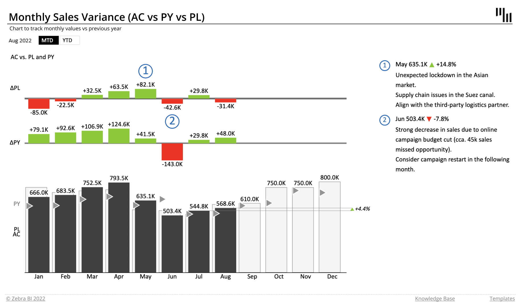
Monthly Sales Variance (AC vs PY vs PL)
This report focuses on absolute variances between the actual, previous year's and planned results. It is an information-dense chart that includes actual values for all three categories – actuals are visualized with a solid dark gray column, plans with light gray and previous year's data with a triangle.
You can switch between monthly and year-to-date views for improved insights.
The report's home page shows the following:
- actual values
- previous year
- planned values
- two sets of absolute variance charts
- comments
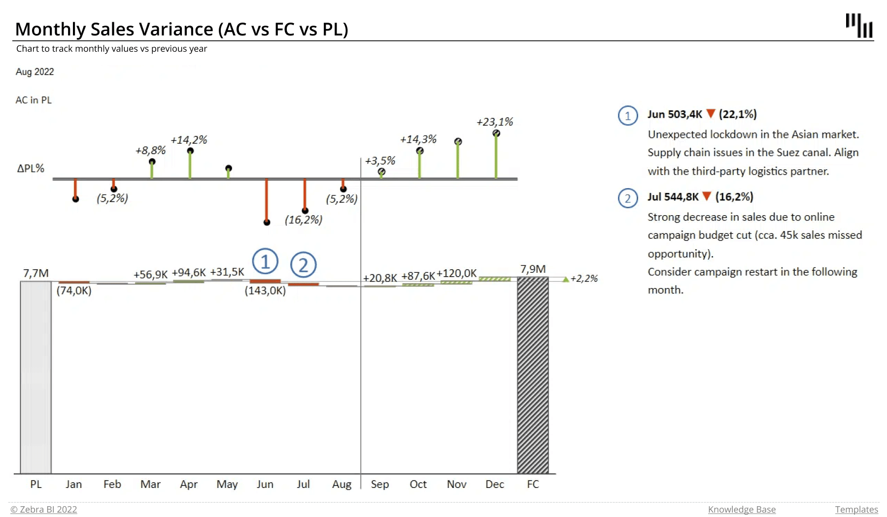
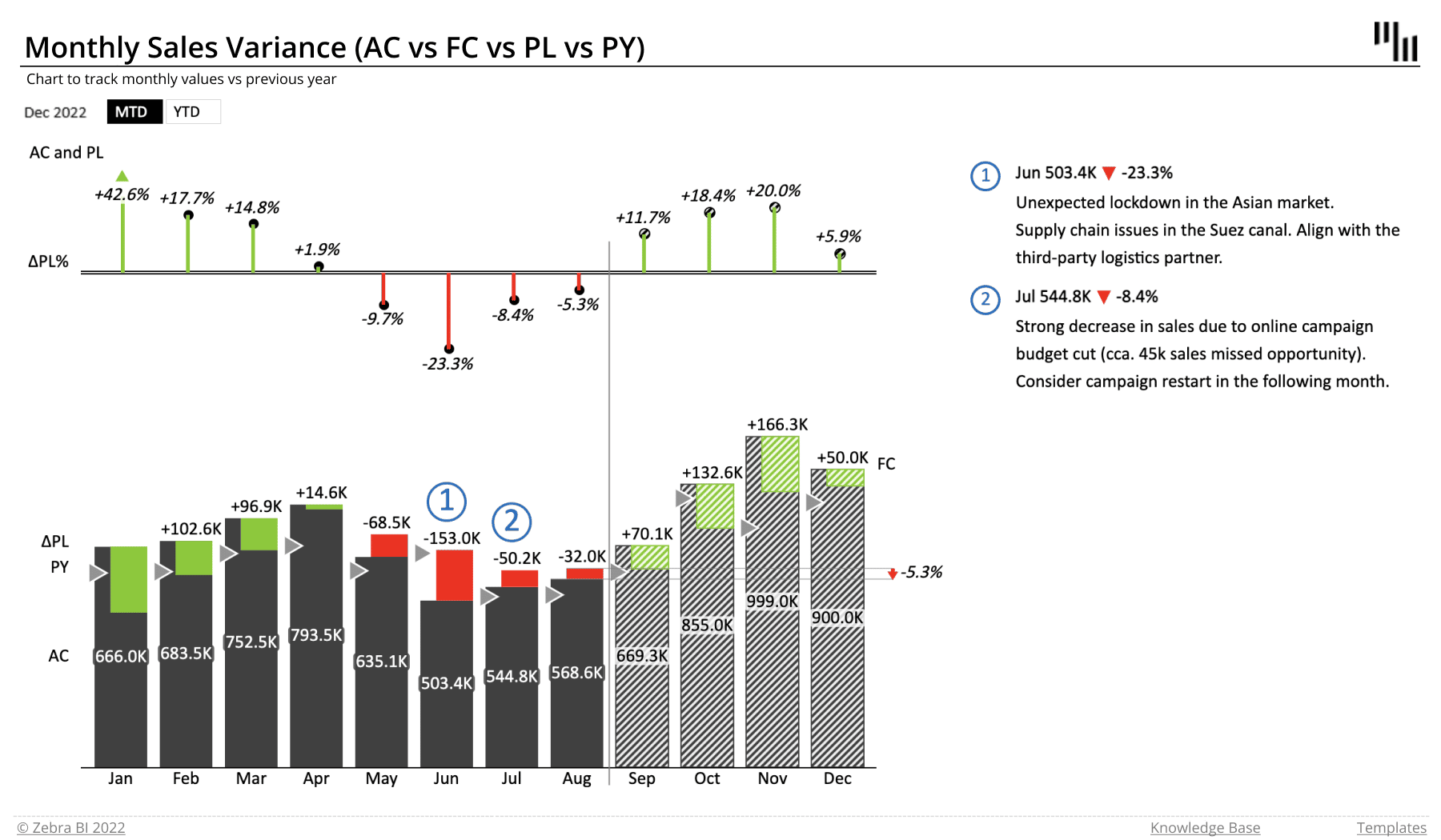
Monthly Sales Variance (AC vs FC vs PL)
This report shows relative and absolute variances between actual results and plans. It also includes clearly displayed forecast data. You can switch between monthly and year-to-date views for a better insight. This template features a bridge chart that shows how variances contribute to a change between the two values.
The report's home page shows the following:
- actual values
- plan
- forecasts
- relative variance lollipop chart
- comments
Monthly Sales Variance (AC vs FC vs PL vs PY)
This is the most information-dense report for sales variances. It shows relative and absolute variances between actual results and plans. It also includes clearly displayed forecasts and previous year's data. You can switch between monthly and year-to-date views for a better insight.
This template also includes a bridge chart which shows relative variances for previous year's data and plans as well as absolute variance against previous year's data.
The report's home page shows the following:
- actual values
- plan
- previous year
- forecasts
- relative variance lollipop chart for plan
- integrated variance for plan
- comments
Sales Variance Table
The sales variance template visualizes absolute and relative variances, showing actual sales results compared to various past and future values, such as previous year's results, planned sales and forecasts.
Who it's for: This is a core tool for top management and sales management.
Why you need it: These sales variance reports allow you to keep your finger on the pulse of your annual sales and monitor them as compared to forecasts, budgets and previous year's results by individual countries. It also includes subcalculations for individual regions (Western Europe, Eastern Europe, the Americas and Asia).
Zebra BI advantage: These are combined table-chart reports. Absolute variances are visualized with vertical variance bars, while relative variances are visualized with vertical lollipop bars.
Since use cases vary, we prepared different types of Excel report templates for sales variance tables. Feel free to download all of them or read on to select the ones that suit you best.
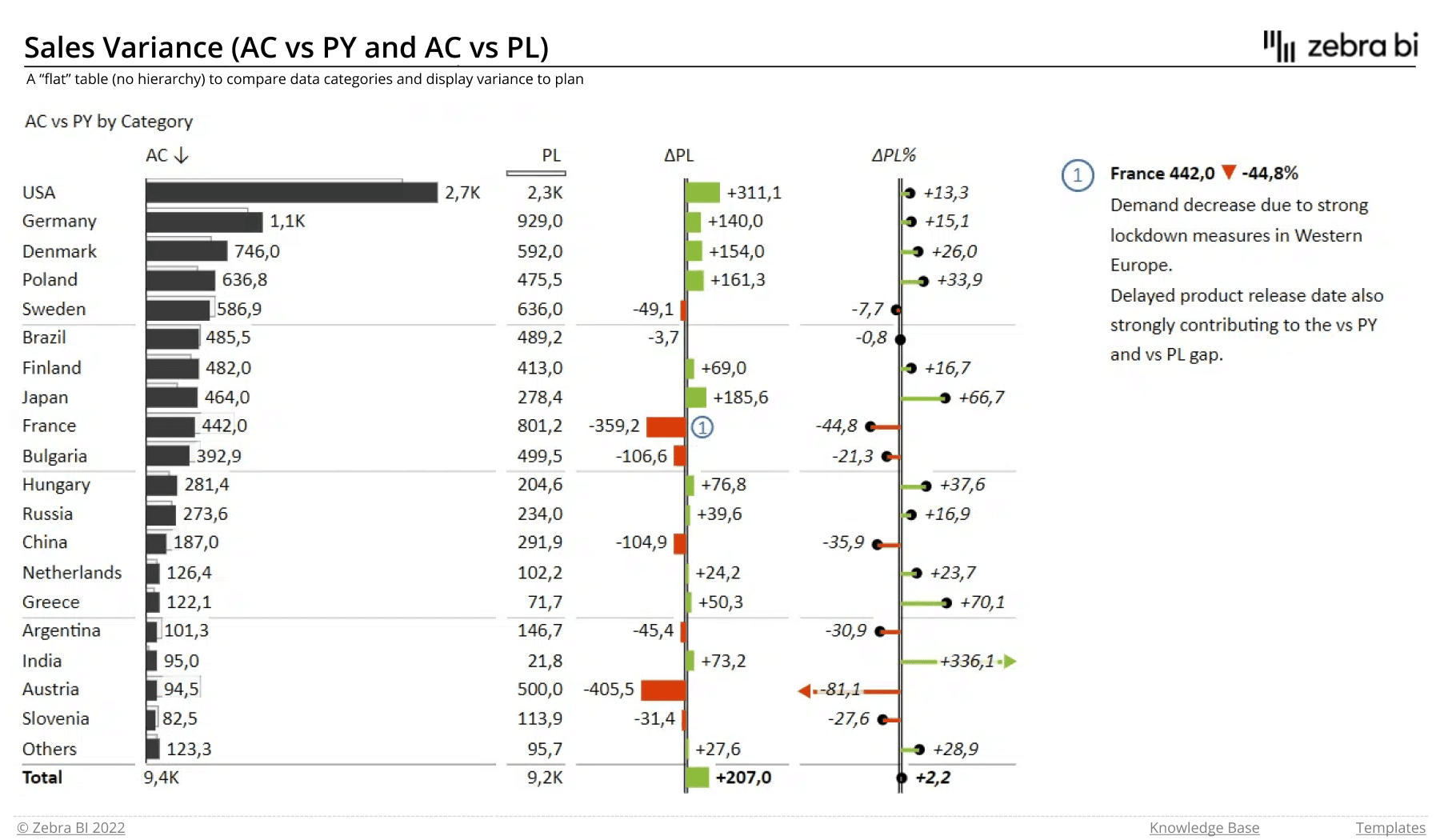
Sales Variance (AC vs PY and AC vs PL)
This table-and-chart combination provides a deeper insight into sales performance, displaying it as compared to previous year's or planned sales. The template contains both report types with various visual configurations.
Take a look at the chart below. For the purpose of clear visual communication, the actual and planned values are visualized with darker and lighter bars respectively, while the absolute and relative variances are shown with the red and green bars on the right.
The report's home page shows the following:
- data for individual countries and regions
- actual values
- planned values
- absolute and relative variances
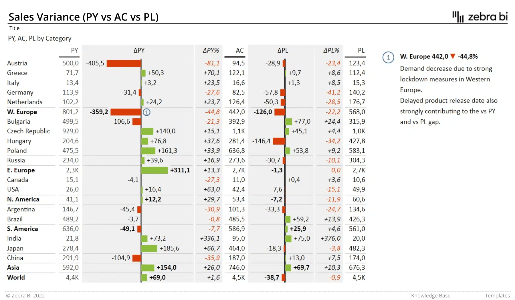
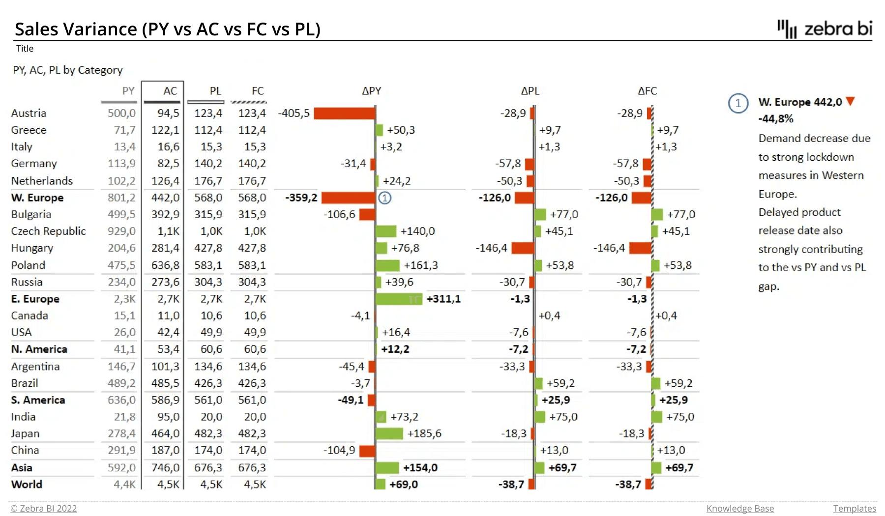
Sales Variance (PY vs AC vs PL)
Choose this Excel report template when you want to clearly display the absolute variance between the actual results and planned and previous year's values. In it, the results are displayed both numerically and visually.
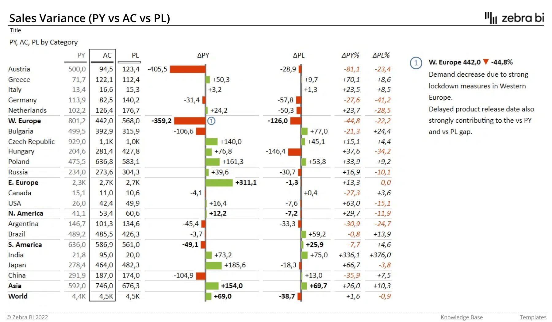
The report's home page shows the following:
- data for individual countries and regions
- actual values
- planned values
- previous year values
- absolute variance
The report also comes in a version with a different ordering of values and visuals.
Sales Variance (PY vs AC vs FC vs PL)
To compare your actuals with planned, previous year's and forecasted data, use this template. It displays all the values as well as the absolute variance to provide a comprehensive insight into your sales data.
The report's home page shows the following:
- data for individual countries and regions
- actual values
- planned values
- previous year values
- absolute variance
EBIT Contribution Analysis
EBIT contribution analysis shows how individual categories contribute to the final EBIT result. The analysis is visualized with a bridge chart, which is perfect for showing the opening and closing balance of EBIT. Additionally, it takes all the changes and presents them in a waterfall chart.
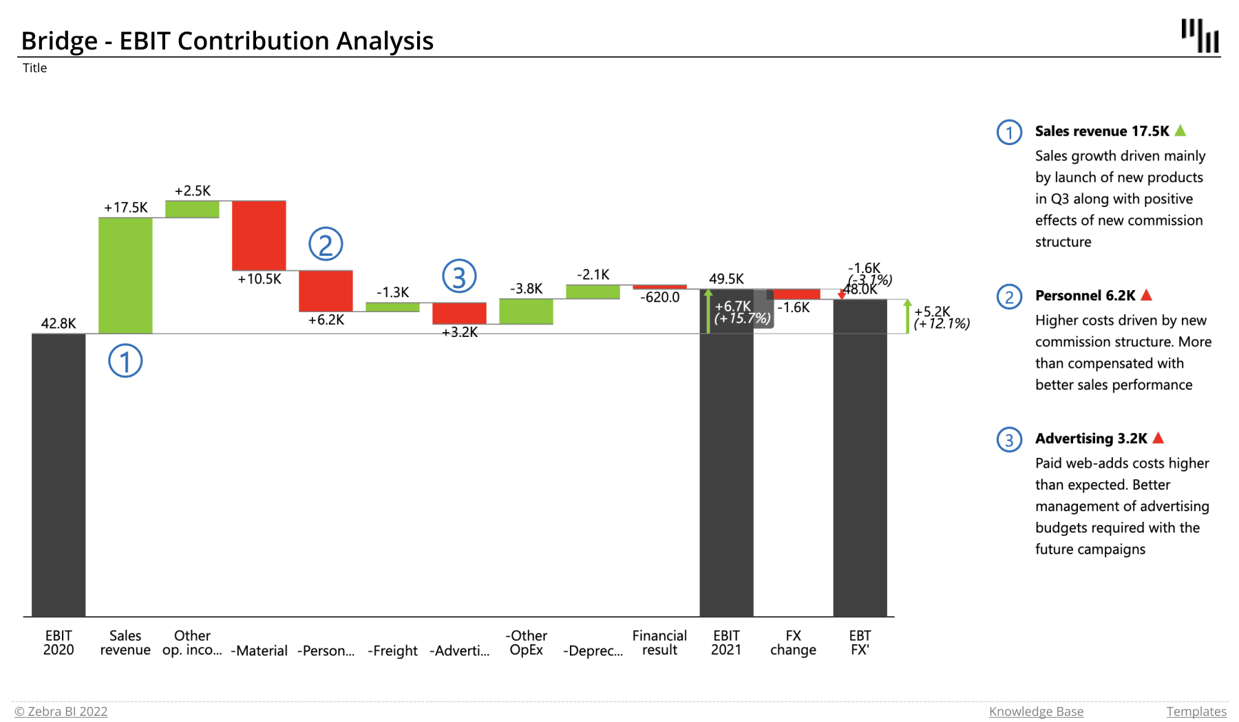
Who it's for: This is another tool for decision-makers, investors and financial executives.
Why you need it: It enables you to take a look at how individual categories contribute to your earnings and explain the reasons behind individual changes. This tool is especially handy for planning.
The report's home page shows the following data:
- starting and ending values of EBIT
- individual categories of revenue and costs
- absolute and relative variances in values
- comments
Zebra BI advantage: This is a great example of a bridge chart. The bridge charts work quite nicely in financial reporting; financial management and top executives love these types of charts.
Price-Volume-Mix Analysis
The Excel Price-Volume-Mix Analysis provides you with a significant insight into what drives the changes that you're seeing. It shows you how price changes, sales volume, and product mix are affecting your revenue. Are the prices increasing or are the volumes? Are you selling more profitable products? Which categories are the most successful? The Price-Volume-Mix Analysis can answer all these and more.
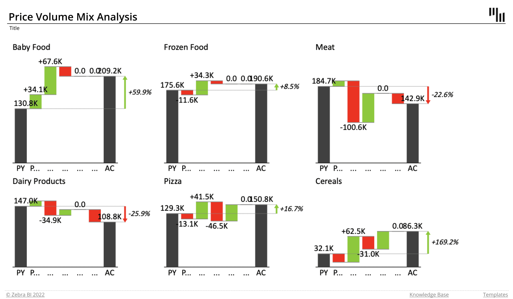
Who it's for: Price-Volume-Mix reports are of interest to product managers and CFOs.
Why you need it: Price-Volume-Mix analysis is a powerful tool that lets you take a look at the factors influencing your revenues. You can locate your key issues and opportunities and focus your efforts on what matters most. These reports let you understand your margins and product profitability better.
Zebra BI advantage: A key advantage here is the small multiples view. It shows multiple charts (rendered to the same scale) in a single report for easy comparison. It's a great way of looking at data, as it enables you to understand broader trends in your business.
Cost Variance Tables
At its core, variance analysis allows you to compare actual costs with planned or previous year's costs. These reports let you take a look at whether your costs are increasing or decreasing as well as your performance against your planned costs.
Who it's for: Project managers, finance department staff and management.
Why you need it: Since cost variance lets you see your performance against planned or previous year's costs, it can help you with your broader business projections. After all, a business needs to keep a close eye on its costs to improve future planning and forecasting.
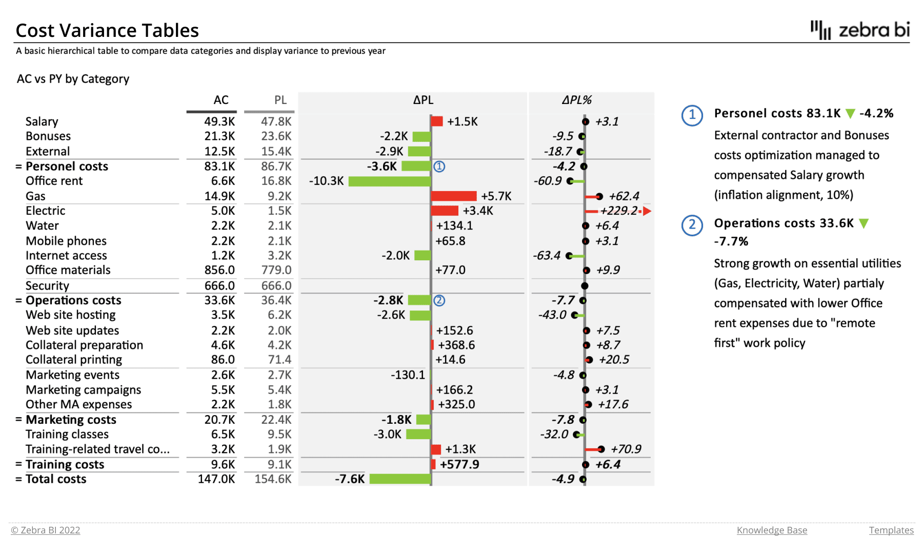
Zebra BI advantage: This visual uses vertical variance charts to visualize AC vs BU variances for different types of costs for the current month and year to date. As we're dealing with costs, the positive variance is red, while the negative variance is green.
Since use cases vary, we prepared a series of Excel report templates for cost variance tables. Feel free to download all of them or read on to select the ones that suit you best.
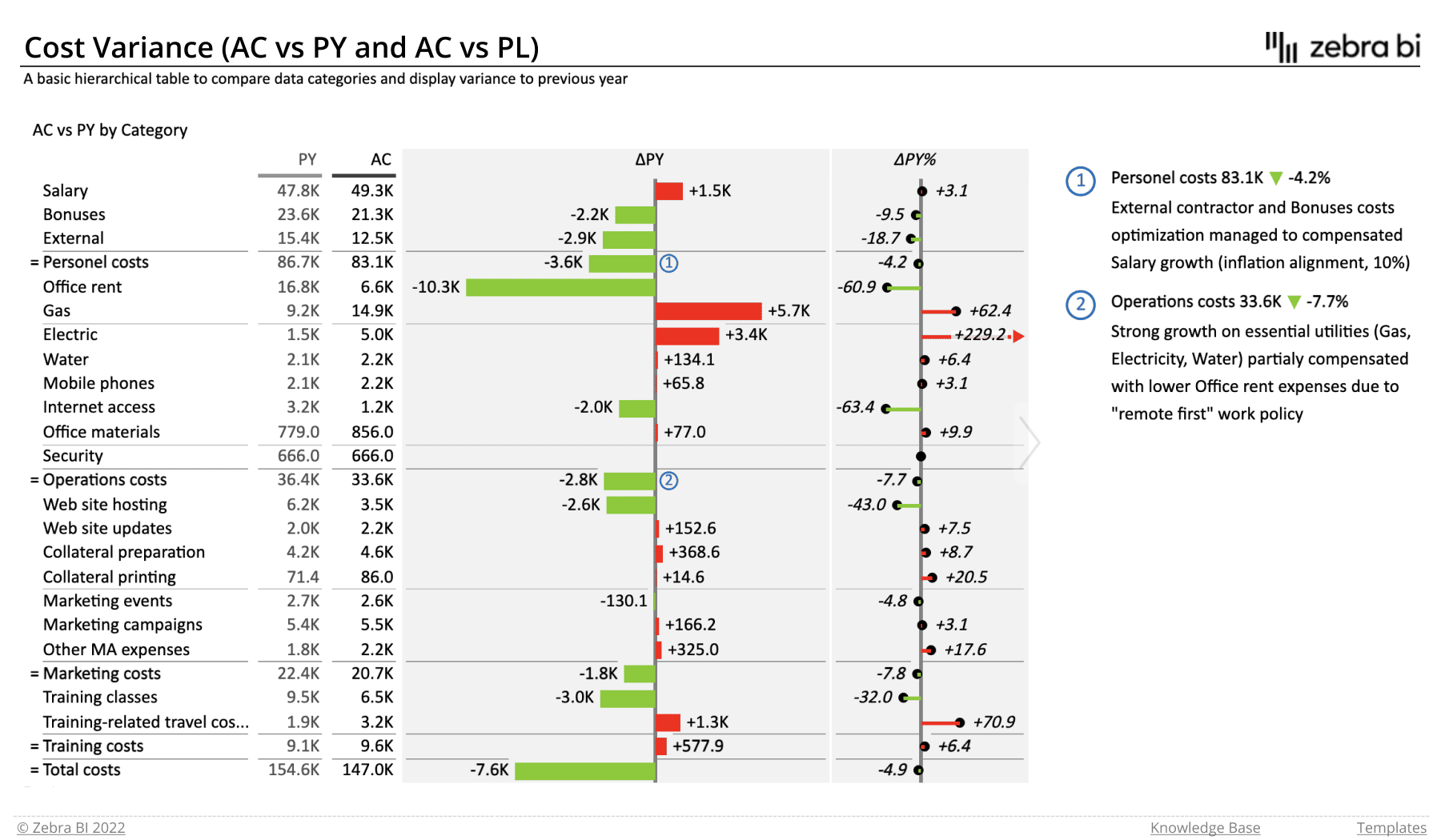
Cost Variance (AC vs PY and AC vs PL)
This table and chart combination provides an insight into how your actual costs compare to the planned or previous year's costs. You have two options for each comparisons. The first one is a hierarchical table which enables you to compare data categories and display absolute and relative variances. Note the use of subtotals to improve readability and keep similar types of data together.
The second option is a flat table which allows you to compare data categories and display variances.
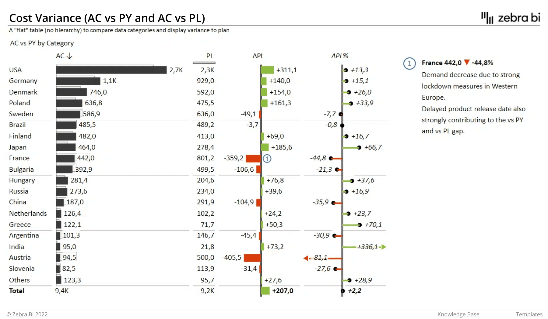
The report's home page shows the following:
- cost-related data
- actual values
- planned or previous year's values
- absolute and relative variances
- subtotals for individual cost categories
- comments
Cost Variance (AC vs PY vs PL)
Similarly to the previous report, this one displays actual data along with previous year's and planned numbers. However, it merges all the data into the same dashboard and focuses on absolute variances. It also makes use of subtotals to show groups of similar costs and their impact on your overall costs.
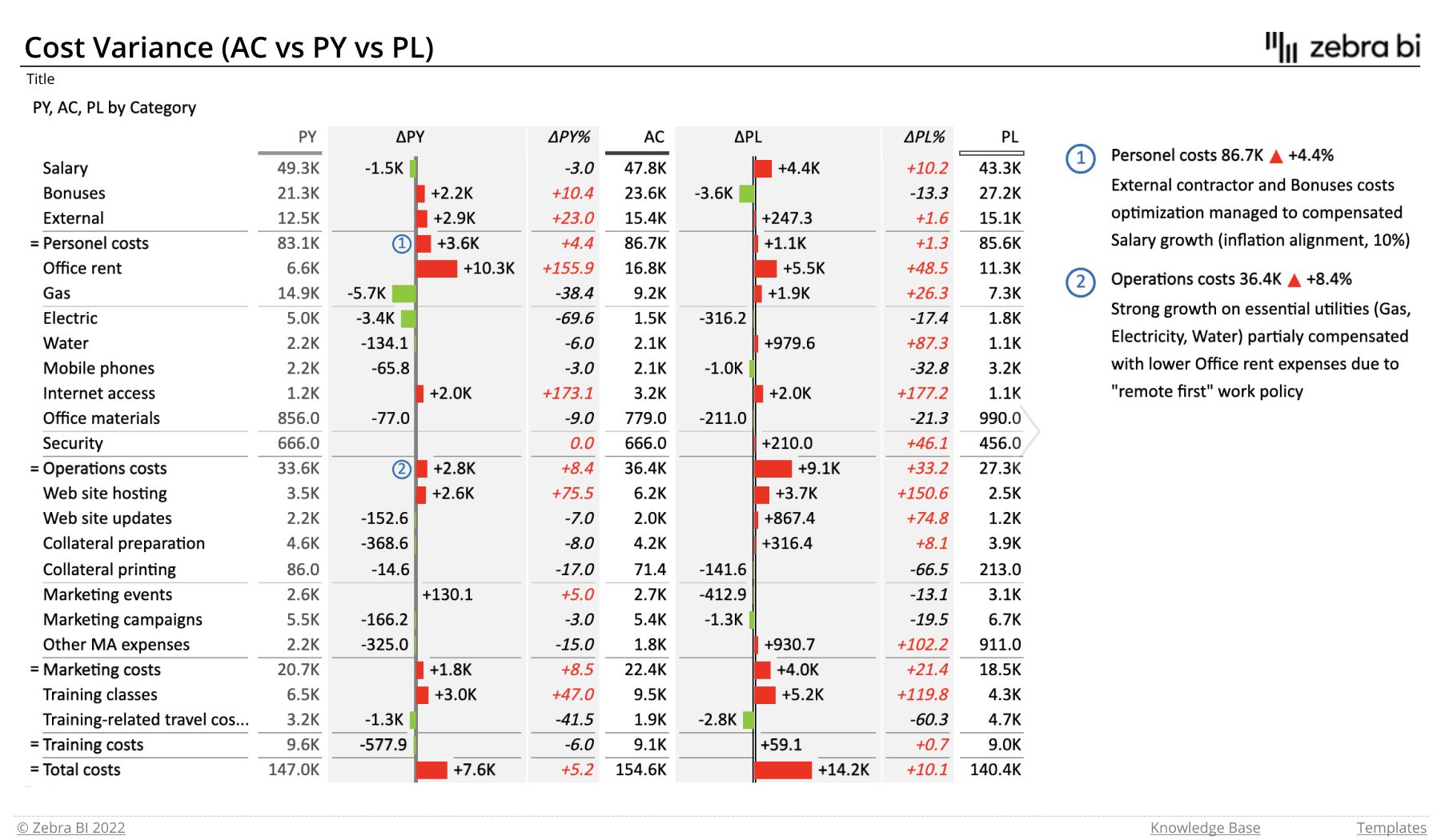
The report shows the following:
- cost-related data
- actual values
- planned or previous year's values
- absolute variance of planned and previous year's costs
- subtotals for individual cost categories
- comments
Cost Variance (AC vs PY vs PL vs FC)
This visual is actually an information-dense table. It can display all four data sets (actual data, previous year, plan and forecast) as well as relative and absolute variances. This provides you with an in-depth insight into your costs and how they relate to your plans and forecasts.
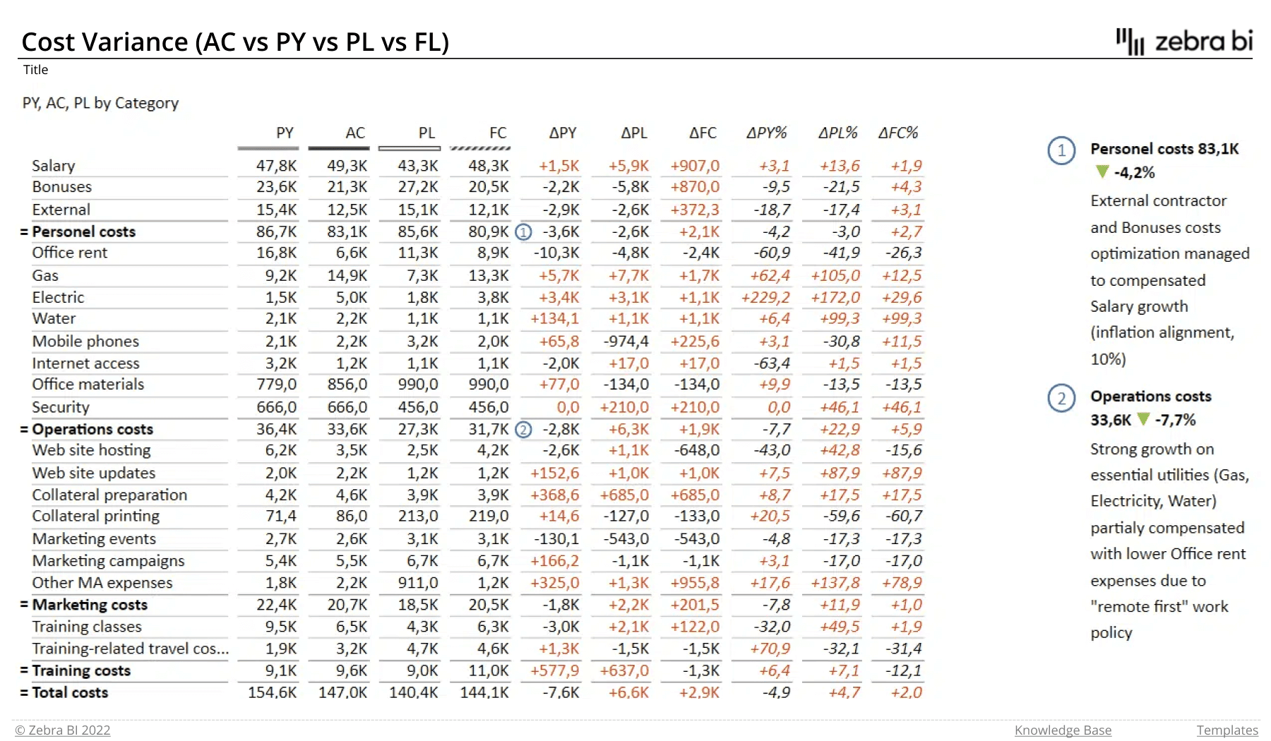
The report's home page shows the following:
- cost-related data
- actual values
- planned or previous year values
- forecast
- absolute and relative variances
- subtotals for individual cost categories
- comments
Marketing Budget Variance Analysis
This report is created for marketing executives, who need to demonstrate how their actual marketing spend aligns with the planned budget. It makes use of a bridge chart to show how individual components contribute to the end result and relies on comments to explain any major deviations.
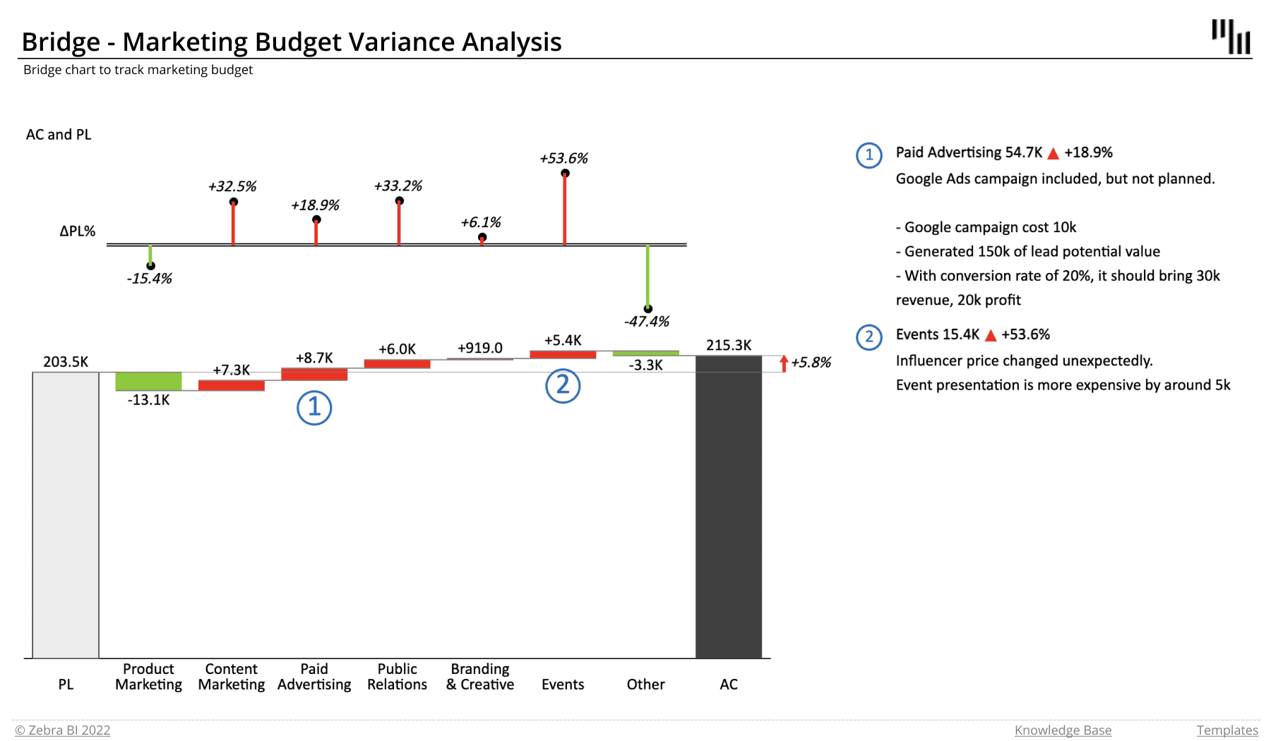
Who it's for: Marketing executives and senior management.
Why you need it: This report clearly shows how variances related to individual parts of marketing contribute to the final result. It clearly communicates major events, such as an unplanned Google campaign and/or price change. The bridge chart is easy to read. It allows users to click on variance values to switch between relative and absolute variances or display both.
Zebra BI advantage: The bridge chart and flexible labels make the data easy to read. Dynamic comments allow the users to clearly communicate what happened and why.
Subscription Business Model
This is another example of a bridge-chart-based report which is used to show the profit structure of a subscription business model. It displays individual components of the revenue and costs, and uses variances to show how the profit moves compared to the plan.
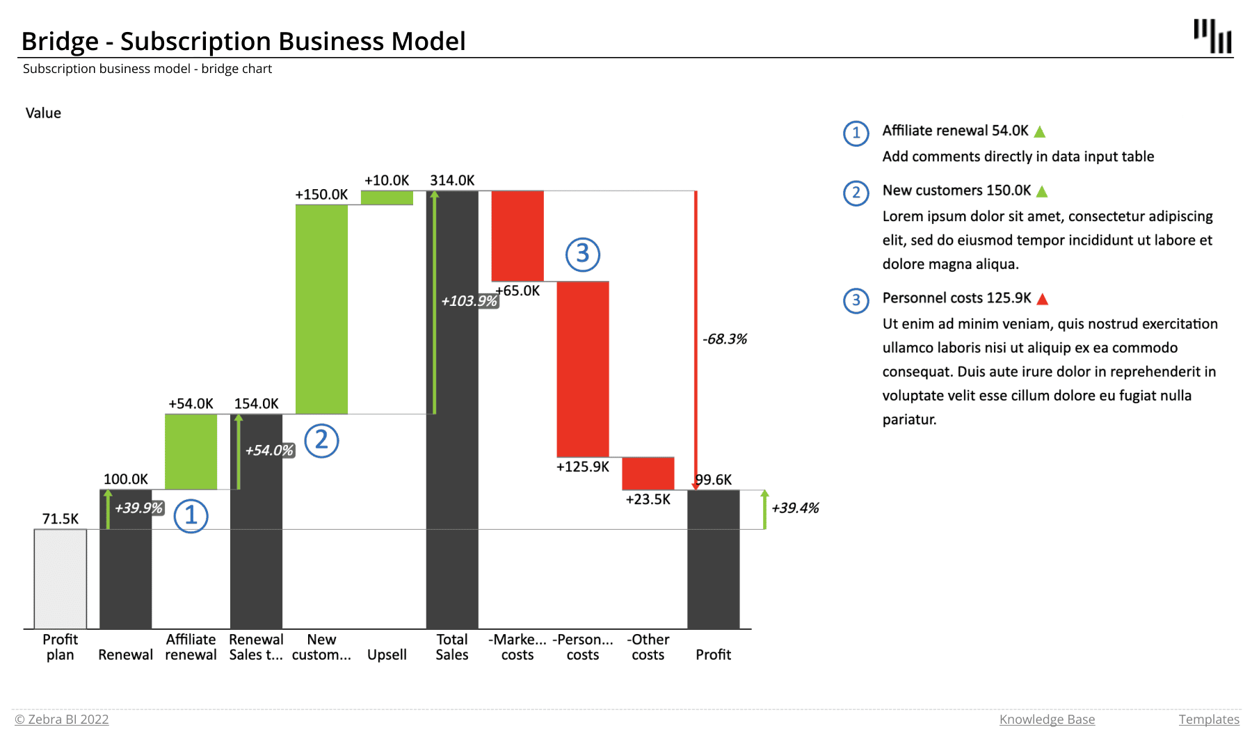
Who it's for: Management, sales and finance departments.
Why you need it: This bridge chart provides a quick breakdown of profits from a subscription business model.
Zebra BI advantage: The bridge chart clearly communicates how revenues and sales contribute to the final profit. It also includes a subtotal to show the degree to which subscription renewals affect the total sales revenue.
Balance Sheet
Balance sheet is one of the core financial reports in business. It covers a company's assets, liabilities and shareholder equity, and provides a snapshot of a company's business. This report features a combination of a table and charts to clearly show how individual items contribute to the total and how they deviate from the plan.
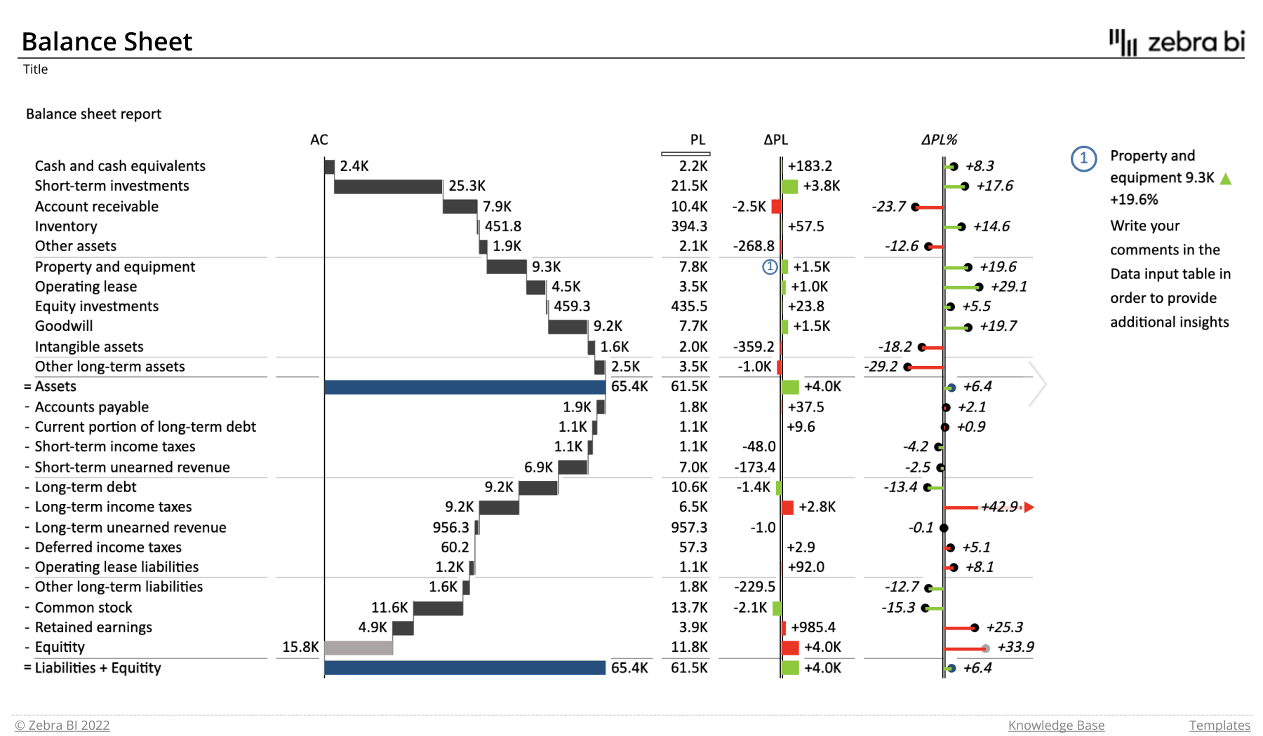
Who it's for: Management, investors and external stakeholders, such as banks or lenders.
Why you need it: This tool is key for measuring the company's efficiency and profitability.
The report shows several items that make up your balance sheets:
- liabilites
- equity
- assets
- actual and planned values
- relative and absolute variances
- comments
Zebra BI advantage: This report features a waterfall chart to show contributions to individual results. Instead of negative values, it utilizes the invert-value functionality to show how liabilities affect the balance sheet. It also uses distinctive visual styles for absolute and relative variances.
Key takeaways
Excel reports make business data accessible and understandable to multiple stakeholders in an organization. It is important to ensure the right people are privy to the right information at the right time.
Representative Excel reports examples help you build a case for data dashboards in your company in a way that emphasizes their benefits, informs stakeholders about their intended uses, and makes them resonate with key decision makers.
These ready-made Excel report templates take the guesswork out of Excel dashboard creation. You can think of them as a collection of tools to sharpen your business acumen. Whether you're simply getting started with Excel or are already an expert, dashboards can help take your reporting to the next level.
Get all the templates
If you'd like to explore all our Excel report templates and examples, simply click on the button below and enjoy! Remember, all templates are downloadable!
Very useful, well explained. Thanks!
Thank you Adam, we're glad you liked it.
If you liked this article, make sure you watch the webinar, where you'll find a few more ideas and examples: http://zebrabi.com/report-templates-webinar/
Thanks for sharing!