Power BI is Microsoft's business intelligence solution in the cloud and on the desktop. It is a very interactive platform that allows you to create your Power BI dashboards from a wide range of data sources, including Excel, relational databases, OLAP, Analysis Services, Hadoop and even social networks, such as Twitter and Facebook.
Of course, Power BI features many charts and visualizations but unfortunately, it doesn't allow you to build advanced, information-dense business reports and dashboards out-of-the-box. There's no way for you to follow IBCS standards, create advanced waterfall charts, difference highlights, small multiples, advanced options for managing outliers, etc.
Fortunately, Power BI allows you to import custom visuals, which opens you to a world of new possibilities. 🙂
But first, let's start with the basics...
First look at Zebra BI custom visuals
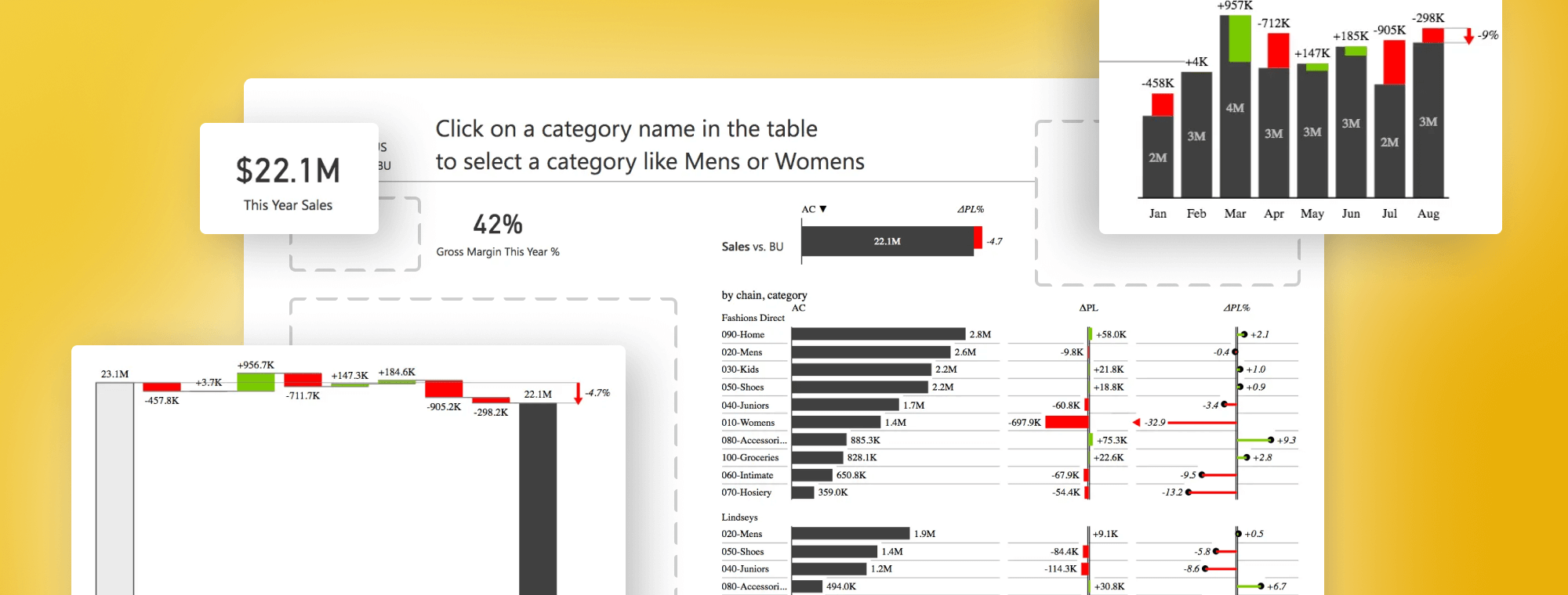
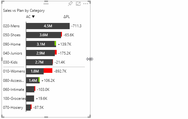
In Power BI, you are working in workspaces, where you organize your reports, dashboards and data sets. You will be spending most of your time working with reports to create visuals that you can then pin to your Power BI dashboards for quick access. Take a look at a sample report, created with Zebra BI custom visuals.
This report has multiple elements - a waterfall chart, numeric indicators, sales by month and by store chain and categories. It is an information-dense page telling a complex story. The first thing you'll notice is how interactive this report is. You can essentially click on any part of data to filter other data or find out more. For example, when you click a specific month on a chart with monthly totals, other charts change to reflect to show just data for that month. You can also click on variance values to change them from absolute to relative or to display both values.
Trying to convey the same information with default Power BI charts would result in unwieldy stacked or comparison charts that are difficult to read. The waterfall chart is the easiest way to convey this information. In Zebra BI custom visuals, you simply need to add the actual sales and the plan and the chart automatically adjusts to reflect the values. In the next step, you just add months to create an interactive IBCS-compliant chart automatically.
Tip: You are not limited to a single type of chart. By clicking on the left or right arrow on the edges of the chart, you can slide between different types of charts and select the most suitable one.
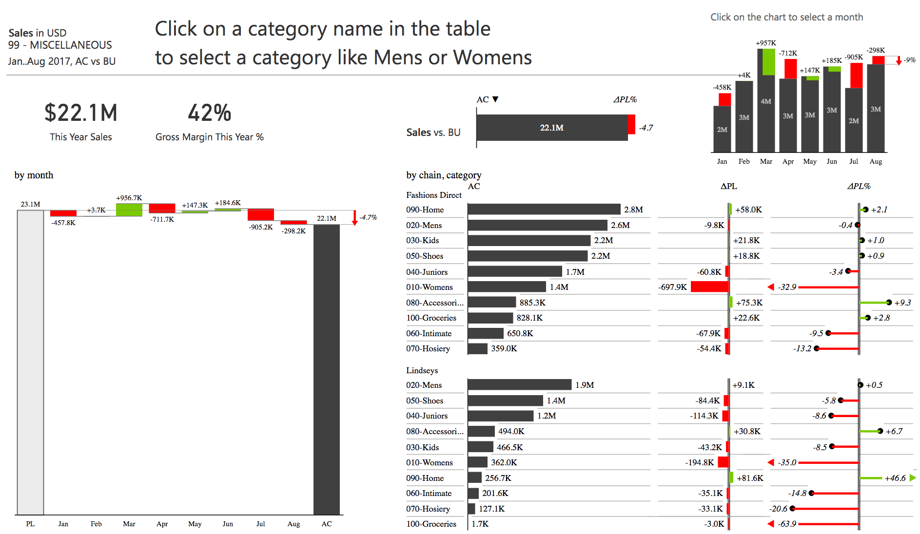
Small multiples in Power BI
Another visual that shines in Power BI dashboards are Zebra BI's small multiples. This powerful method puts multiple scaled charts on a single page. In this example, a single glance will tell you that men's fashion is the largest category and how it compares to others:
The interactive nature of Power BI comes in handy in this view as well. For a better understanding of data, you can exclude specific charts with a couple of clicks. You just need to hold down CTRL and select the charts you want to view. Visuals then adjust automatically for a better viewing experience - charts become larger and more readable.
This report also features a great example of a slicer (in the top right corner). A slicer narrows the portion of the dataset shown in other visualizations in a report. For example, you can use slicers as an alternate way of filtering to easily add or remove months from the charts in your reports.
Tip: Once you are happy with a specific chart that you want to view often, you should pin it to your dashboard for easy access.
Diving into detail
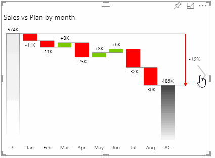
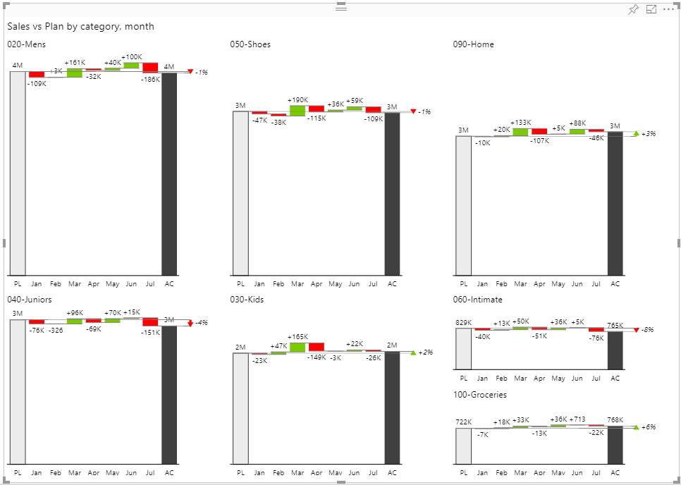
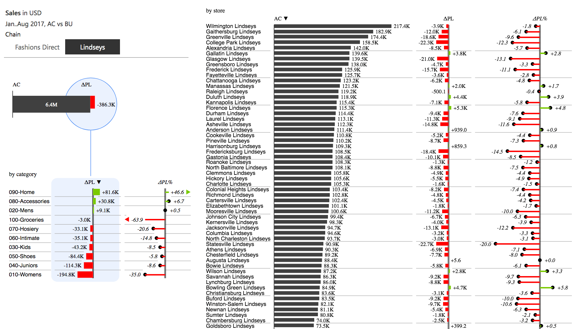
You can also visualize more detailed data. This report, for example, breaks down the sales by individual stores.
Again, data in this interactive chart can be easily sorted by variance or actual values. By clicking on the name of an individual store, the left-hand side displays more detailed information about it. The smaller chart below shows which product category is responsible for the failure to attain the plan.
There are several great visual details here. In the smaller bar chart on the left, you can see that the lollipop circle has been replaced by an arrow with a label. We use this approach when a value is such an outlier that representing it to scale would throw off the visual balance of the chart. These outliers often occur in cases where very small absolute values have very large relative increases or decreases.
Moving on to dashboards
Now is the time to take a look at Power BI dashboards. The visuals in your reports that you have been pinning are placed here. This is s single place to look at your data - from sales and financials to marketing and social media. Therefore, you can select individual visual to act as KPIs. The design process is also easy and very intuitive. As individual visuals are hyperlinked to reports and completely interactive, you just need to resize them on your dashboard and they show up perfect.
Tip: Use the focus mode for a closer look. In this mode, the visual will take up the entire windows for improved insight.
You can also design a dashboard for mobile by looking at the phone-view version. Power BI will put visuals on the mobile dashboard automatically, so you just need to resize them slightly. Use small multiples on your mobile dashboard and view them in a single column.
The power of responsive visuals
Having custom visuals that are truly responsive is a great asset when you design Power BI dashboards for mobile. Truly responsive Power BI custom visuals can do this:
When there's enough space for just one chart, only one chart is displayed. When there's space for two charts, two charts are displayed. And when space is plentiful, three charts are displayed.
Tell a story with your Power BI Dashboards
Power BI is a great storytelling tool. However, to really take advantage of everything it has to offer, we recommend you use the desktop version. In addition to powerful modelling tools, it provides an easier way to hyperlink individual reports or even visuals.
Start by adding shapes or text that can be linked to individual visuals. You can even link to visuals in spotlight or focus mode, so that report readers are guided to the information they need. You can therefore easily create a visual story through bookmarks, as a reader just needs to click on arrows at the bottom of the screen to move through the bookmarked visuals.
Looking for ready-to-use templates you can just download and customize with your own data? Here are the top 12 Power BI dashboard examples you might want to check out!
Try it yourself
The above Power BI dashboards and reports were created using Zebra BI custom visuals. They are designed to help you build extremely clear, detailed and insightful business reports and dashboards in Power BI.
Special attention and a great deal of effort have been invested into making the process of building even the most complex business dashboards a straightforward, extremely fast and enjoyable experience.
You can download Zebra BI custom visuals for Power BI here: