Get follow-along PBIX example
If you'd like to try creating small multiples in Power BI yourself, enter your data below to get immediate access to the full 1-hour video recording of the webinar and all PBIX examples used in the this tutorial.
Small multiple charts are one of the most powerful data visualization methods for financial reports and dashboards.
In this tutorial, we'll show how you can leverage them to make your sales, marketing, and financial dashboards in Power BI stand out!
Note: This Small Multiples in Power BI tutorial is based on our 1-hour webinar on the same topic. If you prefer to watch the video, scroll to the bottom of this tutorial, enter your details and we'll send you the webinar recording and all PBIX examples to go along with it.
It doesn't matter what field you work in - you probably needed to compare multiple categories of data series at some point.
You might be working with cost centers, accounts, sales locations, sales channels, regions, car models, web traffic referrers, etc. And when you work with multiple categories of data points, you don't need complex or cumbersome approaches with multiple pages or tables that are hard to read. There is a data display method that allows you to show information in a way that instantly makes it much more insightful and easier to compare sets of data on a single page.
The visualization is called small multiples (a term popularized by Edward Tufte) and at its core, it's a simple concept. In essence, you
Small multiples are not unique to the world of business (they have been used for side-by-side geographic maps, including when information NASA's Kepler mission on was released to the public).
In business, however, the use is a bit different. Namely, small multiples allow anyone looking at your dashboard to immediately see which categories are the most important and also analyze the trend lines, regardless of whether you use line, bar, or pie charts as the foundation of your dashboard.

Take a look at this simple bar graph example: First, there are eight charts representing sales in eight countries. This is the defining feature of small multiples. The second mandatory feature is that they are rendered using the same scale. This means the Y-axis scales needs to have the same maximum across all the charts.
Just a glance is enough to see that the US is the biggest market with planned 25 % growth. Germany, on the other hand, has lower growth potential despite being a similarly large market. France has been declining for the past 3 years and this is expected to continue.
Let's take a look at another Power BI small multiples line graph example to really show you the power of small multiples. This one displays on-time delivery performance in relation to the goal:

The company's goal is to have 80% of its products delivered on time across all categories. The goal is visualized with the dashed line.
Once you have information aggregated on a single screen, you can start working on making it more meaningful. For example, using a combination of a line chart and area chart - called the Hills and Valleys Chart - emphasizes the positive and negative variance in relation to the goal.

The red and green variances make it much easier to spot what's going on. We can see that the Cell phones category had serious issues that were resolved, while Video games are on an improvement trend.
Another great example of using small multiples is sales. Below is a sales dashboard for a retail company:

One look is all it takes to see that women's fashion segment is in serious trouble.
Until now we dealt with small multiples that visualized a single KPI, like market share, sales category and similar. This is the simplest type of small multiples. The data is simply repeated over and over for all categories.
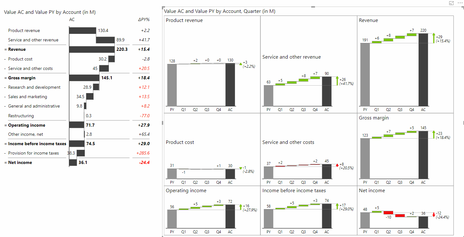
The next graph example is a bit more complex. The Power BI small multiples visual below shows multiple KPIs of the profit & loss statement:

This dashboard is harder to build because KPIs can have different meanings. For example, while revenue growth is normally marked in green, any growth in costs should be marked in red because that's a negative trend in a KPI.
When creating a small multiples dashboard like this, you need to pay attention to the type of the KPI and know when its meaning should be reversed.
You can see more examples of Power BI dashboards in our gallery.
Creating a small multiples dashboard well is hard. What makes it easier is using the right tool for the job.
Tableau software is a tool known for doing small multiples, but the dashboards it produces are not optimized. Here's an example:

If you look closely at the example graphs, you'll notice that all charts are placed on a grid with equally sized cells. This results in lots of wasted blank space.
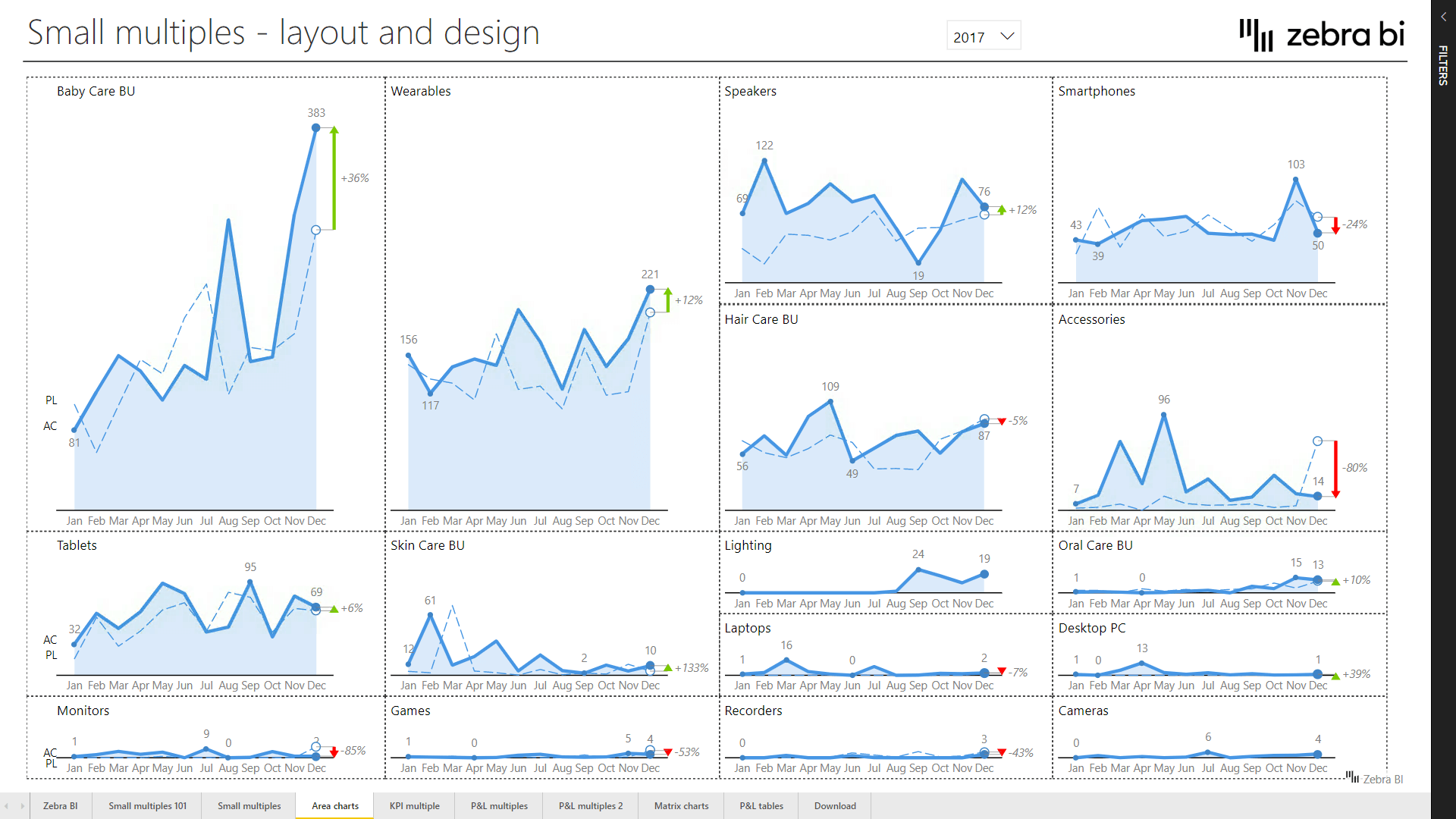
Now let's look at what Zebra BI offers in Power BI with its Smart Rows and Auto features. The grid here is optimized based on the space individual charts actually need:

The next level is to display larger charts across two rows. This is what we call the span function, which means that charts that are big enough simply take more rows in a column. This gives you true flexibility when working with small multiples. The charts are given the space they need and correct scaling is preserved.
Now we can look at an example dashboard built on data from Google Analytics. It displays different sources of traffic to the website and you can quickly see that organic traffic plays an important role as do email campaigns.

However, the number of different traffic sources is very large and a large majority do not really contribute much individually. Therefore it makes no sense to display them on the dashboard, which is where the Top n + others feature comes in.
Instead of displaying hundreds of charts, the Top n + others feature displays a specific number of top categories and sums up other in a category called Others. This means that everything beyond this point is summed up in this automatically calculated data category.
We will now show you how to start creating small multiples using Zebra BI for Power BI.
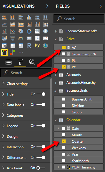
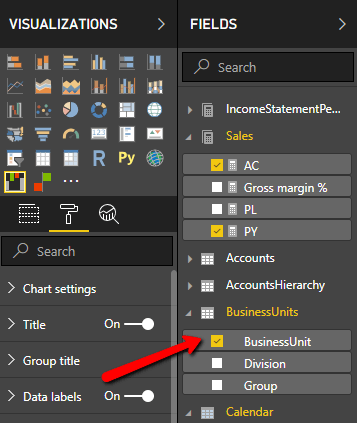
Load up Power BI, and use Zebra BI Power Charts Visual in the provided example files. On a blank page, add sales actuals and compare them to the previous year split by quarter. You do this by selecting AC and PY checkboxes under Sales field group and Quarter field under the Calendar group.
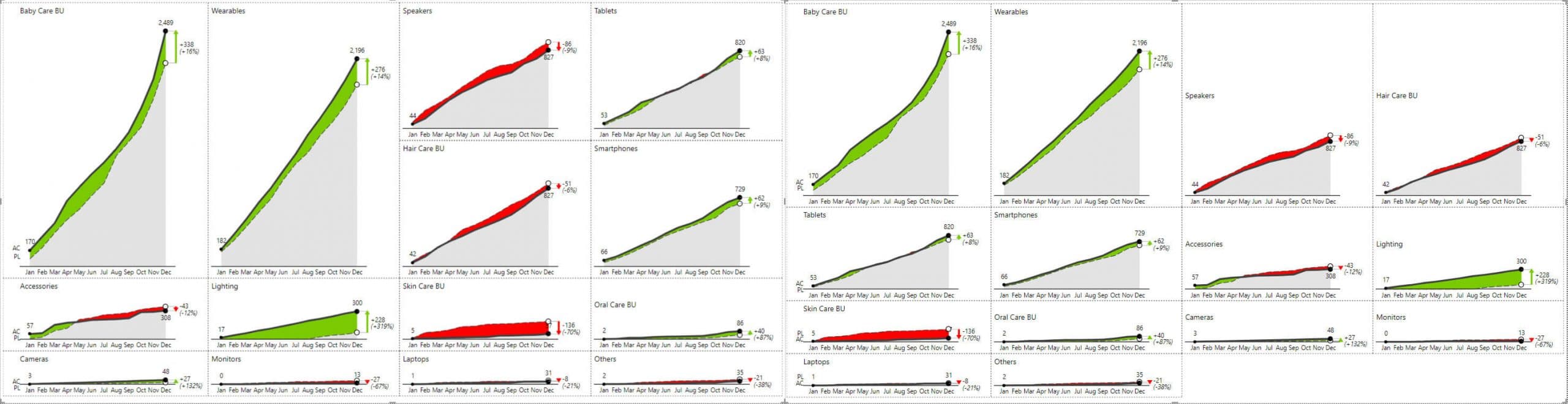
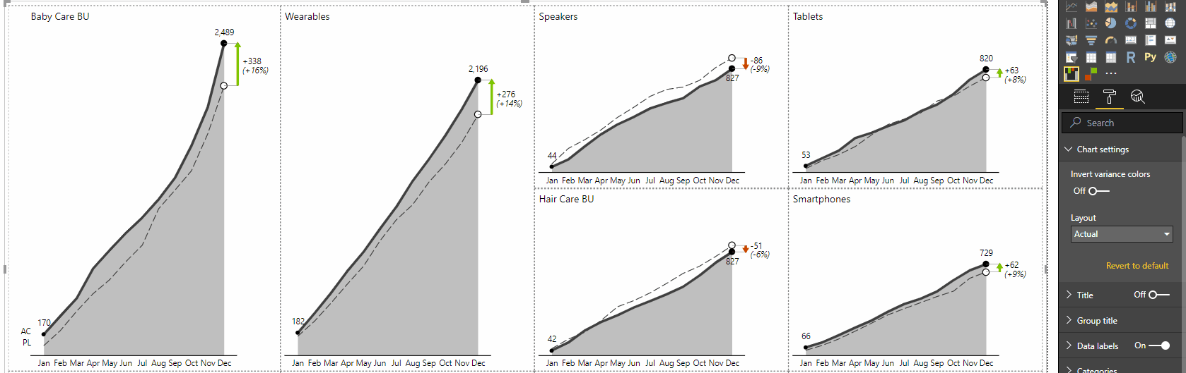
Now add the business unit dimension to get the small multiples chart. Adding this dimension will display actual results compared to plans by quarters for each individual business unit.
This displays all the charts on the dashboard. Since there are so many, they will become small and that's why this visualization is called a small multiple. You are now dealing with limited space so you need to work on the labels. Make sure everything is not too crowded.
Open the Format tab and select the Data labels group. Set the Units to "Thousands" and set the "Show units in" to "Title" value. This re-formats numbers and makes them more readable. Set Decimal places and Percentage decimals to 0 and set Density to only show the first, last and minimum and maximum values.

The next stop under the Format tab is the Small multiples group. Under the Layout option, you can select Smart Rows, which sizes rows based on their values - larger rows for larger values You also have the Auto layout option that better handles scaling when you have large values. In our case, make sure you switch to Auto to make larger charts larger and optimize the utilization of space.
See the comparison of the Auto mode to the Smart Rows.
Under Sorting, the best option is normally Descending to put the largest values first. You can also turn on the grid if you like to improve readability.
Tip: Don't use strong or dark colors for borders and grid lines.
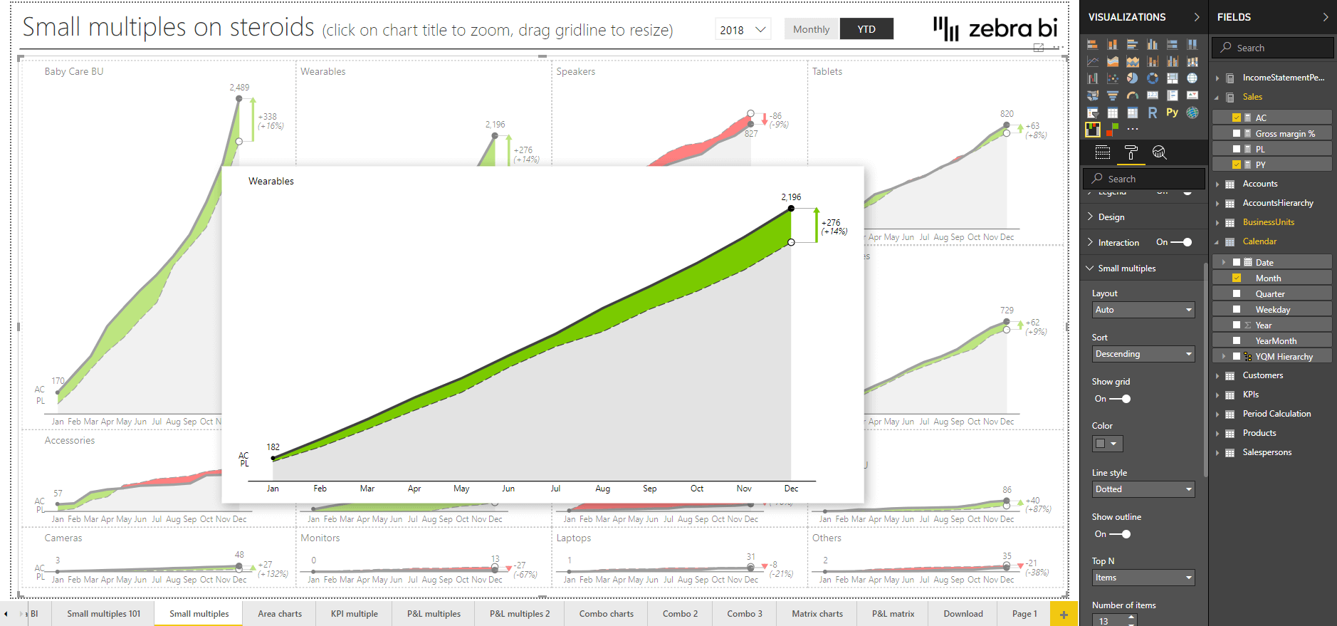
On your small multiples dashboard, you can click on the title of each individual chart to zoom in. Zooming in helps you better understand what's going on with each individual chart.
Sometimes you want to dive in and understand the variances a little bit better. Small multiples can be hard to read. You can turn to the Axis break feature (in waterfall charts) to resolve that. By clicking on the AC or PY column in the chart, you can break the axis while the scaling between the charts is preserved.
Just click to enable or disable it.
Axis break allows you to better compare the rates of your variances. If you want to see the variances better, you can set the axis break to a higher value - 80% for example. This results in more pronounced variances.
Of course, you can switch between different types of charts and each type also has different layouts. Let's take a look at Area charts - here the default value is the layout called the Actual, which means that actual (this year's) values are compared to the previous year.
If you switch it to integrated variance layout (Chart settings - Layout - Integrated variance), the variance between the values is rendered as well. This results in more emphasis on variances. With this toggle, you can easily switch between different layouts to emphasize the things that are important to your data story.
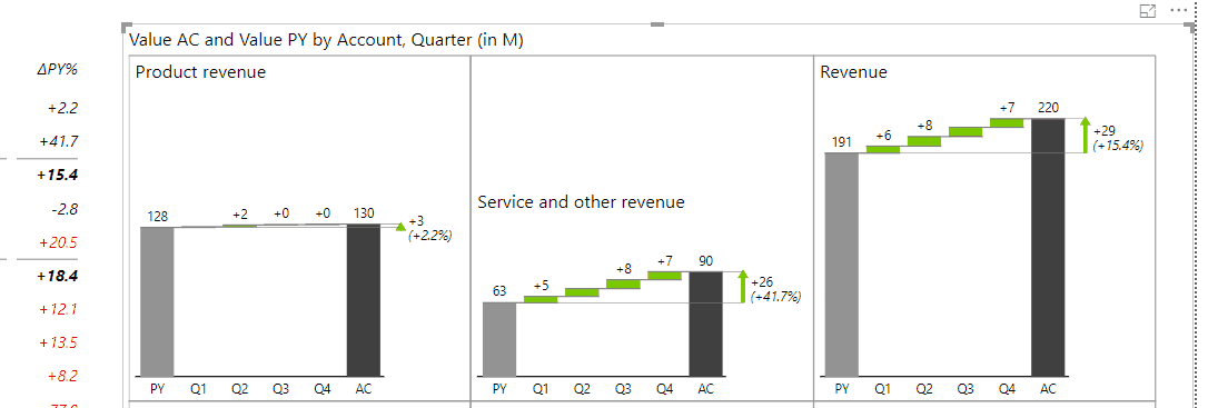
Another powerful feature is the combination of a Zebra BI Power Table and small multiples (a Power BI small multiples dynamic layout). This approach allows you to easily explore data using the table to filter and compare small multiples. For example, just select the Product Revenue in the table and enjoy the details on a large chart. But you can also Ctrl + click multiple elements to select and compare them.
For example, you can compare product revenue to service and other revenue. Or take the product revenue to compare it to the product cost. This gives you unrivaled flexibility to explore data.