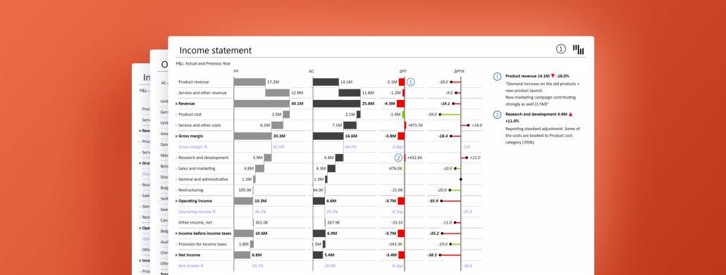
Ace your investor PowerPoint presentations with our comprehensive guide on building impactful stories, emphasizing essential metrics, and skillfully employing visuals.
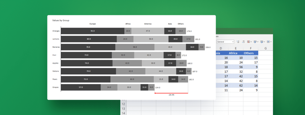
Stacked bar charts allow you to break down your data into segments, which provides your stakeholders with a comprehensive view of the information at hand. Learn how to create your best stacked bar chart in Excel with next-level features using Zebra BI for Office.
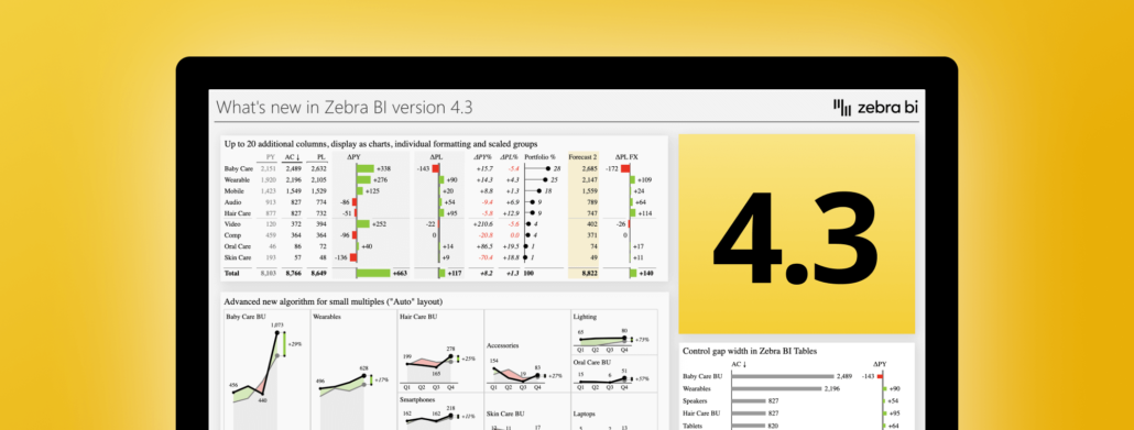
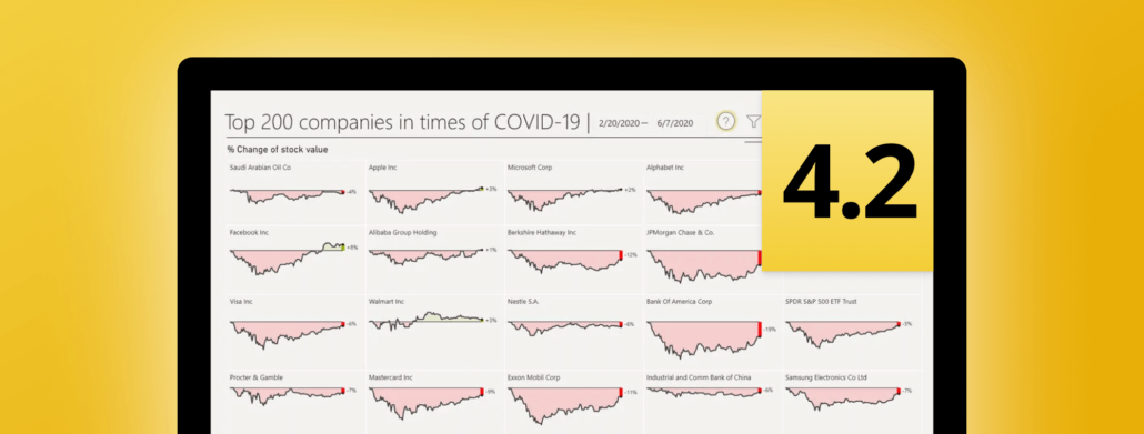
We have just released the new version of our Power BI visuals, both Zebra BI Charts and Tables. In the update 4.2.0, a lot of highly-requested features have arrived.
 September 8th
 February 22nd