
Mastering the 80/20 Rule: How to Make a Pareto Chart in Excel
We live in a world driven by data, and to stay ahead of the game, we need to make sense of it. And let's be honest, turning a pile of raw numbers into actionable insights can be as challenging as mastering a jigsaw puzzle while blindfolded. But fear not, we're here to introduce a concept that could be your guiding light in the labyrinth of data analysis: the 80/20 rule, or as the economists like to call it, the Pareto principle.
Named after the Italian economist Vilfredo Pareto, this simple rule of thumb is about to become your go-to tool when it comes to deciphering data in Excel. "But wait!" you may be wondering, "how do I turn this theoretical concept into a visual masterpiece?" We've got you covered. In this guide, we're going to dive deep into the nitty-gritty of how to make a Pareto chart in Excel.
So, put on your analytical hats as we unlock the secrets of efficient and impactful data analysis. Let's get started. Whether you're an FP&A whiz, a consultant looking for innovative ways to showcase data, or simply a data enthusiast who wants to master a new trick, you're in for a ride. So let's get going.
What is the Pareto Principle (the 80/20 rule)
Let's take a step back and understand what the 80/20 rule is all about. Enter Vilfredo Pareto, an Italian economist who, one fine day, made an interesting observation. He noticed that 80% of Italy's land was owned by a mere 20% of the population. Intriguing, isn't it? This observation sparked the Pareto principle, or as we've been calling it, the 80/20 rule.
The Pareto principle is a simple yet powerful idea that holds that about 80% of the effects come from 20% of the causes. It's like the majority of crumbs on your keyboard coming from the minority of your snacking episodes (not that we're encouraging eating at your desk, of course).
This principle is not restricted to land ownership or your keyboard crumbs. It has far-reaching implications in various domains, including business, economics, and personal productivity. In essence, it's about recognizing the uneven distribution of things in our lives.
You might be wondering, "how does knowing about some 19th-century economist's observations help me?" Hold your horses, or rather, hold your Excel cells. In the next chapter, we're going to delve into the practicality of the Pareto principle in the realm of business. It's about to get real. 👇
Pareto Principle in Business
When we start talking about the Pareto principle in the business realm, that's where the real fun begins. Remember the keyboard crumbs analogy? Let's upscale that a bit. Imagine that in your business, a small subset of activities, let's say 20%, is driving a hefty 80% of your results. Now, that's Pareto principle in action!
In the grand business playground, the Pareto principle serves as a trusty compass pointing towards the elements that pack the most punch. Be it performance drivers, customers, products, or activities, this rule helps zero in on the elements that have an outsized impact on your business performance.
Want to create a Pareto chart just like this one?
Try Zebra BI for Excel for FREE & make a Pareto chart packed with actionable insights in just seconds.
Real-World Examples of the Pareto Principle
Let's illuminate this with some real-world examples. In sales analysis, you might find that a small subset of your products (20%) drives the majority (80%) of your revenue. Or in inventory management, it may turn out that a handful of stock items constitute the bulk of your storage costs. The same logic can apply to your marketing campaigns where a few successful strategies lead to the majority of conversions, or in customer support, where a fraction of issues comprise the bulk of your tickets.
The Pareto principle also shines brightly in realms like quality improvement, time management, risk management, employee performance, product portfolio analysis, and even website analytics. So the next time you find yourself wrestling with a sea of data, don't forget to ask yourself: "Where's my 20% that's causing 80% of the effects?"
But, as with any principle, it's not all rainbows and unicorns. While the Pareto principle can be a potent tool in your business arsenal, it's important to remember its limitations, which we'll delve into in the next section. So, keep those analytical hats on, we're just warming up!
Pros and Cons of the Pareto Principle
Like a well-made espresso, the Pareto principle comes with a delightful blend of perks and a touch of bitterness, the pros and cons if you will. Let's sift through this enticing mix, shall we?
Advantages of the Pareto Principle
The beauty of the Pareto principle lies in its utility. It's like your Swiss Army knife in the wilderness of business decision making. This rule can help you zoom in on the crucial aspects of your business that warrant your focus.
For instance, let's assume that a handful of design issues in your car model are causing the majority of accidents. By applying the Pareto principle, you can isolate these issues, fix them, and voila, you've just made your car significantly safer.
Similarly, if a select group of your customers is generating the lion's share of your sales, it makes sense to shower them with attention and rewards. Thus, the Pareto principle helps you allocate your resources wisely, maximizing the bang for your buck.
Disadvantages of the Pareto Principle
Despite its many benefits, the Pareto principle isn't a one-size-fits-all solution. It's a principle, not a rigid rule. It's crucial to remember that while the 80/20 split often appears, it's not guaranteed in every situation.
Consider a scenario where 30% of your workforce is responsible for 60% of the output. Here, the Pareto principle doesn't quite fit. And if we tried to force it, we might overlook the potential of the remaining workforce. This example underscores the need to be wary of over-reliance on the Pareto principle and the importance of analyzing the unique characteristics of each situation.
Now, with a sound understanding of the Pareto principle and its implications in the business context, we're ready to dive into the heart of the matter: how to make a Pareto chart in Excel. That's right, it's showtime! Let's take this analytical journey to the next level.
How to Make a Pareto Chart in Excel
Are you ready to turn the Pareto principle into a vibrant visual representation? Great, because we're about to dive into the specifics of how to make a Pareto chart in Excel.
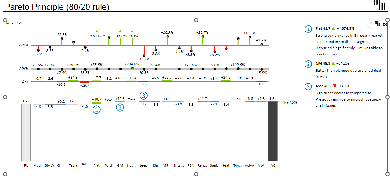
A Pareto chart combines a bar graph and a line graph to highlight the significant factors in a dataset. The bars represent each category's value, while the line represents the cumulative total of these values, both displayed in descending order. It's like showing individual puzzle pieces and the partially completed puzzle at the same time!
Here are the steps to get there:
- Organize Your Data: In two separate columns, list your categories (like products or complaints) and their respective values (like revenue or number of complaints).
- Sort Your Data: Sort your data in descending order based on the values column. Excel's 'Sort Largest to Smallest' feature is your friend here.
- Calculate Cumulative Percentage: In a new column, calculate the cumulative percentage for each category. You can use the formula
SUM($B$1:B2)/SUM($B$1:$B$7)– don't forget to adjust the cell references to fit your data. - Plot the Pareto Chart: With your data prepared, you're ready for the fun part - making the Pareto chart. Select your data (categories, values, and cumulative percentage), go to the 'Insert' tab, and under the 'Chart' group, click on 'Statistical', then select 'Pareto'.
There you have it – your very own Pareto chart in Excel! But there's also an easier & faster way to do it. A fantastic way that, on top of it, enables you to get even more juice out of your Pareto charts. Get ready for some Excel magic!
How to Make a Pareto Chart in Excel: The Better Way
In the world of data analysis, efficiency is key. The quicker you can interpret data, the faster you can act on it. That's where Zebra BI steps in. With the Top N + Others feature, Zebra BI doesn't just help you make a Pareto chart in Excel faster, it takes it to the next level – all while delivering actionable insights that your stakeholders can understand at a glance.
Zoom In on Your Top Performance Drivers: With the [Top N + Others] Feature
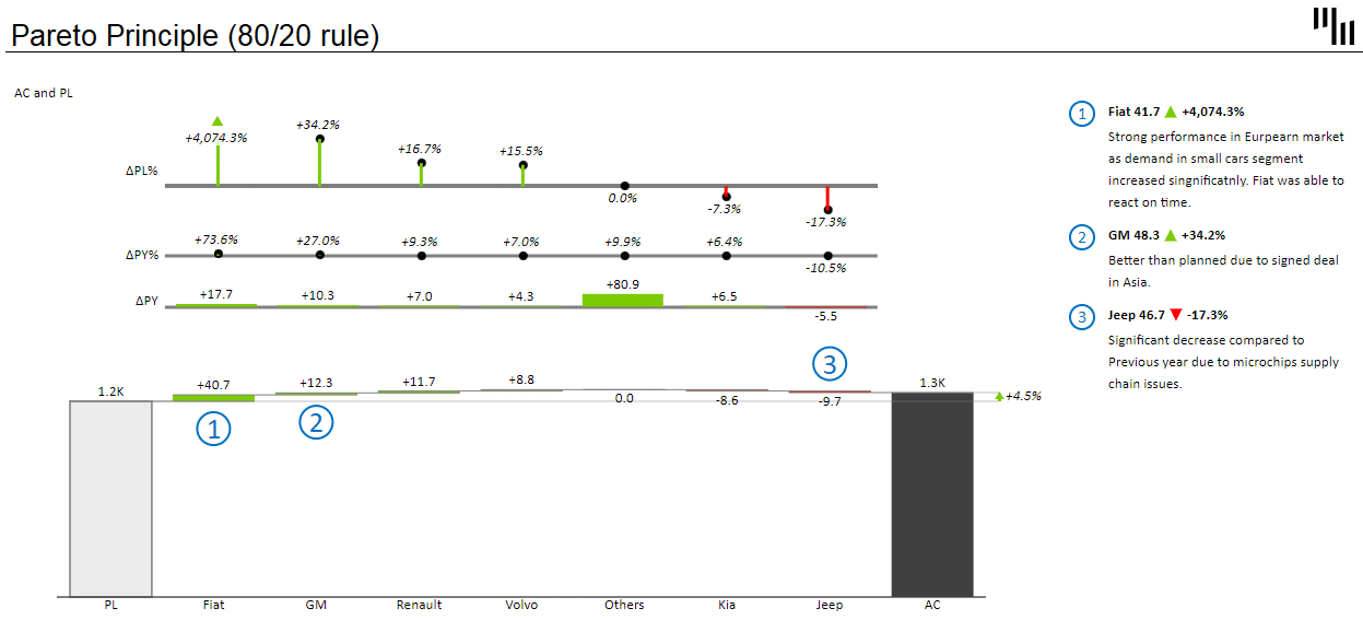
Ever feel like your Pareto chart is a bit overcrowded? Too many categories making it hard to focus on the most impactful ones? Enter the Top N + Others feature. This feature helps you focus on the most significant categories – the 'Top N' – and groups the rest into an 'Others' category.
Here's how it works:
- Insert the Zebra BI Charts add-in: Just like when creating a Pareto chart in native Excel, you'll start by selecting your data. Then insert the Zebra BI Charts add-in for Excel to visualize your data.
- Use the Top N + Others Feature: Simply select the visual and click on the blue bracket that appears on the X axis. This will open a pop-up, where you can toggle on the Top N feature & choose the number of items you want displayed. And voila! The rest of the categories are neatly grouped into the 'Others' category.
By applying this feature, your Pareto chart will become even more powerful, enabling you to highlight the categories that really matter, while keeping the rest within sight.
Now that we've covered just how to make a Pareto chart in Excel, let's just quickly touch upon an even better way to visualize your data according to this principle. 👇
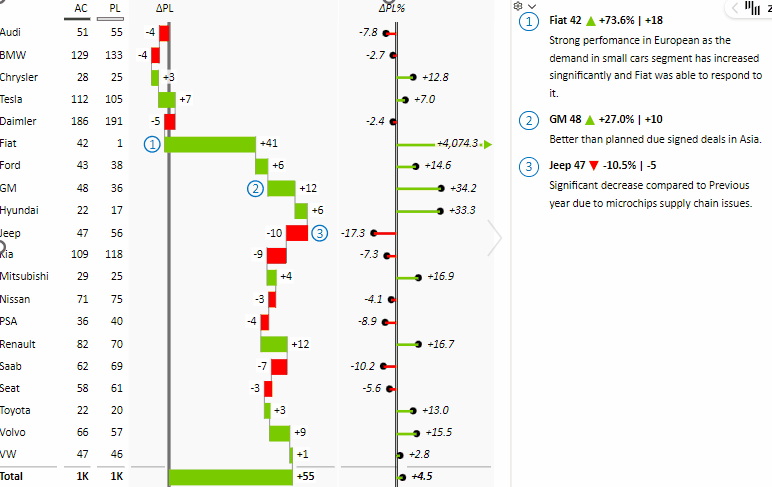
Embracing Tables with Integrated Charts for Pareto Visualization
Just when you thought we had spilled all the Pareto beans, here comes another flavor to savor: Tables with integrated charts. Now, before you start visualizing complex diagrams and an overabundance of data points, let's set the record straight. Using Zebra BI Tables with integrated charts to visualize the Pareto principle is as straightforward as ordering your favorite coffee – and just as satisfying.
To do, that:
- Insert the Zebra BI Tables add-in: start by following the same process as before, just insert the Zebra BI Tables add-in for Excel instead of the Chart one.
- Use the Top N + Others Feature: Simply right-click on any category. This will open a pop-up, where you can select the 'Top N' categories you want to focus on.
Have a look at how simple this is:
"But why tables and not charts?" you may ask. Here's why.
IBCS Compliance
Our fondness for Tables is not just personal preference. It's in line with the International Business Communication Standards (IBCS). The IBCS suggests displaying categories in the table format. We’re all about adhering to best practices, aren't we?
The Top-Down Approach
What's more, using tables allows us to list categories from the top down. This way, you can quickly scan your data, see your top performers, identify areas of improvement, and understand the overall structure, all at a glance. It's like having an eagle's eye view of your data landscape.
So, are tables with integrated charts the secret sauce to mastering Pareto visualization? We'd say they're a crucial ingredient. Combining the compliance with international standards, and the convenience of a top-down view, tables with integrated charts are a powerful tool in your data visualization toolkit.
Elevate Your Pareto Analysis with Zebra BI for Excel
Step up your Pareto game and transform your data into insightful, actionable (tables with integrated) charts in no time. Try Zebra BI for Excel for FREE, and visualize your Pareto analysis in the smoothest, most efficient way.