3 hyper-effective ways to consolidate your KPIs in Power BI dashboards
A good KPI dashboard enables you to understand the context behind key metrics and empowers you to take actions, based on data.
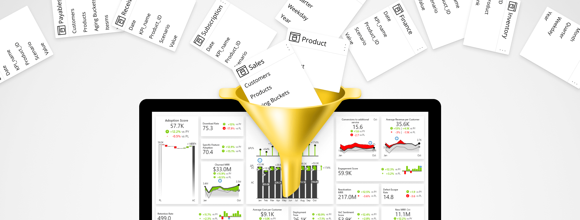
But before you can visualize your KPIs in one place, your KPIs should be consolidated. And that's a major challenge. 😬
Your metrics reside in various, completely separated, datasets. KPIs are also typically quite different in nature. They can be good or bad (revenues vs expenses), have versatile units (e.g. Sales in USD, Gross Margin in %, Net Promotor Score as a 1-10 score, Cost per Employee as a ratio, etc.).
Luckily, there are three highly effective ways how to prepare your KPI data in Power BI. Join our live session to see exactly how to do it. 👇
Wat je leert:
Presentator

Founder & CEO at Zebra BI
Andrej brings 25 years of experience in business intelligence and software development and 20 years as a consultant. Helping numerous international and regional companies achieve consistent and efficient internal reporting throughout the organization inspired him to build Zebra BI.
The ultimate guide to consolidating KPIs in Power BI
They’re gone. The traditional static KPIs presented by Big Annoying Numbers (BAN) are being replaced by a dynamic mix of numbers, comparisons, and drill-through options. These can finally provide the full context of what’s happening in the company.
But there lies an issue. Your KPI data is fragmented and there’s a step you can’t skip before you can visualize it.
Consolidate your KPIs by using best-practice methods that’ll level up your reports and allow you to respond to key business questions in real-time: when it makes a difference.
This way you will not only make it possible to visualize your KPIs in a single visual but will also boost your productivity, expose the cause-effect relationships in your business metrics and make your KPI dashboards utterly actionable.
Bekijk op aanvraag
Watch the video
Zebra BI-webinars zijn al bezocht door meer dan 10.000 deelnemers!