
Zebra BI Charts: The 2025 Benchmark for Exceptional Data Visualization
PRO Trial
Effective data visualization is at the heart of data-based decisions, as clear and well-presented data can guide better business decisions. This is where the Zebra BI Charts visual comes in, following in the footsteps of the highly regarded Zebra BI Tables. A true game-changer in how you present and understand data, it focuses on clear, precise, and flexible visualization, making complex data easy to understand and use.
With Zebra BI Charts, you get more than just a visualization tool; you get a powerful ally in making your data work for you and your business.
Table of Contents
Introduction to Zebra BI Charts
Zebra BI Charts combines advanced technology with business intelligence to enhance time series analysis. In addition to providing businesses with unprecedented insight into their data, it brings clarity, precision, and versatility.
Primarily tailored for in-depth time analysis, Zebra BI Charts also excels in category analysis, offering a comprehensive perspective on data. Integrating seamlessly across Power BI, Excel, and PowerPoint, it is an effective tool for overcoming data silos. It also fosters collaborative data analysis environments. Zebra BI Charts are an innovative and efficient tool for visualizing complex performance metrics.
Ease of Use and Space Efficiency
Zebra BI Charts ensure efficient use of report space and are designed with ease of use in mind. This makes them accessible to both report creators and viewers. This focus on user-centric design streamlines the workflow, allowing for more effective data analysis and communication.
Compliance with IBCS and Enhanced Engagement
By adhering to International Business Communication Standards (IBCS), Zebra BI Charts increase report engagement and comprehension. This standardization ensures that your financial reports are both clear and consistent, making complex data more accessible and comparable.
You can combine Zebra BI Charts with tables for detailed financial reporting or as a standalone visual for precise forecasting. Whether supporting data analysis or presenting financial reports, Zebra BI Charts are an excellent choice for data visualization.
Exploring the Dynamic Features of Zebra BI Charts
Zebra BI Charts visual stands out with its array of advanced chart types, offering everything from the horizontal and vertical waterfall and variance charts to small multiples, area, line, staked charts, and lollipops. More importantly, these charts automatically calculate variances – no need for DAX! –, growth rates, and totals, simplifying your data model while making reports clear and actionable.
With features like the Top N+Others function to focus on key data categories and responsive design that adapts to different screen sizes, perfect for everything from boardroom displays to mobile apps, the interactivity of Zebra BI Charts is unparalleled. Customization is another strength of Zebra BI Charts. Users can tailor charts to their business needs, from styling variance areas to setting up their own themes.
These features and real-time data integration empower users to handle complex data sets and offer versatile chart options to meet diverse business requirements. Whether you're looking to enhance extensive screen dashboards or create detailed mobile reports, Zebra BI Charts deliver clarity, precision, and flexibility in data visualization.
Choose the right chart for your data
One visual, many charts. Simply click the side arrows to cycle through the most effective visual representations of your data. Zebra BI automatically reads your data and suggests charts that best fit your needs. Whether looking at variances, trends, or categories, choose from waterfalls, columns, areas, lines, dots, lollipops, and more.
For data involving trend analysis across different categories, consider using small multiples or stacked charts to provide a clear and comprehensive view (note: stacked charts are not featured in our video).
Automatically calculated variances
Zebra BI Charts simplifies data analysis by automatically calculating absolute and relative variances without additional DAX, making advanced report development faster and user-friendly for a broader audience.
Integrated Dynamic Comments and Comment markers
One of the most powerful features of Zebra BI visuals is the integrated dynamic comments. They provide additional context behind the number and answer the question ‘WHY.’
Bridge Chart (Single Measure Waterfall Chart)
The waterfall chart, known for its valuable insights, is often complex to create. With Zebra BI, however, crafting such detailed charts becomes straightforward and efficient.
Segmented Chart
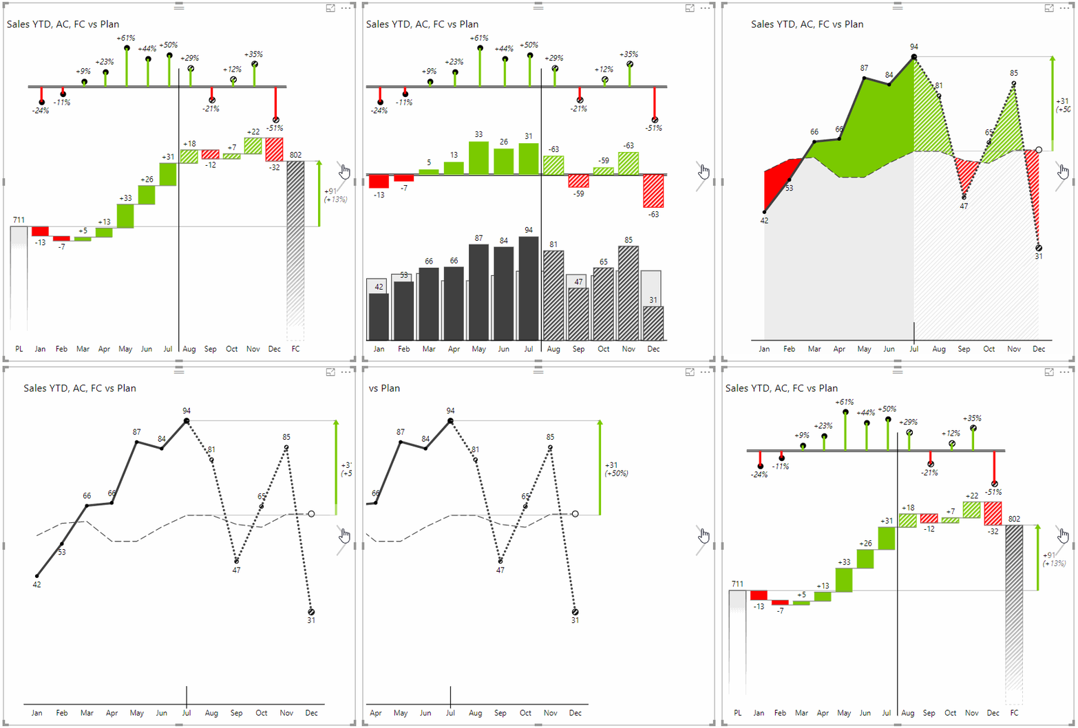
Zebra BI Charts are particularly effective in showcasing forecasts within segmented charts. When a forecast measure is included, the visual displays actual data up to the current period and then transitions to forecast data for the upcoming periods, such as the remainder of the year. These forecasts are presented with a distinct scenario pattern to enhance clarity and ease of understanding. This pattern differentiates between actuals and forecasts, making it immediately apparent which data reflects past performance and which is predictive. This method is visually intuitive and aligns with the International Business Communication Standards (IBCS), ensuring stakeholders can quickly discern and react to the insights presented.
All Zebra BI charts are adept at this, often referred to as segmented charts:
Small multiples
The Small Multiples, or Trellis chart, is a potent data visualization technique that significantly enhances the depth of insight in reports and dashboards. Zebra BI Charts offers comprehensive support for Small Multiples in Power BI, enabling highly valuable visual comparisons within a single report page.
A key advantage of Zebra BI’s implementation of Small Multiples is that all charts are scaled uniformly, ensuring that insights are accurate and comprehensible. This consistent scaling prevents misleading interpretations due to non-uniform scaling across different charts. Additionally, this feature allows users to immediately identify which categories contribute the most to the overall value, making it easier to pinpoint areas of interest or concern in a dataset.
With these capabilities, Zebra BI ensures that each visual in the Small Multiples is aligned and clear, facilitating more informed decision-making and analysis.
Combo Chart (in Power BI)
Combo charts, ideal for presenting two different types of measures or units, are efficiently managed by Zebra BI Charts. For instance, you can display Sales in a million USD and Gross Margin in % together. Save space in your reports or dashboards by incorporating both measures into a single Zebra BI Charts visual, simply by placing the second measure into the Values placeholder:
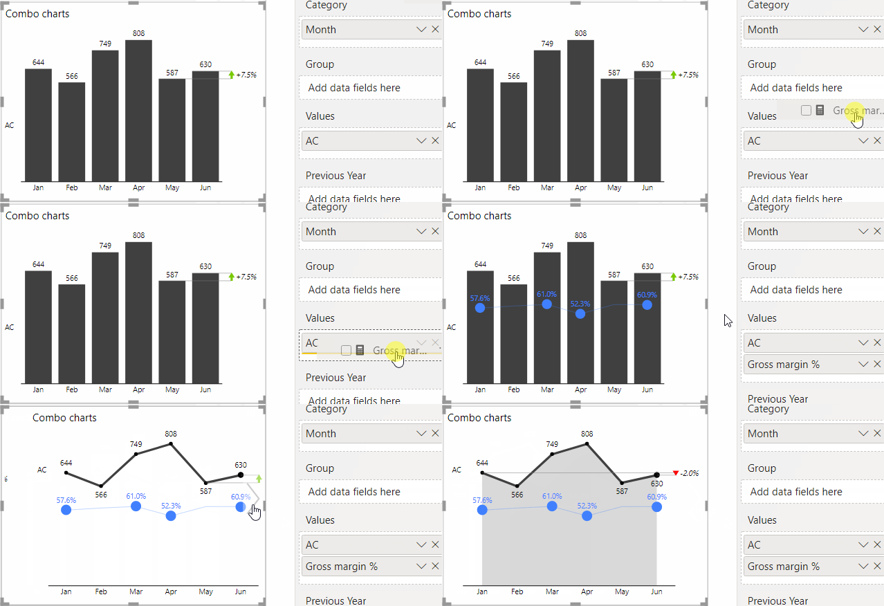
Read how to do it: Combo charts (combination charts)
Charts with a hierarchical X-axis (in Power BI)
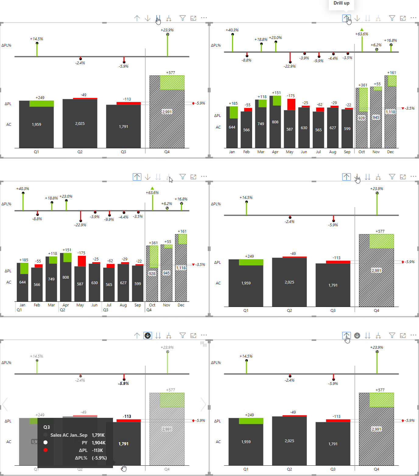
All Zebra BI charts support the standard Power BI drill-down options, such as drill-down, drill-up, go to the next level, and expand all down. This feature is an excellent tool for in-depth analysis, allowing users to dive into the details of their data on the fly.
By enabling a hierarchical view of data, these charts facilitate a comprehensive understanding of complex datasets at multiple levels of granularity. Users can seamlessly navigate through different layers of their data, making it simpler to uncover hidden insights and make data-driven decisions quickly and efficiently.
TopN+Others in Small Multiples
With Zebra BI Charts, you can effortlessly modify the number of small multiples charts displayed with just a single click, a feature accessible even to your viewers. This functionality is particularly useful when dealing with large datasets encompassing numerous categories. By focusing on the top-performing categories, users can gain a clearer overview of those most significantly impacting overall performance.
Additionally, when the number of charts is altered, all remaining data is automatically consolidated and accurately reflected in the 'Other' chart. This facilitates easier reading and comprehension of reports and helps keep the reports cleaner and more focused, enhancing their overall readability and effectiveness.
Show vertical axis (switch between horizontal and vertical chart)
Easily toggle between vertical and horizontal layouts in your charts at any moment with Zebra BI Charts. This flexibility ensures your labels and data are always presented as you prefer. Compatible with integrated waterfall, column, and pin charts.
Grand Total
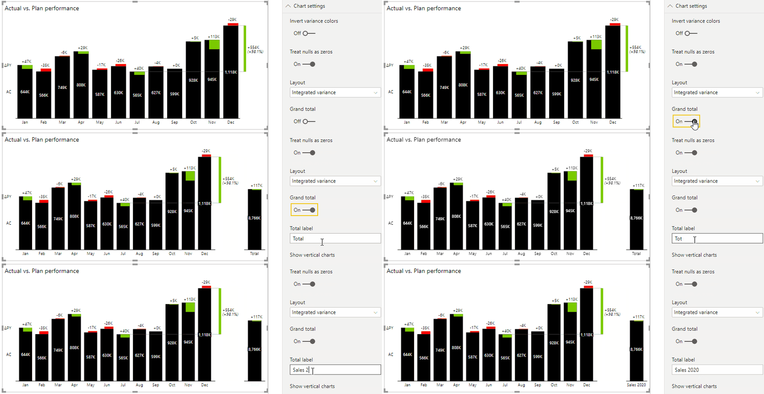
The Total column in Zebra BI Charts is ideal for highlighting top-level figures like Total Year Revenues or Sales, ensuring vital data stands out. This feature uses a different scale to preserve the proportions of your chart. Together with difference highlights, it simultaneously conveys two crucial pieces of information.
Difference Highlight
Zebra BI Charts visual automatically includes difference highlights, a critical feature for pinpointing key deviations in reports. Users can select from various comparison points, such as:
- First to last for YTD results like growth or decline since the year's start,
- Penultimate to last for assessing the impact of recent changes like new campaigns or products,
- Last to corresponding for comparisons like Actual vs. Plan or Actual vs. Previous Year,
- Min to Max to evaluate extremes like best to worst or lowest to highest.
Enhanced with adjustable line widths and arrow styles, Zebra BI Charts enable a focused presentation of deviations, guiding necessary business decisions.
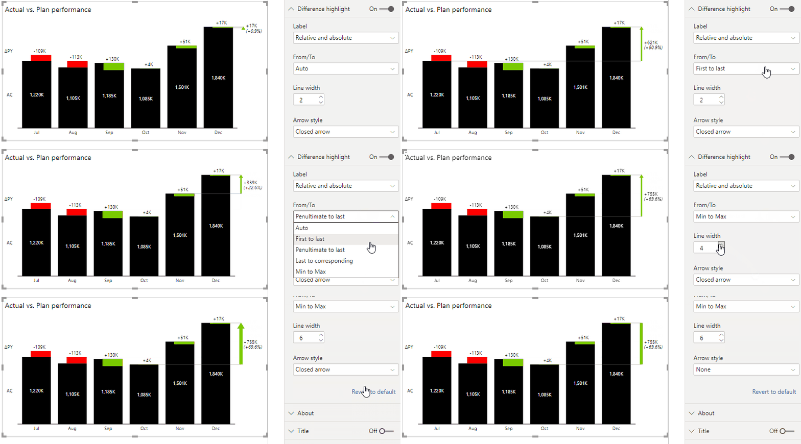
In Zebra BI for Office, you'll find it when clicking on the arrow:

1-Click Axis Break
While axis breaks are a debated topic in data visualization, they can significantly clarify the contribution of data elements in a total result. Zebra BI makes this highly sought-after feature in business reporting accessible with just a single click.
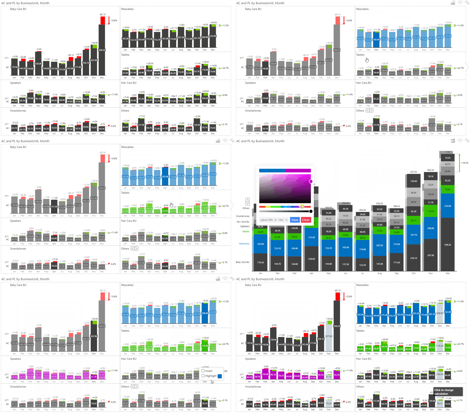
Highlighting Small Multiples
In Zebra BI Charts, emphasize key data groups by coloring individual small multiples series, making them more distinguishable. However, use this feature judiciously to avoid overwhelming your chart, aiming for clear, effective comparisons rather than an overly vibrant, distracting display.
Data labels
Data labels are vital in charts detailing axis elements, values, and deviations. Zebra BI Charts come with a default labeling system that's both clean and easy to read, instantly improving chart clarity. Discover how effortlessly you can toggle between absolute and relative variance deviations in your charts with just a mouse click.
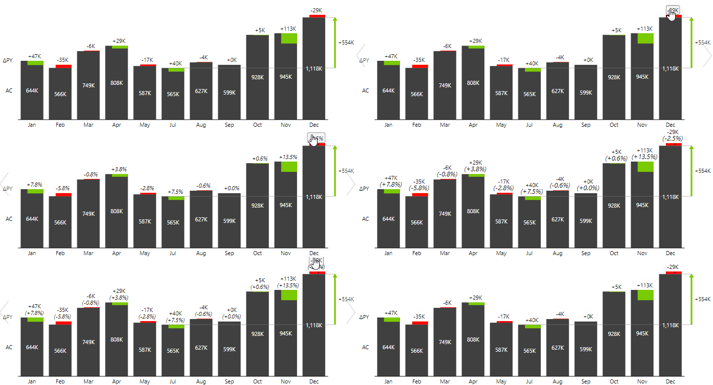
Additionally, many powerful custom label settings can be applied to your charts. Find out more about controlling data labels and number formats.
Responsive design
Zebra BI's visuals set a global precedent as the first fully responsive BI visuals. They are ideal for various display sizes, from large-screen dashboards in digital boardrooms to compact mobile app interfaces.
Flexibility: Personalize Your Visuals with Zebra BI Charts
Tailor your charts to perfectly fit your business needs using Zebra BI's vast array of styling options. Customize everything from variance areas and highlights to number formats, layout, and unit display in titles, colors, fonts, and shapes, enabling you to create visually stunning charts. Additionally, Zebra BI offers pre-set styles, including options designed for people with color deficiencies, ensuring accessibility and inclusiveness in your data presentations.
Moreover, manage visual standards across your company efficiently with Zebra BI's Custom Theme feature. Set up a unified, company-wide visual style easily by configuring a Custom Theme using JSON, enabling consistent presentation and branding in all your reports. This ensures that all visualizations adhere to your organization’s branding guidelines, promoting a cohesive and professional appearance across all reports.
Cross-Platform Compatibility
Like Zebra BI Tables, Zebra BI Charts is designed for cross-platform efficiency, offering seamless integration with Power BI, Excel, and PowerPoint. This versatility fosters a unified approach to data analysis and reporting across different platforms, streamlining workflows and boosting productivity.
The “Power BI vs. Excel” dilemma has become a thing of the past. Power BI experts and Excel users can create charts that look and function identically.
By integrating Zebra BI Charts from Power BI into PowerPoint or using Data Linking with Excel, you ensure your presentations remain accurate, refreshable, and consistent, enhancing their overall impact and professionalism. This cross-platform functionality covers the full spectrum of tasks for Financial Planning & Analysis (FP&A) and similar roles, from periodic reporting (monthly, quarterly, and annual reports) where accuracy, automation, refreshability, clarity, standardization, and interactivity are crucial to ad-hoc analysis and mock-ups where the flexibility of Excel and PowerPoint is key.
With advanced Office features, Excel and PowerPoint reports can also be interactive, clear, and automated. Additionally, because visuals look identical across all platforms, this uniformity aids in digital transformation efforts, promoting greater automation. Zebra BI visuals in all tools ensure the highest level of data security, making them an essential component of any robust data strategy.
Tailoring User Experience with Zebra BI Charts
Zebra BI Charts excels in user experience and design flexibility, which is crucial for modern data analysis. Its fully responsive design adapts to various devices, ensuring optimal viewing on large screens or mobile devices. This responsiveness means that insights are always accessible, no matter where you are.
The design flexibility extends to custom styling options. Users can personalize charts to suit their business needs, from variance areas and number formats to colors and fonts. This level of customization ensures that Zebra BI Charts not only deliver powerful data insights but also cater to diverse user preferences and needs, making them a versatile tool in any data analyst's toolkit.
Cross-Platform Compatibility and Integration
Zebra BI Charts offers seamless integration across major platforms like Power BI, Excel, and PowerPoint and ensures consistent style and design across these applications. This uniformity in appearance further streamlines effective reporting and fosters a unified approach to data analysis and reporting.
By simplifying workflows and enhancing productivity, Zebra BI Charts enables an easy transition with consistent visualization across these platforms. Users enjoy the flexibility of working with familiar tools while benefiting from the advanced capabilities of Zebra BI Charts. This leads to more efficient data analysis processes and improved team collaboration, supported by consistent style and design across different platforms.
Comparing Zebra BI Charts with Native Power BI Charts
- Actionable Reporting: Unlike native Power BI charts focusing on color variety and numerous chart types, Zebra BI Charts prioritize actionable insights. They adhere to IBCS principles, offering clarity and conciseness in messaging and streamlining the journey from data to decision-making. This is achieved without extensive DAX coding or complex formatting.
- Efficient Use of Report Space: Zebra BI Charts are designed for high information density and responsiveness. They make better use of report space than native Power BI charts, which may not always optimize for information density.
- Clear Messaging with Comments: Including comments and comment markers in Zebra BI Charts enhances message clarity, a feature not commonly found in native Power BI charts.
- Increased Engagement: Zebra BI Charts encourage engagement through clickable reports and a modern approach to data storytelling, offering an interactive experience beyond what native Power BI charts typically provide.
- Advanced Visuals with Ease: Creating advanced visuals like waterfall charts, small multiples, and combo charts is straightforward with Zebra BI Charts, requiring only a few clicks. In contrast, similar efforts in native Power BI charts can be more complex and time-consuming.
- Ease of Use: Setting up and customizing Zebra BI Charts is user-friendly and requires no specialized skills, unlike the potentially steep learning curve required for customizing native Power BI tables to achieve similar visual appeal.
- IBCS Standards Out-of-the-Box: Zebra BI Charts come with built-in IBCS standards, ensuring best practices in data visualization are followed, a feature that native Power BI charts do not inherently provide.
- Solving Modern Business Challenges: Zebra BI Charts address contemporary business needs, such as consistent reporting, clear insights, automation, and efficiency, areas where native Power BI charts may fall short in terms of out-of-the-box functionality.
In summary, Zebra BI Charts offer a more streamlined, user-friendly, and efficient approach to data visualization and reporting than native Power BI charts, especially regarding actionable reporting, clarity, engagement, and ease of use while adhering to IBCS best practices.
Conclusion: Navigating Data Analysis with Zebra BI Charts
In the dynamic field of data analysis, selecting appropriate tools is key. Zebra BI Charts emerge as a standout choice, distinguished by their ease of use without additional DAX in Power BI. In addition, they feature time-consuming formatting in Excel and PowerPoint. These charts are user-friendly and come equipped with IBCS standards, representing best practices in data visualization right out of the box.
Zebra BI Charts simplify complex data analysis and enrich the data storytelling process, making them a valuable asset in the data analysis toolkit. We encourage you to explore the transformative capabilities of Zebra BI Charts. See for yourself how they can reshape your data visualization strategy and bolster informed business decision-making.
Ready to try the Zebra BI Charts visual?
Create jaw-dropping reports and dashboards with just a few clicks to deliver accurate insights from your data in record time.