 September 8th
 February 22nd
Zebra BI for Power BI version 3.3 released!
On Friday, July 26 2019, a major new version of Zebra BI for Power BI has been released. With innovative new product features, the new version will help report designers in Power BI create even better reports and dashboards with improved user experience.
Let's take a look at some of the most important updates:
Adding custom columns to Zebra BI PowerTables
Zebra BI PowerTables now supports adding custom-calculated measures or data fields to the existing columns and charts in the table. This takes the flexibility of Zebra BI PowerTables to the next level and will enable the users to create even more useful, informative and insightful reports. This functionality is perfect for adding:
- Common size measures such as "% of Revenue" to your Income statements,
- Additional measures, e.g. Gross margin in % to your Sales vs. Budget reports,
- Custom-calculated variances, e.g. FX-corrected variances (in addition to regular variances calculated by Zebra BI PowerTable).
In the following animation, two additional data fields (Gross margin in USD and Gross margin in %) are added to an existing Sales vs. PY report:
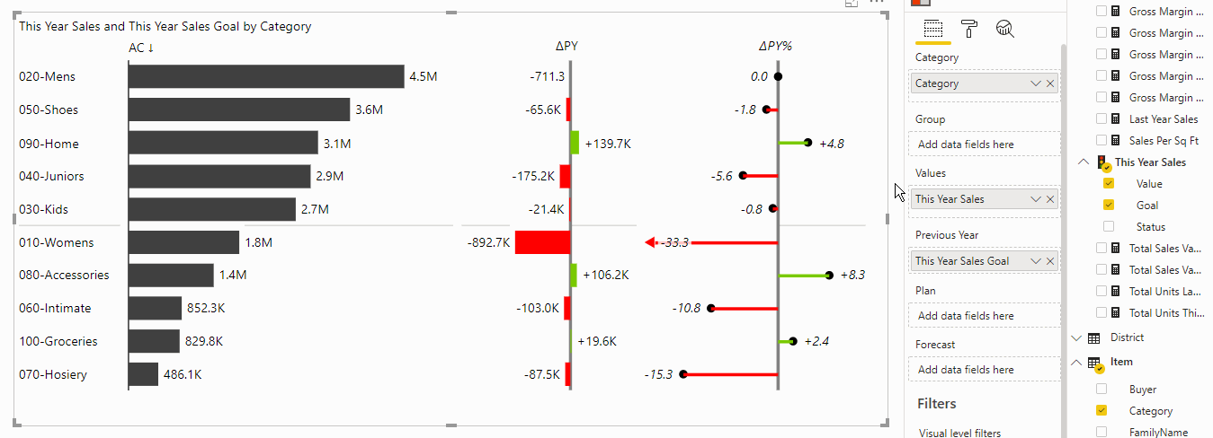
Additional columns work in all the layouts provided by Zebra BI, such as chart layouts, table layouts, cross-tables or hierarchical matrices. As you can see from the above animation, the additional columns can be renamed and moved to any position in the table by simply dragging the column header.
Just add your custom measures to the Values bucket as an additional data field. You can add up to 3 custom measures (altogether 4 data fields in the Values bucket are allowed).
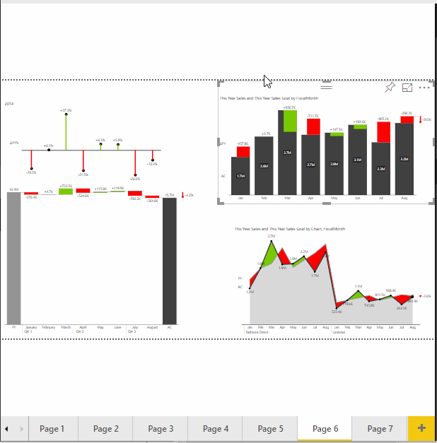
New waterfall charts with subtotals
Zebra BI PowerChart visual, starting from version 3.3.2 now supports new waterfall charts with extremely flexible subtotals:
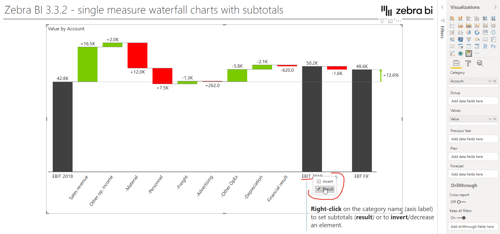
This type of waterfall chart can be built by simply using just one measure (called 'Value' in the above picture) and a category data field (called 'Account' in the example above). To display an element on the chart axis as a subtotal, just right-click on the element name (e.g. EBIT 2019 in the screenshot above) and select Result from the menu. Similarly, you can invert a selected element in case it represents a "bad" KPI (e.g. costs/expenses) that decreases the final result.
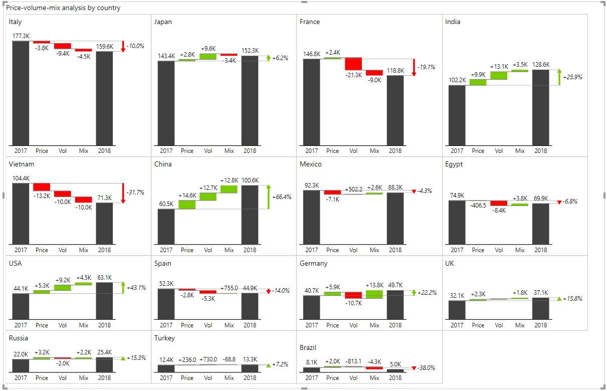
This important new feature allows you to build waterfall charts for practically any data structure you can imagine. Of course, all other trademark Zebra BI features such as small multiples work with new waterfall charts. Here's a powerful example where the price-volume-mix variance analysis is calculated and presented visually for 15 countries simultaneously in Zebra BI PowerCharts visual:
[Tweet "Build waterfall charts for practically any data structure you can imagine. Insane!"]
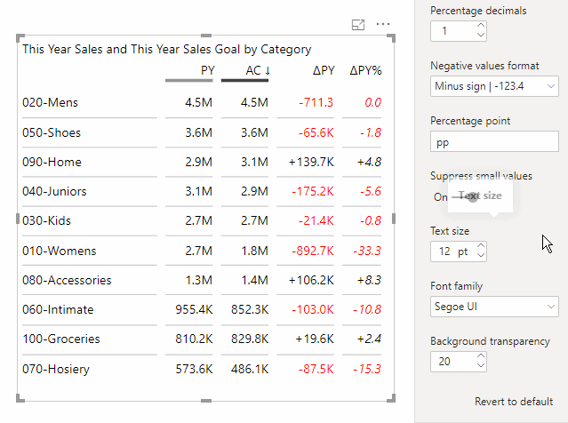
New user interface for managing columns
A new user interface makes it much easier to sort, rename and reorder columns. You can now rename any column directly on the visual (click on the ▼ dropdown icon in the chart header and simply edit the name). Changing the chart type for each column is also improved, click on the dropdown icon to choose the chart for the column).
[Tweet "Renaming any columns on the visual directly is part of the new user interface."]
Cross-visual filtering
Zebra BI now supports cross-visual filtering, which is a standard Power BI function but has only recently been deployed to custom visuals. Now the end-user can simply select multiple filter values by pressing CTRL+click on different visuals on a report page to filter by multiple criteria.
[Tweet "Selecting multiple filter values has never been easier #crossvisualfiltering."]
More data label formats
You can now choose to display negative values in parentheses or with a minus sign:
Zoom in focus mode
A really nice feature was added to automatically enlarge/zoom the font size in Focus mode to improve the readability of visuals in Power BI focus mode.
[Tweet "Zebra's in focus mode feature is World's first in Power BI custom visuals!"]
By default, the zoom factor is 150%, but you can customize the zoom factor for each visual in the settings (under Interaction > Zoom in focus mode (%)). While in focus mode, press CTRL+mouse wheel to increase/decrease the zoom while you're presenting:
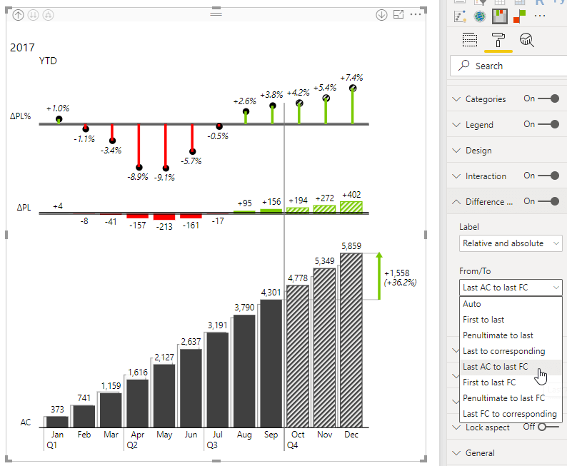
Additional difference highlight option
The selection of options to highlight a difference in Zebra BI PowerCharts visuals has been expanded with another helpful option. The option to display a difference between the last actual data point and the last forecast value will come in handy in charts that show forecasts in addition to actual values:
As usual, this new version of Zebra BI custom visuals is available for all existing users in the member portal area. Just go and sign in and simply download our latest release 3.3 and start implementing it to your existing or new reports. For all the rest of you that would like to feel the same excitement, click on the button below and start your free trial.
Great work, Zebra BI team! The visuals are amazing!
I like the zoom-in feature in this new release. It is quite frustrating to go in focus mode and have the text (labels and legends) not scaled up proportionally.
Cool new user interface and custom column. I like it!
David thank you so much! It is fantastic to hear that our developments are working out for you.
BR
Miha
Very good work...all the new features, are very useful. Congratulations!!
Hi Esteban,
Thank you! We are always trying to think ahead and provide added value. Hope this gives you an additional "edge" in your line of work.
An excellent update. you are always a crazy team with a suite of incredible products. thank you so much
David hi,
Thank you! So good to hear that - yeah, we do mad stuff 🙂 and a lot of things are coming up. It is a very vibrant 2019 and we plan to make autumn extremely interesting 😉
Hi,
Is it possible you can download a demo"What's new in 3.3 PBIX" pbix file similar to what you did for 3.1 (i.e, http://zebrabi.com/Zebra_BI_New_features_3.1.pbix). Thanks.
Hi Steve, sure! Please download a nice sample PBIX file here: http://zebrabi.com/power-bi-custom-visuals/zebra-bi-3-3
You'll also find a video, a published interactive report and a list of all the new features in version 3.3 on the above page.