Best practices in designing financial reports
In this webinar, we'll share with you some tips on how to create efficient reports and dashboards. Additionally, you'll see and hear about the best practices when designing variance reports, profit&loss statements, accounts receivable and other templates.
Wat je leert:
Presentator


Founder & CEO at Zebra BI
Andrej brings 25 years of experience in business intelligence and software development and 20 years as a consultant. Helping numerous international and regional companies achieve consistent and efficient internal reporting throughout the organization inspired him to build Zebra BI.
How to design variance reports, profit&loss statements, accounts receivable and other templates.
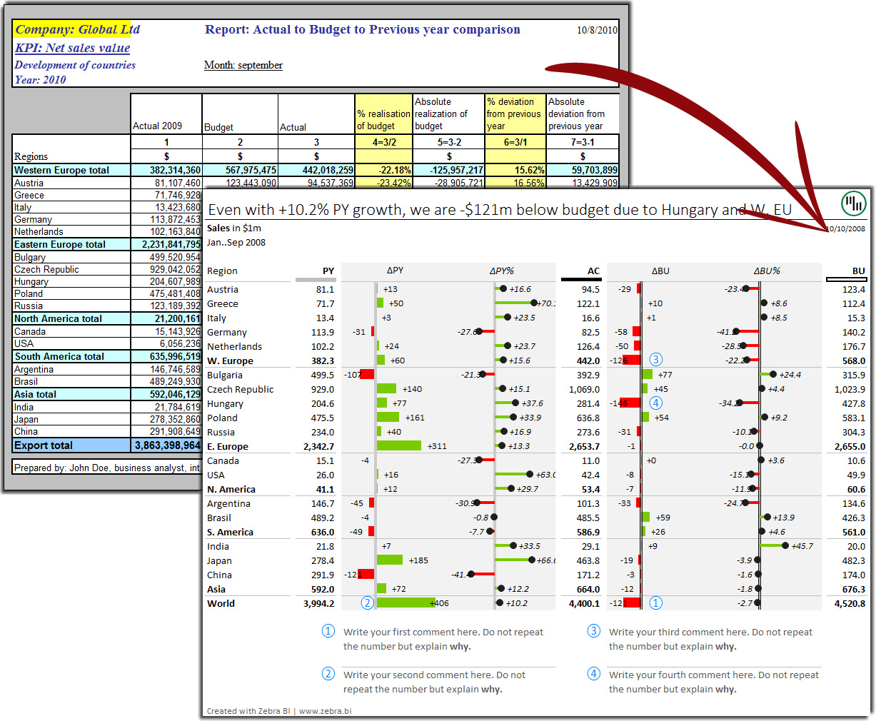
How do your financial reports look like? All too often, they fall somewhere between messy spreadsheets and “dashboards”, full of poorly labelled and inappropriate charts, 3D effects and speedometers, that simply do not get their message across to the management.
Countless reports and presentations are created throughout organizations on a daily basis, all in a different format, length, shapes and colors, depending on the personal preferences of the person who prepares them. Result: managers often do not make their way through the data presented, time being wasted, important decisions perhaps not being made.
It’s more critical now than ever before for financial analysts, business analysts, controllers and reporting professionals to understand best practices in the design of reports, dashboards and presentations. Turning increasing volumes of data into actionable insight certainly is a challenge. But it's manageable... if you learn the secrets of good reporting!
Bekijk op aanvraag
Watch the video
Zebra BI-webinars zijn al bezocht door meer dan 10.000 deelnemers!