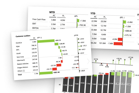
An example of a bridge chart in Excel made with Zebra BI for Office

How to Create Excel Waterfall Charts that do not suck?
In this step-by-step guide, you'll learn how to create an impressive waterfall chart in Excel that will help you communicate your data effectively.

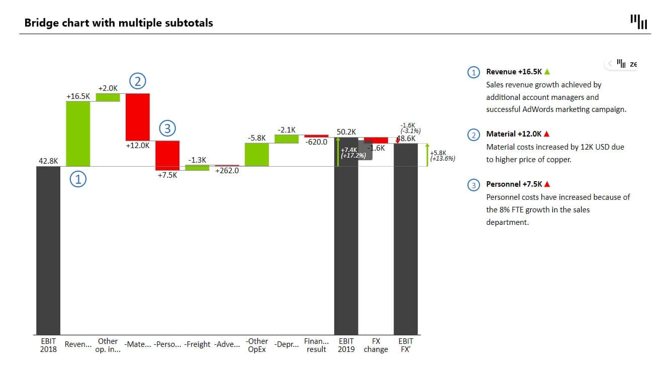
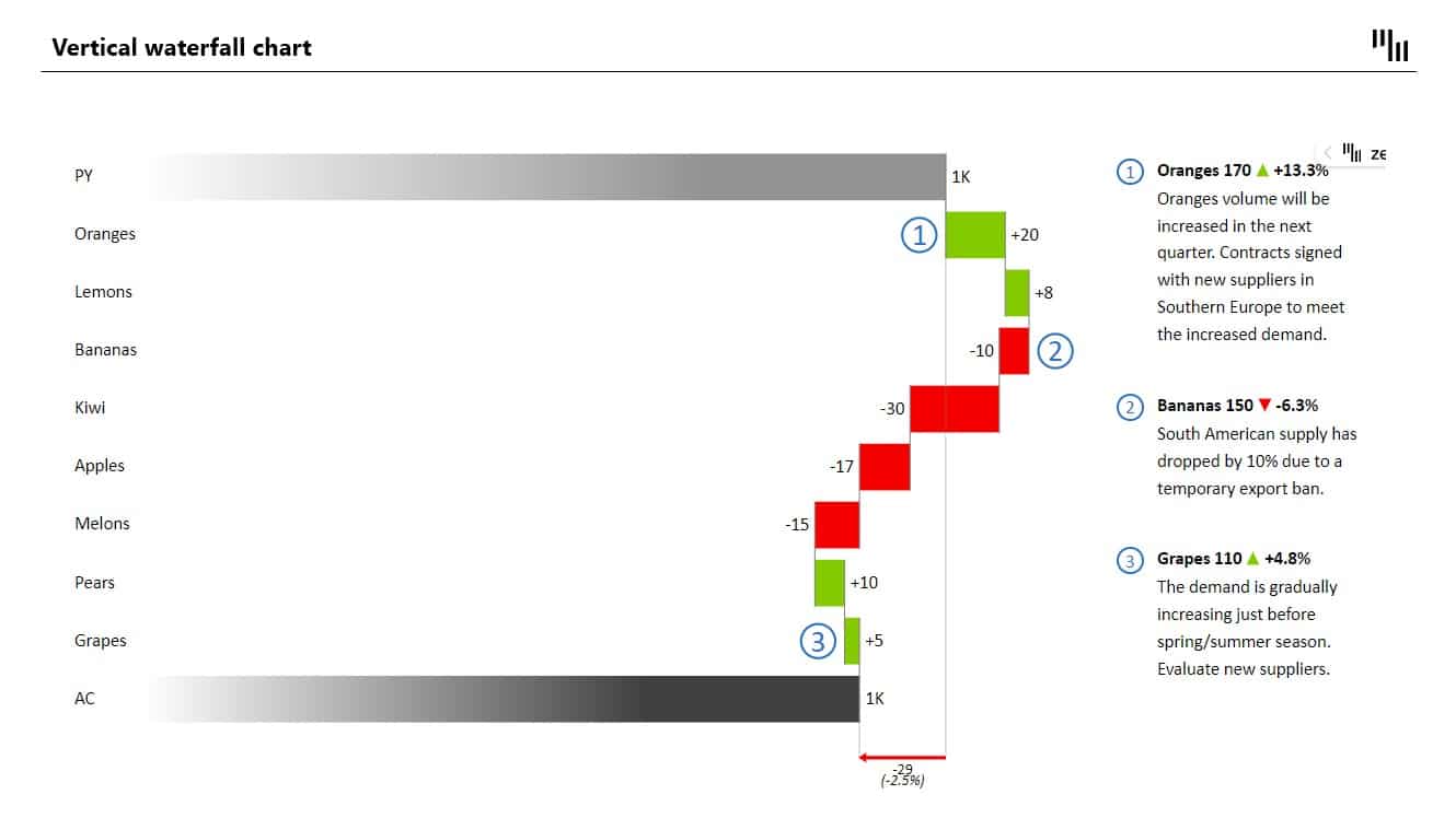

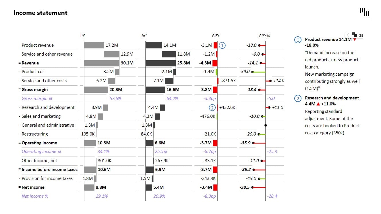

Table of contents
Use the links bellow to jump to each section.
Waterfall chart
Visualize the story behind your numbers
Excel Waterfall chart, also known as cascade or bridge chart..
is an ideal way to visualize a starting value, the positive and negative changes made to that value,
and the resulting end value.
is an ideal way to visualize a starting value, the positive and negative changes made to that value,
and the resulting end value.
Excel is a popular solution for creating waterfall charts..
But many struggle to create charts visually appealing and easy to understand...
But many struggle to create charts visually appealing and easy to understand...
Use of waterfall charts
Waterfall charts are popular in the corporate and financial environment as they are
very useful for a visualization of the positive and negative movements
within a measured quantity or KPI (eg. Monthly Net Profit or Cash Flow).
Other Examples:
very useful for a visualization of the positive and negative movements
within a measured quantity or KPI (eg. Monthly Net Profit or Cash Flow).
Other Examples:
1
Visualizing profit and loss statements
2
Comparing product earnings
3
Highlighting budget changes on a project
4
Analyzing inventory or sales over a period of time
5
Showing product value over a period of time
6
Creating executive dashboards
💡
#PRO TIP
Use a waterfall chart whenever you want to show how a starting value increases or decreases through a series of positive or negative changes.
How to create a waterfall chart
The easiest way
This is what your waterfall chart could look like in just a couple of clicks:
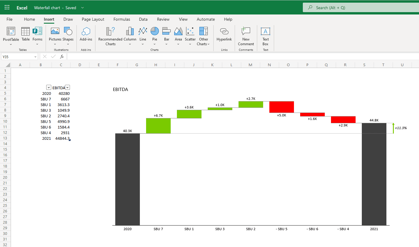
Excel waterfall chart – advanced data visualization with Zebra BI for Office
If you don't have time to tweak the default Excel waterfall charts..
But would like to add those advanced features to your waterfall charts fast...
Zebra BI for Office
is just you need.
But would like to add those advanced features to your waterfall charts fast...
Zebra BI for Office
is just you need.
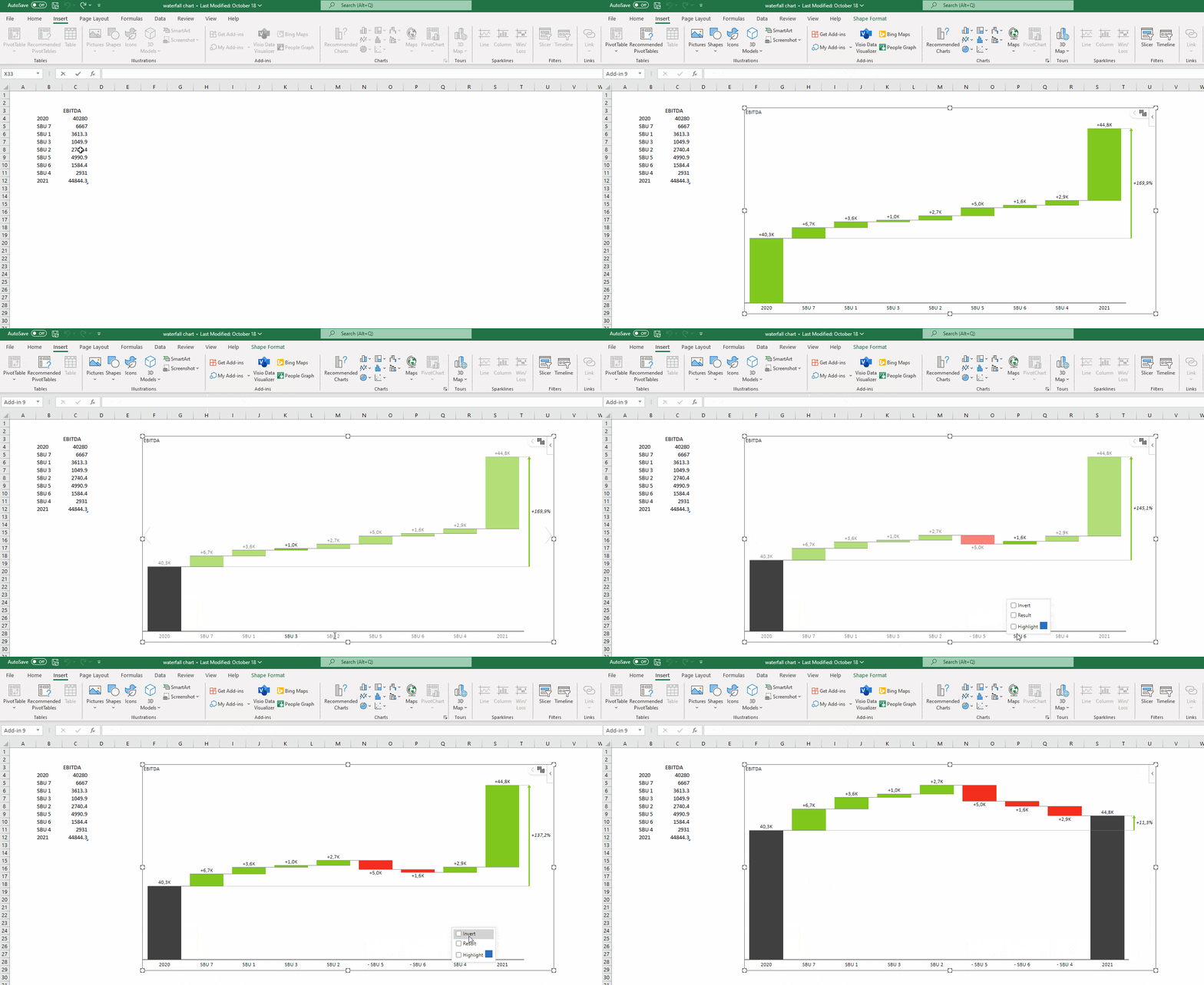
Waterfall chart in Excel in just a few clicks with Zebra BI for Office
Excel 2016 Way
Microsoft introduced 6 highly requested charts in Excel 2016.
Including a built-in Excel waterfall chart.
Including a built-in Excel waterfall chart.
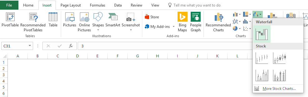
While the addition of waterfall charts in Excel 2016 is a great..
The current functionality still leaves much to be desired...
The current functionality still leaves much to be desired...
10 steps to a perfect Excel waterfall chart
Step #1
Remember to set the totalsStep #2
Ditch the clutter Step #3
Break the axis Step #6
Use vertical chartsStep #7
Add subtotalsStep #8
Customize chart with colorsStep #10
Scale your charts1. Remember to set the totals
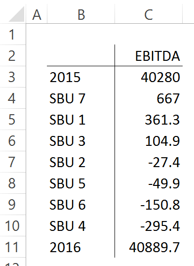
Let's say we want to have this data table visualized with a waterfall chart...
EBITDA of our fictional company for the years 2015, and 2016..
And the individual contributions of 7 small business units to the change...
EBITDA of our fictional company for the years 2015, and 2016..
And the individual contributions of 7 small business units to the change...
This shouldn't be too hard..
Click inside the data table, go to the "Insert" tab...
And click "Insert Waterfall Chart" and then click on the chart...
Voila:
Click inside the data table, go to the "Insert" tab...
And click "Insert Waterfall Chart" and then click on the chart...
Voila:
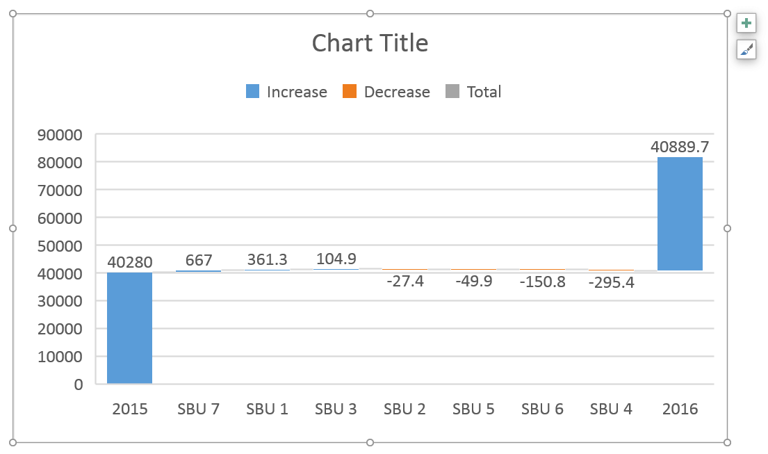
OK, technically this is a waterfall chart, but it's not exactly what we hoped for..
In the legend we see Excel 2016 has 3 types of columns in a waterfall chart:
1. Increase
2. Decrease
3. Total
This is correct, but in the chart, there are no Total columns, only Increase and Decrease..
The first and last columns should be Total (start on the horizontal axis)..
To set them as such, we have to double-click on each of them..
To open the Format Data Point task pane and check the Set as total box.
In the legend we see Excel 2016 has 3 types of columns in a waterfall chart:
1. Increase
2. Decrease
3. Total
This is correct, but in the chart, there are no Total columns, only Increase and Decrease..
The first and last columns should be Total (start on the horizontal axis)..
To set them as such, we have to double-click on each of them..
To open the Format Data Point task pane and check the Set as total box.

You can also right-click the data point and select Set as Total from the list of menu options..
Or, you can skip all this and use Zebra BI for Office to do the hard work for you...
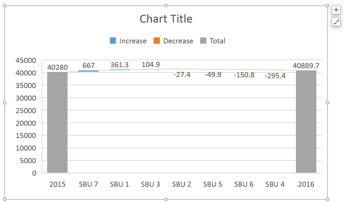
Finally, we have our waterfall chart:
Or, you can skip all this and use Zebra BI for Office to do the hard work for you...
Finally, we have our waterfall chart:
2. Ditch the clutter on your visualization
Data visualization best practice is to remove ALL elements from the visualization that is not absolutely necessary.
The default Excel waterfall chart often contains elements that do not contribute to data comprehension, instead acting as distractions...
So, let's remove all unnecessary elements and write our key message to the title. It’s a shame that the chart title cannot be inserted automatically from a cell.
The default Excel waterfall chart often contains elements that do not contribute to data comprehension, instead acting as distractions...
So, let's remove all unnecessary elements and write our key message to the title. It’s a shame that the chart title cannot be inserted automatically from a cell.
💡
#PRO TIP
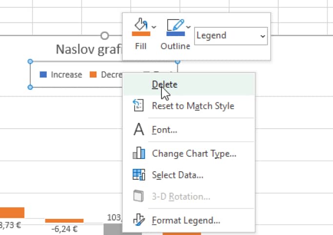
To remove the distracting chart elements, right-click on each of them and then click "Delete".
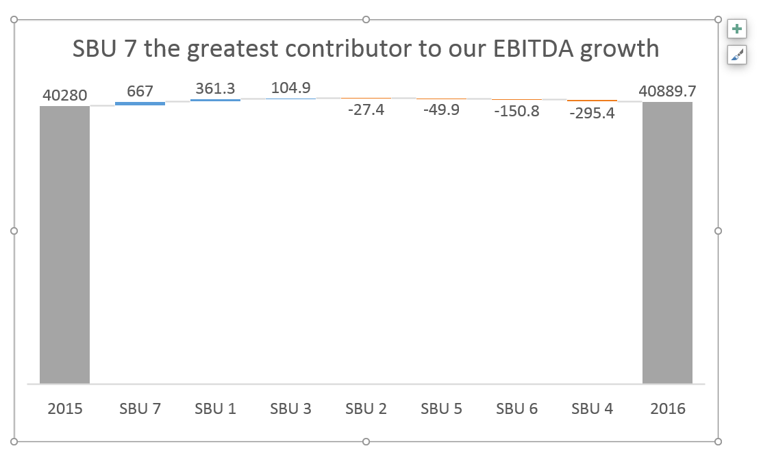
Great, this is much better.
But it required additional work that would not be required if Excel defaults were better.
We’ll show you how to do it better with Zebra BI for Office.
But it required additional work that would not be required if Excel defaults were better.
We’ll show you how to do it better with Zebra BI for Office.
3. Break the axis to highlight contributions
This limitation is especially noticeable in waterfall charts..
Because waterfall charts have essentially two different types of data:
1. Totals: usually the first and last column in a series.
2. Contributions: the floating bricks make up the “bridge” between the two totals.
A common problem is that contributions are often very small compared to totals. This is also apparent in our example (image above).
First, a point of order: this chart correctly visualizes the situation as the contributions really ARE that small compared to totals. Our 2016 result is essentially the same as our 2015 result.
This visualization is also completely in line with IBCS Standards.
However, users (and their bosses) are sometimes more interested in contributions than in totals and the relationship between the two.
In this case, the only viable option would be to break the vertical axis and have the totals start at some value larger than 0. Let’s say 35,000. This highlights individual contributions, but risks guiding unaware readers to false conclusions about the data.
Simpler option:
1. Click on the chart to select it
2. Re-add vertical axis: Go to Design >> Add Chart Element >> Axes >> Primary Vertical
3. ”Break" vertical axis: right click on the vertical axis and click "Format Axis...", then under Axis Options write "35000" under Bounds >> Minimum.
4. Remove the vertical axis: right click on the vertical axis and click "Delete"
This is the chart we end up with:
Because waterfall charts have essentially two different types of data:
1. Totals: usually the first and last column in a series.
2. Contributions: the floating bricks make up the “bridge” between the two totals.
A common problem is that contributions are often very small compared to totals. This is also apparent in our example (image above).
First, a point of order: this chart correctly visualizes the situation as the contributions really ARE that small compared to totals. Our 2016 result is essentially the same as our 2015 result.
This visualization is also completely in line with IBCS Standards.
However, users (and their bosses) are sometimes more interested in contributions than in totals and the relationship between the two.
In this case, the only viable option would be to break the vertical axis and have the totals start at some value larger than 0. Let’s say 35,000. This highlights individual contributions, but risks guiding unaware readers to false conclusions about the data.
Simpler option:
1. Click on the chart to select it
2. Re-add vertical axis: Go to Design >> Add Chart Element >> Axes >> Primary Vertical
3. ”Break" vertical axis: right click on the vertical axis and click "Format Axis...", then under Axis Options write "35000" under Bounds >> Minimum.
4. Remove the vertical axis: right click on the vertical axis and click "Delete"
This is the chart we end up with:
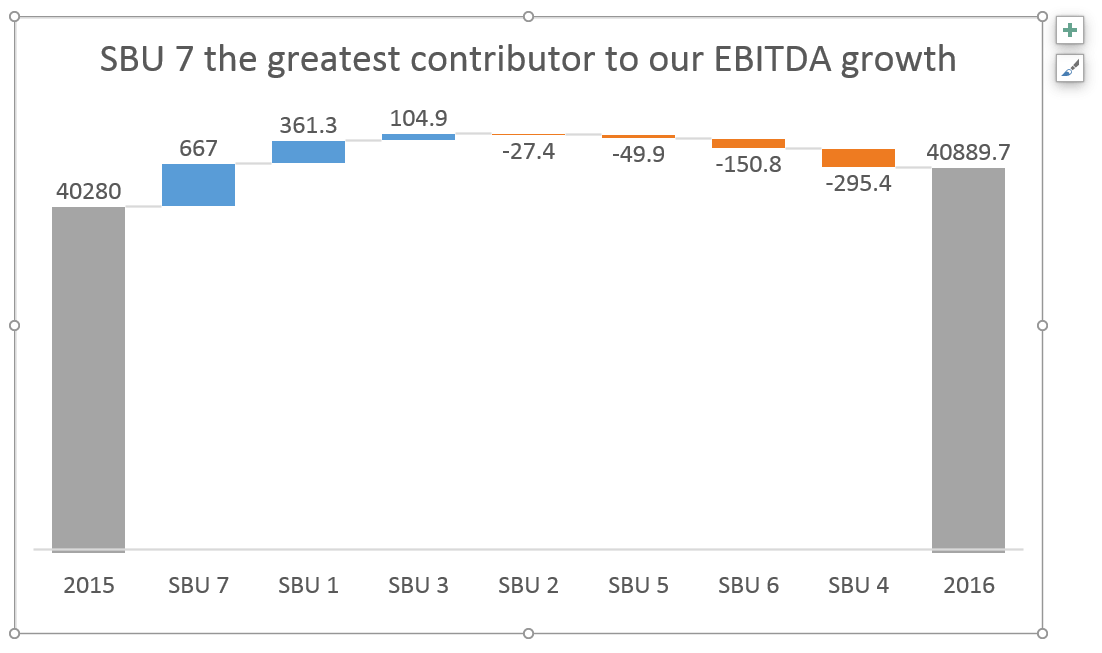
Now the contributions are much more prominent, but there's no obvious indication that the vertical axis does not start at zero..
Which is really bad because the user does not draw the correct conclusion from the visualization.
Which is really bad because the user does not draw the correct conclusion from the visualization.
4. Add relative contributions in percentages
When analyzing contributions you're sometimes more interested in relative contributions (in percentages of the total) than in absolute contributions.
Unfortunately, if you want to do that in a default Excel waterfall chart, you're out of luck - you're stuck with displaying absolute contributions only.
See how easy this is to do in Zebra BI for Office.
Unfortunately, if you want to do that in a default Excel waterfall chart, you're out of luck - you're stuck with displaying absolute contributions only.
See how easy this is to do in Zebra BI for Office.
5. Highlight differences between totals
Another thing that you're not able to do in an Excel waterfall chart is to display the total difference between 2015 and 2016 in our example.
Sure, you can see in the chart that the 2016 column is higher than the 2015 column (especially now that we cut the vertical axis).
But by how much?
Unless you can do complex subtractions in your head, you don't know the exact number.
There’s also no way to display the relative difference in percentage.
Since this difference between totals is rather important...
It's definitely a major feature that's missing in Excel waterfall charts.
Of course, it's much easier to highlight the differences using Zebra BI for Office.
Sure, you can see in the chart that the 2016 column is higher than the 2015 column (especially now that we cut the vertical axis).
But by how much?
Unless you can do complex subtractions in your head, you don't know the exact number.
There’s also no way to display the relative difference in percentage.
Since this difference between totals is rather important...
It's definitely a major feature that's missing in Excel waterfall charts.
Of course, it's much easier to highlight the differences using Zebra BI for Office.
6. Use vertical waterfall charts
We know that horizontal charts (i.e. the charts that have a horizontal category axis) are used to display time-related data.
For everything else, we should use vertical charts instead.
Waterfall charts are no exception.
Strangely, in Excel 2016, there is no way to insert a vertical waterfall chart.
While this feature has been requested, there's no indication of whether it will be implemented and when.
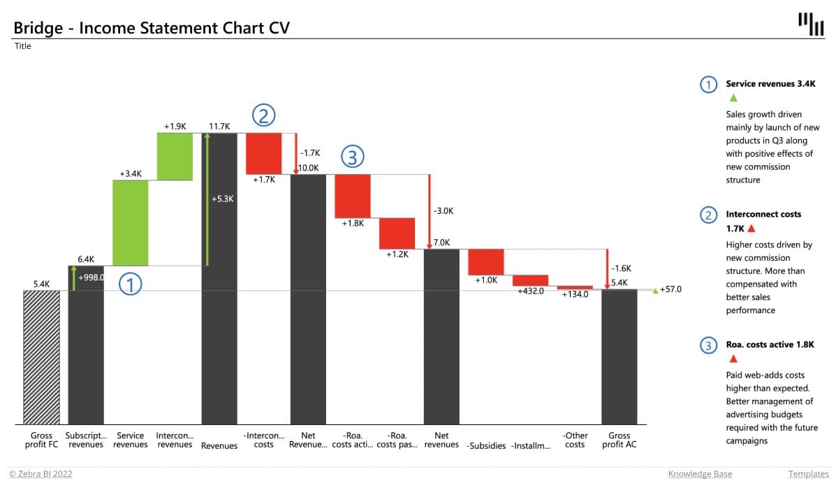
We prepared a demonstration in Zebra BI for Office, so you can see how to create an income statement with vertical waterfall charts.
For everything else, we should use vertical charts instead.
Waterfall charts are no exception.
Strangely, in Excel 2016, there is no way to insert a vertical waterfall chart.
While this feature has been requested, there's no indication of whether it will be implemented and when.
We prepared a demonstration in Zebra BI for Office, so you can see how to create an income statement with vertical waterfall charts.
7. Add (some) subtotals
Since we're on the subject of visualizing income statements - in a typical income statement, there are some categories that are actually sums of several other categories.
For example, you can choose to calculate a sum of all Operating Expenses (OpEx).
This better visualizes the relationship between "Revenue" and "Earnings before interest and taxes" (EBIT).
EBIT = Revenue - OpEx.
In a table, this is easy to do - just write a formula and you're done.
When you create a waterfall chart in Excel? Not so much.
It's apparently so hard to do it manually that there's not a single tutorial or template available on the internet.
You can, however, enter subtotals and designate them as such in your waterfall chart.
However, you need to calculate them yourself to make sure they are correct.
For example, you can choose to calculate a sum of all Operating Expenses (OpEx).
This better visualizes the relationship between "Revenue" and "Earnings before interest and taxes" (EBIT).
EBIT = Revenue - OpEx.
In a table, this is easy to do - just write a formula and you're done.
When you create a waterfall chart in Excel? Not so much.
It's apparently so hard to do it manually that there's not a single tutorial or template available on the internet.
You can, however, enter subtotals and designate them as such in your waterfall chart.
However, you need to calculate them yourself to make sure they are correct.
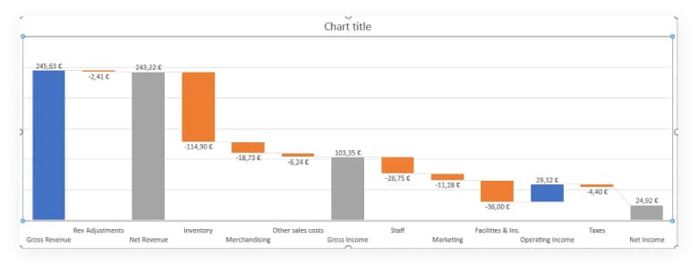
You can see how Zebra BI for Office automatically creates subtotals in this handy animated gif at the end of this article.
8. Customize your chart with colors
The default color scheme in Excel could be better.
Visit the Chart Design tab and open the Change Colors gallery.
Visit the Chart Design tab and open the Change Colors gallery.

Here, you can select a color palette. You can also choose a different theme on the Page Layout tab.
To adjust how the colors are used, click the Colors button and select Customize Colors at the bottom of the list.
To adjust how the colors are used, click the Colors button and select Customize Colors at the bottom of the list.

You can set it up to display positive values in green and negative values in red, which is a common approach in financial reporting.
9. Turn connector lines on or off
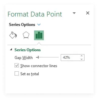
Connector lines connect columns to show the movements in values in the chart. You can turn them on or off by right-clicking a data series to open the Format Data Series pane and checking/unchecking the Show connector lines box.
10. Scale your charts
Making sure that all related charts in a report or dashboard are on the same scale is one of the most important concepts in data visualization.
💡
#PRO TIP
If you don't synchronize scales, don't even insert the charts.
All too often you see two Excel charts side by side with completely different scales.
While each of them is an adequate data visualization on its own, you must make sure they are scaled once you put them side by side!
Otherwise don't even insert the charts and just leave the data in a table — or risk misleading/incorrect interpretation.
So, how do you synchronize scales of Excel charts? While the procedure is not particularly hard, it is time-consuming.
It's a similar procedure that we used to break the axis.
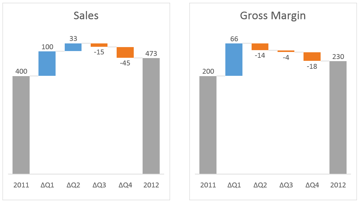
Say we have these two default Excel waterfall charts and we need to scale them:
While each of them is an adequate data visualization on its own, you must make sure they are scaled once you put them side by side!
Otherwise don't even insert the charts and just leave the data in a table — or risk misleading/incorrect interpretation.
So, how do you synchronize scales of Excel charts? While the procedure is not particularly hard, it is time-consuming.
It's a similar procedure that we used to break the axis.
Say we have these two default Excel waterfall charts and we need to scale them:
The first step is to re-add Vertical Axis on both charts.
1. Click on the first chart to select it
2. Re-add vertical axis: Go to Design >> Add Chart Element >> Axes >> Primary Vertical
3. Repeat for the second chart
This is what we have so far:
1. Click on the first chart to select it
2. Re-add vertical axis: Go to Design >> Add Chart Element >> Axes >> Primary Vertical
3. Repeat for the second chart
This is what we have so far:
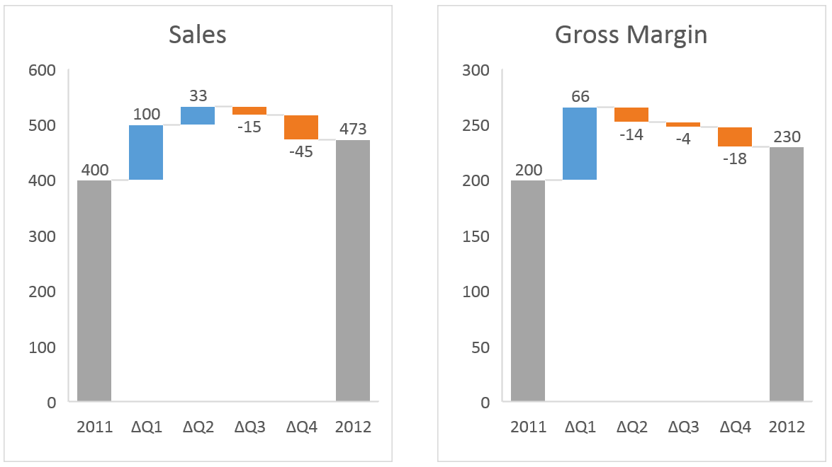
Now we have to adjust the scale of the right chart to be the same as the left.
Right-click on the vertical axis and click "Format Axis...", then under Axis Options write "600" under Bounds >> Minimum.
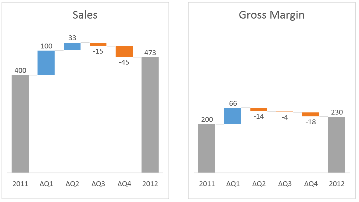
Remove the vertical axis from both charts (right-click on the vertical axis and click "Delete") and we have our correct visualization:
Right-click on the vertical axis and click "Format Axis...", then under Axis Options write "600" under Bounds >> Minimum.
Remove the vertical axis from both charts (right-click on the vertical axis and click "Delete") and we have our correct visualization:
OK, that wasn't too bad. Now, what if you have a monthly report with 6 waterfall charts on it?
Would you do this procedure for 6 charts every month when the data changes? I guess not.
Of course, you can automate this, but you have to use VBA to do it.
If you don't want to use VBA, maybe this article from 2012 by Jon Peltier will help you.
Would you do this procedure for 6 charts every month when the data changes? I guess not.
Of course, you can automate this, but you have to use VBA to do it.
If you don't want to use VBA, maybe this article from 2012 by Jon Peltier will help you.
Advanced things you can do much easier
You got it so far: everything is much easier if you use Zebra BI for Office
instead of native Excel charts.
See what else can be done 👇
instead of native Excel charts.
See what else can be done 👇
1. Adding variances and difference highlights
The default Excel waterfall charts do not show a very important feature that is crucial for the understanding of your performance: variances (absolute & relative) and difference highlights.
In Zebra BI for Office, both features are applied automatically.
In Zebra BI for Office, both features are applied automatically.
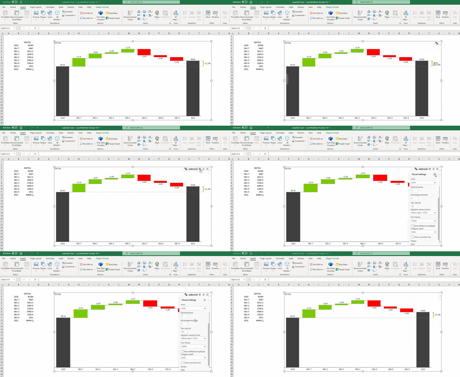
You can also control whether an increase is a positive or a negative event..
We know that in some cases, like when it comes to costs, an increase is a negative development.
You can simply right-click on the category where data should be inverted and select a custom calculation "Invert".
This will automatically adapt the visualization to display the right context.
Another useful feature we added is the difference highlights between starting and ending values..
The difference highlight is added automatically and is on by default.
By going to the settings in the global toolbar, you can also switch it off.
We know that in some cases, like when it comes to costs, an increase is a negative development.
You can simply right-click on the category where data should be inverted and select a custom calculation "Invert".
This will automatically adapt the visualization to display the right context.
Another useful feature we added is the difference highlights between starting and ending values..
The difference highlight is added automatically and is on by default.
By going to the settings in the global toolbar, you can also switch it off.
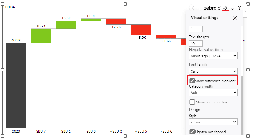
In the previous example, you can see that the increase between EBITDA in 2020 and 2021 was 4.6k or 11.3%.
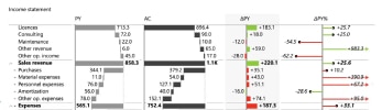
2. Creating an income statement with vertical waterfall charts
How about inserting a waterfall chart into an income statement?
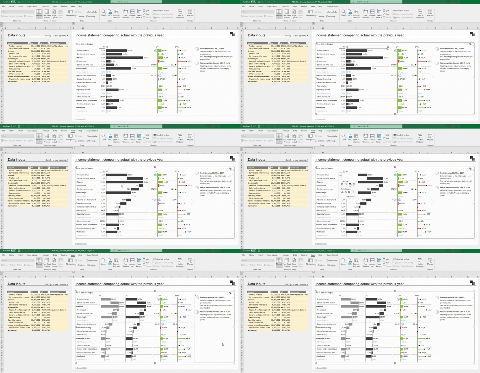
The cool thing about this is that by glancing at the waterfall chart, you can already see how you're performing.
The calculations like "Result" and "Invert" are reflected in the waterfall chart and all categories get subtracted so that you can clearly see the contribution of each to the final result.
The calculations like "Result" and "Invert" are reflected in the waterfall chart and all categories get subtracted so that you can clearly see the contribution of each to the final result.
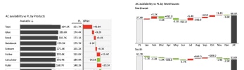
3. Small multiples with waterfall charts
How about creating up to 200 waterfall charts at once?
Here are 6 waterfall charts in a few clicks:
Here are 6 waterfall charts in a few clicks:

Small multiples with waterfall charts in a few clicks with Zebra BI for Office
You only need to select a single cell in your data and insert the Zebra BI Charts for Office.
Use the chart slider to get to the waterfall chart, use the custom calculation "Result" on the first and last entry, and Zebra BI will do the rest.
You will see the automatically calculated variances and highlighted differences.
But, most importantly, no matter how many charts you have, they are all inserted within the same visual and also automatically scaled between each other which immediately puts the data into the right perspective.
Check this short video to see how easy is to create Waterfall charts with Zebra BI for Office:
Use the chart slider to get to the waterfall chart, use the custom calculation "Result" on the first and last entry, and Zebra BI will do the rest.
You will see the automatically calculated variances and highlighted differences.
But, most importantly, no matter how many charts you have, they are all inserted within the same visual and also automatically scaled between each other which immediately puts the data into the right perspective.
Check this short video to see how easy is to create Waterfall charts with Zebra BI for Office:
Now, it's your turn
Impress everyone with your advanced waterfall chart: insert Zebra BI for Office for free
.
.
Trusted by the world's leading professionals

1,500,000+
data professionals leverage Zebra BI product and resources

3,000+
clients rely on our services and
trust us with their businesses
trust us with their businesses

129
Countries from across the world uses Zebra BI
























*Over 1 million Zebra BI users trust us worldwide. View customer by industry
More than 40 customizable bussiness report templates for Excel
carefully designed to cover every detail of your report.
Get Started For Free
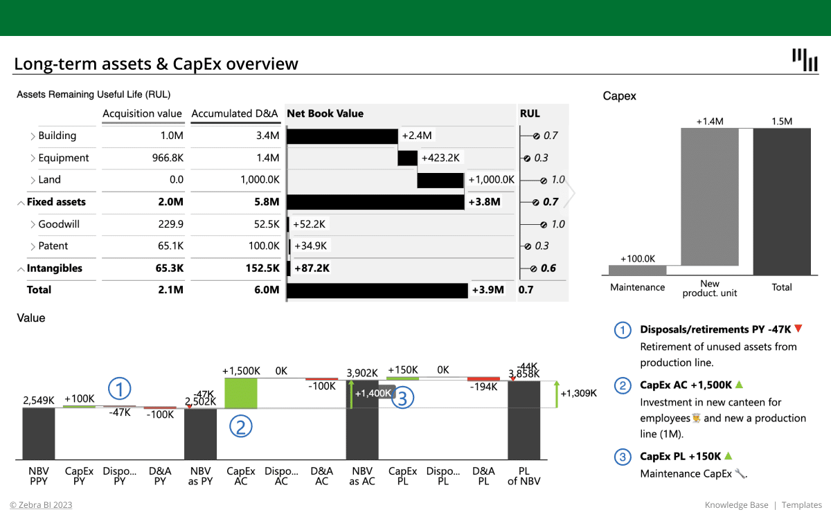
Long-term Assets and CapEx Report
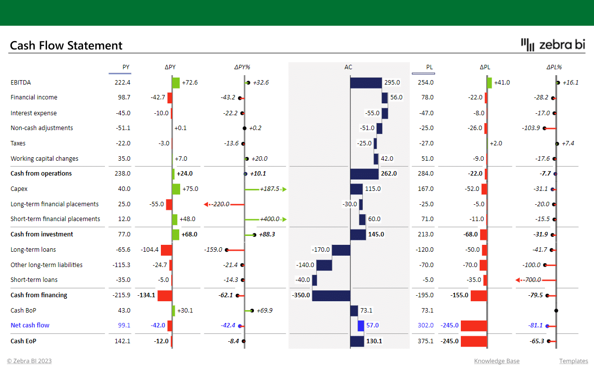
Cash Flow Statement form Pivot Table
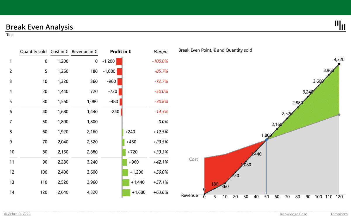
Break-Even Analysis Template for Excel
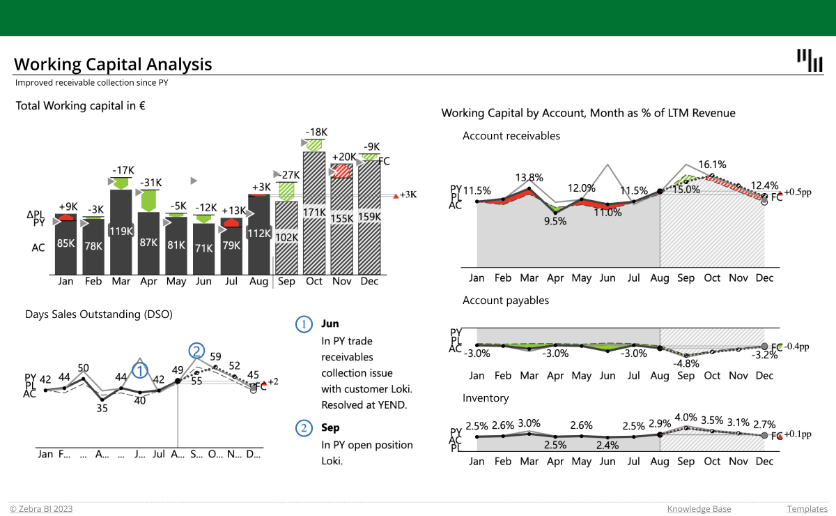
Working Capital Analysis
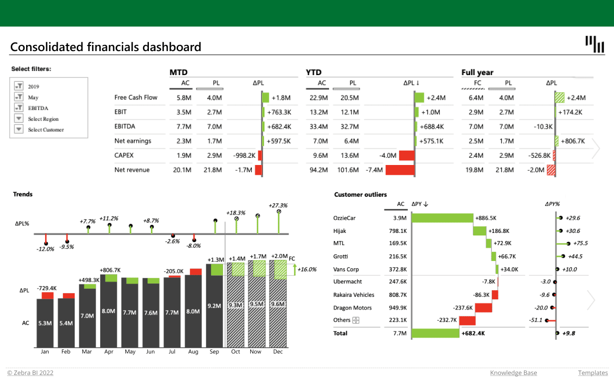
Consolidated financials dashboard in Excel
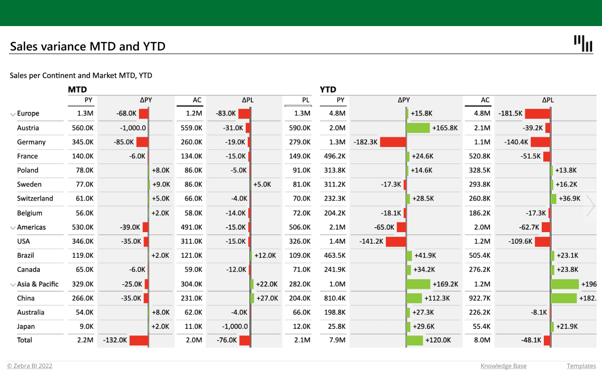
Sales variance report with multiple levels
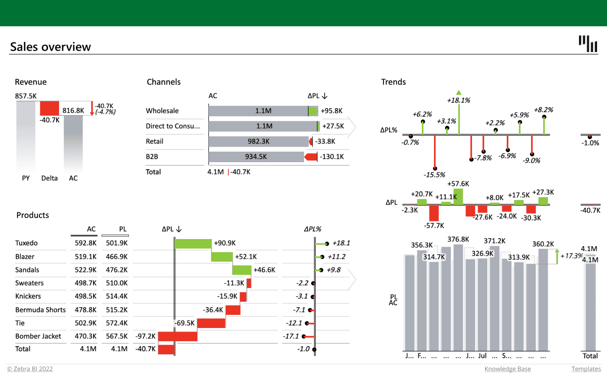
Sales overview report in Excel
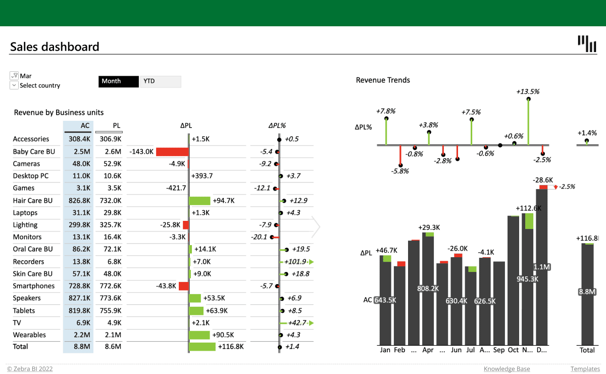
Sales Dashboard
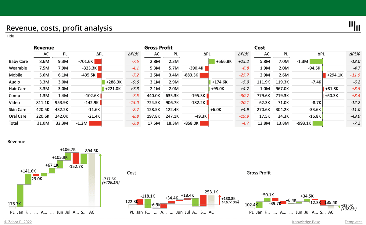
Revenue-cost-profit analysis
Inventory report
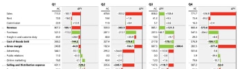
Quarterly income statement
Income statement with multiple levels
MORE THAN 1.500,000 EXPERTS USE OUR PRODUCT DAILY
Experts thinks Zebra is awesome

Verified customer
“This tool is unique. Most tools only show us WHAT happened. Zebra BI answers WHY it happened.”

Gabriel Medina
Analyst at GxSoft Argentina
Verified customer
“Our controllers now spend less time preparing comprehensive reports and more time analyzing data and crystallizing the message.”

Alejandro Meyer
Planning & Controlling Director at SanLucar Fruit
Verified customer
“This a highly professional product. Our company’s leadership (finance and operations) is already asking we roll this out to all our PBI financial reports.”

Joe Pawlowski
Innovation Manager - Business Intelligence, DHL

Report consistency
quick comprehension of numbers by using the right charts and colors, following IBCS standards for consistent reports.

Data security
We don't store your data. All we do is use it to render visuals in your Excel. We're GDPR and CCPA-compliant.
Not another tool =
BI consolidation
With Zebra BI you get advanced reporting and visualizations in Excel, complementing your existing BI tools and leveraging the power of millions of Excel users.
Make your reports stand out
Insert Zebra BI into your Excel and see the magic in your data happen!
Try Zebra BI for free
AVAILABLE FOR FREE!
Create actionable reports with Zebra BI for Excel
Join over 1.5 million Zebra BI users who now produce insightful reports every time.