Share this
Choosing the correct chart for your Power BI report


In this live session, we'll guide you through the 3 fundamental rules that you should always follow when creating charts. By learning them, there is a good chance you will get it right no matter what the context of your data is.
We’ll dive deep into the different chart types, from most basic to advanced, and analyze real-life examples in both native Power BI and Zebra BI visuals.
You'll learn:
Presenter


Founder & CEO at Zebra BI
Andrej brings 25 years of experience in business intelligence and software development and 20 years as a consultant. Helping numerous international and regional companies achieve consistent and efficient internal reporting throughout the organization inspired him to build Zebra BI.
What happens when your charts aren’t right for your message or situation?
After much work, you’ve managed to prepare your data, set up a working data model in Power BI, and included many nice-looking charts into your reports and dashboards. You have shared your reports with your end-users, but WHAT??? They asked you if you could put the data into a large table instead!
Have you ever been in this situation? You’re not the only one… Even if you’re technically highly advanced, you have bumped into a classic issue: your charts aren’t the right ones for your message or situation. They might even be misleading.
Managers often prefer to inspect a table in Excel to come to a decision rather than observe beautiful visuals in Power BI. Not because tables are better, but mostly because the selection of charts is wrong and/or they are poorly designed.
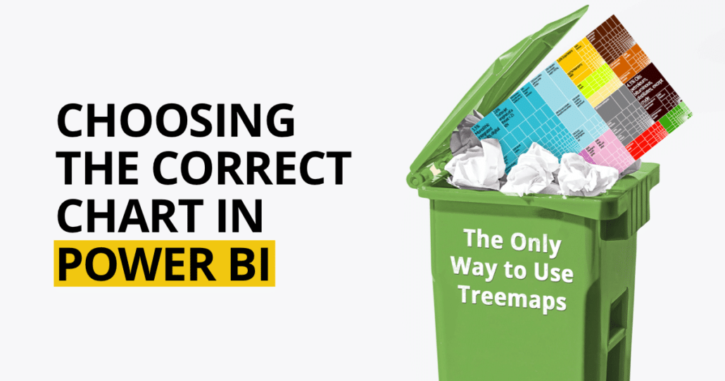
You also probably heard that donut charts are a no-go and that you should replace them with other types, like treemaps. What if we told you this isn’t really the case?