Data analysis reports are vital tools for businesses to understand their performance and make informed decisions. The ability to analyze and interpret data has become increasingly critical in today’s data-driven world. Data analysis reports allow businesses to investigate trends, patterns, and anomalies in their data to generate meaningful insights and actionable recommendations. In this article, we’ll dive deep into the world of data analysis reports, from their importance and types to best practices and tools for their creation and interpretation.
Table of Contents
The Importance of Data Analysis Reports
Data analysis reports are essential for a variety of reasons. They provide businesses with objective insights and help them make informed decisions based on real data. By analyzing data, businesses can identify areas of improvement and optimize their performance. Additionally, data analysis reports can help businesses identify trends and patterns that are not readily apparent, enabling them to adjust their strategies to capitalize on these emerging opportunities.
Moreover, data analysis reports can also help businesses identify potential risks and threats. By analyzing data, businesses can identify patterns that may indicate potential problems and take proactive measures to mitigate them. For example, a business may notice a decline in sales in a particular region and investigate the cause, which could be due to increased competition or changing consumer preferences. By identifying these risks early on, businesses can take steps to address them before they become major issues.
Types of Data Analysis Reports
There are several types of data analysis reports that businesses utilize. Some of the most common ones include:
- Trend analysis reports: These reports examine trends in data over a period of time to identify patterns or changes.
- Comparative analysis reports: These reports analyze multiple sets of data to compare and contrast performance between different periods or segments.
- Correlation analysis reports: These reports identify the relationship between different sets of data. If two sets of data are correlated, there may be a causal relationship between them.
- Predictive analysis reports: These reports utilize algorithms and statistical models to predict future outcomes and trends.
Another type of data analysis report is the descriptive analysis report. These reports provide a summary of the data, including measures of central tendency and variability. They are useful for providing an overview of the data and identifying any outliers or unusual patterns.
Additionally, businesses may use diagnostic analysis reports to identify the root cause of a problem or issue. These reports use data to identify potential causes of a problem and help businesses make informed decisions about how to address it.
How to Create Effective Data Analysis Reports
Creating effective data analysis reports can be challenging, but there are some best practices that businesses can follow to ensure their reports are comprehensive and understandable. Here are some tips for creating effective data analysis reports:
- Establish clear objectives: Before starting your report, define your objectives, and identify the specific data sets you need to achieve them.
- Simplify complex data: Use data visualization tools like charts and graphs to simplify complex data and make your insights more accessible.
- Provide context: Contextualize your data by providing relevant background information that explains the significance of your findings.
- Be objective and unbiased: Ensure that your report is objective and unbiased by avoiding making unfounded assumptions or conclusions.
Another important aspect of creating effective data analysis reports is to ensure that your report is easily understandable by your target audience. This means using language that is clear and concise, avoiding technical jargon, and providing explanations for any complex terms or concepts. Additionally, it is important to consider the format of your report, as different audiences may prefer different formats such as visual presentations or written reports. By taking these factors into account, businesses can create data analysis reports that effectively communicate their insights and drive informed decision-making.
The Role of Visualization in Data Analysis Reports
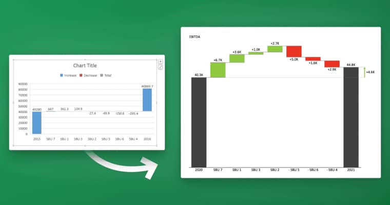
Visualization plays a crucial role in data analysis reports. Visualizing data can help businesses identify patterns, trends, and anomalies that may not be immediately apparent from raw data. By using visual aids like charts, graphs, and tables, businesses can communicate insights more effectively to stakeholders across different departments. Data visualization also allows businesses to spot discrepancies easily, leading to faster decision-making and problem-solving.
Key Metrics to Include in Your Data Analysis Report
Choosing the right key performance indicators (KPIs) to include in your data analysis report can make all the difference in how effectively your report is received. Here are some critical metrics that every data analysis report should include:
- Conversion rates: This metric identifies the percentage of users who take a desired action, like making a purchase or signing up for a service.
- Customer acquisition cost: This metric shows how much it costs to acquire a new customer and is essential for assessing overall profitability and growth potential.
- Customer retention rate: This metric measures the percentage of customers who remain loyal to your business over a given period of time.
- ROI: Return on investment (ROI) calculates the profitability of your business and helps evaluate the effectiveness of your marketing and advertising efforts.
However, there are other important metrics that can provide valuable insights into your business performance. One such metric is the bounce rate, which measures the percentage of visitors who leave your website after viewing only one page. A high bounce rate can indicate issues with website design, user experience, or content quality.
Another important metric to consider is the customer lifetime value (CLV), which calculates the total amount of revenue a customer is expected to generate for your business over their lifetime. This metric can help you identify your most valuable customers and tailor your marketing and retention strategies accordingly.
Common Mistakes to Avoid When Creating Data Analysis Reports
It’s easy to make mistakes when creating data analysis reports, making it important to take proactive measures to avoid them. Here are some of the most common mistakes businesses make when crafting data analysis reports:
- Using irrelevant data sets: Make sure that the data sets you use are relevant to your objectives and business needs.
- Misinterpreting data: Avoid drawing unfounded conclusions or making assumptions based on incomplete data.
- Using complicated jargon: Avoid technical jargon and explain your findings in simple terms that are easily understood by stakeholders.
- Not providing context: A lack of context can lead to misinterpretation, so it’s crucial to provide relevant background information that helps explain your data.
Best Tools and Software for Generating Data Analysis Reports
Several tools and software are available to help businesses generate data analysis reports more effectively. Some of the best tools for generating data analysis reports include:
- Microsoft Excel: Excel is a versatile tool that allows businesses to automate reporting and analyze data. It’s an excellent tool for small and medium-sized businesses.
- Google Analytics: Google Analytics is a web analytics tool that provides businesses with insights related to user behavior and website performance.
- Tableau: Tableau is a data visualization tool that allows businesses to create interactive dashboards and reports.
- SAS: SAS is a data analytics tool that provides businesses with insights into customer behavior, financial performance, and operational efficiency.
How to Interpret and Communicate Insights from Your Data Analysis Report
Interpreting and communicating insights from your data analysis report is critical for its effectiveness. It’s crucial to understand your data thoroughly before presenting it and to use visualization tools to make your insights more accessible. When communicating your insights, make sure to provide context and explain your findings in simple terms that are easily understood by stakeholders. Be prepared to answer any questions or concerns they may have about your data and findings.
Using Data Analysis Reports to Drive Business Decisions
Data analysis reports are a powerful tool for driving business decisions. By providing objective insights, data analysis reports enable businesses to identify trends and patterns and make data-driven decisions. When making decisions based on data analysis reports, it’s essential to consider your objectives, relevant data sets, and potential risks and opportunities.
Examples of Successful Data Analysis Reports in Different Industries
Data analysis reports can be applied to a wide range of industries, from healthcare to finance to retail. Here are some examples of successful data analysis reports in different industries:
- Healthcare: Data analysis reports can be used to examine patient outcomes and identify trends that can improve patient care.
- Finance: Data analysis reports can be used to analyze investment trends and identify potential opportunities for investors.
- Retail: Data analysis reports can be used to analyze customer behavior and preferences, enabling businesses to tailor their marketing strategies to their target audience more effectively.
Tips for Presenting Your Data Analysis Report to Stakeholders
Presenting your data analysis report to stakeholders is a critical part of the process. Here are some tips for making sure your presentation is as effective and engaging as possible:
- Know your audience: Understand who your stakeholders are and their level of expertise to tailor your presentation accordingly.
- Provide context: Provide relevant background information that explains the significance of your data and findings.
- Use visualization tools: Use charts, graphs, and other visual aids to make your insights more accessible and understandable.
- Demonstrate the ROI: Show how your insights can lead to measurable benefits and ROI for the organization.
- Be prepared to answer questions: Be prepared to answer any questions or concerns your stakeholders may have about your data and findings.
Measuring the ROI of Your Data Analysis Report
Measuring the ROI of your data analysis report is critical for determining its value and effectiveness. Here are some metrics you can use to calculate the ROI of your data analysis report:
- Conversion rates: Calculate the percentage of users who took a desired action based on your data analysis report.
- Cost savings: Calculate how much your business saved by implementing insights derived from your data analysis report.
- Revenue growth: Calculate how much your business grew as a result of implementing insights derived from your data analysis report.
- Customer retention: Calculate how many customers you were able to retain as a result of implementing insights from your data analysis report.
The Future of Data Analysis Reports: Trends and Predictions
Data analysis reports are becoming more sophisticated and complex, with increasing quantities of data and new analytical tools being developed regularly. Here are some key trends and predictions for the future of data analysis reports:
- Increased automation: Businesses are increasingly automating their data analysis processes to save time and improve accuracy.
- Use of AI and machine learning: AI and machine learning are becoming more prevalent in data analysis reports, enabling businesses to analyze vast quantities of data more efficiently and effectively.
- Data privacy concerns: As data privacy concerns continue to rise, businesses must take measures to protect their data from breaches and other threats.
- Real-time reporting: Real-time reporting is becoming more prevalent, enabling businesses to monitor and adjust their performance in real-time.
Conclusion
Data analysis reports are a powerful tool for businesses to understand their performance and make informed decisions. By analyzing and interpreting data, businesses can identify trends, patterns, and anomalies to generate meaningful insights and actionable recommendations. With the right tools, best practices, and strategies, businesses can create effective data analysis reports that drive business outcomes and deliver value to stakeholders.


