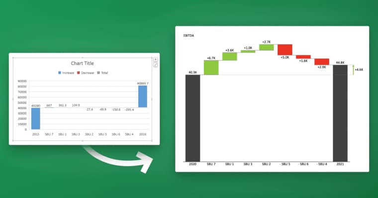
Are you looking for an effective way to display your data in an easy-to-understand format? Look no further than Power BI. This powerful tool from Microsoft offers a range of visualizations, including the popular bar chart. In this article, we’ll break down exactly how to create a bar chart in Power BI, including choosing the right data, customizing your chart, and sharing it with others.
Table of Contents
Understanding the Basics of Power BI
Before we dive into creating our bar chart, it’s important to understand the basics of Power BI. This tool allows you to connect to various data sources, clean and transform your data, and create visualizations to help you gain insights. Power BI has a range of visualization options to choose from, including line charts, scatter charts, and pie charts, but today we’re focusing on the versatile bar chart.
One of the key features of Power BI is its ability to handle large amounts of data. With Power BI, you can import and analyze data from multiple sources, including Excel spreadsheets, cloud-based services, and databases. Additionally, Power BI allows you to create relationships between different data sources, which can help you uncover insights that might not be apparent when looking at individual data sets. By leveraging the power of Power BI, you can gain a deeper understanding of your data and make more informed decisions based on your findings.
Introducing the Bar Chart Visualization in Power BI
The bar chart is a powerful visualization that displays data in horizontal or vertical bars. This makes it easy to compare different data points and identify trends over time. The bar chart can also be customized to display different colors, labels, and legend options, so you can tailor it to your specific needs.
One of the key benefits of using a bar chart in Power BI is its ability to handle large amounts of data. With the ability to group data into categories and subcategories, the bar chart can effectively display complex data sets in a clear and concise manner. Additionally, the bar chart can be used in conjunction with other visualizations, such as line charts and scatter plots, to provide a comprehensive view of your data.
Another advantage of using the bar chart in Power BI is its interactivity. Users can easily filter and drill down into the data by clicking on specific bars, allowing for deeper analysis and insights. This level of interactivity can help users identify patterns and outliers that may not be immediately apparent in static charts or tables.
Step-by-Step Guide to Creating a Bar Chart in Power BI
Now that we understand the basics of Power BI and the bar chart visualization, let’s dive into how to create a bar chart in Power BI. These steps will guide you through the process:
- Connect to your data source and select the data you want to display in your bar chart.
- Select the bar chart visualization from the visualization pane on the right-hand side of the screen.
- Drag and drop the fields from your data source to the appropriate areas of the visualization, such as the values and axis sections. This will configure your chart.
- Customize your chart by selecting colors, labels, and legend options from the formatting pane on the right-hand side of the screen. This will allow you to make your chart look exactly how you want it to.
It’s important to note that when creating a bar chart in Power BI, you can also add additional data fields to your chart to create a stacked or clustered bar chart. This allows you to compare multiple data sets within the same chart. To do this, simply drag and drop the additional fields into the appropriate areas of the visualization, such as the legend or axis sections. You can also adjust the formatting options to customize the appearance of your stacked or clustered bar chart.
Choosing the Right Data for Your Bar Chart
When choosing what data to display in your bar chart, it’s important to consider the message you want to convey. Bar charts work best when displaying categorical data, such as sales figures broken down by month or the number of employees in different departments. This makes it easy to compare different data points and identify trends over time.
It’s also important to consider the audience who will be viewing your bar chart. If your audience is not familiar with the data being presented, it may be helpful to include additional information or context to help them understand the significance of the data. Additionally, it’s important to choose a clear and easy-to-read format for your bar chart, such as using contrasting colors and labeling each bar with the corresponding data point.
Customizing Your Bar Chart: Colors, Labels, and Legend Options
One of the advantages of the bar chart visualization is the ability to customize it to suit your needs. Power BI offers a range of options for customizing your chart, from changing the colors of the bars to adding labels and adjusting the legend options. By playing around with these options, you can create a chart that is not only easy to understand but also visually appealing.
Another useful feature of customizing your bar chart is the ability to add data labels. Data labels can be used to display the exact value of each bar in the chart, making it easier for viewers to interpret the data. Additionally, you can adjust the position and font size of the data labels to ensure they are easily readable. By utilizing these customization options, you can create a bar chart that effectively communicates your data and insights.
Adding Interactivity Features to Your Bar Chart
Another advantage of using Power BI for your visualizations is the ability to add interactivity features. For example, you can add filters and slicers to allow viewers to drill down into specific data points or select specific time periods. This creates a more immersive experience for viewers and allows them to gain insights more quickly.
In addition to filters and slicers, Power BI also allows you to add interactive tooltips to your bar chart. Tooltips provide additional information when a viewer hovers over a data point, such as the exact value or percentage. This can help viewers better understand the data and make more informed decisions.
Furthermore, Power BI offers the ability to add drill-through functionality to your bar chart. This allows viewers to click on a data point and be taken to a more detailed report or dashboard with additional information related to that specific data point. This can be especially useful for exploring trends or identifying outliers in your data.
Best Practices for Designing Effective Bar Charts in Power BI
When designing your bar chart, there are a few best practices to keep in mind. First, make sure your chart is easy to read by using clear labels and avoiding clutter. Additionally, consider the scale of your chart and whether you need to adjust it to emphasize certain data points. Finally, make sure your chart is visually appealing by using colors and fonts that are easy to read.
Another important aspect to consider when designing your bar chart is the use of data labels. Data labels can provide additional context and information to your chart, making it easier for viewers to understand the data being presented. However, it’s important to use data labels sparingly and strategically, as too many labels can clutter the chart and make it difficult to read. Consider using data labels for the most important data points or for comparisons between categories.
Troubleshooting Common Issues with Bar Charts in Power BI
While creating a bar chart in Power BI is relatively straightforward, there are some common issues that can arise. These include issues with data formatting, axis labeling, and chart scaling. The Power BI community is an excellent resource for troubleshooting these issues, so don’t hesitate to reach out for help if you run into any problems.
Advanced Techniques for Customizing Your Bar Charts in Power BI
If you’re looking to take your bar chart to the next level, there are several advanced techniques you can use. These include adding trend lines, conditional formatting, and custom calculations. These techniques allow you to extract even more insights from your data and create a chart that is tailored to your specific needs.
Integrating Your Bar Chart with Other Visualizations in Power BI Dashboards
Power BI also allows you to create dashboards that combine multiple visualizations, such as bar charts, line charts, and scatter charts. By integrating your bar chart with other visualizations, you can create a more complete picture of your data and gain insights from multiple angles.
Sharing and Collaborating on Your Bar Chart Visualizations with Others
Once you’ve created your bar chart in Power BI, you may want to share it with others or collaborate on it with colleagues. Power BI offers several options for sharing and collaborating, including sharing your visualization as a link, embedding it into a website or PowerPoint presentation, or allowing colleagues to access it through a workspace in Power BI.
Using Filters and Slicers to Enhance Your Bar Charts in Power BI
Filters and slicers are a powerful way to enhance your bar chart and allow viewers to drill down into specific data points. Filters allow you to select specific categories or time periods, while slicers allow you to select multiple options at once. By using these features, you can create a more interactive and engaging visualization.
Tips and Tricks to Get the Most Out of Your Bar Charts in Power BI
Finally, here are some tips and tricks to help you get the most out of your bar charts in Power BI:
- Choose the right type of bar chart for your data, such as a stacked bar chart or a clustered bar chart.
- Experiment with different colors and fonts to find the combination that works best for your chart.
- Use conditional formatting to highlight specific data points or trends.
- Consider using animated charts to bring your data to life and make it more engaging.
- Don’t be afraid to reach out to the Power BI community for help and advice.
Comparing Different Types of Visualizations: When to Use a Bar Chart
While the bar chart is a powerful visualization, it’s not always the best choice for every situation. Other visualizations, such as pie charts and line charts, may be more appropriate depending on the type of data you’re working with. It’s important to consider the message you want to convey and choose the visualization that best suits your needs.
By following these steps and tips, you can create a powerful and effective bar chart in Power BI that allows you to gain insights and communicate your data clearly and succinctly.


