If you’re looking for a way to create a live dashboard in Power BI, you’re in the right place. In this article, we’ll discuss everything you need to know, starting with why you should create a live dashboard in Power BI, and going all the way to advanced techniques for enhancing your dashboard. So, let’s get started!
Table of Contents
Why Should You Create a Live Dashboard in Power BI?
A live dashboard in Power BI is an interactive way to monitor data in real-time. With live dashboards, you don’t have to refresh your data manually, and you’ll always have the most up-to-date information at your fingertips. Live dashboards can be used for a variety of purposes, including monitoring website traffic, tracking sales, monitoring social media engagement, and much more.
Additionally, live dashboards in Power BI allow you to easily share your data with others. You can grant access to specific individuals or groups, and they can view the dashboard in real-time from their own devices. This makes collaboration and decision-making much easier, as everyone is working with the same, current information. Furthermore, Power BI offers a wide range of customization options, allowing you to tailor your dashboard to your specific needs and preferences. You can choose from a variety of visualizations, colors, and layouts to create a dashboard that is both informative and visually appealing.
Choosing the Right Data Sources for Your Power BI Dashboard
Before you can create a live dashboard in Power BI, you need to choose the right data sources. The data sources you choose will depend on the purpose of your dashboard and the information you want to monitor. Power BI supports a wide range of data sources, including Excel spreadsheets, SharePoint lists, SQL Server databases, and many others.
When selecting data sources for your Power BI dashboard, it’s important to consider the quality and reliability of the data. You want to ensure that the data you are using is accurate and up-to-date, as this will impact the effectiveness of your dashboard. Additionally, you may want to consider the ease of accessing and integrating the data into your dashboard, as some data sources may require more technical expertise to set up.
Another factor to consider when choosing data sources for your Power BI dashboard is the scalability of the data. As your business grows and your data needs change, you want to ensure that your data sources can accommodate these changes. It’s important to choose data sources that can handle large amounts of data and can be easily updated or expanded as needed.
Understanding Power BI’s Live Connection Feature
Power BI’s live connection feature allows you to create a live connection between your data sources and your dashboard. This means that any changes made to your data sources will be automatically reflected in your dashboard. To use the live connection feature, you need to have access to the data sources you want to connect to. You should also ensure that your data sources are properly formatted and structured.
One of the benefits of using Power BI’s live connection feature is that it allows you to work with large datasets without having to import them into Power BI. This can save you time and storage space on your computer. Additionally, the live connection feature allows you to work with real-time data, which can be especially useful for businesses that need to make quick decisions based on up-to-date information.
However, it’s important to note that using the live connection feature can also have some drawbacks. For example, if your data sources are slow or unreliable, this can impact the performance of your dashboard. Additionally, if you need to work with data from multiple sources, you may need to create multiple live connections, which can be time-consuming to set up and manage.
Step-by-Step Guide to Creating a Live Dashboard in Power BI
To create a live dashboard in Power BI, follow these steps:
- Open Power BI Desktop and create a new report by selecting ‘Get Data’ to connect to your data sources.
- Once your data is loaded, use the ‘Report’ view to drag and drop fields onto the canvas to create visualizations.
- Customize your visualizations by adjusting colors, labels, and filters to suit your dashboard’s purpose.
- After setting up your visualizations, click ‘Publish’ to send your report to the Power BI service.
- In the Power BI service, pin your visualizations to a new or existing dashboard by selecting the ‘Pin’ icon on each report element.
- Configure the dashboard’s tile settings and arrange them according to your preference.
- Set up a data refresh schedule by going to the dataset settings in the Power BI service.
- Optionally, enable real-time streaming on your dashboard if your data source supports it.
- Share your live dashboard with others by granting access through the Power BI service.
By following these steps, you can ensure that your data is up-to-date and that your dashboard provides the most accurate and relevant information.
Adding Visualizations and Charts to Your Power BI Dashboard
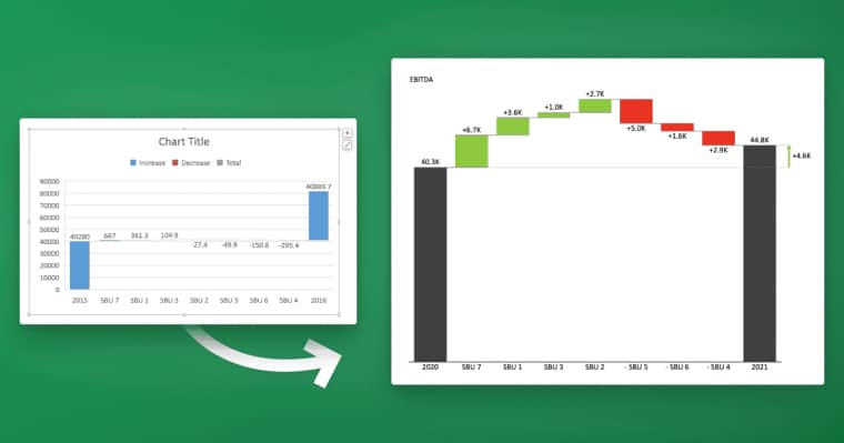
Visualizations and charts are the cornerstone of any good dashboard. In Power BI, you have a wide range of visualization options to choose from, including bar charts, line charts, scatter plots, and many others. When adding visualizations and charts to your dashboard, you should keep your audience and the purpose of your dashboard in mind.
It’s important to note that not all visualizations and charts are created equal. Some may be more effective than others depending on the type of data you’re presenting and the story you’re trying to tell. For example, a bar chart may be great for showing comparisons between different categories, while a scatter plot may be better for showing correlations between two variables. Take the time to experiment with different visualization types and find the ones that work best for your data and your audience.
Customizing Your Live Dashboard with Filters and Slicers
To make your live dashboard more interactive and user-friendly, you can add filters and slicers. Filters allow you to narrow down the data in your dashboard based on specific criteria. Slicers allow you to present the same data in multiple ways based on different criteria. When adding filters and slicers to your dashboard, make sure to choose the ones that are most relevant to the data you’re monitoring.
Additionally, it’s important to consider the placement of your filters and slicers on the dashboard. Placing them in a prominent location, such as at the top or on the side, can make them more easily accessible to users. You can also customize the appearance of your filters and slicers to match the overall design of your dashboard. Experiment with different styles and layouts to find the best fit for your data and audience.
Sharing and Collaborating with Your Power BI Dashboard
Once you’ve created your live dashboard in Power BI, you’ll want to share it with others. Power BI makes it easy to share and collaborate on dashboards with your colleagues, clients, or stakeholders. You can share your dashboard by publishing it to the Power BI service, embedding it in a website or SharePoint, or sharing a direct link to your dashboard.
When sharing your dashboard, you can also control who has access to it and what level of access they have. You can choose to share it with specific individuals or groups, and you can set permissions to allow them to view, edit, or manage the dashboard.
Collaborating on a dashboard is also easy with Power BI. You can add comments and annotations to specific visuals or data points, and you can use the built-in chat feature to discuss the dashboard with your collaborators in real-time. Additionally, you can set up alerts to notify you and your team when specific data changes or thresholds are met.
Tips for Maintaining and Updating Your Live Dashboard in Power BI
Creating a live dashboard in Power BI is only the first step. To make sure your dashboard continues to provide value, you’ll need to maintain and update it regularly. This includes making sure your data sources are properly formatted, checking for errors and inconsistencies, and making updates and revisions as needed.
Another important aspect of maintaining and updating your live dashboard in Power BI is to regularly review and analyze the data being displayed. This will help you identify any trends or patterns that may require further investigation or action. Additionally, it’s important to keep your dashboard visually appealing and user-friendly by regularly updating the layout, colors, and fonts to ensure it remains engaging and easy to navigate for your audience.
Common Mistakes to Avoid When Creating a Live Dashboard in Power BI
Creating a live dashboard in Power BI can be complicated, and there are many mistakes you can make along the way. Some common mistakes include using the wrong data sources, using the wrong visualizations, and not structuring your data correctly. To avoid these mistakes, make sure to plan your dashboard carefully and test it thoroughly before publishing it.
Best Practices for Designing an Effective Live Dashboard in Power BI
When designing a live dashboard in Power BI, there are several best practices you should follow. These include keeping your dashboard simple and easy to read, using clear and concise visualizations, and making sure your data is accurate and up-to-date. To learn more about best practices for designing effective live dashboards in Power BI, check out our guide.
Advanced Techniques to Enhance Your Power BI Dashboard
If you’re looking to take your live dashboard in Power BI to the next level, there are several advanced techniques you can use. These include using DAX formulas to create dynamic calculations, using custom visuals to enhance your charts and graphs, and integrating external tools and data sources with your dashboard. To learn more about these techniques, check out our advanced guide.
Using DAX Formulas to Create Dynamic Calculations in Your Live Dashboard
DAX formulas are a powerful tool for creating dynamic calculations in your live dashboard. With DAX, you can create complex calculations based on multiple criteria, such as time periods, categories, and more. To get started with DAX, you’ll need to be familiar with basic functions and operators, and have a good understanding of your data structure.
Troubleshooting Common Issues with Your Power BI Live Connection
Despite its many benefits, creating a live dashboard in Power BI can be fraught with challenges. Common issues include slow data refresh rates, data errors and inconsistencies, and compatibility issues with your data sources. To troubleshoot these issues, make sure to check your data sources, refresh your data frequently, and work with your IT team to address any compatibility issues.
Integrating Other Applications with Your Power BI Live Dashboard
Finally, if you’re looking to integrate other applications with your live dashboard in Power BI, there are several tools and services that can help. These include Zapier, Microsoft Flow, and others. By integrating other applications with your dashboard, you can automate tasks, streamline workflows, and make your dashboard even more powerful.
Creating a live dashboard in Power BI is a complex and involved process, but with the right tools and knowledge, anyone can do it. By following these tips and best practices, you can create a dashboard that will help you monitor data in real-time, make informed decisions, and achieve your business goals.


