PowerPoint is a powerful tool for creating presentations, and it is commonly used to create flow charts. Flow charts are important for representing processes in a visual format, which makes them easier to understand. In this article, we will be discussing the process of inserting a flow chart in PowerPoint. We will cover the basics of flow charts, the benefits of using them, the steps to creating a flow chart, how to choose the right flow chart template, customizing your flow chart, adding text and labels, inserting images and icons, connecting and linking shapes, animating your flow chart, sharing and exporting your presentation, troubleshooting common issues, and best practices for using flow charts in business presentations.
Table of Contents
Understanding the Basics of Flow Charts
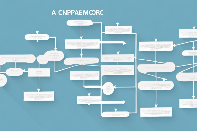
A flow chart is a graphical representation of a process or system that uses symbols to represent the steps of the process. Flow charts typically begin with a start symbol that initiates the process and end with a stop symbol that marks the end of the process. The symbols in between represent the various steps that the process follows. Each symbol is connected by lines that show the flow of the process. Flow charts can be used in a variety of fields, including engineering, business, and education.
One of the benefits of using flow charts is that they can help identify inefficiencies or bottlenecks in a process. By visually mapping out each step, it becomes easier to see where delays or errors may be occurring. This can lead to improvements in the process and ultimately save time and resources. Additionally, flow charts can be used to train new employees on a process or system, as they provide a clear and concise overview of the steps involved. Overall, flow charts are a valuable tool for improving processes and increasing efficiency in a variety of industries.
The Benefits of Incorporating Flow Charts in PowerPoint Presentations
Using flow charts in your PowerPoint presentations has several benefits. Firstly, it makes your presentation more engaging and easier to understand for your audience. Secondly, it helps you organize your ideas and present them in a logical flow. Lastly, it is a valuable tool for analyzing processes and identifying areas for improvement.
Another benefit of using flow charts in PowerPoint presentations is that it can save time. Instead of explaining a complex process or system verbally, you can use a flow chart to visually represent it. This can help you convey information more efficiently and effectively, allowing you to cover more material in less time.
Additionally, flow charts can be customized to fit your specific needs. You can choose the colors, shapes, and symbols that best represent your ideas and make your presentation more visually appealing. This can help you create a more memorable and impactful presentation that resonates with your audience long after it’s over.
Step-by-Step Guide to Creating a Flow Chart in PowerPoint
Creating a flow chart in PowerPoint involves the following steps:
- Open PowerPoint
- Go to the Insert tab and click on the SmartArt button
- Select the Process category and choose a flow chart template
- Enter your text in the text boxes provided
- Customize your flow chart by changing the shapes, colors, and styles
- Add text and labels to your flow chart
- Insert images and icons to enhance your flow chart
- Connect shapes in your flow chart using lines or arrows
- Animate your flow chart to increase engagement
- Save and share your presentation
When creating a flow chart in PowerPoint, it is important to keep in mind the purpose of the chart. Is it meant to explain a process, show a timeline, or illustrate a decision-making tree? Understanding the purpose will help you choose the appropriate template and design elements.
Another important aspect to consider is the audience. Who will be viewing the flow chart? Will they be familiar with the terminology and symbols used in the chart? It may be necessary to provide a legend or key to ensure that the audience can understand the information presented.
How to Choose the Right Flow Chart Template for Your Presentation
Choosing the right flow chart template is important for creating a professional-looking presentation. PowerPoint comes with several built-in templates, but you can also download additional templates from the internet. When choosing a template, consider the purpose of your presentation, the audience, and the style you want to convey.
One important factor to consider when choosing a flow chart template is the level of detail you want to include. Some templates are more detailed and complex, while others are simpler and more streamlined. If you are presenting to a technical audience, a more detailed template may be appropriate. However, if you are presenting to a general audience, a simpler template may be easier to understand.
Another factor to consider is the color scheme and design of the template. You want to choose a template that complements your content and enhances the overall look of your presentation. Avoid templates that are too busy or distracting, as they can take away from the message you are trying to convey.
Customizing Your Flow Chart: Colors, Shapes, and Styles
Customizing your flow chart can make it more visually appealing and help convey your message more effectively. You can change the colors, shapes, and styles of the symbols to match your brand, preferences, or the theme of your presentation. PowerPoint provides several customization options, including shape fill, outline, effects, and layout options.
One important aspect to consider when customizing your flow chart is the use of color. Color can be used to highlight important information, create contrast, and make your flow chart more engaging. However, it is important to use colors that are consistent with your brand or theme, and avoid using too many colors that can be overwhelming or confusing.
In addition to colors, you can also customize the shapes and styles of your flow chart symbols. This can help you create a unique and professional-looking flow chart that stands out from the rest. You can choose from a variety of shapes, such as rectangles, circles, diamonds, and arrows, and apply different styles, such as gradients, shadows, and reflections, to enhance the visual appeal of your flow chart.
Tips and Tricks for Creating Professional-Looking Flow Charts in PowerPoint
To create professional-looking flow charts in PowerPoint, follow these tips and tricks:
- Keep it simple and don’t overcrowd your flow chart with too much information
- Use consistent colors, fonts, and styles throughout your presentation
- Align your symbols and text to create a clean and organized layout
- Use descriptive labels and text to explain your process clearly
- Test your flow chart before presenting it to identify any errors or issues
Another important tip for creating professional-looking flow charts in PowerPoint is to use appropriate symbols and shapes. Choose symbols that are easy to understand and represent the process accurately. You can also customize the shapes to match your company’s branding or style.
Additionally, consider using animation to enhance your flow chart presentation. Animating the flow chart can help to draw attention to important points and make the presentation more engaging. However, be careful not to overdo it with too many animations, as this can be distracting and take away from the message you are trying to convey.
Adding Text and Labels to Your Flow Chart
Adding text and labels to your flow chart is important for clarifying the different steps in your process. Use short and concise descriptions that are easy to understand. Place your labels near the corresponding shapes and use arrows or lines to connect them to create a clear flow.
Another important aspect of adding text and labels to your flow chart is to ensure consistency in the formatting. Use the same font, size, and color for all labels and text to create a professional and cohesive look. Additionally, consider using different shapes or colors for different types of steps in your process to make it easier to follow.
It’s also a good idea to review and revise your text and labels after creating your flow chart. Make sure that each label accurately describes the corresponding step and that the flow of the chart makes sense. You may also want to have someone else review your chart to ensure that it is easy to understand and follow.
Inserting Images and Icons to Enhance Your Flow Chart
Inserting images and icons can make your flow chart more interesting and engaging, especially if you are presenting complex topics. Use relevant images and icons that match your theme or brand and place them near the corresponding shapes. Be careful not to clutter your flow chart with too many images that distract from the main message.
How to Connect and Link Shapes in Your Flow Chart
Connecting the shapes in your flow chart makes it easier to understand the flow of the process. You can connect the shapes using lines or arrows to show the direction of the flow. There is no specific “Link shapes” option in PowerPoint, but you can manually connect the shapes using lines or arrows to indicate the flow of the process.
Animating Your Flow Chart: Simple Techniques for Increasing Engagement
Animating your flow chart can make your presentation more engaging and interactive. Use simple animation techniques like entrances or exits to reveal the symbols as you present. Use a consistent animation style throughout your presentation to avoid distracting your audience.
Sharing and Exporting Your PowerPoint Presentation with Embedded Flow Charts
Sharing and exporting your PowerPoint presentation is important to ensure your audience can access and view it. To share your presentation with embedded flow charts, save it as a PowerPoint presentation or export it as a PDF. You can also share it through cloud storage services like OneDrive or Dropbox.
Troubleshooting Common Issues when Inserting a Flow Chart in PowerPoint
Some common issues when inserting flow charts in PowerPoint include incorrect labeling, inconsistent text formatting, unwanted automatic resizing, and difficulty connecting shapes. To troubleshoot these issues, double-check your labeling and formatting, use the “Lock aspect ratio” option for images and shapes to control resizing, and manually connect your shapes using lines or arrows if you’re having trouble.
Best Practices for Using Flow Charts in Business Presentations
When using flow charts in business presentations, follow these best practices:
- Use flow charts to present complex processes or systems
- Keep your flow chart simple and easy to understand
- Use relevant imagery and icons
- Include descriptive labels and text
- Practice your presentation to ensure a smooth flow
Examples of Great Flow Charts: Inspiration from Top Brands and Thought Leaders
Looking for inspiration for your flow charts? Take a look at some great examples from top brands and thought leaders. Some examples include the customer journey map from Airbnb, the sales process flow chart from Hubspot, and the content marketing strategy flow chart from Moz. These examples can help you create a professional-looking flow chart that effectively conveys your message.
Overall, including a flow chart in your PowerPoint presentation is a valuable tool for conveying complex processes in a clear and organized way. Follow these steps, tips, and tricks to create a professional-looking flow chart that engages and impresses your audience!


