


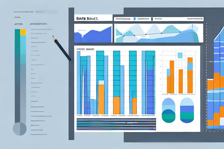
If you’re using Power BI for data visualization, you’re probably familiar with bar charts – one of the main chart types in this software. Bar charts are powerful tools for presenting and comparing data, but their effectiveness depends on how well they’re sorted. In this article, we’re going to dive into the world of sorting bar charts in Power BI.
Table of Contents
Introduction to Power BI Bar Charts
Before we get started, let’s briefly go over what bar charts are and how they work in Power BI. Bar charts are visual representations of data using horizontal or vertical bars to display values. They’re used to compare data across different categories or time periods and are particularly useful for showing changes in data over time. Power BI offers various options for customizing bar charts, such as adding titles, data labels, and legends. However, the way the bars are sorted can significantly impact the chart’s readability and usefulness.
One important thing to keep in mind when creating bar charts in Power BI is the choice of colors. It’s essential to choose colors that are easy to distinguish and don’t clash with each other. Power BI provides a color palette that you can use, or you can create your own custom color scheme. Additionally, you can use conditional formatting to highlight specific data points or categories.
Another useful feature of Power BI bar charts is the ability to drill down into the data. This means that you can click on a specific bar to see more detailed information about that category or time period. This feature is particularly helpful when dealing with large datasets or when you need to analyze data at a more granular level.
Understanding Data Sorting in Power BI
In Power BI, sorting data means arranging it in a specific order, based on one or more criteria. By default, bar charts in Power BI are sorted by the category field, which is usually the X-axis. For example, if you have a bar chart showing sales data for different regions in the US, the bars will be sorted alphabetically by state name. However, this default sorting might not be the most informative or intuitive way to present the data, especially if you want to highlight the top or bottom performers.
One way to customize the sorting in Power BI is to use the “Sort by Column” feature. This allows you to sort the data based on a specific column in your dataset, rather than the default category field. For example, if you have a bar chart showing sales data for different products, you can sort the bars by the total sales amount, from highest to lowest or vice versa.
Another useful sorting option in Power BI is the “Sort Descending” feature. This allows you to reverse the order of the data, so that the highest values appear first. This can be particularly helpful when you want to highlight the top performers or outliers in your data. For example, if you have a scatter plot showing the relationship between advertising spend and sales revenue, you can sort the data by the revenue column in descending order, to see which advertising campaigns had the biggest impact on sales.
Importance of Sorting Bar Charts in Power BI
Sorting bar charts in Power BI can enhance the chart’s visual impact, make it easier to read, and provide a more meaningful insight into your data. By sorting bars in a descending or ascending order, you can quickly identify the best or worst performers, the most significant trends or patterns, and outliers or anomalies. Furthermore, sorting bars can help create a more compelling narrative and support your business decisions or recommendations.
Another benefit of sorting bar charts in Power BI is that it can help you identify data quality issues. For example, if you notice that a bar representing a particular category is significantly smaller or larger than the others, it may indicate a data entry error or inconsistency. By sorting the bars, you can easily spot these issues and take corrective action.
Additionally, sorting bar charts can help you compare data across different time periods or categories. For instance, if you have a bar chart showing sales data for different regions, you can sort the bars by region to see which one has the highest sales. You can also sort the bars by time period to see how sales have changed over time. This can help you identify trends and patterns that may not be immediately apparent when looking at the raw data.
Limitations of Default Sorting in Power BI Bar Charts
While default sorting can be helpful for some situations, it has some limitations that you should be aware of. For example, default sorting is based on one field only, which may not be sufficient if you need to sort the data by multiple criteria. Also, default sorting does not take into account the value of the bars, which can be problematic if you want to sort them by importance or impact. Finally, default sorting can produce inconclusive or misleading results if your data has outliers or extreme values.
Another limitation of default sorting in Power BI bar charts is that it does not allow for custom sorting. This means that if you have a specific order in which you want the bars to be displayed, you will need to manually sort them or use a different visualization. Additionally, default sorting can be affected by the data type of the field being sorted. For example, if you are sorting by a date field, the default sorting may not be in chronological order.
It is important to note that while default sorting may have its limitations, there are ways to work around them. Power BI offers various sorting options, such as sorting by multiple fields or sorting by a custom order. Additionally, you can use measures or calculated columns to create new fields that take into account the value of the bars or adjust for outliers. By understanding the limitations of default sorting and exploring alternative options, you can create more effective and informative bar charts in Power BI.
How to Sort Bar Chart by Value in Power BI
If you want to sort Power BI bar charts by value, you have a few options. One way is to use the sort descending or sort ascending buttons that appear when you select the visual. This method will sort the bars based on their corresponding values, from highest to lowest or vice versa. Another way is to use the dropdown menu under the values field in the Fields pane. From there, you can choose to sort the data in ascending or descending order, or by other criteria, such as a custom column or a measure.
Additionally, you can also sort the bar chart by a specific category or field. To do this, select the visual and go to the Format pane. Under the X-axis section, you can choose the field you want to sort by and select the sort ascending or sort descending option. This will rearrange the bars based on the selected field.
It’s important to note that sorting a bar chart can affect the overall message and interpretation of the data. Make sure to consider the context and purpose of the chart before deciding on a sorting method. For example, sorting by value may highlight the top performers, but sorting by category may emphasize the differences between groups.
How to Sort Bar Chart by Category in Power BI
Sorting bar charts by category is the default option in Power BI, but you can still customize it to suit your needs. To sort bars by category, select the visual and click on the dropdown menu under the Category field in the Fields pane. You can choose to sort the data in ascending or descending order, or by other criteria, such as a custom column or a measure. You can also drag and drop the values under the Legend/Area field in the Fields pane to create subcategories and sort them accordingly.
How to Sort Bar Chart by Custom Order in Power BI
If you want to sort Power BI bar charts by a custom order, you can use the “Sort by Column” option. This method allows you to sort the bars based on a specific column in your data, such as a lookup or a reference table. To do so, create a new column in your data that contains the desired sorting order, and then select the visual and click on the dropdown menu under the Category field in the Fields pane. From there, choose the “Sort by Column” option and select the custom column you created.
Advanced Sorting Techniques for Power BI Bar Charts
Beyond the basic sorting options, Power BI offers some advanced sorting techniques for bar charts. One of them is sorting by a measure, which allows you to sort the bars based on a calculated value, such as a percentage or a deviation from the average. Another technique is sorting by a hierarchy, which enables you to sort the bars based on a parent-child relationship between categories. For example, if you have a bar chart showing sales data by product and region, you can sort the bars first by region and then by product.
Tips and Tricks for Effective Visualization with Sorted Bar Charts in Power BI
While sorting bar charts can help make them more informative and engaging, there are some tips and tricks you can use to take your visualizations to the next level. For instance, you can add data labels to the bars to show the exact values and make comparisons more comfortable. You can also add reference lines, such as averages or targets, to the chart to provide context and support your analysis. Finally, you can use colors to highlight specific bars or groups of bars and guide the viewers’ attention.
Best Practices for Sorting and Presenting Data with Power BI Bar Charts
Sorting and presenting data with bar charts in Power BI is not only a matter of technical skills but also a matter of good design and communication. To create effective and compelling bar charts, you should follow some best practices, such as using clear and concise titles and labels, avoiding clutter and redundancies, and focusing on the most critical points. Also, you should consider your audience’s needs and preferences and adjust the chart’s style and format accordingly.
Troubleshooting Common Issues with Sorting Bar Charts in Power BI
If you encounter any issues with sorting bar charts in Power BI, you can try some troubleshooting techniques. For example, if the bars are not sorting correctly, check if the sorting criteria are set correctly, and if there are any conflicting values or expressions. If the bars are sorting in the wrong direction, make sure you selected the right option (ascending or descending). If you’re using a custom sort order, double-check if the column is correctly formatted and if the data types match.
To sum up, sorting bar charts in Power BI is an essential skill for creating meaningful and impactful visualizations. By following the tips and techniques we discussed in this article, you can make sure your bar charts convey the message you want to deliver and support your data analysis and decision-making processes.


