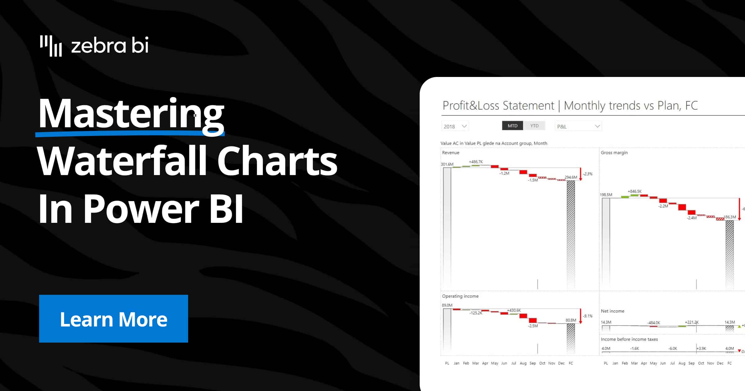
Mastering Advanced Power BI Waterfall Charts (The Easy Method)
PRO Trial
Advanced Power BI waterfall charts are essential tools in financial analysis, as they provide a clear way to visualize how values change step-by-step over time or between categories.
Finance teams love them because they make it easier to analyze variance, contribution margins, and overall performance at a glance. Everyone else loves them because they make things easy to understand, regardless of your department or expertise.
While Power BI has a built-in method for creating waterfall charts, its functionality is sometimes limited by too much manual work needed, and not enough visualization flexibility.
Fortunately, there's a solution to all that. Keep reading and find out more.
The basics: what is a waterfall chart?
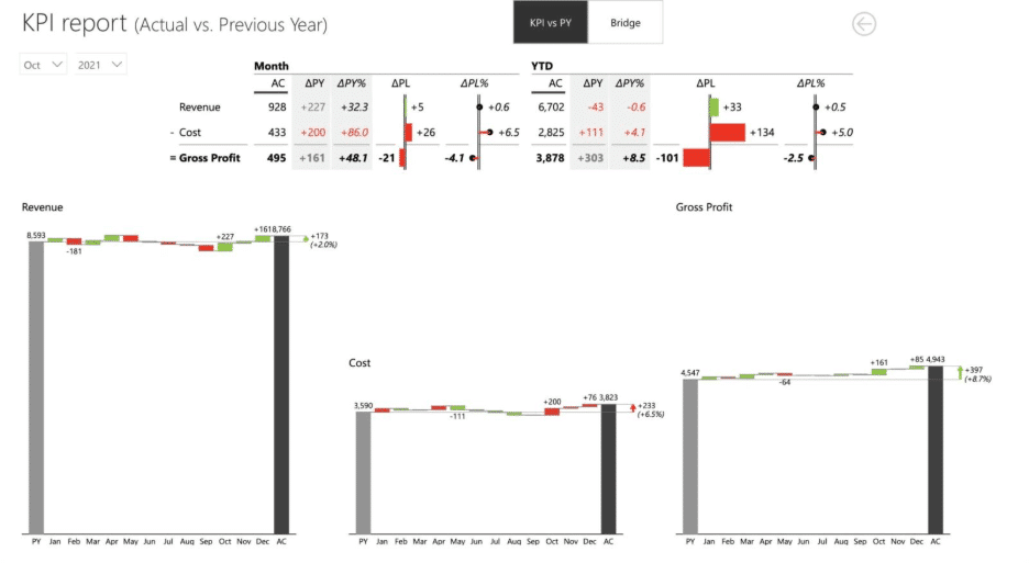
A waterfall chart is a type of data visualization that shows how an initial value, such as revenue, is affected by different factors (both positive and negative) before arriving at a final value.
Finance professionals use them for tasks like budget vs. actual analysis, variance analysis, and contribution margin breakdowns. They’re incredibly useful for storytelling with data, making complex trends and insights easy to understand.
If you want to learn more about waterfall charts, we have a guide that covers waterfall charts from a use case perspective and provides you with best practices for financial teams.
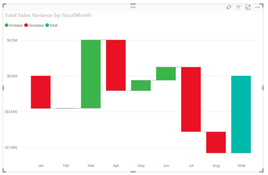
Creating a basic waterfall chart with Power BI’s native method
Power BI offers a built-in waterfall chart option, which allows users to create basic visualizations. Here’s a quick step-by-step guide:
- Load your data into Power BI.
- Select the “Waterfall Chart” visual from the visualizations pane.
- Add fields for a category column (e.g., months, departments), breakdown values, and totals.
- Customize formatting options, like colors and labels.
Limitations of Power BI’s native method
While Power BI’s native method works for simple use cases, it struggles with more advanced scenarios. Compared to Zebra BI, the native method shows several key limitations:
- Rigid design: The native chart lacks flexibility. You can’t display relative variances as pin charts or position them responsively above/next to the waterfall using just one visual. Zebra BI’s responsive design makes complex variance analysis far clearer.
- Complex calculations: In Power BI, advanced variance analysis requires creating custom DAX measures. Zebra BI automates both absolute and relative variances — no DAX needed.
- Limited variance comparisons: Native charts only allow a single variance view. Zebra BI enables multi-variance comparisons (e.g., PY vs AC and FC + PL vs AC and FC) in one chart, giving users full context at a glance.
- No automatic start/end values: Power BI requires manual workarounds to highlight opening and closing balances, while Zebra BI automatically calculates and visualizes them.
- Missing storytelling features:
- No small multiples for comparing multiple entities side by side.
- No comment markers for adding context directly inside charts.
- No difference highlights to emphasize changes between elements.
- No option to invert variance colors for financial reporting standards.
- Lack of IBCS compliance: Native visuals don’t follow international business communication standards. Zebra BI charts are fully IBCS-certified, ensuring clear, standardized reporting across the organization.
Creating a Waterfall Chart with Zebra BI
Advanced waterfall visuals in Power BI are even faster and more effortless when you use Zebra BI. Follow these steps to get started:
- Install Zebra BI: Download Zebra BI for Power BI directly from Microsoft AppSource.
- Add Zebra BI to your report: Insert the Zebra BI Charts visual into your Power BI report.
- Set up your data: Drag your category field into the Category placeholder and your value fields into the Values placeholder.

- Select waterfall chart (the Waterfall option will be displayed as the first option, right after adding fields to their respective placeholders)
- Automatic variance calculations: Zebra BI applies variance calculations automatically—no DAX measures/ coding needed!
Finance teams from Heijmans and Abbott use Zebra BI charts because it provides them with:
- Automatic variance calculations save time and effort.
- Horizontal waterfalls make the most of your report space.
- Small multiples let you easily compare regions, products, or periods.
- IBCS-compliant formatting ensures clear and professional visuals.
Want to see how Zebra BI's custom visuals and features can help your Finance team? Read more about how Heijmans turned a once-slow financial reporting process into a mean, lean, data visualization insights generation machine for the entire company
Real-life applications for waterfall charts in finance
Waterfall charts shine in financial analysis, precisely because they provide the visual aids your team needs to share the full data story with the rest of the organization.
Here are some examples of how Zebra BI elevates these use cases, specifically for this chart type:
Variance analysis
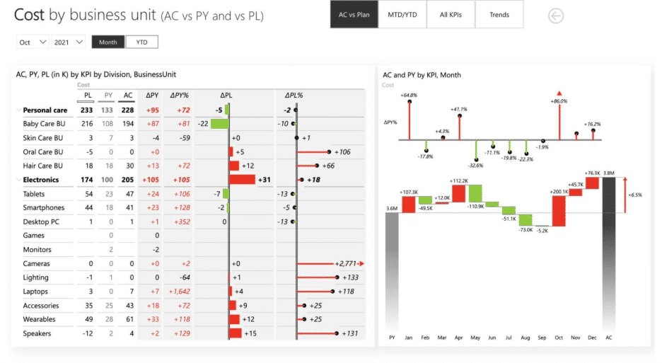
From now on, when you create a Profit and Loss statement, you can dive into the specific factors that influenced overall performance changes. Analyze cost increases, revenue growth, or other key elements that contributed to the variances.
Understanding these factors helps pinpoint opportunities for improvement and areas requiring attention. Use this analysis to guide better decision-making and strategic planning.
Budget vs. actual comparison
Compare your organization's budgeted figures to actual outcomes to identify areas of overperformance or underperformance. This comparison provides valuable insights into financial efficiency, helping you understand where resources were effectively utilized and where adjustments are needed. It’s a critical step for refining future budgets and improving financial accuracy.
Contribution margins
Break down profits or revenues in your P&L statements by category to understand the specific impact of each contributor. Whether it’s a product line, service, or business unit, examining contribution margins allows for a clearer view of what’s driving profitability. This level of detail supports better allocation of resources and sharper focus on high-performing segments.
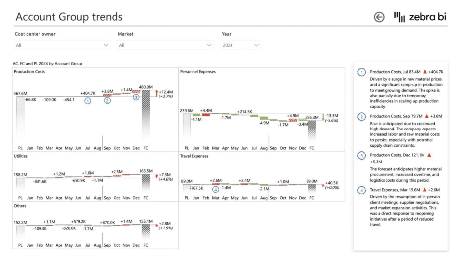
Extra features: horizontal waterfall charts & small multiples
Zebra BI goes beyond the basics by offering horizontal waterfall charts, which are perfect for wider datasets, and small multiples, allowing you to compare multiple charts side by side. These features enable you to create custom visuals easily and uncover trends and insights that would be impossible to visualize with Power BI’s native tools.
Power BI vs. Zebra BI: Which one's right for you?
On its own, Power BI provides you with basic functionalities to get by and create waterfall charts that do help you create statements and reports that share a decently-detailed data story.
However, Zebra BI brings it to the next level: it makes it not just easier, but also incorporates horizontal charts, small multiples, and a professional and polished look for your custom visuals:
- Automatically calculated relative and absolute variances (and there's no need for DAX)
- Multi-tier chart and responsive design: relative variances displayed as pin chart above or next to the waterfall chart
- Multi-variance comparison: comparison to PY PL vs AC and FC in one chart
- Automatic visualization of initial and ending value
- Small multiples
- Comments with comment markers
- Difference highlight
- Invert variance color
- IBCS compliance
| Capabilities | Power BI Native Method | Zebra BI |
| Ease of use | Basic, requires DAX for advanced scenarios | Automated variances and intuitive setup |
| Flexibility | Limited formatting and customization | Highly flexible, responsive design, pin charts, and multi-tier views |
| Advanced variance analysis | Single variance view only, manual measures needed | Automatic absolute & relative variances, multi-variance comparison |
| Storytelling | Very limited (no small multiples, comments, or highlights) | Rich storytelling with small multiples, comments, highlights, and inverted colors |
| Automatic start/ end values | Not available (manual workaround needed) | Fully automatic |
| IBCS compliance | Not compliant | Fully IBCS-certified |
| Scalability for analysis | Works only for simple cases | Suitable for advanced financial reporting and multi-scenario analysis |
Real-World Example: Budget vs. Actual Analysis
A finance team at a multinational services company was asked to review Forecast vs. Actual performance across several business units. Executives wanted to see how the quarter unfolded compared to both the planned budget and the previous year, and they needed clear visibility into the drivers of deviations.
Using Power BI’s native waterfall chart, the team managed to display the variance against forecast, but the analysis was fragmented. Each baseline (Plan, Forecast, Previous Year) required a separate chart, and explaining relative variances meant building additional DAX calculations. The final presentation left leadership with numbers on slides but little clarity on what truly drove performance.
When the team shifted to Zebra BI, they were able to consolidate the entire analysis into a single, interactive waterfall chart:
- Multi-variance comparison displayed Actual vs. Forecast, Plan, and Previous Year together, eliminating the need for multiple visuals.
- Automatic variances (absolute and relative) were generated instantly, saving hours of manual measure building.
- Difference highlights and inverted colors made unfavorable results in labor costs and procurement expenses stand out immediately.
- Comment markers allowed the team to annotate extraordinary events, like a one-time technology investment.
- The visuals adhered to IBCS standards, which gave executives a consistent, easy-to-read format across all regions.
The outcome was striking: the finance team cut report preparation time in half, executives quickly identified where corrective actions were needed, and the conversation shifted from reconciling figures to discussing concrete strategies. What began as a routine quarterly check-up turned into a proactive planning session, powered by Zebra BI’s waterfall capabilities.
Ready to make your waterfall charts better and easier?
If you’re tired of the limitations of Power BI’s native waterfall charts, it’s time to try Zebra BI. With its ease of use, advanced features, and professional design, Zebra BI empowers you to create powerful visuals that tell your data’s story.
Start your free Zebra BI trial today and see the difference for yourself!
FAQ
Can I create a waterfall chart in Power BI without Zebra BI?
Yes, but native charts have significant limitations for finance use cases.
Does Zebra BI support both vertical and horizontal waterfalls?
Absolutely — you can switch between them instantly.
Can I use Zebra BI’s small multiples with waterfalls?
Yes, it’s one of the most powerful features for comparing multiple entities.