A good Power BI dashboard is actionable. It does more than just display data and let you figure things out on your own. It guides your attention, highlights issues or opportunities, and tells a story that your team can turn into decisions.
When BI dashboards show numbers without context, comparisons with no relevant context, or charts that look nice in a meeting but don’t tell anyone what to do next, you’re paying for data you can’t act on.
Usually, the problem isn't a lack of data but how you’ve designed your dashboards.
These Zebra BI dashboard examples are all built around one question: What should we do next?
In this guide, you'll find 20+ real-world Power BI dashboard examples from leading teams across sales, finance, HR, manufacturing, and more. Each example comes with design insights and a free downloadable template, so you can put it to work immediately.
I had no Power BI knowledge prior to taking the role. I found Zebra BI early on, and once I used the trial, I built a report in half a day, and it was infinitely better than what I had done with base Power BI.
Author
Shane Brinkmann, Business Analyst, W.L. Gore
If you are a visual type of the person, let us guide you through some of the reports in this video.
Start your FREE Trial with expert onboarding
We don't just give you examples - we teach you how to use them like a pro.
Your trial includes:
✓ Full access to all Zebra BI features
✓ Guided onboarding program
✓ Access to all 12 examples from this page
✓ Video tutorials, guides, and implementation support
Important note
All of our examples of Power BI dashboards are specifically designed to clearly answer the 4-Question Insight Test:
1. Is the performance of my Power BI report good or bad? 2. How good/how bad? 3. Why? 4. What should we do about it?
Now, let's take a look at some of the best Power BI dashboards.
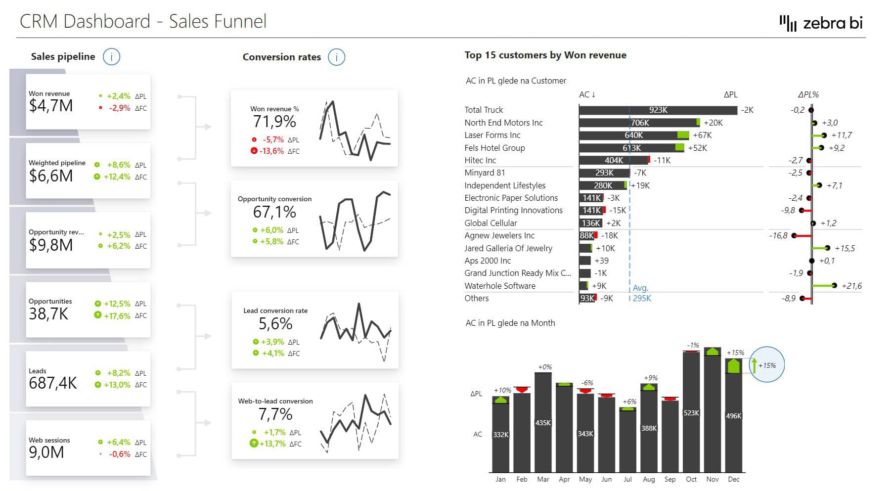
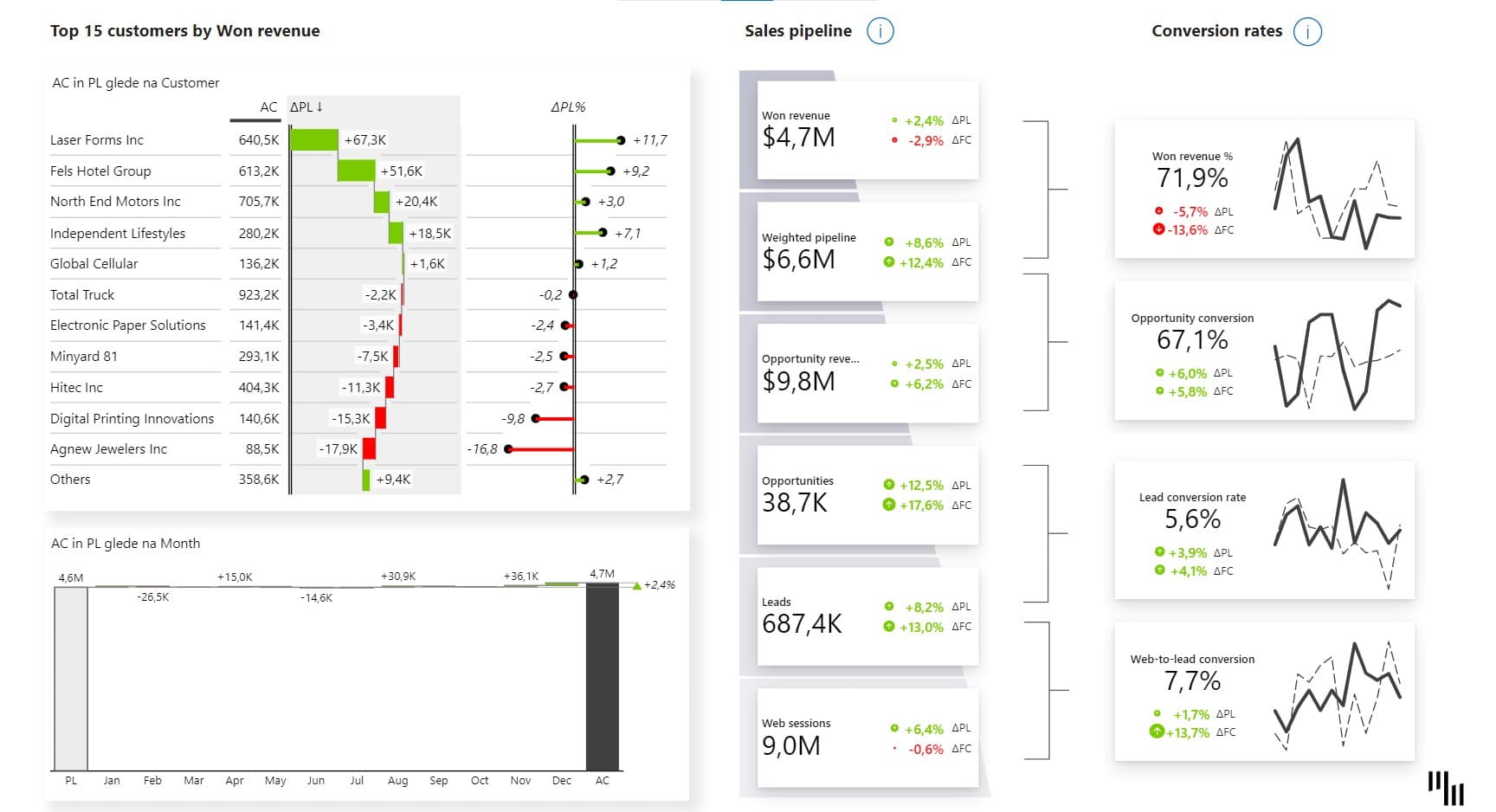
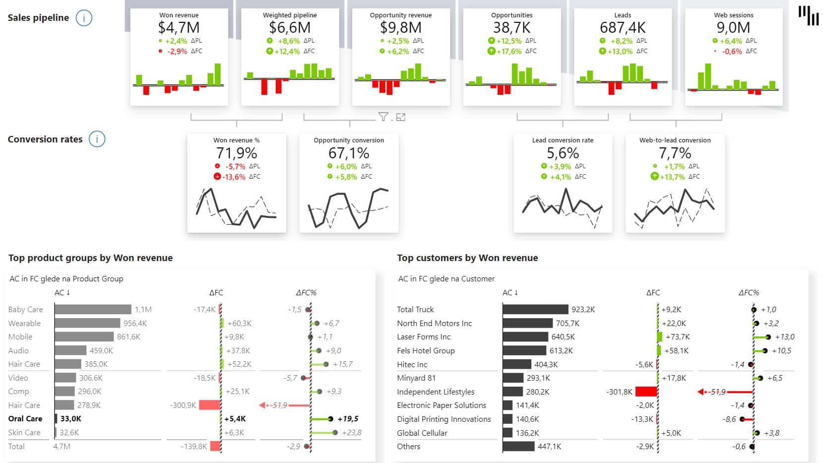
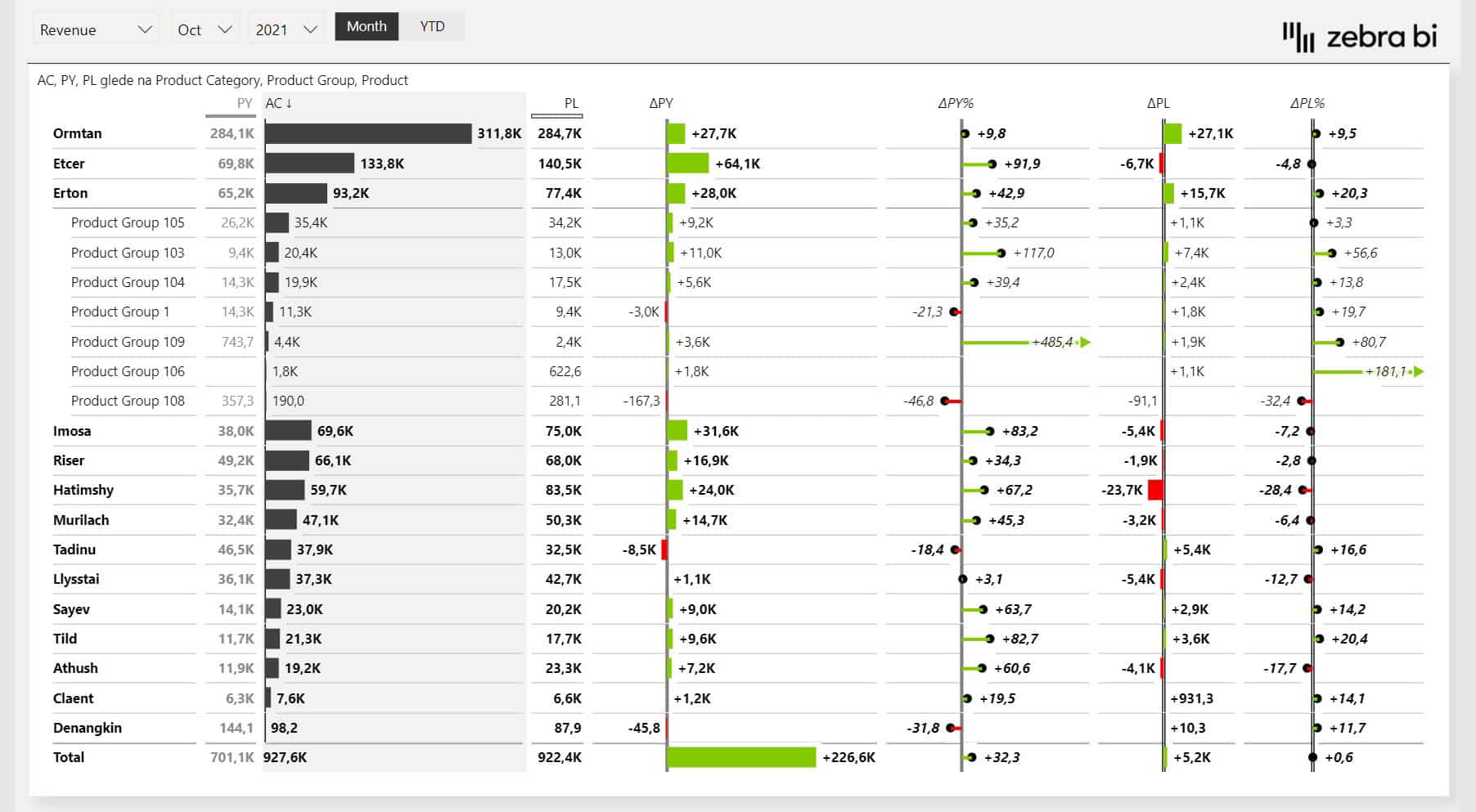
1. Sales Funnel Power BI Template
The Sales Funnel template for Power BI brings together your most important sales funnel KPIs on a single page and lets you interact with them. It helps you track the connections between them, provides insights into your sales funnel performance, and helps you understand your pipeline instantly.
Additionally, it highlights the comparisons between actuals and plans, so you know exactly how you are doing and adjust your plan.
This is one of the best Power BI dashboards for understanding exactly where deals are won, lost, or stuck. So, it’s a must-have tool for sales managers, sales employees, and senior management.
You can use this dashboard to pinpoint the sales areas you need to focus on. You might notice you're successful at creating leads but are having a hard time turning them into opportunities. This dashboard will help with your sales performance reporting and also help you find efficiency opportunities by highlighting where you can improve.
This is one of our most actionable Power BI dashboard examples. It uses the new Zebra BI Cards visual with conversion rates, where the second column of cards displays conversions, such as opportunity conversion, lead conversion rate, and web-to-lead conversions.
Zebra BI cut our dashboard creation time in half - and made the results easier to present to leadership.
Author
Sr. Financial Analyst, Abbott
In addition to Zebra BI Cards, the template also includes Zebra BI Tables and Charts. These visuals are excellent for conducting structural analyses, such as customer and product analysis, as well as time-series analysis of performance drivers.
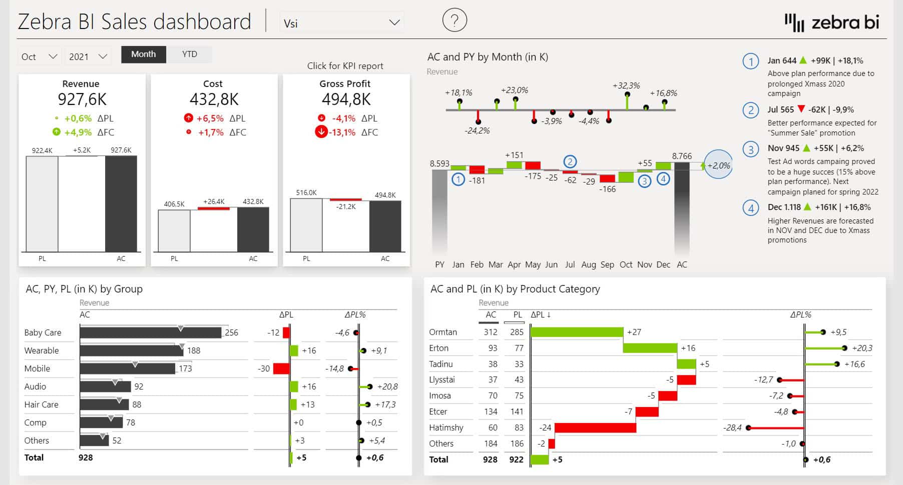
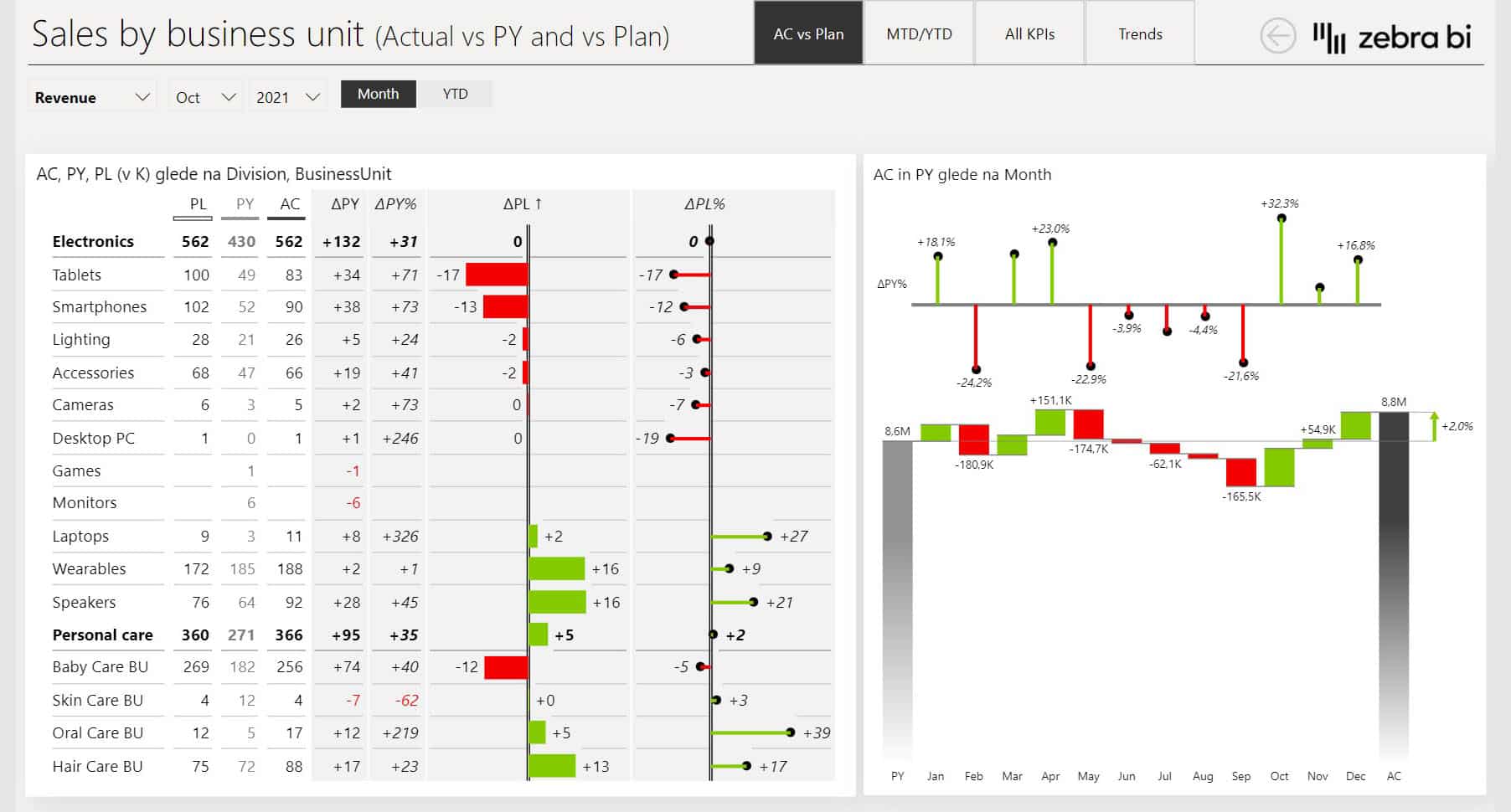
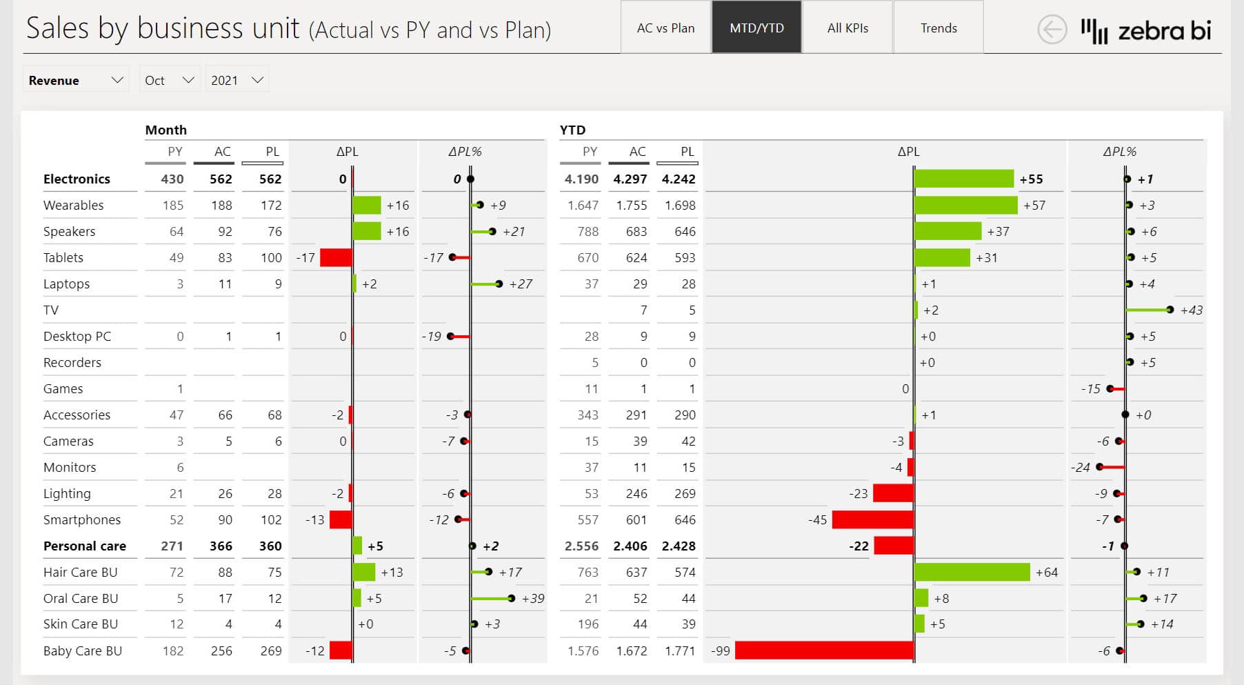
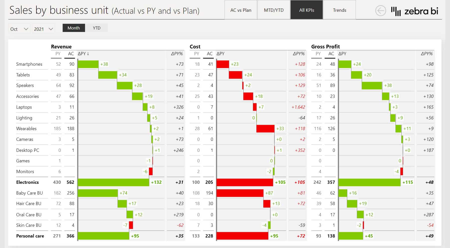
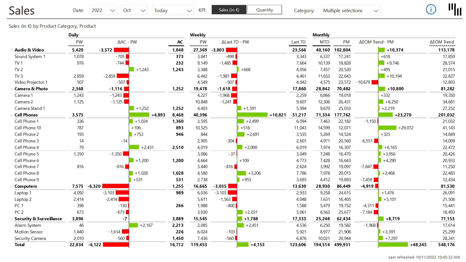
The Sales Dashboard gives you a complete picture of your sales performance without having to go through multiple reports or leave the page.
t’s one of the best Power BI dashboards for sales managers who need a fast, reliable read on performance without digging through raw data.
You can use it to cut reporting time and still deliver the information depth your leadership wants. It comes prebuilt with everything from drill-throughs to N charts, so you spend less time manually configuring it and more time analyzing the data.
The Power BI dashboard calculate variances and handle most of the formatting out of the box by using Zebra BI Tables, Charts, and Cards.
Our financial landing page at KPN is completely based on the sales dashboard template.
Author
Planning & Controlling Director at KPN
Features such as tooltips or drill-throughs work within the visuals, so you can switch between different perspectives of your sales data without extra configuration.
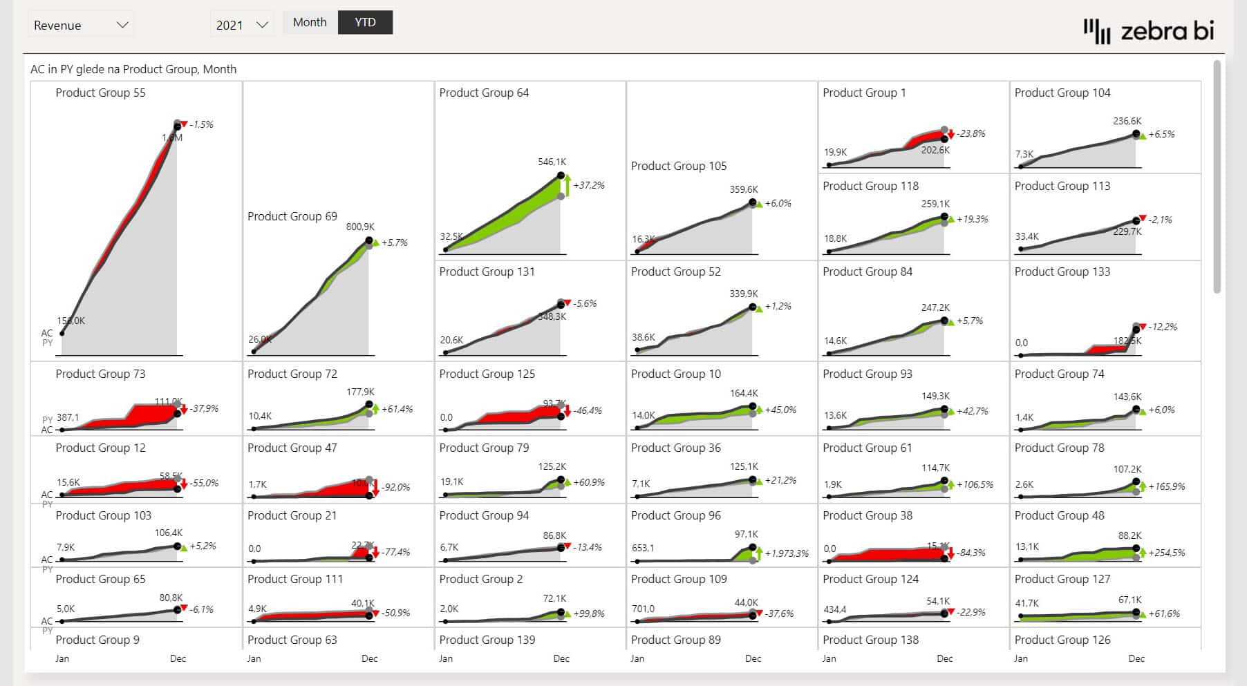
One standout feature is the Top N functionality, which highlights the most impactful product categories or groups while decluttering the dashboard. This cuts the noise by keeping the focus on the elements that influence the bottom line.
Unlike traditional setups that often rely on complex and advanced DAX code, Zebra BI visuals minimize the need for such complexity by offering intuitive solutions out of the box.
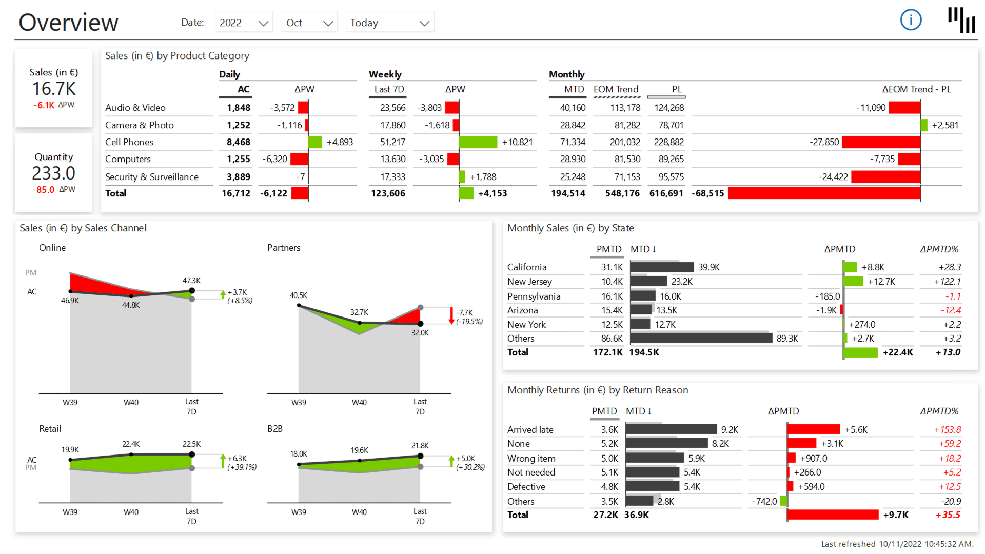
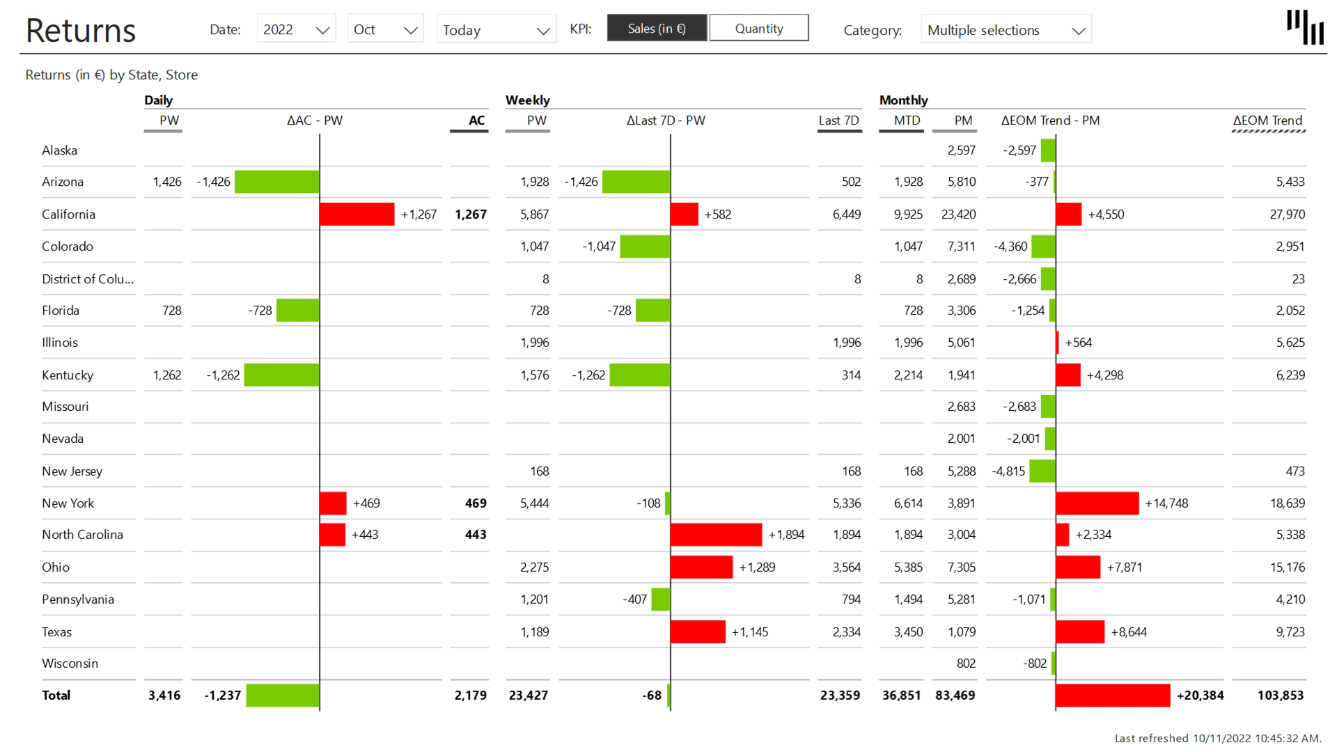
Every time you open this dashboard, you'll know exactly how you perform on a daily, weekly, and monthly timeframe, without manually updating a single thing. You save time and stay on top of your numbers by checking your sales and returns or analyzing trends.
This is one of the best Power BI dashboards for C-level executives who need a daily read on sales performance, and for sales managers who want the full picture with the option to dig into details.
You can switch between Sales and Quantity views, track end-of-month forecasts based on current trends, and switch to dedicated pages for more detailed information.
From building one report that everyone could use, we saved about one to two annual analysts' worth of time across all of our teams.
Author
W.L. Gore & Associates
The Overview shows you the following categories:
Today: No need to manually change the date, each refresh will pull the latest data and show you today's values.
Your KPIs: On the top left, you can see today's values for two KPIs: Sales and Quantity. Clicking on them switches all the other charts between Sales (default) and Quantity.
3 timescales: The table at the top shows Daily, Weekly, and Monthly data.
EOM Trend: An automatically calculated end-of-month forecast
Last 7 Days: This makes the charts much more actionable because each data point accounts for exactly 7 days. With International Business Communication Standards (IBCS) implemented out of the box, critical metrics like sales figures are presented clearly and effectively.
The Daily sales Zebra BI dashboard also reduces the number of measures analysts need to write, saving time on setup and maintenance.
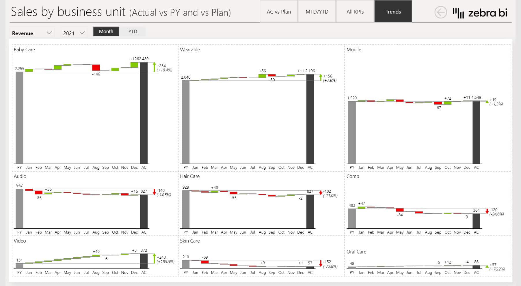
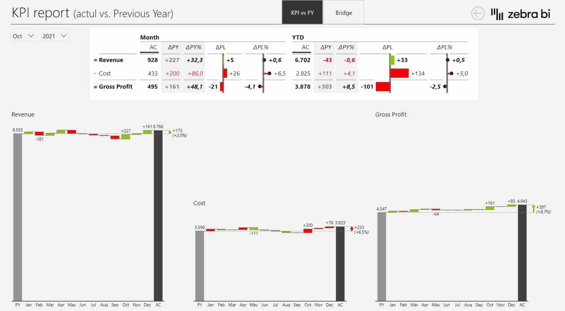
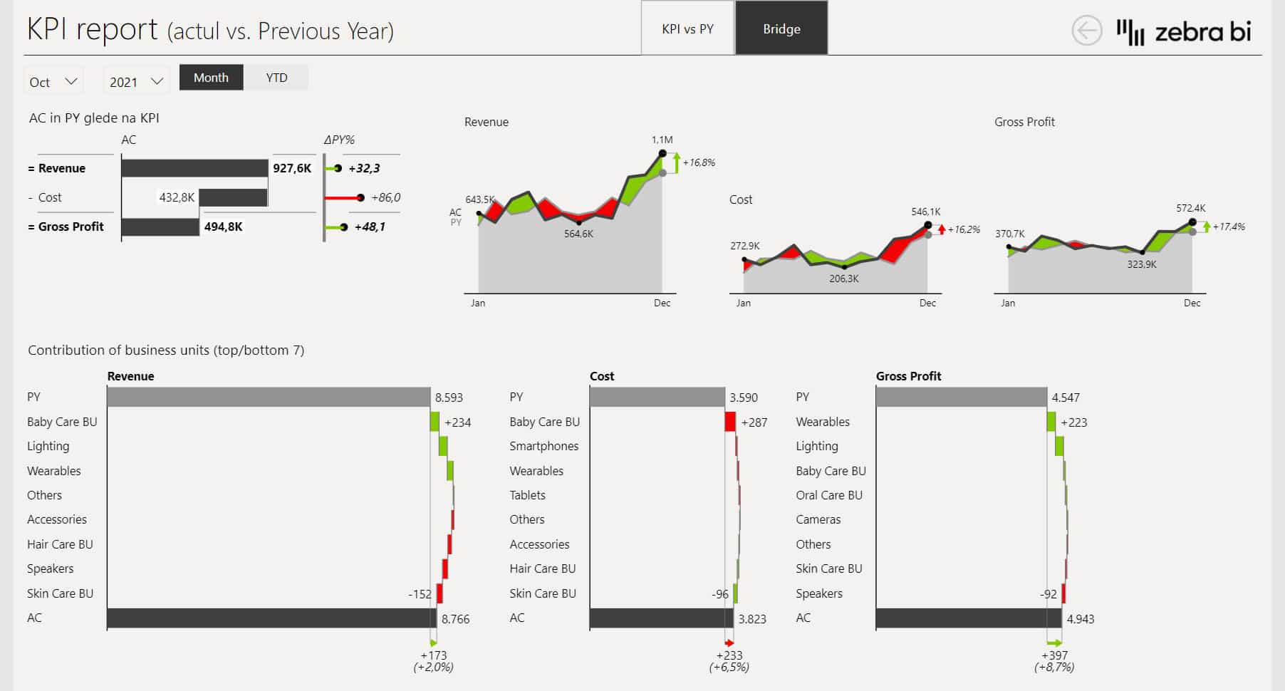
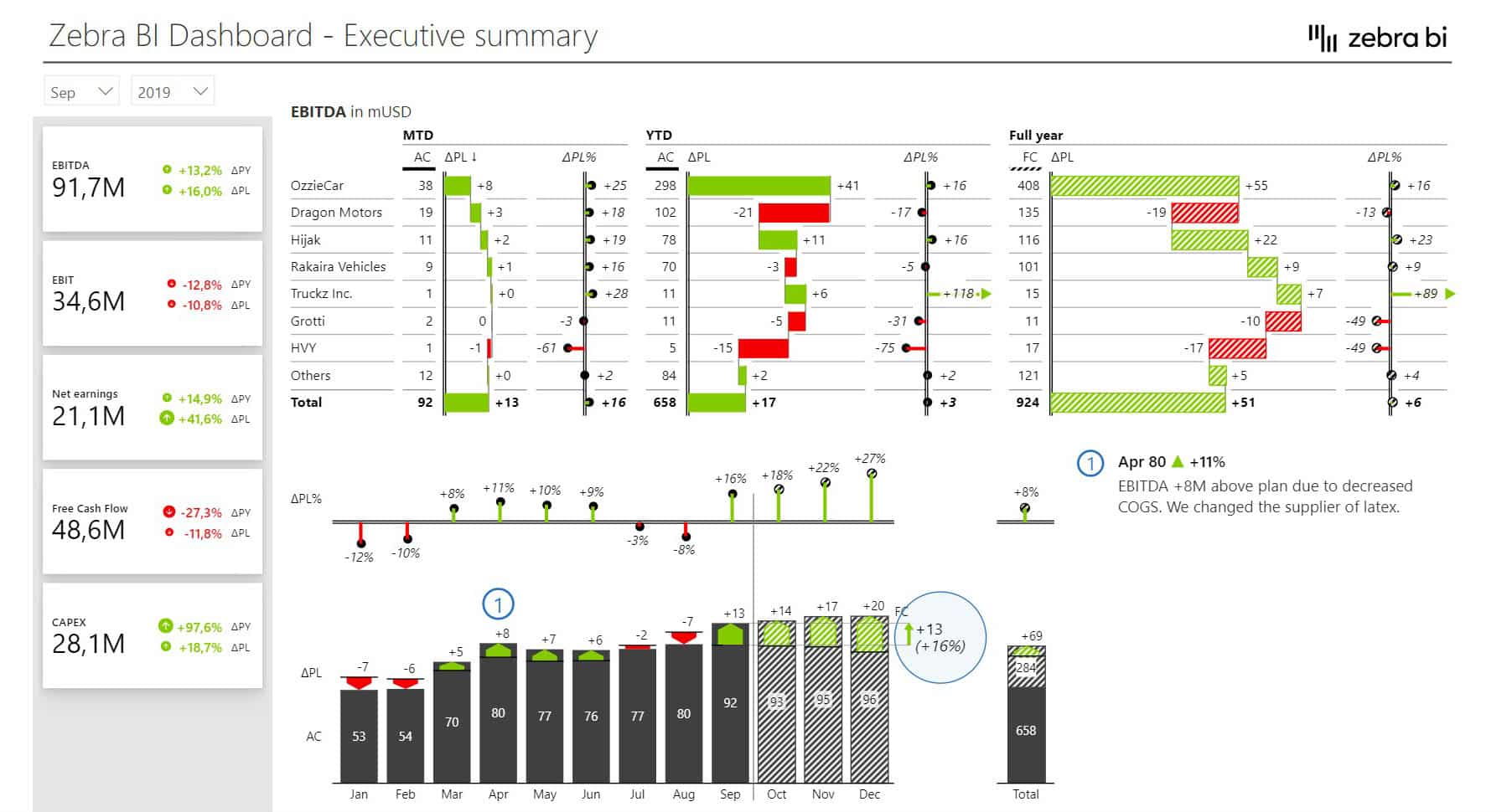
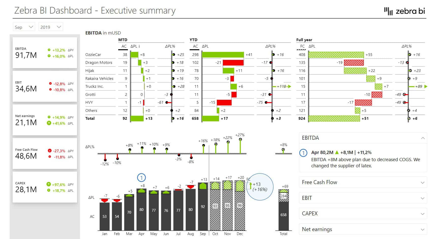
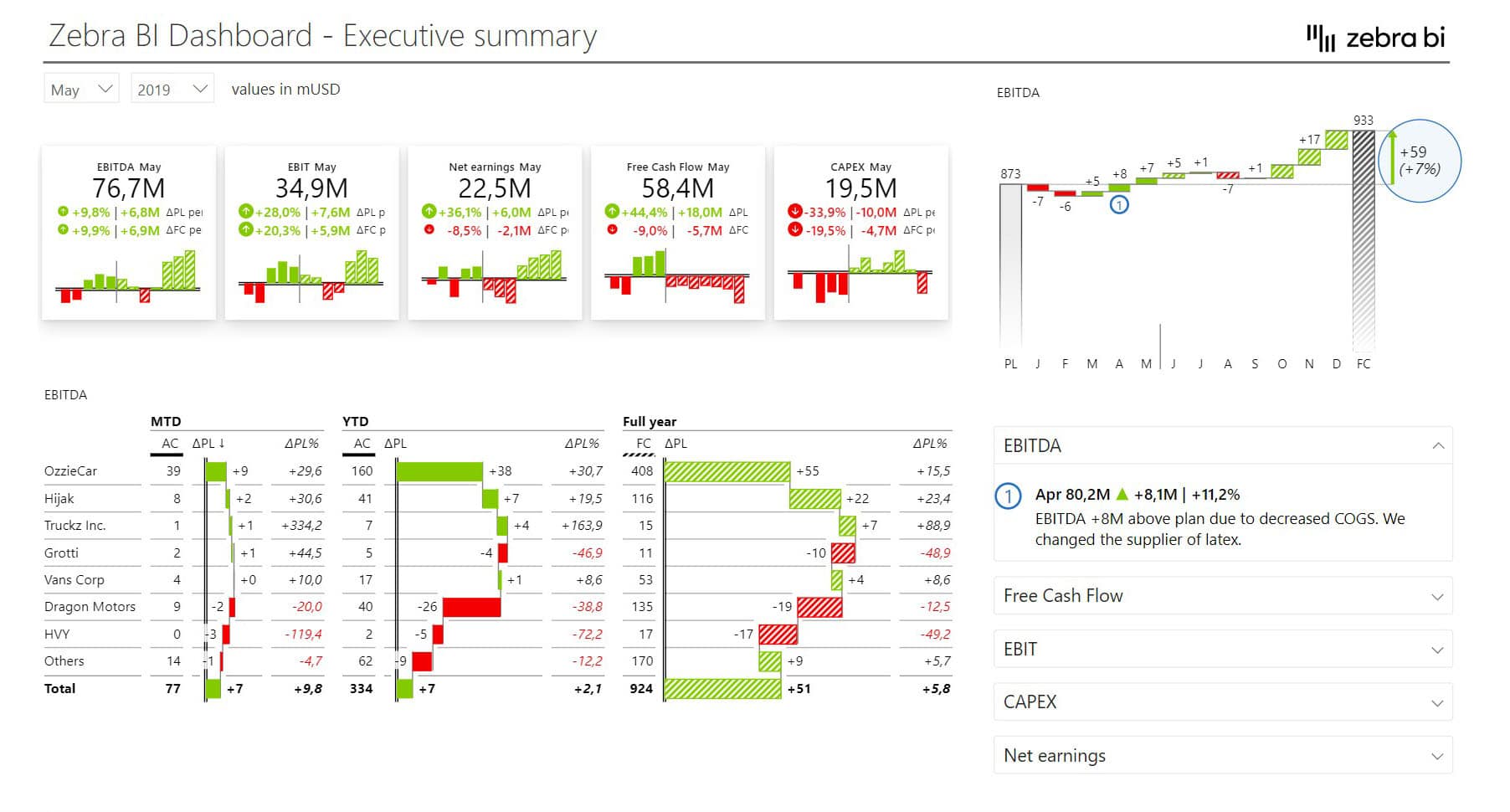
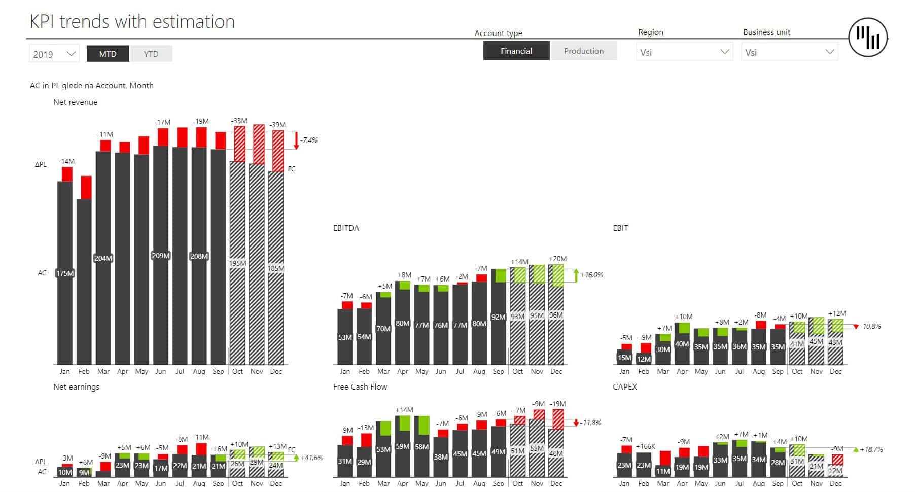
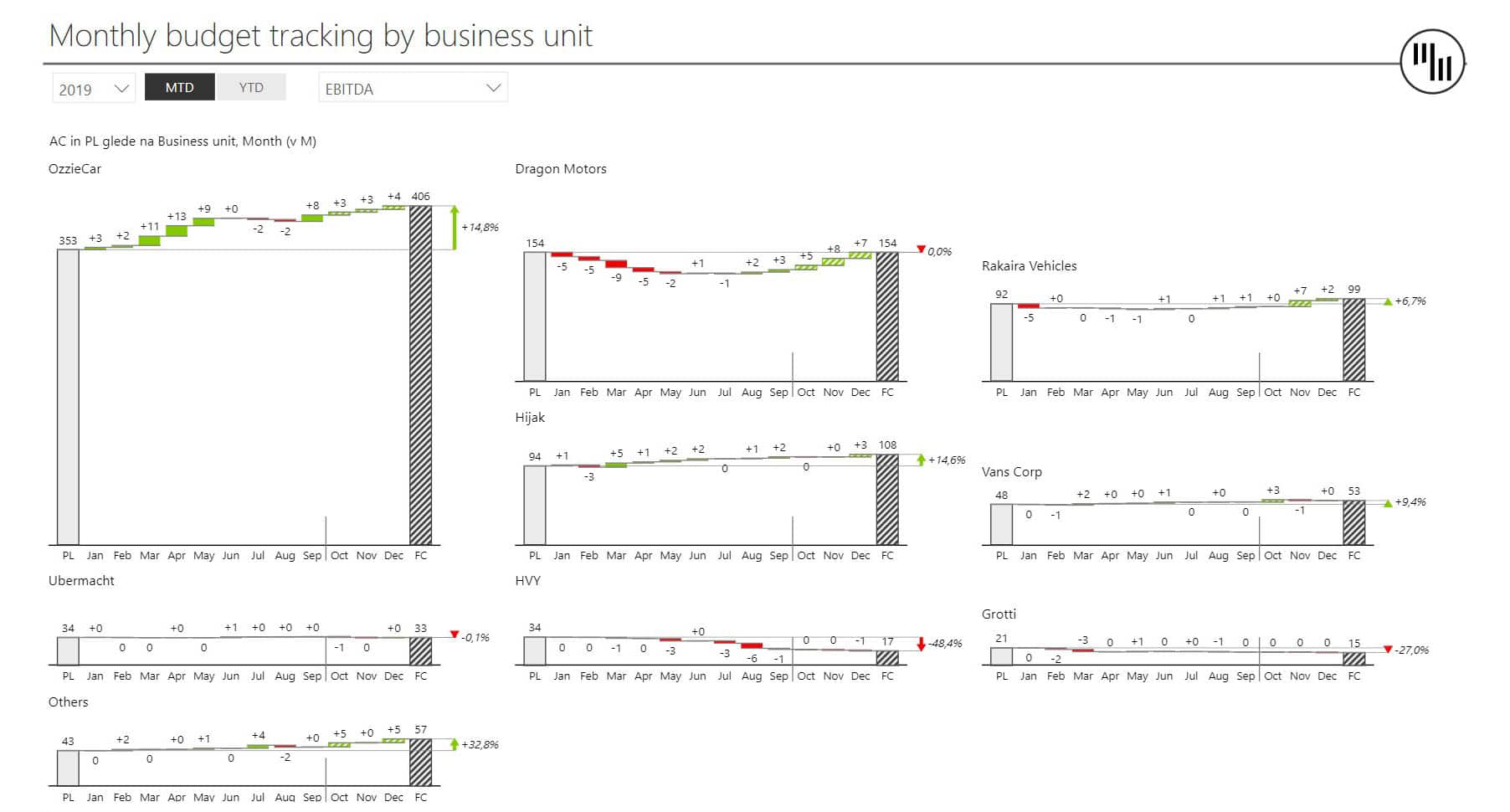
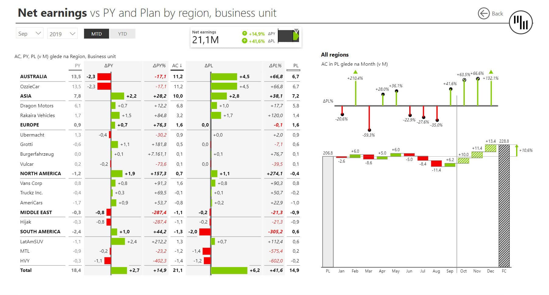
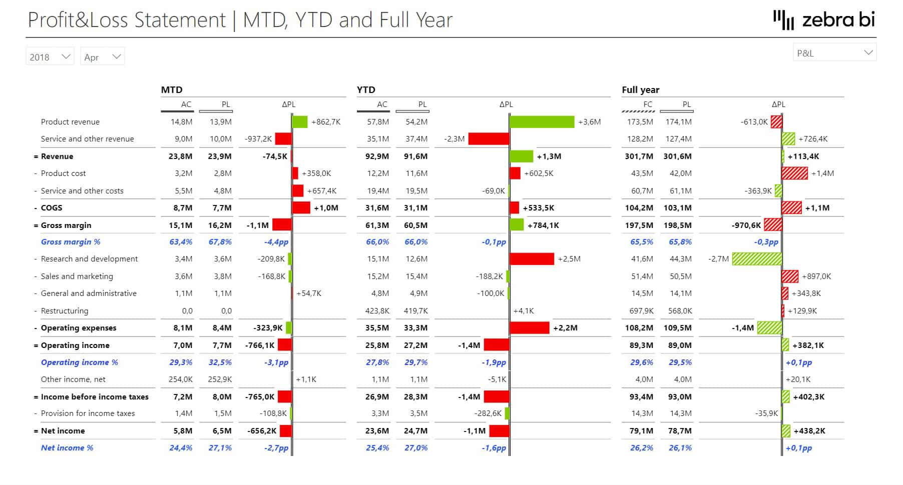
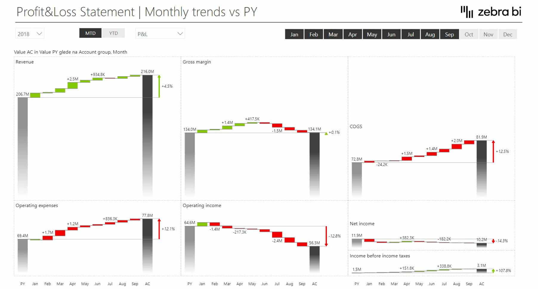
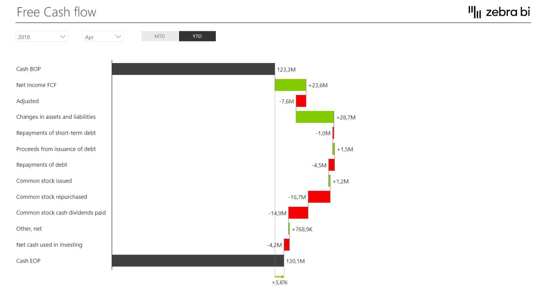
The Consolidated Financial template is designed to help you create a clear overview of financials for the management team. And it has a simple way to do that through waterfall charts, as they’re a great tool to show individual positive and negative contributions between a starting and ending value.
This Power BI dashboard is designed for executives who need to walk into a meeting with a clear picture of where the business stands and why.
It integrates month-to-date, year-to-date, and full-year data in one place, making it easy to spot trends, compare performance across business units, and drill into the individual factors behind any number.
Our CFO stopped using other tools and now lives in the Zebra BI dashboard for meetings.
Author
W.L. Gore & Associates
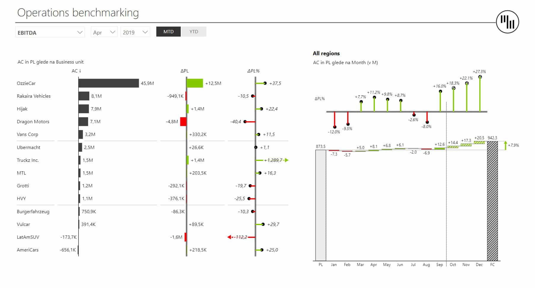
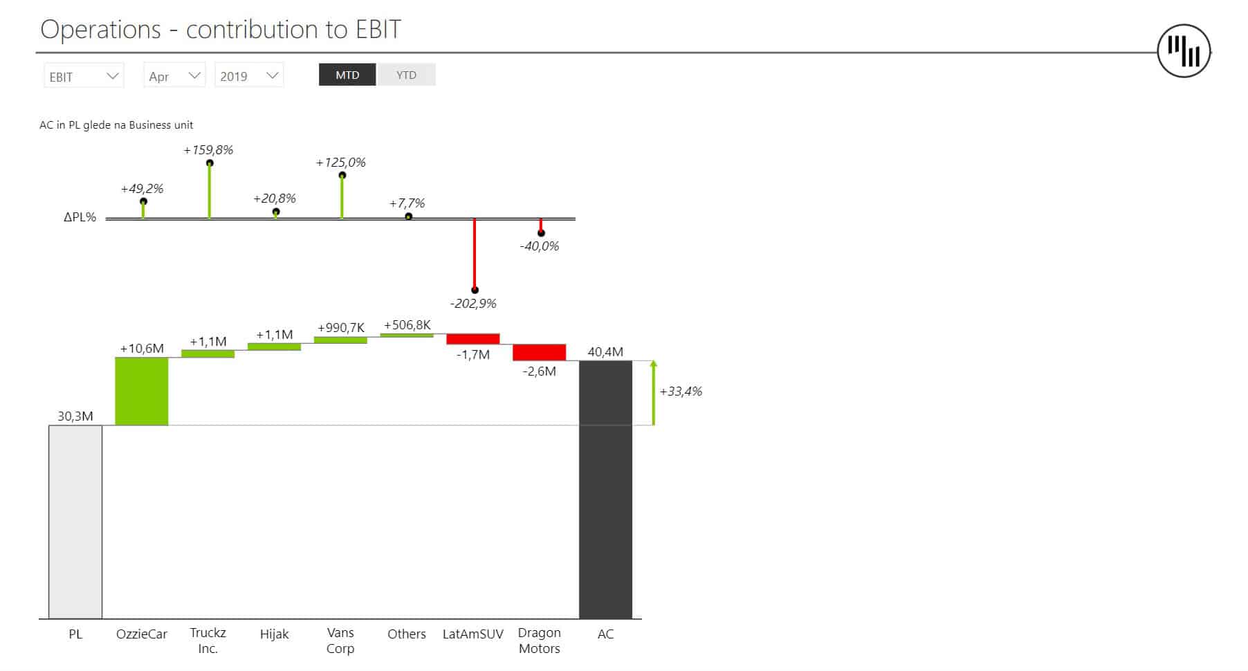
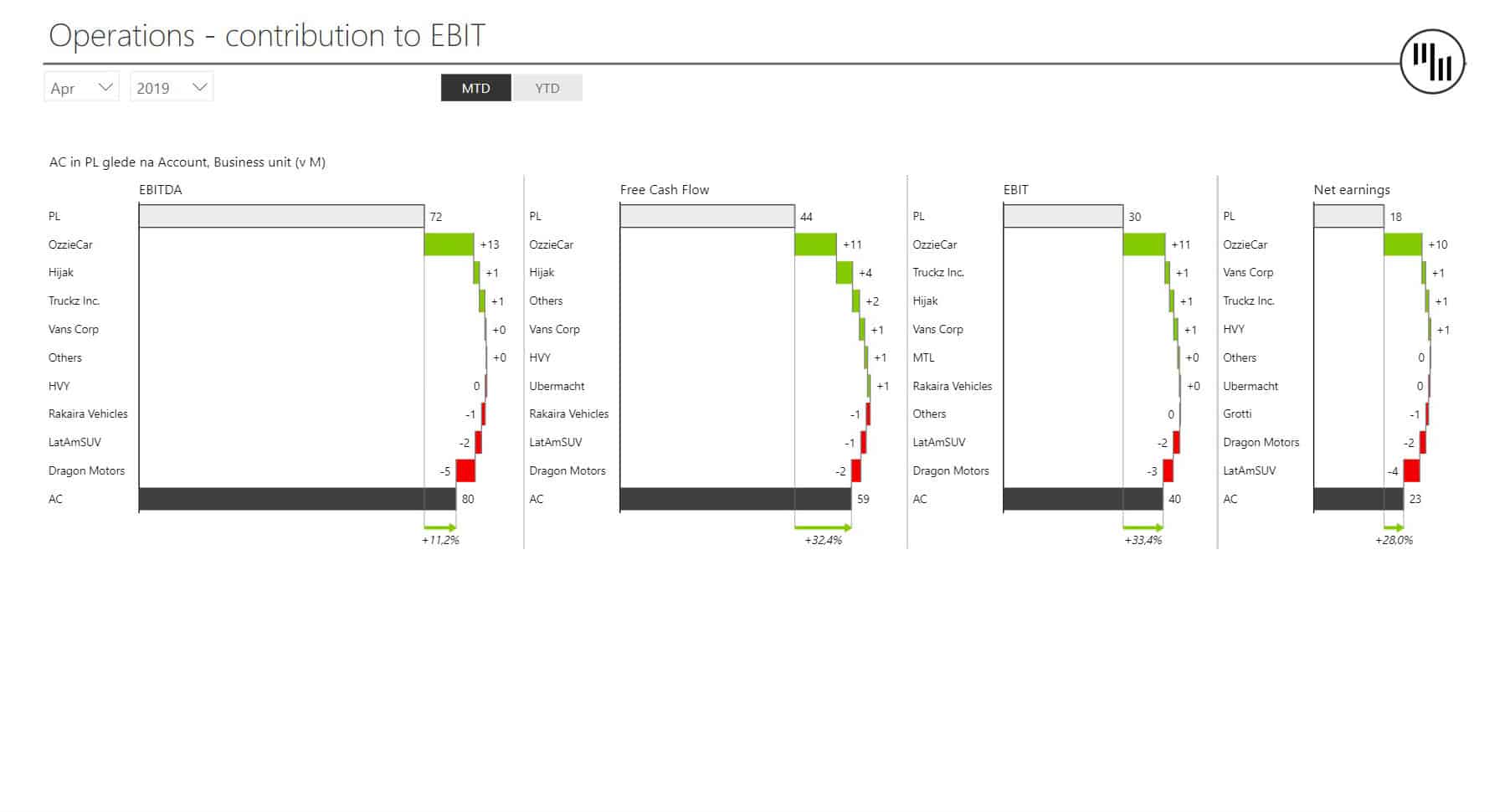
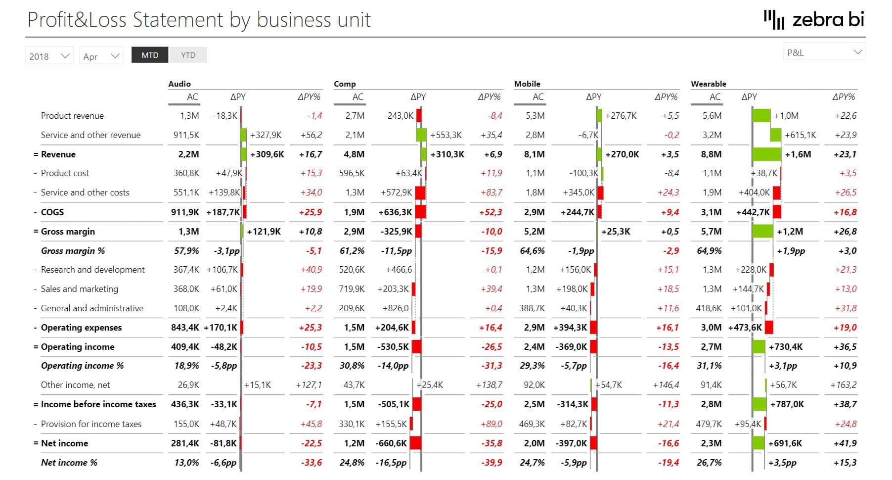
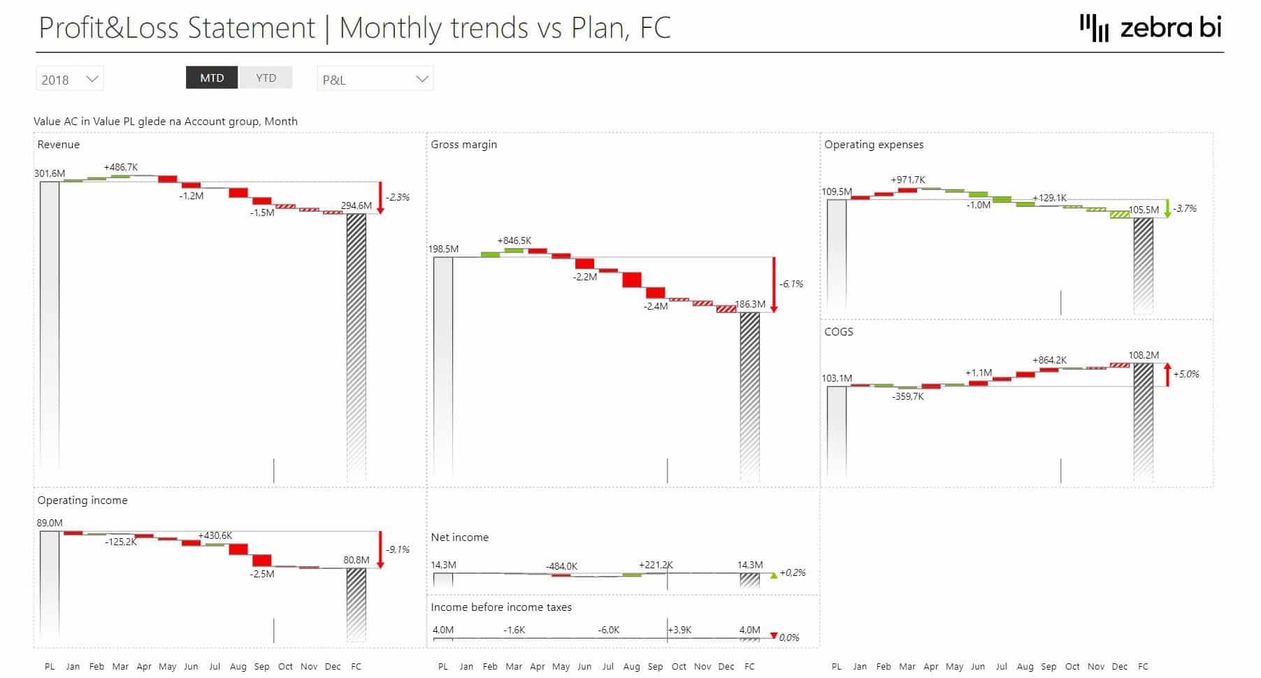
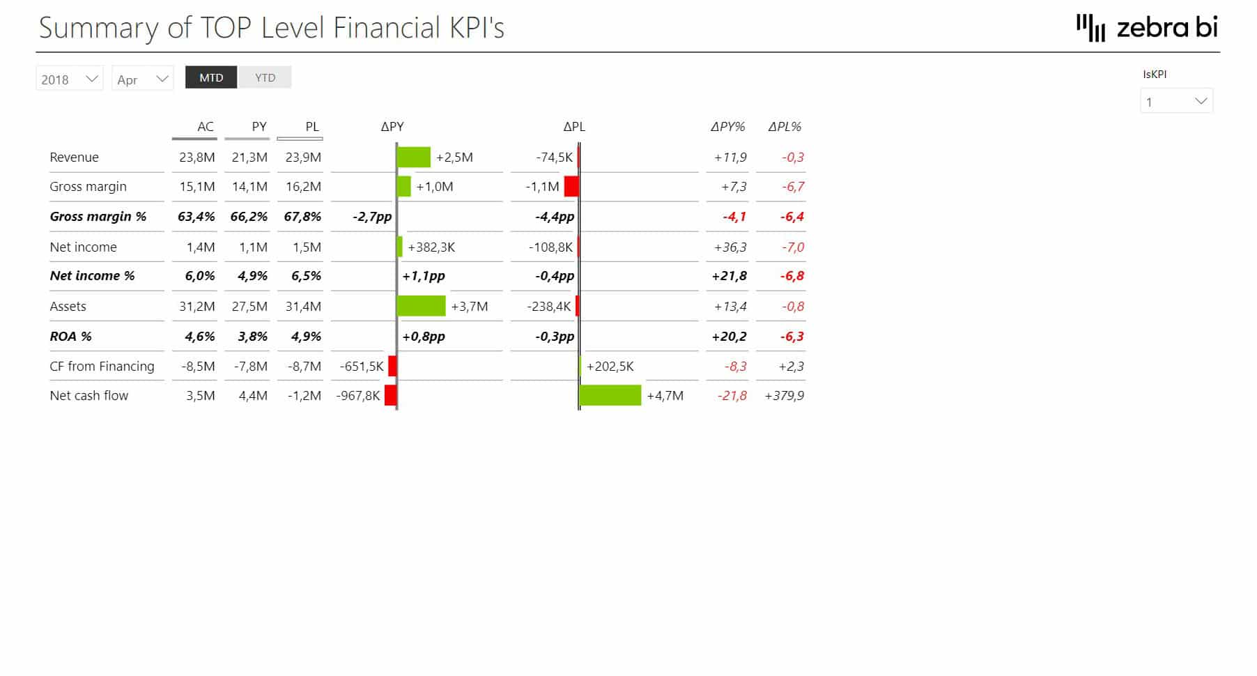
The first page covers EBITDA, EBIT, net earnings, free cash flow, and CAPEX, along with monthly trends, business unit breakdowns, and dynamic comments for each KPI. In addition to this, the template uses Zebra BI Cards, Tables, and Charts, with a focus on variances.
You get the full story as Cards give you the top-level read, while Tables and Charts break down the contributing factors, with no context lost.
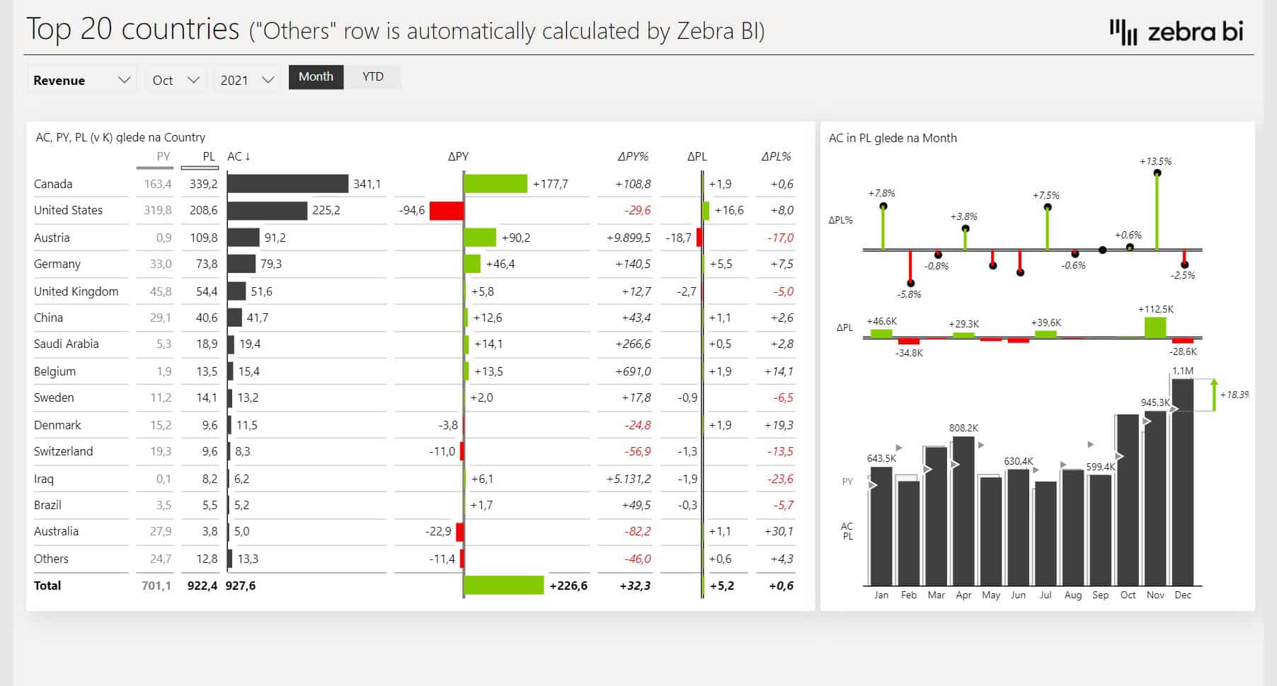
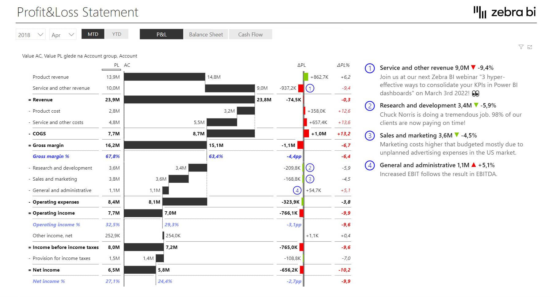
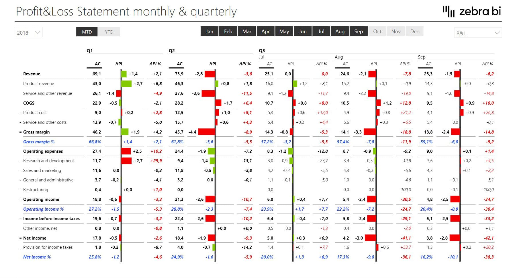
Zebra BI’s Power BI Income Statement template comes with hierarchical data you can expand or collapse, interim calculations, waterfall charts, and performance indicators like Gross Margin % and Operating Income as % of Revenue.
The Power BI template gives finance teams, investors, and senior managers a structured view that goes from summary to detail in a single click.
Interim calculations and waterfall charts make it easy to see the impact of individual items on the whole. Income statements can guide decisions of whether to focus on growing revenue or cost control, launching new products, or shutting down lagging departments.
The homepage shows actuals and plan values, along with variances, for revenue, gross margin, operating income, income before taxes, and net income, plus dynamic comments for each KPI.
This visual enables you to build stunning P&L, CF, and BS statements with complex structures with ease.
Capterra review
One standout feature we’re particularly proud of is calculations. Need to add a new element to your table that’s not in your dataset? No problem. You can calculate it directly within the visual, without touching your dataset.
But here’s what truly sets Zebra BI Tables apart from other dashboard examples. They incorporate charts directly within the table, such as waterfalls, to visually explain how profit is generated.
If you want to learn more about building super-effective Power BI financial dashboards, we have a full guide about that too.
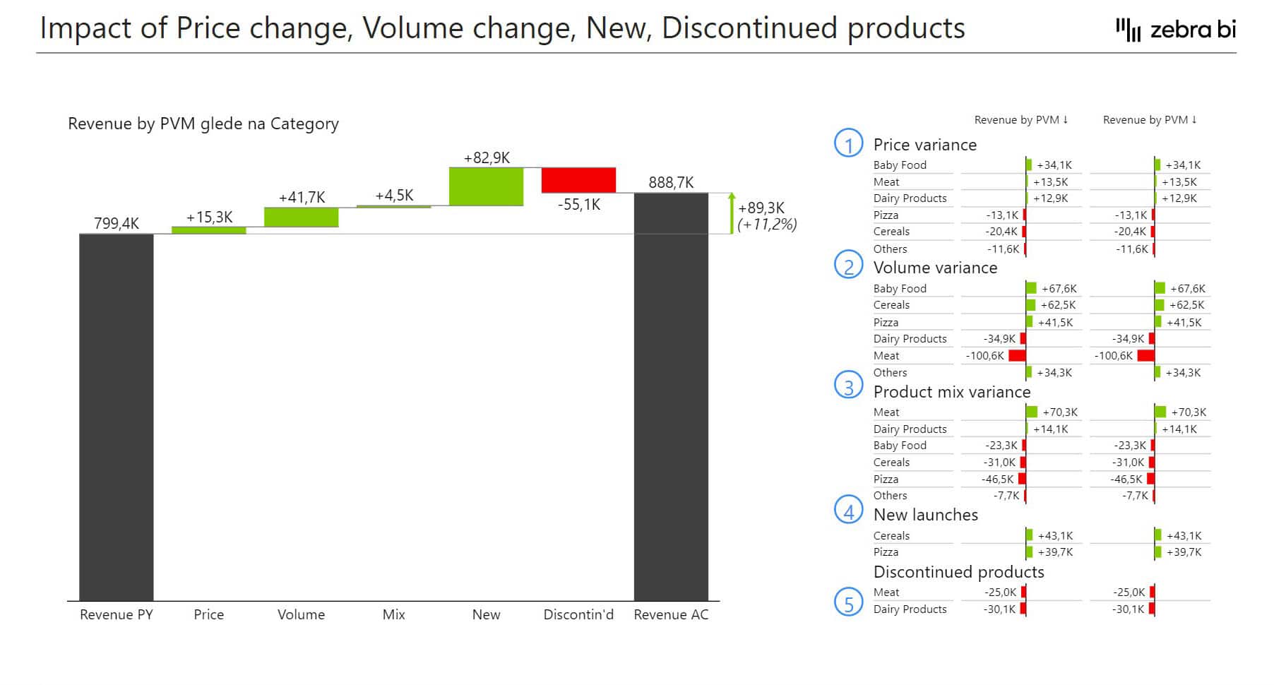
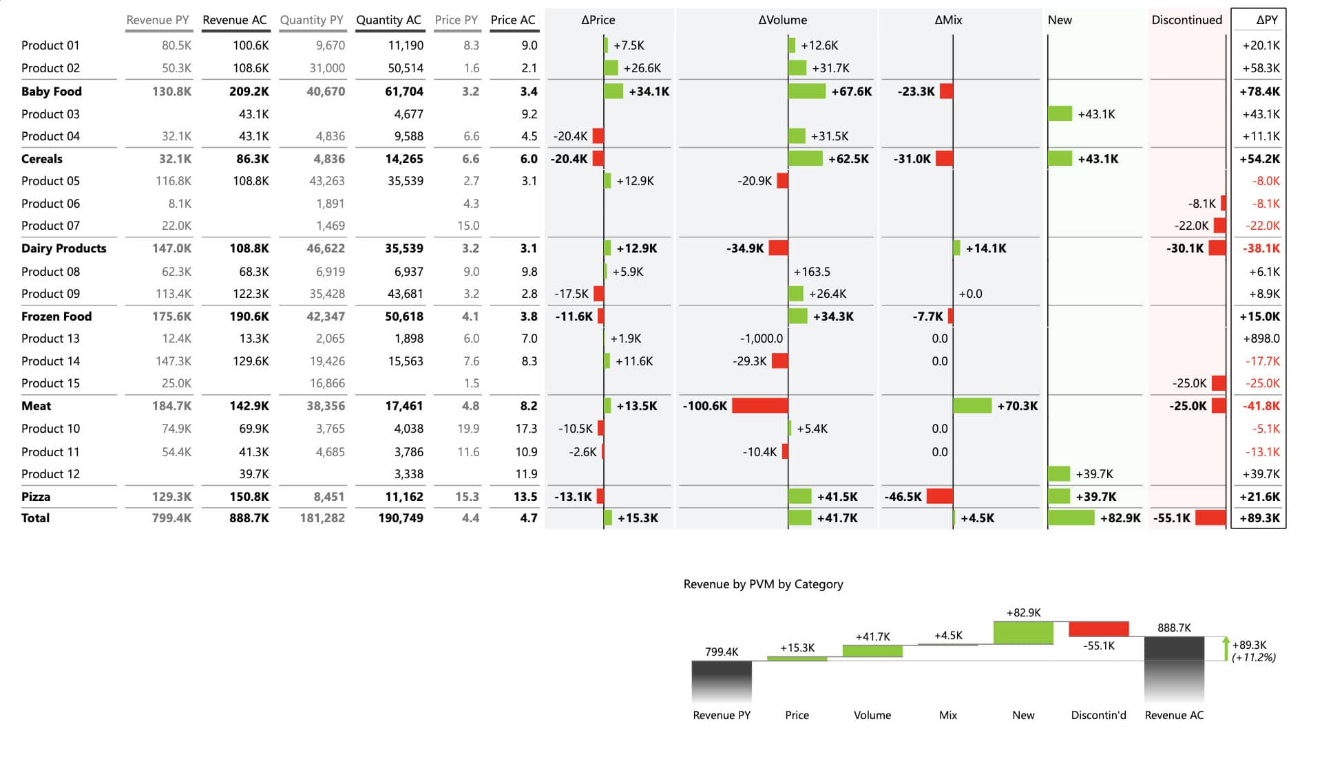
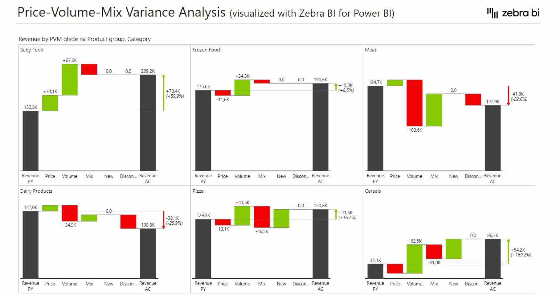
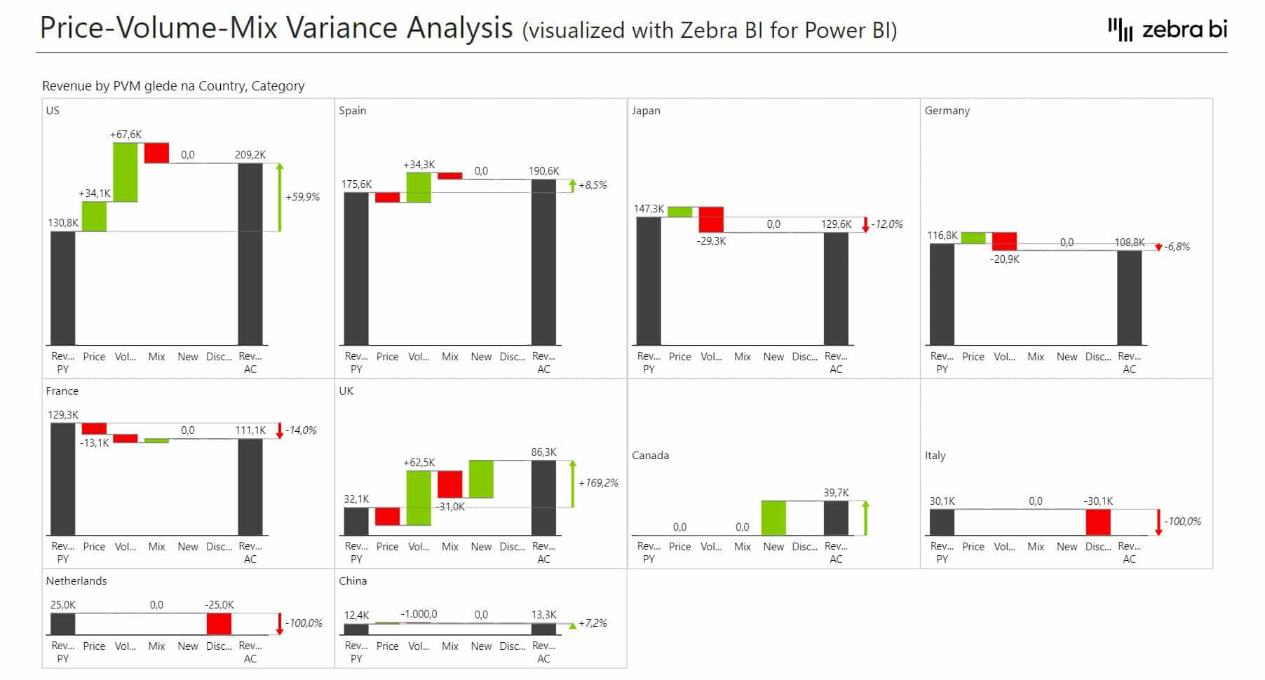
6. Price-Volume-Mix Variance Analysis Power BI Dashboard
A typical business dashboard shows revenues, gross profits, income, and comparisons between actuals, plans, or forecasts. These variances are then explored in terms of time, geography, or product line. However, a Price-Volume-Mix analysis shows how factors such as price changes, sales volume, and product mix affect your revenue.
The Price-Volume-Mix Variance template explains the reasons behind the revenue growth and presents top contributors for each category, including price, volume & mix variance, new launches, and discontinued products.
This Power BI dashboard example explains the reasons behind the revenue growth and presents top contributors for each category, including price, volume & mix variance, new launches, and discontinued products.
It's built for CFOs and product managers who need to move past "revenue was down 8%" and get to a specific, logical explanation.
Instead of relying on guesswork, you can pinpoint which factors are driving margin deterioration or growth, and focus on fixing them before they become a problem. When you need to compare Price-Volume-Mix variance across multiple product groups at once, the small multiples view renders all charts to the same scale on a single page, making patterns and outliers easy to detect.
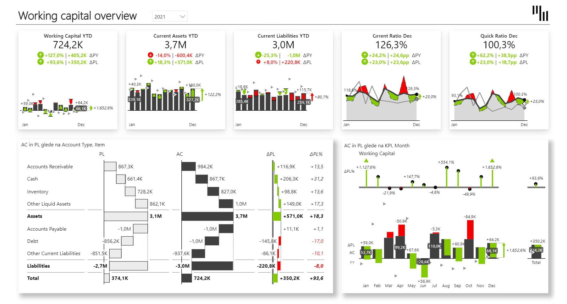
Can your business operate through difficult periods? What if a major client pays late or an unexpected cost hits?
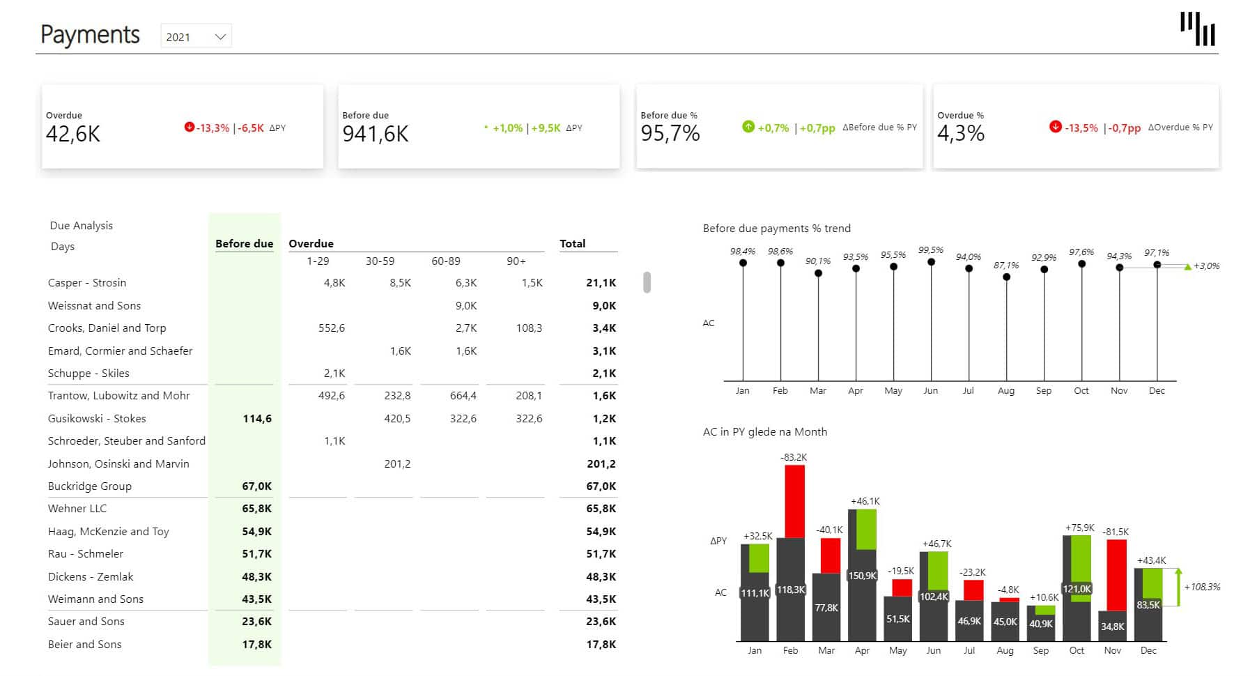
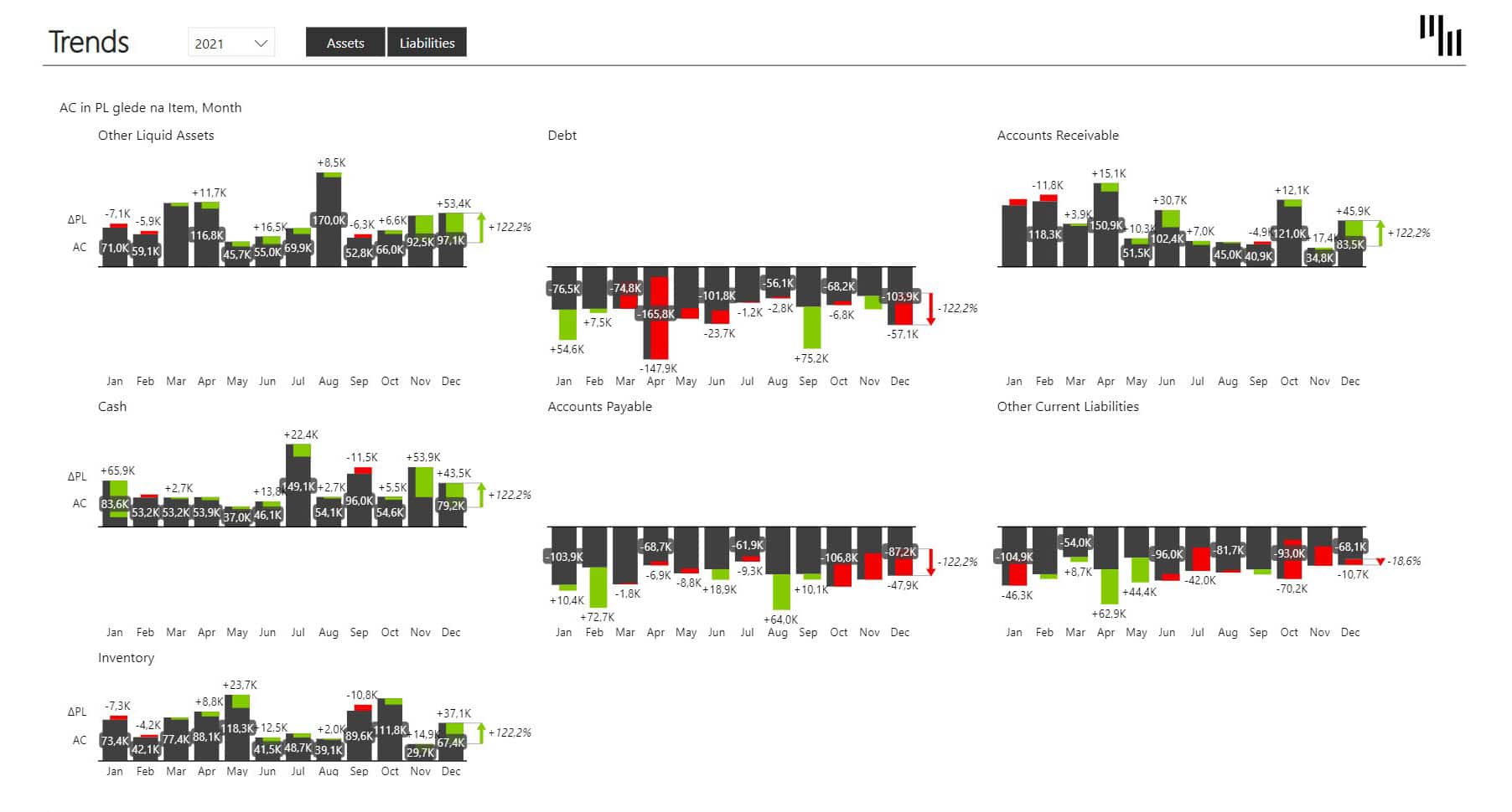
Working capital tells you where you stand, but staying on top of it requires constant monitoring across current assets, current liabilities, payment trends, and balance sheet movements.
FP&A professionals, controllers, and financial analysts can use the Working Capital dashboard to get a clean view of working capital, current ratio, and quick ratio on a single page. From there, dedicated pages cover payment analysis and balance sheet trends.
Cards at the top surface the key KPIs and act as filters for the trend chart, so you can focus on the metric that matters most at any given moment. The balance sheet is visualized using waterfall charts within the Tables visual, making it easy to see what's contributing to changes in your position. The Charts visual tracks trends for whichever KPI you select.
Together, these three views give finance teams and management a shared, up-to-date picture of liquidity without any manual data pulling or formatting.
Report page gallery
Working Capital - Page 1Working Capital - Payments - Page 2Working Capital - Trends - Page 3
Cash flow surprises catching you off guard? Need to monitor working capital but it's too complex?
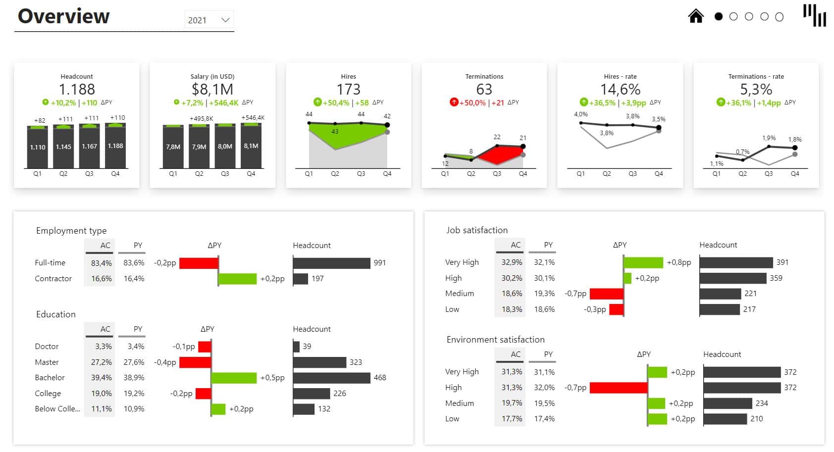
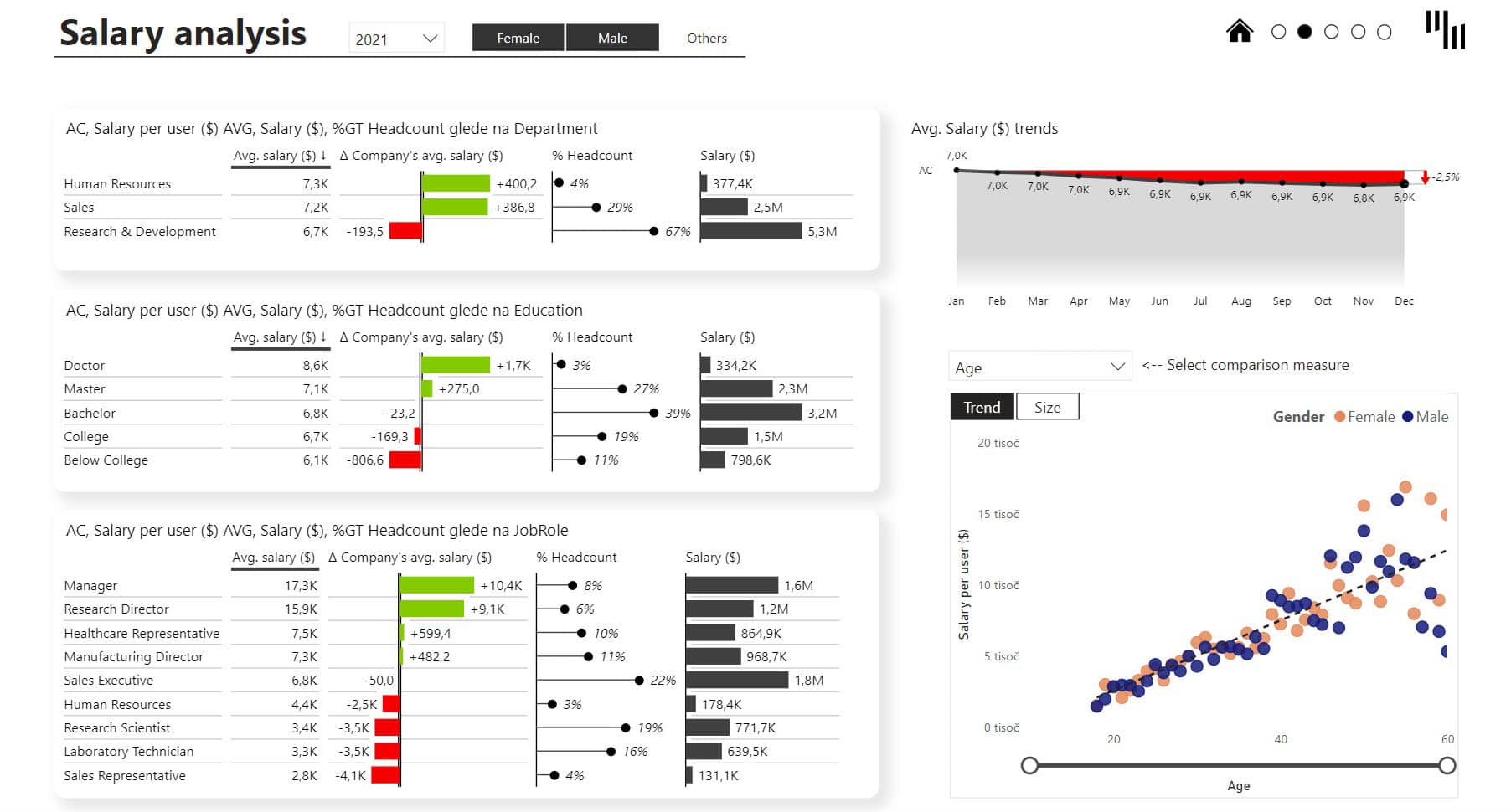
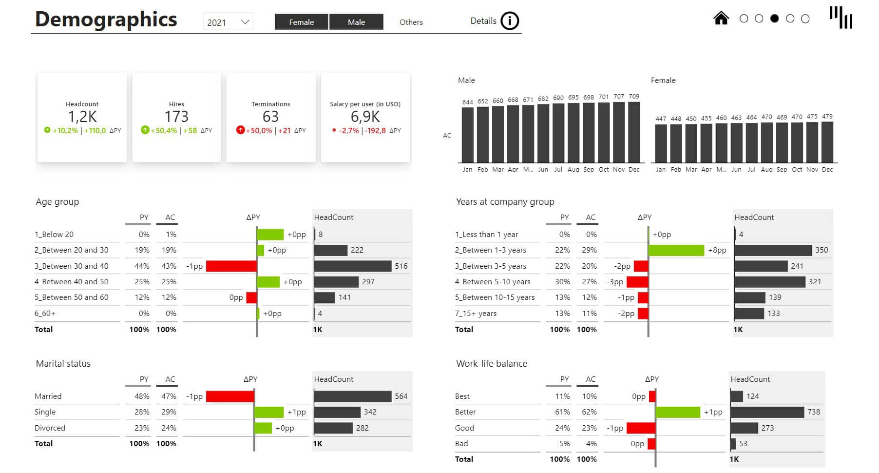
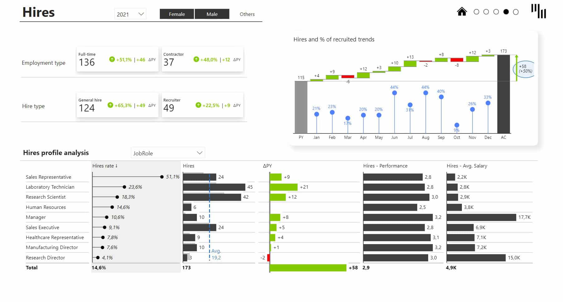
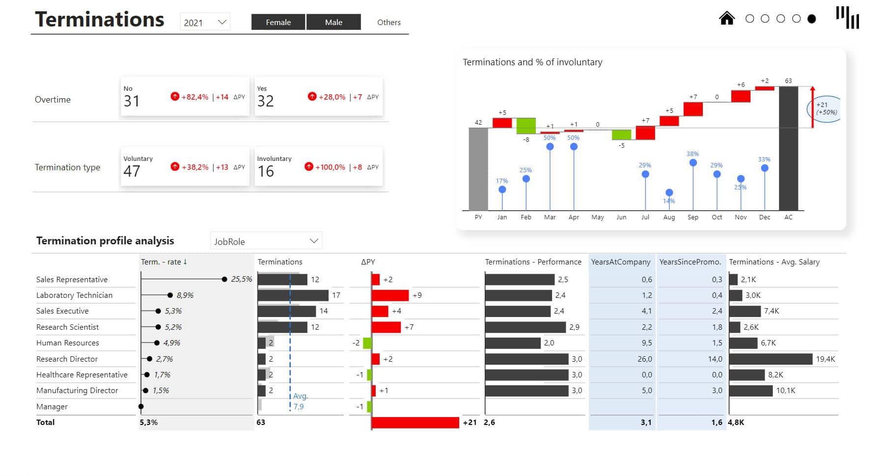
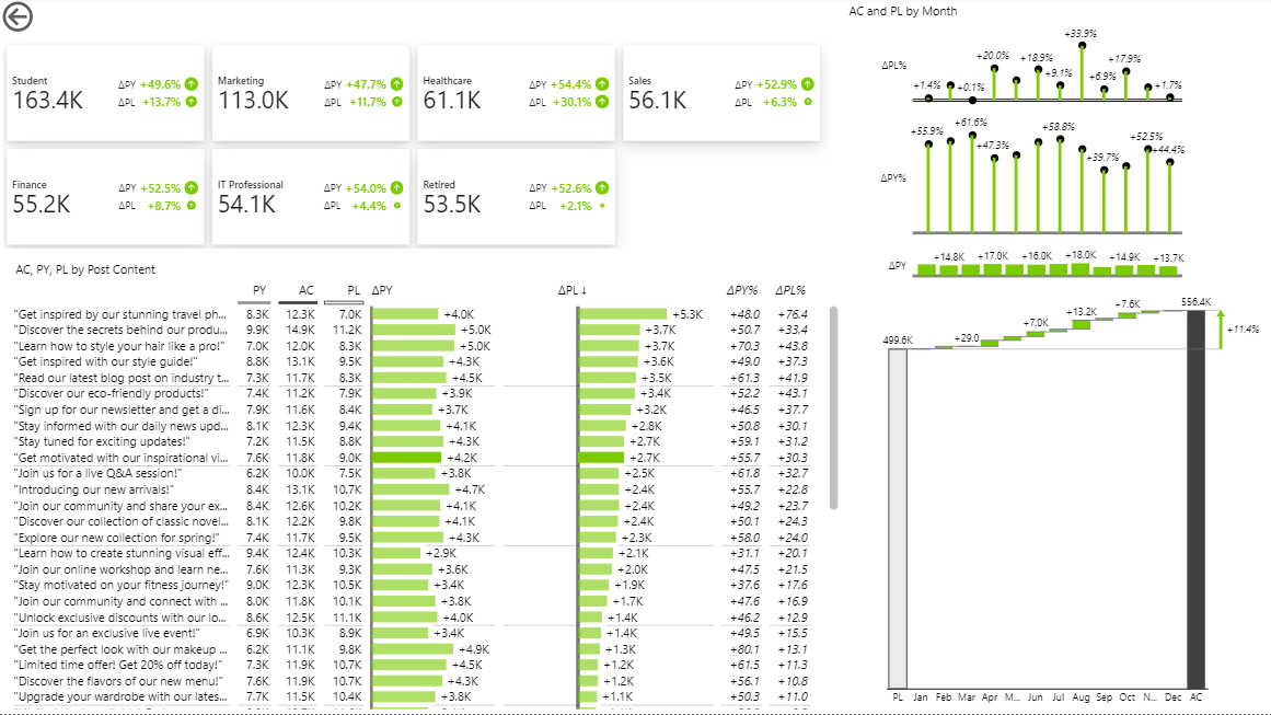
Headcount, salaries, hires, terminations, employee satisfaction, work-life balance, workforce demographics. HR teams sit on a lot of data, but rarely have a clear way to see it all in one place and act on it.
Built for HR managers and COOs, the HR analytics dashboard gives you a snapshot of your most important workforce metrics on a single page, with dedicated pages for salary analysis, demographics, hires, and terminations. You can slice everything by gender, department, job role, and more, so patterns that would otherwise stay hidden become immediately visible.
The dashboard’s cards surface the top-level KPIs with variances calculated automatically, no DAX coding or custom formatting needed. Charts update as you switch views, highlighting trends and variances across chart types.
Tables break down workforce distribution across every dimension, with integrated charts that add context to each category without taking up extra canvas space.
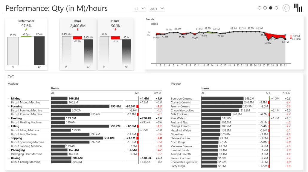
In manufacturing, every hour of unplanned downtime comes with a price tag.
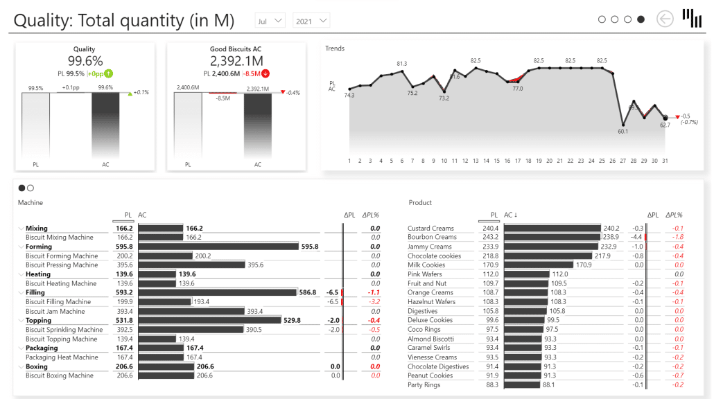
Use the Manufacturing OEE Power BI dashboard to filter through main KPIs and dive into dedicated, detailed pages for Availability, Performance, and Quality. Built for production managers, operations managers, and manufacturing analysts, it tracks OEE and its 3 components on a single page.
You can check how well your equipment is performing while taking a close look at availability, performance, and quality separately.
The template includes Zebra BI's advanced visuals that are interactive and easy to customize, so the dashboard can grow with your reporting needs without having to rebuild it.
For instance, the Zebra BI Cards allow you to look at the top-level KPIs like OEE, Availability Rate, Performance, and Quality without any sort of DAX coding or formatting. This enables you to get the insights you need, in seconds, with zero fuss.
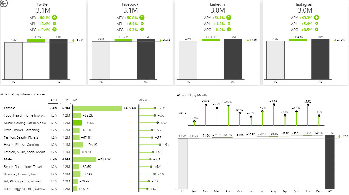
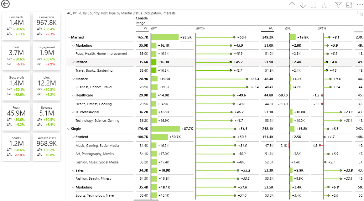
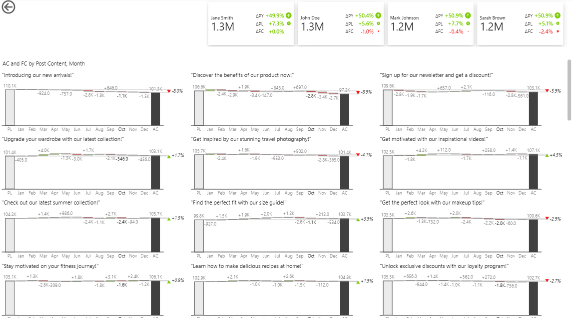
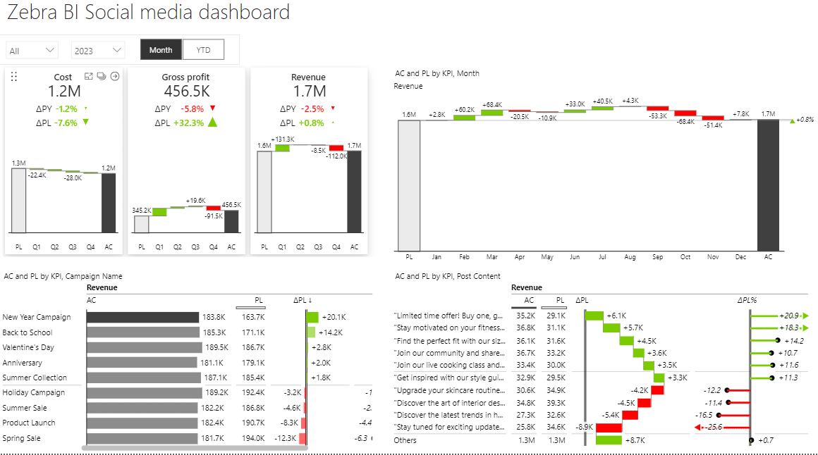
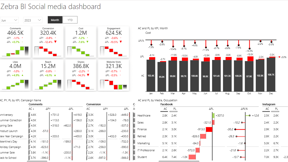
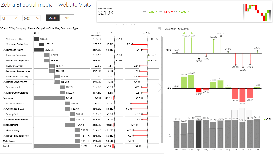
Most social media reports only tell you how many likes you got. You still have to figure out why some posts outperform others, which campaigns are worth the money, or where you should focus next.
The Social Media dashboard helps social media managers, marketing teams, and analysts track impressions, engagement, follower growth, and campaign performance across platforms in one place.
You can monitor individual posts, compare channels, and spot trends early without pulling data from each social media platform. Cards, charts, and tables highlight variances automatically, with no DAX coding or custom formatting.
Report page gallery
social media Power BI template
Managing multiple social channels but can't prove ROI? Marketing asking which campaigns work?
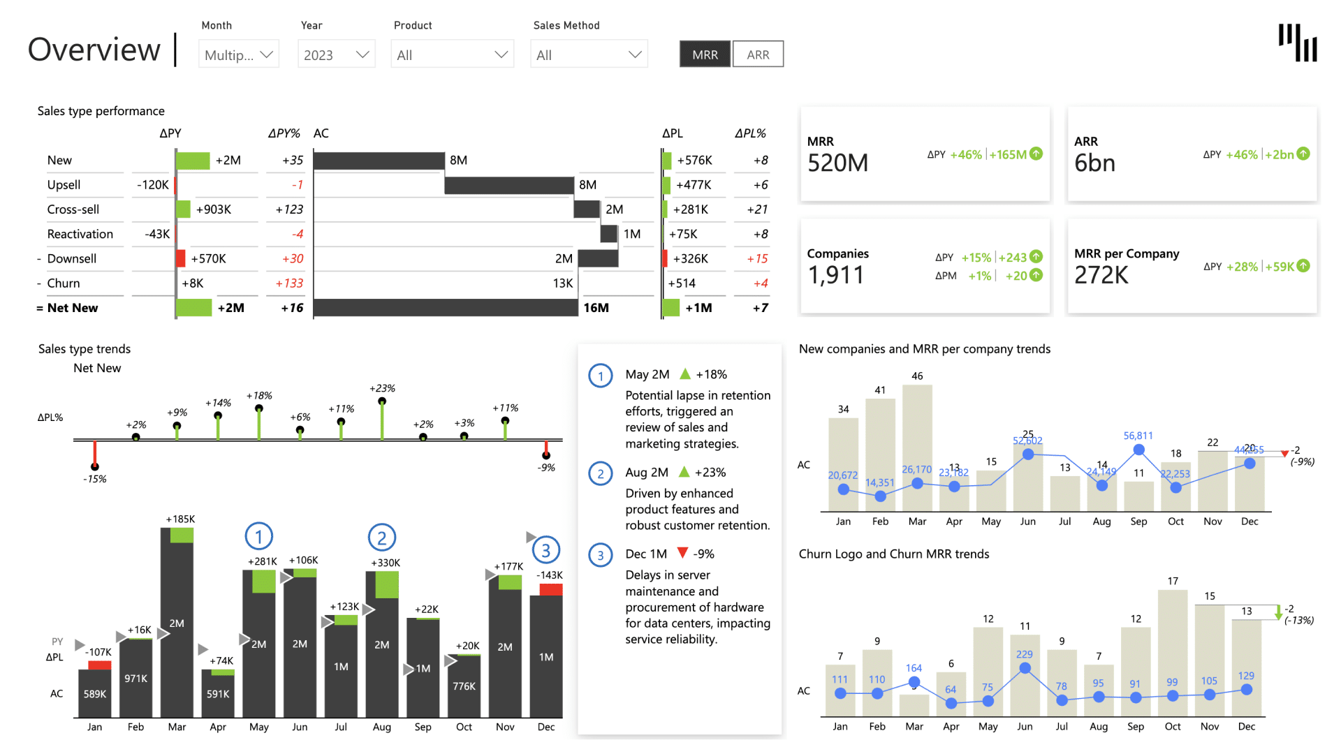
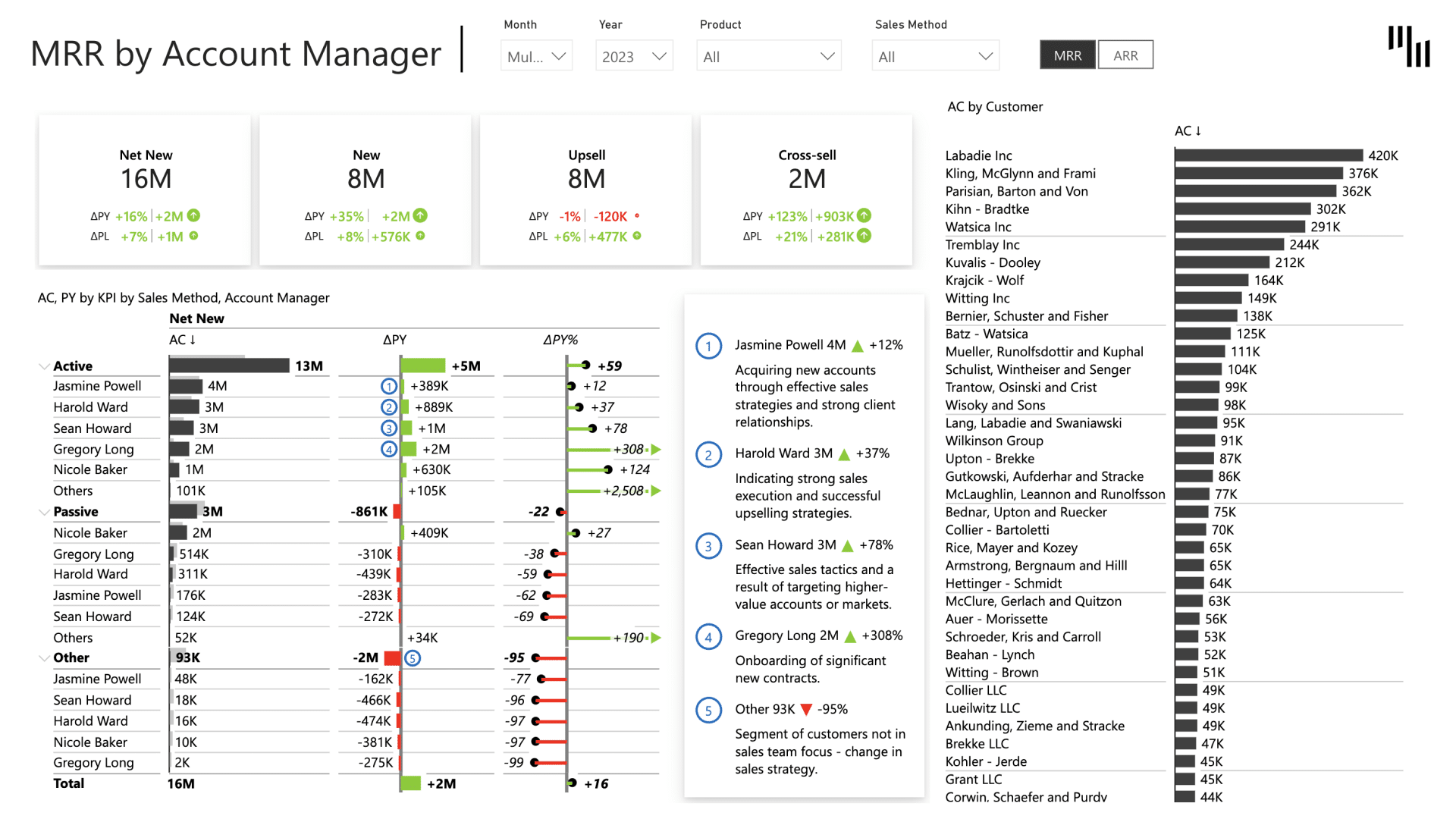
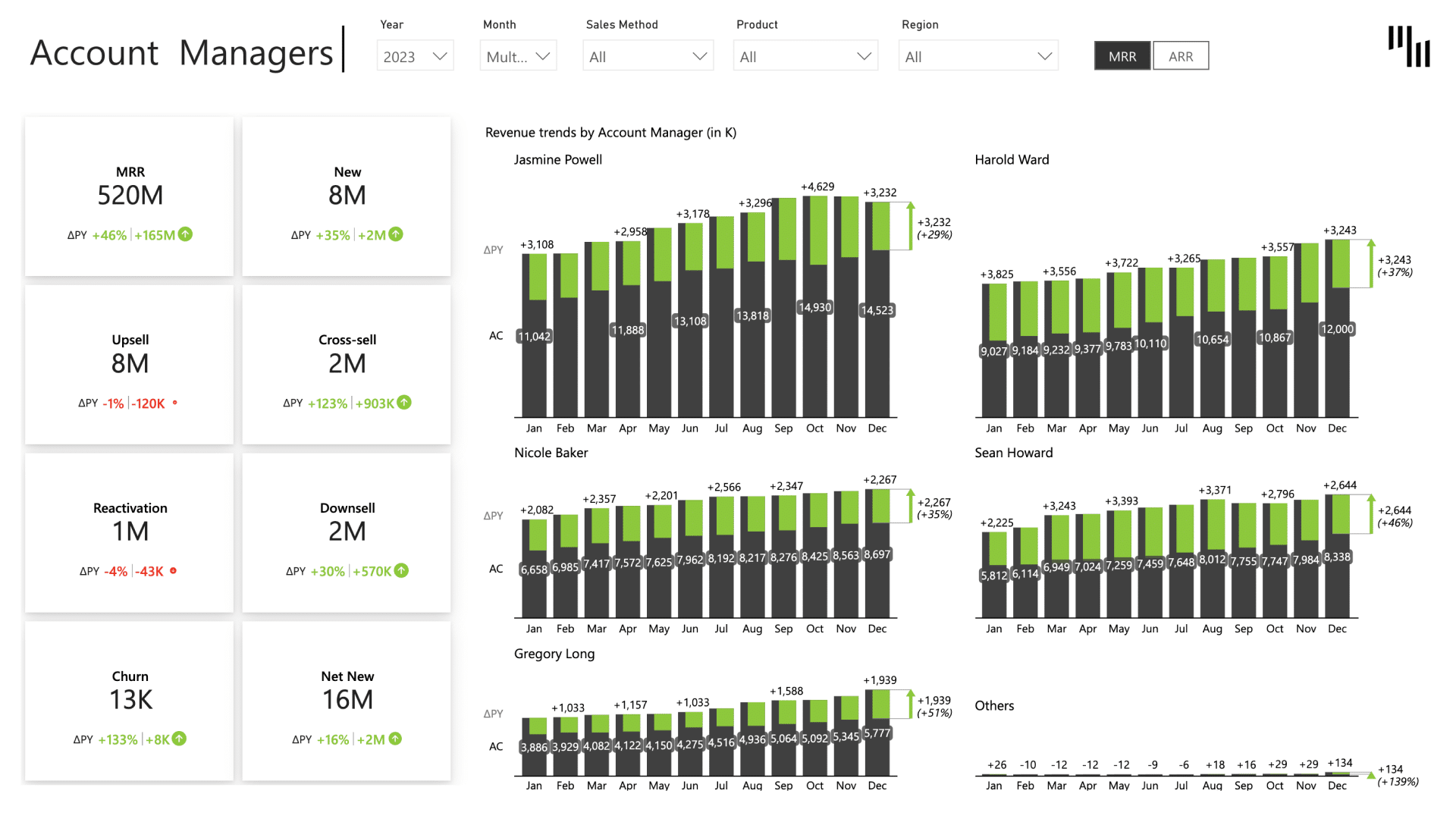
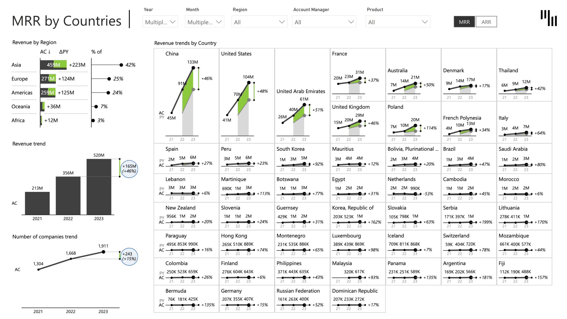
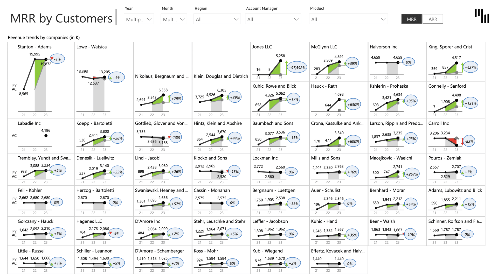
For SaaS products, revenue growth means very little without retention. You can be adding new customers every month and still move backward if churn is eating into your MRR.
The SaaS sales Power BI dashboard is one of the best for SaaS executives and managers, as it shows MRR trends, breaks down sales by type, and evaluates the effectiveness of account managers to help you in fostering growth and retaining customers.
Dedicated pages go deeper into churn patterns and retention trends, so you understand not just what the numbers are, but what's driving them.
Report page gallery
MRR growth slowing and you can't see why? Which account managers need coaching?
Switching between your business ads platform, CRM, and random spreadsheets to put together the campaign performance isn’t a reporting strategy.
CMOs and executives who need a high-level view of marketing ROI and efficiency can check everything with the Marketing Performance template, from ad spend and traffic through to conversions, customers, and revenue.
Marketing managers and analysts can dig deeper with dedicated views for channel attribution, campaign analysis, funnel performance, and efficiency.
Additionally, it highlights where performance breaks across channels and campaigns. You can compare them side by side, see where leads drop off, and check the numbers behind rising CAC, weak conversion rates, or inefficient campaigns.
The marketing performance dashboard template includes Zebra BI’s Tables, Charts, and Cards. You can surface top-level KPIs like CAC, ROAS, CPL, and CTR with variances calculated automatically and break down the contributing factors across channels and campaigns.
No idea which channels are actually driving revenue?
13. Annual Comparative Statement Power BI Template
Most finance teams have similar annual spreadsheets: years of income data, updated quarterly, manually formatted, and most of the time, impossible to read.
The Annual Comparative Statement Power BI template turns that same data into an interactive dashboard that displays trends, variances, and performance patterns across years and regions with one click.
It gives you a summary view for leadership and the details for your finance team, without needing two separate reports. You can inspect variance analysis, track how actuals compare to plan, and explore key metrics through filters, hierarchies, and small multiples.
The template is built with Zebra BI Tables, Charts, and Cards. Here’s how they work:
Tables combine a hierarchical P&L structure with waterfall charts so you can see exactly how each line item impacts Net Income, with variances automatically formatted .
Cards keep top-level KPIs like Revenue, EBITDA, and Net Income front and center.
Charts take care of trend and contribution analysis across multiple KPIs at once.
We have the P&Ls here. We have a balance sheet. We have a cash flow, all gathered in one single report here. … In the same report, you can basically switch from income statements, your P&Ls, to a balance sheet and to cash flow
Andrej Lapajne, Founder & Chairman at Zebra BI, Power BI & AI: Beyond Excel
Also, when a number needs context, dynamic comments let you add details in the report, so whoever opens it gets the full picture without having to ask.
Still presenting 5 years of financials in a static Excel table?
Cost benefit decisions shouldn’t be made in spreadsheets that are hard to understand, harder to update, and almost impossible to present to leadership or stakeholders.
You can compare pessimistic and optimistic scenarios, track how cost and benefit categories perform against plan across 4 years, and identify when benefits start to offset costs.
You can eliminate back-and-forth by adding dynamic comments to explain the reasoning behind each movement. Finance teams, project managers, and executives get the full context without having to search through emails or Slack messages.
15. Inventory monitoring and management Power BI dashboard Template
Inventory problems such as stockouts, overstocking, or slow-moving items might become obvious only when they’re costing you money.
The Inventory monitoring and management template gives inventory managers and supply chain teams a clear view of stock levels, sell-through rates, and days’ inventory outstanding across warehouses and product groups.
Use it to optimize stock levels, reduce storage costs, and keep your inventory aligned with business goals, whether you're doing a routine analysis or preparing for a busy sales period.
When seasonal demand comes, you'll see it in the data before it hits your shelves.
No clear view of what's moving and what's sitting?
Did you just notice cost overruns in the monthly report? Chances are, they’ve been building for weeks.
The Cost Management template gives controllers, FP&A professionals, and CFOs a complete picture of operating expenses across 15 dedicated pages. That includes OPEX overviews, cost center reports, vendor analysis, marketing events budget tracking, and OPEX forecasting with up to three forecast scenarios side-by-side.
The template creates patterns easy to identify by breaking down production costs, personnel expenses, utilities, and more across 3 years. The vendor report adds another layer, showing exactly which suppliers are driving cost movements and why.
Similar to the best Power BI dashboards, the cost management template keeps context where it belongs, with dynamic comments built directly into the report.
Struggling to see where costs are creeping up before it's too late?
Wondering how your performance holds up in the industry?
Financial experts built the benchmarking & financial analysis template for the athletic footwear and apparel industry, with examples from Nike, Adidas, Lululemon, and other major companies.
Use it to evaluate your financial performance against competitors, spot where you're falling behind or pulling ahead. Once you have the data, turn it into smarter budgets, cleaner forecasts, and more efficient strategic decisions.
Tracking financial performance but no idea how you stack up against Nike or Adidas?
18. Financial Analysis & Benchmarking Power BI Report Template (Food & Beverage Industry)
Is your company’s margin better than Coca-Cola’s? Or is your inventory turnover keeping pace with Nestlé or PepsiCo?
The financial analysis & benchmarking template for the food and beverage industry gives financial analysts, accountants, and business executives a way to measure their performance against major companies, including Coca-Cola, PepsiCo, Nestlé, Diageo, and Heineken.
You can analyze each company's performance individually and track how key metrics like gross margin, EBIT, or net income have changed from 2020 to 2023. All the available data helps you identify where your performance compares to industry competitors.
With every major financial metric in one view, from inventory turnover and return on assets to cash flow conversion ratios, the top-level KPI summary gives you the full picture without jumping between reports.
You can use the analysis & benchmarking template to make decisions faster with all the competitive data already structured and ready to use.
Do you need more industry context to make strategic decisions?
19. Brand and Product Portfolio Analysis Power BI Template (FMCG Industry)
With multiple brands across multiple categories, data piles up fast, and important signals might get lost in endless rows and columns. The Brand and Product Portfolio Analysis template provides strategic planners in the FMCG industry with a complete view of brand and product performance across 9 dedicated pages. That includes market development, portfolio analysis, market share trends, average price trends, and brand analysis across companies and categories.
You can track revenue, units sold, and average price per unit across periods and product categories, and monitor market share shifts at the brand and company level. On top of that, nothing slips your attention as you can compare every brand in a category side by side.
The template helps you optimize your product mix, identify where to invest more or pull back, and walk into any strategic conversation with the data to back your decisions.
Too many products and not enough clarity on which ones are actually performing?
20. Brand and Product Portfolio Analysis Power BI Template (Automotive Industry)
With multiple models, segments, and regions to manage, it's easy to lose track of where your brand is actually winning and where it's falling behind.
If you’re a C-level executive, marketing director, or strategic planner, Zebra BI's Brand and Product Portfolio Analysis template for the automotive industry gives you a complete view of brand and portfolio performance.
It breaks down revenue analysis, revenue trends by company and region, rolling 13-month trends, and quarterly breakdowns across 15 companies and 71 models.
You can track revenue, market share, units sold, and customer satisfaction scores across companies and models, monitor how performance shifts by region and segment, and identify which models are driving growth and which are dragging it down.
Also, the template helps you track momentum over time without losing the detail you need to act on it.
Executives want answers you can't pull together fast enough?
You've seen the solution to your reporting challenges
You just spent 10 minutes learning how top companies build actionable dashboards. Now imagine deploying all 20 in the time it would take you to build just one from scratch.
YOUR CHOICE:
Build from scratch → 20+ hours per dashboard, uncertainty about best practices, trial and error
Use our examples → 2 hours to deploy, proven designs, start impressing stakeholders today
WHAT YOU GET:
✓ All 20 examples from this page
✓ Expert onboarding program that teaches you how to use them like a pro
No credit card required • Download in 2 minutes • Used by 1,500,000+ professionals
Your stakeholders need insights. Your team needs tools. You need results. Start your free trial now and deliver all of it by tomorrow.
If you'd like to explore the best Power BI dashboard options Zebra BI offers and get your questions answered live, join our next live demo session! Simply sign up now, and we'll send you a reminder a few days before the presentation. We look forward to seeing you there!
FAQ
Why should I use dashboard examples instead of building from scratch?
Dashboard examples save time, reduce design errors, and ensure you’re following reporting best practices. Zebra BI Power BI dashboard examples and templates are IBCS®-certified. They are designed for decision-making, so your stakeholders can easily understand the story behind the numbers.
Can I customize Zebra BI dashboard examples to my company’s needs?
Yes. All Zebra BI Power BI dashboard examples and templates are fully interactive and customizable. You can adapt them to your data model, change layouts, apply your company’s branding, and scale them across departments.These power bi examples let you plug into live data, customize the layout, and go live quickly.
What types of dashboards are included in Zebra BI examples?
We cover a wide range of use cases, including: - Financial dashboards (P&L, income statements, cost analysis) - Sales dashboards (pipeline, performance by region/product, funnel tracking) - Marketing dashboards (campaign ROI, conversion analysis) - Operations dashboards (supply chain, HR, productivity KPIs) - Executive dashboards (company-wide KPIs, strategy alignment)
These power bi report examples and dashboard templates are designed as real-world power bi examples, not just concept visuals.
Do I need advanced Power BI skills to use Zebra BI dashboards?
No. Zebra BI visuals are designed for both beginners and advanced Power BI users. With automatic variance calculations, small multiples, hierarchical drilldowns, and dynamic comments, even complex dashboards can be created in just a few clicks. All Power Bi users can easily leverage our power bi dashboard templates and power bi examples.
How do Zebra BI visuals improve Power BI dashboards compared to native visuals?
Native Power BI visuals often require heavy manual setup to display variances, subtotals, or commentary. Zebra BI automates these tasks and adds features like: - One-click variance analysis - Dynamic comment markers - Top N + Others calculations - Responsive small multiples - IBCS®-compliant visual standards
This ensures your dashboards are not just pretty, but decision-ready.
Can I connect dashboard examples to live data?
Yes. All power bi examples and dashboard templates can be connected to your live data sources in Power BI (SQL, Excel, Fabric, etc.), so they become production-ready dashboards—not static templates.
What industries benefit most from these dashboard examples?
Zebra BI dashboard examples are used across industries—finance, FMCG, manufacturing, retail, tech, and more. Our Power BI dashboards and templates are fully customizable, so they adapt to any KPI framework or reporting requirement.
How do I try Zebra BI with my own data?
You can start a free trial and import your own data into Power BI. Within minutes, you’ll be able to transform your reports into professional, insight-driven dashboards.
How do the examples help finance and FP&A teams in particular?
Finance teams often struggle with creating consistent P&Ls, forecasts, and budget vs. actual analyses in native Power BI. Zebra BI examples and dashboard templates showcase: - Fully dynamic income statements and P&Ls - One-click actual vs. budget vs. forecast comparisons - Variance waterfalls that highlight drivers instantly - Hierarchical drill-downs for accounts and cost centers
This reduces manual prep time and improves alignment with CFO reporting standards.
 September 8th
 February 22nd


I’m very interested, but I’m limited with using June version of power bi and not November or Jan 2026 updated version.
Do you specify somewhere where i can download templates based on version of power bi being used? Thanks, stacy
Hi Stacy,
PowerB I Desktop June 2025 version should be OK. If you have any issues, please write to support@zebrabi.com
Hi Stacy,
Power BI Desktop June 2025 version should be OK. If you experiance any issues, please write to support@zebrabi.com