Last Mile Analytics: The Framework, and Two Teams Who Crossed It
PRO Trial
What if the problem with your reporting isn't the dashboard? What if it's the meeting?
Think about your last variance report. When did anyone act on it? If the honest answer is "they didn't," you're not alone. Gartner says 80% of analytic insights never deliver a business outcome. The gap between a dashboard going live and a decision getting made has a name: the last mile of actionable reporting. We ran a three-part series on how teams close it. Part 1 covered why BI fails. Part 2 laid out the framework. In Part 3, I sat down with two finance teams who'd actually crossed it. This piece pulls them together: the framework, plus their stories.
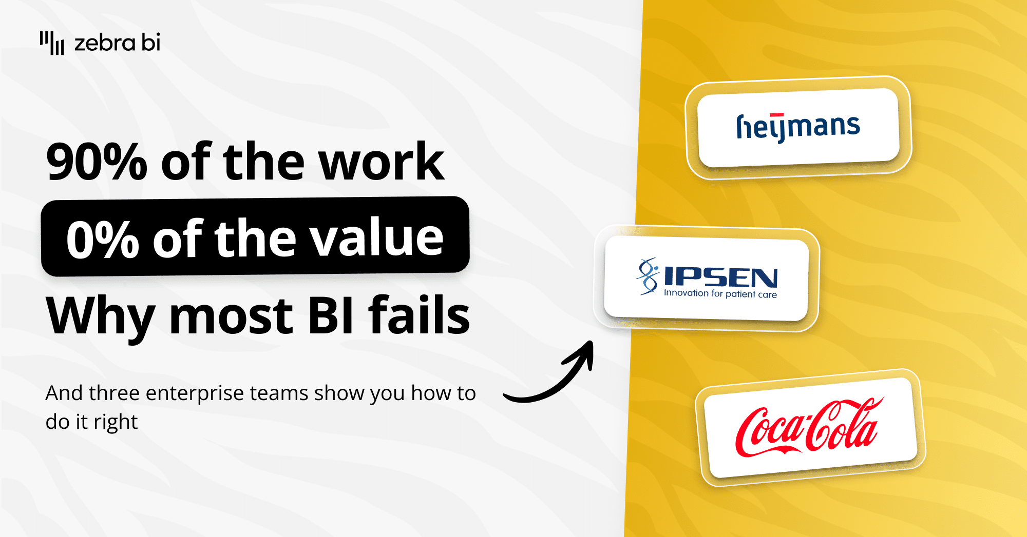
You'll meet a third team in the recording at the bottom of this page. And many more, including Coca-Cola, Abbott, Raiffeisen Bank International, and KPN, over in our customer stories.
What is Last Mile analytics?
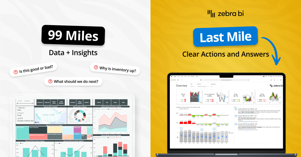
The phrase comes from logistics. A package travels 8,000 kilometers and fails at the last 800 meters because the courier can't find the door. Analytics works the same way. Your team does 90% of the work and gets 0% of the value because nobody acts on what they see.
That was Marnix Jansen's opening line in Part 2. 90% of the work, 0% of the value. It's the line I keep coming back to.
Here's what it looks like inside a finance team:
- The variance report goes out Monday. By Wednesday, nobody's mentioned it.
- The board deck has 47 slides. The board approves three decisions.
- Five business units track the same KPI in five different ways. Half the monthly review is spent arguing about which number is right.
None of those are technology problems. They're decision problems, and tools alone don't fix them. This is why BI fails in the last mile.
Tine Ozimič framed it in Part 3 as the 3-30-300 rule. Three seconds to see what's going on. Thirty to drill into why. Three hundred to reach a decision. If your report can't do all three, you've built a dashboard. You haven't built a decision tool.
The 4-question test for any Power BI report
Most Power BI reports fail one simple test. They tell you what happened. They don't tell you what to do next.
Marnix ran the test on real Power BI screenshots in Part 2, and it's brutal. Pull up your most-viewed report and ask it these four questions:
- Is the performance good or bad?
- To what extent?
- Why?
- What are we going to do about it?
If your report can't answer all four, it isn't actionable. It's accountability reporting in disguise: a record of what happened, not a tool for deciding what's next.
These are the questions executives are already asking when they look at your screen.
We've heard finance leaders phrase it almost word for word the way Marnix did: "Is my performance good or bad? How good? How bad? Why? What are we going to do about it?" Same four questions, same order. If your report doesn't answer them, the meeting will, slowly, badly, and usually end without a decision.
Why do most Power BI reports stop at question two?
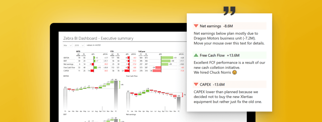
Marnix used a doctor analogy I keep stealing. Imagine your doctor says, "I tested your blood. Your score is 120." Good or bad? You have no idea. You need context. The target was 180. Your score last year was 180. The average for your age is 180. Any one of those turns 120 from a number into a decision.
Now look at your variance report. Most of them stop at "your score is 120." A grid of numbers. No target, no benchmark, no comparison, no last-year line. The reader has to bring all of that to the screen themselves, which is exactly why nobody acts on what they see.
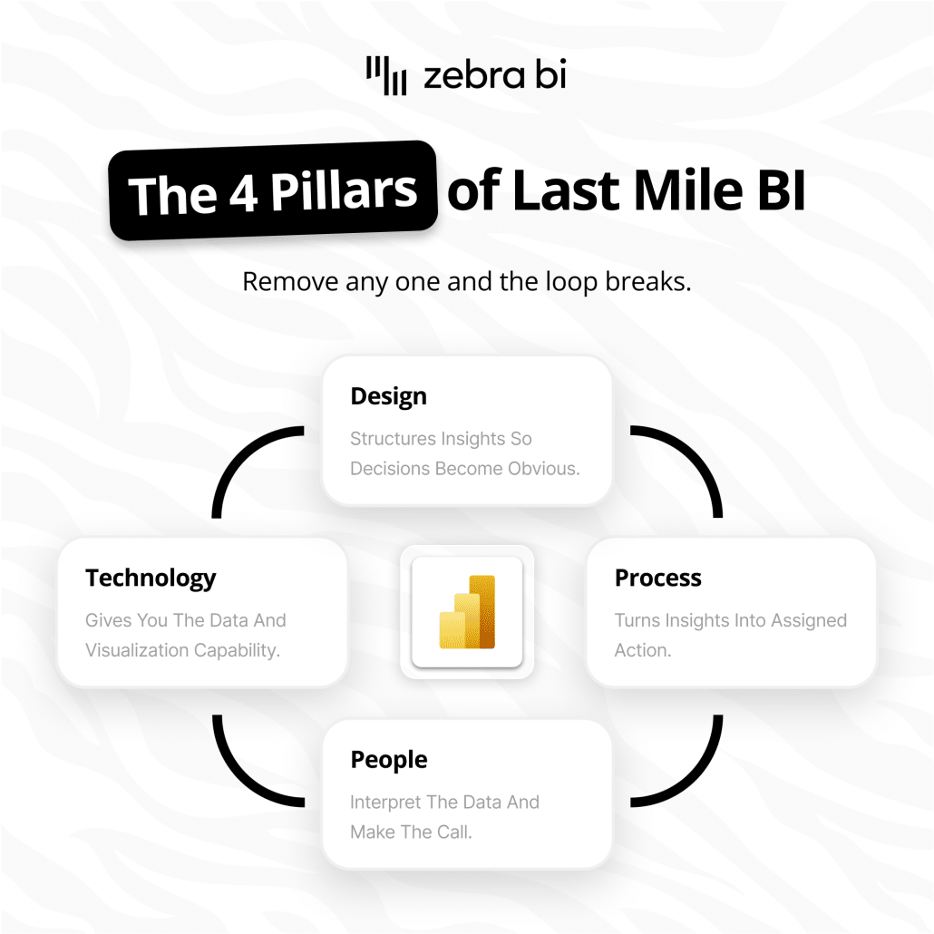
The fix is structural, not cosmetic:
- Question 1 needs a benchmark. Plan, prior year, target, peer. Without a comparator, "good or bad" is a coin flip.
- Question 2 needs the variance, scaled. Not just the absolute gap, but how big it is relative to what matters.
- Question 3 needs drilldown. One click to the line that moved the number.
- Question 4 needs commentary. A human sentence on the same screen, written by the person closest to the number, saying what changed and what's being done about it.
Question 4 is the one finance teams skip most often. Commentary lives in a separate email, a Word doc, or the call. By the time the board sees the report, it's been stripped of the one thing that turns a number into a decision.
That's the work right there: a single screen that answers all four questions before anyone has to ask. Pick your last board pack and try it. If you find yourself reaching for a second tab, an email thread, or "let me check with Sarah," you've got more work to do.
Two finance teams I interviewed for Part 3 did exactly that. Neither needed a new platform, just reporting that actually works.
Try Zebra BI's Power BI Dynamic Commentary Template.
Take the Last Mile maturity check
8 questions, two minutes. Find out where your team sits and which case study below to read first.
The Last Mile Maturity Check
8 questions. Check every box that describes your organisation right now.
How many of these sound familiar?
Two finance teams that crossed the last mile in Power BI
I sat down with both of these finance leaders during Part 3. Their stories are different. The pattern is the same.
Heijmans: When seven teams finally spoke the same language
Max Koene is a Finance BI Analyst at Heijmans, a Dutch construction and infrastructure company with seven business units. Before he got involved, all seven tracked the same KPIs. They just didn'tcalculate them the same way.
Max said it cleanest:
"We have the same KPIs across business units. Sometimes the KPIs were differently calculated, or different setup. So you would have the same KPIs, but at the discussion, you would have different decisions made on these KPIs."
Max Koene, Business Analyst, Heijmans
Read that twice. Same number on the slide, different decision in the room.
That's question one of the four-question test failing before the report even opens. Nobody can tell if performance is good or bad when "performance" means seven different things across the table. You spend the meeting asking which number is right instead of asking what to do about it.
What Heijmans did:
- One number, one definition. Standardized every KPI dashboard on the same calculation, surfaced everywhere.
- No manual prep. The team was spending its hours typing data into systems instead of looking at it. Automating the inputs gave them their analysis time back.
- Standardized the visual language. Same chart formats, same colors, same scaling across all seven units, so a number means the same thing in a finance review and a board pack.
The hardest part wasn't the IT work. Max told me it was the mental shift. "Who wants to change everyone? But who wants to put in the effort to change?" The dashboards were the easy part. Getting seven teams to agree on the same number, the same way, was the actual project.
What it gave them back: the C-suite can see every KPI on a tablet without being overwhelmed, drill into HR or P&L from the same screen, and finance fields fewer of the same repeated questions every month. That last part is the tell. When the same questions stop coming in, the work has done its job.
Ipsen Pharma: when the stakes are patients, not P&L
Robert Anschutz leads business excellence at Ipsen Pharma. Ipsen makes treatments for rare diseases, which means every market has a small number of patients and every decision matters more than usual.
Before Zebra BI, when Ipsen's market share dropped in a country, Robert's team could see the drop. They couldn't see where it was coming from. Country-level visibility, no further. The report stopped at question two.
Now, when a number moves, his team can drill within seconds:
- Down to the region
- Down to channel: hospital versus retail
- Down to the healthcare professional, the team is talking to
Same report. Same screen. All four questions answered before the meeting ends.
The line from Robert I keep going back to wasn't about Power BI:
"If we have a way to better analyze the data to generate insights from it, that also means that patients get life-saving treatments at an earlier point in time. So it directly affects them, and that's basically also the motivation for our daily work."
Robert Anschutz, Lead Business Excellence, Ipsen Pharma
Insight to decision to outcome. The dashboard isn't the goal. A patient getting a life-improving treatment sooner is the goal. Reporting is the tool that gets you there.
The numbers underneath: 6,000 people across Ipsen now read the same KPIs in the same colors, speaking the same language. From an intern to the executive team. Top management can dig deep on their own without booking time with the BI team, freeing Robert's analysts to do the work only they can do.
What both teams did that most don't
Two different setups. Heijmans was a leadership-led standardization push. Ipsen was a precision drilldown problem. The pattern underneath is the same:
- Both put the four-question test inside one report instead of across five tabs and a follow-up email
- Both made the meeting easier, not just the dashboard prettier
- Both treated the change as a behavior project. The rollout was the easy half
Neither needed a new platform. Both already had Power BI. What they added was a structure that helped them cross the last mile: four questions, one screen, one visual language, every time.
For a third take, scroll to the recording below. A finance manager at a European industrial company built it from the bottom up with no mandate and no budget. He's the proof that you don't need a CFO sponsor to start.
How to start practicing decision intelligence this week
You don't need budget approval, a new tool, or a six-month transformation program. You need an hour and your last board pack. Tick each one as you go.
Here's the order I'd do it in:
Run the 4-question test on one report.
Pick the one that matters most: monthly variance pack, board deck, FP&A review. Walk through the first chart and ask: good or bad? To what extent? Why? What now? Every time you reach for a second tab, an email, or "let me ask Sarah," mark it. That list is your backlog.
Watch one meeting like an outsider.
The next time your report goes out, sit in the meeting that follows. Count how many decisions actually got made. Count how much time was spent arguing about whose number is right versus what to do about it. That ratio is your last mile, in real time.
Take the maturity check.
Eight questions, two minutes, and you'll know where your team sits and the one move that bumps you up a level. Scroll up to The Last Mile Maturity Check.
Talk to one finance person before you talk to IT.
The teams that crossed the last mile started with the meeting, not the model. Ask your FP&A lead: "If you could change one thing about how we read this report, what would it be?" The answer is almost never "more data." It's almost always "context, faster."
Pick one report to fix this quarter.
Don't try to standardise seven business units in week one. Heijmans didn't either. Pick one report that ten people read every month, fix all four questions on a single screen, and let the rest of the org notice. That's how it spreads.
The point isn't the dashboard
When I sat down with Max and Robert, I expected two case studies. I got the same story told twice. Different industry, different mandate, different starting point. Same answer: the last mile of analytics isn't a tooling problem. It's about getting the meeting to start with the decision, not the data.
Most BI projects stop at "what happened." The teams that win finish the sentence: what happened, why, and what we're going to do about it, on one screen, in one language, every time.
If you've read this far, you already know which report on your team falls short. Start there.
What to do next
- Take the Last Mile Maturity Check to find out where your team sits and what to fix first
- Book a demo to see the four-question test built into Power BI in 20 minutes
- Watch the full Part 3 recording below to hear from a third finance team in their own words
Hear the third team in their own words
A finance manager at a European industrial company who built it from the bottom up. No mandate, no budget, just a refusal to keep waiting for the report.