Price-Volume-Mix variance analysis in Excel
Overview
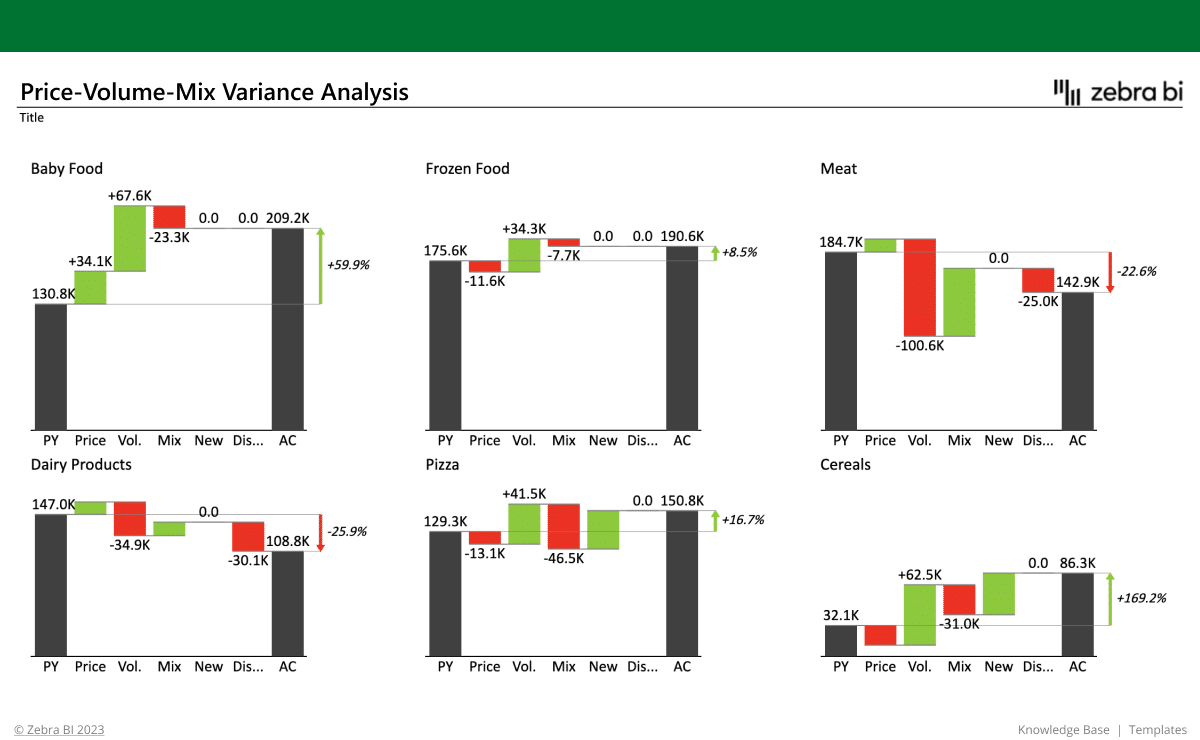
This Volume Variance Excel template helps you break down revenue changes using a clear and structured PVM (Price, Volume & Mix) analysis. A Price-Volume-Mix Analysis Report is commonly used in finance, sales, and business analytics to understand how changes in price, volume, and product mix impact revenue or profit.
The report highlights three key components:
- Price Effect: Impact of prices changing (e.g., price increases under the influence of market trends)
- Volume Effect: Changes in product quantities sold (i.e., product volume changes)
- Mix Effect: Shifts in product mix or service mix (i.e., the impact of product mix changes)
Built with Zebra BI visuals using standard tables and PivotTables, the report showcases how each factor—including new launches and discontinued products—contributes to revenue performance using professionally formatted bridge charts and small multiples with comment markers and automatic variance highlights for accurate and insightful reporting.
This Price Volume Mix variance Excel Template is ideal for finance professionals, business analysts, controllers, and FP&A teams who need to analyze and explain changes in revenue. It is especially valuable for:
- Finance teams conducting profitability analyses and annual business reports
- Sales and marketing departments tracking price and volume trends
- Business strategists making better product and pricing decisions
- Retail and eCommerce businesses analyzing SKU performance
Whether you’re in consumer goods, manufacturing, retail, or services—anyone looking to understand revenue drivers will benefit from this Price Volume Mix Excel Template. From business leaders to analysts, everyone can use this Price Volume Mix variance report template to drive business success.
What is a Price Volume Mix Analysis?
"PVM" stands for "Price, Volume, and Mix" analysis.
A volume price analysis is used to understand the key drivers behind revenue changes over time (such as sales strategies changing, volume effects, sales volume increases or decreases, price changes, or the overall comprehensive price volume mix together).
By isolating how much of the revenue movement is due to pricing strategies, quantity sold, or changes in the product/customer mix, PVM analysis offers a deep, actionable view into business performance. It helps explain not just how much revenue changed—but why it changed and how this will impact the future strategy.
What business insights will it give you?
The Price Volume Mix Analysis Excel report helps you easily analyze your price volume mix data and answer critical business questions such as:
- What’s driving our revenue growth or decline?
- Are we selling more, or just charging more? How should this volume analysis affect our business strategy?
- Which product categories or regions are improving and which are underperforming? How is this correlated with the sales price volume mix?
- How are new or discontinued products affecting our results?
With these insights, you can:
✅ Draw revenue & profitability insights – Understand the "why" behind revenue variance for individual products according to negative or positive price variance or volume variance
✅ Make strategic pricing decisions – Identify whether price adjustments are helping or hurting the business, according to market trends and internal business reporting
✅ Improve your sales performance tracking – Evaluate whether revenue growth is from increased sales volume or product mix changes.
✅ Perform product portfolio optimization – Focus on the most profitable products and on increasing the impact of volume increases.
✅ Run forecasting & budgeting – Predict how pricing, volume drivers, and mix changes impact future performance and how your overall market positioning and business strategy impacts on revenue performance.
Why use this template?
This Excel example is designed to apply best practices in data visualization right out of the box. It enables you to:
- Communicate complex variance analyses clearly and efficiently, using Zebra BI charts and PivotTables
- Use visual storytelling with accurate and scaled bridge charts, to make reports understandable at a glance
- Highlight key differences with built-in automatic variance calculations
- Add insights using integrated comments and markers for contextual explanations
Whether you’re reporting to executives or diving into detailed analysis, this template ensures your message is crystal clear, your findings are accurate and well-structured, and your data actually drives decisions.
Zebra BI charts, tables and cards enhancements
We wanted to make sure you get the most out of your Price Volume Mix analysis formula and template, so we enhanced it with the best and most suitable Zebra BI features:
-
Zebra BI Charts:
- Bridge chart built from a normal Excel table to explain revenue changes between actuals and previous year. Includes difference highlight to automatically show variance between actual and PY. Comment markers provide clear explanations directly within the chart. Visual scaling is accurate and non-misleading to ensure clear communication of impact.
- Small multiples created using PivotTable-based charts to provide detailed PVM analysis by product category. Includes automatically calculated variance highlights and consistently scaled visuals across charts. Ideal for in-depth, category-level comparisons of revenue drivers.
All of these charts enable you to:
- Create powerful out-of-the-box waterfall charts with difference highlights to clearly explain contributions to revenue change (e.g., price, volume, mix)
- Visualize the positive and negative impacts of each driver in line with business communication standards, making performance easier to understand for stakeholders
- Use small multiples waterfall charts for side-by-side comparisons across product categories or regions—ideal for scalable, detailed overviews
- Bridge chart built from a normal Excel table to explain revenue changes between actuals and previous year. Includes difference highlight to automatically show variance between actual and PY. Comment markers provide clear explanations directly within the chart. Visual scaling is accurate and non-misleading to ensure clear communication of impact.
- Small multiples created using Pivot Table-based charts to provide detailed PVM analysis by product category. These sales variance tables include automatically calculated variance highlights and consistently scaled visuals across charts. Ideal for in-depth, category-level comparisons of revenue drivers
-
...And Zebra BI Tables created so you can:
- Run effective variance analysis, essential in PVM reporting
- Combine tabular data with integrated price volume mix variance analysis charts to show key revenue, prices, and actual volume differentials
- Automatically highlight important deviations as per business communication standards, making it easy to detect trends and outliers instantly
Why is Zebra BI’s template the right choice for you?
All Zebra BI templates are designed using IBCS® principles and real-world reporting experience. They help you build professional reports faster, reduce manual work, and ensure your insights are clear, consistent, and actionable — every time.
How it works
Getting started is quick and easy — even if you’re not an Excel expert.
1. Download this Excel template/example to find best practices and inspiration for actionable reporting techniques.
2. Use sample data to test it out and check what the background is to find the application for your use cases.
3. Use the free trial or another Zebra BI plan to create PVM analysis reports with Zebra BI visuals on your own data.