Watch "Scaling Self-Service BI in Power BI" webinar recording
Watch our full webinar on scaling self-service BI in Power BI, with actionable tips and tricks.
Self-service Business Intelligence (BI) promises to empower every team member with the data they need to make smarter decisions, faster.
But how do you give users the freedom to explore data without creating a chaotic environment of inconsistent metrics and untrusted reports? It’s a delicate balance between empowerment and control.
In the most recent Zebra BI webinar, our experts Tilen Barbarič and Mark Leskovšek detailed a proven framework for building a scalable self-service BI environment in Power BI.
They shared practical strategies to ensure every report remains governed, consistent, and ready for decision-making. This recap expands on their key insights, offering a detailed guide to balancing user freedom with robust data governance.
At its core, self-service BI is an approach that enables all business users (not just data specialists) to access, explore, visualize, and analyze information independently.
The goal is to equip people across the organization to answer their own data questions using governed, user-friendly tools. When implemented correctly, business users get timely insights, while BI teams can shift their focus from fulfilling ad-hoc requests to strategic governance and system optimization.
As a general rule, there are two different tiers of self-service users:
The biggest hurdle in self-service BI isn't the technology itself; it's finding the right balance between control and autonomy.
You want to empower users to find their own answers, but you also need to ensure the data they are using is accurate, secure, and consistent.
Without proper governance, you risk a free-for-all where metrics like "revenue" or "margin" mean different things across different departments, leading to confusion and poor decisions.
Here are some additional key challenges and statistics brought up by Tilen and Mark during the webinar:
Every scalable self-service environment should master these foundational elements to enable users to explore data independently while maintaining governance and trust.
A well-structured data model using star schema is the foundation of any successful self-service BI implementation.
This approach organizes information into fact tables connected to dimension tables, including a calendar table for time intelligence, keeping data clean, efficient, and easy to maintain while enabling scaling across the organization.
Disconnected tables are dimension tables without defined relationships to your fact table, enabling dynamic filtering and calculation switching.
Common examples include KPI tables (Revenue, Cost, Gross Profit), period calculation tables (MTD, YTD, Last 12 Months), and comparison type tables (vs. Previous Year, vs. Plan). Create them by going to Home > Enter Data, then combine them with switch statements for flexible user selections.
Field parameters allow users to dynamically select which dimensions they want to analyze—region, country, division, product group, or salesperson—switching perspectives with a single click.
They support custom hierarchies and multi-level selections (like Region + Country simultaneously), providing more freedom than predefined views while maintaining control over available options.
Switch statements enable dynamic calculations that respond to user selections from disconnected tables. A single "AC Value" measure can calculate Month-to-Date, Year-to-Date, or Last 12 Months based on user selection, eliminating multiple separate measures and making reports more maintainable with less measure sprawl.
Bookmarks capture and save specific report states—filters, layouts, visual types, and visibility settings—for instant recall.
They're powerful for creating predefined views for common analysis scenarios, like switching between table and chart views or toggling hierarchy configurations. Be cautious not to overuse them as maintenance complexity increases significantly.
Tooltips provide additional context and insights by hovering over data points, showing detailed breakdowns or trend analyses without leaving the current view.
They're intuitive for non-technical users and efficient—queries only trigger on hover, not during initial page load. You can even combine them with bookmarks to create dynamic tooltips that change based on slicer selections.
Want to see all this live in action? Watch the full webinar and see how Tilen and Mark tackled a quick sales & profitability analysis and financial statements, using advanced techniques like:
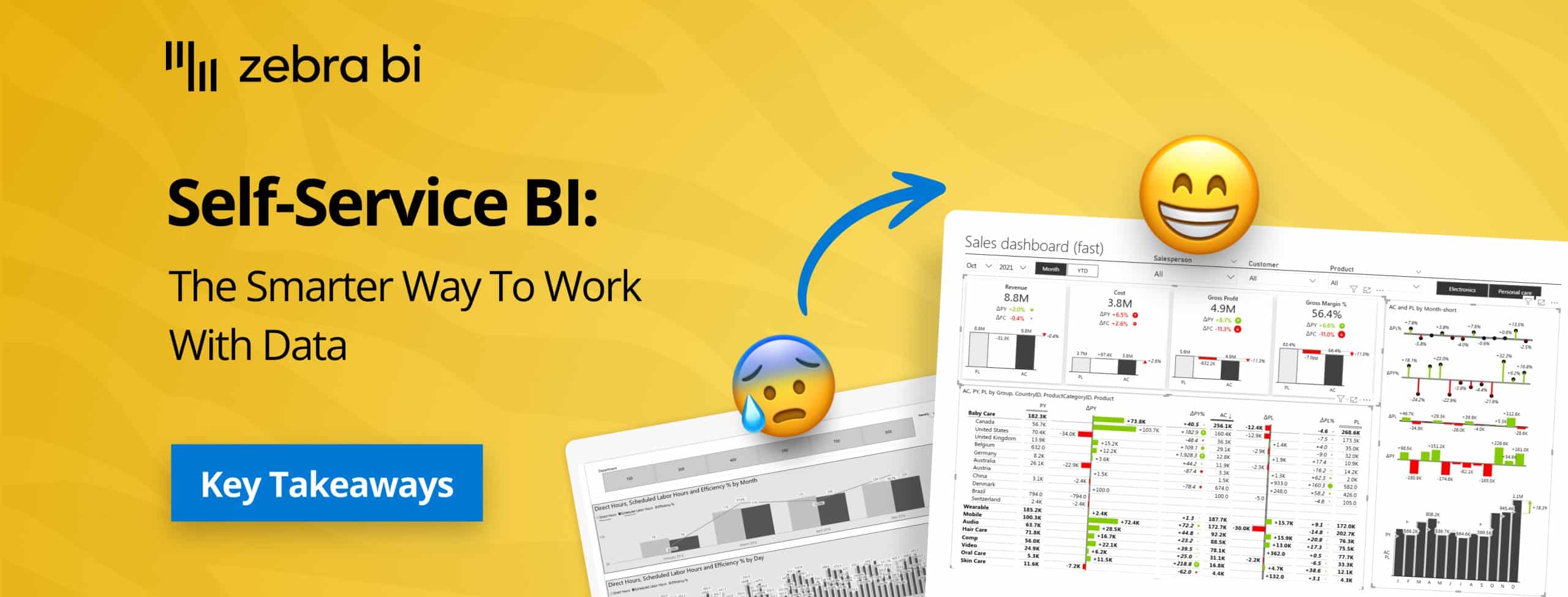
As showcased by Mark and Tilen, Zebra BI visuals enhance Power BI's native capabilities with features specifically designed to accelerate self-service reporting while maintaining governance and consistency.
The people that don’t actually know Power BI, they don’t actually have to deal with picking the visualizations now. They just want a chart. And with Zebra BI, it is as easy as that: click on chart and boom, you have it.
The webinar highlighted the success story of KPN, a leading telecommunications company. They successfully implemented a self-service model by creating "exploratory dashboards" with Zebra BI.
Their BI team designed a robust, governed reporting space, but gave users powerful, interactive tools to explore the data on their own terms.
Want to learn more about KPN's success story? Read more about it here.
Empowering users through self-service BI is an ongoing process that requires careful planning, support, and adaptability. By fostering a data-driven culture and continuously improving your BI solutions, you can ensure long-term success and value for your organization.
Remember: