Power BI reports become truly collaborative when you add dynamic comments in Power BI-but choosing the right approach means understanding both native features and advanced solutions.
With Zebra BI, you can seamlessly add dynamic comments to your Power BI reports, helping your team collaborate directly within the reports and provide context for every data point. Start your free trialand access the template to start using dynamic comments in your reports immediately.
The difference between a static dashboard and a living, breathing business intelligence tool often comes down to one thing: commentary in Power BI that provides context, explains insights, and enables team collaboration.
Here's the challenge most teams face: insights get discussed via email instead of in the report itself. Screenshots with annotations float around in chat threads, losing critical context. Teams wonder whether to use native commenting features or build custom solutions. Reports show the what but lack the crucial why behind the numbers.
This strategic guide helps you understand all commentary options in Power BI, choose the right approach for your needs, and implement effective team collaboration.
We'll explore:
Native Power BI commenting features and their collaboration capabilities
Strategic guidance on selecting the right method for your audience
Team collaboration best practices including @mentions, bookmarks, and notifications
Decision frameworks to match commentary approaches to business needs
Understanding commentary in Power BI: Strategic overview
Commentary transforms raw data into actionable business intelligence. While visuals show trends and numbers, commentary provides the business context that data alone can't convey. It answers the critical question: "Why did this happen?"
What commentary helps with & why it's important
Commentary in Power BI delivers four essential capabilities:
Business context that explains the story behind the numbers
Historical documentation creating audit trails and institutional knowledge
Team collaboration enabling real-time discussions within reports
Actionable insights turning observations into decisions and next steps
Dynamic comments in Power BI not only give your reports context, but they also allow teams to collaborate within the report, improving efficiency and decision-making. Start Free Trial to experience dynamic comments and see how they transform your reports into actionable insights.
The commentary landscape
When you're ready to add comments in Power BI, you'll encounter three distinct approaches:
Native Power BI features: Built-in collaboration through Microsoft's dashboard commenting system. Power BI comments on dashboards integrate seamlessly with the Microsoft 365 ecosystem and provide chat-style team interaction.
Custom dynamic solutions: Leverage Power BI's data modeling capabilities to create commentary that adapts to filters and slicers. Includes options like matrix visuals, Smart Narratives, and Power Apps (detailed in our implementation guide).
Third-party tools: Tools like Zebra BI offer professional annotations, cell-level notes, and advanced formatting tailored for business reporting.
Hybrid approaches: Combine multiple methods, using native comments for team discussions alongside custom solutions for formal presentations.
7 methods of commenting in Power BI
While commenting in text boxes already adds some value and it’s really simple to create, it’s certainly not dynamic. Thebuilt-in comment feature that you can use in Power BI Service is a step further but it really looks more like a chat than a comment function.
The options for creating dynamic comments that we'll look into more in detail are the Dynamic matrix: a basic matrix visual in Power BI; and Smart Narrative, included as a preview feature from Power BI’s September 2020 update.
You can also comment in Power Apps - it enables writeback from Power BI so the end-users can write comments directly from your Power BI pages.
Static text boxes
Static text boxes in Power BI are a straightforward yet essential feature that allow you to display static information directly on your Power BI reports.
These text boxes can be used to provide important context, instructions, or notes for end-users, ensuring that the purpose of the report or specific visual elements on the page are well understood.
Unlike dynamic visuals that adapt to filtering or interaction, static text remains unchanged, serving as a constant reference point in your Power BI dashboards or reports.
To use static text boxes effectively, it is important to align them with your report's overall design and layout. Choose concise wording and a clear, legible font to enhance readability without overwhelming the viewer.
While useful as they are, the downside to static text boxes is related precisely to the fact that they are static, offering no room for direct interaction, dynamic updates, or collaborative discussion within the text itself. This limitation becomes particularly evident when team collaboration and real-time feedback are crucial.
Built-in comment function in Native Power BI
Power BI comments on dashboards represent Microsoft's out-of-the-box solution for team collaboration. This native commenting feature integrates directly with the Power BI Service and the broader Microsoft 365 ecosystem, providing a familiar chat-style collaboration tool.
Native comments in Power BI work exclusively in the cloud-based Power BI Service. You can add comments in Power BI immediately—no DAX formulas, no data models, just click and comment.
There are a few types of comments you can add using the Native Power BI app:
Dashboard-level comments enable general discussions about the entire dashboard or report These comments remain visible to all Power BI dashboard viewers and support reply threading with chronological conversation views.
Visual-level comments tie directly to specific tiles or visuals. When viewing these comments, Power BI spotlights the relevant visual and filters to show only comments for that element. An icon indicator shows which tiles have active comments.
When to use native comments
Adding comments in Power BI using the native feature makes sense when:
Quick team collaboration is the primary need
Internal discussions about insights require real-time interaction
Chat-like interaction aligns with team communication style
Microsoft 365 ecosystem is already central to operations
Informal commentary serves the purpose adequately
When not to use native comments
Avoid native Power BI comments on dashboards for:
Board-level presentations where the informal appearance undermines professionalism
Data-integrated commentary that needs to respond to filters like a visual
Complex formatting requirements beyond basic text
Export needs since comments don't export with reports
Offline or Desktop commenting as the feature is Service-only
While Power BI’s native comments provide basic collaboration, Zebra BI gives you dynamic, professional annotations and the ability to comment on specific data points in real-time-without leaving Power BI.
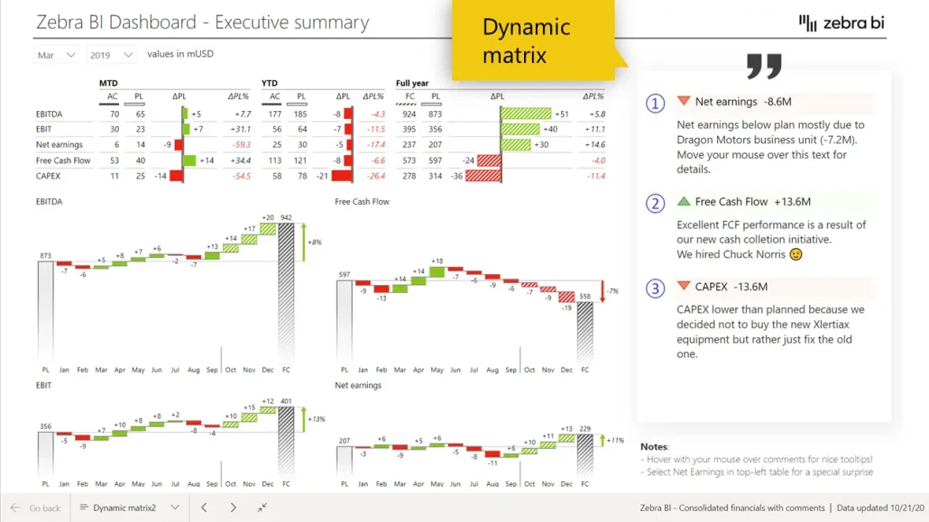
The dynamic matrix is particularly useful when you need to display tabular data that allows for interactivity and real-time updates based on user selections or filters.
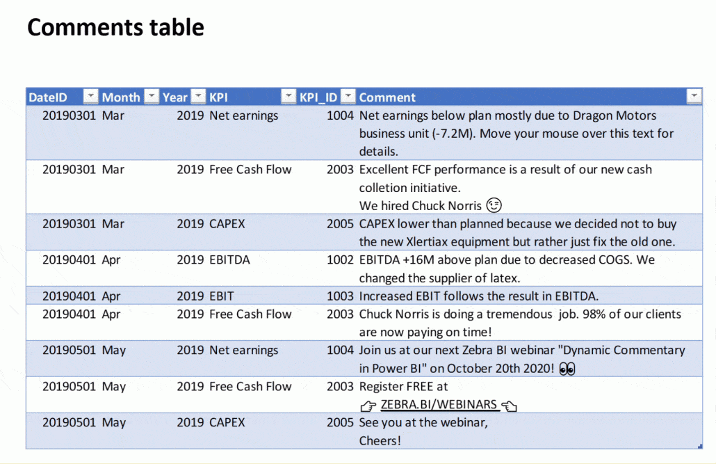
1) Include comments in your Power BI model
A prerequisite for any commenting solution is a Comments table. It’s a simple table in Excel where you have at least two (but usually more!) columns: a column with text that contains your comments, and one column with a date field that will serve as a link with a calendar dimension.
Once you have your table ready, you’ll need to include it in your Power BI model. The best one for most cases is a star schema including a fact table. Then you should to connect it to the calendar table so your time filters will properly work.
2) Load and display comments in your Power BI report using different methods and design options
After you load the comments, you can display them by pulling the Comments column into your report. And the basic version of commenting is ready!
However, a lot can still be done. Check the full tutorial to see various design options and tricks so the comments are easier to read and understand, for example displaying value columns one below the other.
You can get access and copy-paste the DAX formulas that you can use for some of the settings, on our dedicated webinar page.
We explored conditional formatting too, to achieve the sleek look of the comments with the icons below.
PowerApps
When building a Power Apps visual, you have no limitation in terms of design - Power Apps can display all your comments but they also have something the previously mentioned methods don’t have - the ability to write back.
In a Power App, you can now simply add a button to create a new comment. The end-user, or multiple end-users, can add the comments directly into the Power App and then just submit the item that will be dynamically linked back to the table.
The only limitation here is that you need a person with very good Power BI skills and plenty of time on their hands to set this up.
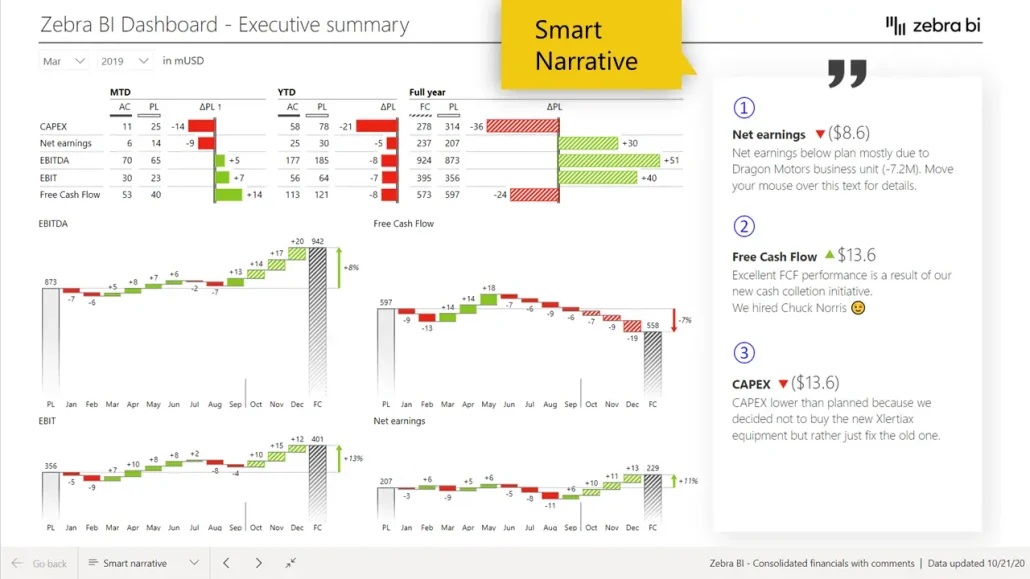
Smart Narrative
With the Power BI September 2020 update (preview feature), you can add comments with Smart Narrative too.
The Smart Narrative can be compared to a smart text box where you can have pieces of text that can be completely dynamic. You can add values and format each word, sentence, or character in a different way, which makes the smart narrative very interesting for constructing dynamic comments for the future.
The tricky part of it is creating and editing comments one by one, which means going through the same process for each comment as unfortunately, copying won’t work and it will return only a static text.
This is how the final result looks like - visually, it's very close to the version with the matrix:
Comment markers: the detail that makes a difference
Comment markers in Zebra BI are a powerful tool that allows users to enhance their data storytelling by adding contextual explanations directly to charts and visualizations.
These markers serve as a bridge between visual data points and the insights they provide, ensuring that viewers can quickly grasp the key messages without needing to analyze the data extensively.
By placing comment markers strategically on a specific point or trend within the visualization, users can highlight crucial findings, anomalies, or trends. This not only improves the readability of the report but also helps maintain consistency in communicating insights across different teams or stakeholders.
Annotations
Annotations allow you to add visual commentary directly on your charts, connecting specific insights to exact data points. Unlike text boxes or sidebar comments, annotations integrate seamlessly with visuals—making it immediately clear which data you're explaining.
Annotations work best for board presentations, executive dashboards, and formal reporting where visual polish matters. They're less suitable for collaborative team discussions (where chat-style comments work better) or situations requiring user writeback functionality.
In Zebra BI, annotations provide a streamlined solution that lets you add professional commentary directly to charts without modifying your data model. These annotations respond dynamically to filters and slicers—just like the chart data itself—combining ease-of-use with executive-ready appearance.
Hybrid approaches: Combining commentary methods
You don't have to choose just one approach. Some organizations may combine multiple commentary methods to optimize for different needs within the same reporting ecosystem.
For example, you may want to combine Native Power BI comments with Zebra BI comments. This approach delivers the best of collaboration and professionalism. Use native comments for day-to-day team discussions and real-time collaboration, while Zebra BI comments provides leadership with clean, professional-looking commentaries in their reports.
This combination provides clear separation—your team gets the chat-style interaction they need for operational discussions, while leadership sees clean, professional commentary in their reports. It's particularly effective when the same data serves both operational and executive audiences.
Likewise, you may want to combine Power Apps and Zebra BI. This hybrid commenting method represents a premium solution for sophisticated reporting needs. Zebra BI handles professional visualization with executive-ready annotations, while Power Apps enables user-generated commentary and writeback functionality. This combination works well for organizations that need both top-down professional communication and bottom-up field commentary. The trade-off? You'll need both budget for licensing and skills to implement Power Apps effectively.
Similarly, you may also want to use tooltips and native comments. This approach keeps your main canvas clean while providing detail on demand. Configure contextual, data-driven commentary to appear in tooltips when users hover over specific data points, while native comments handle team collaboration and discussion threads. This approach excels for dense Power BI dashboards where screen real estate is precious, giving users access to detailed commentary without cluttering the visual experience.
Different business functions have distinct commentary needs. Here are some examples of how to match commentary in Power BI to your specific use case:
Financial Planning & Analysis often need to explain material variances and documenting assumptions. Combine dynamic matrix for formal variance reports with native comments for review discussions. Example: "Revenue -$2.4M vs. plan due to delayed contract signing. Expected to close in Q4."
Supply Chain & Operations need real-time field updates. Comments enable frontline workers to add comments directly from the floor or handle follow-up discussions. Example: "Line 3 down 4hrs due to bearing failure. Root cause: missed preventive maintenance cycle."
Marketing Analysts benefit from combining comments for campaign collaboration with commentary for detailed performance metrics. This keeps campaign dashboards clean while providing strategic context on demand.
Executive Leadership demands a professional presentation. In this cas,e you may want to skip chat-style comments entirely—use Zebra BI for clean, strategic summaries. Example: "Q3 EBITDA exceeded plan by $4.2M (8%) driven by margin expansion."
HR teams require privacy-conscious commentary. Comments keep sensitive information secure, with carefully restricted information for appropriate team collaboration only.
Project Managers will often combine comments for day-to-day collaboration with row-level notes for detailed milestone tracking and dependency documentation.
Want to see some of the best ways to use Power BI comments, in action? Watch our webinar on Power BI commentary and learn everything you need to know about this from our very own Andrej Lapajne!
Strategic best practices for using comments in Power BI
Implementing effective strategies for using comments in Power BI can enhance collaboration and streamline data interpretation.
Match method to audience
Internal teams benefit from native comments with collaboration focus. Executives require custom dynamic solutions or Zebra BI for professional appearance. External clients need static or professional solutions only—never chat-style comments.
Establish clear governance
Define purpose and scope of commentary in Power BI. Set quality standards that users understand and can follow. Create moderation processes that maintain quality. Implement regular review cycles to keep commentary current.
Train users thoroughly
Cover three areas: technical (how to use features), strategic (when to use commentary), and standards (quality expectations). Provide examples and templates that users can follow.
Start simple, scale for complexity
Begin with native comments for quick wins. Add custom solutions that are easy to implement and scale (such as Zebra BI, for example). Avoid over-engineering early in the process. Iterate based on user feedback and changing requirements.
Tactical best practices for Power BI comments
Here are some practical strategies to implement effective commenting in Power BI.
For comment quality:
Be specific and actionable with clear next steps
Include context: what happened, why it happened, what comes next
Keep concise (aim for 2-3 sentences)
Use proper grammar and tone appropriate for workplace
Add timestamps for time-sensitive items
For governance:
Maintain quality comments in Power BI:
Assign comment ownership by report or domain
Schedule quarterly reviews of governance policies
Archive obsolete comments regularly
Monitor for inappropriate content consistently
Track adoption metrics to measure success
For performance:
Optimize commentary in Power BI:
Limit active conversations—delete old ones when reaching limits
Keep comment text reasonable length within the 2-3 sentences
Don't overload single reports with 100+ conversations
Use conditional visibility for many comments
Consider separate detail pages for extensive commentary
Ready to tell your data story more coherently than ever?
Commentary in Power BI transforms static reports into collaborative decision-making tools. Whether you choose native Power BI comments on dashboards for team collaboration, implement custom dynamic solutions for professional presentations, or invest in third-party tools like Zebra BI for advanced capabilities, the key is matching your approach to your specific needs.
Remember these core principles:
Start with your audience and goals—let requirements drive method selection
Leverage native features first for quick wins and team collaboration
Use custom solutions like Zebra BI for easy implementation and scalability
Invest in professional solutions when executive presentations demand it
Establish clear governance to maintain quality and security
Train users thoroughly on both technical skills and strategic usage
Monitor and iterate continuously based on feedback
The reports that drive the best decisions are those that combine accurate data with meaningful context. By implementing effective commentary in Power BI, you create reports that don't just show what happened—they explain why it matters and what to do about it.
Your data tells a story. Commentary provides the narrative.
Want to learn more about turning comments into your ally in data storytelling? Check out our webinar and get the FREE PBIX files for the best use case examples.
And if you're ready to take your Power BI dashboards and storytelling to the next level, try Zebra BI. For free. And let us know what you think.
Try Zebra BI for FREE - experience dynamic comments in Power BI
Zebra BI gives you professional, filter-responsive dynamic comments built directly into your Power BI visuals - no DAX coding, no complex setup, just comments that update automatically with your data.
Would you happen to have a guide detailing the method for the Power Apps option, or have a source you could recommend learning from? I haven't used Power Apps before.
Hi Clyde, unfortunately, we don't have instructions for it yet, but we might prepare something in the future. I'm inviting you to sign up for the newsletter so you'll get the invite by email in case we'll have a webinar related to Power Apps.
Great tutorial. Using it now.
However, What if I don't want my numbers formatted to Millions, and just want the default? Could you share what changes to the DAX would look like?
You say you're actively working on linked comments at the moment, and this will be available soon.
How soon is 'soon'?
(I realise you can't commit to anything until it has passed testing and is ready, but some indication would be great. Are we talking 1 month, 6 months or 12 months+ for instance?)


Hey,
Would you happen to have a guide detailing the method for the Power Apps option, or have a source you could recommend learning from? I haven't used Power Apps before.
Hi Clyde, unfortunately, we don't have instructions for it yet, but we might prepare something in the future. I'm inviting you to sign up for the newsletter so you'll get the invite by email in case we'll have a webinar related to Power Apps.
Great tutorial. Using it now.
However, What if I don't want my numbers formatted to Millions, and just want the default? Could you share what changes to the DAX would look like?
Hi Ron, thanks for your feedback. Glad to help. Just remove (or adjust) the FORMAT from the DAX. Cheers, Zebra BI Team
Hi,
You say you're actively working on linked comments at the moment, and this will be available soon.
How soon is 'soon'?
(I realise you can't commit to anything until it has passed testing and is ready, but some indication would be great. Are we talking 1 month, 6 months or 12 months+ for instance?)
Cheers,
Andy
Hi Andy, unfortunatelly this is not up to because Microsoft does not allow this feature for custom visuals. We recommend you use PowerApps for this. https://zebrabi.com/webinar/writeback-commentary-power-apps-webinar/
Excellent thoughts