Data Storytelling Made Simple: Adding Comments in Power BI with Zebra BI
PRO Trial
There’s no doubt about it - executives and other business intelligence consumers want to see more comments in their Power BI reports that would help them better understand data and take action. However, many analysts still find it difficult to use comments in their reports, instead relying on old-fashioned approaches like copying and pasting data (or putting screenshots) into PowerPoint presentations.
These days might be drawing to an end.
In this blog post, we’ll look at the most practical and the most straightforward way of adding dynamic commentary to your Power BI dashboards usingZebra BI for Power BI. This will allow you to take a big step forward in your dashboards because providing accurate commentary and explanations for your data is probably the single most impactful thing you can do today to improve your dashboards.
We’ll conclude by offering some guidelines and tips that will help you integrate commenting into your operational workflows.
Understand why comments in Power BI are important
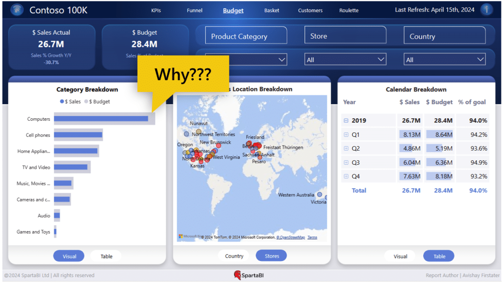
First, we need to get on the same page about the utility of comments. Let’s start by looking at what we mean by that. Here is a popular dashboard from a Power BI community website.
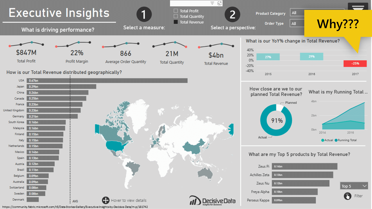
It’s a well-designed and laid-out dashboard that looks really nice, and it’s clearly intended to provide executive insight. However, when it comes to getting certain insights, it doesn’t really do its job all that well. It's not actionable and does not provide the information that’s needed to make business decisions on a daily basis.
For example, once you take a look at the data on the dashboard, the first thing to get your attention is the significant 25 percent year-over-year drop in revenue. The natural reaction is to try and find out why. Sadly, this dashboard simply does not deliver the necessary information.
While it might be possible to drill deeper into the data and find the reason, such a precipitous drop merits a clear explanation on the first page.
However, a single short comment that explained the context and the actual reasons for the decrease would be immensely helpful. It could even include a recommendation or a suggestion about what to do.
Using comments in Power BI to deliver insights
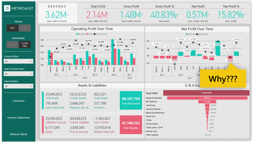
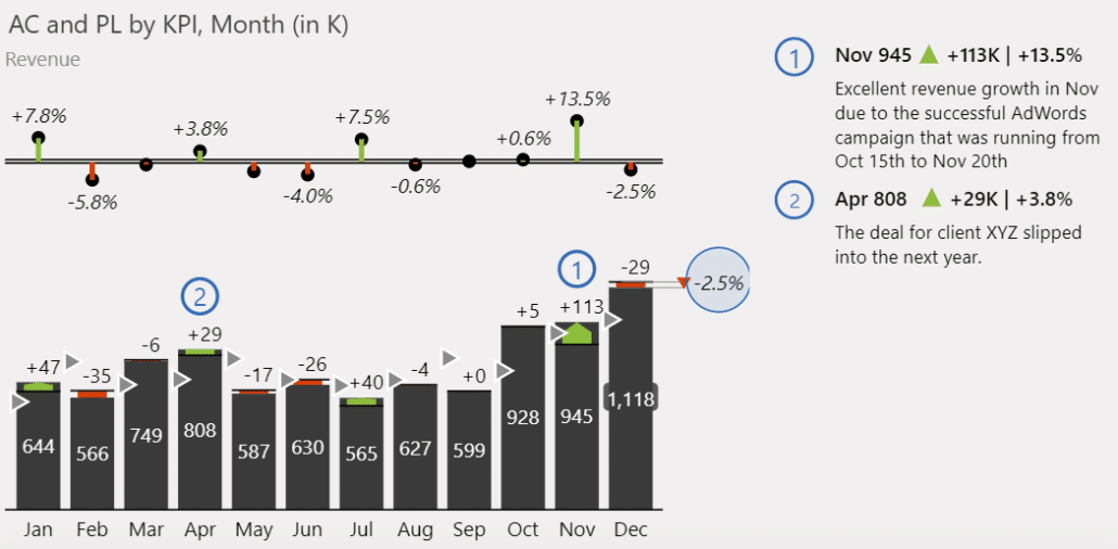
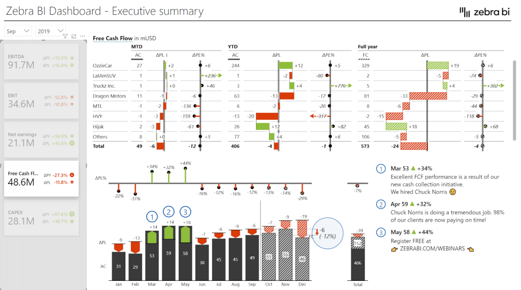
Let’s take a look at a better example. We’ve prepared a sales dashboard that clearly shows how important comments in Power BI reports can be.
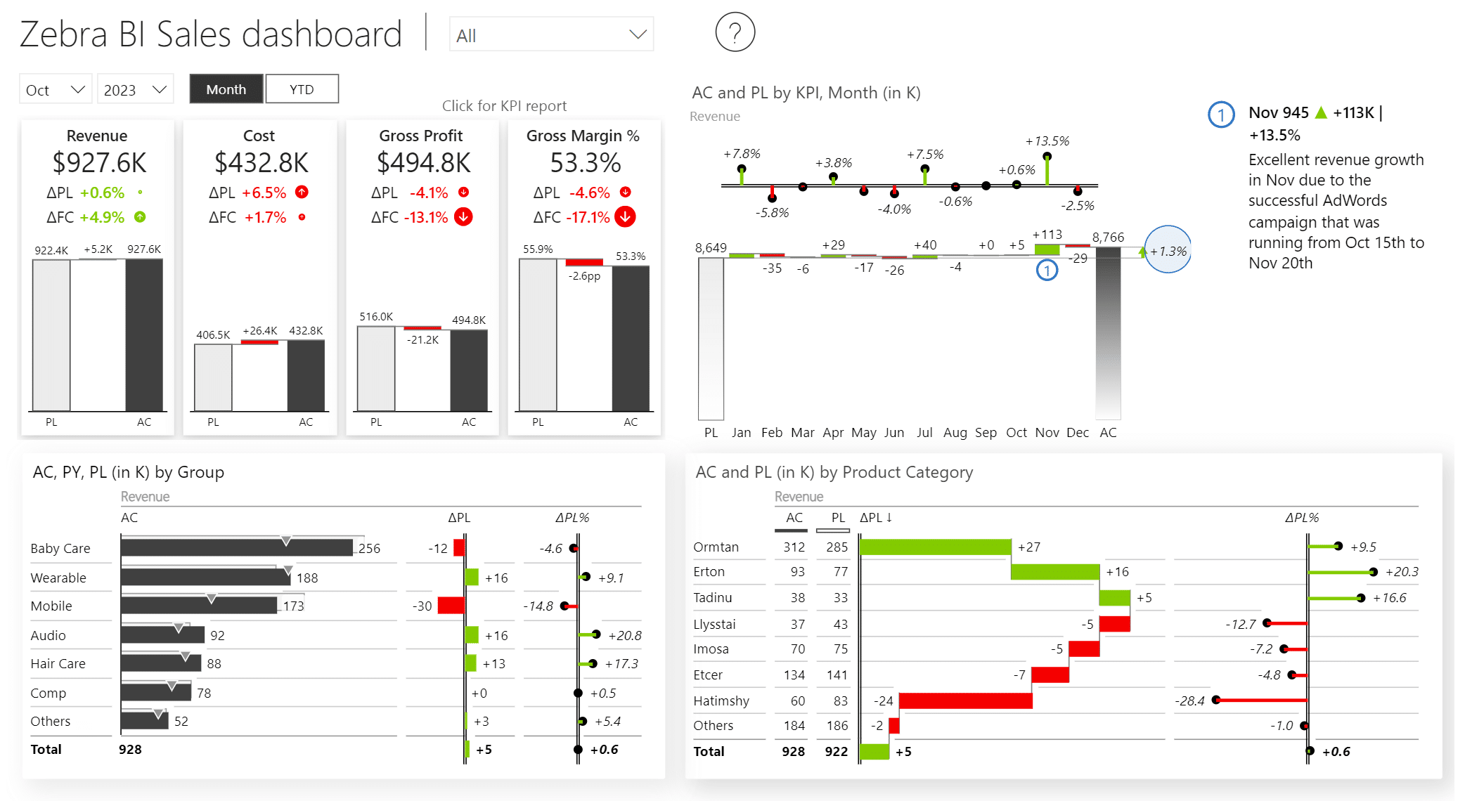
The dashboard shows excellent growth across the board. A commentary clarifies that this growth is a result of a successful AdWords campaign executed in November. This is a piece of information that a user can’t locate in the actual numbers that make up the report. It is this comment that provides key context, allowing us to understand the situation much better.
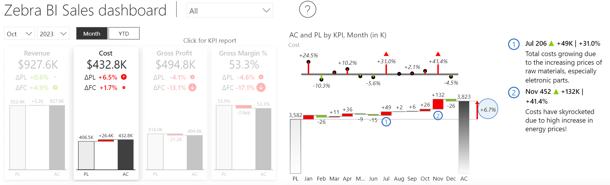
You could even drill down into more detail. For example, it is clear that costs are growing, so you can click on the Cost KPI card to filter the dashboard based on costs. This view also includes comments explaining that costs are growing due to increasing prices of raw materials and energy prices.
We see that comments in Power BI reports are a really convenient way to provide additional value and insights to your dashboards. They are key ingredients to transform your data into a compelling and actionable narrative. Commentary is a crucial storytelling element providing short textual context that can be added to your visual presentations.
Going about comments the wrong way
Comments are such a useful tool, yet they remain underutilized. One of the main issues is that users simply do not use comments in Power BI. Instead, they go to PowerPoint, type up their comments there, and then switch between the two apps to create presentations.
They copy the data to PowerPoint and add text boxes and bullet points to explain it. This has the result of creating a parallel universe in which most of your valuable knowledge is locked and not easily accessible. It is not updated and becomes difficult to maintain and share.
Here’s an example of a typical PowerPoint that’s created with this approach.
Some users insert call-outs into their reports, which is a step forward but still requires a lot of manual effort. Every change becomes a major headache as individual call-outs need to be moved, modified with new data, and deleted. People spend hours and days simply rearranging text boxes in their presentations.
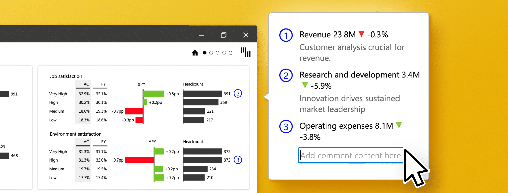
Finally, here is a report that shows how it is done properly. In this example, comments are linked to exact data categories: the first comment refers to revenue and is available exactly where it is needed. The second comment refers to research and development, and it clearly shows to which data point belongs.
This post demonstrates how to seamlessly integrate comments into your Power BI dashboards without relying on DAX and other complex methods. By adopting this approach, you can adhere to best practices and ensure your comments remain within your central Power BI reporting system rather than getting buried in a PowerPoint presentation on your server. This enables you to deliver reports and information promptly to the appropriate audience.
Why aren’t companies using comments in their reporting?
When we talk to users from our more than 3,000 enterprise customers, a common thread emerges. C-level executives, heads of reporting departments, and other leaders echo the same sentiment: comments in Power BI are the most glaring omission in their dashboards.
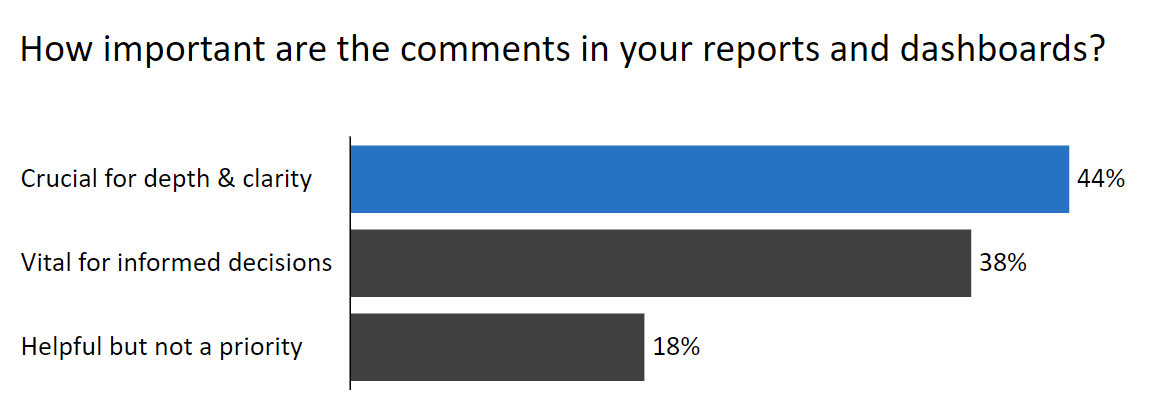
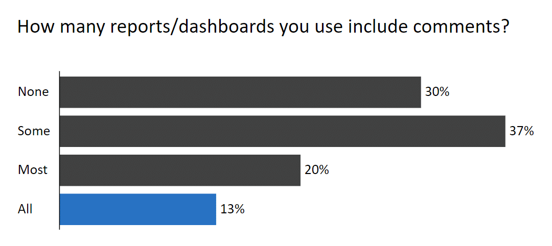
To delve deeper, we ran a short survey among our customers about the importance of comments in Power BI reports and dashboards they use. The results showed that 44% of respondents believe they are crucial to achieving the depth and clarity of the insights, while another 38% think that comments are vital for making informed decisions. Comments clearly rank highly and likely represent the foremost priority in dashboarding right now. Executives want and need comments in their dashboards.
And while the need is clear, many companies do not use comments. Our survey has shown that 30 percent of respondents never use comments, and only 13 percent use them in all their reports. Here are the results:
Upon examining the top 100 entries in the community gallery of Power BI templates and reports, we discovered that virtually none of them incorporate comments. It seems like the vast majority of templates running in today’s world don't include any comments.
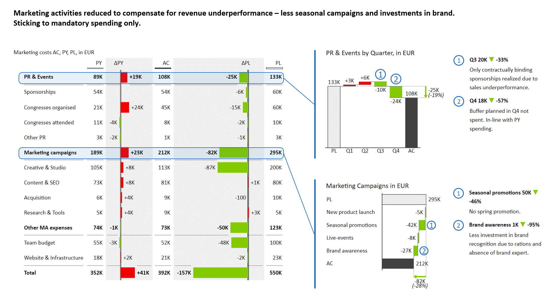
One of the most common questions that comments answer is “why”. Our example from the start of this post was attractive and showed some data but failed to provide the answer as to why there was a sharp drop in revenues. And this is the story we see again and again in dashboards and reports.
There are plenty of dashboards without any comments explaining changes in data that would most definitely be concerning to any executive looking at them.
Your dashboards should deliver the in-depth understanding that is needed to make better decisions and take smarter actions.
Technology is certainly a barrier when it comes to comments. They are often omitted because users find the process too complex and lack the necessary know-how. This makes it a technology issue as well as a user experience issue. When designing Zebra BI, our goal was to make it so simple anyone could do it in Power BI.
Can PowerPoint be the right tool for reports?
Simply put, yes, but there are some tips & tricks you should know. Consider the example below, which shows how much additional contextual information can be provided with a thoughtful chart design. Here is a typical PowerPoint slide featuring comments. While it contains information, it is difficult to read, and it is not immediately clear which data categories the comments refer to.
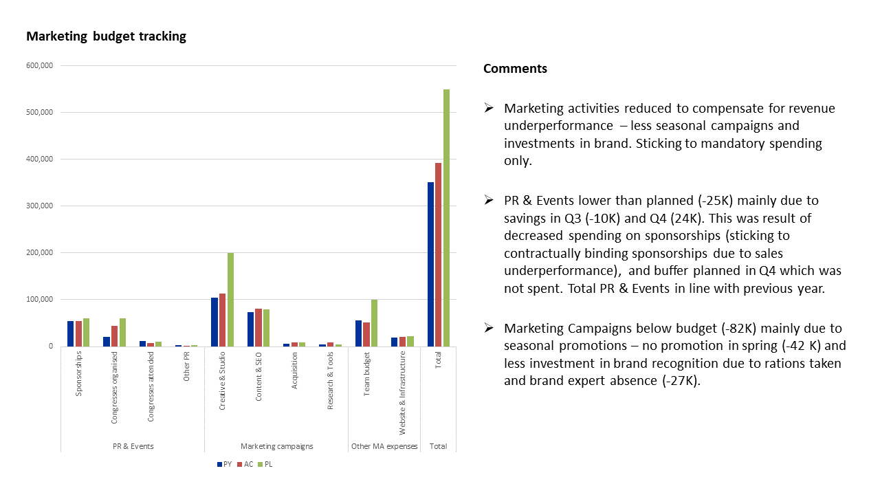
A much better approach is to take individual categories, add breakdowns by quarter, and then add comments that explain the most important data points, which are usually the ones with the most significant variance.
The easiest way to add comments in Power BI
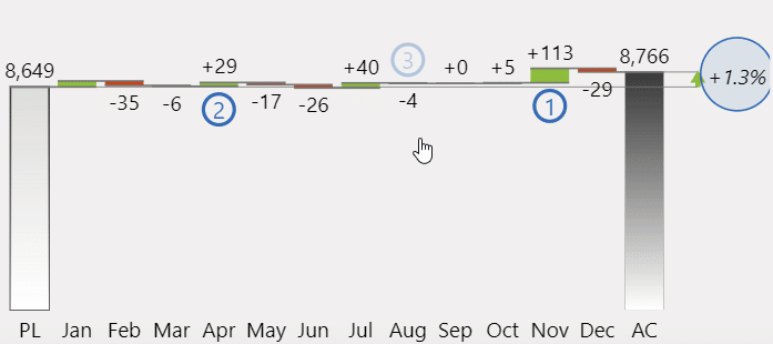
To show what makes a good dynamic dashboard, here is our first dashboard again.
The dashboard is made up of several elements: a monthly chart, some waterfall charts, and comments. It is completely dynamic (interactive), which means that everything, including comments, changes based on a filter that is applied once one of the KPIs, such as revenue, cost, gross profit, and gross margin, is selected.
Here is how the dashboard looks if you select the Cost KPI.
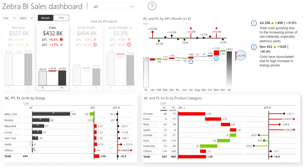
Once the filter is applied, other information, including comments, is displayed. This shows just how tightly integrated the comments are into the report. They are stored in the database and aware of the filter context, so they are very easy to add, maintain, and use.
We made adding comments in Power BI very simple in Zebra BI. You just need to click on the Add annotations button within the visual.
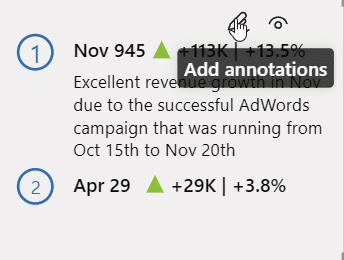
A selection panel appears, where you should select the Add comment option.
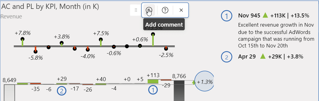
As you enter the mode for adding comments, you can select specific data points (a month in our example) and click to add a comment. The data point to which the comment will be applied is marked with a translucent number.
Note: When writing comments, make sure you are concise, precise, and accurate. Don’t try to overexplain things; keep things simple.
Once you add these comments, they become an integral part of the visual and stick with the data. This means that if you change the visualization type, the comment stays with the data, so you don’t have to drag it around or resize it. It will even respond to filtering.
Using comments in a hierarchical Power BI report
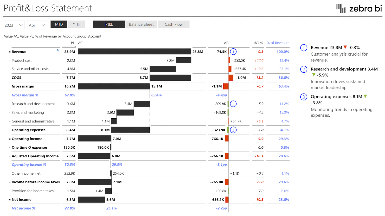
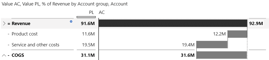
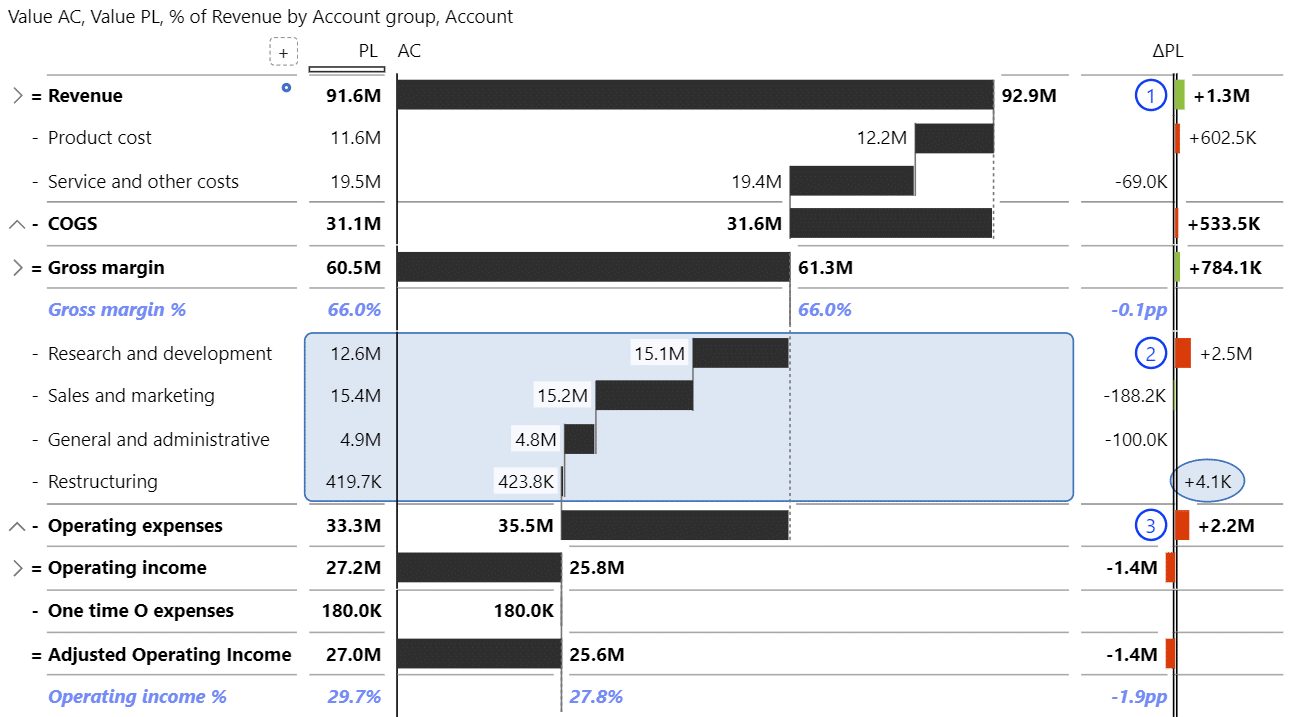
To show just how versatile comments can be, let’s look at how they can be used in a profit and loss statement.
Because each comment is an integral part of the visualization, it will respond to any kind of typical actions in your dashboards. This P&L report has a hierarchy, which means that individual values, such as Revenue or COGS, consist of several items.
You might add a comment belonging to a lower-level item in a hierarchy, like Service and other revenue, in our example. Then, you might collapse the category to improve readability, in which case the comment will be hidden. However, the visual will now display a comment indicator that shows there are comments below the currently visible level. A user then has to simply click on this to expand the visual to the level containing comments automatically.
These comments will respond to any filtering. If you switch to the balance sheet report, comments will disappear because they were made for the P&L statement.
However, there is one thing you need to do to make them even more useful. With the current setup, the comments will stay the same even if you switch to another month or year. To fix this, you need to store comments for each value for the month.
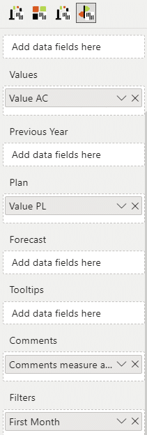
All Zebra BI visuals now have a Filters placeholder, where you can tell the visual to be aware of the filter context for a month.
All you need to do is add the Month measure to your Filters placeholder in the visual.
Now, when you add a comment to a value in May, it will be stored for that month only and will no longer show up once you switch to another month. This is a great way to keep track of your past comments and explanations, as you have been doing business for over a year. All of this data is stored live in a central and managed location.
Use annotations to add more context
Another great feature that allows you to add more information to your visuals is area highlights.
Click the Add annotations button again and select the Add highlight button.
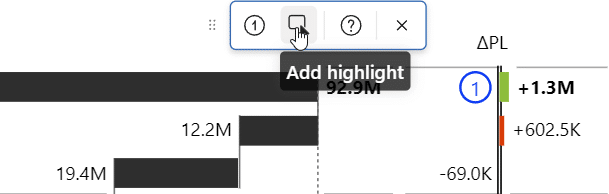
Your cursor will change shape and allow you to select an area or individual values on your report.
Just like comments, highlights are also completely dynamic. If you decide to change the layout of your reports at any point by reordering your columns or changing to a different view, the annotations and comments stick to the data points to which they were added.
This is different from PowerPoint, where every change you make requires you to move and modify any text boxes and callouts manually.
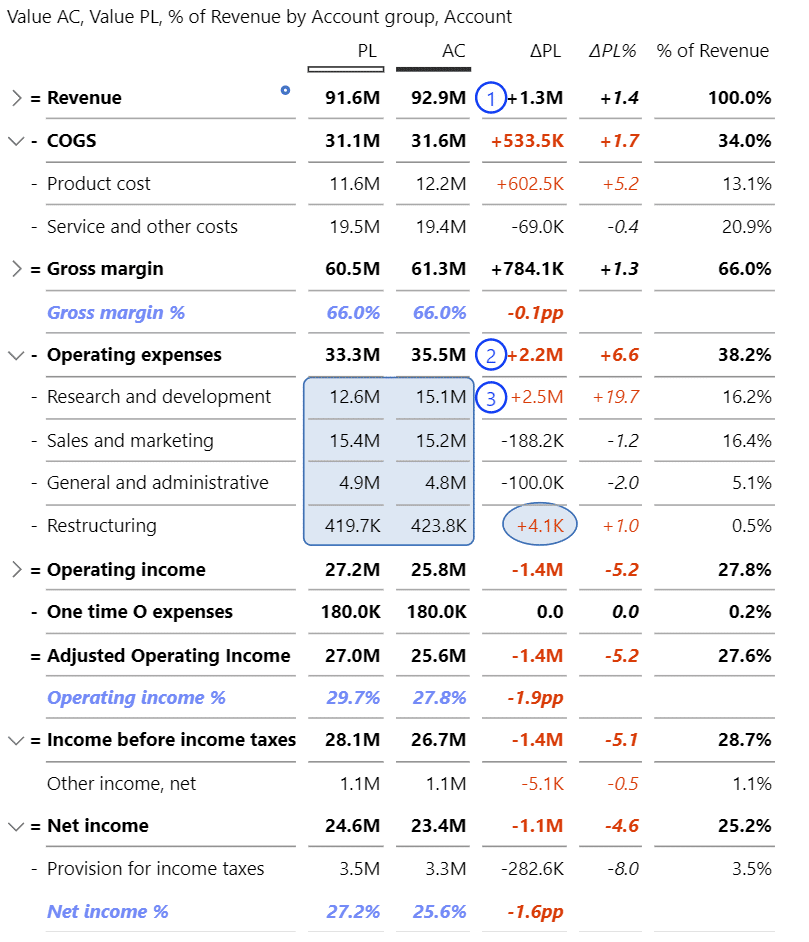
Here is the same report in a table format:
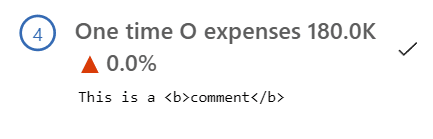
Another feature that you can use in comments is the HTML-rich formatting tags, like bold, italic, and others, to add emphasis and communicate even better.
This post shows that Zebra BI for Power BI offers the easiest way to add commentary to your Power BI reports. It’s a one-click solution that requires no code, DAX knowledge, or writeback. In addition to comments, you can also add highlights to areas or individual data points.
At the same time, all annotations are “sticky” and will stay with your data and respond to filters, layout changes, and sorting operations. Any information you enter is stored with the Power BI report, so it will be available over time, ensuring that you always work with consistent and accurate information.
Best practices to ensure consistent and actionable commentary in Power BI
All of this shows that you now finally have a tool for adding commentary, and there is no excuse not to do it. This brings up the larger question of how you will organize your operations to make sure you get really valuable and insightful information that adds the right context to your dashboards.
Here are some tips.
Assign owners for commentary. This varies from company to company. It could be your finance people or analysts. Just make sure you are clear about who is responsible.
Set a deadline. This is another basic tenet of management. Simply set a date by which comments need to be gathered and entered.
Provide guidelines for writing comments. While it might sound trivial, many people are not good at writing insightful comments. They often get lost and just state things that are obvious from the data. Instead, they should focus on the following:
- Explain why something happened, which is an analyst's core job.
- Link your comments to data categories to make sure there is no disconnect between the data in your charts and your comments.
- Make your comments short and clear.
- The information you provide should be exact and actionable.
- Provide advice to the reader.
You can use commentary in any scenario. You might be working on an executive summary …
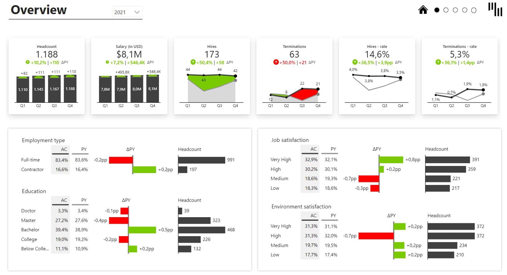
… or an HR dashboard.
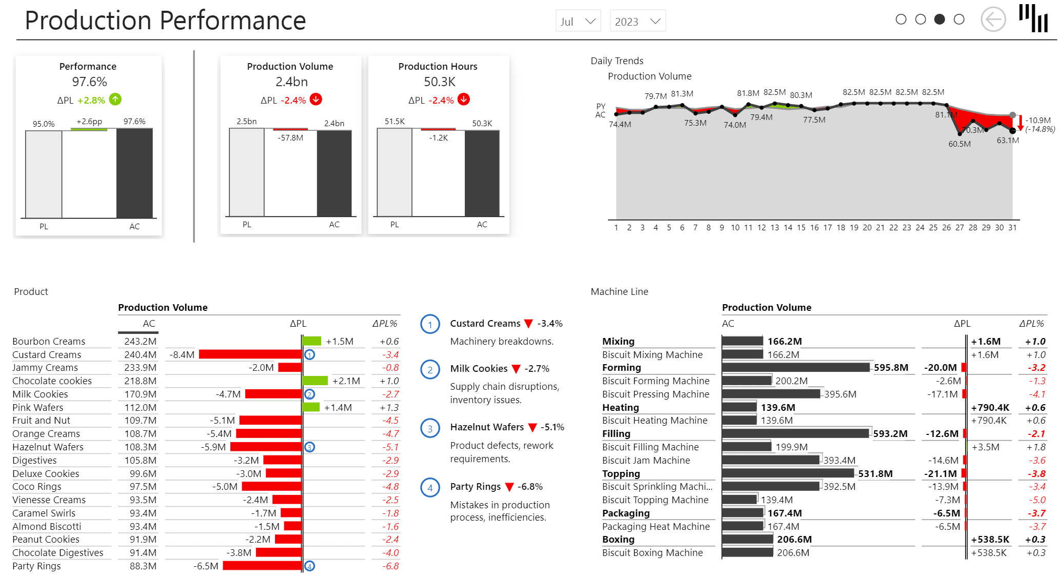
It can also come in handy when working on production reports.
Our recommendation when it comes to comments in Power BI dashboards is to start today because including comments is by far the most impactful thing you can do to dramatically improve the satisfaction of the end-users with your reports and dashboards.
And if you want to gain a broader understanding of the importance of storytelling in reporting, don't forget to check our guide on Power BI data storytelling right here.
Webinar recording + Free PBIx examples
Watch the recording from the webinar and learn more about dynamic comments in Power BI:
PBIx examples shown in the webinar
Try it on your own! Download our report templates and add dynamic comments with ease.