If you’re looking for more advanced Power BI visualizations, look no further than Zebra BI. Our visuals are officially Microsoft-certified and offer powerful features that make reports and dashboards understandable & actionable.
 September 8th
 February 22nd
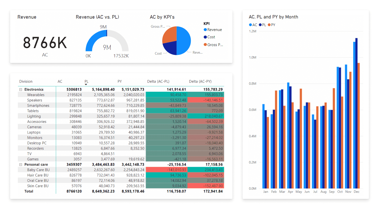

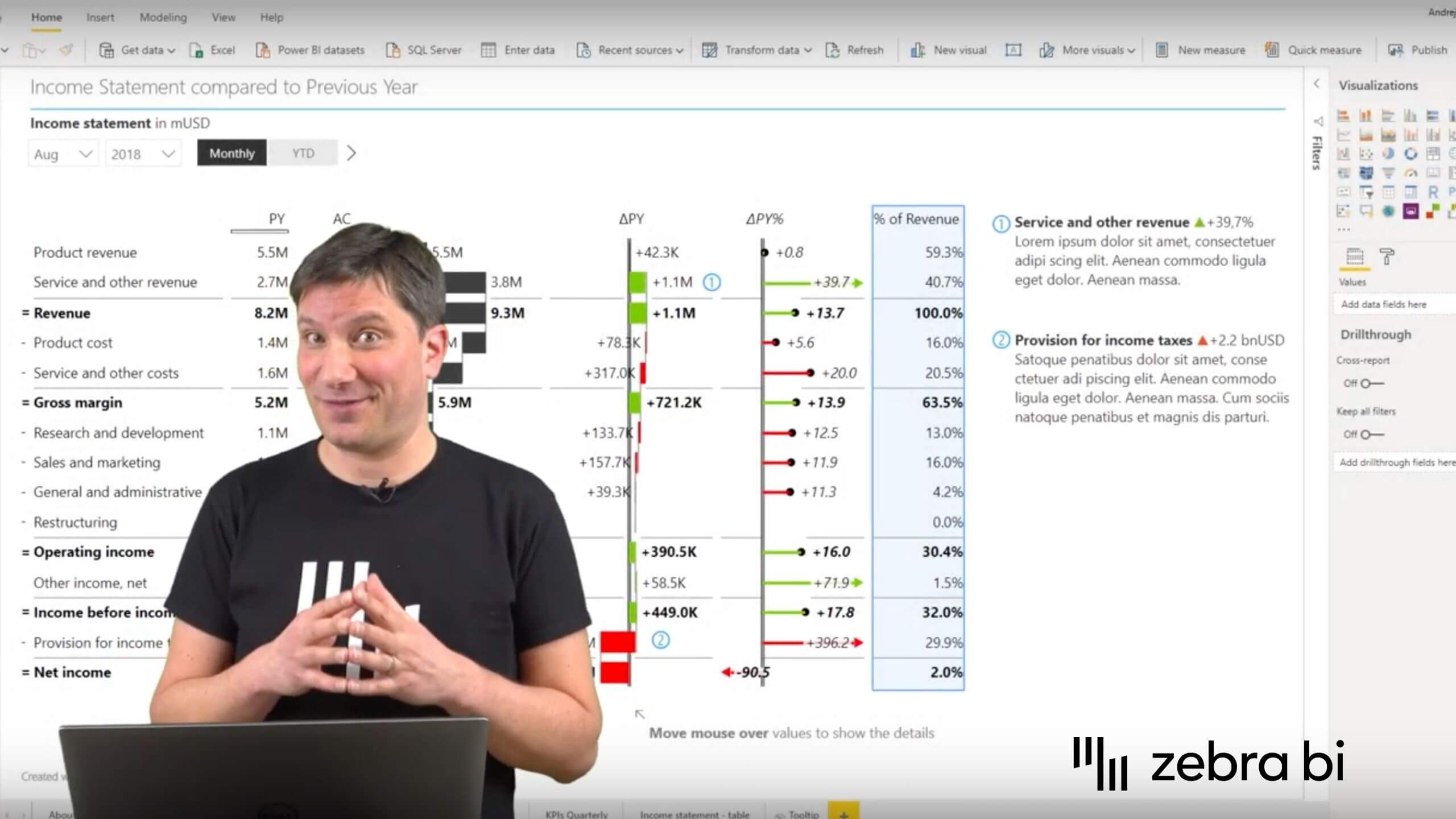
Because Power BI standard visualization options are rather limited, it's often difficult (and sometimes even impossible!) to visualize complex business data in a way that end-users would understand. Zebra BI visuals were built to make reports and dashboards understandable and actionable. Our visuals don’t just show how something is good or bad, but they tell you exactly what’s going on. So, if you’re hoping to discover real insights, you need Zebra BI visuals.
Try out interactive PBIX examples

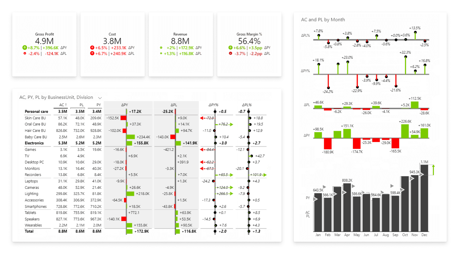
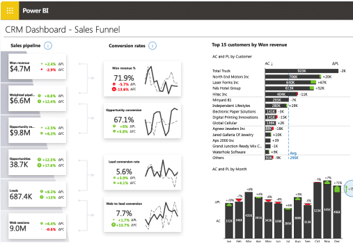
Building reports and dashboards in Power BI takes time. Sometimes it takes hours, sometimes days or even weeks. All this to build a very complex model that is impossible to maintain (kudos to all people out there who maintain reports that other people built). With Zebra BI visuals you can easily be 10x times faster, since our visuals automatically calculate many business categories, such as year-over-year variance in Plan or Forecast.
For a user, this means you can have an extremely simple data model and Zebra BI visual is going to not only visualize that but calculate & visualize your data. With our visuals, you can, therefore, simplify your model, shorten the time needed for creating reports, as well as make reports more flexible and easier to maintain in the long run.

Zebra BI supports IBCS reporting standards and custom themes. We want you to focus on interpreting your data, not worrying about the look of reports, while doing crazy things to fix the design in Power BI. Even if your company employs thousands of people who interact with Power BI, you can now make sure that no matter who builds it, each report will have a consistent design, making it easier to understand.
Learn more about IBCS-compliance and Custom Themes

We’ve been building financial and sales dashboards for more than two decades so we understand all the nitty details behind it. It’s all we think about every day. So, if the Power BI team is working on building a better platform, then our main focus is data visualization and millions of ways of making it better.
For example, just recently Power BI introduced “visual personalization” that enables you to choose a visual, however, not necessarily the right one! On the other hand, Zebra BI shows you exactly which visuals are the best fit for your specific data set. We could go on about features such as responsiveness of visuals, column sorting, as well as many others, but you get the point: it’s the user experience that makes people so happy with Zebra BI visuals.

Zebra BI Live Demo
Speaking of dashboard building expertise: since 2015 we’ve been creating detailed video tutorials on our Youtube channel that have been watched over 200,000 times.
We host new live online webinars almost every month. They're free and available to everyone. Plus, they come with practical visual examples you can play with.