Best practices for creating PowerPoint template for business presentations
When it comes to business presentations, PowerPoint is ubiquitous, with some putting its market share at 95 percent. Learn all about PowerPoint templates to get the most out of this powerful and flexible tool.
If you've ever sat through a business presentation, odds are very good it was delivered using PowerPoint. It is unarguably the most popular presentation software in the business world and academia, used by millions of users across the globe.
PowerPoint has a whole range of advantages, including familiarity and user-friendliness and integration with the Microsoft Office suite. Its popularity means that you will have no issues finding support or help when designing your business presentation. There are thousands of power users ready to lend a helping hand.
PowerPoint is also a very flexible and extensible tool that can be easily extended with add-ins, such as Zebra BI for Office that delivers advanced charting and data visualization options.
Microsoft has also been very good with ensuring compatibility and portability, so other users will be able to open your PowerPoint templates on most devices and operating systems. Last but not least are advanced collaboration options that Microsoft has added in recent years that make it easy to share your work and connect with others.
Focus on use scenario
So how should you go about designing a PowerPoint template?
The first thing you should do is to decide what its primary use scenario will be. Your primary goal may be to create a visual background and aid to your spoken presentation. On the other hand, you may be creating a handout or a standalone report that will be sent separately and read by the user at a later date. PowerPoint templates are also commonly used as interactive instructions or documents.
Both of these use cases require different approaches.
Visual support for spoken presentation
If your presentation will play on a screen while you speak, your PowerPoint template should be designed to support your content and help communicate your message effectively to your audience.
Keep it simple. Don't overwhelm your audience with slides loaded with text. Your slides should only include key points and you should focus on using impactful graphics that support your story. Remember, surveys have shown that people really dislike slides with too much text. Don't alienate your audiences by filling slides with text that you then read.
Limit the amount of information. This is similar to the previous point but still makes for a great practice. When designing a business presentation, keep one major takeaway per slide so you don't dilute your messages.
Stay consistent. Your slides should have the same design, which includes the color scheme, font size and type, branding and other design elements. This makes it easier to follow the topic since your audiences don't have to decipher each individual slide.
Create a visually appealing design. If you want your presentation to look professional, use high-quality images and visuals. In business presentations, you should focus on charts and tables that support your points and provide more detail as well as visual support.
Insert suitable charts and tables. Consider the type of data you want to represent and the message you want to convey. For example, use bar or column charts to compare data across different categories or time periods. Line charts are ideal for showing trends or changes over time and waterfall charts show how individual items contribute to a change in value.
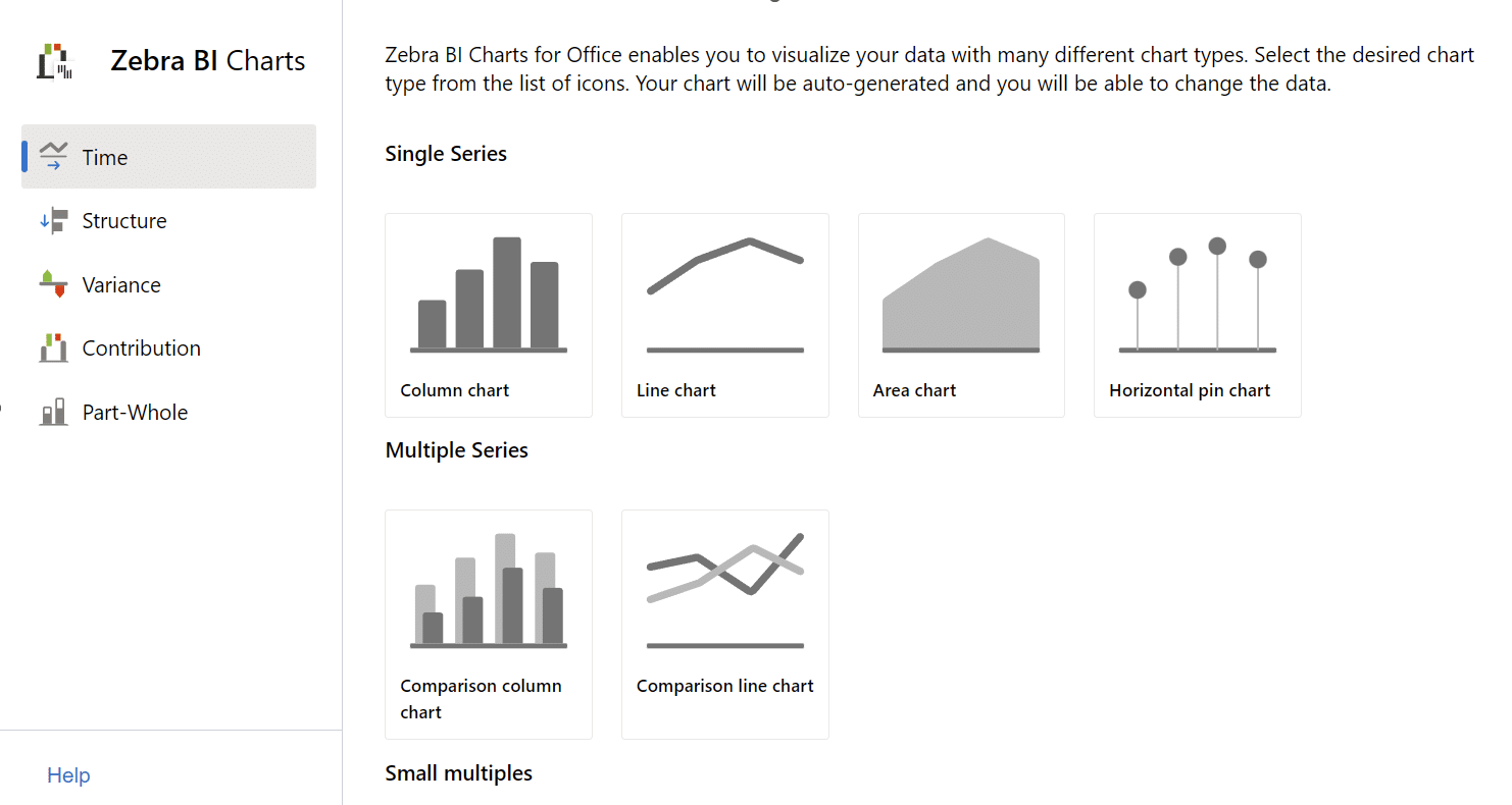
Zebra BI for Office includes a handy tool for selecting the right chart.
Bottom line is to treat your PowerPoint template as supporting information for your words. Don't read from slides and treat them as core messages that reinforce and highlight what you're saying.
Standalone handout or report
You can also use PowerPoint templates as handouts for later reference after a presentation or a standalone reference or report. You can take a different tack here and include additional information or design more text-heavy slides, since your audiences have more time to read your documents.
You should still follow the core concepts from above but you have a bit more leeway when it comes to the amount of text. For example, while a spoken presentation may only include a chart, the same chart on a handout can be accompanied by comments highlighting specific peaks in data.
Speaker notes in PowerPoint are another great tool. Use them to include supporting stats and text that do not need to be included in the main slide. You can spend a bit more time on them, flesh them out and create a great looking standalone document for your colleagues, customers or superiors.
Best practices for crafting your PowerPoint template
It is up to you to make your business presentations good. Let's face it - meetings are simply not going anywhere and their number is increasing. A recent study speculates that large organizations may be losing up to US$ 100 million per year due to unproductive meetings.
We should all try not to contribute to this.
Here are some practices that can help you craft great business presentations.
Data-driven storytelling. This is a practice of using data to convey a compelling narrative that combines analytical insights with storytelling techniques. Your PowerPoint template should deliver actionable insight. That means data that helps business users, managers and analysts make informed decisions.
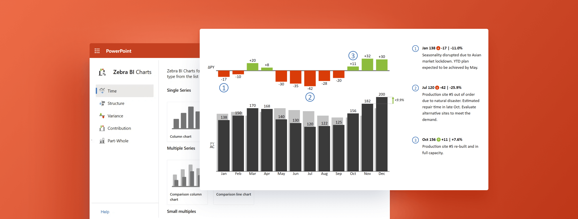
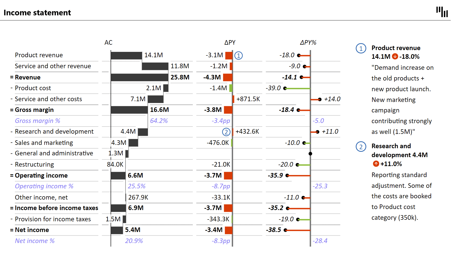
In practice, this means supporting your conclusions with data and incorporating supporting evidence to provide context. For example, you can use Zebra BI for Office to calculate variances and show actual and previous year data on the same chart.
This chart features high data density - it shows previous year and this year data along with absolute and relative variances. Any business user can look at this chart and quickly understand what is going on with sales.
For more detailed information about this topic, read or blog post Actionable reporting in Excel & PowerPoint: How to convert boring reports into data stories.
Top-to-bottom design. We recommend this method of organizing and delivering information where the main message or high-level insights are presented first, followed by supporting details and data. Start with top-level information, such as a summary slide with top KPIs and a short profit and loss statement to identify the key message of your business presentation. Then delve deeper with every following slide for more granular and specific information.
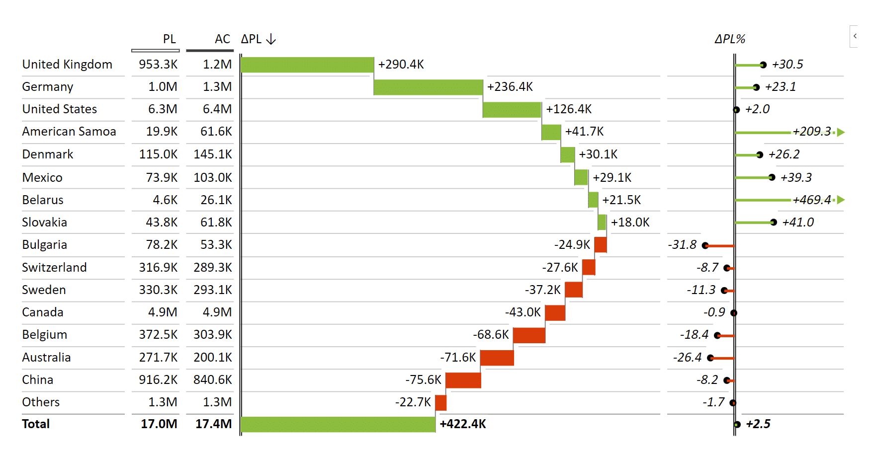
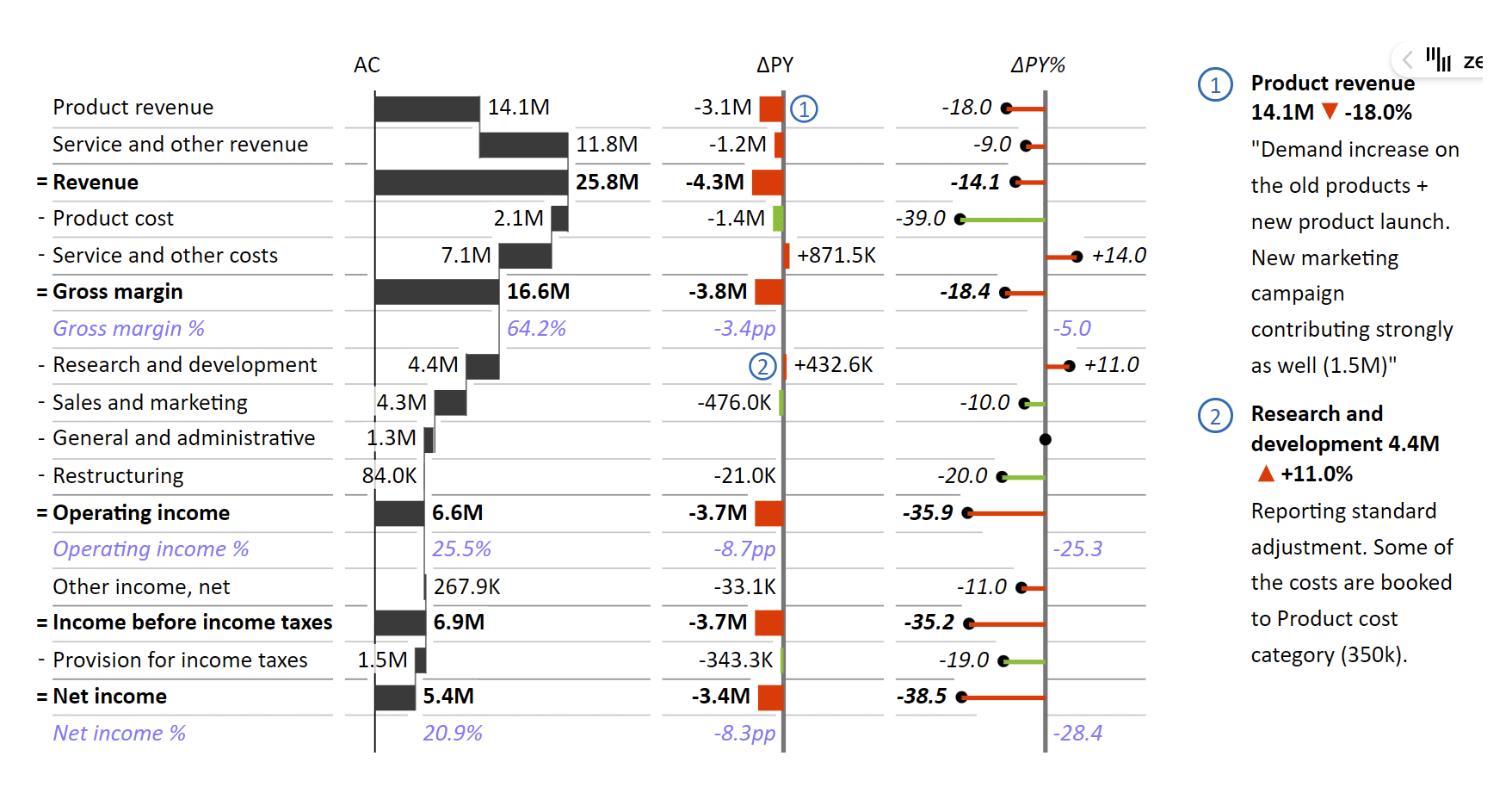
For example, a more general P&L statement ...
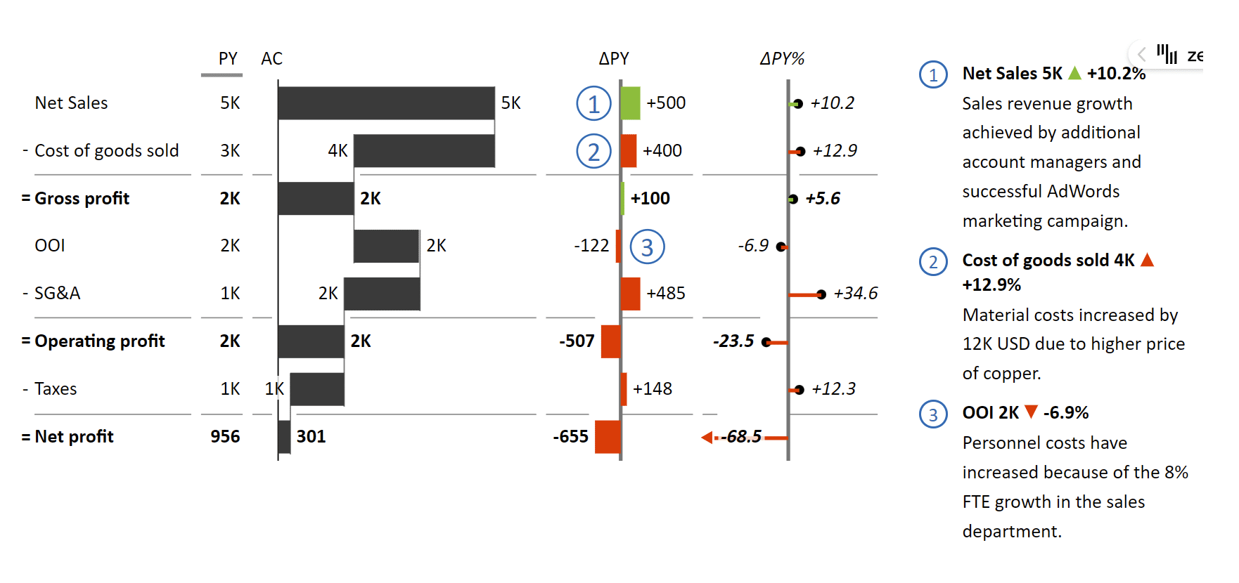
... can be followed by a more detailed overview:
Keep it simple and consistent. You're probably not a designer. The best choice when it comes to design is to keep it simple and clean. Don't overwhelm your audience with design. Use a clear and legible font, with a limited number of colors.
Consistency is just as important. Use colors, images and fonts consistently! For example, when a change has a negative impact, color the bar red, even if it is positive. For example, a decrease in the product cost is a negative value that has a positive impact and should be green.

TIP: If you want to ensure consistency in the long term or on a wider scale, such as your entire company, you could create a simple style guide, which prescribes the fonts, colors and other design choices. To get you started, you could base it on IBCS guidelines.
Use a consistent layout. A consistent layout can help your audience navigate your presentation more easily. Use the same layout for each slide coupled with consistent font sizes and formatting.
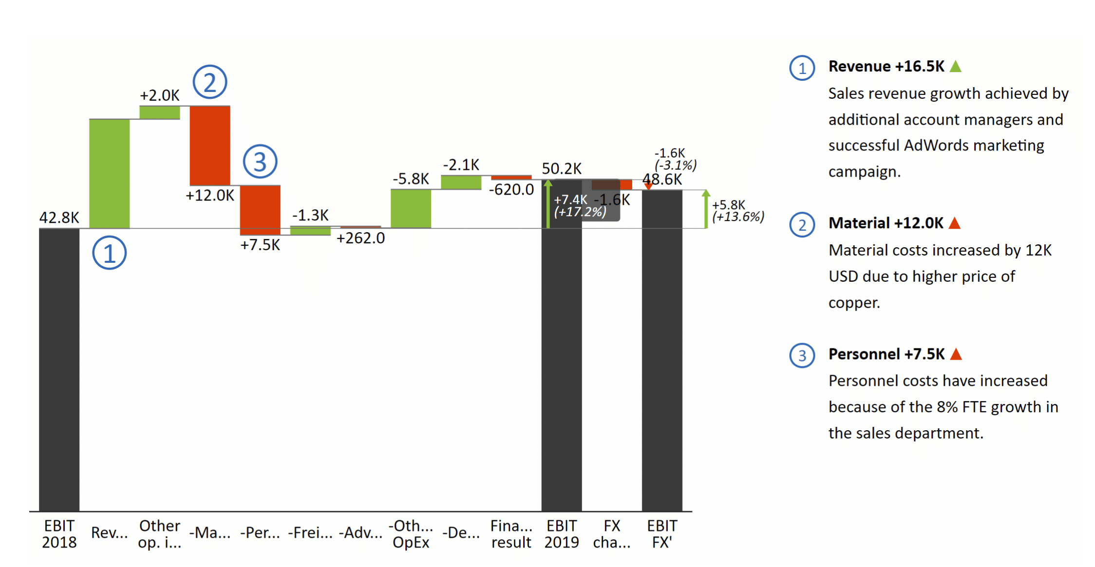
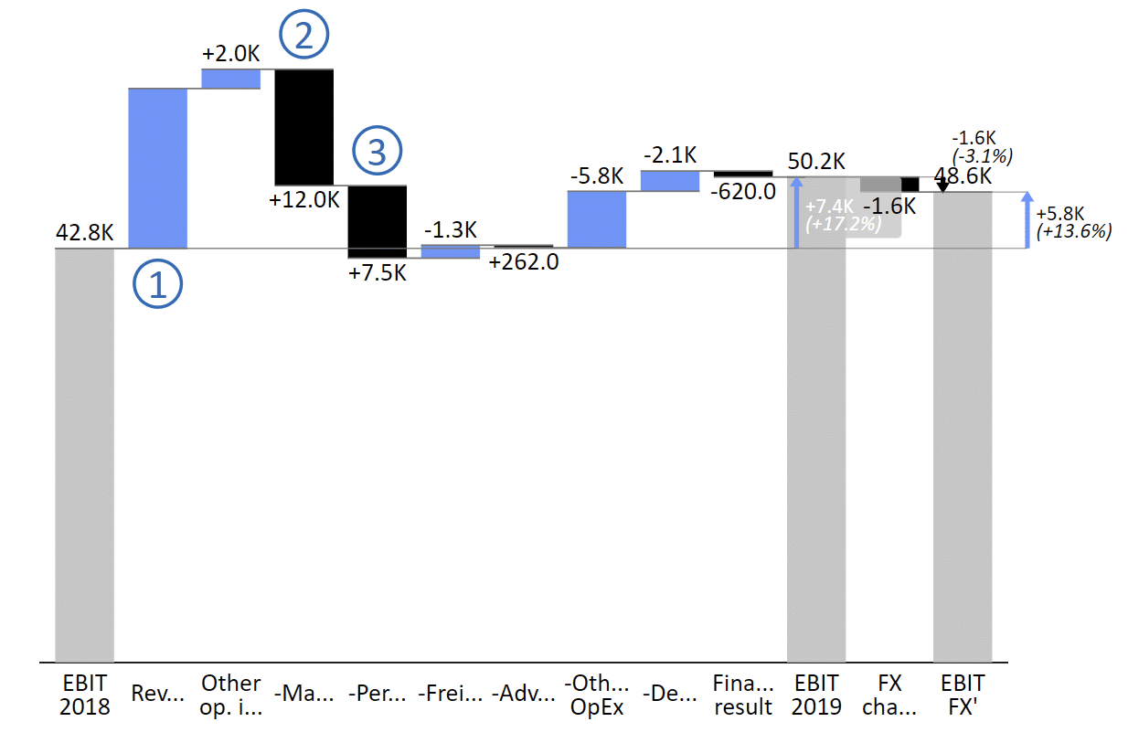
Use visuals, images and graphics: Use professional-looking data visuals, high-quality images and graphics that are relevant to your content. You can use Zebra BI for Office to visualize the related financial and business data. Here's a nice waterfall chart with multiple subtotals that explains individual factors contributing to EBIT.
To liven up your PowerPoint template, you can use PowerPoint built-in icons and shapes. If you need stock images, you can look for them in numerous online services, including Pexels and Unsplash, which offer a selection of free photos.
Stick to a color scheme. Choose a color scheme that fits with your brand or the message of your presentation. You could also select a standard option that is included with Zebra BI visuals. There is one more thing to consider: with increasing focus on accessibility, you could also go for the colorblind-friendly design.
Make it easy to read. Use a font size that is easy to read from a distance and use white space to make your content more visually appealing and easy to digest. When designing your PowerPoint template, also think about contrast and how it directs the attention of your audience.
TIP: If you are designing a dashboard page, be mindful of the layout. Put your most important KPIs in the upper left section. People normally read from left to right and from top down and you should follow their natural eye movement.
Include a title slide. A title slide with your company name, logo, and the title of your presentation can help set the tone for your presentation and give your audience a clear idea of what to expect. You should also include it in a standalone business presentation, so the reader can quickly see whether this is the material they are interested in.
Smart use of slide transitions and animations. Slide transitions and animations can add visual interest to your presentation but they are often abused. Use them sparingly, limit yourself to just a few types of transitions and don't use distracting animations. You could use a simple "Wipe" transition for bullet points but animations such as Boomerang or Bounce are simply distracting.
How to do it with Zebra BI
When it comes to designing and creating visuals for your PowerPoint templates, we got you covered with Zebra BI for Office. PowerPoint's default charting capabilities are limited and when creating business presentations you should really use something more powerful to get your points across.
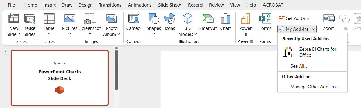
You can try out the free version right away. Open PowerPoint and select the Insert tab. Click Get Add-ins > search for 'Zebra' > click Add next to Zebra BI Tables for Office and/or Zebra BI Charts for Office.
Creating a new visual is easy. After you've installed it, you simply insert a new chart or table. A dashboard will open from which you can select the type of visual you want to create. You can select from Time and Structure series, Variance and Contribution charts and Part-Whole visuals.
Once you've selected the visual type, you just need to insert your data and you're ready to go.
To get a real feel of the power of Zebra BI, let's look at the types of business presentations you can create with it.
Income statement
The income statement is one of the holy trinity of business reports. It visualizes profit and loss data for the current and previous year. It achieves this using a vertical waterfall chart to show contributions of individual items with advanced features including subtotals and subcalculations.
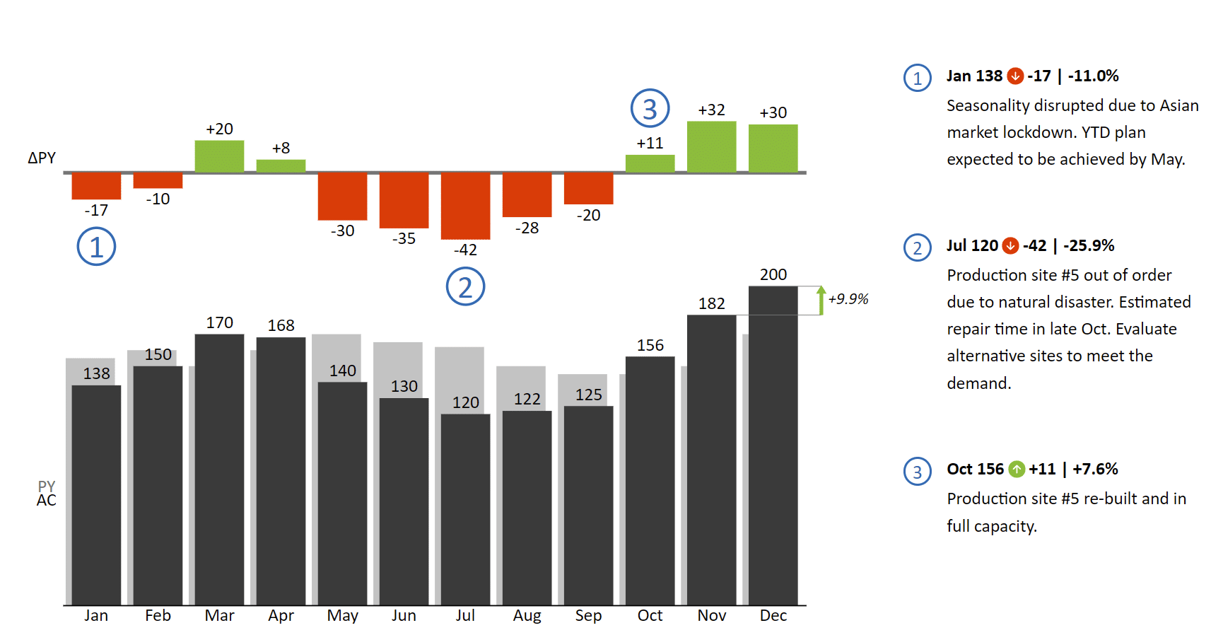
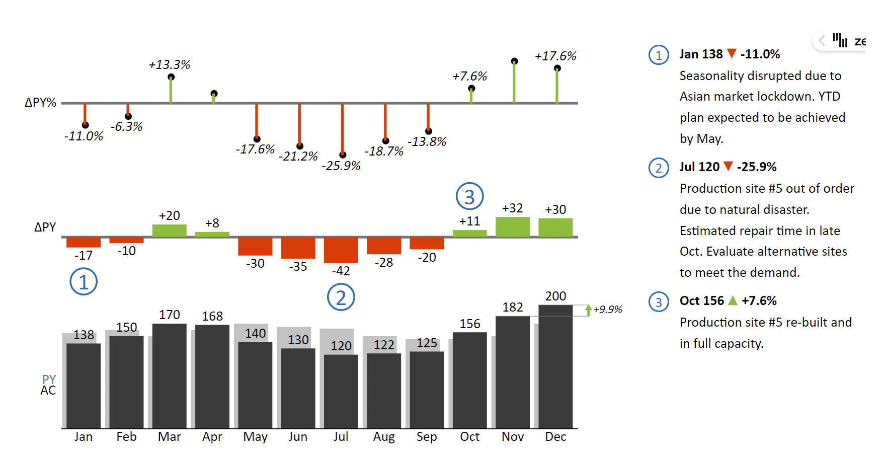
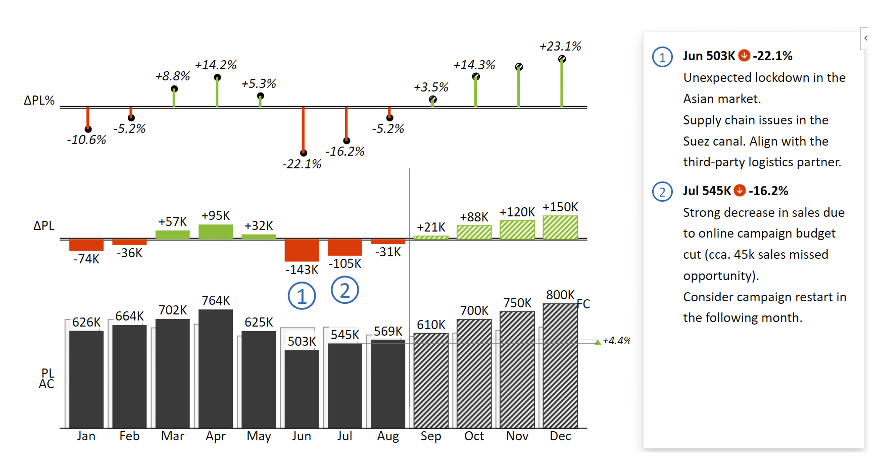
Sales reports with monthly variances
Monthly sales variance reports compare to see whether your actual financial outcomes meet the planned or forecast results. This Zebra BI chart reflects how employing a standard like IBCS can streamline visual communication. Actual results are shown in a solid color while forecast values are shown in dashed columns. Relative and absolute variances are displayed along actual and planned and forecast values.
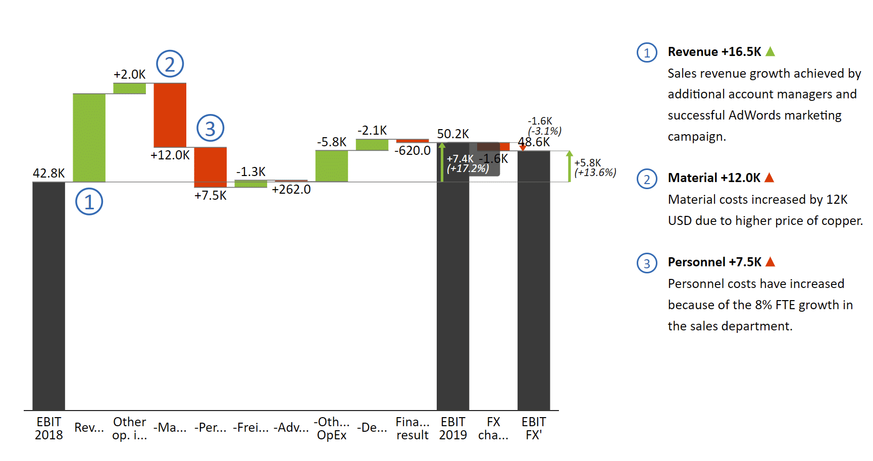
EBIT Contribution Analysis
This is a great example of a bridge chart showing how an initial value changes over time or through a series of steps. It shows the cumulative effect of positive and negative changes on EBIT with an intermediate subtotal.
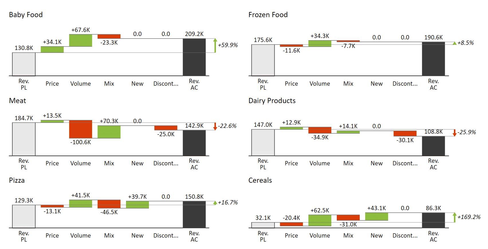
Price Volume Mix Analysis
Price-Volume-Mix analysis is a powerful tool for understanding your margins and product profitability better. Zebra BI shines here by providing extensive support for small multiples - a series of charts rendered to the same scale on a single visual for streamlined comparison.
This is just a small selection of the charts you can create using Zebra BI for Office. You can download a sample PowerPoint template with 30+ advanced PowerPoint charts and tables and look at all the options you have.
Start designing now
When designing your PowerPoint template, start by considering your communication goal and audience and work from there. Design should follow function and there's no need for you to get lost in the many design options. Start by creating a simple and effective presentation that supports your message and then add design choices later.
Of course, don't forget to install Zebra BI for Office and fill your business presentation with effective and information dense charts that deliver your messages effectively.
Get Zebra BI for Office to your PowerPoint
Create outstanding business presentations according to the latest best practices.