Actionable reporting in Excel & PowerPoint: How to convert boring reports into data stories
Tired of messy spreadsheets with bad visualizations? It's time to put them to rest and learn how to present the most important insights fast. And that's exactly where Zebra BI for Office comes in! Read on to find out how this innovative tool can help you achieve actionable reporting in Excel & PowerPoint, so you can make the most of your spreadsheets and slides.
We'll tackle this step by step.
First, we'll take a look at how to create actionable reports in Excel. We'll show you how you can use actionable charts and tables with a bunch of cool functionalities to produce in-depth analyses and gain next-level insight.
Then we'll touch upon how to create modern BI reports that tell a story not just in Excel but also PowerPoint. We'll put great emphasis on how to make your reports interactive so they can provide the answers to your or your managers' questions at any given time (think meetings).
But before we dive in, let's first have a look at why you even need actionable reports.
Why actionable reports are even more important today than ever before
The business world in 2022 is different from the world of just a couple of years ago. The COVID-19 pandemic triggered an unprecedented surge in online collaboration. The number of Teams meetings has increased by 55%, while the cost of poorly organised and unstructured meetings has soared to USD 399 billion in 2019 alone.
The world of business intelligence is undergoing significant changes as well. We are seeing a distinct move from descriptive analytics to prescriptive analytics, as businesses are becoming less interested in just monitoring data and opting for actionable insights instead. This means no more dull and uninformative tables. Business users want to know what happened and look at the past and future. They need data that is actionable. Data that helps them make good decisions.
Another trend to keep an eye on is the integration of BI platforms and productivity tools. In the Microsoft world, Power BI is being integrated into Excel, which is no wonder, since Excel remains the top dog in the world of BI. Just look at the numbers: Office 365 has more than 120 million monthly active users. Excel is used by 54% of businesses. This means there are countless presentations and data analyses stored in local Excel files. Excel is not going anywhere and Microsoft’s investments in the Power BI and Excel integration reflect that.
But there's this one problem.
The way we use Excel hasn’t evolved with the times. There are new features and trends and requirements, but most users are still doing analyses the way we did 10 or 20 years ago. It’s usually all about some numbers in a grid with an occasional chart. What you need, however, is actionable insight. Reports that help business users, managers and business analysts make informed decisions fast.
So how can you go about it?
OK, so we've established that plain Excel spreadsheets lack actionable insight. But how exactly can you go about making a report that doesn't? Don't worry, Zebra BI for Office can help! It comes with 2 visuals – Zebra BI Charts and Zebra BI Tables. The charts enable you to visualize trends over time, while the tables are perfect for break-downs by categories other than time (business units, for instance). And they both deliver insights that allow you to act fast.
Let's start with Zebra BI Charts and the features that make them actionable.
- Interactive charts. All Zebra BI charts are interactive. They can pull data from other sources or from the Excel spreadsheet itself. If you modify the data, the visual changes in real time.
- Automated calculation of variances. No matter which chart type you choose, Zebra BI automatically calculates the absolute & relative variances for you.
- Rich commenting. Comments can be used to quickly and easily add additional context to your data points.
- Chart selection. The chart designer or viewer can use the slider to easily switch between chart types and see data from different points of view.
- Fully responsive charts. If the user resizes the chart, the data density adjusts so that the same amount of data can be shown in the same space. This is useful when creating reports that display large volumes of data.
See it in action:
Pay attention to how relative and absolute variances are initially shown as separate charts and then merged into the bar chart when the visual above is resized.
Start with Excel data tables
While Zebra BI visuals work great even if you just use values, the best approach is to use Excel tables. The fastest way to do that is to select your data and press CTRL + T. Using tables makes your data much more flexible and dynamic. For example, you could select just a part of your data to visualize, which gives you more freedom in storytelling.
Using tables also enables you to add more columns later on, allowing for a dynamic expansion of data. One neat way to use this feature is to just add a new column with comments, which then appear automatically in your Zebra BI visual to add more context to your data.
Add forecast data to your analysis
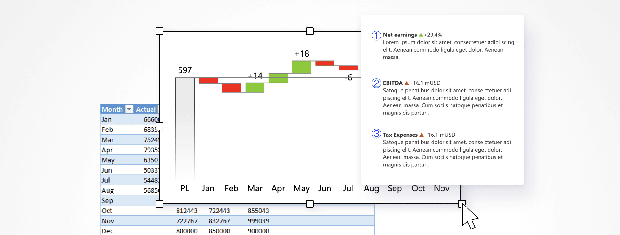
Let's take a look at a table that is a bit more complex.
It contains actual data along with previous year's, planned and forecasted numbers. Forecasts will make your data much more actionable because they don't just help you analyse your past data but also look ahead.
This data set allows you to compare your actual data to three parameters to provide a far more detailed context for your operations.
A quick glance reveals that up until June, the company exceeded the plan and then hit some roadblocks over the summer.
You can reveal even more information by changing the chart type. Once you switch to the waterfall chart, you can see how the company intends to conclude the year.
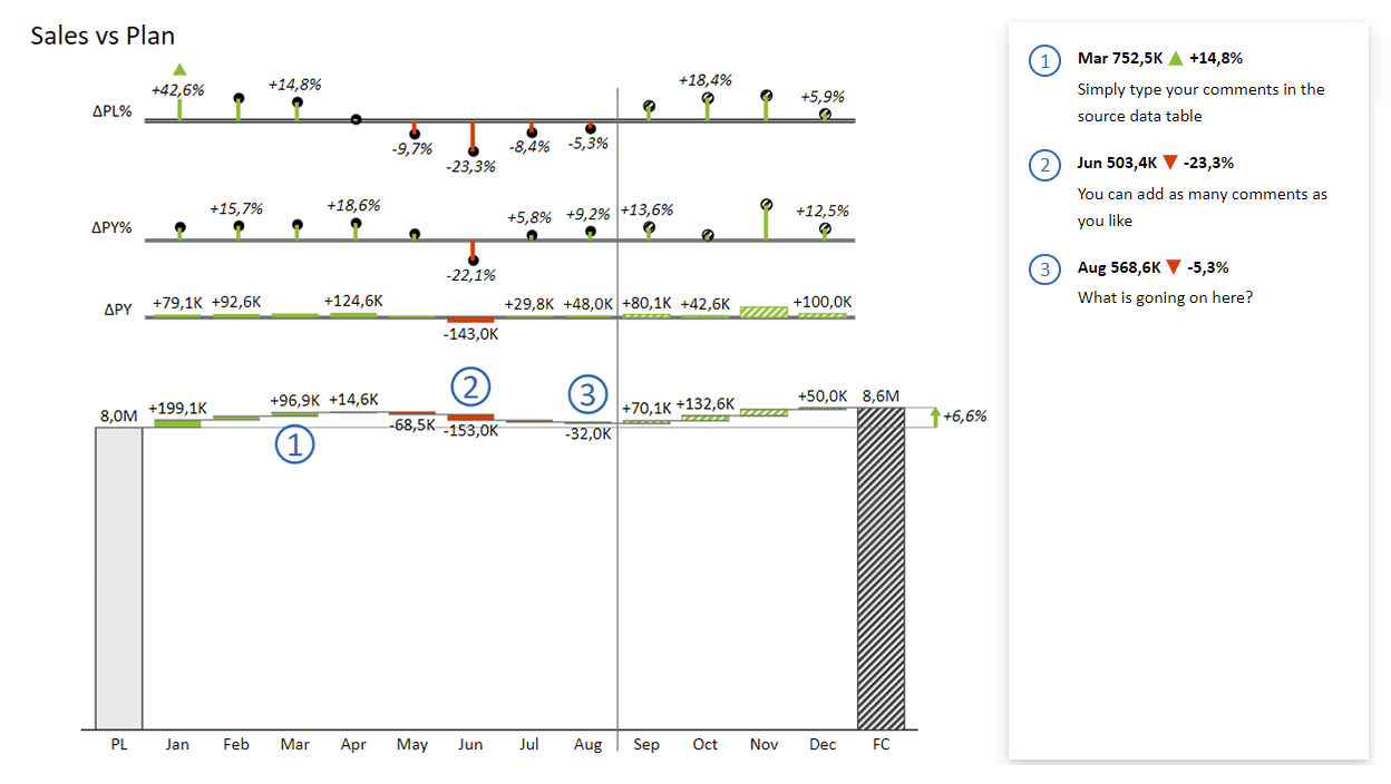
It clearly shows that if everything goes according to this forecast, the company will finish the year 6.6% above plan. This ability to dynamically switch charts based on the same data opens up new storytelling opportunities. By explaining data from different angles, you can tell new stories and discuss actions or measures that need to be taken.
Visualizing your tables
While the last two tips were based on Zebra BI Charts for Office, this one will take a closer look at Zebra BI Tables for Office. Both visuals can be found in the integrated Microsoft Store. Simply search for Zebra BI and try them out for free.
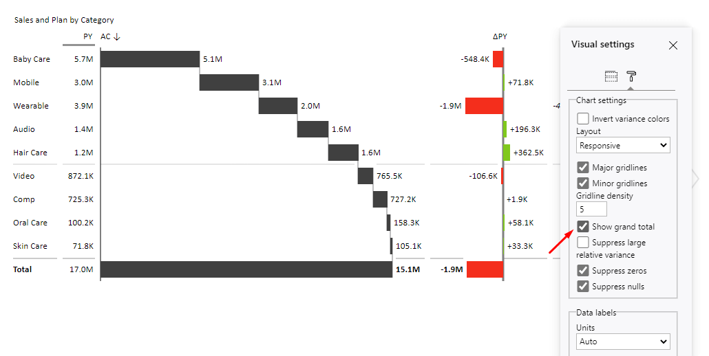
Let's take a look at a sample table in Zebra BI for Office.

This visual gives you immediate insight into which is the worst performing product category by including both absolute and relative variance compared to the plan. You can sort individual measures or even switch the entire chart into a waterfall chart to clearly show how each category contributes to the overall result.
The stories told by these charts can be further expanded by including the grand total or moving and renaming data columns.
Flexibility is key
The things we've covered so far are the bare essentials of actionable reporting. Charts, tables combined with charts, comments and forecasts should be at the core of your efforts to communicate your business data effectively.
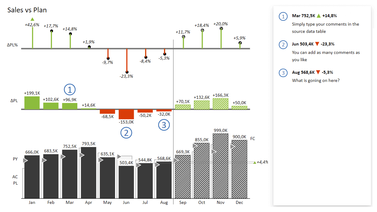
The next thing you need are flexible charts, which is where Excel often fails to deliver. One example are waterfall charts with multiple subtotals, such as this one:
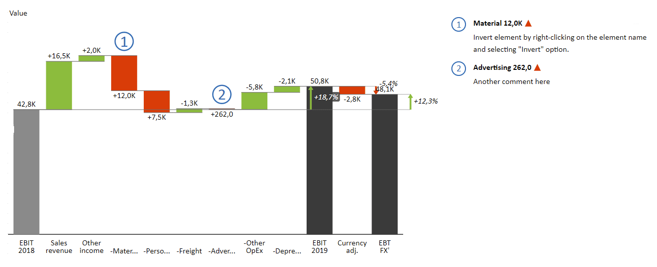
This chart shows your EBIT and contributing elements which include sales revenue, material costs and other. However, there might be additional categories affecting your EBIT, such as currency adjustments. In Zebra BI for Office, you can clearly communicate how this factor affects your EBIT – in this particular case, for instance, it reduces it by 5.4%.
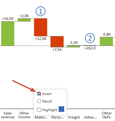
Another thing you might want to pay attention to are costs. You don't want them to show as positive but negative values. With Zebra BI, you can fix this with just 2 clicks. Simply right-click on the relevant columns and tick the "Invert" option.
Similarly, you don't want your interim calculations to be visualized as totals but subtotals. With Zebra BI, you can simply mark them as subtotals and that's it, you're done. This gives you the freedom to create charts that truly reflect your business stories.
Time for some interactive data analysis
The next step in the process of making your business analyses more interactive involves the use of pivot tables. You might want to start with something simple, like quarterly revenue over a year, and use a waterfall chart.
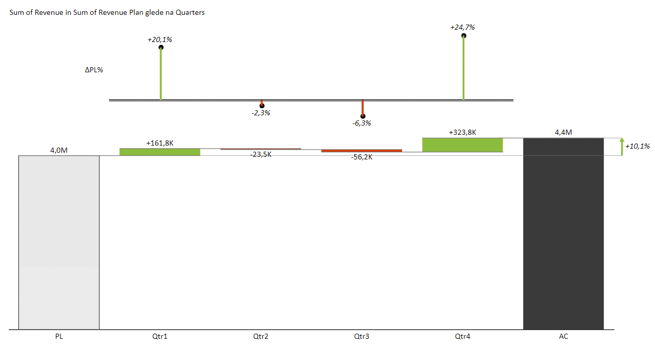
This chart shows a 10.1% increase in sales revenue but that's simply not enough information. You want to see how you got there and what contributed to it. Instead of combing through all the numbers, you could just add the business unit category to your "PivotTable Fields".
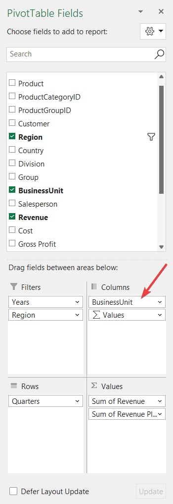
This enables you to show the revenue for individual quarters for each business unit in a separate chart and puts them all on the same page. This is called small multiples and is essentially taking multiple charts and rendering them to same scale on the same page.
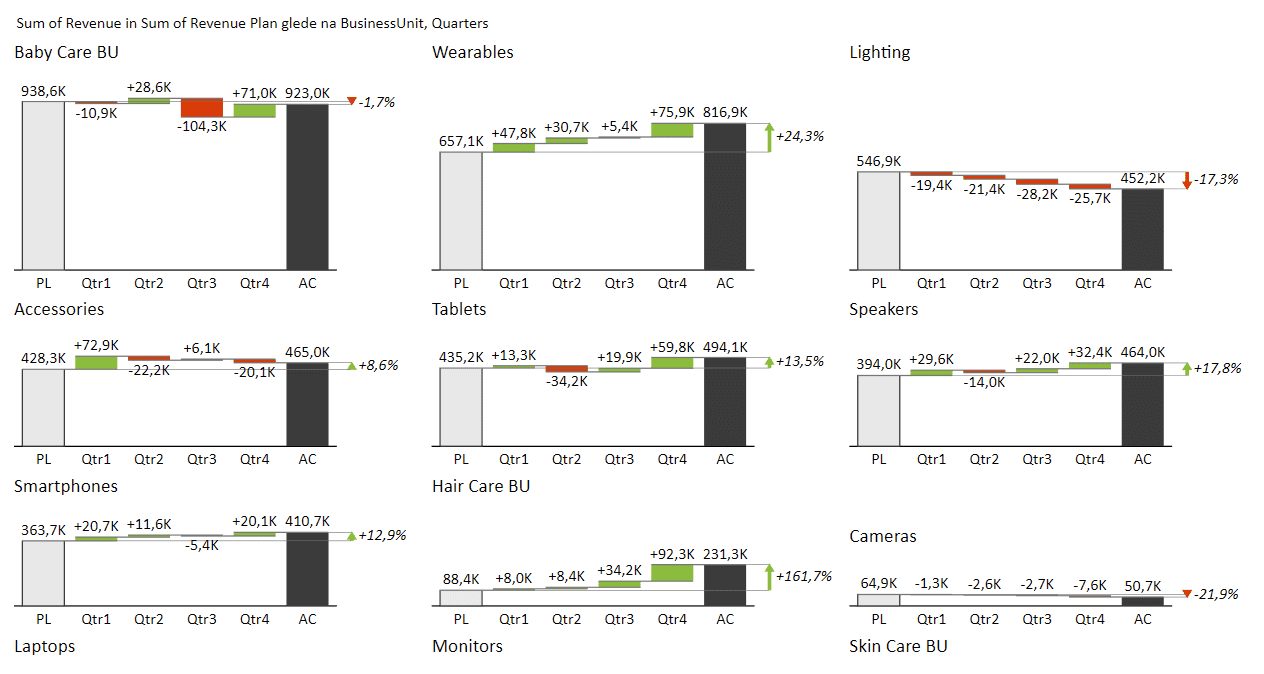
Instead of painstakingly combing through your data, you can instantly see which of your most important units are the worst- and best-performing. For example, it's obvious that Lightning has had some issues and Wearables is on fire.
This is the true power of exploratory analysis.
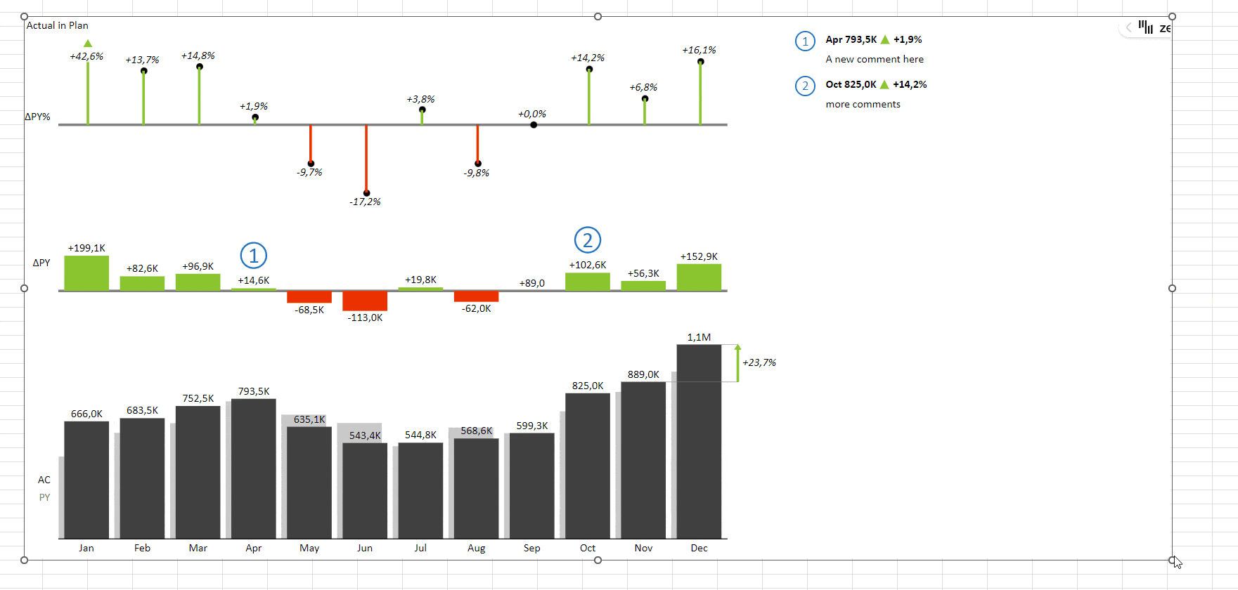
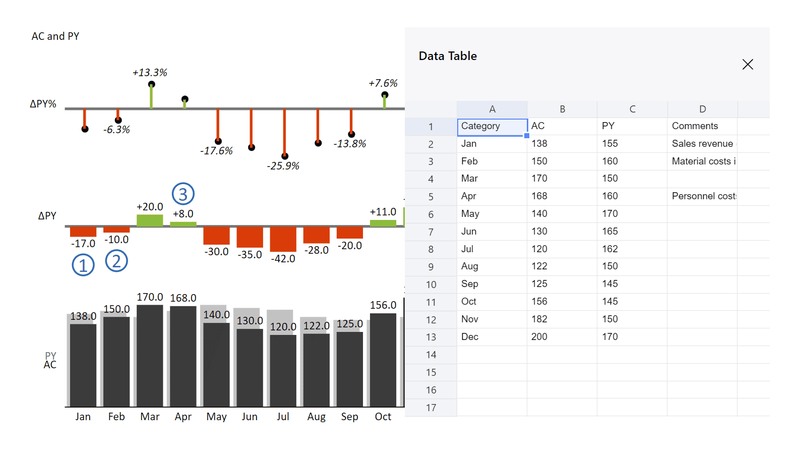
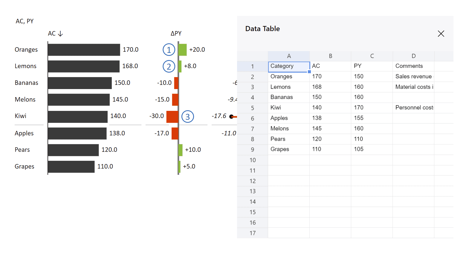
Exercise I: Period slicer
Let's say we want to build a simple chart for tracking the monthly values compared to the ones from the previous year. Something that looks like this:
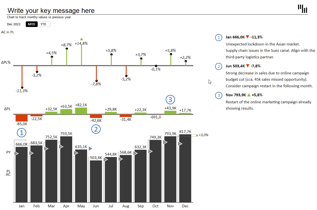
You generally want to see this data either in a month-to-date or year-to-date context. That's why we added a simple switch at the top, enabling you to easily move between the two views. To create a chart like this, you need to learn a couple of tricks. Let's dive right in.
The switch is a native Excel element, called a slicer. It is essentially a switch between two views that offers different period calculations. First, you need to enter the values for the switch by simply typing in the names, like this:

Then you can simply Select this data and choose "PivotTable" on the "Insert" tab in Excel.
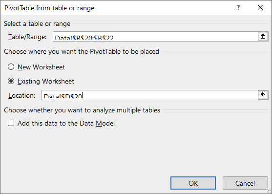
In the "PivotTable Fields" pane, simply move the "Period calculation" value into the "Filters" field. This is just a simple trick to make sure that you have this switch available.
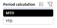
The next step is to insert a slicer. Select the field with the PivotTable and select "Slicer" from the "Insert" tab in Excel. Select the "Period Calculation" option in the dialogue box and voilà, a brand new slicer:
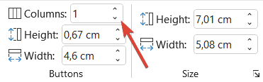
You can customize it to fit your needs. A neat trick for getting two horizontal selection buttons is to just set the number of columns to 2.
Making the slicer work
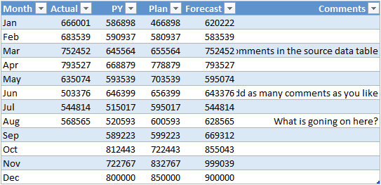
To ensure the switch actually does what it says, you need one more step. You need to create a new table with year-to-date calculations so it returns the values you need when switching views.
You can achieve this with the calculation that returns the sum of all the preceding months in the column if the year-to-date option is selected. So January returns the value for January, while February returns the sum of January and February, and so on.
This is the calculation used for February:
=IF(Period_calc="MTD";C8;SUM(C$7:C8))The C8 number is then increased to C9 for March and so on. You then have to do the same for all three columns of data – actual, previous year, and plan.
Another trick is to fix the comments. You need to have comments on both tables, so you need another formula for this purpose. This formula essentially checks whether the source field has a comment in it or not. If it does, it copies the comment, otherwise it just displays an empty string. That's what you have to do to avoid having zeroes in your table.
=IF(ISBLANK(F7);"";F7)Exercise II: Income statement
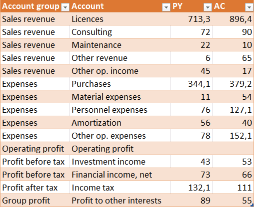
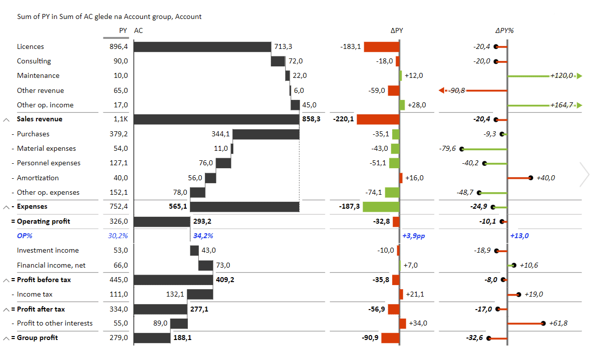
Income statements are the most basic financial reports and most business users need them at some point. That's why it makes sense to make them exceptional.
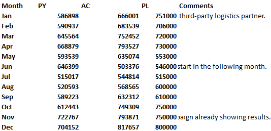
An income statement is usually built from different types of revenue and expenses and showcases the final profit or loss. Here's a table with the basic data needed for an income statement:
You want to use this data to create a pivot table and then insert a Zebra BI Tables for Office element. What you get is a starting chart that can you can sort and rearrange a little, although sorting by any of the columns woldn't really make sense in this particular case.
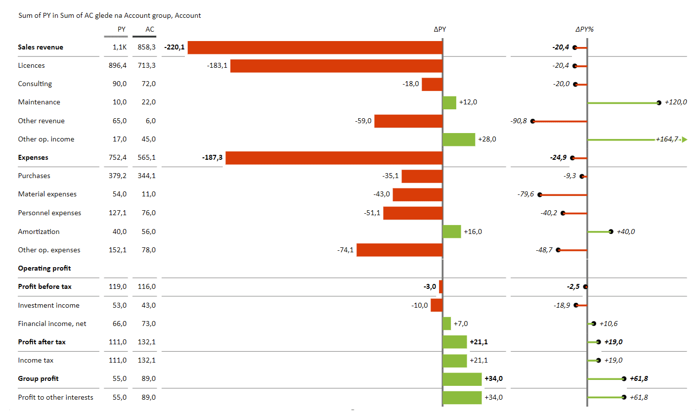
The best thing to do here is to take the actual values (AC) and change their chart type into a calculation waterfall chart.
Now this looks much better, wouldn't you say?
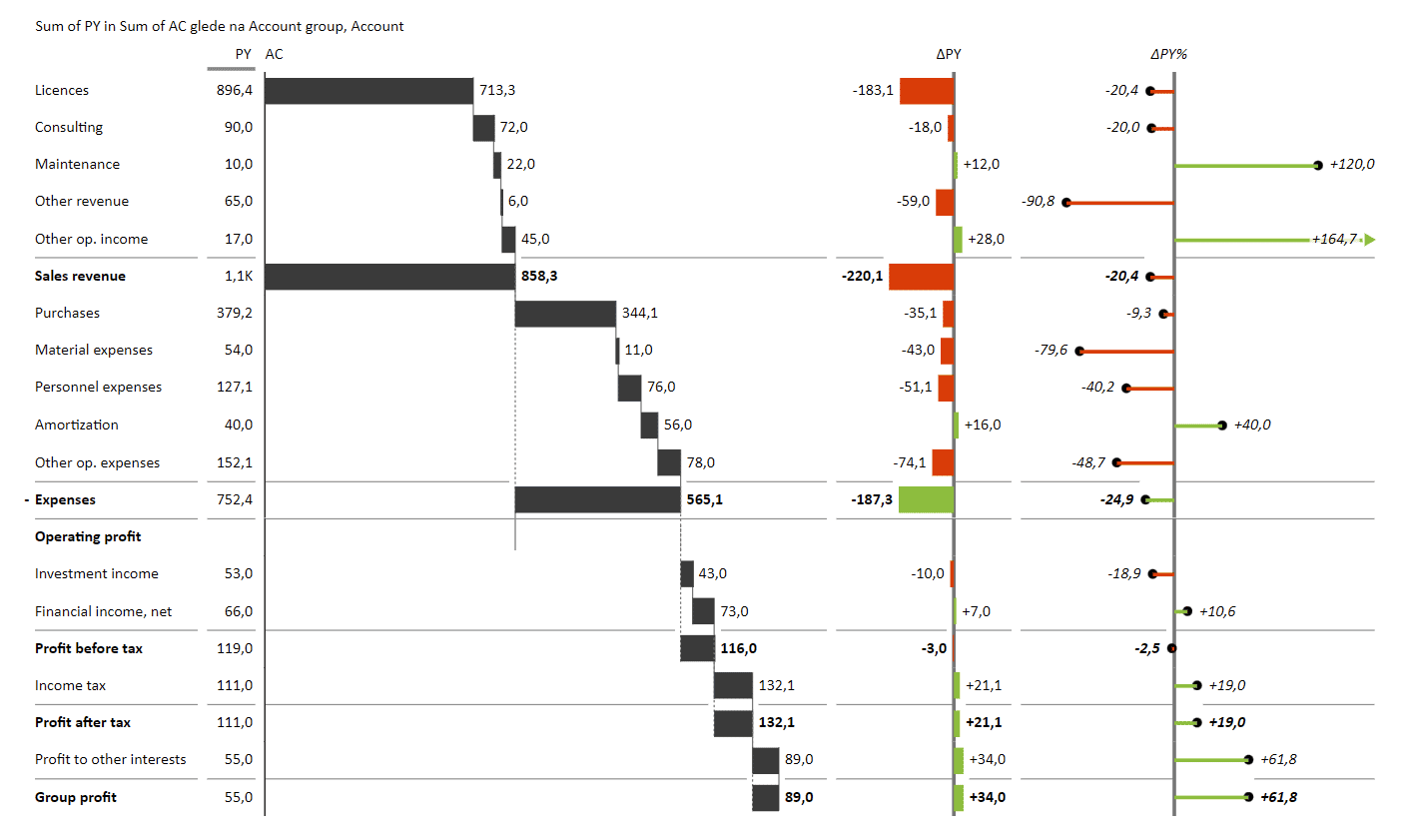
But you're not quite finished yet. As it is now, the chart shows expenses as revenues, so you need to invert the expense item group. Go ahead and right-click on the "Expenses" item and select "Invert" and "Invert all children" options.
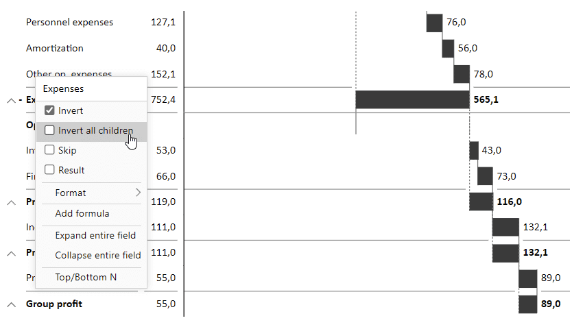
This will change the look of the chart to clearly show that the expenses contribute negatively to the profit.
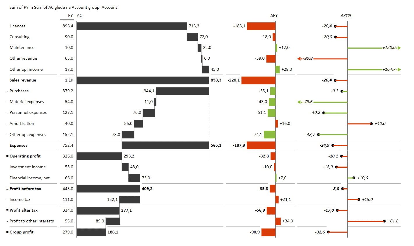
Next, select the "Operating profit" item and set is as a "Result".
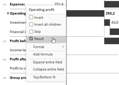
You then need to go down the list and set "Profit before tax", "Profit after tax" and "Group profit" to "Result" and revert "Income tax" and "Profit to other interests" items.

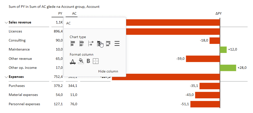
This is the foundation that you can build on. For example, you can have a look at what's actually your percent of operating profit. Simply right-click on your chart and select "Add formula".
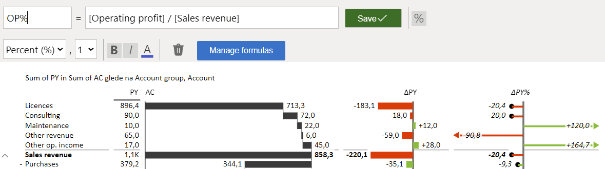
This calculation divides your operating profit by your sales revenue.
If you use pivot tables, the visual offers more interactivity, providing a hierarchical display, for example. This means you can conveniently expand or collapse certain elements. You can just have a look at the revenue or explore a more detailed breakdown. Just take a look at how compact the fully collapsed statement looks:
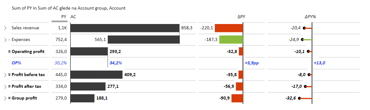
This is why you should really use pivot tables.
Data storytelling in PowerPoint
You can also use these rich and engaging visuals in PowerPoint. You should first find and install Zebra BI Charts and Zebra BI Tables for Office from the Microsoft Store.

Let's start with charts. Once you add the Zebra BI Chart, the interface prompts you to select a chart type.

When you do, you get a chart with some demo data which you simply replace with yours, either by typing it in or copy-pasting it from Excel.
On to Zebra BI Tables! You can follow the same process to add them to your slides, just select Zebra BI Tables from the drop-down menu instead.
These visualizations have all the features of the charts and tables you find in Excel with Zebra BI. You can resize them, select between different chart or table types and sort your data.
The best part?
They are fully responsive. This gives you enormous flexibility when it comes to creating presentations and delivering them to your audience.
All in all, Zebra BI for Office brings the much-needed change to your Office reports and presentations, with the exact look and feel of Power BI. This way, we're delivering a seamless cross-platform experience and taking actionable reporting to every report user out there. This enables everyone to create actionable charts in Excel with just 1 click, then move them to PowerPoint, and maybe even reuse them in Power BI later on.
Making business intelligence in Office work
Zebra BI for Office makes rich and engaging business intelligence in Office a snap. It enables you to use your existing data in the tools you're most familiar with, without having to switch to more complex ones. You can just do your data analysis in Excel and then present it in PowerPoint. This provides you with just the flexibility you need for efficient data storytelling.
Ready to try it hands-on? Try Zebra BI for Office for free and get cracking. It's time for some Actionable Reporting in Excel & PowerPoint.