On using Butterfly (aka Tornado) charts
A butterfly chart is a special type of bar chart, often used to represent two data series side by side, such as comparing male vs. female, displaying positive vs. negative opinions, presenting election results (e.g. republicans vs. democrats), etc. In general, you may use it as an alternative to a regular bar chart or a stacked bar chart, whenever you're presenting two (or more) opposing data sets.
Let's take a closer look at the following three examples:
- a population pyramid
- positive vs. negative opinions in a poll (e.g. Yes/No or Good/Bad)
- voting results (option A vs. option B)
Population pyramid: from a pyramid to a tornado
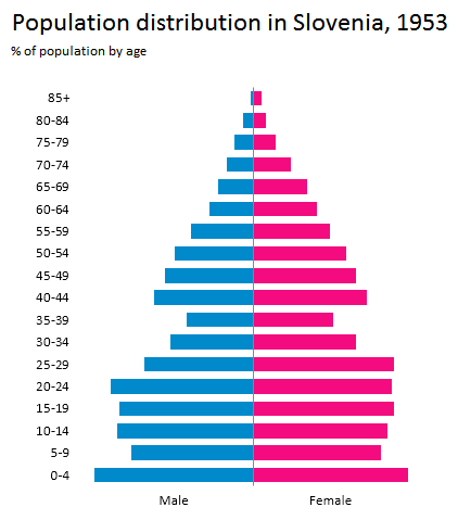
Presenting a population pyramid with the butterfly chart has been a de-facto standard for years. Here's how the population in Slovenia looked like in 1953, by age and gender:

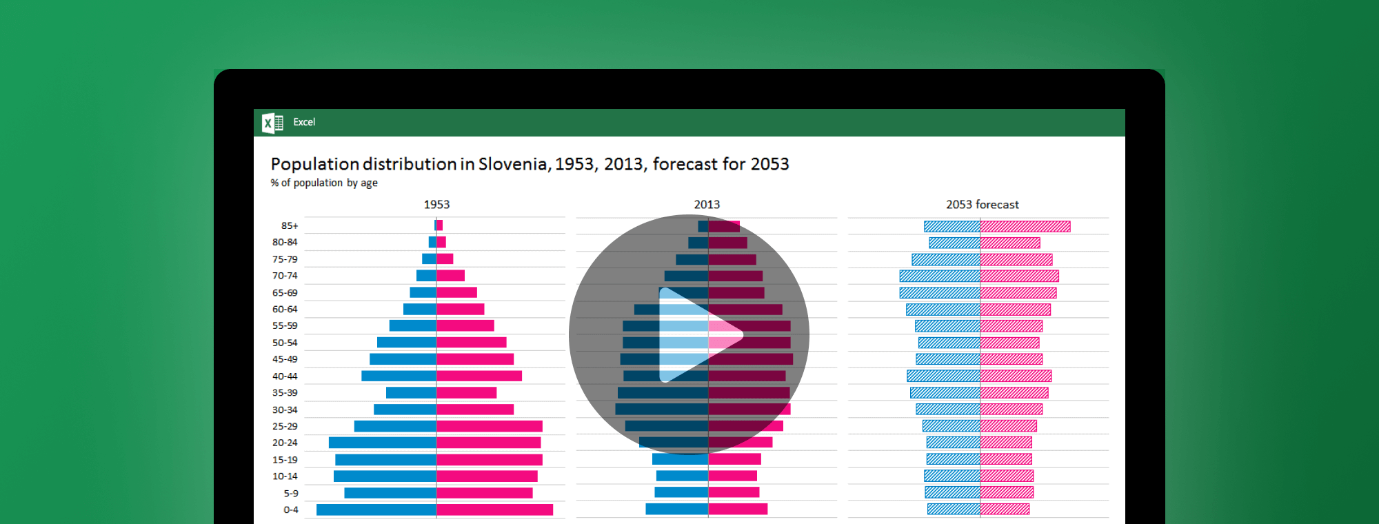
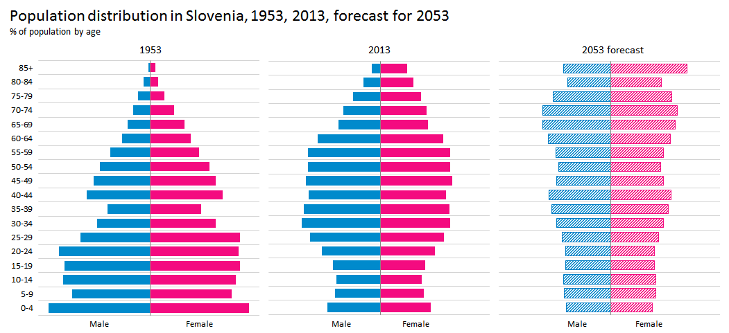
Well, that was way back in 1953 when the population structure in Slovenia still looked like a pyramid. However, we get the whole story by adding more recent data and a forecast for the future:

Due to rapid changes in the age structure of the population, the population "pyramid" in 2013 does not look like a pyramid anymore. In fact, the population will keep ageing and by 2053 this chart will look more like a tornado. Hence, the tornado chart...
As you see, adding charts for multiple years helps gain a deeper understanding. That's why small multiples are one of the most efficient methods in data visualization. Less is not more, less is a bore. Less is less. More is more. Three multiples is better than just 1 single chart. But you know what's even better? More multiples! So make sure you watch the video at the end of this post where we create population pyramids for world's top 10 most populated countries.
Presenting opinion polls or public survey results
Another example where you may want to use the butterfly chart is when presenting poll results. Especially opinion polls or public surveys where the key to understanding the results lies in observing two opposing answers, such as Yes vs. No, Support vs. Oppose, Good vs. Bad or just generally Option A vs. Option B.
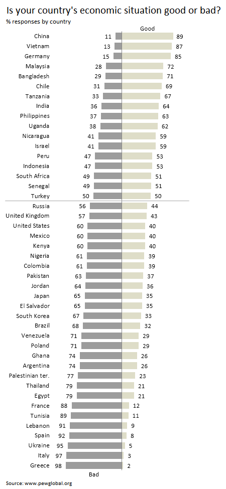
Below we present the results from a survey by PewResearchCenter where people described their own country's economic situation as good or bad. The percentage of responses are depicted so the total for each row is 100%, but the butterfly chart presents % of "good" answers on the right and % of "bad" answers on the left, so the opinion of people in each country is quite clear:

The survey was done in 2014 and as one might expect, Greece is right at the bottom of this list.
In the light of the forthcoming US presidential election, the following example might also be interesting - results from the last US presidential election (source: Wikipedia):

Creating butterfly charts in Excel with Zebra BI
There are many tutorials on the internet on how to create butterfly charts in Excel. They require you to write formulas on your Excel worksheets and use various tricks to produce a butterfly chart in the end. Of course, this takes a fair amount of work.
With Zebra BI you can create a butterfly chart in 2 clicks.
How about creating 10 butterfly charts? 2 clicks as well! See it in action in the video below where we create population pyramids for the world's top 10 most populated countries.