 September 8th
 February 22nd
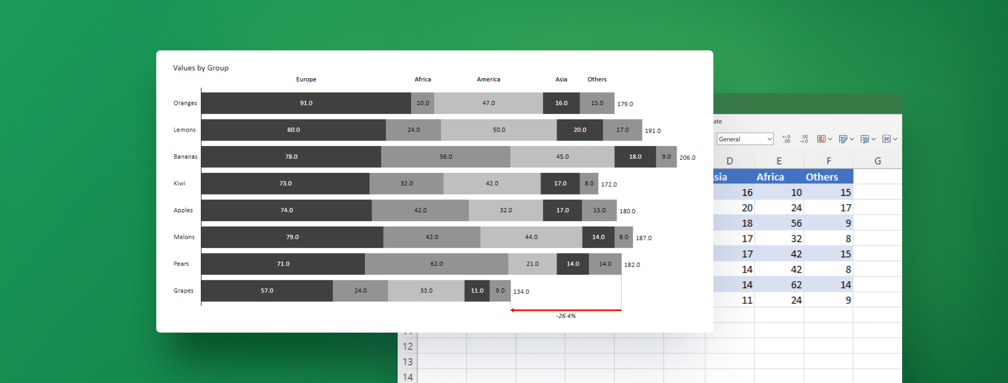
Stacked Bar Chart in Excel: How to Create Your Best One Yet
If you're a business analyst, controller or data professional of any kind, you know that showing data in an engaging and understandable way is crucial for getting the insights across. That's where a stacked bar chart comes in. It allows you to break down your data into clear and concise segments, giving your audience a comprehensive view of the information at hand.
With the right tools and a bit of know-how, you can create stunning stacked bar charts in Excel that will impress even the most data-savvy stakeholders. Ready to get it going? Let's dive right in.
How to create a stacked bar chart in Excel
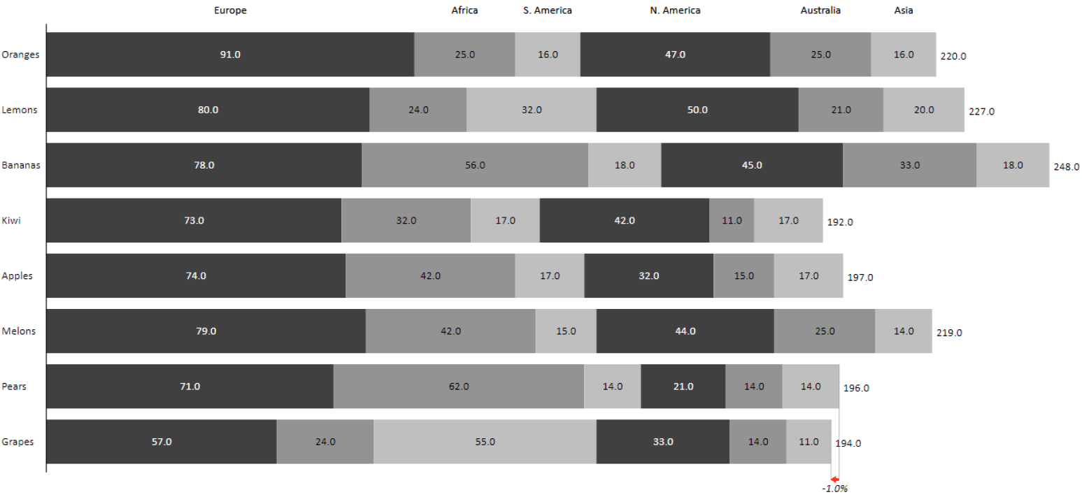
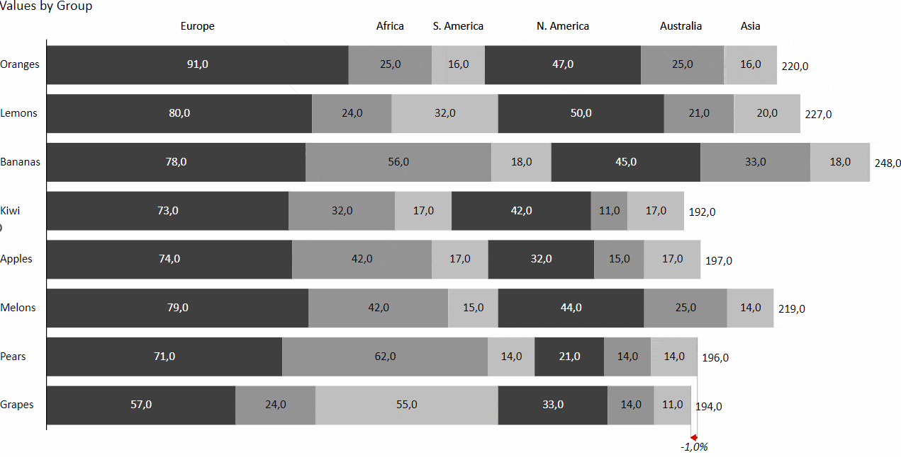
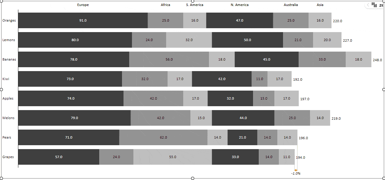
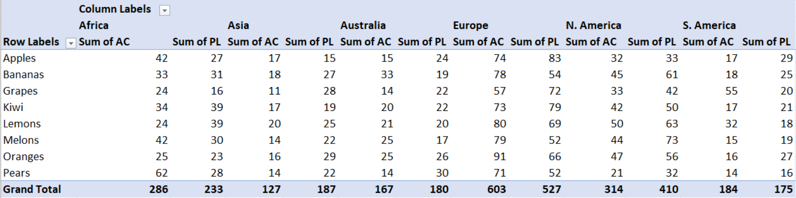
First and foremost, you need to have your data organized and ready to go. Let's say we have sales data for different kinds of fruit across 6 different regions (Europe, North America, Asia, Africa, South America and Australia). Your data might look a lot like this:
| Category | Europe | N. America | Asia | Africa | S. America | Australia |
| Oranges | 91 | 47 | 16 | 25 | 16 | 25 |
| Lemons | 80 | 50 | 20 | 24 | 32 | 21 |
| Bananas | 78 | 45 | 18 | 56 | 18 | 33 |
| Kiwi | 73 | 42 | 17 | 32 | 17 | 11 |
| Apples | 74 | 32 | 17 | 42 | 17 | 15 |
| Melons | 79 | 44 | 14 | 42 | 15 | 25 |
| Pears | 71 | 21 | 14 | 62 | 14 | 14 |
| Grapes | 57 | 33 | 11 | 24 | 55 | 14 |
Okay, now that you've got your numbers in a grid, let's take a look at how to make a stacked bar chart in Excel.
- Select the data you want to use
- Click on the “Insert” tab in the Excel ribbon
- Click on the “Bar” button in the “Charts” section
- Select the “Stacked Bar” option from the drop-down menu
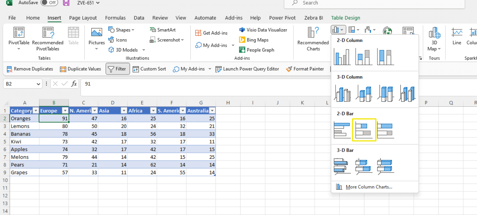
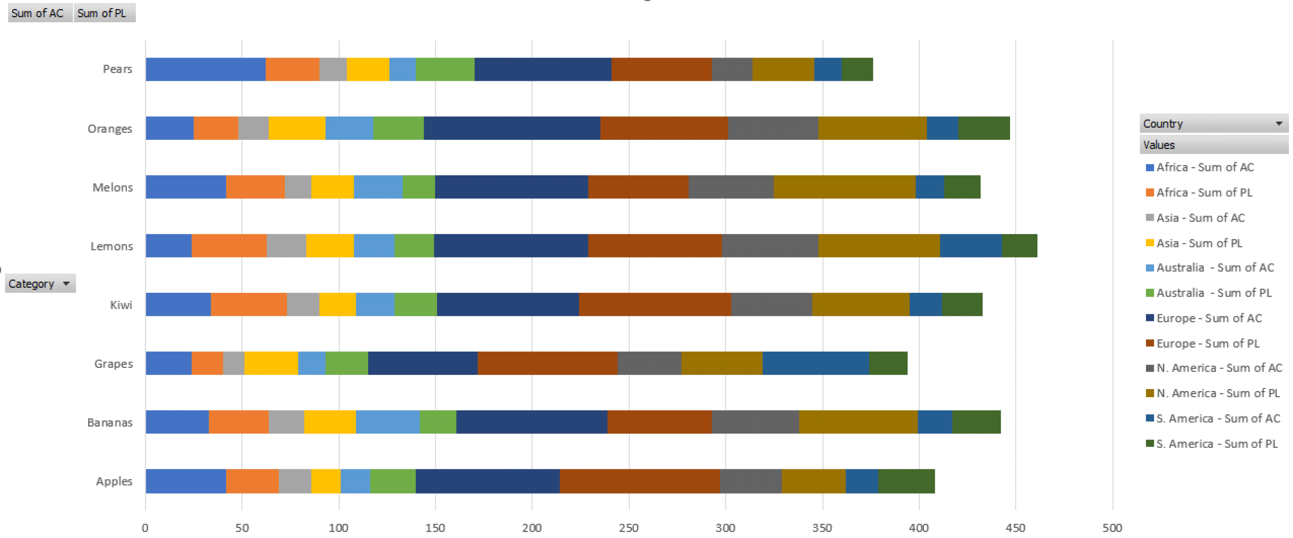
5. Voila! You now have a basic stacked bar chart in Excel – and here's what it should look like:

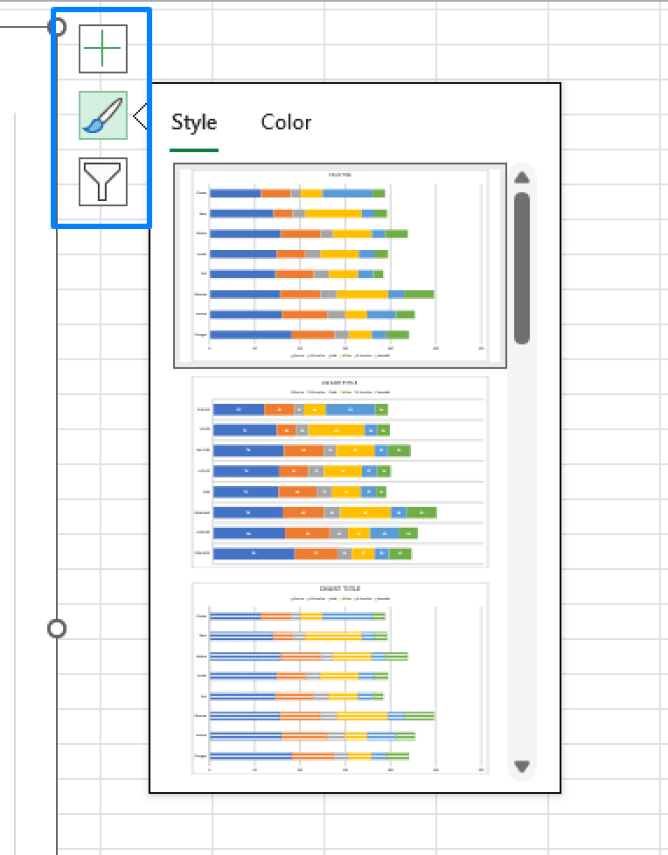
Keep in mind that you may need to adjust the size and position of the chart to make it more readable. You can also add or remove different elements, edit chart filters and change between different styles and pre-set color schemes to make the chart more visually appealing. All 3 options can be accessed from the chart menu that appears on the right side of your chart.
Okay, so you know how to create a basic stacked bar chart in Excel. But, let's be real, a basic chart isn't going to cut it if you want to impress your audience.
That's where Zebra BI for Office comes in. This impressive yet easy-to-use software features 2 Excel add-ins that take your charts and tables to the next level with a variety of advanced features and customization options.
Taking it up a notch with Zebra BI for Office
If you haven’t used Zebra BI for Office yet, that's the perfect time to get to know it up close. Get started for free to receive an instructional guide that will help you set the ball rolling. Get ready to produce next-level stacked bar graphs today.
Easily the best tool for data visualization in Excel
Zebra BI for Office offers 2 add-ins for Excel that make it easy to create and customize your charts and tables: Zebra BI Charts for Office and Zebra BI Tables for Office. They enable you to create stacked bar charts in Excel with just a few clicks. But that's only the beginning!
The add-ins literally take your numbers and transform them into actionable data stories which deliver immediate and accurate insights. They allow you to easily draw attention to specific data points, switch between horizontal and vertical views, and customize the charts to match your story better.
Let's take a look at how easy it is to create a stacked bar chart in Excel with Zebra BI, and dive deeper into the features that make it so much better than the native alternative. When you got your add-ins, well, added to your Excel, here's what you've got to do.
1. Select the data you want to use for your charts.
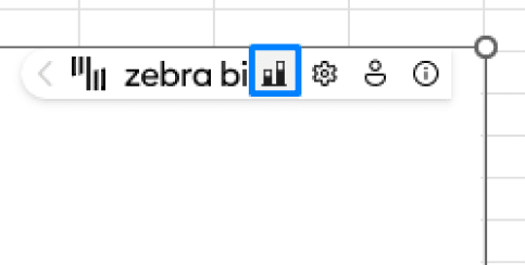
2. Click on “Insert”, then “My Add-ins” in the Excel ribbon. Select "Zebra BI Charts" in the drop-down menu.
3. You'll get a chart which can be easily transformed into the stacked bar chart. Just go to the menu in the upper right corner and click on the icon with 2 bars.
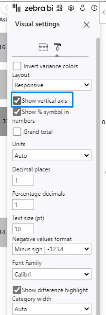
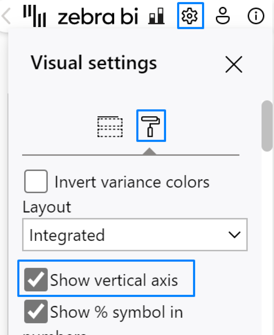
4. Then click on the settings icon and check the box next to "Show vertical axis".
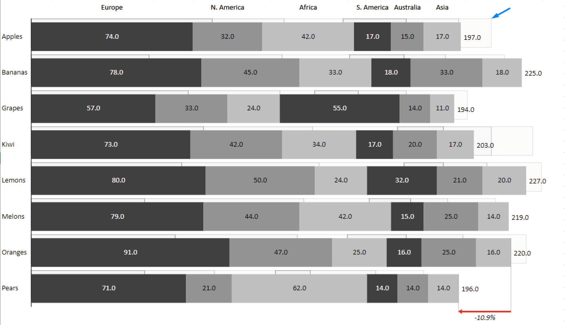
5. And voilà, your best-ever stacked bar graph.
But why exactly is it better, you may ask?
Let's have a closer look.
Features that make all the difference
Charts are never just charts. They're your medium. That's why every little detail contributes to a better insight delivery. Since Zebra BI is all about clear and actionable insights, it is by far the best tool for creating stacked bar charts and other data visualizations. Let's see what sets it apart.
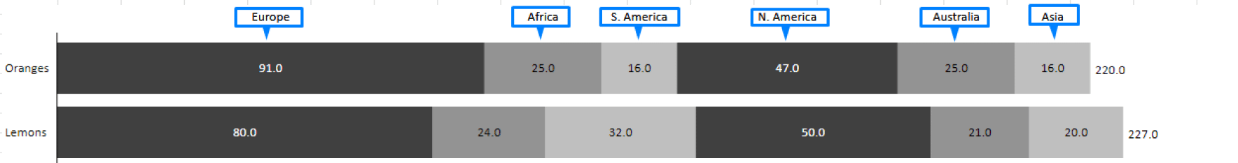
Built-in adaptive legend
In Zebra BI Charts, the names of your data labels are always right next to their respective data items. This way, you always know which groups show which data, without having to check the legend again and again. The legend is completely responsive, so you can resize the visual at will and the labels will move with it.
Responsive filtering
Hovering over any category will automatically highlight all the corresponding items, making them pop out conspicuously. Hovering over any specific group will yield the same result.
If you want a certain group to stand out even when you're not interacting with the visual, you can also highlight it with a different color. Just right-click on the group name and select "Highlight".
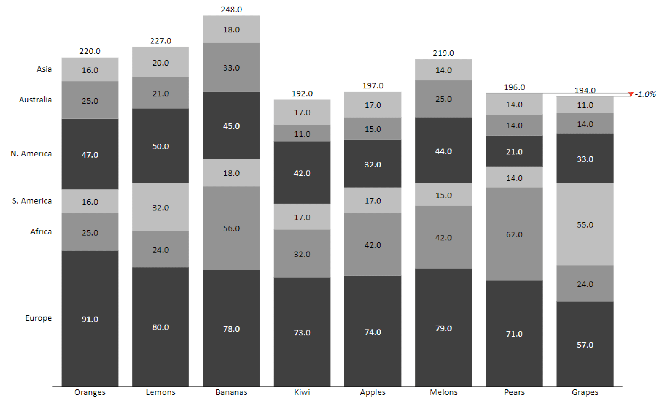
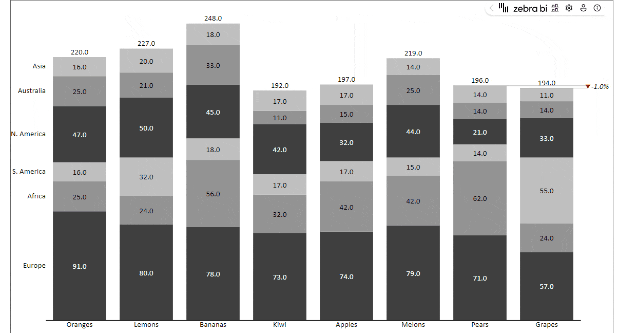
Category totals
If you have several data series, Zebra BI automatically sums them up. The total for every bar is always displayed to the right of the bar, so you can get a better picture of how each part relates to the whole.
Chart customization
You can change between a couple of preset color scales or choose a custom style to match your story better. Feel free to adjust it to your needs – you'll find the options under "Settings" > "Design Style".
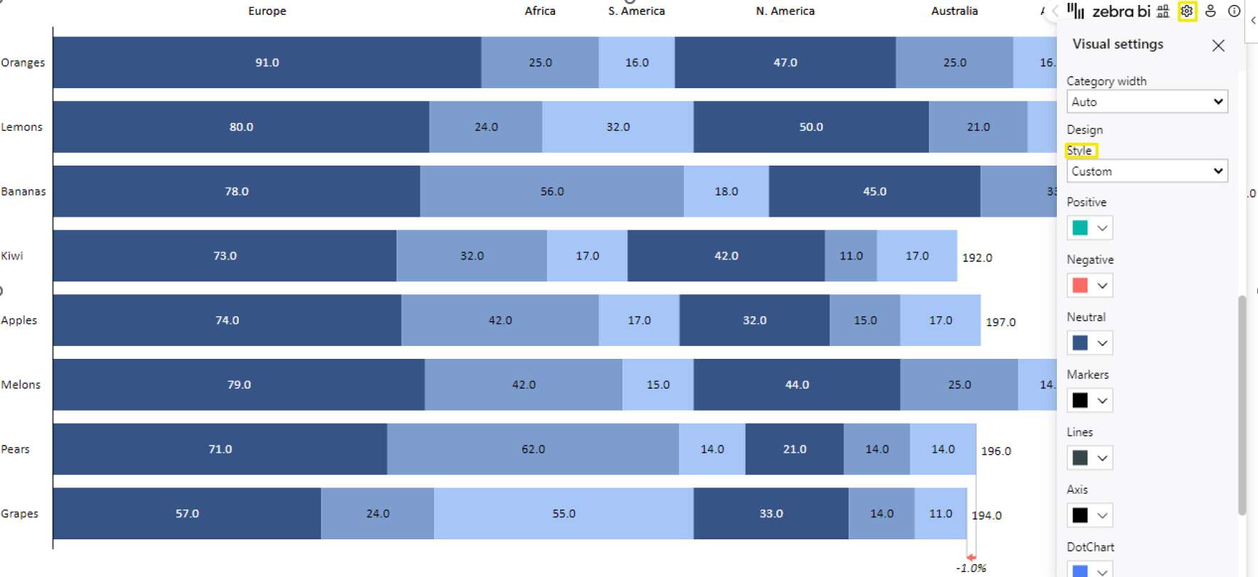
As Zebra BI strives to be as inclusive as possible, it also offers a colorblind-friendly style which makes it easier for people with color vision deficiency to understand the data.
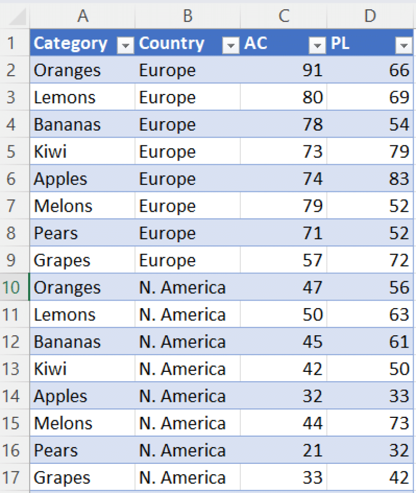
Comparing 2 measures in your stacked bar graph in Excel
You can also decide to display two measures in your stacked bar chart, and add your comparison (previous year, plan or forecast) to the appropriate placeholder in the settings. To create a comparison stacked bar chart, you need to create a visual from a pivot table. Your source table should be similar to this one:
Now that you've got your data structured properly, you can create a pivot table by placing your columns into the corresponding fields.
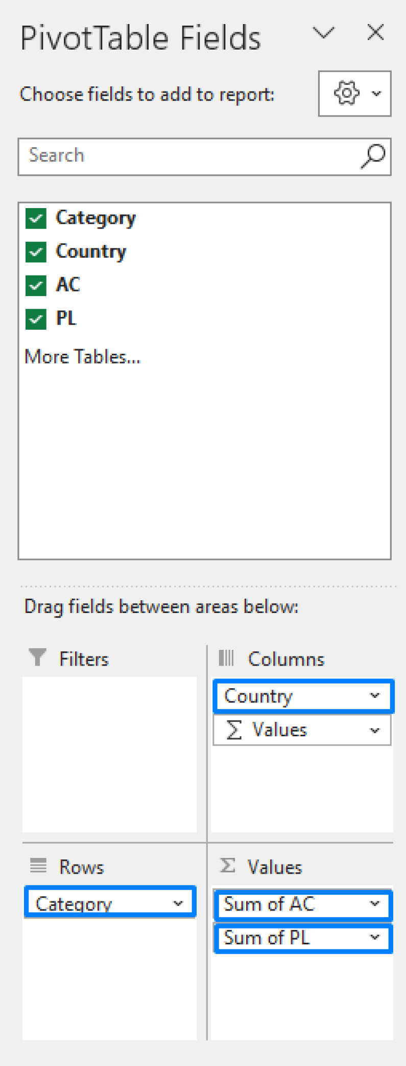
Your pivot table should look like the one below. Make sure you turn off grand totals for rows, otherwise the visual will recognize that as an additional chart. To do that, go to the "Design" tab > click on "Grand Totals" and select "On for Columns only".
Now, we can create a visual. Go to "Insert" > "My Add-ins" > "Zebra BI Charts for Office". The visual will primarily display a small multiples view, so you can just click on the stacked chart view, where we first got the stacked column chart:
And let's also change the orientation to display bars instead of columns.
This is our outcome, with Plan bar comparisons displayed in the background.
Amazing, right? This gives you a clear comparison between your measures – which is impossible to get in native Excel charts. You could add another measure to your Values field, but this is the outcome you'd end up with:
You can see that the Plan measure here is simply added to the bars displaying Actual measures. There is no clear overview of how the actual results compare to the plan and you have to keep checking the legend to make sense of the data before you.
Stacked column charts
As opposed to a stacked bar chart which is generally used to compare 2 structural categories (e.g. fruit : region), a stacked column chart is more suitable for cases with a time component (e.g. region : month), as per IBCS. But if you ever start out with the "wrong" chart type, there's no need to worry! With Zebra BI for Office, you can easily switch between the two.
To transform your stacked bar chart into a column chart, just go to the settings and uncheck the box next to "Show vertical axis" (and vice versa). And volia, you've got yourself a stacked column chart instead:
It doesn't get easier than this!
Please note: for the purpose of clarity, we're showing how to transform a stacked bar chart into a column chart and then small multiples on the same example data we've used thus far. Since the latter involves no time component, the stacked bar chart is still the preferrable chart type in this case.
Using small multiples instead of stacked bar charts and columns
While stacked bar/column charts can be powerful tools for visualizing data, they're not always the best options. When you have more than two or three categories to compare, it can be difficult to read the chart and compare different data points. In this case, small multiples are a much better choice.
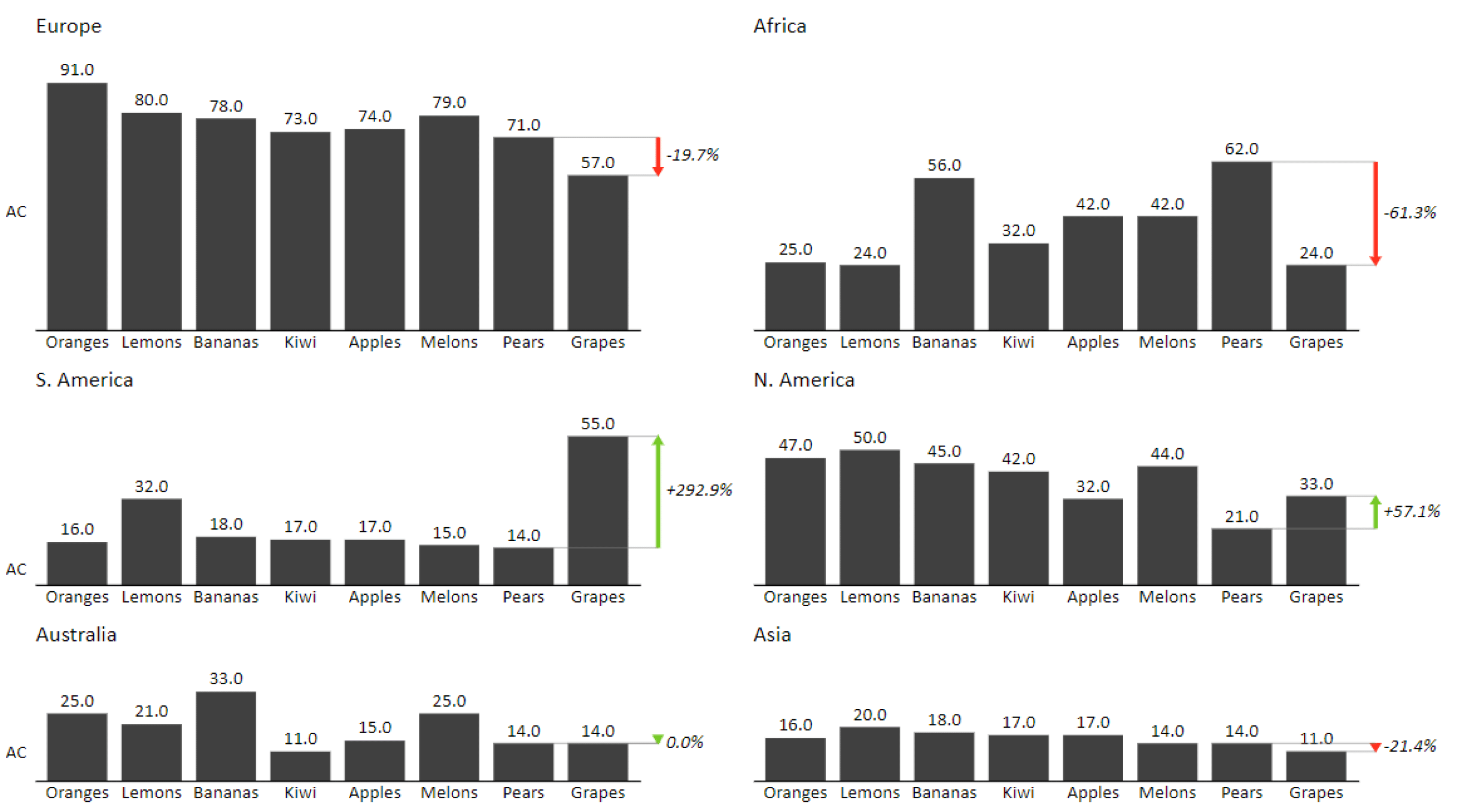
As you can see, small multiples feature a series of charts that show the same data across different categories (or typically, across different time periods). This way, you can compare the data more easily, as each chart only shows one category at a time, or sometimes two. You get a much clearer picture of what is actually going on, which largely facilitates data analysis.
With Zebra BI for Office, you can transform your stacked column charts into small multiples with 1 single click. Take a look at how easy it is.
But you don't have to create your small multiples from stacked bar charts. You can easily create them from scratch if you prefer. All it takes is a few clicks.
Creating small multiples from scratch with Zebra BI for Office
To create small multiples from a data table with Zebra BI for Office, follow these steps:
- Select the data you want to use for your charts.
- Click on “Insert”, then “My Add-ins” in the Excel ribbon
- Select Zebra BI Charts in the drop-down menu.
If you don't have your data table ready yet, don't worry. You can still insert the Zebra BI Charts for Office add-in, click on the "Time" tab and select "Small multiples" in the Chart Selector. Aside from small multiples, you can choose between over 20 other chart types, including stacked bar and column charts.
For cases where tables seem like the more appropriate choice to visualize your data, try out the Zebra BI Tables for Office add-in – it features 5+ tables with integrated charts, so you can tackle your reports and dashboards like a pro. Grab the Excel file below and follow the instructions to easily add it to your spreadsheet.
Make next-level stacked bar charts, small multiples and other visualizations fast
Get started with Zebra BI for Office for free & get an easy-to-use instructional file that will help you get rolling. Creating advanced visualizations in a matter of seconds has never been easier.