The 3 steps to implementing management reports in a pharmaceutical company
This is a guest post by Darko Vlajković, a consultant at MCB. See more about MCB at the end of the post.
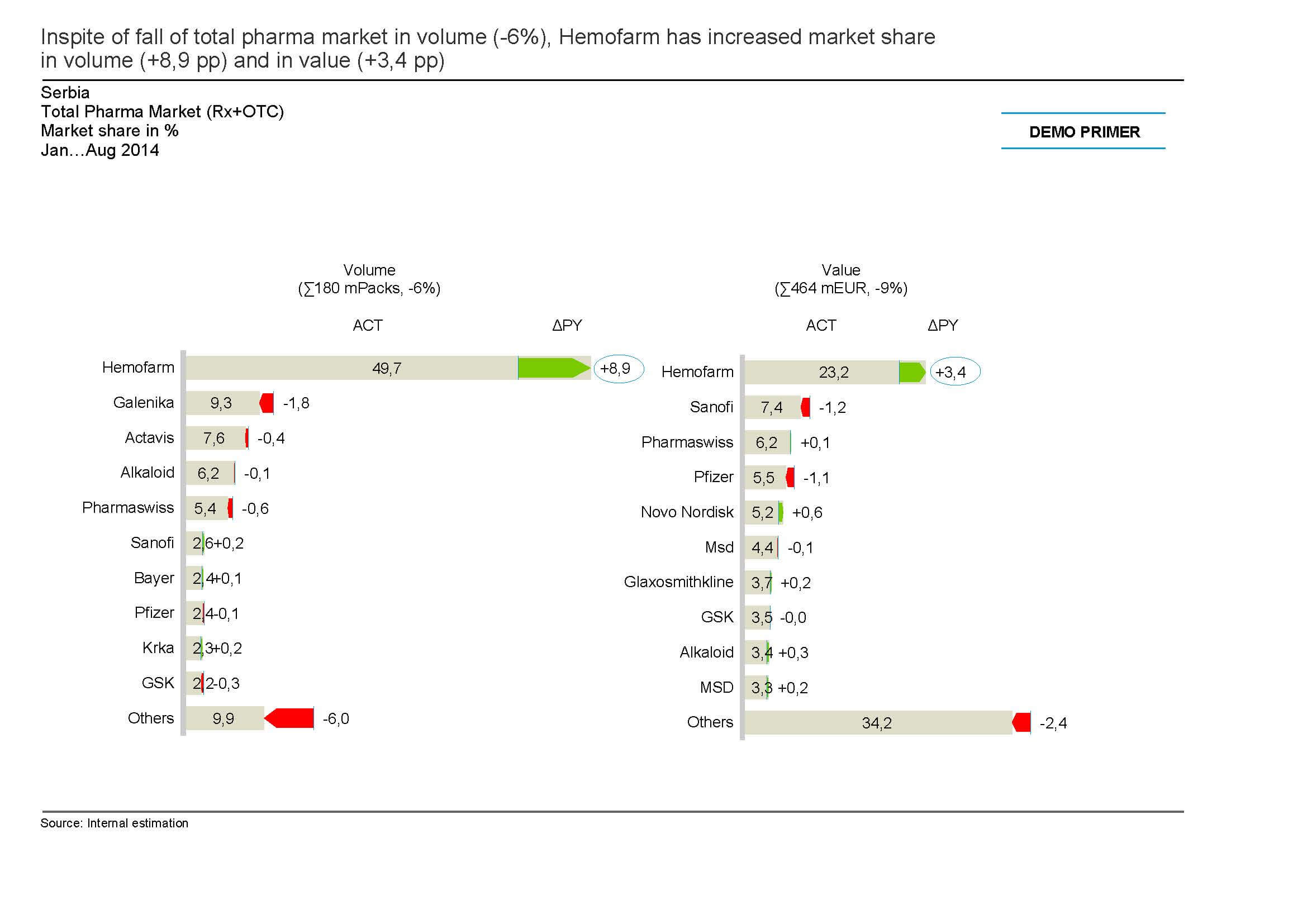
We had an opportunity to work with the Sales & Marketing team in the Serbian pharmaceutical company Hemofarm, which operates in more than 30 countries on 3 continents and has approximately 2.500 employees. The goal of the project was to make management reports more transparent, visual and automated. The end result were reports that top management could analyze quickly and easily and make the right decisions based on them.
How did it all begin? In the summer of 2014, we were contacted by Marko Devrnja, director of Sales & Marketing support team in Hemofarm. He called us to assist them in preparing the management reports for their top management on monthly and quarterly basis.

Hemofarm had 3 challenges:
- Standardization
- Visualization
- Automation
1. Standardization
One of the challenges with standardization was that different people made reports without first agreeing on the basic rules:
- Same or similar terms were named differently
- Graphs were not suitable for type of data they were displaying
- No key messages in reports
The consequence was that managers had to spend far more time trying to figure out what is what in those reports and they spend little time discussing the substance. With the help of SUCCESS and IBCS (International Business Communication Standards) rules we helped them standardize those reports and improve their quality. In doing so managers were able to read those reports like maps and make decisions based on them.
2. Visualization
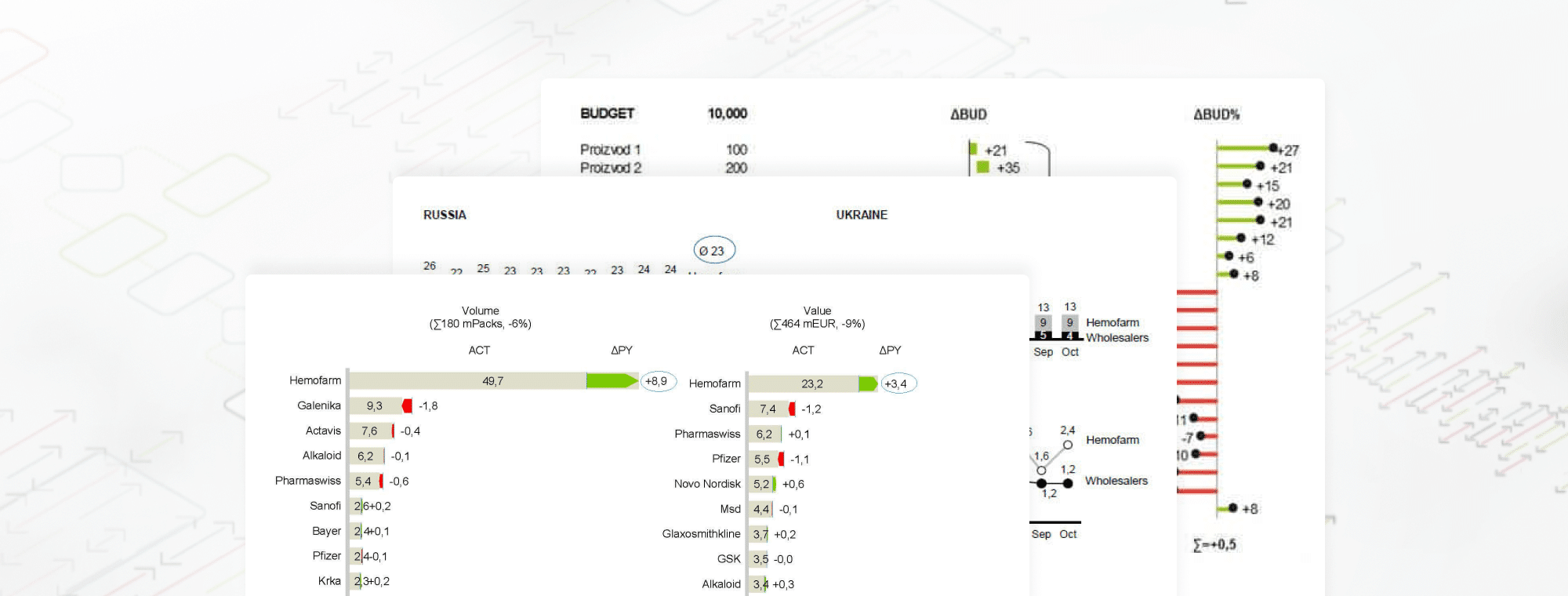
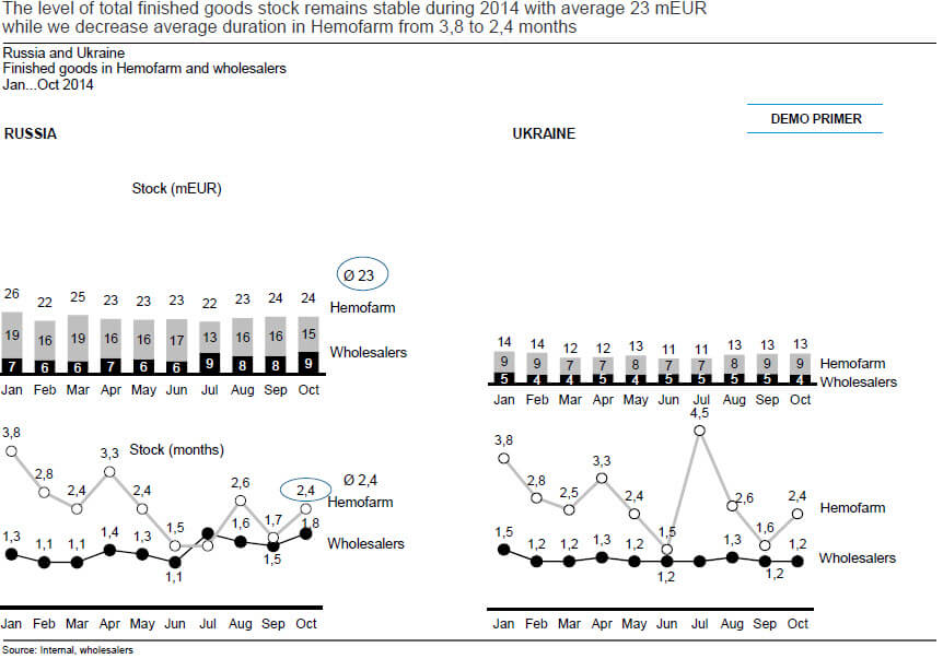
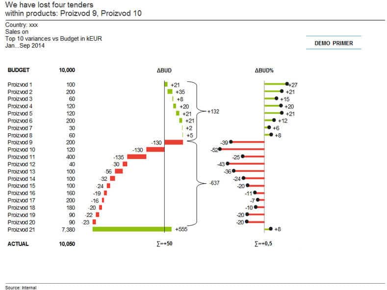
Visualization helps the manager make better decisions. It often happens that reports are crowded with data. That is why managers cannot separate what is relevant and what is not. The challenge here was to show the data in a transparent way so that the key information can be spotted quickly. Data tables were sorted to have a logical structure and so that the key performance indicators can be seen easily. People in general are visual beings. Managers want to see variances on which they could act. And they want to see them in color (green and red) and not just the numbers. In that way, they could act more quickly and with greater precision. Graphs are vital to emphasize the information that is important for making decisions.
3. Automation
Automation helps the analyst to significantly reduce the time required making reports. We gave them Excel templates so that they can spend less time on designing the reports and more time on analyzing the data.
For this part of the process, we had significant help from the software called Zebra BI. Zebra BI is an Excel add-in that allows you to make graphs in seconds and with only one click. When you insert new data all Zebra BI graphs are refreshed automatically. What was also important to us as reporting consultants is that all graphs are made according to the SUCCESS and IBCS rules.
All of the above processes (Standardization, Visualization, Automation) were covered by Zebra BI. It really made our job easier and we could implement transparent management reports in Sales & Marketing department.
About Hemofarm
Hemofarm a.d., a member of STADA Group, is a Serbian pharmaceutical company based in Vršac, Serbia. Founded in 1960, it is one of the largest domestic producer and exporter of medicines in Serbia. Hemofarm currently operates in more than 30 countries on 3 continents and has approximately 2.500 employees.
About MCB
MCB Menadžment Centar Beograd is a Zebra BI consulting partner. It has been the leading Serbian company in controlling for 14+ years and is a member of ICV (International Controller Association). Their 3 main areas of operations are: Consulting, Training and Publishing.
Learn how to always select the right chart for your report
FREE WHITEPAPER
PDF format, 18 pages, Jan 2015