Zebra BI vs Inforiver: The Comparison for Power BI Reporting
You've been looking at Zebra BI. Maybe you've started a trial, sat through a demo, or built a couple of test reports. Before you commit, you want to be sure Inforiver isn't the better call, because that's the obvious cross-shop, and their marketing has made sure you've heard of them.
Fair question. Here's the honest answer from the team that built Zebra BI.
Both Zebra BI and Inforiver are Microsoft-certified, IBCS-certified, and both run in Power BI and Fabric. So, the differences that matter aren't in a feature checklist.
They're in what happens when your CFO opens the report on Monday morning. Does the dashboard land the answer in 30 seconds and drive a decision, or does your team get asked to walk through the chart again?
That's the test, and Zebra BI is built to pass it. The rest of this page shows you the proof. And where Inforiver is genuinely the better call, we'll tell you. It happens, but probably not for the reasons their marketing suggests.
Zebra BI vs Inforiver features comparison
| Zebra BI | Inforiver Analytics+ | Inforiver Reporting Matrix | |
| Best for | Executive-ready reporting and decision velocity | All-in-one charts, KPI cards, tables, Gantt in a single visual | Tabular financial reporting and writeback workflows |
| Architecture | 3 integrated visuals: Tables, Charts, Cards | 1 consolidated visual with 100+ chart types | Separate visual focused on matrix-style reporting |
| IBCS approach | IBCS-compliant by default, no configuration | "Flexible IBCS" theme, configurable per report | IBCS-compliant, configurable |
| Chart breadth | Focused on the IBCS-aligned chart set for variance, P&L, and comparison reporting | 100+ chart types incl. Marimekko, Gantt, scattergrams | Focused on tabular formats |
| Commenting in view mode | Yes | Different model | Different model |
| Pricing starting point | $68/month for 10 users (covers Tables + Charts + Cards in one license) | Public per-user pricing $30/month for 10 users ($80/month combined for equivalent coverage) | Public per-user pricing $50/month for 10 users ($80/month combined for equivalent coverage) |
| Microsoft AppSource | Yes | Yes | Yes |
| Platforms | Power BI, Excel, PowerPoint, Fabric | Power BI, Fabric | Power BI, Fabric |
| Notable customers (with published stories) | Microsoft, Coca-Cola, W.L. Gore, Bayer, Heijmans, AbbVie, Helvetia, Raiffeisen Bank International, Delica, KPN | Published Lumel customer roster | Published Lumel customer roster |
Zebra BI is sharper. If you’re looking for IBCS-aligned reporting that an executive can read in 30 seconds and act on, that's exactly what Zebra BI is built for and what we’d argue we do better than anyone else in the Power BI ecosystem.
If you came here looking for a planning, budgeting, or writeback tool, you're actually shopping a different product category, and the Inforiver question is a separate decision from the reporting one.
Start a free 14-day trial of Zebra BI · Book a 20-minute demo
What Zebra BI and Inforiver get right
Before we get into the differences, here's where Inforiver and Zebra BI overlap. If you're hearing "they're basically the same" from your BI team, this is what they mean:
- Both are Microsoft AppSource certified, deployable through standard IT governance.
- Both hold an IBCS Association certification, so the visual semantics (solid fill for Actuals, outlined for Plan, hatched for Forecast, gray for Prior Year) are consistent in both products.
- Both serve enterprise finance and BI teams in Power BI and, increasingly, in Microsoft Fabric.
- Both handle variance, P&L, and waterfall charts that native Power BI struggles with.
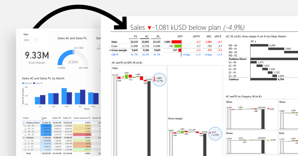
If you're moving off native Power BI matrix and stacked column charts, either one closes most of the gap. Zebra BI does it with fewer choices and an IBCS-compliant result out of the box.
What makes Zebra BI stand out
Some of these differences won't show up in a demo. They might show up in production, at scale, 6 months after your solution goes live.
IBCS as default, not as a configuration
Inforiver supports IBCS through what they call a "Flexible IBCS theme." It's a toggle. Every report builder has to remember to apply it, configure it, and stick to it. If one analyst forgets, the standard breaks, and your entire company procedure is gone.
Zebra BI enforces IBCS by default. When a developer on your team drops a Zebra BI visual into Power BI, the output is IBCS-compliant immediately. No theme toggle, no per-report configuration, no QA cycle to catch the one analyst who skipped a step.
Why this matters at scale: when you're rolling reporting out across 20 departments and 200 analysts, "configurable" is a polite word for "inconsistent." The whole point of IBCS is that Tokyo and Toronto read the same chart the same way. A configurable standard isn't really a standard.
Zebra BI allows us to provide IBCS-compliant dashboards by default. It's built-in. We don't waste time on formatting, variance calculations, or defending design choices.
We chose Zebra BI because it lets us apply IBCS standards out of the box, making our reports clear, actionable, and consistent.
Customer evidence at the executive level
This is the part of the comparison most comparison pages avoid, because it's the part you actually need to see. These are verbatim quotes from named champions in published Zebra BI customer stories.
From building one report that everyone could use, we saved about one to two annual analysts' worth of time across all of our teams by consolidating and automating reports with Zebra BI.
These visuals weren’t just cosmetic upgrades, they helped us tell the right story faster and better.
These are real stories from real companies. The kind of evidence that holds up in a budget conversation and answers every executive sponsor is asking quietly, "If we buy this, what actually changes?"
Reports without context are just numbers
The "why" lives in conversation, and most BI tools push that conversation out of the report into email, Slack, or a deck. By the time the answer comes back, the decision moment is gone.
Zebra BI has an annotation layer built into the visual itself. Comments attach to specific data points and remain there even after filter changes. The differentiator is what goes into the comment automatically: when you comment on a variance cell, Zebra BI captures the data point, the variance value, and the surrounding context, so the comment carries the numbers it's about, not just the words.
Why this matters: When the CFO asks, "Why is Q3 down?" the comment appears in the variance cell, with the variance number already attached, and the answer goes right next to it. The conversation closes inside Power BI, on the data the conversation is about.
It's better to show the report first and explain later. With Zebra BI, the comments are right there, so people understand immediately.
Commenting in View mode will be available with Zebra BI Tables +, currently in beta. This means the users reading the report, not only the report builders, can annotate directly inside the dashboard. They can ask questions on a specific variance or flag something unusual without leaving Power BI.
Inforiver supports commenting on their certified visuals as well, and the capabilities are broadly comparable at the certified-visual level (cell-anchored, filter-responsive). If commenting is central to how your finance team closes the loop after a report review, test both with a real reporting cycle, not a demo.
Speed to value and usability
Inforiver's architecture (100+ chart types in a single consolidated visual) means every chart you build starts from a long menu. Powerful, but you pay for it on every onboarding ramp and every new analyst hire.
Zebra BI's three-visual architecture (Tables, Charts, Cards) is narrower by design and therefore faster. You don't go shopping in a menu, you pick the visual that matches the question.
Three clicks and you've got a variance report. Excellent customer service, competitive pricing, drill-down functionality.
Quality of outcome over quantity of options
Inforiver's positioning leans on counts: 100+ charts, 4-in-1 visual, more IBCS variants, more options.
Zebra BI's positioning leans on the report itself. Does it answer the four questions every executive actually cares about (is performance good or bad, how good or bad, why, what’s next)? If yes, the count doesn't matter. If not, the count is worse than useless because it adds decisions for the report builder without changing the answer for the report reader.
We chose not to build Marimekko charts, scattergrams, or bubble charts. Not because we couldn't, but because we decided to stick to the IBCS-standardized visualizations that bring value to business reporting. Inforiver chose differently. Both are defensible choices. Pick the one that matches your reporting maturity goal.
The same visuals, in PowerPoint and Excel
Enterprise teams don't live in one tool. They build in Power BI, prototype in Excel, present in PowerPoint, and increasingly explore in Fabric. Every switch between those surfaces is normally a re-learning tax.
Zebra BI runs across all four. Same visual library, same IBCS standards, same boardroom-ready output. Build a variance chart in Power BI, drop the same chart structure into PowerPoint for the board deck, hand the prototype to an FP&A analyst who'll iterate in Excel. The output stays consistent across every Microsoft surface the team touches.
For finance teams who still rely on Excel and PowerPoint for half their workflow (which is most finance teams), this matters more than feature count. One visual language across the stack, not three.
Zebra AI now ships as a native workload in Microsoft Fabric, extending the same visual standards into the AI-narrative layer. If your reporting roadmap is heading toward Fabric, you're not waiting for a third-party catch-up.
Inforiver's product line is concentrated in Power BI and Fabric. If your finance team's day still includes Excel and PowerPoint, that's where the experience gap shows up.
When Inforiver is the answer to a different question
We're not going to pretend Inforiver does nothing well. They do. But for a finance or BI buyer evaluating reporting tools, most of what Inforiver markets as "more" is either solving a different problem or building features outside the IBCS-recommended set.
Planning and writeback. Inforiver Writeback Matrix is purpose-built for budgeting, forecasting, and workflows where users edit numbers that get saved back to the data model. Zebra BI doesn't have a writeback product because writeback is a different category from reporting.
If planning is your primary need, you're really evaluating EPM and planning tools (Anaplan, Workiva, Planful, or Inforiver Writeback), and that's a separate decision from your reporting visual choice. Most organizations end up running a planning tool and a reporting tool side by side, not one tool that tries to do both.
A wider chart catalog, including chart types outside the IBCS-recommended set. Inforiver markets 100+ chart types, including Marimekko, scattergrams, and bubble charts. Those chart types aren't part of the IBCS-recommended set for variance and comparison reporting, where the priority is fast, unambiguous reading. If your reporting standard is IBCS (and if you're looking at Zebra BI, it almost certainly is), most of the wider catalog isn't actually a feature you'd use.
If neither of those applies to you, the rest of this comparison is about which tool answers your actual reporting question faster, more consistently, and with better adoption from the people who read the report.
Product-by-product breakdown
Inforiver Analytics+ vs Zebra BI Charts and Cards
Inforiver Analytics+ is a single visual with 100+ chart types, KPI cards, tables, and Gantt rolled into one. The pitch: one visual, one license slot, one place to look.
Zebra BI Charts + Cards is two integrated visuals built around the IBCS-aligned chart set most finance teams actually use day to day: bar, column, waterfall, variance, small multiples, scaled bullet, and KPI cards.
Trade-offs:
- The 4-in-1 architecture saves you a visual slot on the canvas, but every chart you build starts from a longer configuration menu. Some buyers find that powerful; others find it slow.
- The narrower Zebra BI chart set means your builders make fewer choices and your viewers see more consistent output across the org. The cost is that the chart types we deliberately don't include aren't an option.
Inforiver Reporting Matrix vs Zebra BI Tables
Inforiver Reporting Matrix is built for tabular financial reporting, with IBCS support and writeback functionality.
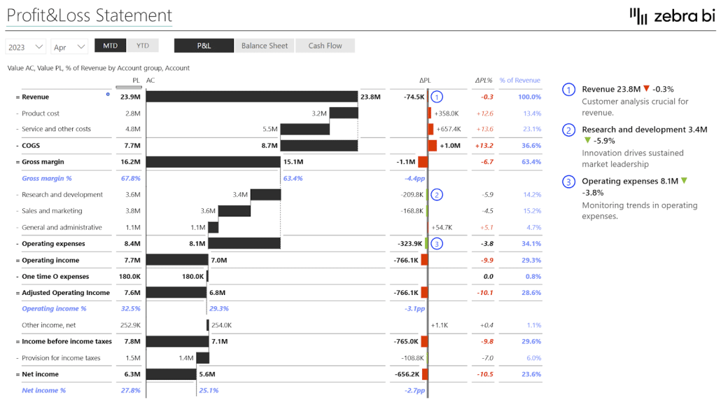
Zebra BI Tables is built for hierarchical P&L logic with native support for invert calculations, skip rows, sub-totals, and result rows, plus an annotation layer for the qualitative "why" that goes alongside the numbers.
The practical difference is how long it takes to get a clean P&L report. If your reporting follows standard finance logic (revenue, COGS, gross profit, OpEx, EBIT, net income, with margin lines and variance columns), it builds in minutes without DAX. Inforiver Reporting Matrix is more flexible but expects more configuration to get to the same output.
In my research, there was no better visualization for a P&L format than the Zebra BI Tables.
Pricing comparison
Inforiver's own published comparison flags pricing transparency as a weakness for Zebra BI. We're going to disagree on the page and on the pricing page.
Zebra BI
| Plan | Price | Users | Annual |
| Starter | $68/month | 10 users | $816/year |
| Business | $316/month | 50 users | $3,792/year |
| Enterprise | Custom | Custom | Custom quote |
Every user who views or interacts with a Zebra BI report needs a license. There's no separate "designer" tier. Minimum purchase is 10 users. The free 14-day trial gives you full Enterprise features. Zebra BI for Office (Excel and PowerPoint) has a free single-user forever tier.
Inforiver
Inforiver publishes per-user pricing for Analytics+ and Reporting Matrix separately. At 10 users, Analytics+ is $30/month, and Reporting Matrix is $50/month. That’s $80/month combined for 2 products that map closest to what Zebra BI covers in a single license.
A note on the 2025 Zebra BI pricing plans change
We updated our pricing plans in 2025. It wasn't frictionless, and we're not going to pretend otherwise. The question we'd ask anyone weighing this is whether the math holds.
W.L. Gore saved roughly one to two analysts' worth of time per year by consolidating and automating reports with Zebra BI. Coca-Cola's intelligence team cut development time from hours to minutes. Helvetia removed the report-building step from their monthly cycle entirely. The price went up. The return went up more.
Now it's instant. There's no time required for building reports anymore. Everything updates automatically, so users just open the dashboard and it's there.
If your finance team saves 2 hours per analyst per week on formatting, the payback math is straightforward, and you can run it yourself before talking to sales. In addition to the saved time, your team also gets visuals that need no further explanation. Decision makers get clean, consistent reports that are built on best practices and easy to read. This makes it easier to catch issues early and quickly act on them.
The decision framework: What to actually evaluate
Most BI tool evaluations get lost in feature checklists. We'd suggest a different approach, borrowed from the actual question every executive viewer is asking when they open the report. We call it the Four-Question Test.
A good report answers all four. A bad report answers one.
- Is the performance good or bad?
- How good or how bad?
- Why?
- What’s next?
Run this test on the candidate report you'd build in each tool, not on the feature list.
- Question 1 and 2 (good or bad, how much): both tools can answer these with proper variance visuals. Inforiver gives you more chart-type options to do it. Zebra BI gives you fewer options because we standardized on the chart types that answer the question fastest.
- Question 3 (why): this is where the annotation layer matters. Zebra BI has commenting built into the visual that persists through filter changes and travels with the report. Inforiver has a commenting feature too, but our annotation layer is built around the decision moment, not just the comment. Test both on a real reporting cycle, not a demo.
- Question 4 (what’s next): no BI tool answers this directly. The closest either of us gets is making questions 1, 2, and 3 fast enough that the executive has time and context left to answer question 4 themselves. The faster the first 3 answers, the more bandwidth for the fourth. That bandwidth is the real product.
If you can build a report in either tool where an executive lands the answer to all four questions in under 60 seconds without anyone in the room explaining a chart, you've found the right tool for your org. Run that test. Then decide.
The people that don't actually know Power BI, they don't actually have to deal with picking the visualizations now. They just want a chart. And with Zebra BI, it is as easy as that: click on chart and boom, you have it.
Frequently Asked Questions
Is Zebra BI or Inforiver better for finance reporting?
For finance teams who need reporting, variance analysis, and executive-ready dashboards in Power BI, Zebra BI is the more direct path to a clean, IBCS-compliant report. For teams whose primary need is budgeting, forecasting, or writeback into the data model, Inforiver Writeback Matrix is a different product category and worth evaluating separately. Most organizations end up with both kinds of tools, not one tool that does both.
Does Zebra BI have fewer chart types than Inforiver?
Yes, deliberately. Zebra BI focuses on the chart types IBCS does recommend for finance reporting (variance, waterfall, small multiples, scaled bullet, P&L tables, KPI cards) and builds those deeper than the all-in-one alternatives.
Can I switch from Inforiver to Zebra BI? What's involved?
Yes. The data model in Power BI doesn't change, so you're swapping the visual layer rather than re-engineering the underlying reports. The actual timeline depends on how many reports you have, how customised they are, and how your IT governance process treats new AppSource visuals. The fastest way to get a real estimate for your situation is to talk to our team, and we'll walk through your report inventory and give you an honest assessment of effort.
Is Inforiver cheaper than Zebra BI?
It depends on the bundle and the user count. Inforiver's BI Bundle (Analytics+ + Reporting Matrix + Premium Table + SuperFilter) is priced as a bundle. Zebra BI is priced as a single product covering Tables, Charts, and Cards. Compare apples to apples by mapping your actual report inventory to each tool's products, then multiply by your real user count. We've seen the comparison go both ways depending on team size.
Do both work natively in Power BI and Fabric? And how does performance compare?
Yes. Both are Microsoft-certified, both are on AppSource, and both work in Power BI Desktop, Service, and Fabric. On performance, here's the honest answer: in Power BI, the bottleneck is almost always the data model, not the visual layer. The visual you pick (Zebra BI, Inforiver, native, anything else) sits on top of a query that Power BI sends to your model. If that query returns 30,000 rows, every visual on the page is going to feel slow, and the fix is at the model layer, not the visual layer.
For typical finance reporting (variance reports, P&L, monthly close, waterfalls, KPI cards), you're working with hundreds to a few thousand rows per visual. Both Zebra BI and Inforiver handle that range comfortably. Performance isn't the deciding factor at enterprise scale.
Inforiver markets the ability to render 30,000 data points in a single visual. If your reporting genuinely needs that volume rendered side by side in one visual (think tens of thousands of SKUs, products, or transactions on a single page without aggregation), it's worth testing. For most finance reporting, the better answer isn't a visual that renders 30,000 rows; it's aggregating at the data model so no visual is asked to.
Your IT team will thank you, the dashboard will load in seconds, and the executive who opens it will use it. If you're not sure which camp you're in, run a real test with both tools on your real data model. That's the only benchmark that matters.
Is Zebra BI a legacy tool?
It's a positioning claim by a competitor, not a product fact. Zebra AI shipped on Microsoft Fabric in 2026. Zebra BI ships continuous updates on Power BI on a regular release cycle. "Legacy" is what someone calls a product they want you to evaluate on feature count instead of outcomes. Look at the release notes and the customer outcomes and decide for yourself.
Does Zebra BI support writeback and planning?
No. Writeback and planning are a different category from reporting visuals. If that's your primary need, you're really shopping EPM and planning tools (Anaplan, Workiva, Planful, or Inforiver Writeback Matrix) and that's a separate decision from your reporting visual choice. Most finance teams end up with one tool for planning and another for reporting, not one tool that tries to do both.
Try Zebra BI yourself
The fastest way to make this decision is to try Zebra BI on a report you actually care about. Pull up your last variance analysis, your monthly P&L, or your sales dashboard, rebuild it in Zebra BI, and run the Four-Question Test on the result. See if an executive can read it in 30 seconds without anyone in the room explaining a chart.
You'll have your answer in an afternoon.
- Start a free 14-day Zebra BI trial (full Enterprise features, no credit card)
- Book a 20-minute demo with our team if you want to see a finance report built live
- Already evaluating both? Talk to us about switching from Inforiver, and we'll give you an honest assessment, including whether Zebra BI is the right tool for your specific case