 September 8th
 February 22nd
Variances are the holy grail of reporting because they help us understand performance in the right way. Compare your data to something and put it into perspective.
Let Zebra BI visuals automatically calculate absolute and relative variances for you, saving you weeks in developing advanced reports.
Highlight the categories that had the greatest impact on your business and limit the number of categories displayed in the visual. All the other values are shown as Other element.
You can choose to show Top N, Bottom N, or Top + Bottom N elements.
Goodbye complex data set changes, hello custom calculations within Zebra BI!
Whenever you want to add a new element to your table and it's not in your data set, you can simply calculate it with a formula within a visual, without doing any work on your data set.
Zebra BI visuals for Power BI are the world's first fully responsive BI visuals, making them perfect for large screen dashboards such as in digital boardrooms, as well as for mobile apps.
Use endless possibilities to create stunning tables that work best for your business. From sorting by any column with 1 click to simply reordering columns by dragging. You can rename any column directly on the visual, change the chart type for each column or turn it into a table column, and much more.
In today's rapidly changing times it is essential to be as flexible and agile as possible. With this functionality, you can add up to three different measures for Plan and/or Forecast to the same table and have all scenarios always in front of you.


Letting Zebra BI Tables calculate all of the variances for you will save you time and simplify your Power BI model in the long run.
You can easily define sorting rules for any column, change the column order, or even hide columns if that's what you need!
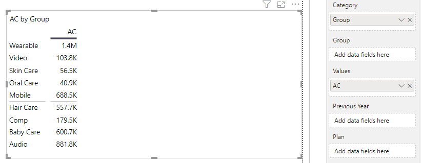
In reality, we are often dealing with more complex datasets that are harder to display than a single measure.
With a simple drag&drop, you can add another data field to Zebra BI Tables visual to create a hierarchical table with expand/collapse buttons. This simple action will make your data much more organized and easier to drill down into the details.
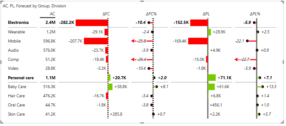
To get a cross-dimensional table ("cross-tab") where you can drill down in rows, as well as in columns, simply add an additional field to the Group placeholder and create a hierarchy in columns.
You can do a lot more with multi-group (segmented) tables or cross-tables, for example:
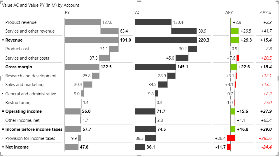
Calculation tables are very useful for financial reports such as income statements, cash flow, balance sheets, and other related reports where the data set that you have is actually a calculation.
With Invert/Result option you can easily define addition and subtraction rules for each row, depending on whether it's related to a revenue stream or an expense.
Income statements are one of the most powerful tools for business analysts, CFOs, BI specialists, and many others.
Still, visualizing an income statement in Power BI can be quite tricky. With the Zebra BI Tables visual, creating one only takes a few steps thanks to subtotals, invertible rows for costs, and automatically calculated absolute and relative variances.
Use a combination of Zebra BI's vertical waterfall charts and variance charts to display your data clearly for everyone to understand.
Use Dynamic Comment Markers for comments to appear in the tooltip when you hover over them. You can also use a Comment Box to display dynamic comments next to your tables in Power BI reports. Right inside the visual!
Comments are completely dynamic so you can simply switch the time period to see the relevant ones only.
Make sure you're using the most appropriate display or visualization of each column by selecting the type of your measure.
Switch any column you want from a chart to a table column. The change is simple to implement, so you can always decide on what shape would you like your data to be shown.
Switch between a simple table matrix view and a view with integrated charts anytime.
Add up to 20 custom-calculated measures to the existing columns and charts in the table. This takes the flexibility of this visual to the next level and enables you to create even more useful, informative, and insightful reports.
Perfect for adding:
In a situation when you have different types of KPIs in your table, you can invert certain elements where that makes sense.
For example, if you’re showing Revenue and Costs within the same table, it has a completely different meaning whether the Revenue is growing versus if Costs are growing. Growing costs have a negative contribution to the end result.
With Zebra BI you can invert a group, rows, and all children within a group.
Not sure how to display Forecast with native Power BI visuals? With the help of the Zebra BI visuals, you can add and compare Forecast values in just one visual without creating a mess.
Because all this is done within one single chart, all the data bars are scaled and can therefore be compared to each other.
Dynamically switch the display of actual performance compared to the Plan vs. compared to the Previous Year without dealing with the complex setup in Power BI.
With Zebra BI Tables you don't need to mess with bookmarks and doubled and hidden visuals anymore! Simply add the 3 scenarios to your table and get an option to switch between two comparisons out-of-the-box.
Provide additional insights to report viewers with Enhanced Tooltips that are way more powerful than native Power BI. Deliver more details and insights by showing additional dimensions that aren't even part of the visual.
Since the report page tooltips are actually designed on a separate page in Power BI reports, there are endless possibilities of what you show in the tooltip and how you design it.
Sounds trivial, but many Power BI users out there are struggling to set up their favorite number format.
With Zebra BI you simply choose to display negative values in parentheses or with a minus sign from the menu.
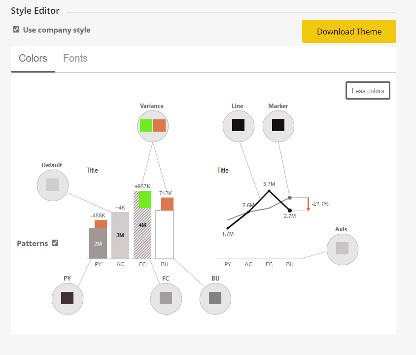
Apply your visual styling with extensive support for custom design. You can change the color, font type, font size, shape, etc. on practically every element in the Zebra BI visuals.
However, if you prefer to control the behavior of visuals for the whole company, from one central place, you can set up your own Custom Theme using JSON.
In hierarchical tables, you can expand/collapse rows and columns by simply clicking on the arrows. You can also choose to collapse or expand all, allowing you to tailor your tables to your exact needs and desires.