Power BI Waterfall Charts Explained – Horizontal, Vertical & Best Practices
PRO Trial
How many times have you worked on a critical report in Power BI, and your boss asked for a visual that clearly shows how individual components contribute to a total?
Raise your hand if it happened at least once.
You tried column and bar charts, but they don’t quite tell the data story effectively.
So...what then?
That’s where the waterfall chart comes in.
Waterfall charts can be a highly impactful alternative that breaks down your data step by step, making complex information easy to understand at a glance.
In this guide, we’ll take you through waterfall charts in Power BI, their benefits, and when they are best used so you can transform your data visualizations into something dynamic and compelling.
Keep reading if you never want to be caught in a Power BI visualization pickle ever again.
What is a horizontal waterfall chart?
Offering a fresh take on the conventional vertical waterfall chart, the horizontal waterfall chart presents data horizontally rather than vertically.
This unique orientation is particularly beneficial when visualizing extensive data sequences, such as time series, providing a distinct perspective on data trends.
It is worth mentioning horizontal waterfall charts are best-suited in specific scenarios and are not meant to replace vertical charts,
For example, the horizontal waterfall chart tends to be a better representation when you are visualizing time series (from left to right, from the oldest to the newest)--particularly when you need to analyze root causes, over time.
Still, in situations where you need to visualize structural breakdowns, though (vertically, from top to bottom, ascending/ descending or custom sort order), vertical charts can be better.
Benefits of using a horizontal waterfall chart in Power BI
The horizontal waterfall chart in Power BI has many advantages, making it a robust tool for data visualization.
Here are just some of the main benefits of waterfall charts in Power BI:
1. Clarity
The horizontal waterfall chart in Power BI excels at presenting data progression over time or across categories in a format that is both compact and easy to read.
The waterfall chart's clean, modern design enhances chart comprehensibility and interpretability, which is especially important when sharing insights with stakeholders or clients who may not have a background in data analysis. The visual simplicity of the chart helps convey complex information in a digestible manner.
2. Storytelling
This chart type is particularly effective at facilitating straightforward comparisons between different data points and enabling immediate visualization of how one category or period compares to another.
These attributes make horizontal waterfall charts powerful tools for analyzing trends, spotting patterns, and telling a clear story with your data. By making these insights visually apparent, the chart supports communication and engagement in presentations and dashboard design.
3. Decision support
Horizontal waterfall charts highlight changes in data and can display extended data sequences. The ability to quickly reveal shifts and patterns supports data-driven decision-making.
Waterfall charts enable users to make informed decisions based on the clear depiction of data relationships and distributions within the chart, confidently acting on the insights that the visuals provide.
4. Overcoming static reports limitations
Waterfall charts help overcome the limitations of static reports by providing a dynamic and interactive approach to analyzing data changes over time or across categories.
Unlike static reports that often only display summarized or fixed data views, waterfall charts break down variances and transitions, clearly highlighting the factors driving change. This allows for detailed and actionable insights, and with platforms like Power BI, charts can be customized or drilled down for even deeper analysis, offering a flexible and insightful alternative to traditional static reporting formats.
Types of waterfall charts
Waterfall charts can be categorized into two main types based on their orientation and use cases. These are vertical waterfall charts and horizontal waterfall charts, each serving unique purposes in data visualization.
Vertical Waterfall Charts
Vertical waterfall charts present data transitions in a top-to-bottom manner. This type of chart is commonly used for scenarios that require a clear breakdown of components or steps in processes. Vertical waterfall charts can be further divided into the following categories:
Structural Waterfalls
Structural waterfalls are used to display hierarchical or layered data, making it easier to understand relationships between different levels or components.
Calculation Waterfalls
Calculation waterfalls illustrate the step-by-step progression of values through computations, enabling users to see how individual elements contribute to a total.
Variance Waterfalls
Variance waterfalls detail changes or fluctuations between two points or states, such as the impact of individual factors on a budget or actual performance.
Horizontal Waterfall Charts
Horizontal waterfall charts display data transitions in a left-to-right direction. They are well-suited for comparing changes or growth over a timeline or distinct categories. Horizontal waterfall charts can be classified into the following types:
Growth Waterfalls
Growth waterfalls focus on showcasing incremental growth or progress over time, perfect for tracking trends, revenues, or expansion stages.
When to use waterfall charts?
Waterfall charts are particularly useful in scenarios where understanding the progression or breakdown of data is critical.
Here are just some of the use cases for waterfall charts:
Analyzing revenue or profit changes
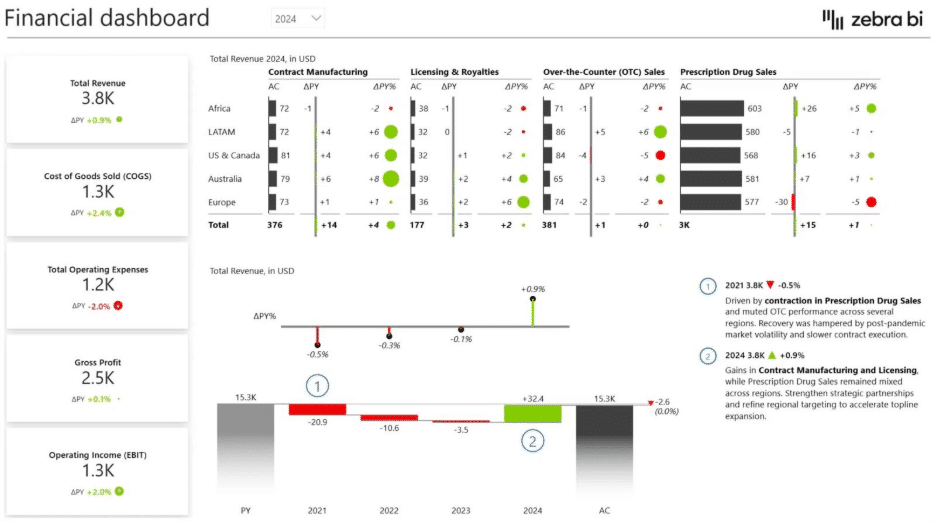
Waterfall charts can help identify the key drivers of changes in revenue or profit, providing clarity on how different factors contribute to overall financial performance.
Monitoring budget variance
When comparing planned versus actual budgets, waterfall charts make it easier to visualize overspending, underspending, and other discrepancies.
Tracking project milestones
For project management, these charts highlight how individual milestones or delays impact the overall progress of a project timeline. They also help teams identify potential bottlenecks and adjust resources accordingly to stay on track.
Understanding component contributions
Waterfall charts effectively illustrate how different components add up to a total, such as various departmental contributions to overall sales figures.
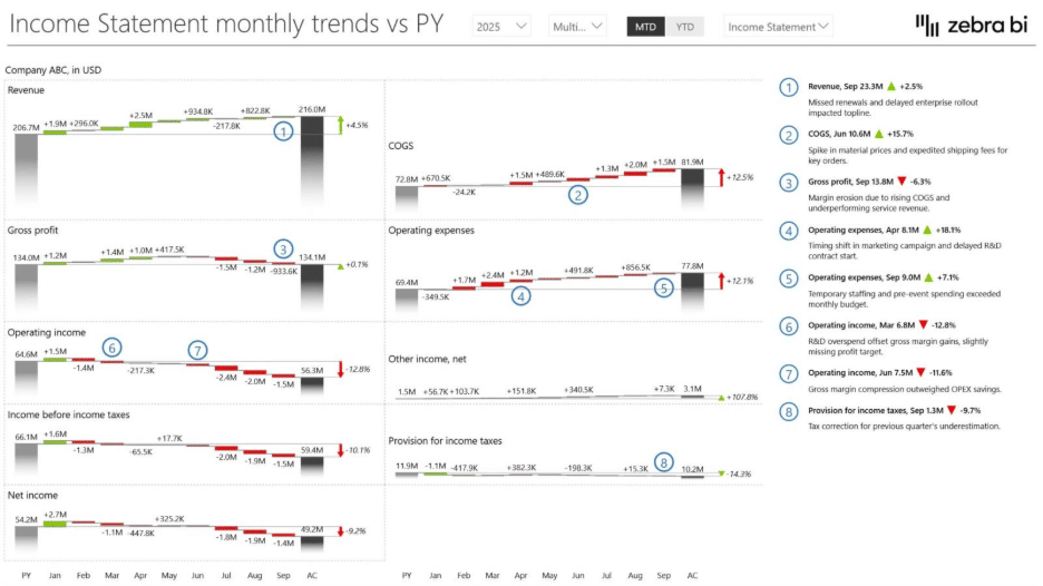
Visualizing profit and loss dynamics
Horizontal waterfall charts are particularly useful for breaking down profit and loss dynamics over time or across different categories. By aligning components horizontally, it’s easier to compare contributions sequentially, enabling businesses to pinpoint where gains or losses originate.
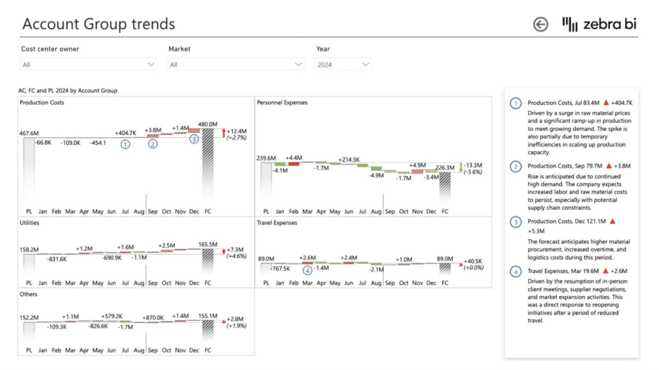
Evaluating project phases
Horizontal waterfall charts are ideal for assessing project progress across distinct phases, in time. Each phase can be represented as a horizontal step, making it easier to visualize the cumulative impact of delays, resource allocations, and completed tasks on the overall project timeline.
Analyzing Trends Over Time
Horizontal waterfall charts are particularly useful for analyzing trends and changes over time. By representing time on the horizontal axis, businesses can track the progression of key metrics, such as revenue, expenses, or customer growth, within specific periods.
Horizontal waterfall chart vs. other Power BI charts
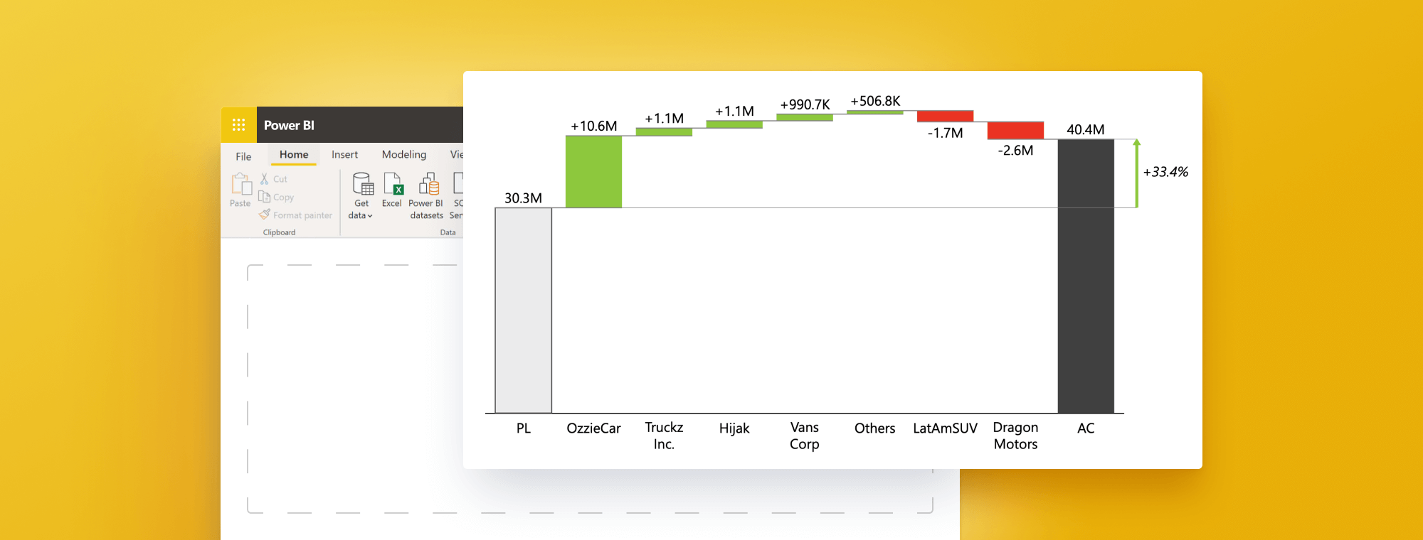
A horizontal waterfall chart in Power BI allows the visualization of the cumulative effect of sequentially introduced positive or negative values.
These visuals often display how an initial value is affected by a series of intermediate positive or negative values. They can quickly highlight the largest contributors to changes over time and provide more detailed information when you hover over specific data points.
Not sure which chart to choose? Try our interactive chart selector.
Here's a quick comparison between waterfall charts and the other main types of Power BI charts:
- Column chart: Column charts are useful for comparing different categories of data side-by-side, where the categories are displayed on the x-axis and the values are shown on the y-axis. They are not as effective in displaying changes over time as waterfall charts, which give a clear visual representation of the cumulative effect.
- Bar chart: Similar to column charts but rotated 90 degrees. These charts are often used when category column names are long or there are many categories. Bar charts may not provide the same clear picture of cumulative change over time as a waterfall chart.
- Line chart: Line charts are excellent for displaying trends over time, with time usually shown on the x-axis and the metric of interest on the y-axis. They show the change in value and can display the trend of a single category column or compare trends among different categories. However, they don't show the cumulative effect of changes like waterfall charts.
While each chart type has its strengths, the horizontal waterfall chart stands out for its ability to display the cumulative effect of sequential changes over time. This makes it a valuable tool for many business scenarios, such as understanding a financial metric's progression over time.
| Feature | Waterfall Chart | Other Chart Types |
| Displays Cumulative Effect | Yes | No |
| Tracks Sequential Changes Over Time | Yes | Limited or No |
| Suitable for Financial Analysis | Yes | Sometimes |
| Visualizes Trends | Limited | Yes |
| Compares Multiple Categories | Limited | Yes |
Using your chart for data-driven decision-making
Data visualization tools are designed to assist you in making data-driven decisions. Using a horizontal waterfall chart in Power BI allows you to gain a more comprehensive understanding of changes in your data (which will lead to more informed decisions).
Waterfall charts can provide valuable business intelligence into your data by effectively displaying the cumulative effects of sequentially introduced positive or negative values. Whether you're monitoring revenue shifts over time or analyzing fluctuations in average monthly expenses, a horizontal waterfall chart can help illustrate these data trends clearly and meaningfully.
Understanding these dynamics could be instrumental in various contexts, within the Finance team and outside of it too. For instance, business managers could use it to track revenue and cost progression over a fiscal period, to help evaluate financial performance.
Going beyond financial analysts, environmental scientists could employ this chart type to analyze changes in temperature or sea levels over time, helping to model and understand climate change.
So, regardless of the field, a horizontal waterfall chart in Power BI is a powerful tool in your data analysis arsenal. As a result, you can make more confident, data-driven decisions.
Best practices for chart creation and presentation
In the final part of our guide, we'll examine some best practices for creating and presenting a horizontal waterfall chart in Power BI. By sticking to these principles, you can ensure your chart is visually compelling, informative, and easy to understand for pretty much any audience.
Choose the right data for your chart
This type best suits data demonstrating a start and end point with changes in between. Financial data, project timelines, or inventory levels tracking are some examples. The data should tell a coherent story when visualized this way.
Keep the chart simple and uncluttered
Simplicity is the key to data visualization. Avoid overcomplicating your chart with too many categories or time periods. Remember, the goal is to convey a clear picture of changes in your data, not to confuse or overwhelm your audience.
Use color and visual elements sparingly
While color coding can help differentiate between increases, decreases, and totals in a horizontal waterfall chart, it's crucial not to overdo it.
Instead, stick to a consistent color scheme that complements your data and enhances readability. Also, use visual elements like labels and legends judiciously to aid understanding without clutter.
Provide context and explanations for your audience
Any data visualization is only as good as the insights it provides. Therefore, contextualize your chart by including captions, notes, or verbal explanations. Define what each element represents and explain any anomalies or notable trends in the data.
Incorporate subtotals for clarity and structure
When presenting data with multiple categories or layers, including subtotals can help your audience grasp the intermediate levels of information before reaching the final total.
Subtotals will help you give context to segmented data, making it easier to identify patterns or trends within specific groups while maintaining an overall understanding of the dataset. Ensure that subtotals are clearly labeled and visually distinguished to avoid confusion.
Follow IBCS standards
Our best advice is to follow IBCS standards. The International Business Communication Standards (IBCS) are practical proposals for business communication design. IBCS provides a set of rules and guidelines on how to design and present information in a way that is easy to understand and interpret. It helps to create a unified language between different organizations and departments, enabling better communication and collaboration.
Following those guidelines, you can ensure your data visualization is clear and concise — something you get out-of-the-box with Zebra BI for Power BI.
These best practices will help you create a horizontal waterfall chart in Power BI. This chart lets you communicate your data insights and make data-driven decisions.
How Zebra BI elevates waterfall charts
Power BI's native waterfall charts offer basic functionality for visualizing data changes over time.
However, the manual setup for subtotals, the need for DAX formulas for advanced visualizations, limited formatting options, and static design make them time-consuming to create and challenging to scale for professional, presentation-ready reports.
Zebra BI upgrades Power BI waterfall charts with automated formatting, advanced analysis, and consistent, professional custom visuals—saving time and effort.
Here are some of the elements Zebra BI can help you elevate in relation to your waterfall charts:
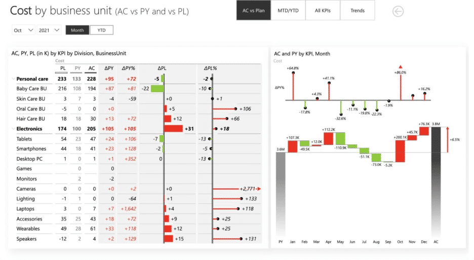
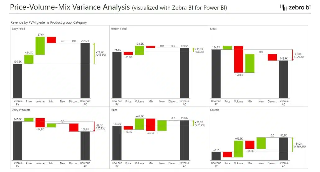
- Small multiples (scalability) - Creates multiple waterfall charts simultaneously for different regions, countries, or product lines in one visual
- Variance analysis - Shows both absolute and relative variances (Actual vs. Budget, Actual vs. Previous Year) in a single integrated chart
- Advanced labeling - Automatically positions data labels inside or outside bars and displays percentages, contributions, and running totals without extra measures
- Visual design & IBCS standards - Applies professional formatting with appropriate colors, bar widths, and totals according to industry best practices
- Interactivity - Enables users to expand/collapse categories, sort dynamically, and drill down into details directly within the chart
- Enterprise-level features - Handles large datasets seamlessly while offering custom templates for consistent, scalable reporting across organizations
Want to learn more about creating advanced waterfall charts in Power BI, the easy way? Or maybe you want to learn how to create waterfall charts in Excel too? We got you! Check out our comprehensive guides on the topics.
FAQ
What’s the main purpose of a waterfall chart in Power BI?
To visually explain how a starting value changes into an ending value by showing the impact of each contributing factor.
Can I make a waterfall chart without Zebra BI?
Yes, but the native Power BI visual lacks finance-ready features like subtotals, advanced variance coloring, and small multiples. Furthermore, Zebra BI also allows you to add comments to your visuals, and work with a scalable visual solution that can be applied to other cases as well (which, in the case of native Power BI means you need to customize your charts for every particular use case, most of the times).
Is a waterfall chart only for finance data?
No — it’s also widely used in sales, operations, and project management to track incremental changes.
When should I use a horizontal waterfall chart?
Use horizontal waterfall chart when analyzing time-related changes and root causes.
What is a waterfall chart in Power BI used for?
A waterfall chart in Power BI is used to visualize how positive and negative changes contribute to a total over time or across categories. It’s especially useful for variance analysis, P&L breakdowns, cash flow statements, and budget vs. actual reporting.
How do I create a waterfall chart in Power BI?
Power BI has a native waterfall visual, but it’s limited. For finance-ready charts, tools like Zebra BI for Power BI offer automatic variance calculations, subtotals, small multiples, and advanced formatting — all without manual data prep.
What are the limitations of the default Power BI waterfall chart?
Native waterfall charts lack flexible formatting, small multiples, dynamic comments, and advanced variance options. They often require manual work to display subtotals and intermediate values correctly.
Can I customize waterfall charts in Power BI?
Yes, but customization in the native visual is limited. With Zebra BI, you can fully control colors, labels, totals, grouping of minor items, and even add real-time comments to explain data points.
What industries use waterfall charts the most?
Waterfall charts are heavily used in finance, but also in sales, marketing, operations, and supply chain — anywhere you need to track the factors that drive change from one value to another.
Why are small multiples important for waterfall charts?
Small multiples allow you to compare multiple categories, regions, or time periods side by side in the same view, making it easy to identify patterns without flipping through multiple pages. Furthermore, small multiples also allow you to scale your charts while maintaining visual integrity.
How can I get Zebra BI for Power BI?
You can start a free trial of Zebra BI for Power BI in just a few clicks. Simply install it directly from Microsoft AppSource or sign up through the Zebra BI website.
The trial gives you full access to all Zebra BI visuals—Tables, Charts, and Cards—so you can test their performance, explore advanced features like small multiples, variance analysis, and dynamic comments, and experience how Zebra BI helps you build decision-ready dashboards in minutes.