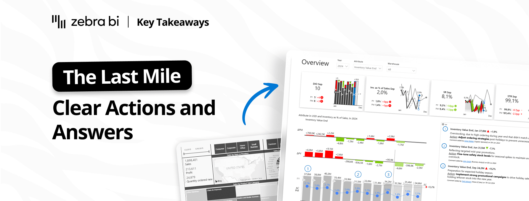
Key Takeaways: Why BI Fails: 7 Last Mile Patterns (And How to Fix Them)
PRO Trial
In this post: Seven reasons your dashboards aren't driving decisions, drawn from Part 1 of our "Why BI Fails in the Last Mile" webinar series with Tine Ozimic (Head of BI) and Mark Leskovsek. These lessons apply whether you use Zebra BI or not.
Part of my job is understanding why finance teams struggle with reporting. I read a lot of BI research. I talk to a lot of practitioners. And the same pattern keeps coming up. Companies have data platforms. The dashboards. The cloud infrastructure. And they're still not making decisions from any of it.
What almost nobody explains is where exactly the breakdown happens. It's not the data. It's not the tools. It's what comes after the dashboard goes live. There's a gap between an insight being visible and a decision being made. Most organizations are losing decisions right there.
It's called the Last Mile.
Curious where your organization is losing decisions? Take the 2-minute Last Mile Health Check ↓
In early March, we kicked off a three-part webinar series on exactly this: "Why BI Fails in the Last Mile." Tine Ozimic, our Head of BI, and Mark Leskovsek ran Part 1. The Q&A alone was worth attending: finance leaders and FP&A practitioners describing their own versions of the same problem, in different words, from different industries.
Here are seven things from that session worth keeping. They apply whether you use Zebra BI or not.

1. Your analytics investment is only as valuable as the last step in the chain
Tine borrowed the term "last mile" from logistics: the most expensive, complex, and failure-prone leg of any delivery. In shipping, you can optimize the entire supply chain and still fail if the package doesn't reach the door. In analytics, you can build a perfect data model and still fail if nobody acts on what it says.
This reframes where the problem lives. Most organizations, when BI isn't working, invest in earlier stages: better data pipelines, more dashboards, shinier tools. The bottleneck isn't upstream. It's at the very end, where an insight is supposed to become a commitment.
"If we mess things up at that point," Tine said, "all the good things we do before are actually worthless."
That line is accurate. Gartner puts the BI failure rate at nearly 80%. A separate survey of 500+ analytics leaders found that only 44% believe their teams are unlocking long-term business value. West Monroe's 2026 research found that 73% of leaders say slow decisions cost up to 5% of annual revenue. The infrastructure isn't the problem. The last mile is.
2. You're probably building reports around your data instead of around your decisions
Most BI projects start with the data: what do we have, how do we model it, what can we visualize? The result is a dashboard with 40 KPIs, six tabs, and a filter panel that would make an airplane cockpit jealous.
Then someone opens it in a meeting and says, "So... what am I looking at?"
Tine named this as problem number one. Reports built around data create noise. Reports built around decisions create focus. The starting question changes everything: instead of "what data do we have," you ask how this decision is actually made, who makes it, and based on which signals. Then you build the report backwards from there.
Mark backed this up with a client example that felt painfully familiar: "One customer complained that even within the same region, reports aren't unified. People don't even know what they're looking at." When every report is a new learning curve, teams default to what they already know. Usually Excel.
Tine's framing: "If those elements aren't clear, dashboards will create discussions rather than commitments. We want commitments, not discussions."
Zebra BI is built around this principle - reports that start with the decision, not the data dump.
3. Your reporting meetings are running at a 90/10 ratio, and it should be flipped
This will sound familiar to anyone who runs a monthly business review.
The meeting starts. Someone opens the report. The first question isn't about strategy. It's about whether the numbers are right. "Is this the correct definition? Why does this look different from last month?" Thirty minutes of validation. Maybe forty. By the time anyone asks what to do about actual performance, you're out of time.
Tine estimated most meetings run at 90% number validation, 10% decision-making. It should be the reverse. And it doesn't flip because of laziness. It doesn't flip because of structural gaps: reports that aren't standardized force people to relearn the format every time. Variance analysis that isn't baked in means the group spends the meeting figuring out why numbers changed instead of deciding what to do.
The best moment in the Q&A: Mark referenced the "3 seconds, 30 seconds, 300 seconds" rule. Your executive dashboard communicates the headline in 3 seconds. A detail page gives context in 30 seconds. A deep-dive answers specific analytical questions in 300 seconds, about 5 minutes.
If your top-level report takes 30 seconds just to orient yourself, you've already lost the meeting.
What would your meetings look like if variance analysis was already built in?
4. Good insights don't create action. Decision framing does.
This was the line Tine repeated twice, and it may be the single most important idea in the whole session: "Insights alone do not create action, even if they are a really good one."
You know this feeling. You build a clear report. The variance analysis is solid. The trends are obvious. You present to leadership. Everyone nods. Nothing happens. No owner. No next step. No follow-up.
What's missing is decision framing. Every meaningful finding should trigger one of four responses: act on it now, adjust the plan, monitor and revisit, or escalate because it's above your authority. If those four options aren't built into how your team interacts with data, insights just generate conversation.
Consider a real scenario. Your report shows production costs in one region jumped 12% above plan. Does the person reading it know whether that's a "fix it locally" situation or a "flag this for the CFO" situation? If the report doesn't frame that, the meeting will spend 20 minutes debating it and likely end without a clear answer.
Decision framing is what turns a report into a decision tool. Without it, it's a very expensive PDF.
Zebra BI lets you embed decision framing directly into reports - so every finding lands with context, not just a number.
5. Unassigned decisions have a 100% failure rate
A meeting happens. Eight people are in the room. A decision is made. Everyone agrees. Then it vanishes, because nobody wrote down who owns it, what the deadline is, or how anyone will know if it actually happened.
In large organizations, this barely registers as a problem anymore. It's just how things work. Except it doesn't work.
Mark shared a client example that illustrated this clearly: "When decisions are made, actions disappear unless they are tracked. So they started explicitly tying initiatives to categories and costs so follow-through could be monitored, not just discussed."
During the demo, he showed what this looks like in practice: commentary fields attached to specific data points in a report, with action items, owners, status indicators, and due dates. The action tracking lives right next to the insight that triggered it, not in a separate project management tool nobody checks after the meeting.
Is this hard to build? No. Is it common? Almost never. That's the gap.
Action tracking built into the report itself - not a separate tool.
6. When people go back to Excel, listen to what they're telling you
Someone in the Q&A described a pattern that happens constantly in large companies: business users validate the requirements for a new dashboard, approve the design, watch the demo, sign off, and then immediately export everything to Excel and work from there.
The instinct is frustration. "We built exactly what they asked for. Why won't they use it?"
Tine named two possible causes, and they require completely different fixes.
First: the dashboard might not support how people actually work with data. If it lacks drill-through, flexible filtering, or the ability to explore and rearrange numbers the way you naturally would in a spreadsheet, people go back to the tool that lets them do that. It's not resistance. It's a design gap.
Second: the users might not have the data literacy to navigate the dashboard confidently. Excel feels safe after 15 years. Going back isn't rejection. It's a retreat to familiarity.
Both speakers made the same point: a dashboard is not a one-time deliverable. If you hand it off and move on, you'll discover six months later that nobody uses it. And they'll be right, because the dashboard stopped reflecting how the business actually operates the day you stopped iterating on it.
If your users keep going back to Excel, it's worth seeing what a report that actually fits how they work looks like.
7. Technology, design, people, and process all have to work. Not some of them. All of them.
Tine closed with a framework that sounds simple but is harder than it looks. Four things must work together to close the last mile:
- technology (the data and the ability to visualize it)
- design (the structure that makes insights obvious)
- people (the judgment to interpret data and decide)
- and process (the discipline to turn decisions into tracked action).
Take away any one, and the whole thing stalls. Beautiful reports without process discipline produce insights that die in the meeting. Strong processes without good design produce bureaucracy around data nobody understands. Smart analysts without the right tools spend their time formatting instead of thinking.
One Q&A question pushed this further: what about the factors that aren't in the data at all? Market sentiment, competitive moves, judgment calls that senior leaders make from experience and gut feel?
Mark's answer was practical. AI tools are starting to fill some of that gap by scanning external sources and providing context. But the simpler solution is commentary and annotations built right into the report, where people can capture what the numbers alone don't say. The best reports combine hard data with human judgment. The worst ones pretend numbers are the whole story.
And running through the entire session was the case for standardization. When reports follow a common visual language, IBCS standards (International Business Communication Standards) being the most rigorous example used by companies like AbbVie and Deloitte, something small but powerful happens: people stop spending cognitive energy on the format and start spending it on the content.
As Mark put it: "The point of a report is not visual appeal. It's to provide you with the insights so that you can create good decisions."
That sentence belongs on the wall of every finance and BI team.
Where this goes from here
Part 1 was the diagnosis. Deliberately heavy on the "why" before the "how." You can't fix the last mile if you can't name what's broken. [Watch the Part 1 Recording Here]
Part 2 lands March 26 and goes deeper into the practical side: how to build the dashboards from the demo, how to structure commentary and action tracking, and how to implement this framework with real data.
Part 3 (April 23) brings customer case studies with actual numbers: what organizations changed, what they measured, and what the results looked like.
If you want a quick gut check on where your organization stands, try the Last Mile Health Check below. Eight questions. About 2 minutes. You'll probably check more boxes than you'd like.
The Last Mile Health Check
8 questions. Check every box that describes your organization right now.
How many of these sound familiar?
Frequently asked questions
What is the Last Mile of analytics?
The Last Mile is the final step in the analytics chain: the moment an insight is supposed to become a decision. It's the stage most BI investments ignore, and where most value is lost. Even with perfect data and well-built dashboards, decisions don't happen automatically. That last step has to be designed.
Why does BI fail to drive decisions?
Four root causes come up most often: reports built around available data rather than actual decisions, no decision framing that connects findings to clear actions, no process for assigning and tracking action items after meetings, and lack of report standardization that forces teams to relearn the format every time they open a dashboard.
What is the 90/10 reporting meeting problem?
Most business review meetings spend 90% of the time validating data and 10% making decisions. The fix is structural: standardized report formats, built-in variance analysis, and a clear framework for what decisions each report is meant to drive. Flipping the ratio to 10% validation and 90% decision-making is the goal.
What does decision framing mean in reporting?
Decision framing means structuring every key finding so it connects directly to an action. Each insight should prompt one of four responses: act now, adjust the plan, monitor and revisit, or escalate. Without this framing built into the report, findings generate conversation but rarely commitment.
How do you stop decisions from disappearing after meetings?
Track actions inside the reporting tool itself, not in a separate system. Commentary fields with owners, due dates, and status indicators attached to the specific data point that triggered the decision keep actions visible and accountable. The closer the action tracking is to the data, the more likely it gets followed through.
What is IBCS, and why does it matter for reporting?
IBCS (International Business Communication Standards) is a set of rules for designing financial and business reports so they communicate clearly across teams, regions, and organizations. When everyone reads the same chart the same way, meetings shift from "what does this mean?" to "what do we do about it?" Companies like AbbVie and Deloitte use IBCS-aligned reporting to reduce meeting friction and accelerate decision cycles.
About the series: "Why BI Fails in the Last Mile" is a three-part webinar series running March through April 2026. It covers the gap between dashboards and decisions, what finance and BI teams can do to close it, and real transformation case studies from organizations that have made the shift.