Mastering Data Storytelling in Power BI: Unlock Insights with Zebra BI
PRO Trial
As a finance or business intelligence analyst, you are the hero of your company's data journey.
You've battled through messy spreadsheets, wrangled complex datasets, and emerged with crucial insights. Now, you face the final challenge: presenting your findings to stakeholders in a way that inspires action.
Power BI is your trusty sword, but to truly win the day, you must become a master storyteller. Weaving a compelling narrative around your data is what transforms a simple report into a legendary tale of business success.
Here's the catch: data storytelling in Power BI is about more than just presenting numbers.
It's about highlighting the context, the trend insights, and the insights that will drive business decisions.
Power BI is already a mighty tool for all this, but if you really want to tell the full story (and deliver it effortlessly), you might just need a sidekick.
Here's what you need to know about Power BI storytelling (and how to do it easily):
What is data storytelling in Power BI?
Data storytelling is the art of creating a narrative around your data. It involves using visuals to convey not only what is happening in your data, but why it's happening and what action should be taken next.
A good data story guides decision-makers through insights, ensuring that the data doesn't just sit in a dashboard but actively drives business outcomes.
In Power BI, storytelling means presenting your data with visuals that are easy to understand, impactful, and engaging.
By using Power BI's interactive elements, you can guide your audience through the story, from data exploration to decision-making. The goal is to transform raw numbers into a coherent narrative that anyone in your organization can understand and act upon.
Storytelling in Power BI: The fundamentals
Every compelling data story consists of three essential components: context, insights, and actionable takeaways.
- Without context, your audience won't understand the significance of the numbers.
- Without insights, they won't know what the data means.
- And without actionable takeaways, they won't know what to do next.
You need all three of them, so here's how they specifically translate in Power BI:
Context sets the stage
Context is what makes your data meaningful. It answers questions like:
- What period are we looking at?
- What were our goals?
- What external factors might have influenced these results?
In Power BI, you can provide context through titles, annotations, and visual hierarchy that guides the viewer's attention to what matters most.
Insights reveal the story
Insights are the "Aha!" moments hidden within your data. They're the patterns, anomalies, and trends that tell you what's really happening in your business.
Effective Power BI storytelling examples often feature variance analysis that shows the difference between actual performance and targets.
Additionally, trend lines that highlight growth or decline over time, and segmentation that breaks down performance by different categories, for more focused insights.
Actionable takeaways drive decisions
The ultimate goal of data storytelling is to drive action from your data sources.
Your Power BI reports should always answer the question: "So what?" Every visualization should lead to a clear understanding of what needs to happen next, whether that's investigating an anomaly, capitalizing on a trend, or adjusting a strategy.
Storytelling visual elements and how to best use them
Each visualization type serves a specific purpose and tells a different kind of story, so choosing the right visual for your Power BI data story is critical.
Here's a quick guide to some of the most effective storytelling visuals and when to use them.
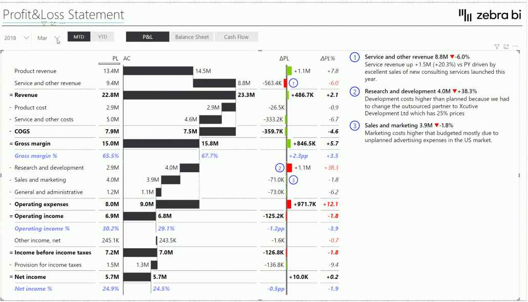
Waterfall charts
Waterfall charts are exceptional for showing how an initial value is affected by a series of positive or negative values, over time.
They're the go-to visual for explaining the "bridge" between two points.
- Vertical waterfall charts work well for showing structural root causes for the difference between two or more statuses
- Horizontal waterfall charts are better suited for analyzing root causes, over time, for the change or variance between two or more statuses..
Use waterfall charts for budget variance analysis, explaining profit and loss changes, or contribution analysis (showing how individual components contribute to an overall result).
There are multiple types of waterfall charts you should know about too:
- Structural waterfalls (for hierarchical breakdowns)
- Calculation waterfalls (for step-by-step computations with subtotals and inverted items for costs)
- Variance waterfalls (for showing budget/actual differences)
- Growth waterfalls (for incremental growth tracking)
Small multiples
Small multiples display the same chart type repeatedly for different categories, creating a grid of mini-visualizations. This technique is powerful for comparing patterns across multiple dimensions without cluttering a single chart, in one scale (on a synchronized Y-axis, which can be very important for ensuring visual integrity).
For example, you can use small multiples when you need to compare trends across many regions, products, or time periods simultaneously. They're particularly effective when you want your audience to spot outliers or identify which categories follow similar or different patterns.
Charts with integrated variance
Variance charts are specifically designed to highlight differences between actual results and targets, budgets, or prior periods.
They immediately draw attention to areas of over-performance or under-performance through color coding and visual emphasis. Use variance charts in financial reporting, KPI dashboards, and any scenario where understanding the gap between expected and actual performance is critical for data-driven decision-making.
Dynamic comments
Dynamic comments automatically update text based on your data, adding narrative context without manual intervention. They can highlight the biggest change, the top performer, or any metric that crosses a threshold.
Use dynamic comments to ensure your dashboard tells a clear story even when the underlying data changes, making your reports more autonomous and reducing the need for separate written explanations.
In Zebra BI, dynamic comments come with a host of additional features to make Power BI storytelling smoother:
- Dynamic comment markers with tooltips: Automatically numbered markers (1, 2, 3) that appear on charts
- Integrated dynamic comments: Generate titles automatically from category names and calculate differences automatically
- Hierarchical comments: Can show comments at every level of a hierarchy
- Annotation layer: Comments that persist on visuals (different from dynamic comments)
- Writeback capability: Can be combined with Power Apps for user-generated comments
- Comment indicators: Visual alerts that comments exist at lower levels
- Filter responsiveness: Comments change dynamically with filters and slicers
Want to learn more about Power BI dynamic comments and what is the best way to create them? Check out our guide about this!
Cards
Cards display single, high-impact numbers prominently. They're ideal for showcasing key performance indicators that require immediate attention.
Use cards at the top of your dashboard to highlight the most important metrics, ensuring they're the first thing your audience sees. Cards work best for metrics like total revenue, overall variance, customer count, or any single number that sets the context for the rest of your report.
Line charts
Line charts are ideal for showing trends over time. They excel at displaying continuous data and making patterns immediately visible to your audience.
Use line charts when you need to show how a metric evolves over weeks, months, quarters, or years. They're particularly effective for revenue trends, performance tracking, and forecasting scenarios where the trajectory of the data matters as much as the individual data points.
Also, you should use line charts when your space is limited (e.g., small chart sizes, small category widths, etc.).
Bar charts
Bar charts are perfect for comparing discrete categories or time periods. They make it easy to see which items are larger or smaller at a glance, making them essential for ranking analysis.
Use bar charts when comparing sales across regions, performance across product lines, or any scenario where you need to show "what's bigger" or "what's performing best." The horizontal or vertical orientation can be chosen based on whether this is a structural or time series analysis.
Stacked bar charts
Stacked bar charts show both the total and the composition of categories within that total. They're valuable for displaying part-to-whole relationships while maintaining the ability to compare totals across different categories.
Use stacked bar charts when you need to show how different segments contribute to overall performance, such as revenue by product line across regions, or when you want to reveal both the size of different categories and their internal composition simultaneously.
Generally, small multiples are a more effective visualization and storytelling tool than stacked bar charts because they allow you to be more flexible with what you show, when, and how.
Combination charts
Combination charts merge two or more chart types into a single visualization, allowing you to compare different datasets or metrics on one graph.
For instance, they can combine a line chart with a bar chart, making it possible to display trends over time alongside discrete values. They are best for highlighting relationships between datasets or showing how one metric impacts another.
Use combination charts when you need to emphasize both magnitudes and trends simultaneously, such as comparing sales volume (bar) against gross margin (line). Their versatility makes them a powerful tool for unveiling multi-faceted insights in a concise format.
Avoid using combination charts for unrelated data series, as this can lead to confusion; instead, when comparing related series such as actual vs. plan data, integrated variance charts provide a clearer and more effective visualization.
Extended charts
Extended charts refer to any advanced or specialized chart types that go beyond standard visualizations like line or bar charts. These charts are designed to handle complex datasets or specialized use cases, often incorporating additional dimensions or interactivity.
Specifically, extended charts are combinations of two or more charts that fit together thematically, and share the same scale.
Real-life applications: Power BI data storytelling in action
The true value of data storytelling becomes clear when you see it applied to real business challenges.
Here's how organizations across different functions use Zebra BI visuals to unlock insights and drive better decisions.
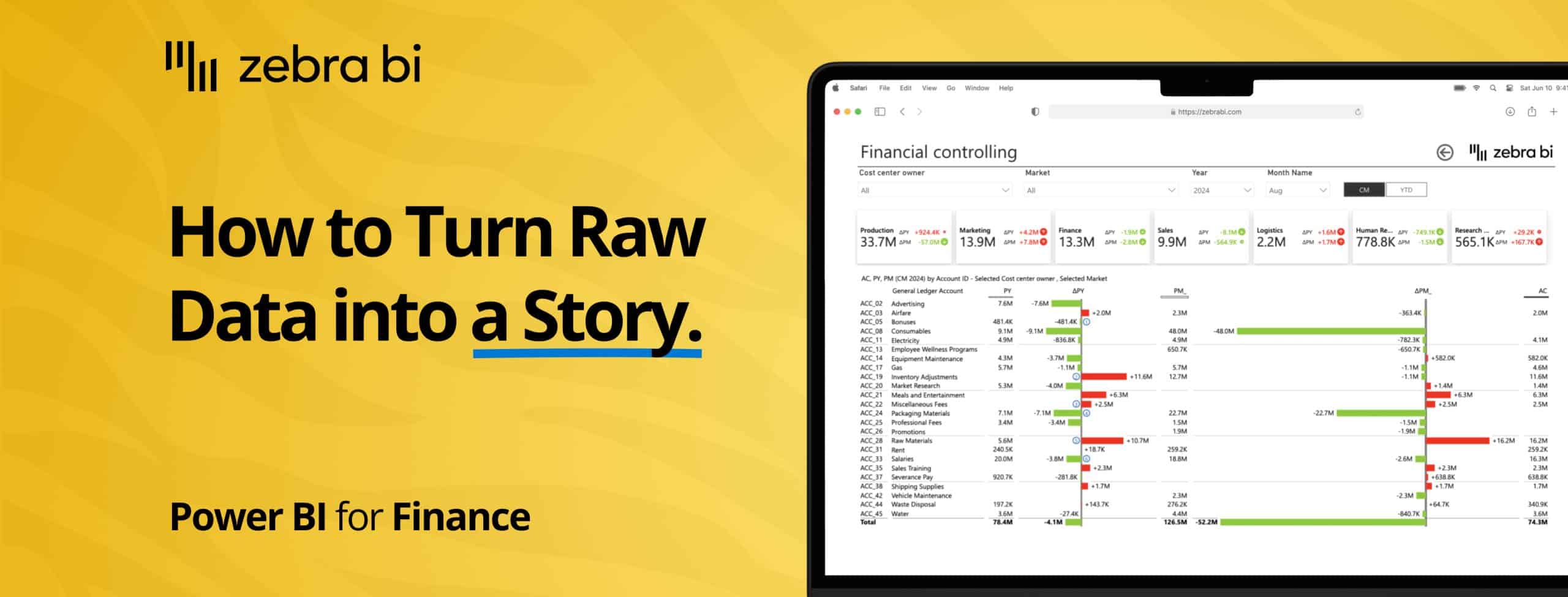
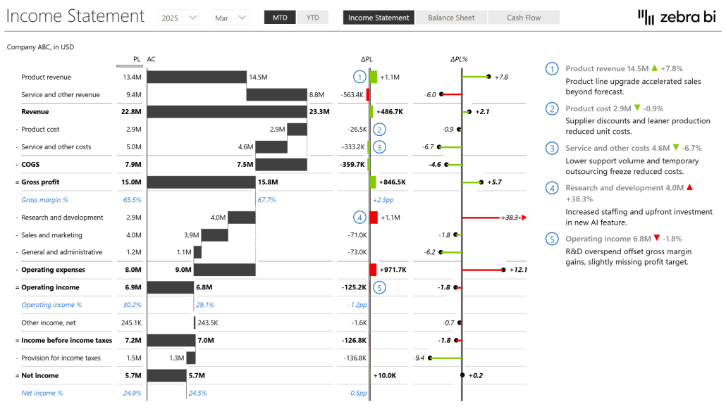
Finance reports
Finance teams use Zebra BI visuals to easily compare actual performance against budgets and forecasts.
With automatic variance calculations and drill-down capabilities, financial analysts can quickly identify which departments or cost centers are over or under budget, track variances over time, and provide clear explanations for financial performance.
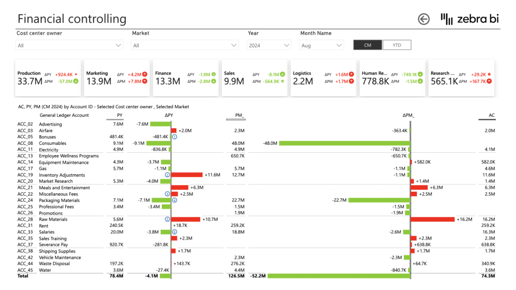
The ability to move from high-level P&L statements down to individual line items makes it easy to spot issues early and take corrective action before small problems become major concerns.
Sales dashboards
Sales managers leverage storytelling visuals to break down regional performance, track sales growth trajectories, and identify key drivers of success or failure.
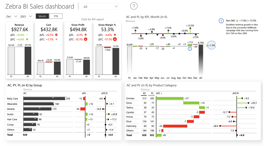
By using comparative visualizations and trend analysis, they can spot which regions are outperforming others, which products are gaining or losing market share, and which sales representatives might need additional support or recognition.
The visual narrative makes it easy to celebrate wins and address challenges in team meetings.
Executive dashboards
CEOs and other executives use Zebra BI's advanced visuals to gain a high-level overview of key business metrics while retaining the ability to drill down for more detail when necessary.
Executive dashboards built with Zebra BI provide the perfect balance of simplicity and depth, showing the most critical KPIs at a glance while allowing leaders to investigate specific areas of interest without requiring a separate detailed report.
This self-service approach saves time and enables faster decision-making at the highest levels of the organization.
Optimizing your Power BI dashboards for better storytelling
Creating effective data stories requires more than just good visuals—it requires thoughtful design and a clear understanding of your audience's needs. Here are best practices to ensure your Power BI reports tell compelling data stories.
Start with a clear goal
Before building any visualization, ask yourself: What message do I want to communicate? What decision should this report enable? Ensure that every visual aligns with the story you want to tell.
Remove any chart or table that doesn't directly support your narrative. A focused dashboard with five purposeful visuals is far more effective than a cluttered one with fifteen charts that tell no coherent story.
Choose the right visual
Not every chart is suitable for every type of data. Line charts excel at showing trends, bar charts are perfect for comparisons, and waterfall charts explain changes.
Match your visual type to your data type and the insight you want to highlight. When in doubt, test different visualizations and ask yourself which one makes the insight most obvious to someone seeing the data for the first time.
Here are some further tips to help you pick the right visual for your Power BI reports:
- Orientation rule: Always place time on the horizontal axis (left to right) and other variables on the vertical axis (top to bottom).
- Sorting: Sorting your data is essential for making insights immediately obvious to your audience.
- Consistency principle: Use the same shapes for the same purposes consistently across all your reports to avoid confusion.
- Pattern coding: Implement patterns to code various scenarios, such as Actual, Budget, Forecast, and Prior Year data.
- Length vs. area: Remember that humans are better at comparing lengths than areas, which is why bar charts are generally more effective than pie charts.
- Data guidance: Use lines and areas for dense datasets, while columns are better suited for sparse data.
- Axis breaking: Be cautious of Power BI automatically breaking axes in line charts, as this can unintentionally exaggerate trends.
Use annotations and commentary
Add comments directly to your visuals to highlight significant findings or to add context to the data.
A well-placed annotation can draw attention to an anomaly, explain a sudden change, or provide background that makes the numbers more meaningful. Dynamic commentary that updates automatically with your data ensures your dashboard remains relevant even as the underlying numbers change.
Aim for interactive reports
Interactive visuals allow users to explore the data by using slicers, tooltips, drill-downs, and filters.
This interactivity makes your dashboard more engaging and informative, enabling different stakeholders to find the insights most relevant to their specific needs. Interactive elements transform passive viewers into active explorers who can answer their own questions and discover insights you might not have anticipated.
Design for your audience
Consider who will be using your dashboard and what questions they need answered.
An executive dashboard should focus on high-level KPIs with the ability to drill down, while an operational dashboard might start with more granular details. Understanding your audience ensures your storytelling resonates and drives the actions you intend.
Use variance analysis
Variance analysis is a key storytelling tool for uncovering the gaps between expectations and reality.
By weaving in visual elements like variance charts, bar graphs, or trend lines, you transform complex numbers into a narrative that’s clear and compelling. These visuals help your audience quickly spot discrepancies, understand their root causes, and follow the story of progress over time.
Adding thresholds and conditional formatting sharpens the focus, spotlighting the most critical deviations and directing attention to where it matters most. With this approach, your data tells a story that drives better decisions.
Embrace IBCS
Adhering to established standards like IBCS (International Business Communication Standards) ensures your data stories are universally understood and impactful.
These guidelines promote consistency in visual representation, making your dashboards more readable and actionable for any audience, driving clearer insights and better decision-making.
The role of Zebra BI in Power BI storytelling
While the Microsoft Power BI ecosystem offers a broad array of native visualizations, Zebra BI visuals provide enhanced capabilities specifically designed to improve data storytelling. Let's explore how Zebra BI transforms the storytelling experience.
Key advantages of Zebra BI visuals
Zebra BI brings powerful features to simplify and enhance your data visualization experience.
Ease of use
Zebra BI offers intuitive visuals that are simple to implement but deliver complex data insights. They automatically adapt to the data without requiring extensive configuration, saving you valuable time while ensuring consistency across your reports.
Dynamic commentary
Zebra BI visuals include dynamic comments, allowing users to highlight key insights directly on the dashboard. This feature gives context to the data and ensures that important findings don't get overlooked by stakeholders reviewing the report.
Automatic variance calculations
Unlike Power BI's native visuals, Zebra BI automatically calculates variance, making it easier to spot significant changes in your data without manually setting up calculations. This feature alone can save hours of report development time while ensuring accuracy.
Drill-down functionality
Zebra BI allows for seamless drill-down into your data, ensuring that stakeholders can explore the story from different perspectives. Users can move from high-level overviews to granular details with just a few clicks.
Hierarchical structures
Present data in a way that allows for deeper insights, from broad overviews down to granular details, enabling users to navigate through different levels of data complexity naturally.
Advanced formatting
Zebra BI visuals offer customizable formatting options, making it easy to highlight trends and key figures with professional-grade presentations that align with your organization's branding and reporting standards.
Power BI visuals: Native vs Zebra BI
Understanding the differences between native Power BI visuals and Zebra BI visuals is crucial for anyone serious about data storytelling. While Power BI's native visuals provide a solid foundation, Zebra BI takes your reporting capabilities to the next level.
Speed to insights
Native Power BI visuals often require significant configuration to display variance calculations, conditional formatting, and hierarchical data. Zebra BI visuals come pre-configured with these features, allowing you to generate insights in minutes rather than hours. This speed advantage means you can spend less time building reports and more time analyzing data.
Storytelling capabilities
Zebra BI visuals are specifically designed with storytelling with built-in commentary, automatic variance calculation and formatting, and intuitive visual cues guide your audience through the narrative naturally. Native Power BI visuals, while flexible, require more manual work, skills, and time to achieve the same level of narrative clarity.
Industry-specific flexibility
Zebra BI understands the unique needs of financial reporting, sales analysis, and operational dashboards. The visuals adapt to industry best practices automatically, ensuring that your reports follow established standards that stakeholders already understand and trust.
Watch this video to see these differences in action and discover how Zebra BI can transform your data storytelling:
Are you ready to tell your data story?
Data storytelling in Power BI is more than just presenting numbers—it's about communicating insights that drive business decisions.
By using Zebra BI's advanced visuals, you can unlock the full potential of your data, making it easier to identify trends, variances, and actionable insights that might otherwise remain hidden.
The combination of Power BI's powerful data platform and Zebra BI's storytelling-focused visuals creates an environment where data becomes a strategic asset rather than just a collection of reports.
Whether you're in finance, sales, operations, or executive leadership, the ability to tell compelling data stories will set you apart and enable better decisions across your organization.
Start telling better stories with your data today.