Interactive Excel Dashboards: Master Cross-Visual Filtering In 3 Easy Steps like in Power BI
In today's rapidly digitizing world, businesses thrive on insights. However, the difference between insights and raw data is how they're presented and interacted with. With the emergence of cross-visual filtering in dashboards, professionals now have a sophisticated tool at their fingertips. This technique revolutionizes how we interact with data, moving beyond static reports to dynamic presentations that adjust and refine themselves based on user input.
This guide will give you a deeper understanding of cross-visual filtering, highlighting how it can transform your business. you'll learn how this technique can make your dashboards more interactive, efficient, and user-friendly. From understanding its core principles to implementing it in your reports, we'll walk you through every step, ensuring you harness this innovative feature's full power.
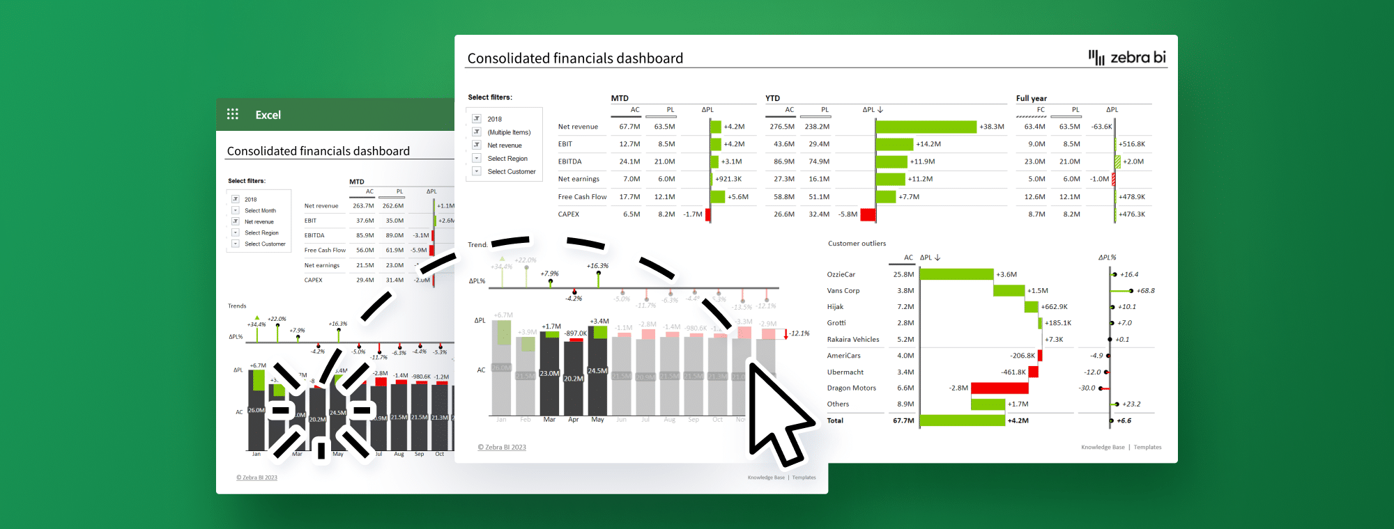
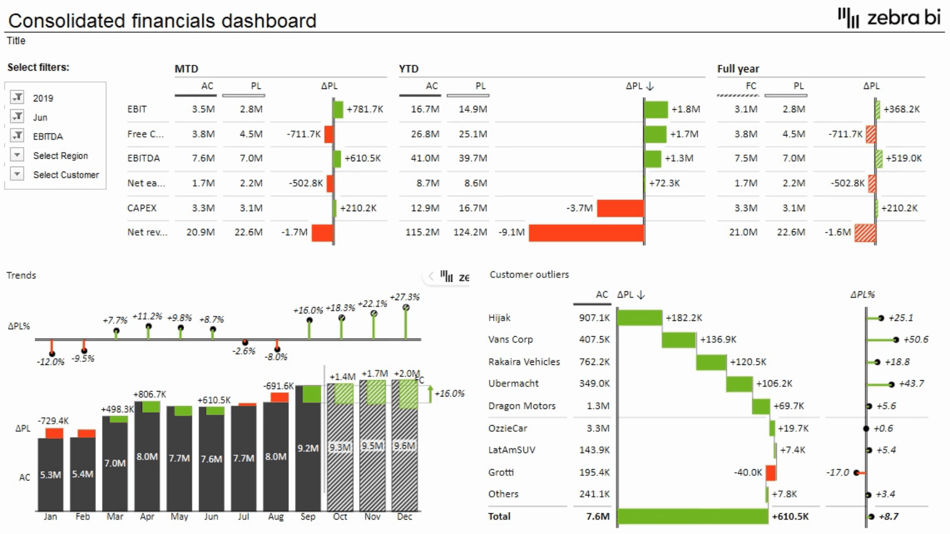
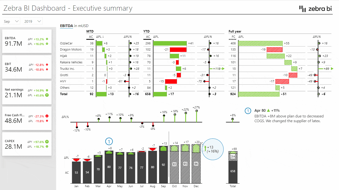
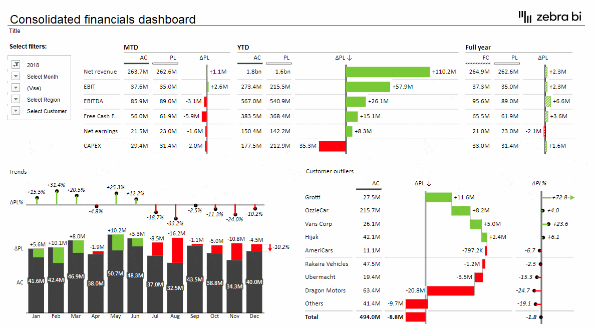
Create interactive Excel dashboards with Zebra BI
Visual cross-filtering is no longer reserved just for Power BI users. Choose Zebra BI for Office and see the magic happen.
What do you want from your dashboard?
A well-designed dashboard is not just a display of numbers but a powerful tool that communicates, interprets, and prompts actions.
Actionable Reporting for Everyone
Your dashboard should serve you most efficiently, whether you are creating complex Excel or Power BI reports or are an end-user looking for essential insights. Everyone, from a data scientist to a sales executive, should understand the dashboard message clearly.
Interactivity
Making your business dashboard an interactive tool, not a static image of your company's past, is crucial. Analyze specific data points, uncover underlying trends, and adjust views without overcrowding the dashboard.
One True Source of Data
It is crucial to maintain consistency and authenticity. Regardless of the tools or platforms used, dashboard creators should maintain persistent control over their data sources.
Efficiency and User Experience
With many software tools available, learning curves and user experiences differentiate the most effective. The tool should be robust, intuitive, and user-friendly, streamlining tasks and offering meaningful insights with minimal hassle.
Flexibility
Different scenarios call for different reports. Whether it's management reports that decision-makers rely on, ad-hoc analyses for specific queries, or visual presentations for stakeholders, your dashboard should be versatile enough to cater to all these needs. This is where Zebra BI ensures a unified cross-platform experience, bridging the gap between varying reporting requirements.
Broadening Your Horizon with Zebra BI
The immense capabilities of interactive dashboards, once limited primarily to Power BI, have expanded their boundaries. With Zebra BI, you can harness these powerful features directly within Excel. So, whether you're accustomed to Power BI or more inclined towards Excel for your data visualizations and reporting, Zebra BI ensures you have the best of both worlds at your fingertips. Experience true dashboard versatility and efficiency, irrespective of your chosen platform, try for free.
What is Cross-Visual Filtering?
The cross-visual filtering feature in the dashboard design adds a dynamic layer to data visualization and interpretation. With cross-visual filtering, various visual elements on a dashboard can interact seamlessly, ensuring a seamless data exploration experience.
Imagine a dashboard with multiple charts and tables. With cross-visual filtering, selecting an item on one chart can automatically influence and update other charts and tables in real time. For instance, if you pick a specific month on a bar chart, the other visuals on the dashboard will automatically adjust. This will highlight or filter information relevant only to that chosen month.
Power BI users are likely already familiar with this feature. Their reports become more comprehensive due to it, allowing them to navigate data layers easily.
The good news? This powerful feature isn't confined to Power BI anymore. Thanks to innovations from tools like Zebra BI, Excel users can now experience the magic of cross-visual filtering within their familiar spreadsheet environment.
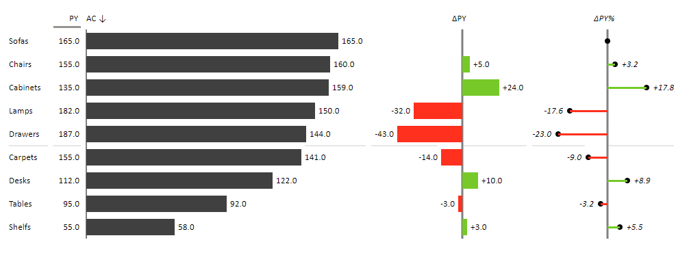
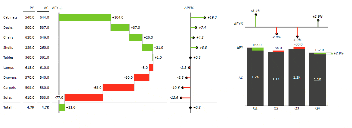
Excel's cross-visual filtering combines several features. It synergizes the filtering capabilities of pivot tables and slicers with advanced visuals. So, when working with Zebra BI visuals, such as the Tables for Office or Charts for Office, the data you select in one visual can dictate how other visuals respond.
The natural beauty of cross-visual filtering lies in its simplicity. It offers advanced interaction without adding or understanding complex elements, such as additional slicers. The dashboard reacts by merely clicking on a data point of interest, providing deeper insights into that specific selection. This functionality streamlines the user's experience, giving them the power to explore without overwhelming them with options.
Whether for daily, monthly, or quarterly management reporting, financial or operational insights, flash reports, or even regulatory compliance, cross-visual filtering enhances the clarity and depth of the reports.
Through cross-visual filtering, dashboard interactivity has evolved to be more intuitive, comprehensive, and engaging than ever before. It transforms static snapshots into dynamic storyboards, guiding users through the complex web of business data.
Main Benefits and Best Practices for Interactive Dashboards
Interactive dashboards are a cornerstone of modern data analysis. When designed effectively, they empower users to delve deeper, discover insights, and make informed decisions swiftly. But what are the benefits of such dashboards, and how can you ensure they're optimized for the best user experience? Let's explore.
Main Benefits of Interactive Dashboards:
- Dynamic Data Exploration: An essential element of interactivity is exploring data with a few clicks. As users actively engage instead of passively consuming data, they discover patterns, anomalies, and insights that might otherwise go unnoticed.
- Unified Cross-Platform Experience: Using tools like "Modern Excel" (including Pivot Tables and Power Query), users can experience a Power BI-like dashboard within Excel. As a result, traditional Excel users will find the transition easier and will be able to get consistent reporting across platforms.
- One True Source of Data: A single, consistent data model, especially with tools like Power BI integrated into Office, guarantees accuracy and uniformity. This minimizes discrepancies and fosters trust in the data presented. More details on preparing data can be found in the Zebra BI Knowledge Base.
- Efficiency and Clarity: When designed well, interactive dashboards avoid information overload. They provide users with the data they need when they need it without overwhelming them with extraneous information.
Best Practices for Optimizing Interactive Dashboards:
- Avoid Overengineering: The temptation to add every possible widget and data point to a dashboard can be strong, but restraint is crucial. Only include elements that add value. An overcrowded dashboard can confuse users, diluting the message and hampering decision-making.
- Adhere to Standards: Following recognized standards, such as the International Business Communication Standards (IBCS), can make dashboards more comprehensible. Such standards promote clear, consistent, and effective visual communication, ensuring that users can quickly grasp the story the data tells.
- Prioritize User Experience: Ensure that the dashboard is intuitive. This means easy navigation, logical flow, and clear labeling. Remember, the goal is to reduce the time users spend figuring out how to use the dashboard and maximize the time they spend extracting insights from it.
- Continuous Feedback Loop: Periodically gather feedback from dashboard users. Their insights can shed light on areas of improvement, features they'd like added, or elements they find redundant.
- Stay Updated: The world of data visualization and BI tools is ever-evolving. Keeping abreast of the latest trends, tools, and techniques can help ensure your dashboards remain cutting-edge and effective.
In summary, when implemented thoughtfully, interactive dashboards can be a game-changer for businesses. They provide a dynamic way to interpret and act on data. By adhering to best practices and understanding the core benefits, organizations can harness the full power of their data, fostering a culture of informed decision-making.
How to Create Cross-Visual Filtering/Visual Interaction in Excel?
While the concept of cross-visual filtering sounds advanced, the beauty lies in its simplicity, primarily when implemented in a familiar platform like Excel. Let's demystify the process and guide you on bringing this interactive feature to your Excel dashboards using Zebra BI.
1. Start with the Basics:
a. Create Pivot Tables: Organize your dataset into a pivot table. This foundational step allows you to summarize and categorize your data effectively.
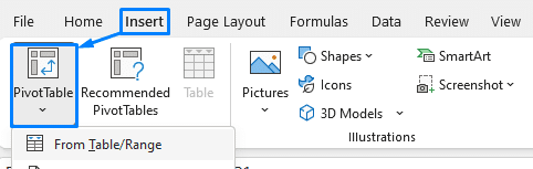
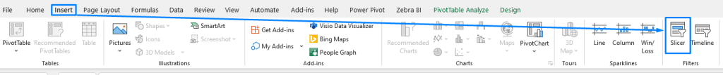
b. Insert Slicers: Slicers offer an interactive way to filter your data. While they're pivotal for cross-visual filtering, they don't necessarily need to be displayed on your dashboard. They can operate behind the scenes, ensuring seamless data interactions without cluttering your visual space.
2. Incorporate Zebra BI Visuals:
a. Insert Zebra BI Charts and Tables: These aren't your standard Excel visuals. They're enhanced, dynamic, and designed with cross-visual filtering in mind.
b. Experience Automated Visual Filtering: Once you've set up your Zebra BI visuals alongside pivot tables and slicers, the cross-visual filtering is virtually automated. Select one visual, and watch the rest of the dashboard respond in kind, adjusting the displayed data based on your interaction.
3. Dive Deeper:
For those who prefer a more detailed, hands-on guide to implementing cross-filtering in Excel with Zebra BI, check out this comprehensive tutorial: Cross-Filtering in Excel with Zebra BI.
Conclusion
Excel is a straightforward tool for setting up cross-visual filtering, especially with Zebra BI's enhanced capabilities. Dashboards in Excel become dynamic, interactive reporting tools. This interactive approach enables data-driven decision-making, whether you're an analyst seeking in-depth insights or a manager looking for an overview. Welcome to the next level of data visualization and analysis!
Create interactive & actionable dashboard in no time.
Start using Zebra BI for Office to give your report viewers the best user experience and the right insights!