How to Create and Maintain Interactive Dashboards in Power BI
PRO Trial
Businesses and organizations rely heavily on analytics to make informed decisions. To promote this, Microsoft developed Power BI, a powerful and user-friendly business intelligence tool that enables users to turn raw data into visually compelling insights.
An Introduction to Power BI and Its Features
Power BI is a self-service analytics tool that lets users create interactive dashboards, reports, and visualizations. It is built with a powerful data modeling engine that allows users to connect to various data sources and transform raw data into meaningful insights. Power BI offers a suite of features that help users gain valuable insights into their data and share them with others in an easy-to-understand format.
One of the key features of Power BI is its ability to integrate with other Microsoft products, such as Excel and SharePoint. This allows users to easily import data from these sources and create reports and visualizations that can be shared across their organization. Additionally, Power BI offers a range of customization options, including the ability to create custom visuals and themes, as well as the ability to embed reports and dashboards into other applications. With its user-friendly interface and powerful features, Power BI is a valuable tool for businesses looking to gain insights from their data.
Understanding the Importance of Interactive Dashboards
Interactive dashboards have become increasingly popular in recent years due to their ability to give users instant access to actionable insights. Interactive dashboards enable users to drill down into data, view different metrics, and perform various data analysis operations on the fly. They are also a great way to enable collaboration, as they allow multiple stakeholders to view and interact with data simultaneously. Overall, interactive dashboards are an essential tool for making data-driven decisions in today's fast-paced business environment.
One key benefit of interactive dashboards is their ability to provide real-time data updates. This means that users can access the most up-to-date information at any given time, allowing them to make informed decisions quickly. Additionally, interactive dashboards can be customized to meet the specific needs of different users, making them a versatile tool for businesses of all sizes and industries.
Another advantage of interactive dashboards is their ability to identify trends and patterns in data. By using interactive visualizations, users can easily spot trends and patterns that may not be immediately apparent in raw data. This can help businesses identify opportunities for growth and improvement, as well as potential areas of concern that may need to be addressed.
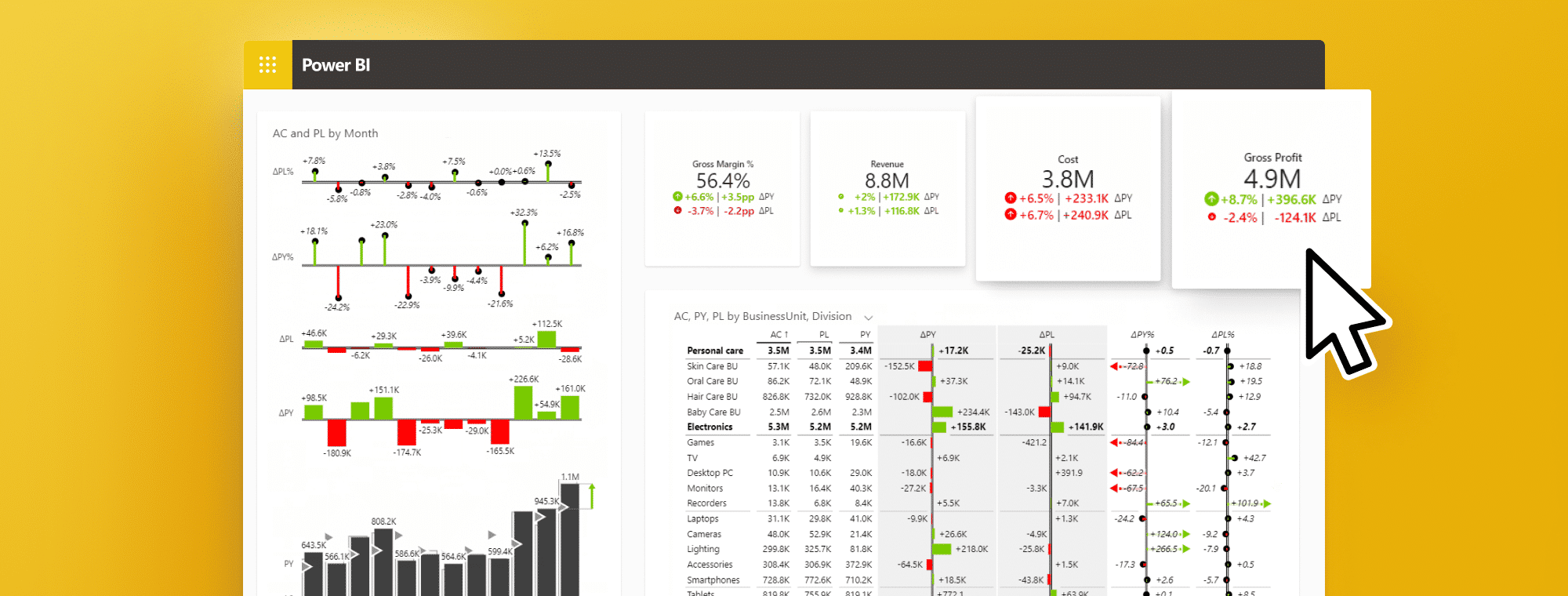
Here is an example of an HR Report created with Zebra BI visuals for Power BI: Cards, Charts, and Tables.
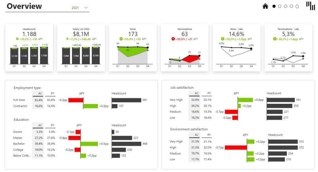
Note that all of the variances are calculated automatically without using complex DAX formulas, and they are all IBCS-compliant (read more about why this is important: IBCS - Achieve Consistent Reporting Across Your Company).
Key Benefits of Power BI Dashboards
Power BI dashboards have several key benefits over traditional reporting tools. Firstly, they are highly visual, making it easy to spot trends, outliers, and anomalies in your data. Secondly, they are interactive, enabling you to explore different facets of your data and answer ad hoc questions quickly. Thirdly, they are highly customizable, allowing you to create a personalized view of your data that suits your needs. Finally, they are easy to share and collaborate on, ensuring that everyone, from executives to frontline staff, can access the insights they need to drive business performance.
Another key benefit of Power BI dashboards is that they provide real-time data insights. This means that you can monitor your business performance in real-time and make informed decisions based on the latest data. Additionally, Power BI dashboards can integrate with a wide range of data sources, including cloud-based and on-premises data sources, making it easy to consolidate all your data in one place. This not only saves time but also ensures that you have a complete view of your business performance.
Exploring the Different Types of Dashboards in Power BI
Power BI offers several different types of dashboards. The most common are interactive dashboards, which allow you to visualize data from multiple sources in a unified view. You can also create paginated dashboards, KPI dashboards, and scorecards, which are designed for specific types of data visualization and analysis scenarios.
Interactive dashboards are great for exploring data and identifying trends, but they may not be the best option for presenting data to stakeholders. Paginated dashboards, on the other hand, are designed for printing and sharing with others. KPI dashboards are ideal for tracking key performance indicators, while scorecards provide a high-level overview of performance across multiple business areas. Understanding the different types of dashboards available in Power BI can help you choose the right one for your specific needs.
Explore Zebra BI's Power BI template library.
Step-by-Step Guide to Creating Interactive Dashboards in Power BI
To create an interactive dashboard in Power BI, follow these steps:
- Connect to your data sources
- Manage your data model relationships
- Calculate required measures
- Create a new dashboard
- Choose the visualizations you want to include
- Configure the visualizations using the formatting options
- Save and share your dashboard with others
It's important to note that when creating an interactive dashboard in Power BI, you should consider the audience who will be using it. Think about what data is most relevant to them and how they will want to interact with it. Additionally, you can use Power BI's built-in features, such as filters, slicers, and drill-throughs, to enhance the interactivity of your dashboard and make it more user-friendly.
Learn more about actionable reporting, including how to set up your reports and share them, with Zebra BI's Academy!
Choosing the Right Data Sources for Your Dashboard
The success of your Power BI dashboard depends largely on the quality and relevancy of the data sources you choose. When selecting data sources, consider the following factors:
- Reliability and accuracy of the data
- Timeliness of the data
- Availability and accessibility of the data
- Security and privacy of the data
Another important factor to consider when choosing data sources for your dashboard is the compatibility of the data with your dashboard's design and layout. It's important to ensure that the data you choose can be easily integrated into your dashboard and displayed in a way that is visually appealing and easy to understand.
Additionally, it's important to consider the scalability of your data sources. As your dashboard grows and evolves, you may need to add new data sources or expand existing ones. Choosing data sources that can easily scale with your dashboard can save you time and resources in the long run.
Design Tips for Creating Effective and Engaging Dashboards
When designing your Power BI dashboard, keep the following tips in mind:
- Choose the right chart type for your data – use Zebra BI's Chart Selector to help you make proper decisions.
- Use colors effectively and consistently to highlight important data points, and use highly saturated colors such as red and green to highlight bad and good things of interest. Use non-saturated colors for base values such as Actuals (AC), previous year (PY), plans (PL), and forecasts (FC). Following the best practices in the business, you should also want to include scenario patterns to create a clear distinction between those figures. Check out how Zebra BI incorporates IBCS standards.
- Keep the dashboard simple and easy to read
- Use filters and slicers to enable interactivity
- Ensure the dashboard is optimized for the devices it will be viewed on – Zebra BI also works in mobile versions.
Another important tip to keep in mind when designing your dashboard is to ensure that the data is presented in a logical and intuitive manner. This means that the layout of the dashboard should be organized in a way that makes it easy for the user to understand the relationships between different data points.
Additionally, it's important to consider the audience that will be viewing the dashboard. If the dashboard is intended for a specific department or team, it may be beneficial to include data that is relevant to their specific needs and goals. On the other hand, if the dashboard is intended for a broader audience, it may be necessary to include more general information that is easily understandable by everyone.
How to Add Visualizations and Customization to Your Dashboard
Power BI offers various visualizations and customization options to enhance your dashboard. Some of the most popular visualizations include bar charts, line charts, scatter plots, and maps. You can customize your dashboard using features like themes, logos, and backgrounds.
Another way to add visualizations to your dashboard is by using custom visuals. These are third-party visuals that can be downloaded and added to your dashboard. Custom visuals can provide unique and specialized visualizations that are not available in the standard Power BI visuals.
In addition to customization options for visuals, Power BI also allows you to customize the layout of your dashboard. You can arrange visuals in different ways, such as using a grid layout or a freeform layout. You can also add text boxes and images to provide additional context and information to your dashboard.
Introducing Advanced Features like Filters, Slicers, and Drill-Downs in Power BI Dashboards
You can use advanced features like filters, slicers, and drill-downs to take your dashboard to the next level. Filters and slicers allow users to interactively filter data, while drill-downs enable users to drill into data at different granularity levels.
Filters and slicers are powerful tools that allow users to focus on specific data points in a dashboard. Filters can be applied to individual visuals or to the entire dashboard, while slicers enable users to filter data across multiple visuals at once. Additionally, drill-downs allow users to explore data in greater detail by drilling into specific data points and viewing more granular information. These advanced features can help users gain deeper insights and make more informed decisions based on their data.
Learn more: How to create slicers in Power BI – Change measures and switch MTD/YTD using slicers.
Best Practices for Maintaining and Updating Your Interactive Dashboard
To ensure your interactive dashboard stays up to date, consider the following best practices:
- Schedule regular data refreshes
- Monitor dashboard usage and user feedback
- Update the dashboard as your business needs change
- Ensure the dashboard is secure and compliant with data protection regulations
Real-world examples of Interactive Dashboards Created with Power BI
There are countless examples of interactive dashboards that have been created with Power BI. Some notable examples include:
Sales Funnel
Download the Sales Funnel template
Daily Sales Flash Dashboard
Download the Daily Sales Flash Dashboard template
Consolidated Financials
Download the Consolidated Financials template
Dynamic Comments
Download the Dynamic Comments template
Income Statement
Download the Income Statement Template
Price-Volume-Mix Variance Analysis
Download the PVM Analysis Template
Troubleshooting Common Issues in Power BI Dashboards
If you encounter issues with your Power BI dashboard, consider the following troubleshooting steps:
- Check your data sources
- Double-check your visuals and formatting
- Ensure your data is up to date
- Look for error messages or warnings in Power BI
Comparing Power BI Dashboard with Other Tools in the Market
While there are many business intelligence tools on the market, Power BI stands out for its ease of use, affordability, and versatility. Compared to tools like Tableau and QlikView, Power BI is more accessible to non-technical users and offers greater integration with Microsoft products like Excel and SharePoint.
Future Trends and Developments in the Field of Interactive Dashboards
As the field of business intelligence continues to evolve, we can expect to see exciting developments in the area of interactive dashboards. Some of the trends to watch out for include the integration of artificial intelligence and machine learning, increased use of mobile devices for data visualization, and greater adoption of cloud-based solutions.
Looking for the best ready-to-use dashboard examples? We have 12 exceptional Power BI dashboard examples to make your life easier and your business decisions more data-driven. Check them out now!