Must-Know Tricks for Interactive Excel Dashboards in 2024
In today's fast-changing business environment, having the right data available is crucial for staying agile. For reasons of power and flexibility, many reports and dashboards are still made in Excel. They often come in the form of fancy charts and pretty colors, which ultimately lack actionable insights. No more! Read on to learn how to create interactive Excel dashboards to help you stay ahead of the competition in 2024.
Now, remember, this guide is all about practical tips & tricks you can implement immediately. We will start from scratch and then add some cool features, including rich visualizations, slicers, and more. The aim here is to create something really powerful and interactive super quickly.
We'll also have a look at how to download and start working with Zebra BI for Office, an add-in for Excel and PowerPoint. This powerful piece of software can help you build insane interactive Excel dashboards as well as ad hoc analyses, prototypes, reports, business presentations, and so much more!
Ready to get started? Let's get right to it.
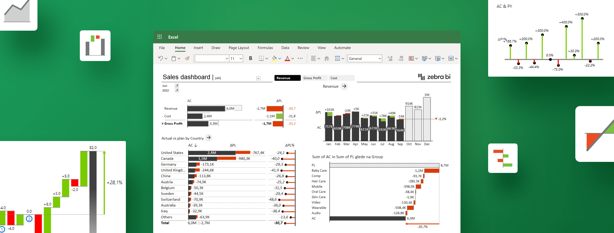
Here's the dashboard we're building
Have a look at what we're about to build.
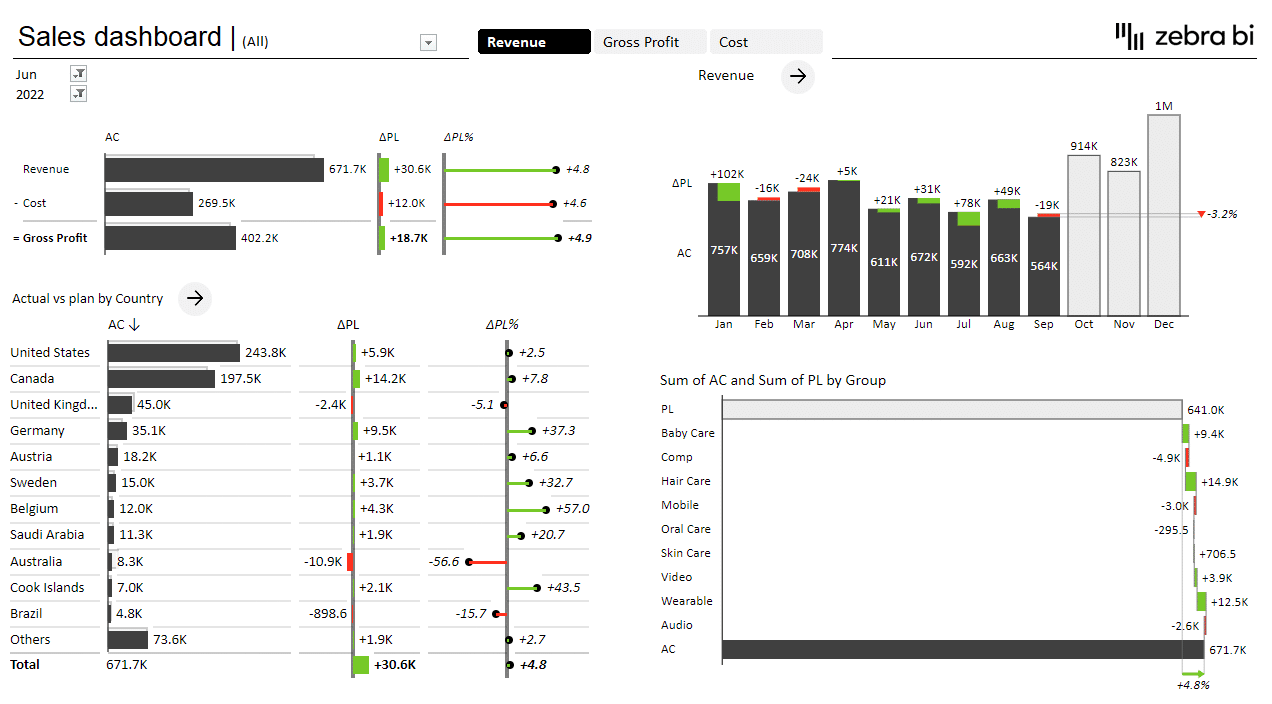
This sales dashboard tracks a couple of typical sales KPIs, such as revenue, gross profit, and costs. It is fully interactive, so data can be easily changed or adjusted. For example, you can switch between years, months, and KPIs and then move on to other pages in the dashboard to view the data in more detail with the same filter applied.
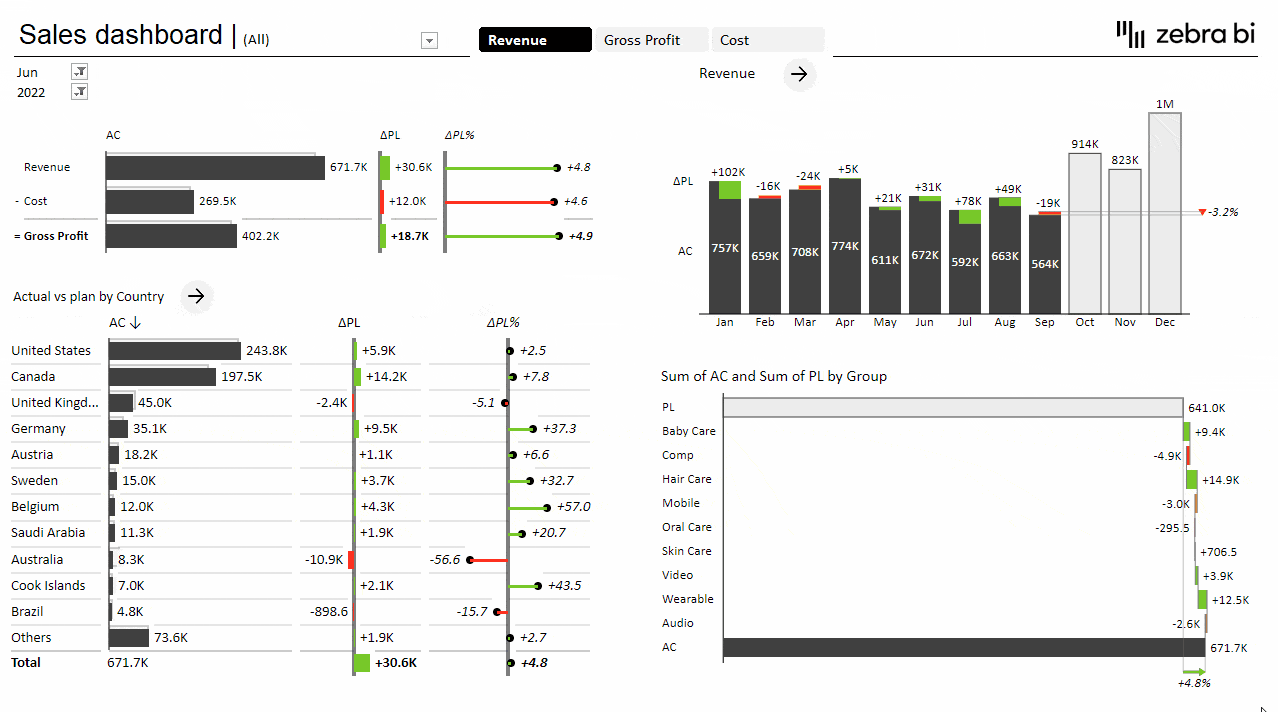
This provides you with all the tools you need to drill down into your data for detailed insights into your business. This interactive approach really opens up your data storytelling options, allowing you to tell a compelling story that highlights the most important data and empowers business decision-makers.
Core dashboard design concepts
There are several best practices you should follow when working in Excel. We recommend starting with the first page, which is typically referred to as the landing page. This is the first page your users will see, and, of course, a typical user would want to see their main KPIs at a glance here.
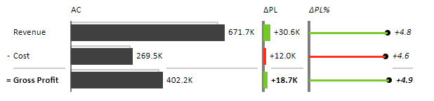
Your landing page is a starting point. In addition to displaying your key metrics, it also serves as a gateway to the rest of your data. To be truly interactive, it should allow users to navigate to other pages in the report. In our sample dashboard, we're looking at three key KPIs: revenue, costs, and gross profit. It's important to note that any dashboard should not only include the values but also put them in context and present them as compared to the plan, previous year, or forecast, for instance.
The next step is to include a time series that highlights business trends, followed by a breakdown of your data by country. This provides actionable insight, allowing you to take action fast. You can have a closer look at certain countries and drill down into detail to get a clear picture of what's going on.
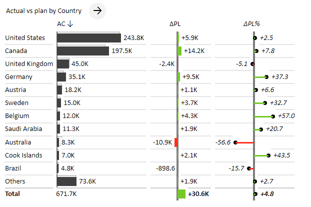
For example, a quick glance is all it takes to see that the United Kingdom, Australia, and Brazil are struggling, and something needs to be done to rectify the situation. To provide more detail, you can link this page to a separate report in your Excel spreadsheet, which shows the performance of individual stores in every country.
How to build interactive Excel dashboards
To create this dashboard, we'll rely primarily on PivotTables and then spice them up with some slicers, hyperlinks (for navigation purposes), and other powerful elements.
While there are many different techniques you could use to build interactive Excel dashboards, PivotTables are probably the most effective and convenient way of doing it. If you can get your data into PivotTables, it means that you have cleaned it up at least a little bit and have a good data structure that will allow you to be agile in your approach to visualizations.
First, let's prepare the page by inserting a rectangle shape in the 16:9 ratio. To get it right, you can look up the actual sizes (cca 19 x 33 centimeters) in PowerPoint under the Custom Slide Size option in the Design tab on your ribbon. The widescreen size will be the most useful one for the broadest range of displays.
Next, open the Source data sheet in your sample workbook. It contains the sales data you will use to create the dashboard.
Click the PivotTable button on the Insert tab on your ribbon.
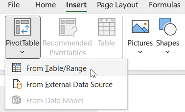
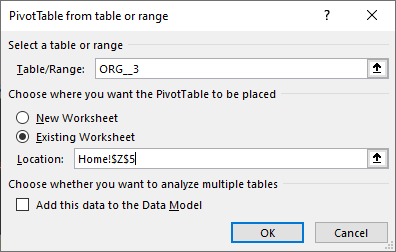
Insert the PivotTable into your home page.
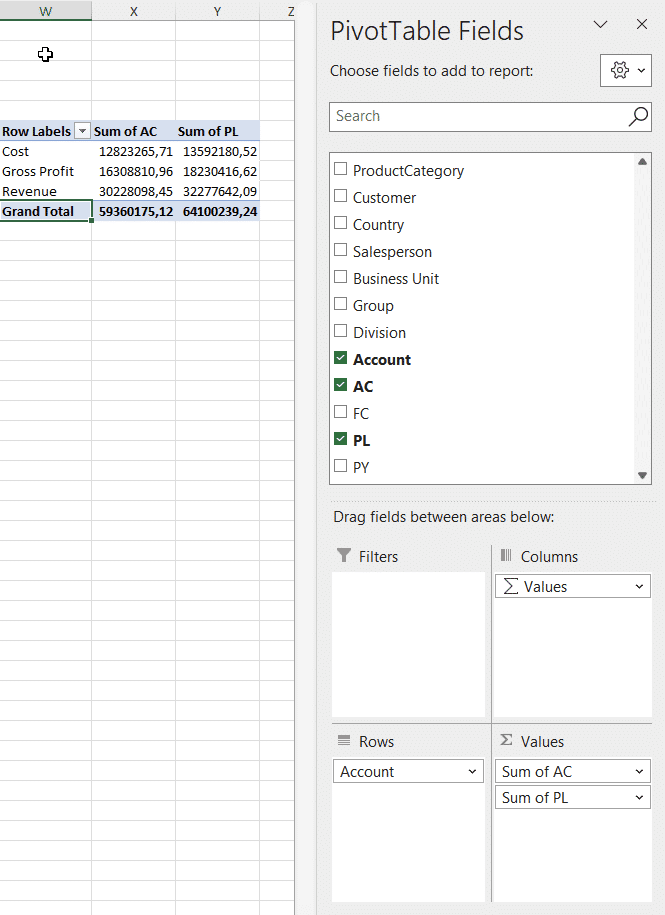
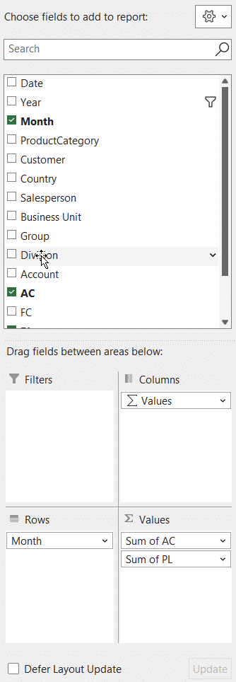
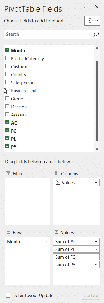
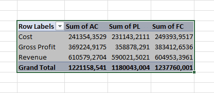
Now, click on the newly inserted PivotTable and add some fields. The first one to add is the dimension Account – place it into the Rows area. Next up are your actual (AC) and plan values (PL), which you should add to the Values area.
Now that you have your PivotTable fields in place, it's time to visualize your data.👇
Meet Zebra BI add-ins for Office
If you're a first time user and haven't downloaded Zebra BI for Office yet, you should do so now. Try it for free & receive an easy-to-use instructional Excel file that will help you get started.
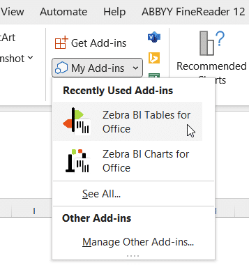
Ensure you install both Zebra BI Tables for Office and Zebra BI Charts for Office. Once downloaded, the add-ins become available in the Insert tab on your tool ribbon. Click the My Add-ins button and select the desired add-in from the available options.
In our case, you should click on the Zebra BI Tables for Office option.
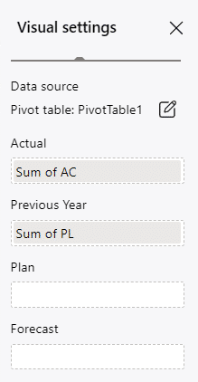
This will insert a simple table visualizing your three core KPIs – revenue, gross profit, and cost. Make sure all the values are in the right placeholders. If you're comparing your actuals to the plan, your Sum of PL value should be in the Plan placeholder, not the Previous Year one. Click on the gear icon and simply move it accordingly.
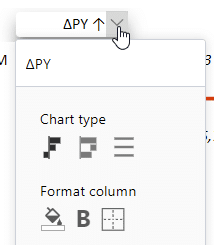
Note: You can change any label to rename your columns and other elements; however, Zebra BI uses the notations recommended by IBCS. This is why you always see these two-letter abbreviations. Rename the labels by clicking on the dropdown menu next to the label name and then clicking on the name.
Designing and customizing interactive Excel dashboards
Once you have your bare-bones dashboard set up, you can start designing the layout. Your most important KPIs should be in the upper left section. As you're moving it, press the ALT key on your keyboard. In Excel, this will align the object to the underlying grid, making sure everything is lined up and matching.
Another great tip you can use to this end is to custom-sort the elements in your PivotTables. You could right-click on the arrow next to the column name – or – right-click on the right border of the field and drag it up or down to sort the table manually.
Adding filtering by year and month
To build interactive Excel dashboards that are user-friendly, you should have separate columns for months and years. You can see this approach in practice in the source data for the sample dashboard.
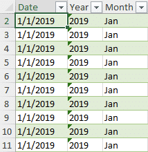
Here, the year and month columns are extracted from the date.
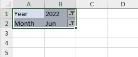
Our goal with this interactive Excel dashboard is to place the month and year filters on the top left, which will allow us to change the values and manipulate data easily.
The first step is to add Year and Month Fields as filters to our Pivot Table. Click on them and drag them to the Filters area of your PivotTable Fields pane.
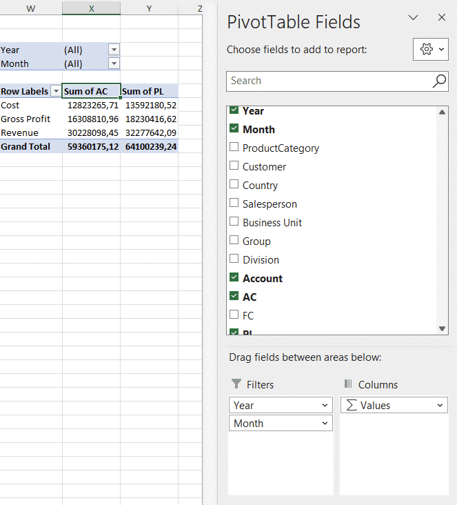
This puts two filter fields above your PivotTable, where you can select individual years and months for filtering the data. However, our goal is to have these selectors above our visual.
Select the Pivot Table and copy it below your existing one. In this copy, all you need is the filter area, so you should remove everything else – all the rows and values. This leaves you with two fields in which you can select the year and the month. You can now copy these above your Tables visual.
But you're not quite finished. Changing the values in this new filter doesn't do anything yet. You need a way to synchronize the two PivotTables first.
Useful tip: When you work in Excel, make sure you give all your objects, including PivotTables, legible and easily understandable names. This will allow you to work with them even weeks or months later when you come back to your dashboard. You can easily rename PivotTables in the PivotTable Analyze tab.
Having fun with slicers
We will synchronize the PivotTables by using a slicer. Click on one of the PivotTables, go to the Insert tab, and click Slicer. This will open a window with all the data fields available for your Pivot Table.
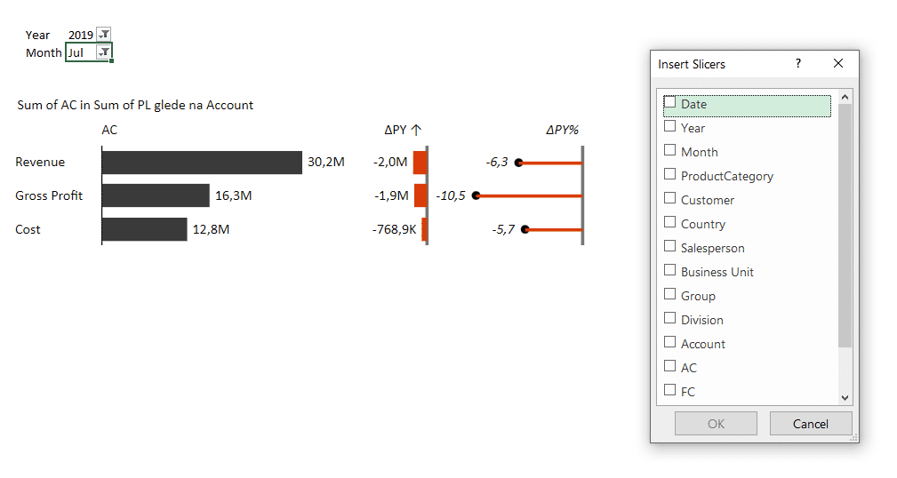
Select the Year and Month slicers. This will create two slicers on your dashboard. However, these two slicers are now only linked to one Pivot Table and not both. So, any selection of months or years made in the slicers only affects the original pivot table.
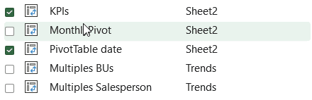
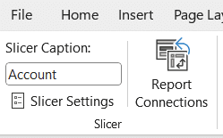
To synchronize them, right-click on a slicer and click the Report Connection entry from the menu.
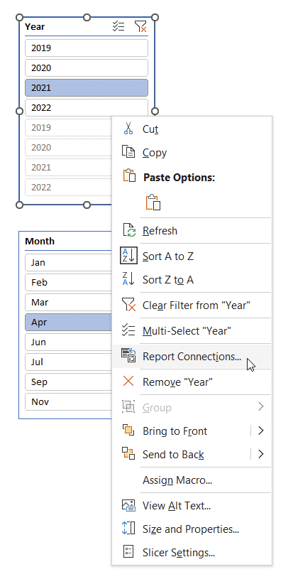
This will open up a new selector window with a list of all the PivotTables in the whole workbook. Here, you tick the PivotTables that you want the slicer to control. You want your filter to change the date and the KPIs in your PivotTables.
Once you do this, everything is synced. So, basically, you can think about the slicer as the synchronizer of multiple PivotTables. And the nice thing is this works across the whole report and not just one worksheet.
Note: Don't forget to set report connections for both slicers.
Note: Your PivotTables may automatically change the width of the columns in which you've placed them. To prevent this, right-click on the PivotTable, select the PivotTable options entry from the menu, and then turn off the Autofit column widths on update option.
What's interesting is that you can then remove Year and Month measures from the Filters area of your PivotTable Fields pane, and the slicers will continue to work as planned.
Adding a time series
Let's continue by making a copy of your existing Pivot Table. Remove other fields and add the Month field to the Rows area of the PivotTable.
Your next step is to delink this new Pivot Table from your slicers. Since you've copied it, the table will be filtered by the slicers you've implemented in the previous step. To delink it, click on the Month slicer, select Report connections, and remove the connection to your new PivotTable. In our case, it was called MonthlyPivot.
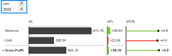
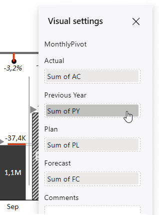
Now, insert the second Zebra BI visual: Zebra BI Charts for Office. With your current values, you get a chart showing your actuals up to the current month and plan values for the rest of the year. Just make sure to move the plan values into the right placeholders in the chart settings (gear wheel icon).
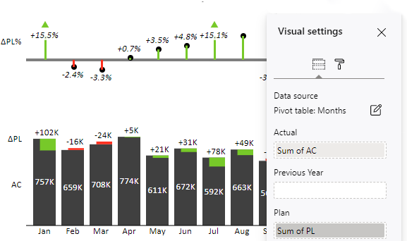
This is what your chart will look like now.
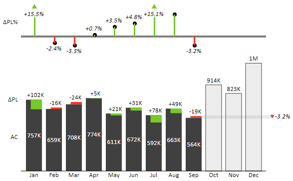
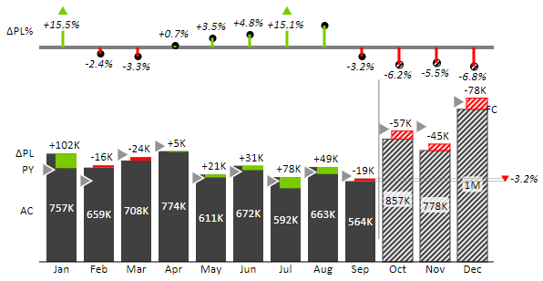
Zebra BI add-ins for Excel also support more complex scenarios with forecasts and other comparisons. Add forecast values into the Forecast placeholder in the chart settings to get a segmented chart.
Adding forecasts to your dashboards makes them much more valuable. Forecasts enable you to look at your data and see how you anticipate to finish the year. To make the visual even more insightful, you could also add the data for the previous year. Click on the PivotTable and add Previous Year data (PY).
Once you've done this, just drop individual values into their right placeholders in the chart settings.
The end result is a rich visualization that clearly shows how well you've performed against your previous year and plan. A single chart gives you an overview of your performance so far and enables you to look to the future.
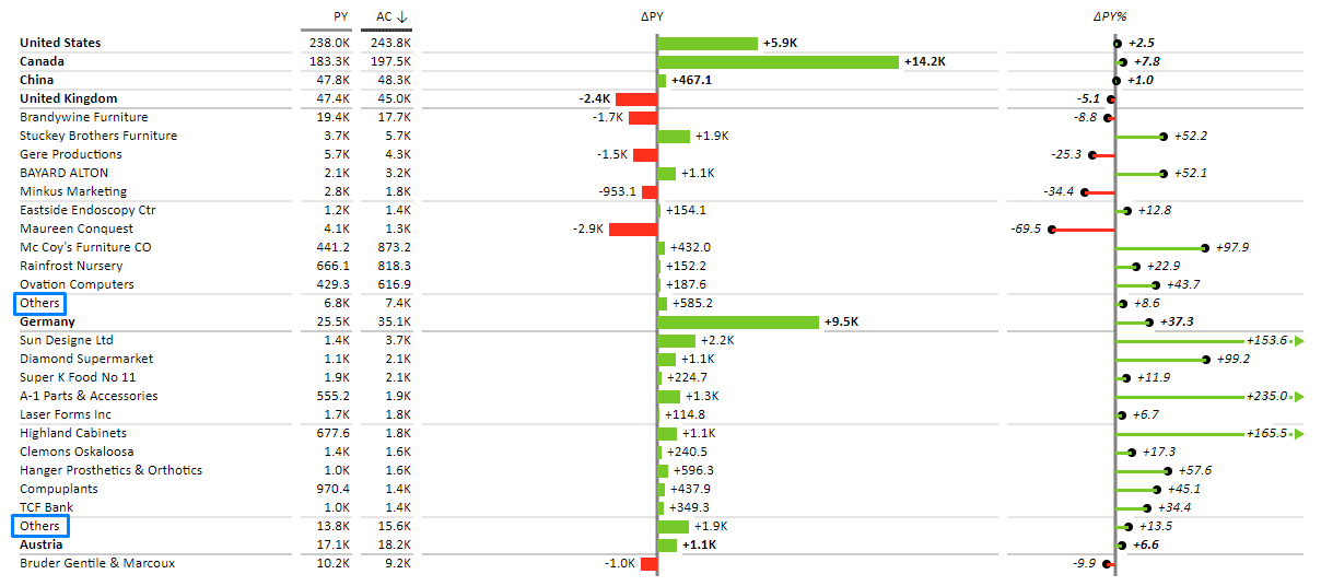
Breaking it down by countries
The next step is to add a breakdown by country. Start by copying your first PivotTable, removing the fields you no longer need, and adding the ones you do. In our case, we'll keep AC and PL values and place the Country value into the Rows area in the PivotTable.
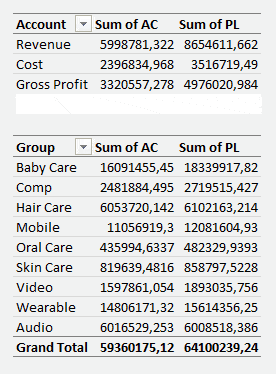
Next, visualize the data by inserting a Zebra BI Table for Office. Isn't it amazing how powerful visualizations can really be? In just a couple of clicks, you can get from this:
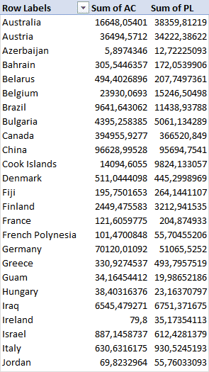
... to this:
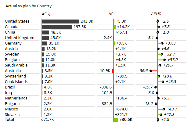
A plain table with a bunch of figures gives you no sense of which country is the largest market, which are the best performers, and which, on the other hand, need some attention. By visualizing your data, you get a much better insight. Moreover, this enables your users to sort and resize the table to get a better grip on your data.
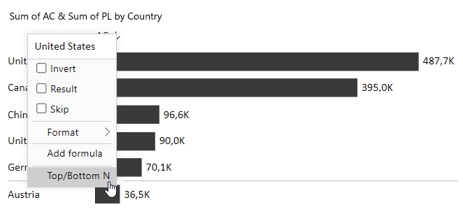
But make sure not to overwhelm your dashboard user on the very first page. This table now displays all of the countries and makes you scroll through them, which can be cumbersome. The best approach to solving this is to show just the top 15 countries. This puts the most important data points at the top.
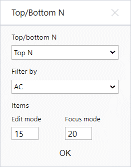
Right-click on any country name and select the Top/Bottom N option from the menu.
Then, set the options. Select Top N and set the number of items under Edit mode to 15. This will have your Tables visual show the top 15 countries only.
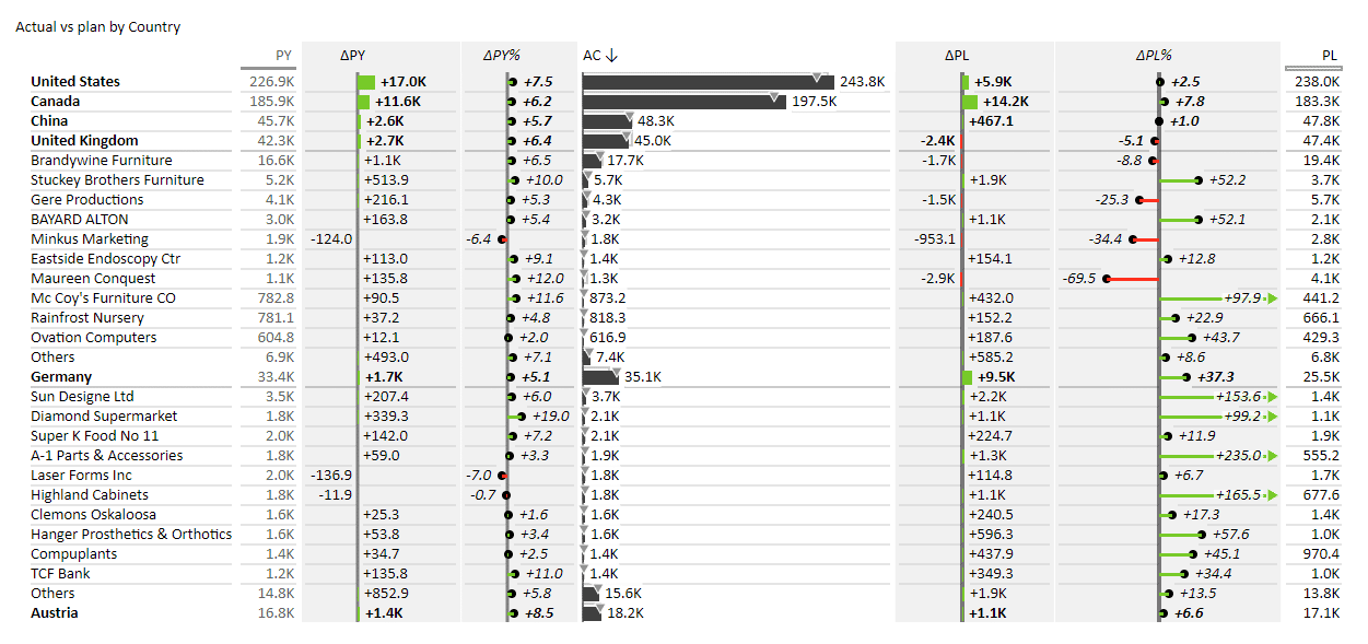
Drilling into more detail
Now that you've created a great overview of your countries, you want to give your users the option to drill into more detail. You can do this by creating a new page with more detail that users can navigate to from the landing page.
Create a new sheet and copy your Pivot Table with Year and Month filters.
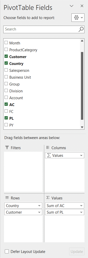
Drop in the values you want to see in your report. In our case, we'll be working with countries, customers, and actuals and plans. This is what your PivotTable Fields pane should look like:
Once your PivotTable is ready, insert a Zebra BI Table.
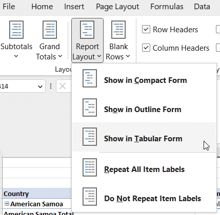
If you get a parsing error, just click on your PivotTable, open the Design tab, and set the Report layout to Show in tabular form.
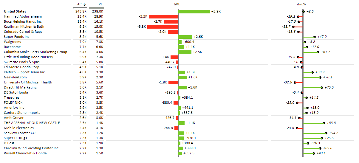
This table delivers a great amount of information, and you can manipulate this data in various ways. You can collapse individual countries or have all the corresponding clients displayed. You can also limit the display of clients to just, say, 10 of your best or worst performers by using the Top N or Bottom N features and setting the number of Items under Edit mode to 10.
To increase information density, you can add the data for the previous year, and Zebra BI Tables will automatically calculate the variances between this data point and your actual results. This great feature completely eliminates the need for manual calculations, saving you tons of time and effort. You can find it in all Zebra BI visuals.
Tip: when it comes to designing a table like this, a sound approach is to put the Previous Year column to the left, actuals in the center and plan to the right. This gives you a logical overview of your data, moving from the past to the future.
Creating a slicer for switching between KPIs
One of the things we're missing to make this dashboard truly interactive is a slicer for switching between KPIs. To do this, click on your Account PivotTable and select Slicer on the Insert tab in Excel. A window pops up in which you should select the Account measure, which actually contains the Cost, Gross profit, and Revenue values.
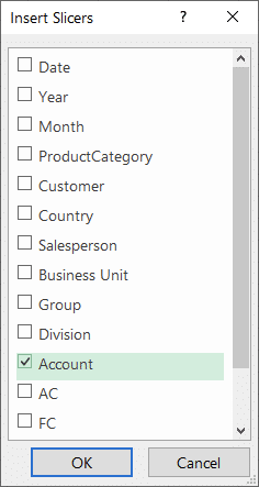
This produces the slicer that you now have to connect to other PivotTables by using the Report connections tool. It needs to be connected to the PivotTables that contain monthly and country data.
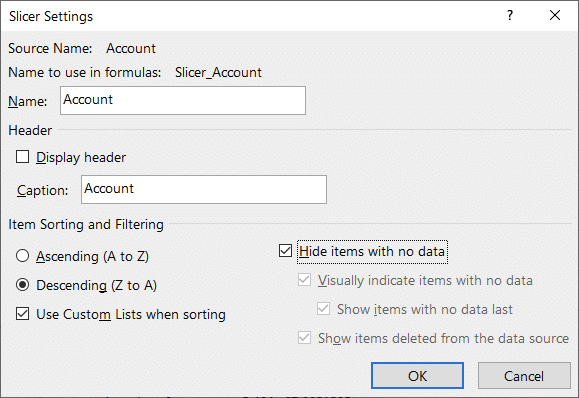
What we really want, however, is to design this slicer as a horizontal one, like the one we saw in our sample dashboard. To do this, click on the slicer to have it show the Slicer tab on your toolbar. Here, you can adjust various slicer aspects. Start by setting the number of columns to 3.
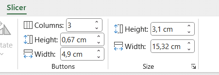
Continue by opening the slicer settings on your Slicer tab.
Go ahead and remove the heading, set the sorting order to descending and select Hide items with no data.
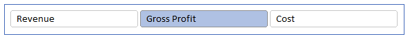
This is your end result.
You can select from a number of predefined Slicer styles or create your own. To do this, you need to select a style, right-click it, and then select Duplicate. Give the new style your name and start modifying it. Excel does not allow you to customize the default Slicer styles, but you can configure your own styles in any way you want.
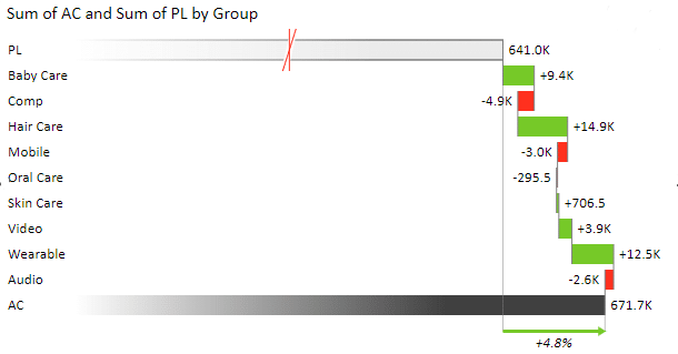
Adding a vertical waterfall chart for business units
The last chart we create will display all the business units. First, copy your existing Pivot Table.
Remove the Accounts measure and add the Group measure, which contains all the business unit groups. We will use this data to create a waterfall chart, which you can do by inserting a Zebra BI Charts for Office visual.
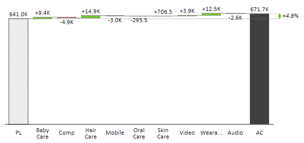
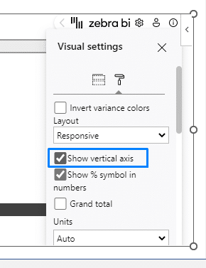
The chart shows the contribution of each business unit to the plan. However, the horizontal axis chart is more suitable for a time series, which is why we should rotate it by 90 degrees. Click on the chart settings and select the Show vertical axis option.
This gives you a much more appropriate design of the waterfall chart for this case. Additionally, you can use the Axis break to highlight the variances.
Finishing touches
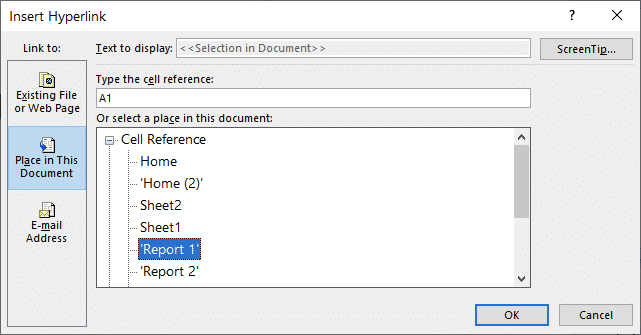
Your users will need to navigate through your report, so you can add hyperlinks that will enable them to move from the landing page to the relevant pages in your report.

You can do this by adding a circle with an arrow in it and then using it as a link. Once you have the design ready, click on it and insert a Link. In the window that opens, select the Place in This Document option and select the sheet to which you want the arrow to lead.
And voilà, here's how you can create interactive Excel dashboards according to the latest reporting best practices! And do it quickly and efficiently.
Forget hours and hours of manual work. With Zebra BI for Office, you can save yourself a bunch of time and effort to focus on what really matters: actionable insights.
As for your stakeholders, they'll finally be able to grasp the key business metrics at a glance. Not to mention easily navigate through your report to explore the data in more detail. It doesn't get better than this!
Build interactive Excel dashboards just like this one
Try Zebra BI for Office for free & receive a fantastic guide that will help you get started!
Prefer to get this guide in the form of a video tutorial? We got you! Watch the recording on demand free of charge.