Data Visualization Trends 2025: Don't Get Left Behind – Discover What's Next
PRO Trial
When data is the key to making informed decisions, your ability to see and interpret data is never been more vital. This journey requires the art of data visualization, which, by definition, turns complex raw data into understandable graphical representations. It provides unmatched efficiency in data exploration and communication. Understanding data visualization trends is crucial for businesses looking to take advantage of their data.
How Data Visualization Transforms Your Business Processes
Data visualization extends beyond aesthetic appeal; it's a powerful tool that boosts your ability to grasp complex information and quickly make well-informed decisions. By visualizing rows of data, your business can detect trends, variances, and anomalies much faster than conventional data analysis methods.
As a result, this method is incredibly useful in areas such as business and performance analysis, financial reporting, and high-stakes presentations that require accuracy and speed of decision-making.
Making Data Visualization Work for You
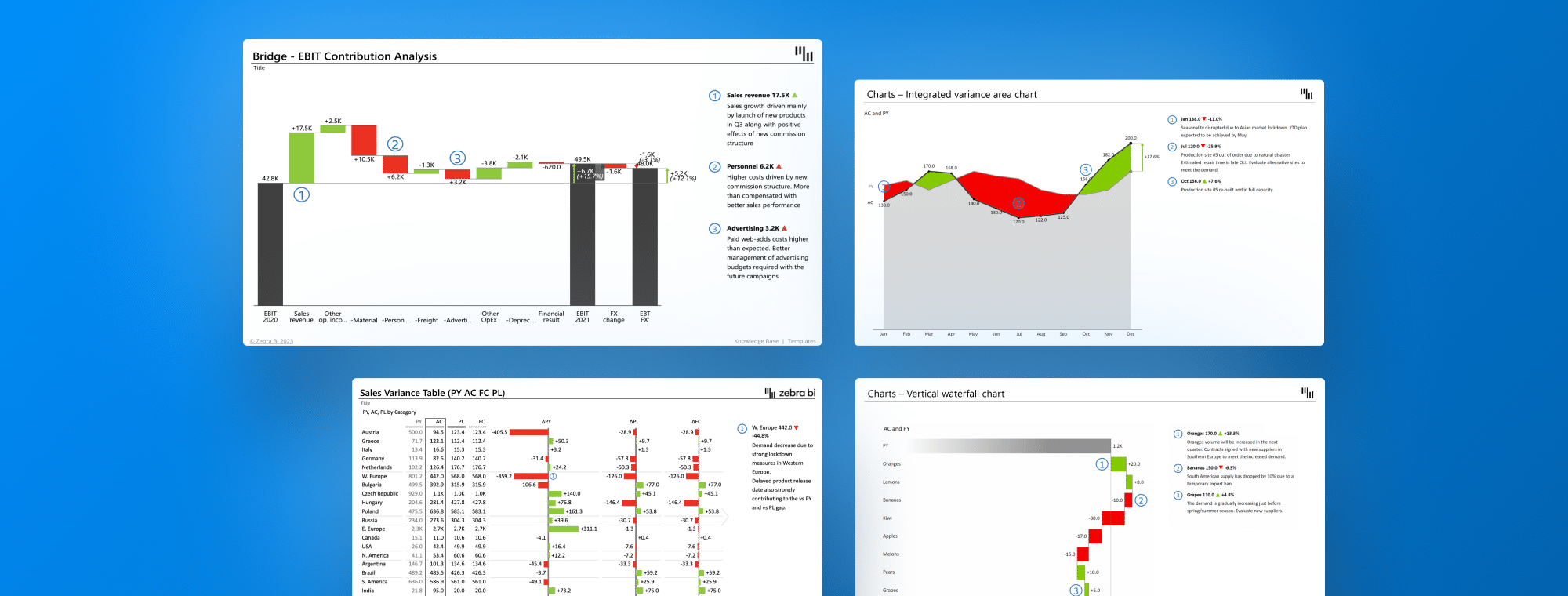
Imagine shifting from a basic data table to an advanced Zebra BI Tables with integrated charts—a stellar example of data visualization power. Unlike traditional tables that display numbers, the Zebra BI visuals instantly bring trends, variances, and patterns into clear view. It's not just about comprehension speed; it's about whether you can identify a trend at first glance. This transition from mere data presentation to insightful visualization marks the essence of contemporary data visualization techniques.
Yet, the journey to effective data visualization is not without its challenges. Common mistakes like choosing inappropriate visuals, poor labeling, overusing slicers, inconsistent color schemes, failing to emphasize key differences, and confusing layout designs can lead to misunderstandings or wrong interpretations. Being mindful of these pitfalls and choosing the right visualization tools can dramatically improve your data visualization's impact and clarity.
Read more: Power BI Dashboard Design: Avoid These 7 Common Mistakes
Essential Strategies for Success
The key to successful data visualization lies in user-centric, sophisticated visuals. Each type of visual has a specific role and clear guidelines. For anyone who wants to enhance their organization's data-driven strategies, it is crucial to become familiar with these principles, stay up-to-date with the latest advancements, and understand how they contribute to the evolving landscape of 2024's data visualization trends.
Key Tools in Data Visualization
Key elements of Data Viz are user-friendly advanced visuals. Let's elaborate on this further.
Tables
Usually, tables in reports look like this: too many numbers, some random colors, and insights that aren't visible at a glance.
Zebra BI Tables visual offers a sophisticated means to present data dynamically, incorporating the latest enhancements for clarity and depth. They are ideal for situations where detail and precision are paramount, turning complex datasets into clear, comprehensible visuals.
The same numbers were used for both reports, but it's clear which one you get insights from, right?
Charts
Charts form the backbone of effective Power BI data storytelling, offering a visual narrative of data over time or among variables. Zebra BI Charts visual, with its cutting-edge features, facilitates an intuitive understanding of complex trends, making them essential for comparative analysis and trend identification.
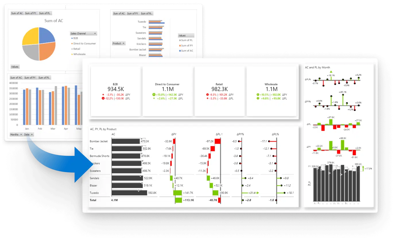
Cards
Cards are invaluable for at-a-glance insights. They distill key data points into easily digestible visuals, perfect for highlighting crucial metrics or KPIs. With Zebra BI Cards as a custom visual, your ordinary card becomes a powerful tool for immediate insight dissemination across all levels of an organization.
Using Data Visualization for Actionable Insights
In the 2024 business landscape, actionable insights are crucial for data-driven decision-making. Using data visualization enhances this process by transforming static data into dynamic insights that drive action.
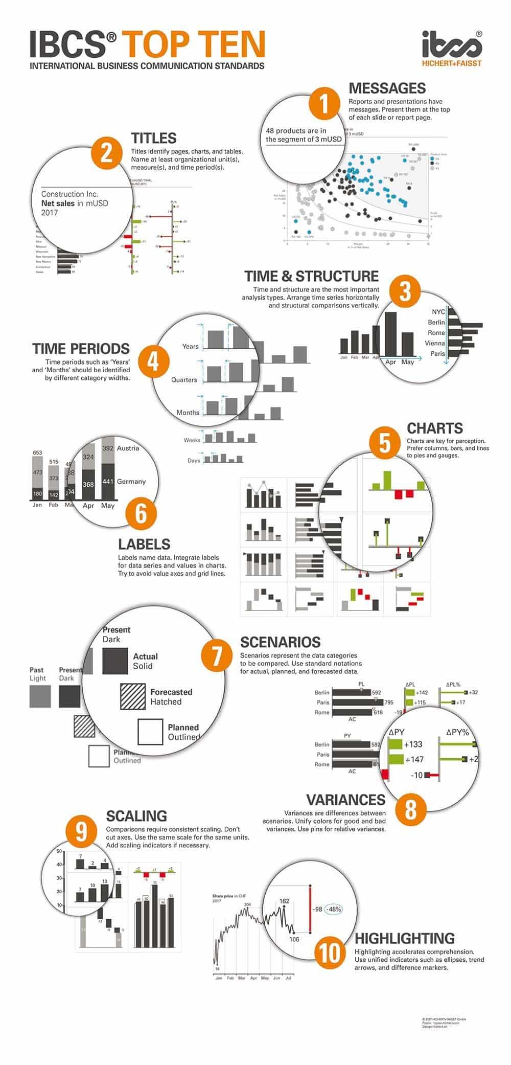
Making Reports Work for You with International Business Communication Standards (IBCS)
Actionable insights, guided by the International Business Communication Standards (IBCS), offer a systematic way to approach data visualization. These standards help present data concisely and uniformly, making it easier to turn complex data into actionable insights. Following IBCS principles, your data visualizations will look consistent and logically organized, helping decision-makers quickly understand the data. This methodical visualization strategy accelerates the move from data collection to strategic action, boosting your organization's agility and competitive edge.
Actionable Reporting Benefits
Standardization
For Report Developers: Adopting actionable reporting ensures all reports follow IBCS best practices and styling, minimizing time spent selecting the most effective data visualization techniques. This consistency speeds up report creation and ensures effective and uniform information distribution.
For Viewers: Standardization reduces interpretation effort, allowing more time for critical decisions. Data is presented uniformly, making key messages instantly recognizable.
Interactivity
For Report Developers: Modern data visualization tools reduce the need for extensive data exploration and pivot table analysis, which obscure key performance indicators (KPIs) and trends. They allow for a more direct route to narrative-driven data presentation.
For Viewers: Interactive reports engage users by letting them delve deeper into the data independently without consulting report developers. This autonomy encourages a more profound and personal interaction with the data, fostering greater insight and understanding.
Operational efficiency and clarity
The synergy of standardization and interactivity answers a crucial question: How efficiently can we move from data to insights? Zebra BI streamlines this process, freeing up valuable time for professionals to focus on what they were hired to do — add value through strategic analysis and decision-making.
In this context, tools like Zebra BI are not seen as replacements for human insight. They are viewed as powerful complements to the analytical process.
Updates and Latest Trends in 2024
In 2024, the world of data visualization is experiencing a wave of innovation that's changing how you interact with data and revolutionizing reporting and storytelling. Here are the most impactful data visualization trends and updates explained.
Interactive Visuals for Deeper Engagement
Interactive visuals take center stage, transforming your engagement with data and storytelling. Let's break down how these features enhance reports and dashboards:
Enhanced Dynamic Commenting in Power BI and Office
This feature brings an additional layer of interaction directly to your reports. Allowing users to add comments to data points or visuals fosters a collaborative environment where insights and queries can be instantly shared. This addition effectively bridges the gap between data visualization and narrative, enabling users to understand the 'why' behind the data effortlessly.
On-Visual Interactions for Simplicity and Informative Reports:
Visual Calculations: The ability to add quick column and row calculations directly to the visual is a game-changer. As a direct result, complex DAX measures are no longer necessary, and data analysis is now democratized. Now, any user can modify a Power BI report to include relevant calculations, enhancing engagement, completeness, and clarity.
Formatting: Tailoring reports to meet viewer needs is crucial for conveying meaningful insights. Modern data visualization tools make it simple to adjust report structure and formatting with just a few clicks. This ease of customization ensures that reports are standardized and maintain high data density for clear comprehension.
Slicers and Cards - Streamlining Data Interaction
Slicers are traditionally used to filter data in Power BI and Excel, and slicers play a crucial role in navigating datasets. However, with the push towards higher data density and clarity, slicers can sometimes clutter the canvas. An innovative approach is to use other visuals (charts, tables, or cards) that offer the same filtering capability plus additional insights. This method, known as cross-visual filtering, enhances report cleanliness and simplicity while providing more information.
At Global Excel Summit 2024, Carlos Barboza showcased how easy it is to create an interactive Excel dashboard within minutes:
Cards for Communicating KPIs: Cards are exceptionally efficient for presenting top-level KPIs, allowing variances or reference labels to provide context. Setting up cards in Power BI with Zebra BI is straightforward and improves critical metrics communication, making it easier to make informed decisions.
There are some things you can do with the native Power BI cards visual, but it is still much easier and quicker to show insights with Zebra BI Cards:
Real-time visualization and automation
As change accelerates, the need for real-time data visualization becomes more pressing. Accessing and analyzing data instantly gives your organization a competitive advantage, allowing you to respond to trends and make decisions quickly. The latest tools, including the latest Zebra BI updates, incorporate automation to streamline the journey from data collection to insight generation. This move towards automation boosts operational efficiency and maintains data integrity across diverse datasets. This ensures you're always ready to act on accurate, timely insights.
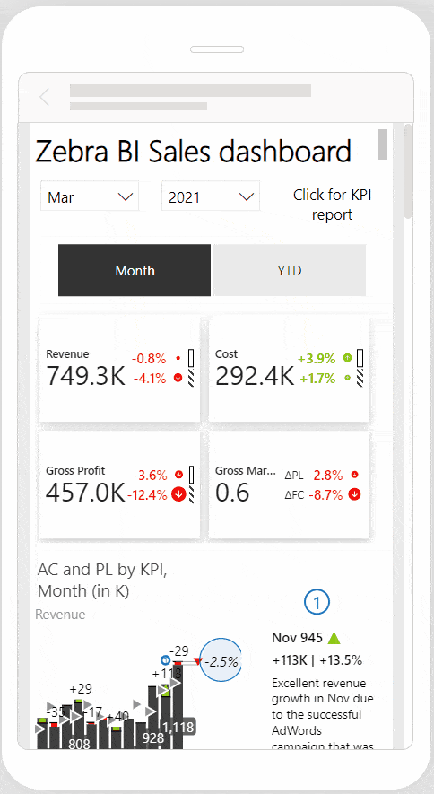
Mobile-friendly insights
With the business environment growing more mobile, data visualization tools are evolving to ensure you can access insights whenever and wherever you need them. This focus on mobile-friendly designs means that no matter where you are, you can make informed decisions quickly, keeping pace with the dynamic business landscape. This trend highlights the importance of flexibility and accessibility in data visualization, meeting your needs.
Navigating Security Concerns in Data Visualization
When dealing with potentially sensitive data, data visualization tools must be selected with a keen eye for security. Data privacy, integrity, and confidentiality are paramount concerns that professionals should not overlook.
Commitment to globally recognized standards and regulations, such as Microsoft certification, GDPR (General Data Protection Regulation), and CCPA (California Consumer Privacy Act), provides a solid foundation for evaluating data visualization tool security credentials. Moreover, considering the customer base or track record of a tool offers insights into its adoption and reliability. Zebra BI, with its strong customer base across various industries, demonstrates its commitment to maintaining the highest standards of data security and user trust.
By prioritizing security, organizations can ensure that their data visualization practices deliver insights and safeguard sensitive information against potential threats.
The synergy between AI and Data Visualization
Integrating Artificial Intelligence (AI) into processes, including data visualization, in business is not just a trend but a transformation. AI's role in 2024 continues to expand, offering unprecedented data analysis, interpretation, and visualization capabilities. Zebra BI stands at the forefront of this evolution, combining its innovation and expertise to harness AI power to create more intuitive and insightful data visualizations.
Zebra AI: Pioneering Automated Data Exploration and Reporting
Our current landscape at Zebra BI is defined by the efficiency and intuitiveness of our products, which allow for the swift creation of insightful visuals requiring minimal configuration. The philosophy is simple: tools should facilitate storytelling through data. As we progress, the focus has shifted toward the next evolutionary phase—embedding Artificial Intelligence (AI) into our offerings to usher in the next era of actionable intelligence.
As a result of this advancement, Zebra AI redefines automated data exploration and reporting. By analyzing data and applying Zebra BI's established best practices, Zebra AI delivers precise insights, enabling a seamless transition from data to decision-making. As an intelligent assistant, it identifies key insights and selects optimal visualizations, streamlining the data visualization process and enhancing strategic decision-making. Zebra BI simplifies data analysis through this integration and empowers organizations to develop a data-driven culture backed by AI.
Best Practices and Use Cases for Data Visualization in 2024
In 2024, the role of data visualization in turning raw data into actionable insights and shaping business strategies and decision-making continues to be crucial. This ensures that data is not only accurately represented but also delivers actionable insights in a clear and engaging manner. Let's dive into the best practices and real-world use cases that illustrate how these approaches define the future of data analysis and storytelling.
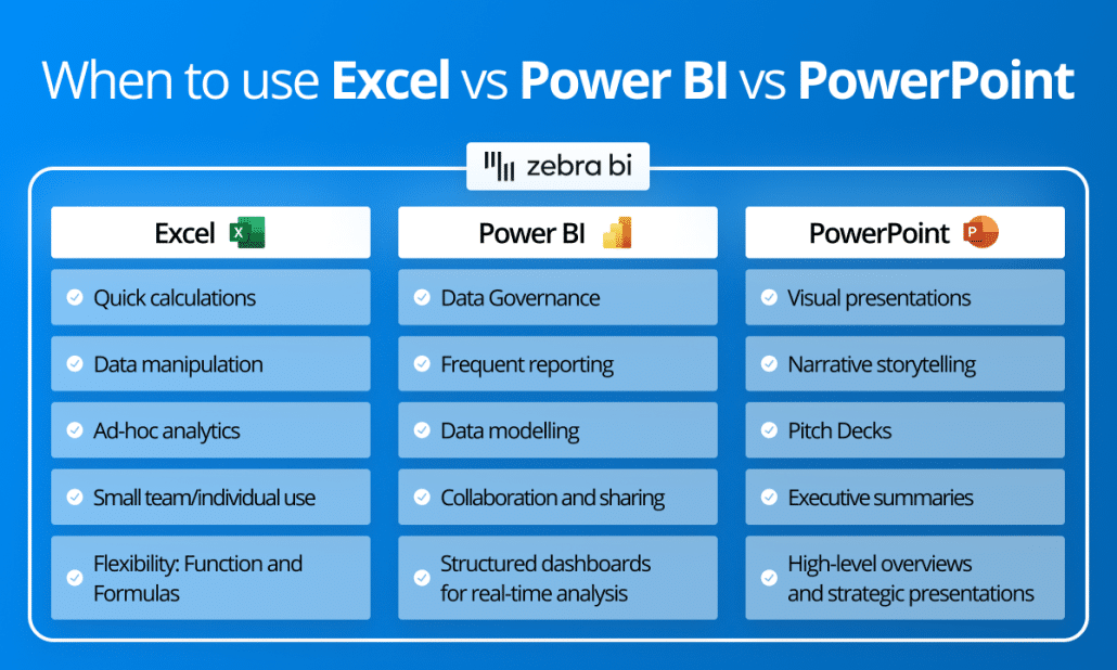
Fostering Cross-platform Collaboration
Integrating Power BI, Excel, and PowerPoint has become essential for comprehensive data governance, modeling, sharing, and real-time analytics. Each platform brings its unique strengths: Power BI excels in data governance and real-time analytics, Excel is unmatched in its flexibility and data manipulation capabilities, and PowerPoint shines in presentation capabilities. Combining these tools, grounded in a single source of truth, enhances actionable reporting. Modern Excel's ability to connect to various databases, including Power BI data models, and PowerPoint’s feature to embed live Power BI reports or link data from Excel ensures information remains current and actionable.
Standardization Across Platforms
Consistency in data visualization is key, regardless of the tool or platform used. Standardizing reports and dashboards across Power BI, Excel, and PowerPoint ensures insights are communicated clearly and meaningfully. It ensures that your reports and dashboards are instantly understandable, facilitating faster decision-making. Adhering to guidelines such as the International Business Communication Standards (IBCS) helps produce consistent, interpretable visualizations across various mediums, fostering data communication clarity and effectiveness.
Transitioning to Interactive Reports
Moving from static to interactive reports represents a significant shift in data visualization. Interactive reports offer a dynamic way to engage with data, uncover patterns, and derive insights through direct interaction. This approach deepens your understanding and connection with the data, encouraging exploration and discovery. Features like drill-throughs and dynamic filtering make reports a tool for exploration, not just presentation.
See how you can build interactive reports (Power BI-like) in Excel.
Smart Mixture and Positioning of Visualizations
Tables, charts, and cards are crucial for comprehensive insights. While each visualization type supports data-driven storytelling on its own, combining them adds depth to reporting. This mixture enhances the information conveyed, presenting data from multiple angles or with additional details.
Selecting the appropriate visualizations and arranging them thoughtfully on the report canvas must take into account data density—maximizing information while ensuring clarity. With Zebra BI, visuals can also function as slicers (even in Excel! See the GIF below), allowing for more efficient use of space by providing context and functionality within the same visual element.
Leveraging templates and tools
Using templates and specialized tools like Zebra BI can streamline your data visualization efforts. Templates tailored to specific business functions or industries save time and effort, while tools with advanced features address particular reporting needs. Zebra BI's templates, for example, incorporate visual design and interactivity best practices, making it more straightforward to create insightful, actionable reports.
These best practices are applicable across various fields, from financial reporting to strategic planning. An interactive sales dashboard might monitor performance, analyze customer segments, and pinpoint growth areas. Financial institutions could develop standardized reports for compliance monitoring, risk assessment, and stakeholder communication.
Some examples are listed below:
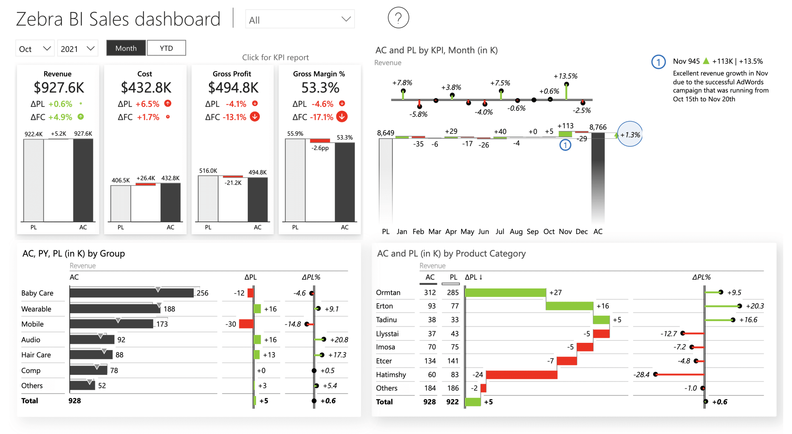
Sales Dashboard Power BI Template is designed to help you make an actionable sales dashboard. It includes all the essential elements such as buttons, report page tooltips, drill-through buttons, drill-downs, top N charts, advanced small multiples, as well as DAX code and a ton of other Power BI dashboarding tips & tricks.
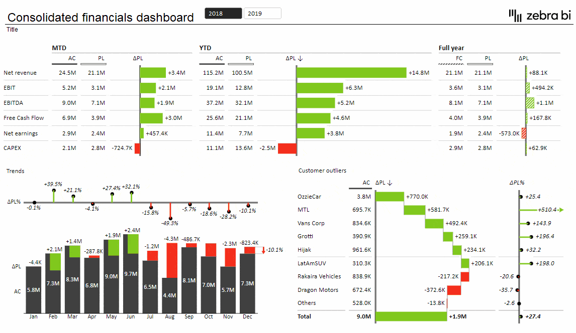
Consolidated Financials in Excel: The combination of charts & tables lets you visualize the most important information on one page. Using cross-visual filtering, you can further filter it by year, month, KPI, region, or customer to get more detailed information in seconds simply by selecting elements of your dashboards.

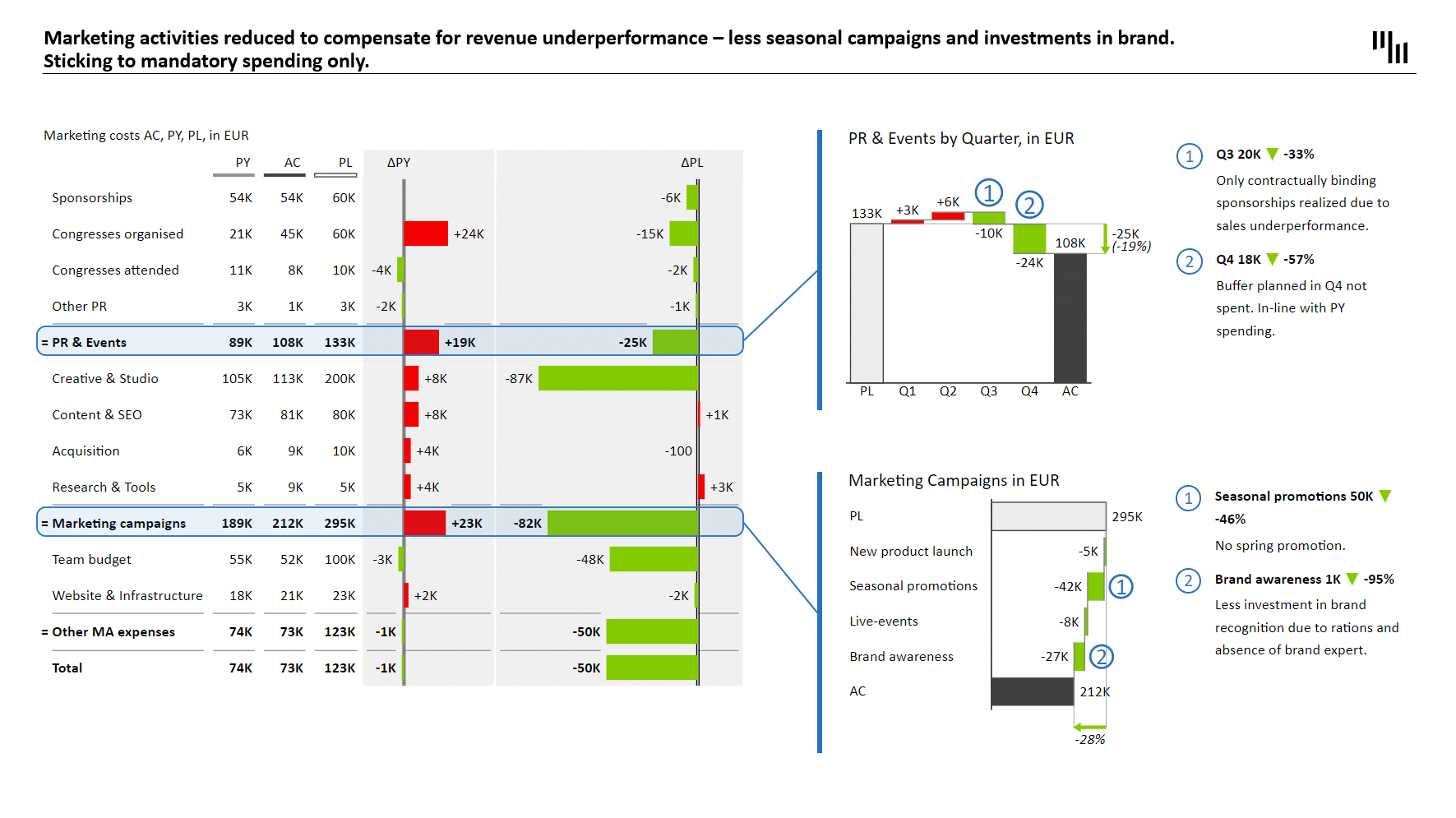
OPEX and Marketing Budget PowerPoint Template transforms complex financial data into clear, engaging, and easily interpretable visuals, which is something every viewer will appreciate. Zebra BI Tables bring a new level of clarity to even the most intricate financial tables. It does so by following the best practices as per IBCS, such as high data density, standardization, and the right choice of visuals (including labeling, scaling, and scenario patterns) to share insights.
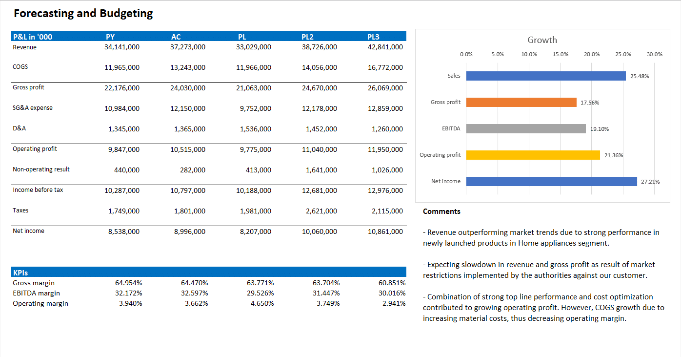
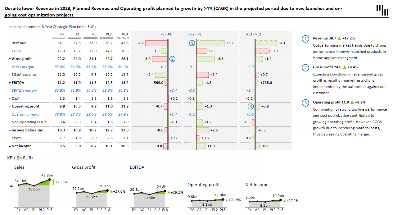
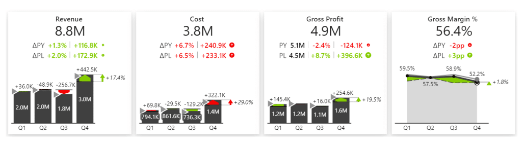
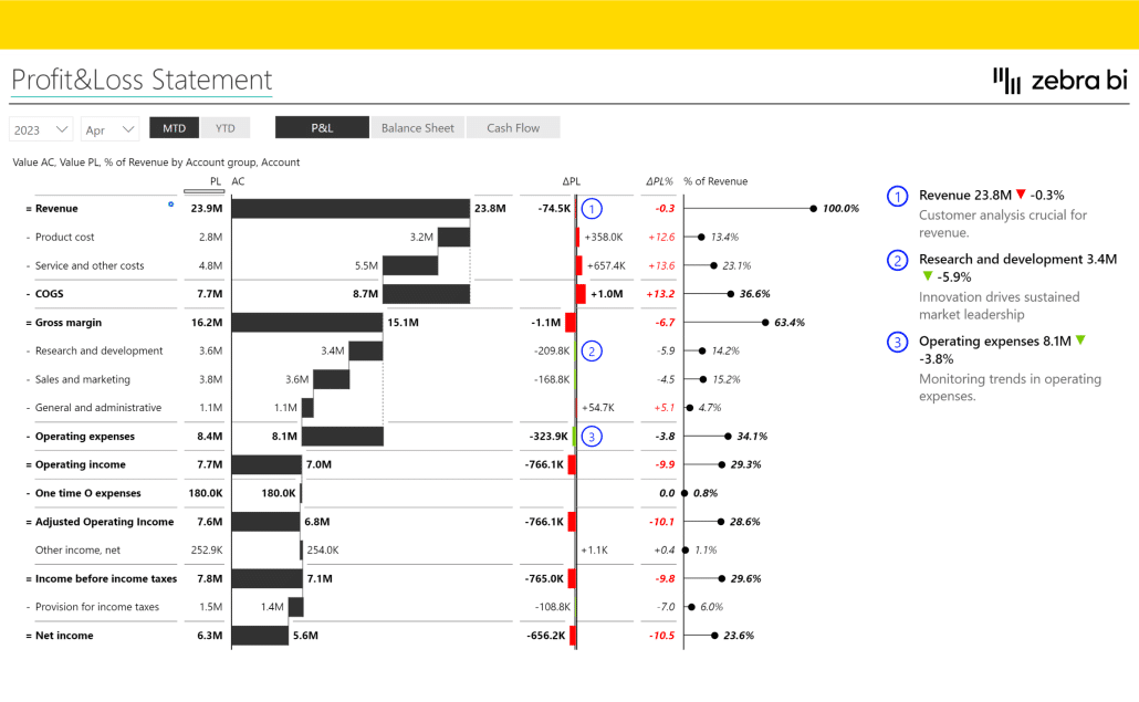
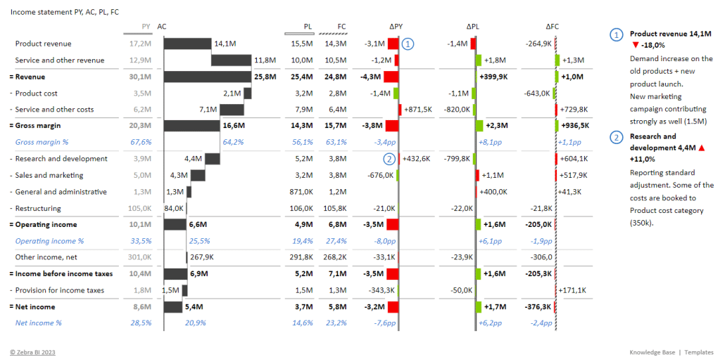
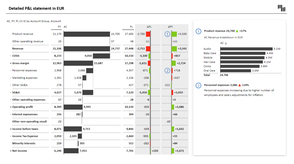
Financial statement analysis and data visualization in 2024
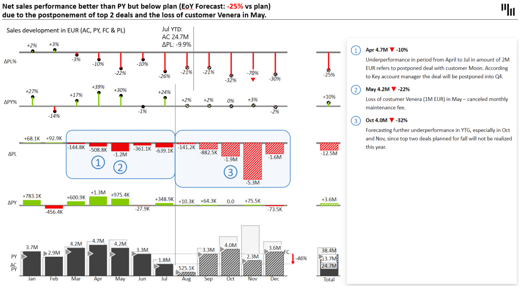
Let's look at the P&L report, for example. Visualizing something like the income statement is not the standard. But by implementing good data visualization practices and modern trends, your report can be transformed into:
To learn more,
- Check out best practices for other business cases as a learning material to make the best use of Dat Viz: Report makeovers in Power BI, Excel, and PowerPoint with the latest trends in data visualization on YouTube,
- Check out other templates on our website.
Conclusion
Our exploration of the evolving landscape of data visualization in 2024 shows that it will remain an essential component of business intelligence, strategic planning, and decision-making. The transformation from basic charts and tables to advanced, interactive, and AI-powered visuals significantly advances our ability to engage with and understand data. Innovations like these make data more accessible and powerful catalysts for insight, innovation, and action.
Throughout our journey, we've highlighted the importance of interactivity, real-time analysis, mobile accessibility, security, and artificial intelligence in shaping the future of data visualization. As a result, organizations worldwide gain access to intuitive and insightful tools and techniques
In the coming years, data visualization will grow as data volume, speed, and diversity increase. Visualizing and deciphering this information will become a key advantage for organizations in the digital age. When used to empower organizations and drive meaningful action, data visualization will continue to lead in business intelligence and analytics by adopting cutting-edge technologies.