Annual Comparative Statement Power BI Template (Free)

Overview
This is what 5 years of financials look like once you switch from a static Excel table to an interactive Power BI dashboard: variances calculated automatically, trends you can actually see, and a report your team can explore instead of just read.
Inside this template
Identify Trends, KPIs, and Financial Patterns Your Spreadsheet Was Hiding
Built entirely with Zebra BI visuals, this report enables you to analyze income statement data across multiple years and regions. Spot trends, key performance drivers, and financial patterns in a dashboard built with easy-to-understand visuals.
This template helps finance professionals and business users make sense of the past, whether for financial analysis, forecasting, or checking assumptions before implementing a plan. Built-in data visualization and interactivity make it easy to analyze the numbers, understand the story behind them, and explain them during a meeting.
Who is this template for?
This annual comparative income statement template is ideal for:
- Finance professionals and controllers – to analyze actual performance historically and validate forecasting assumptions about future performance
- FP&A teams – for building dynamic dashboards that replace static Excel financial statements and outdated financial dashboards
- Executives and senior management – to get high-level and drill-down financial views
- Business managers and non-financial users – to understand how their actions impact financial outcomes
- Data analysts and BI developers – looking to elevate financial reporting with best-in-class visuals
What this Power BI template clears up
This Zebra BI financial reporting template for your annual income statements helps you answer questions like:
- What are the main drivers behind our income growth or decline?
- What does the statement by region look like?
- Which parts of the income statement need more attention and why?
- What are the trends in key metrics like EBITDA or Net Income?
- How well do actuals align with plans and forecasts?
- Are your operating expense ratios on track?
- Is your revenue forecasting accurate as compared to actual revenue historically, as well as other performance indicators?
With these actionable insights, you can use Power BI to:
✅ Understand financial trends over time with regional and hierarchical views
✅ Identify performance gaps with variance analysis and clear visual indicators
✅ Communicate financial data in an accessible and actionable way
✅ Explore key metrics interactively using filters, hierarchies, and small multiples
✅ Drive strategic decision making with insights that connect business actions to financial outcomes
Financial reporting best practices, built in
Get insights you can share with anyone, from project managers to your finance team to C-level executives, without having to build the visualizations yourself. This Power BI annual report template already has them designed and ready, right out of the box.
This Power BI template works as a full financial dashboard for the whole organization, so you can:
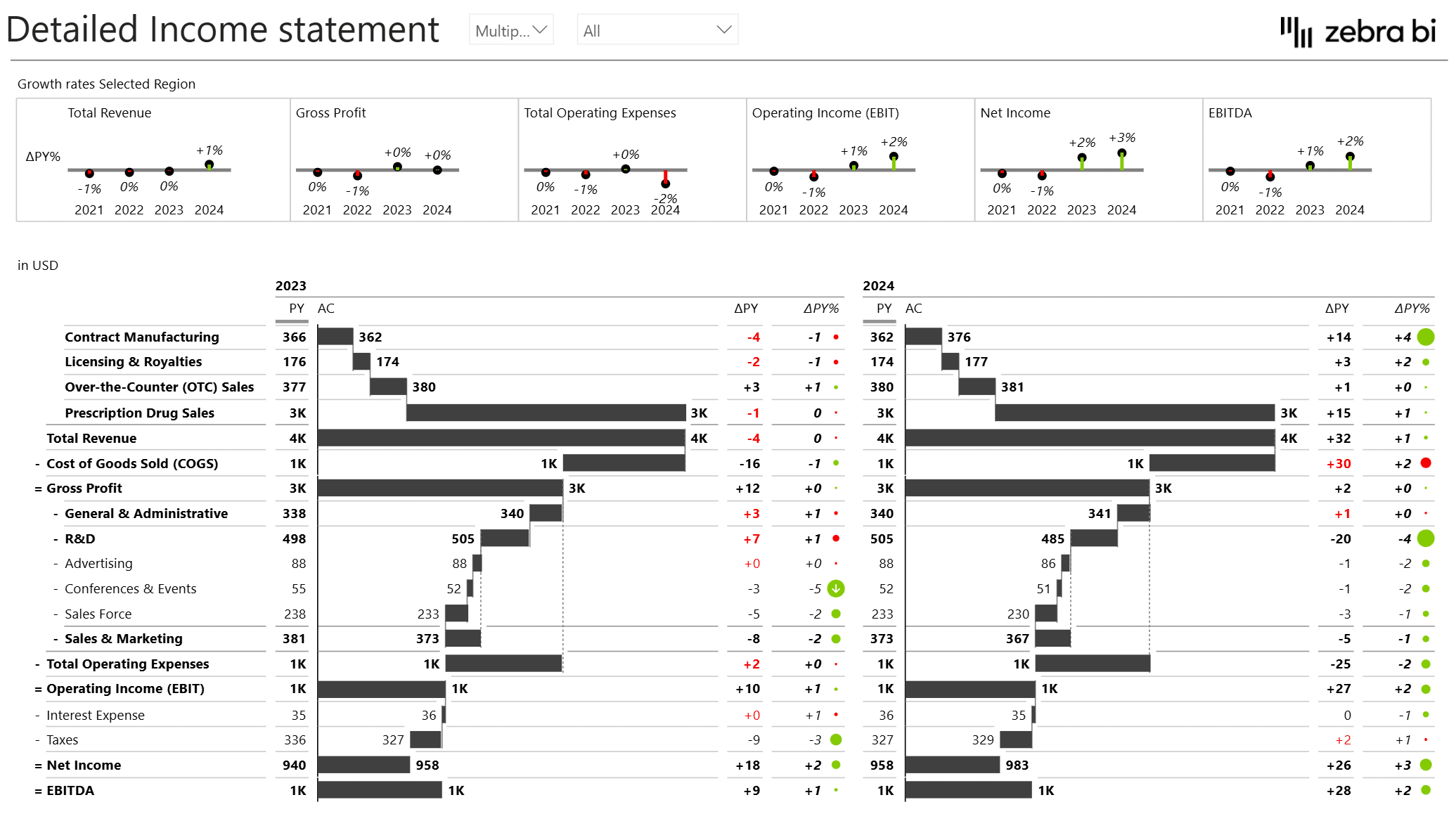
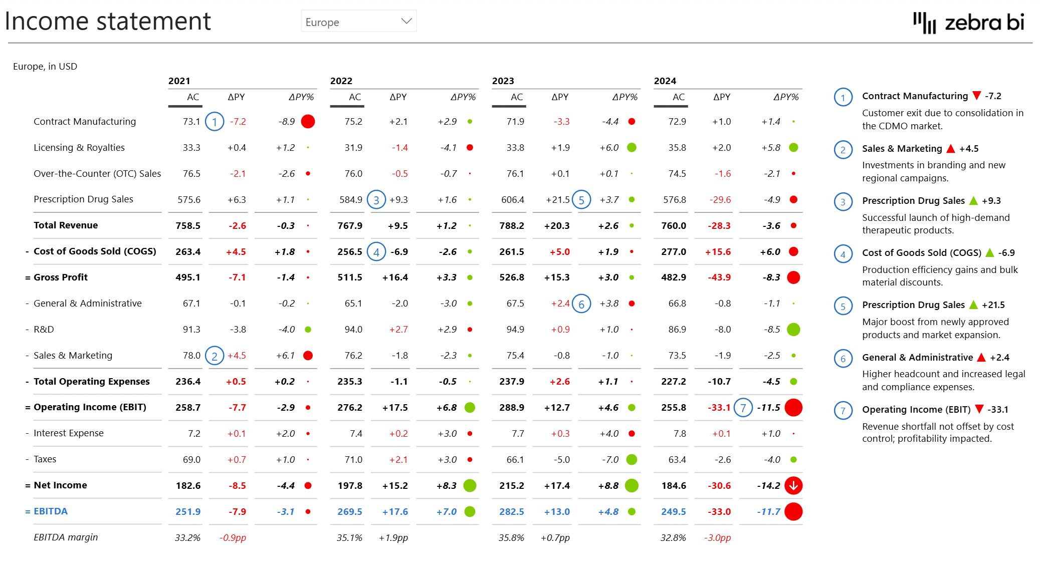
- Present multi-year income statements using a clear, intuitive tabular format in Power BI
- Communicate complex variance analyses clearly and efficiently
- Use visual storytelling to make reports understandable at a glance, even outside of your finance team
- Avoid complicated DAX measures or manual chart tweaking
- Build waterfall charts, small multiples, and integrated variance tables with just a few clicks using Zebra BI visuals
- Use annotations and comment markers to explain the "why" behind financial movements
- Help non-financial users grasp the structure and implications of financial results
- Highlight the relationship between strategy and financial performance
- Help the entire organization make better, more informed decisions
Your message comes through clearly, and your performance metrics back up the decisions that follow, whether you're reporting to executives or digging into detailed financial analysis.
Zebra BI visuals inside this template
To help you make the most out of this template, we have improved it with the following Zebra BI visuals:
Zebra BI Tables
Financial statements follow a structure similar to a category breakdown, so tables are the most natural and intuitive way to present them.
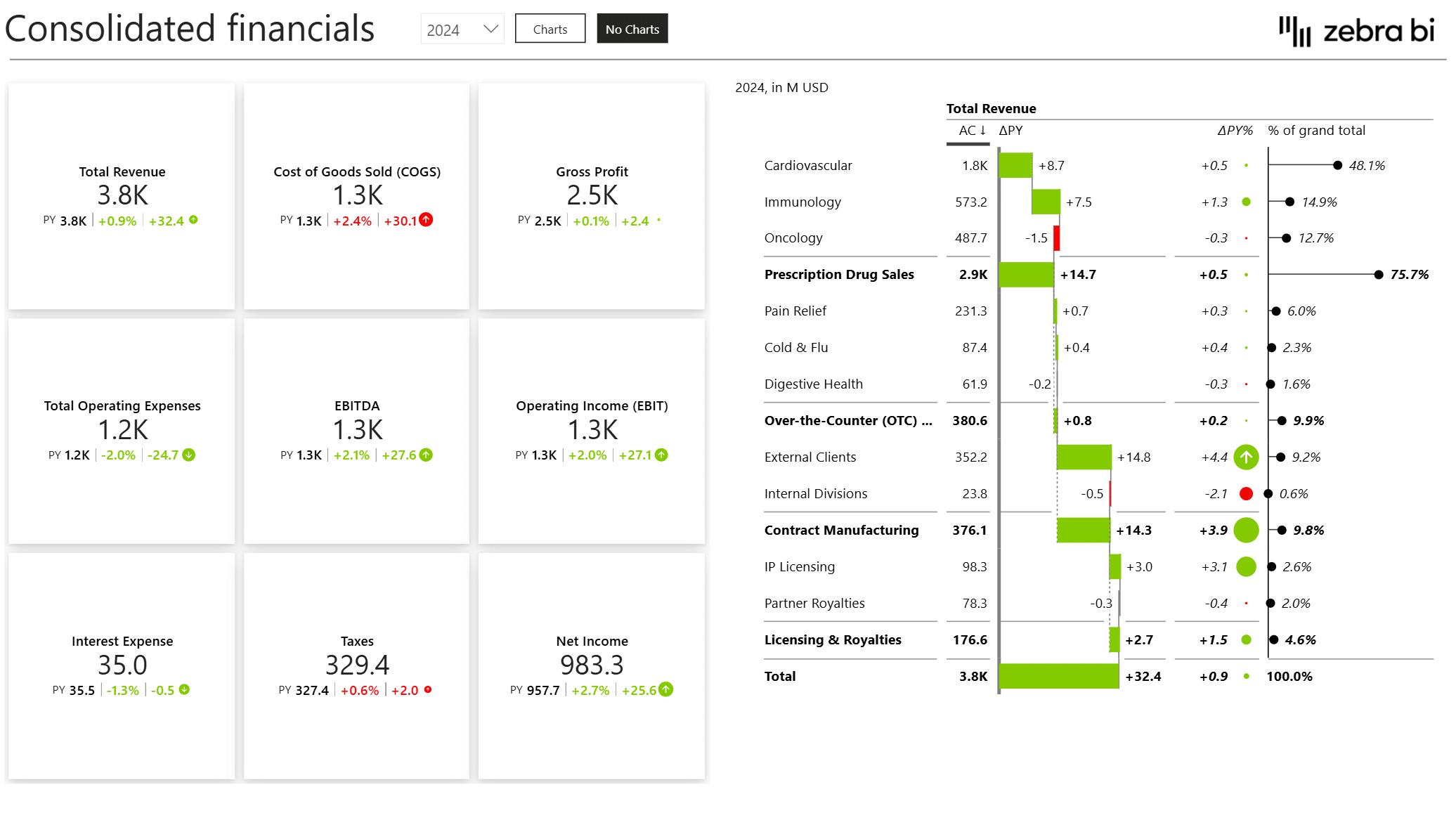
We used a combination of tables and charts with already embedded formulae and out-of-the-box formatting to help you analyze and present your data in a way that makes it easy for non-financial users to understand financial statements and how business actions impact results and strategy.
Here’s what you need to know about the Zebra BI tables in this Annual Comparative Power BI template:
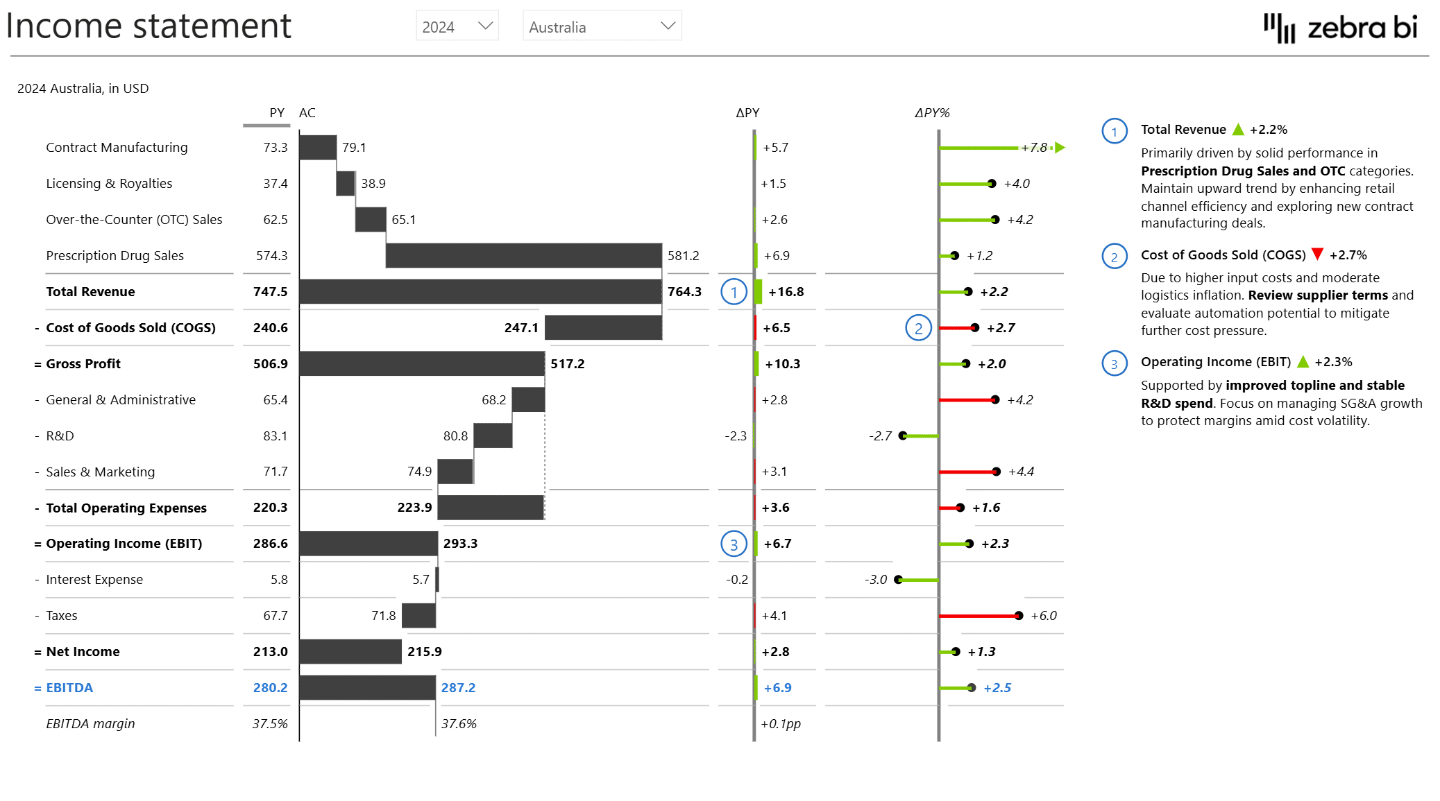
- This template combines tabular structure with waterfall charts to clearly show the impact of each P&L account on the bottom line (Net Income)
- The integrated variance analysis is automatically calculated and formatted out-of-the-box, helping you focus on areas that need attention and explanation
- Our built-in dynamic comments solution enables clear annotations that explain the "why" behind financial changes
- The template also allows you to display grouped categories and hierarchies over time with intuitive formatting
Note on the tables’ guide interpretation: left to right (oldest to newest), top to bottom (aggregated or subtracted items), reflecting widely accepted accounting standards
Zebra BI Charts
The Zebra BI charts in this Annual Comparative template also help you deliver the best and clearest data presentations. They:
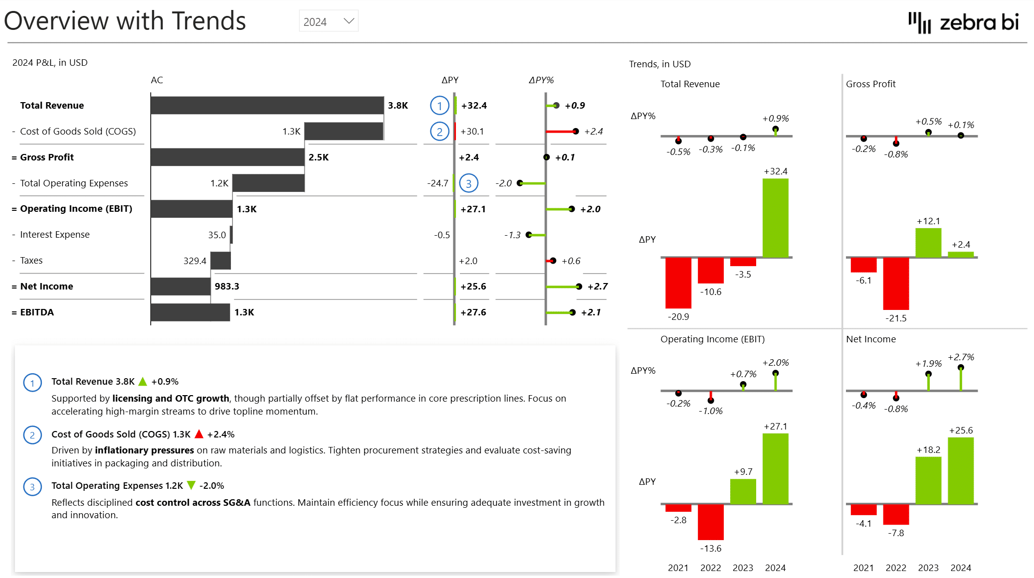
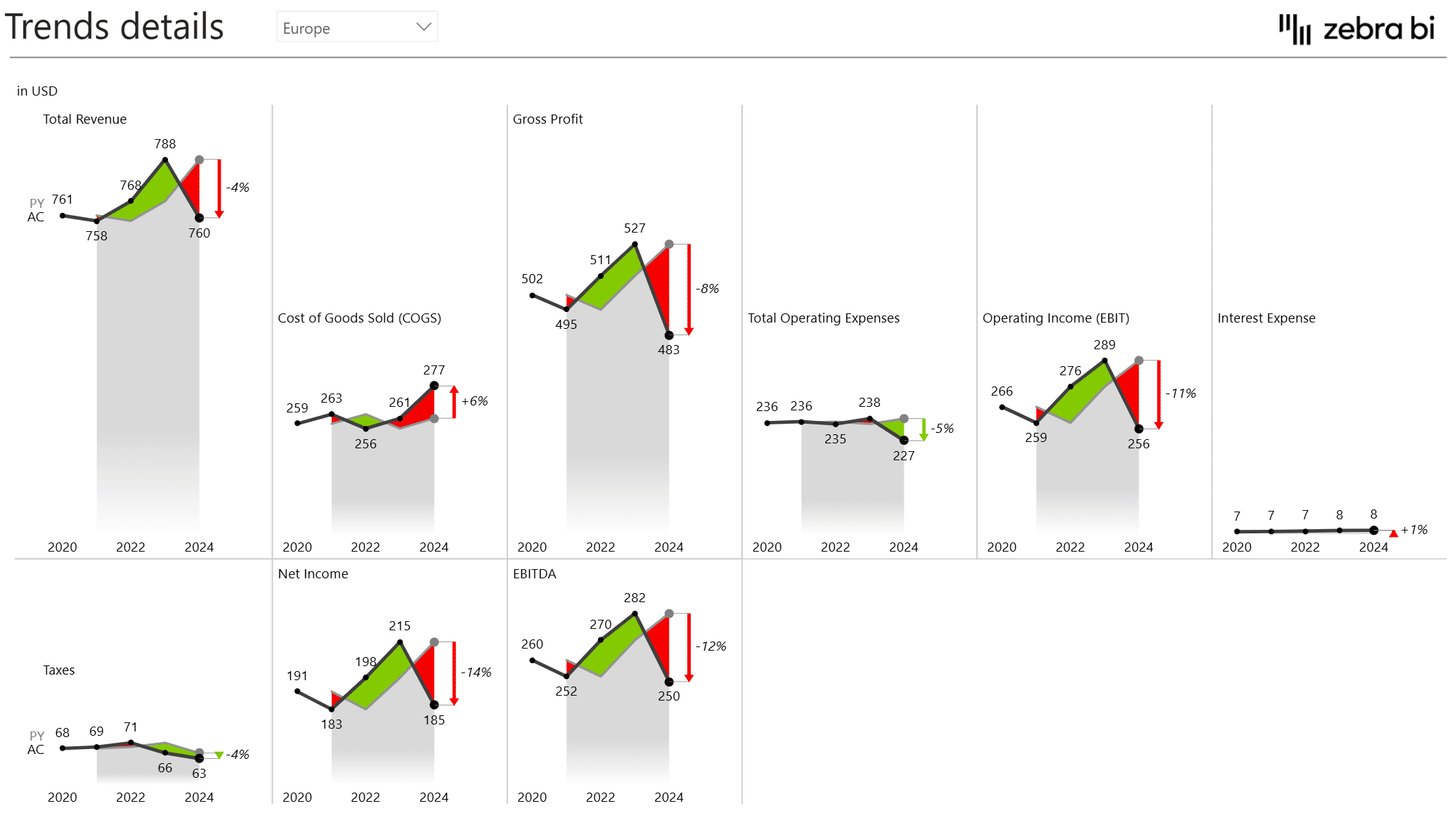
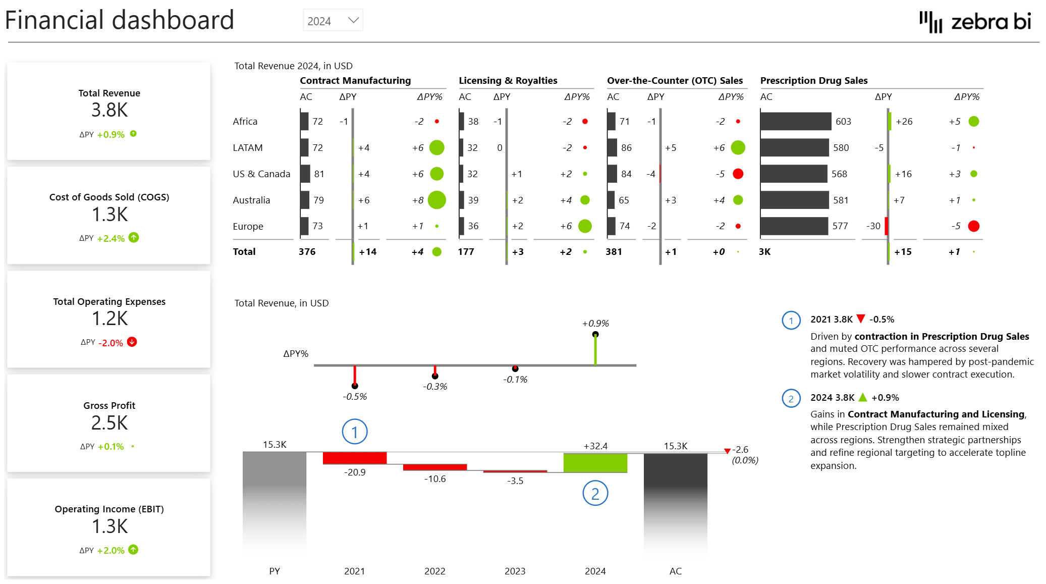
- Include plus-minus charts, waterfall chart, and pin charts for trend and contribution analysis
- Leverage small multiples to track several KPIs in time series with precise scaling
- Variance highlights and dynamic breakdowns explain performance at-a-glance
Zebra BI Cards
Want to get into the details of your financial data? Zebra BI cards help you to:
- Display top-level KPIs like Revenue, Net Income, and EBITDA with visual clarity
- Make key performance indicator tracking consistent and actionable with out-of-the-box built-in variances and IBCS-compliant layouts
Get started in 3 steps
Fill out the form and get the Power BI template