Top 5 New Productivity Features in Zebra BI Custom Visuals for Power BI
PRO Trial
The latest version of Zebra BI for Power BI brings a bunch of new features that bring new flexibility to companies and users who rely on standardized reports to present their data.
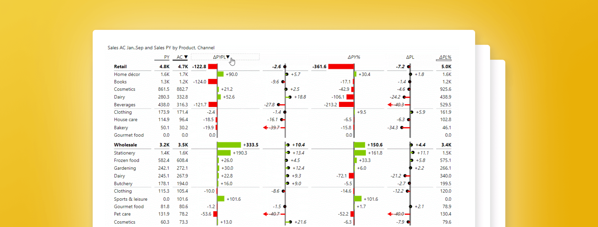
Reorder your columns and scale your reports
As you work with Zebra BI Power Tables you might want to change the default order of columns. While the default ordering is based on best practices and standards prescribed by IBCS, companies very often have reporting standards that define a proprietary order of columns or simply need more flexibility.
For example, data for the previous year should be displayed to the left of Actual results or to the right. With the latest update, you no longer have to worry, just simply drag and drop columns to reorder them.
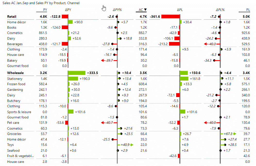
The reordering is very flexible and intuitive. Your custom column order is preserved even after you resize your table. Some detail, particularly charts, might get converted into numbers to save space and retain readability, however, the information itself is not removed and stays front and center. This feature is great for scaling your stories from beautiful, highly visual full-screen power bi dashboards to extremely compact, mobile-friendly reports and everything in between ... with a simple resize action

Use this feature to add a new level of flexibility to your IBCS-compliant reports and dashboards. Our visuals now support virtually any customization you might need to create powerful and convincing data stories.
Focus on the most important things
[Tweet "Top/bottom N feature shows just the most significant items and reduces the visual clutter."]
To make a point, sometimes you just want to show the most significant items and reduce the visual clutter. To help you do just that, we've added the Top/bottom N feature to our waterfall charts. Once you toggle the option On, you simply select the number of top or bottom values you want to display and the chart adjusts automatically.
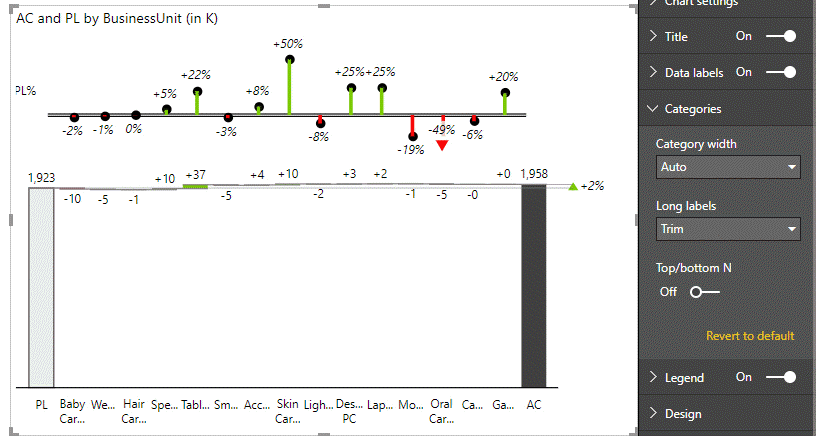
How to use this option? Once you have your waterfall chart, click the Format tab in the Visualizations pane. Open the Categories group and toggle the Top/Bottom N switch into the On position. Afterwards, you can set the number of items that need to be shown. Other items are merged into a single group named Other.
This feature helps you focus on the most important data points while reducing visual density to improve chart readability.
Automated data labelling
[Tweet "Everyone hates it when the labels on their charts overlap & ruin an otherwise perfect visual. Automated data labelling is the answer. "]
Everyone hates it when the labels on their charts overlap and ruin an otherwise perfect visual. We've added an advanced algorithm to Zebra BI PowerCharts to prevent this. When you are working with a narrow chart that cannot accommodate all the labels, the visual will hide them automatically. Labels appear again once you resize the chart or switch to the Focus mode. This ensures optimal label density depending on your context and situation.
To turn this feature on, select your chart and click the Format tab in the Visualizations pane. Open the Data labels group and select Auto from the Density dropdown menu.
Small multiples that combine chart types
Small multiples mode now supports charts combining multiple chart types (bar and lollipop, for example). To use this feature, select your chart and click the Format tab in the Visualizations pane. Open the Chart Settings group and select either "Absolute / Relative", "Actual / Absolute" or "Actual / Relative" from the Layout dropdown menu.
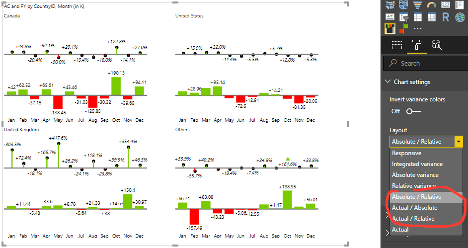
At the same time, we've added the Top N + Others option to the small multiple mode. It works similar to the feature described above by showing only the most important charts and combining the others into a single chart named Other.
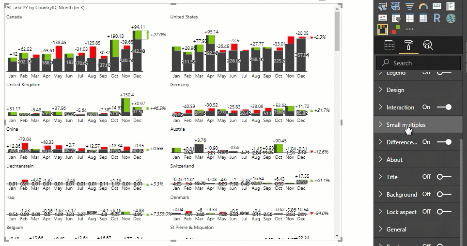
To use this feature, select your chart and click the Format tab in the Visualizations pane. Open the Small multiples group and select an item from the Top N dropdown menu. Then, set the number of items you want to have shown.
Break the axis in line and area charts
[Tweet "To track a difference in a KPI that has very small variations, you can now break the axis in line and area charts to emphasize the changes."]
Sometimes you want to track a difference in a KPI that has very small variations, you can now break the axis in line and area charts to emphasize otherwise minor variances. The feature works on individual charts as well as small multiples.
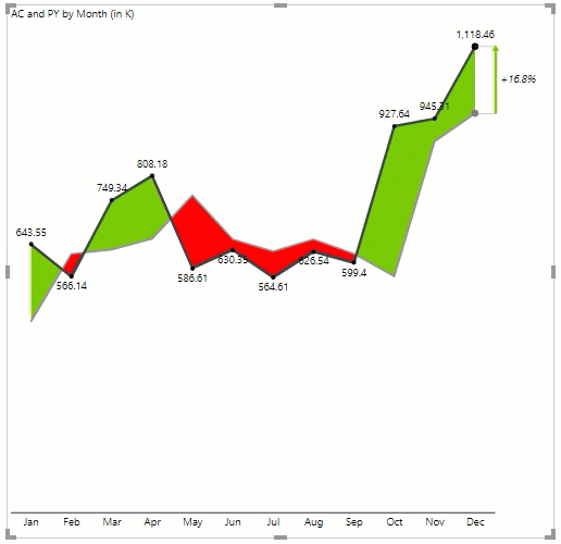
Our advice is to be careful with this feature because it artificially emphasizes differences where there might not be any. However, you might find this feature useful if you want to focus on the trend of a variance or a similar feature of your data.
You can find the axis break option in the Format tab in the Visualizations pane under the Axis break group. Turn the feature on with the toggle and set the Percent value - lower values might result in a better display of very low data labels.
Make sure you download the free trial!
In addition to out-of-the-box support for IBCS standards, Zebra BI visuals for Power BI feature 1-click data sorting, powerful outlier handling, advanced small multiples, responsive visuals, improved navigation, and full customization. With support for Power BI, best practice reporting is now available on the desktop and mobile and in the cloud.
Great Visuals! Thanks for the hard work developing them!
Cristian hi, thank you so much! It is by far the greatest reward for us, getting feedback from our users, knowing that our efforts really matter. If there is anything you would like to ask us, don't hesitate, we are here for you. Have a great day 🙂