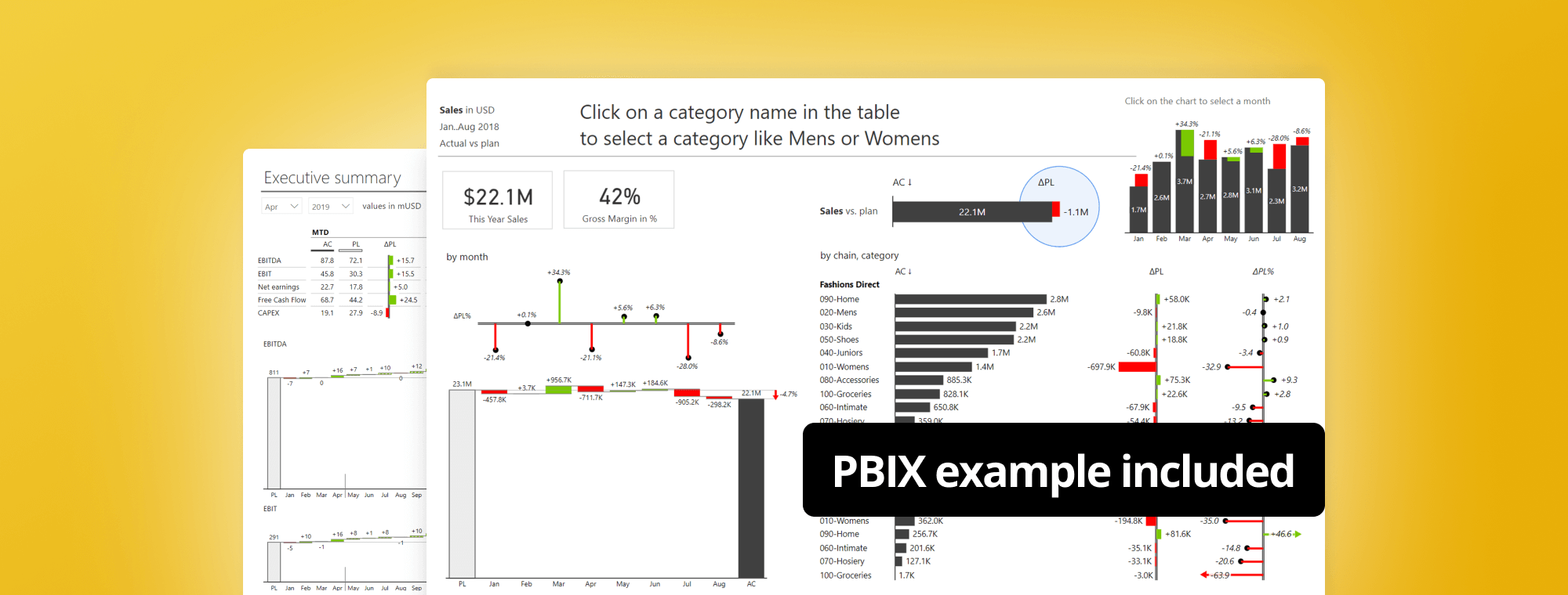
Get follow-along PBIX example
If you'd like to try all of this yourself, enter your data below to get immediate access to the full 1-hour video recording of the webinar and all PBIX examples used in the this tutorial.
As a business analyst, you need more than just basic knowledge of building financial reports, whether it's in Power BI or another software.
Below you'll learn about the best practices that are being successfully adopted by the world's top companies.
You will learn the tricks to create attractive and insightful financial reports. We will look at Sales vs. plan performance dashboards, cost vs. budget analyses, income statements and forecasts.
Note: This tutorial is based on our 1-hour webinar on the same topic. If you prefer to watch the video, scroll to the bottom of this tutorial, enter your details and we'll send you the webinar recording and all PBIX examples to go along with it.
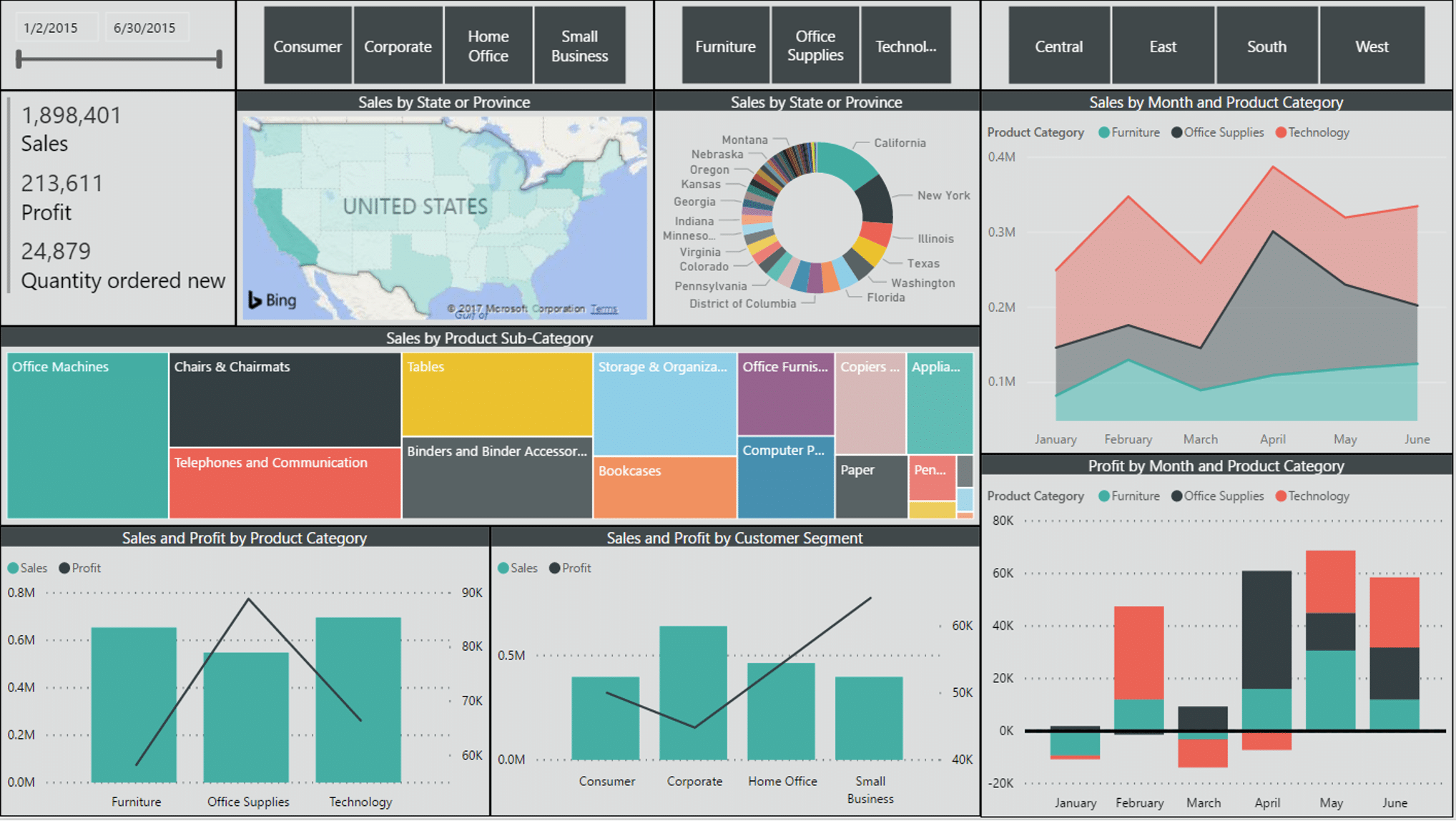
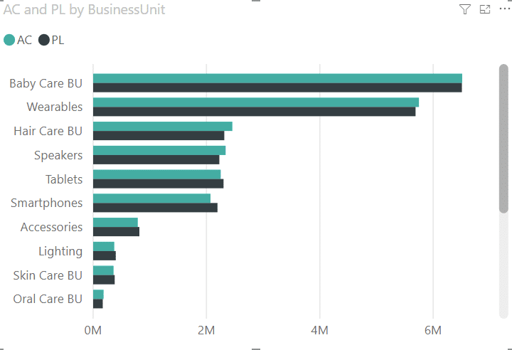
You're probably often dealing with similar datasets like the one below. This is a typical sales dashboard with a dataset that includes different dimensions and data fields. You can see things like the breakdown of sales by geography and by time, indicating there's a calendar behind in this model. There are also product categories, product sub-categories, products, customers, customer segments and other elements.
So, it's a typical sales dashboard above, but does it really get the message across? Is it understandable? Is it actionable? Can you answer certain basic questions about the sales performance? The first very trivial question, is my sales performance good or bad?
It's hard to say, despite having all the breakdowns by geography, by product categories and more. A chart like this makes it essentially impossible to answer a very simple business question. Why? The key problem here is that there's no comparison to previous year, nor comparison to plan. There is no context of the sales here. So, if you cannot observe the variances, if you cannot really compare the categories in your data, and if you can't do this in a simple visual way, then your dashboards will fail.
Second question: How good or how bad? Are my sales on target? Above target? Again, I don't know.
Third, why is the sales performance as it is? Difficult to tell.
And the final, perhaps the most important question, "What are we going to do about it?" This dashboard contains no actionable information that will tell you that you're 30 percent below the plan what are the reasons and where you should focus your attention on that and this is what you should do about it.
So, these are the key four questions that are like a litmus test for your dashboards and reports. Your reports are understandable and actionable when you can answer these four questions fast for any report or dashboard page.
The 4 questions you should ask yourself for any dashboard or report page:
In order for you to answer these 4 questions, you need to equip yourself with proper tools that every business analyst should add to the business analyst's toolbox. These tools include, in no particular order:
Power BI has a lot of visuals. It has everything from pie charts to treemaps, map visualizations, clustered column charts, etc. However, it does not offer advanced business charts - charts where you can compare actual to plan or actual to forecast or actual to previous year, all of which are a basic requirement in any business analysis.
Most of the advanced charts will enable you to perform variance analysis. Clear and understandable variance analysis is probably one half of every business dashboard or a report that you're creating.
You may also have the need for more advanced filtering. You can filter, for example, the top five elements by value in Power BI, but you can't really do things like Top N + Others. This feature allows you to set the number of top elements you want to display along with the element called "Others", which will combine all remaining elements into a single one. This is an important little tool that you should deploy in your dashboards, but it's really hard to do in Power BI. It takes some more advanced DAX that you have to build into your model in Power BI in order to deliver that.
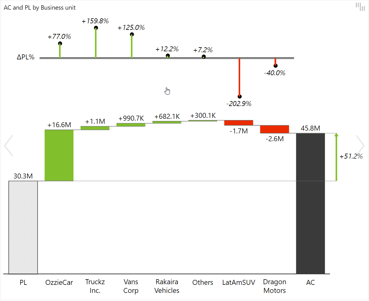
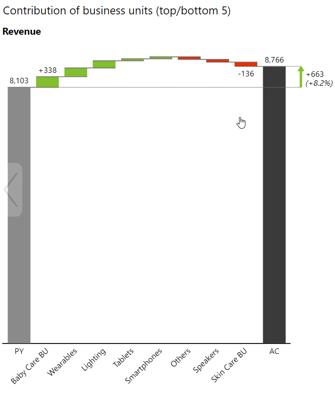
We'll talk about waterfall charts, especially bridge charts with Top N, where you're not just shoving all of your data at once. You can actually ensure you're only rendering the most important changes, the most important elements that contributed either positively or negatively to your total result. A good bridge chart with Top N elements, either positive or negative, is a great business analysis tool in Power BI dashboards and reports.
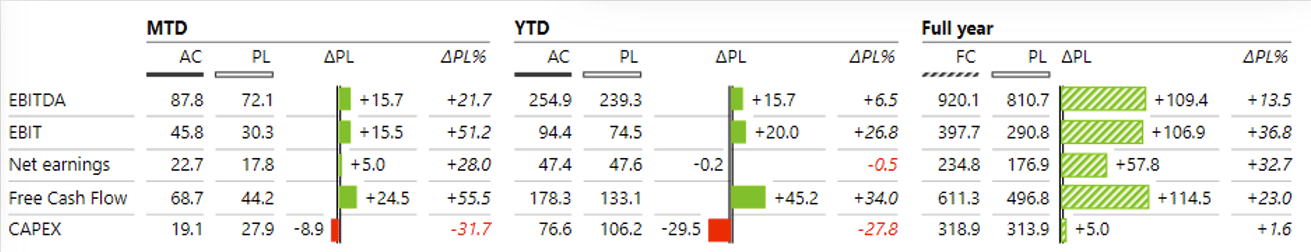
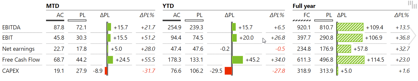
What a serious business analyst needs aren't just simple basic tables or metrics in Power BI, but clear tables with variances and several groups. For example, first, you should present monthly results or month-to-date results for a particular period, then the next group for year-to-date results and another group at the end, where you're presenting full-year results. In the full-year results, you should also present forecast vs. plan, whereas in the current period you're probably presenting actuals versus plan.
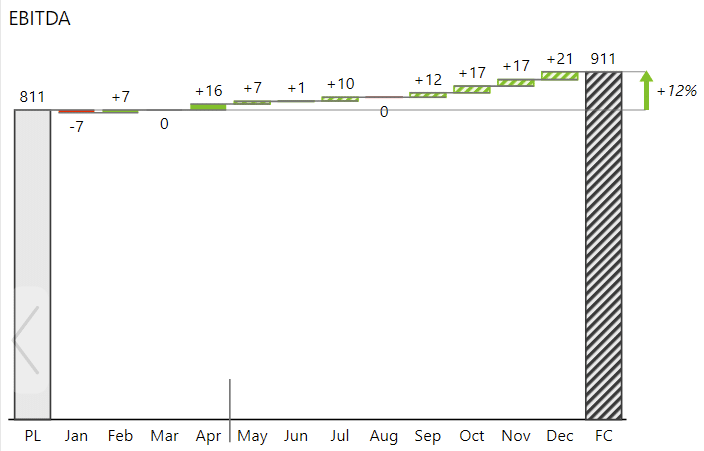
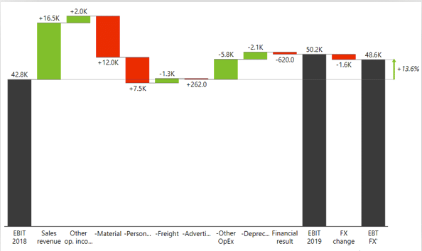
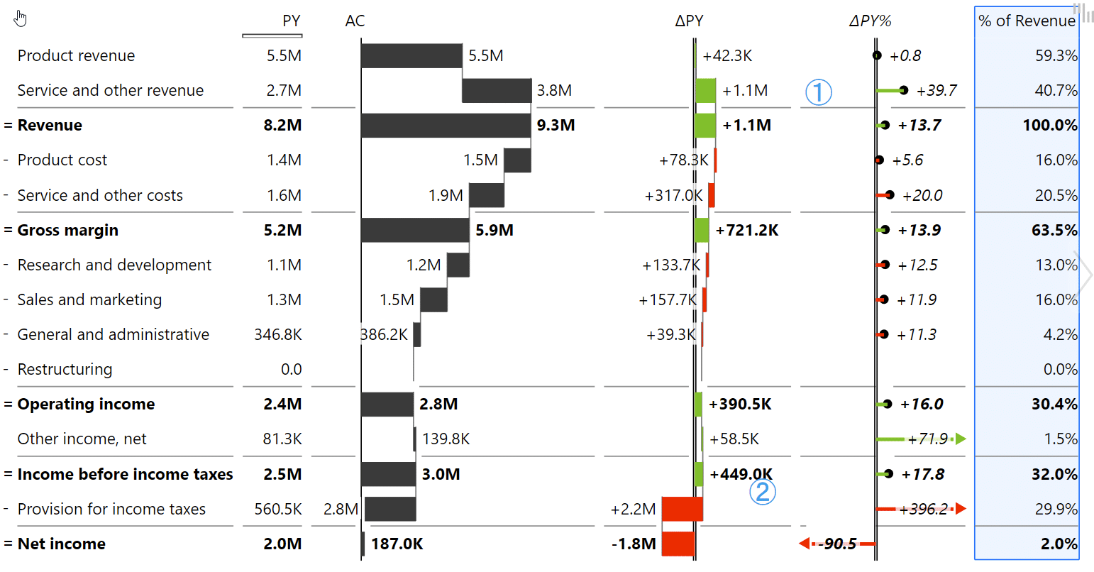
This is especially useful when you need to create an intermediate result within your chart before the final result. This chart helps you show the difference and explain how a certain value changes and what are the causes for that specific change. This is particularly useful with EBIT and EBITDA. To do this, you need waterfall charts with subtotals and a very flexible way to present and calculate them.
Too often in Power BI and other tools, the business performance analysis is focusing on data already in the past. But we forget that in reporting, we should also look into the future and trying to determine what is going to happen? That's why it's wise that you bring your forecast estimations, latest estimates, into Power BI, and to present them very clearly in your reports and dashboards.
If you're presenting income statements, P&L's or similar calculations, then you need additional tools like vertical waterfall charts that we call calculation charts. These can be quite challenging because P&L's and income statements have mixed datasets consisting of positive KPIs, such as revenue, and negative KPIs, like costs, expenses, that need to be subtracted. This is complicated on its own but can get very complex very quickly if you decide to add things like subtotals.
To learn more about creating income statements in Power BI, here's our Definitive Guide to Income Statements in Power BI.
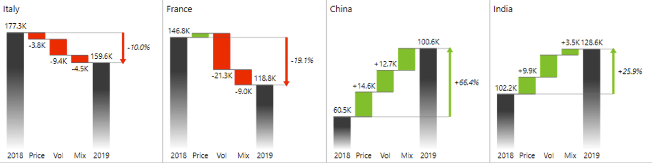
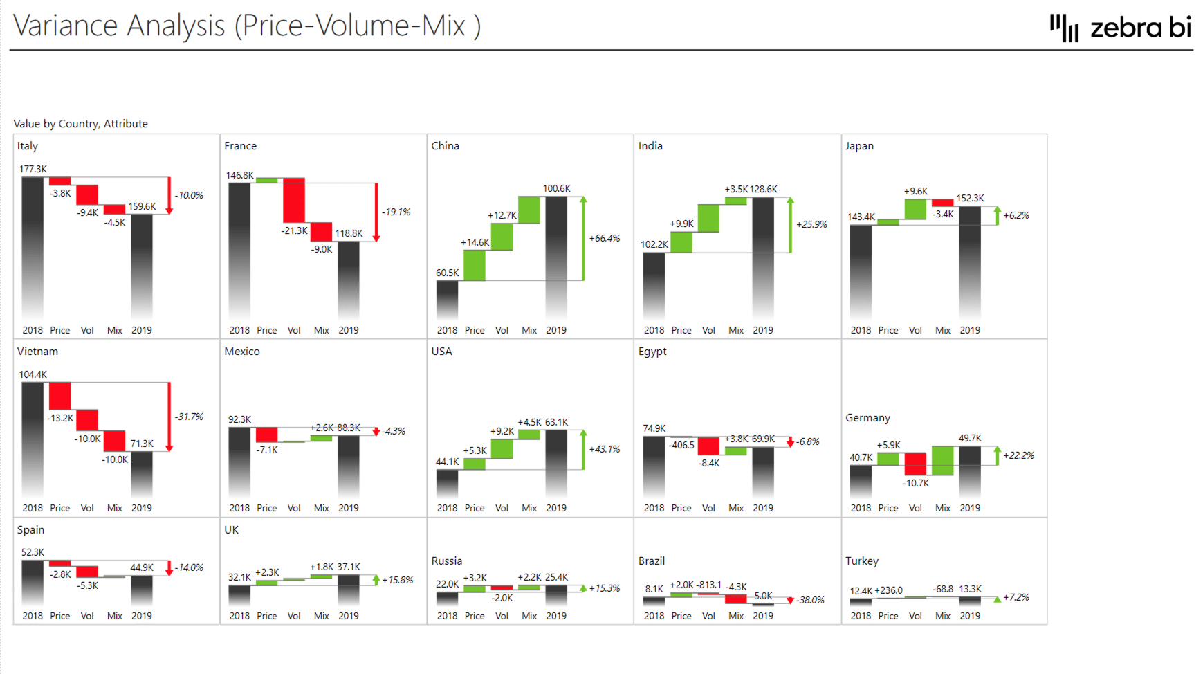
Variance analysis is one of the most fundamental and decisive tasks of every business analyst. PVM variance analysis allows you to calculate how the changes in your product price volume and mix affect your revenues. You can use this analysis for individual segments or categories within your company.
To learn more about price-volume-mix variance analysis, refer to our tutorial here: Price Volume Mix Analysis: how to do it in Power BI and Excel.
As a business analyst, you are always challenged by how much data and how many visuals should you insert into a report. Add too much and the end-user won't be able to make head or tail out of it. Add too little, and you might miss crucial information to act upon. So how do you strike that balance?
One method to both present more information and improve insight is called small multiples. This allows you to display more charts within a single visual and increase information density.
If you'd like to learn more about small multiples, read our extended tutorial here: Supercharge Your Power BI Dashboards with Small Multiples.
In this article, we presume that you, as a business analyst, already have some basic understanding of Power BI. But if you are just getting started or if you would like to become more proficient with Power BI first, you can check out our knowledge base that contains informative articles, videos and examples for Power BI.
To better showcase the impact of each tool, we'll be working with Zebra BI visuals. Most, if not all, of these examples, can be recreated with native Power BI visuals and you can download a free version of Zebra BI Charts and Tables from Appsource or directly from Power BI.
If you'd like to know more about how Zebra BI makes Power BI better, read this: Why add Zebra BI visuals to Power BI?
We will start with a combination of tables and charts showing sales by business units.
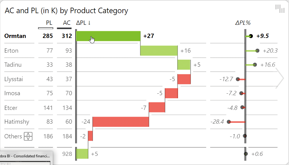
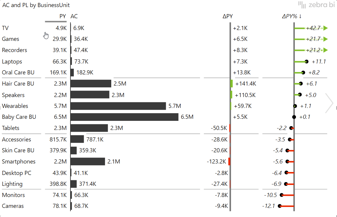
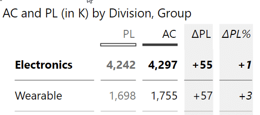
A basic example of variance analysis would be comparing Actual to Plan values, and the easiest solution would be simply placing the columns of those values next to each other and call it a day. The problem with those basic side-by-side charts is that you are not explicitly visualizing the gaps. While it's important to show individual values so the end users understand which is the largest business unit and how others compare to it, you must also display the gap between values. Only then can you answer basic questions, such as whether you are achieving your plan. That is something that's really hard to do if you just have two different colored bars standing next to each other.
If you switch the chart to Zebra BI Tables, it automatically calculates and creates variances for you. Even more, the visual responds to the space available and adapts the information displayed accordingly.
The great thing about having your variances shown is that you can sort by them to quickly identify the best and worst performing business groups.
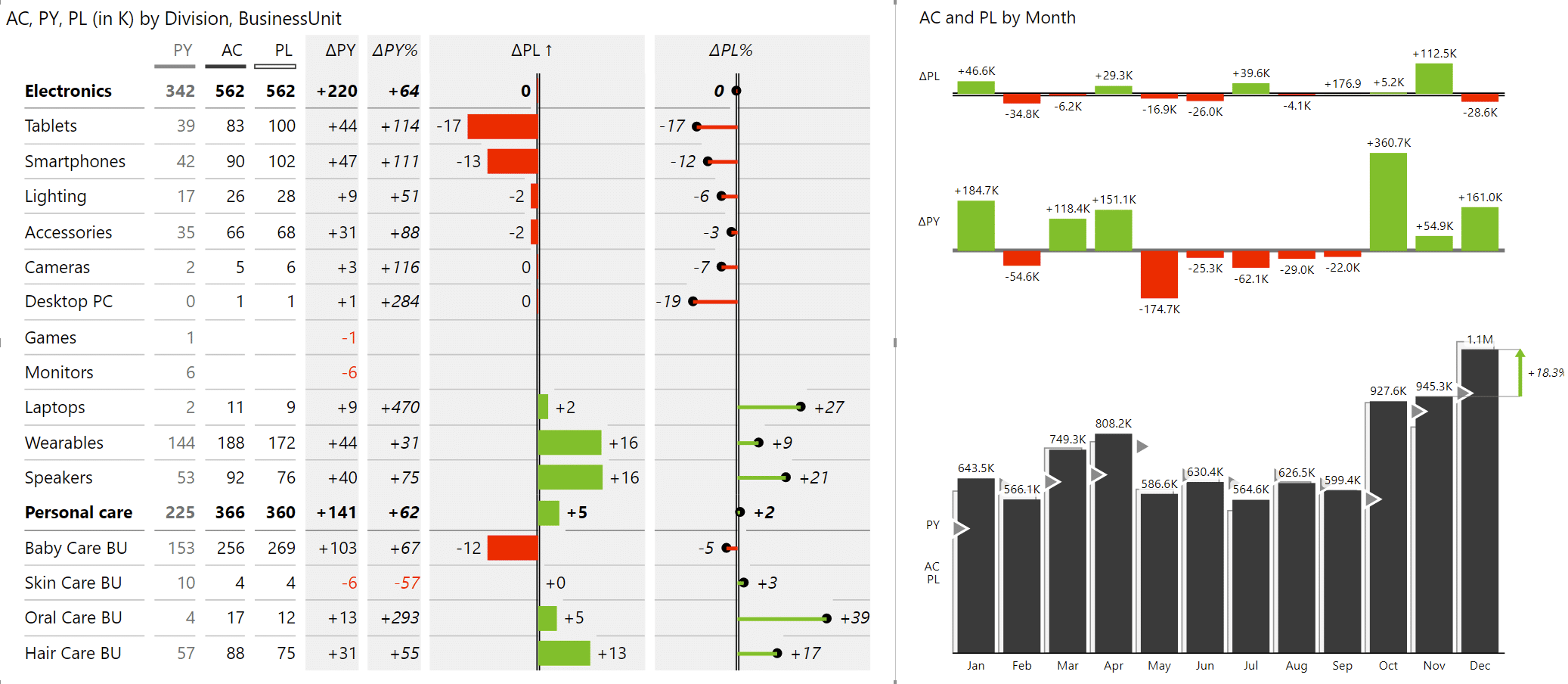
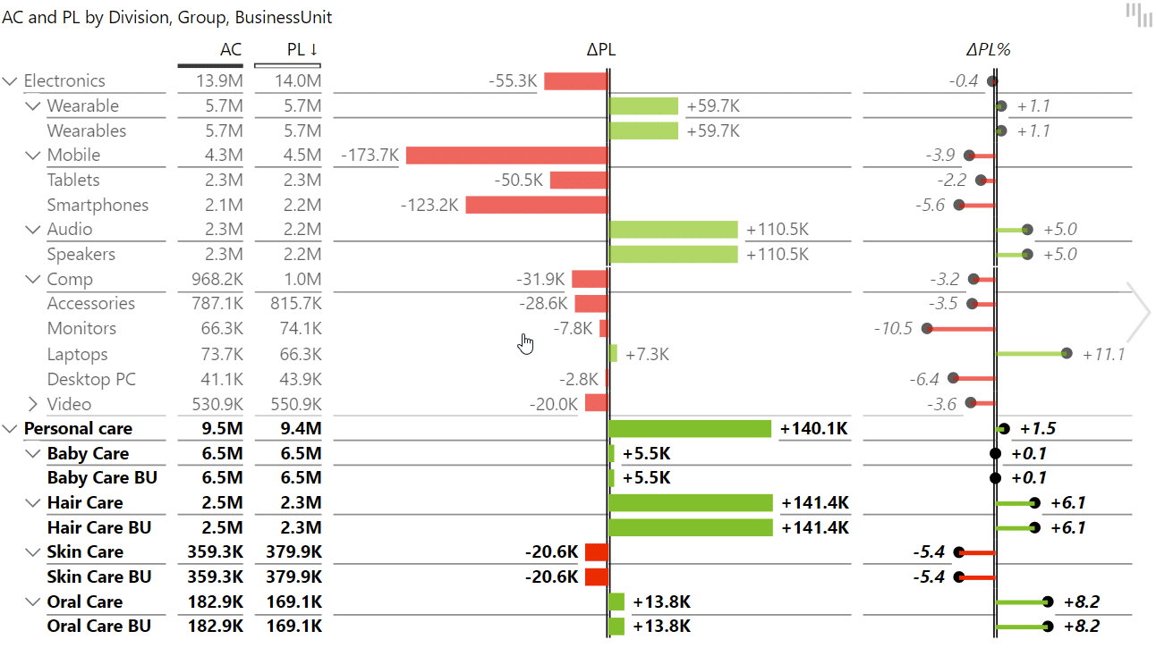
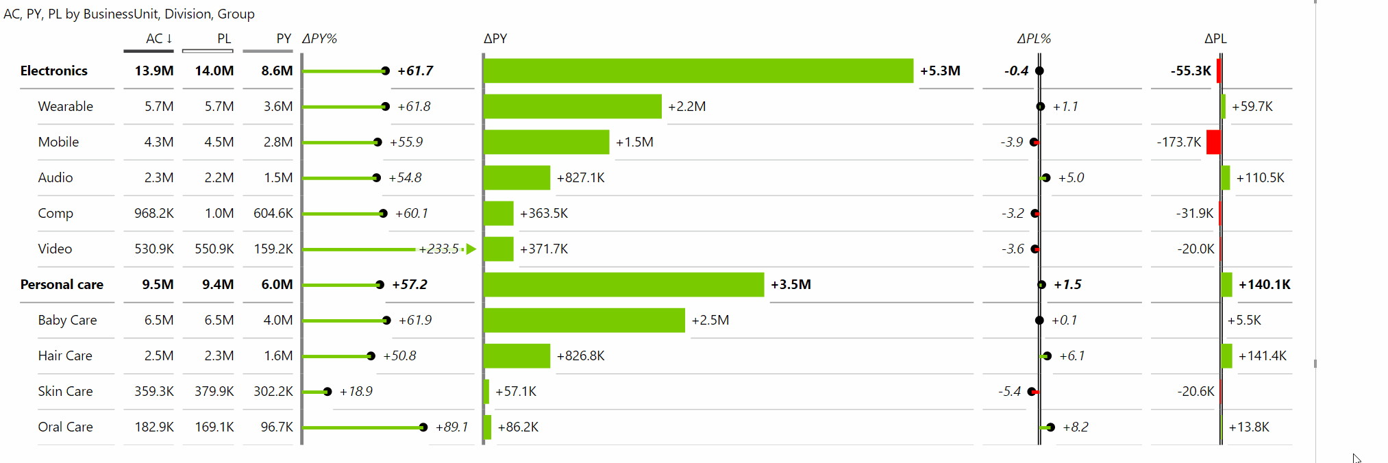
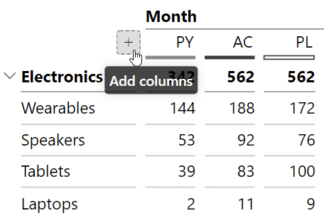
Another thing you would typically do in a table is to build a hierarchy by adding multiple fields into a Category. The users will be able to expand and collapse the tables to get to the details. This allows you to group your results into different subgroups. For example, you might have two groups - Personal care and Electronics, where each has individual divisions, such as Mobile, Video and Computers. The Mobile group consists of tablets and smartphones.
Tip: expose the first two levels in the initial view by default. From here, the user can simply click to drill-down to get into the details.
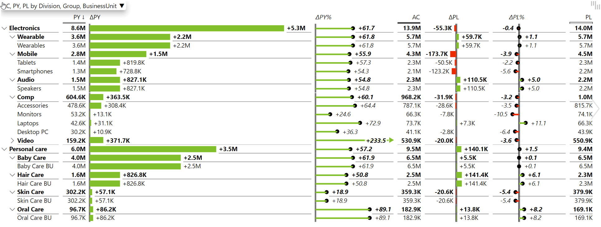
The next thing in a typical table-based report would be creating multiple comparisons. like a comparison to Previous year alongside the comparison to Plan. You then get more columns that you can arrange according to your preferred pattern, like first putting comparison to Previous year before the Actual value, followed by comparison to Plan. Or you can place absolute values, followed by absolute variances and relative variances. In the end, the main goal is to make it as clear as possible and for it to fit your column-structure standard.
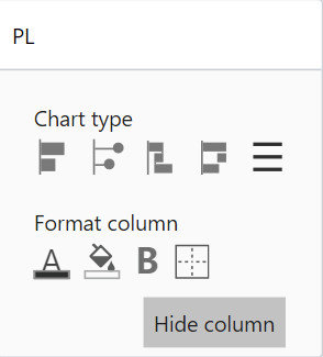
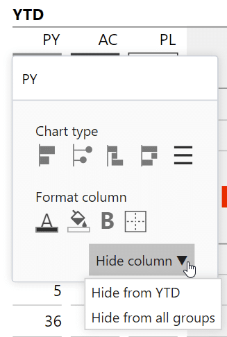
Now the only thing left is to polish the design of your tables. In Zebra BI you can switch the visualization in each individual column, for example changing the format from bars into a simple value column with numbers. Sometimes you can even hide certain columns if you don't need all the measures in your tables. Simply click on the column heading and select the Hide column option. This way, you keep the data within the table, you just decide to not show it.
With tables, it's important that they are readable, so you need to make sure you have enough space for the charts and other data. So one of the many things in Zebra BI, that will help you control this experience, is responsive visualization. It means that depending on the size of the visual, the program will adapt the number of values shown and how they are displayed.
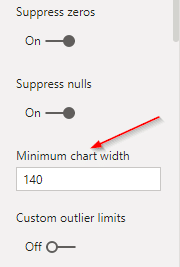
You can adjust the Minimum chart width value in the Chart settings section to determine at which point the data is still being rendered before it collapses or changes format to better adapt to the new size. Just be careful to not make it too small or the charts will look too squeezed together. Like with everything, you need to strike the right balance.
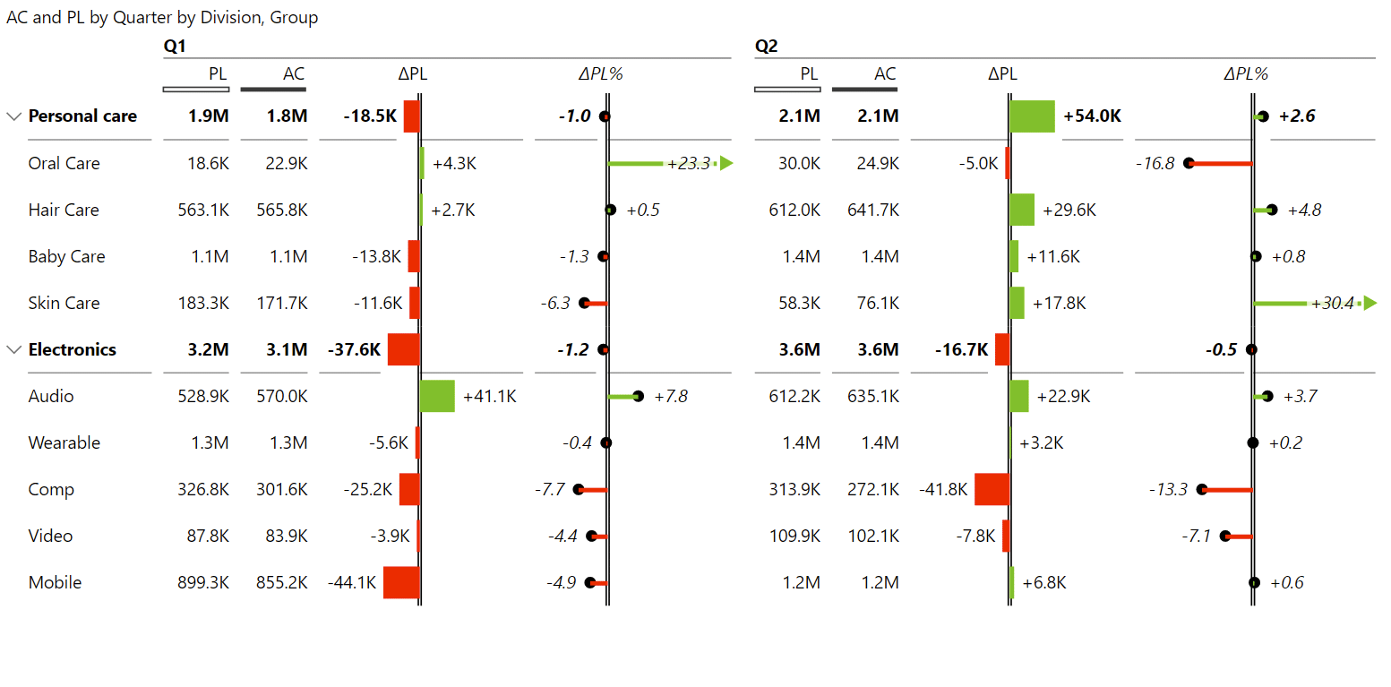
Another feature to further customize your tables is the Group functionality. For example, you can use it to show both year-to-date and monthly results in the same visual. In our example, we insert our Period calculation field into the Group placeholder. Period calculation is the data field that contains all the period options. This is much faster than having a lot of separate visuals to present fresh information since Power BI now only triggers one query.

Similarly, instead of using month versus year-to-date values in your tables, you could just insert certain elements from your calendar dimension for a different view of your data.
If you have well-prepared calendar information then you can, for example, take your Quarters field and insert it into the Group placeholder to analyse your data by quarters. A word of caution, though: if you put too many elements in your columns you will have too much information. It is important to keep things clean and not waste unnecessary space with unnecessary information.
A good way to save space is to ensure a clean display of data labels. For example, most of your values could be in thousands, so zeros or the letter K are displayed across your table. Instead, just use Zebra BI to display the letter K in the title. The result? The entire visual is more legible and easier on the eyes. The columns are narrower and you can present more information. In business reporting, you will often present data in thousands, millions, billions, etc. So always keep the labels in mind.
This setting is in the Data labels pane in the "Show units in" field.
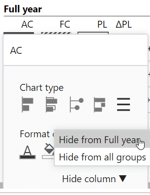
With Zebra BI you can show the Grand Total of the full year with just one click. You can do that with the + icon where you can add additional columns.
The feature is fully customizable. You can change the names of columns directly inside the visual or hide the columns you don't need. When hiding columns, you have granular control over whether to hide it in a single group or across all groups (see image below). To unhide it, click on the + icon again and a list of all hidden columns will appear, along with the one you seek. Click on the name of the column and it will appear once again within your table.
The next stage would be to also build a hierarchy in your groups. This is possible in Power BI because of the multilevel grouping. For example, if you add the month data under the quarters within the Group field, you'll then also show months aggregated to the quarters.
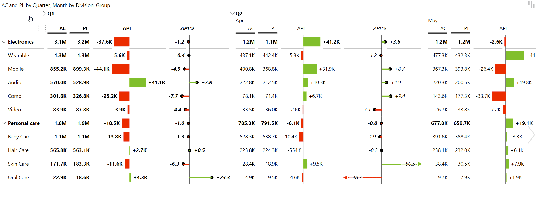
To do this, just add Quarter and Month measures to your Group placeholder.
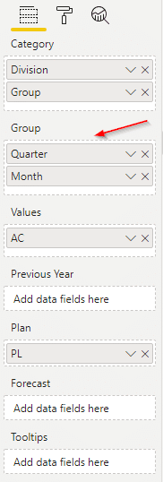
You can then collapse these quarters and only show the last one or the one which concerns you the most.
Whenever you have a hierarchy of at least two levels in the Zebra BI table, then you can also show the subtotal. Here, the subtotal is just the result for the one quarter, which is then displayed along the months.
What if you want to show relative variance as a percentage of the plan instead of the increase/decrease in the plan? For example, instead of showing the value to be -9% below the plan, you present it as 91% of the plan instead. Some specific cases require you to use such notation, especially in project management. While there's no specific function for that, you can add your own custom index. You calculate your index and then just put it into the Values placeholder in Power BI, and it will appear as an additional measure. This is what we call custom calculated columns. It will appear as a distinct measure.
To see how this works, you can open our Zebra BI - Income statements Power BI file that's included with downloads at the bottom of this tutorial.
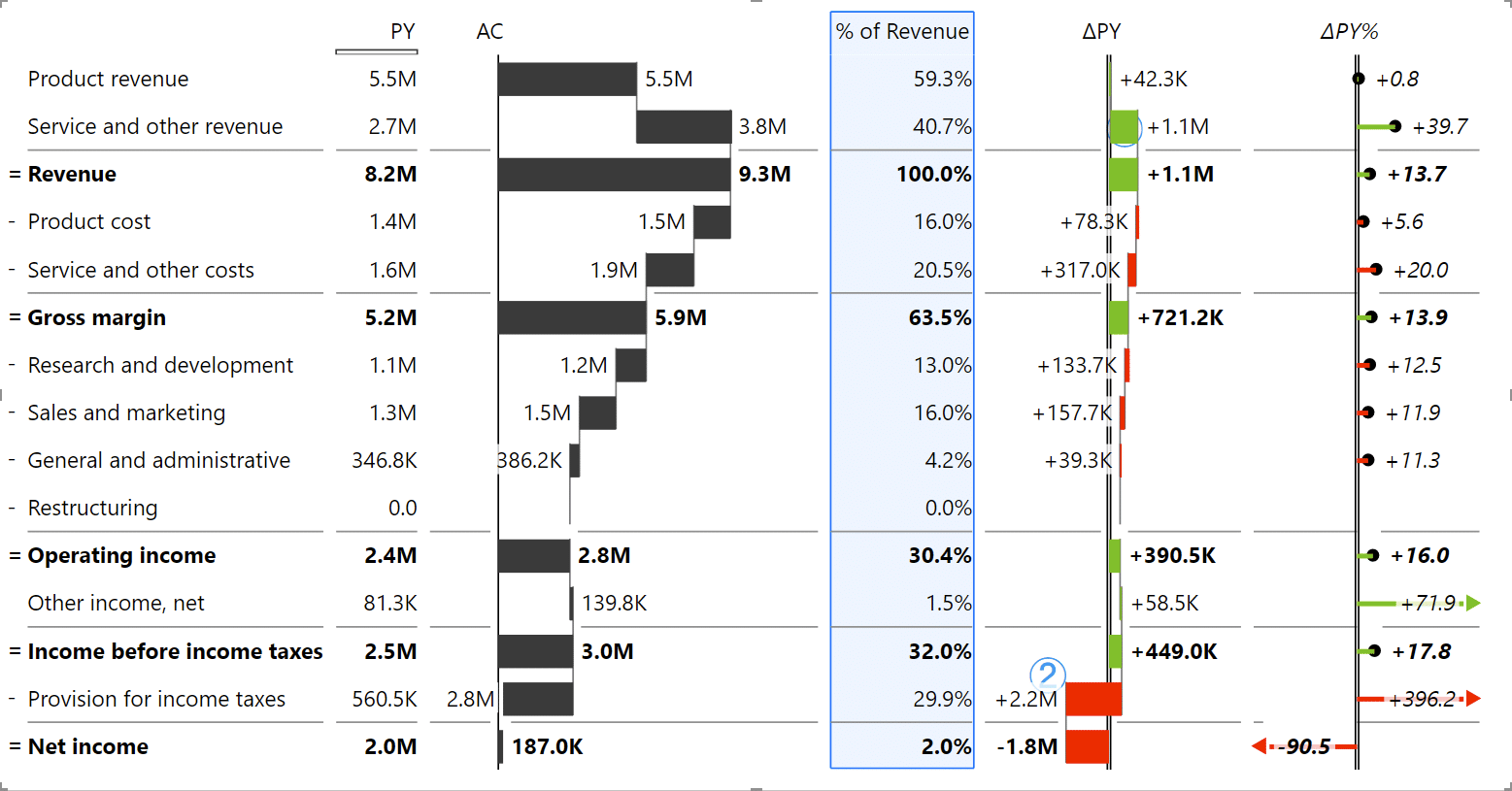
Below is a typical example of an income statement with previous year, actuals, and variances. But to finish the report, we would also like to add the percentage of revenue, which you can calculate using DAX. You can download our PBIX file and try it for yourself.
If you'd like to learn more about data modeling in Power BI, here's our tutorial: Top 5 Power BI DAX tricks for super effective Power BI dashboards.

Once you calculate it (it's already included in our sample file), take this new measure and place it in the Values placeholder, below the AC value. Now it just acts like any other column which you can then rename and move around. You can also further format each column by giving it a border or a background color. In the end, the P&L report should look something like this:
Zebra BI tables allow you to design two views. The first view is what we call the chart view, which is more visual. The second one is called table view that provides more numbers and other data. In this way, end users can first focus their attention on the most important information, like the variances, and then read the full tables and numbers they need.

This is a great compromise; show the visual design first, with fewer columns, but still, have access to all values with one click. This easy-to-access change of information by chart slider is one of the best practices you can apply to your own reports.
Let's talk about chart types and the various analyses you can do with your visuals. Compared with tables, charts are more often used when you have a breakdown by month or work with a time component. Time should run left to right, so whenever you have a time series, use charts with a horizontal axis.
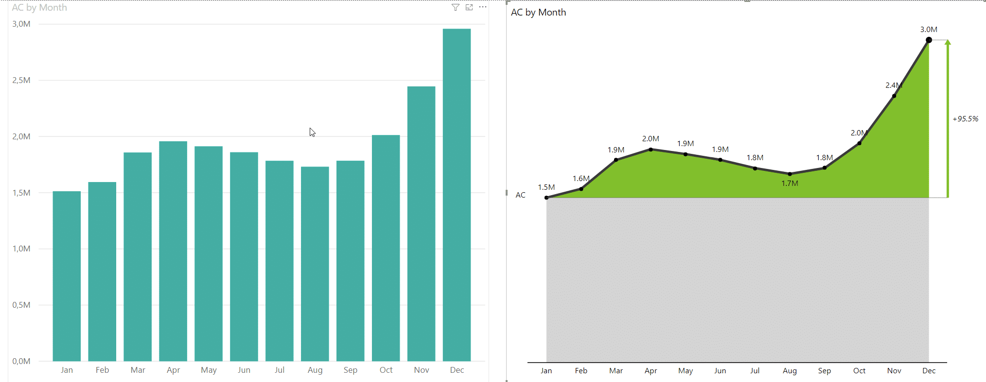
When it comes to presenting single measures, native Power BI does its job well enough. Typical examples include market share, HR reports and simple dashboards presenting data within a certain time frame. But even then, you can do something like show the comparison to the first point in the chart. Zebra BI Charts in this case offer you multiple options to showcase your data and focus on what is most important.
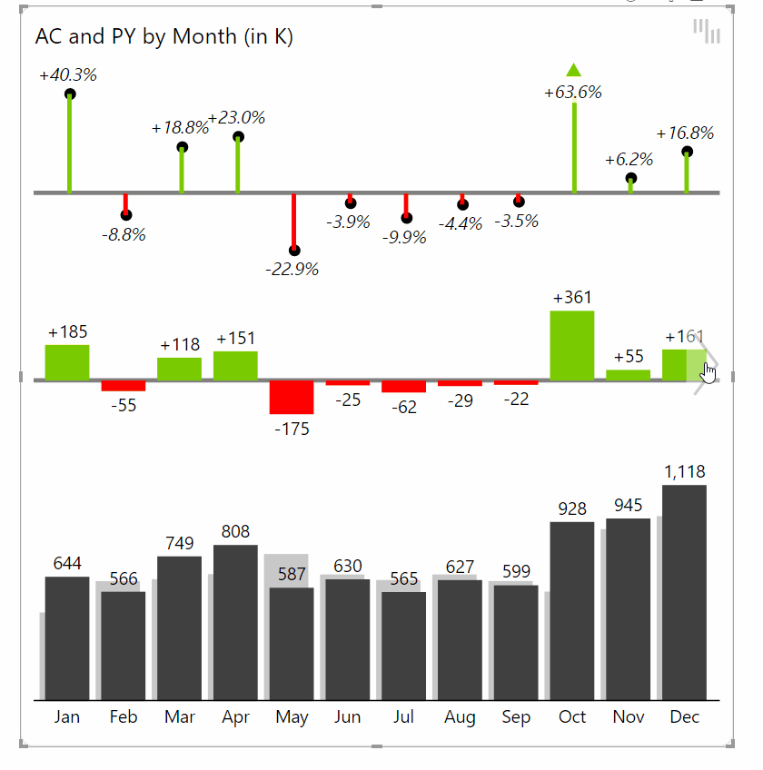
But where native Power BI falls behind is with multiple measures. A typical example is a comparison between Actuals and previous year. By default, Power BI neither visualizes the gap between the measures nor adds any additional labels. You would then need to fiddle around with the settings, but even if you would manage to get the right labels and other elements in place, this will still be just a normal side-by-side chart.
Below is a typical example made with Zebra BI Charts. It's the basic waterfall (bridge) chart, where you have the totals for the previous year and for actual. On the right is the growth rate compared to the previous year, which is already calculated. All the elements are completely interactive, so if you click on the growth rate label, you can choose to show absolute variance, relative variance, or both.
You can also cut the axis to zoom into the variances if you want for people to just focus on the variance. Additionally, you can choose in the settings how much you break the axis.
What does that mean? The percentage shows how much of the total value you are showing. So if you set it 50%, you'll only show the upper half with the variances, while everything else will be below the chart.
Tip: if you want to show just the variances, cut the axis to 100%.

Zebra BI offers several useful charts in addition to the waterfall chart, including a bar chart with variances, area charts and line charts.
The great thing about these visuals is that they have smart responsiveness built in. Take the bar visual, which starts with the bars for values and two additional charts for absolute and relative variances. If you shrink it, separate charts for variances are removed and integrated into bar charts. This is what we call integrated variance charts. Of course, when you resize them back up, additional charts appear again.

However, you can always set the chart responsiveness manually. You might not want the responsive chart in your dashboard, so just open Chart settings and set the Layout from Responsive to another option, such as Integrated variance or Absolute Variance or similar.
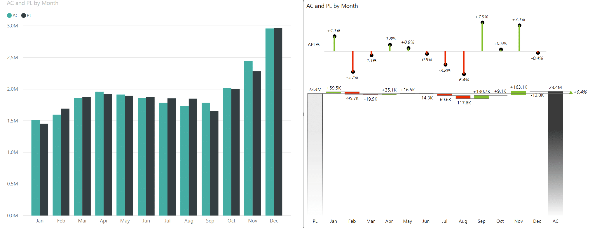
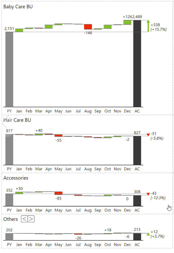
Now that we have a great looking chart with variances between actual results and previous year results, we want to analyze data by groups. With default charts in Power BI, that's almost impossible to do elegantly. You have to fiddle around with drill-downs and barely intelligible charts that tell you very little.
In Zebra BI, you can use scaled small multiples. Small multiples is a visualization method that puts all charts of different categories on a single page and scales them so that you can easily see which ones are the most important and analyze the trends.
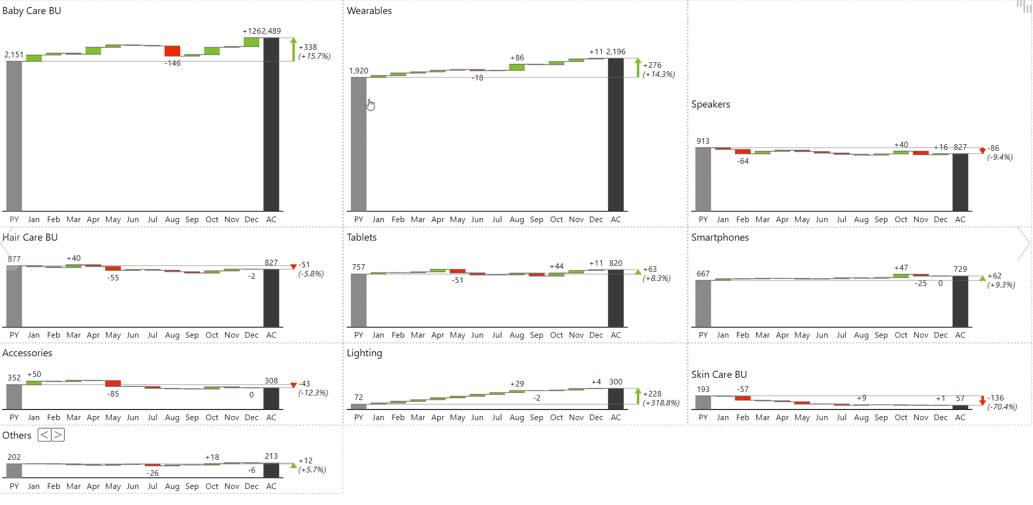
You can easily see that the Skin care business unit is the least important. If you do want to review it, you simply click that part of the visual and it opens up as a full chart that's easier to analyze. It's a great way to first look at the forest and then look at every individual tree.
When working with small multiples you have to clean things up a little, so they are easier to read. This usually means adjusting the Data labels density. For example, you have the setting First, last, min, max, which only displays the first and last values along with the largest and smallest value in between.
Another important feature is the Top N setting. This shows only the categories that have the most impact on your business. In the Visualizations pane, select the small multiples category and enable the Top N feature. Instead of showing 20 business units, it can only display the top 8. But instead of just cutting off the other categories, it bundles them together into the Other category, which is the sum of all other categories.
Zebra BI gives you plenty of control over small multiples. You can set grids, change axis labels, colors. We do recommend that you set the Layout setting to Auto, because it intelligently sets up your small multiples to make the best use of space.
Small multiples also look great on mobile. Zebra BI will automatically adjust them, so you only need to open Mobile layout on your View tab and drag and drop a Zebra BI visual onto your canvas.

You can even change Zebra BI layouts on mobile.
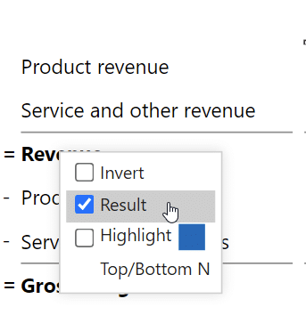
When it comes to business analysis, waterfall charts are very important and sometimes it's nice to be able to have the ability to show subtotals in the chart. For example, when currency fluctuations impact your EBIT, you might want a waterfall chart that shows your EBIT before the impact of currency fluctuations.
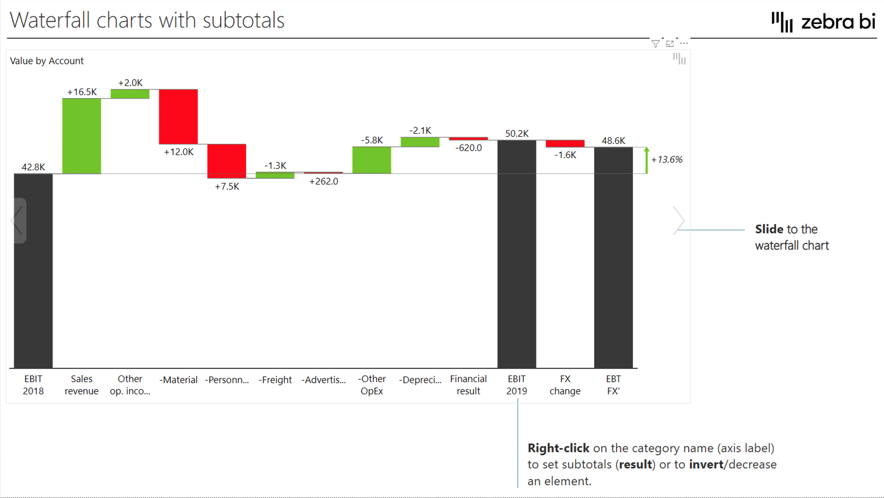
To achieve this, you need to create a table with all of your results already calculated in a simple flat table. Click your chart and set your EBIT elements as results. To do this, right-click on them and mark them as Results. You can then mark any of your elements as results and have complex calculations in your chart.
Waterfall charts can also be used for Price-Volume-Mix analyses, where you can quickly see how price, volume or product mix affect your sales.
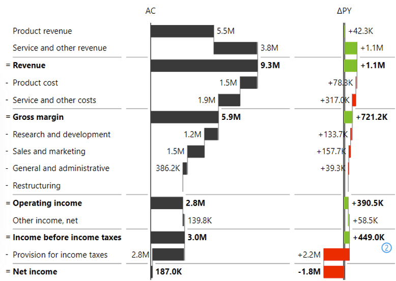
You can do similar things in Zebra BI tables, such as Profit and loss statements and income statements. Let's look at an income statement, where Revenue is the first subtotal of product and service revenue.
This is very easy to do. Just right-click the name and select Result entry from the menu.
When a certain value is a cost, you simply select Invert to show it has a negative contribution to the final result (or subtotal). This is called row-level invert, giving you complete control over individual entries in your dataset.
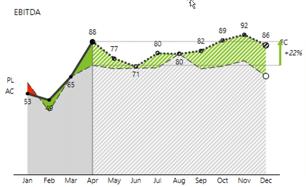
Forecasts come in handy when you want to look at data for the full year before you actually have that data. Instead of comparing actuals to your plan, you need to compare forecast to plan.
The trick is to add all three values to the visual: Actuals, Plan and Forecasts, which you should drop into their respective placeholders. Then you simply click on your visual and hide Actuals from the Full year group of data.
You can also add forecasts to your charts. This will allow you to view actual results up to the current month and then forecasts onward. Like this:
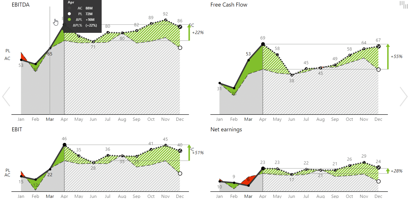
For this to work, fields with actual results in your data need to be empty. Zebra BI will automatically know what to do with it.
If you are a business analyst, this post will surely help you move beyond confusing charts and into a world of intelligible charts that tell a story.
Instead of combing through data, you can use these tips to create reports that pinpoint trends, identify weaknesses and show the strengths.
While Power BI is a powerful tool, it is more powerful with Zebra BI.
With Zebra BI you need very little effort to implement advanced waterfall charts, small multiples and income statements that make sense. Some of these things are much harder or even impossible to do in vanilla Power BI.