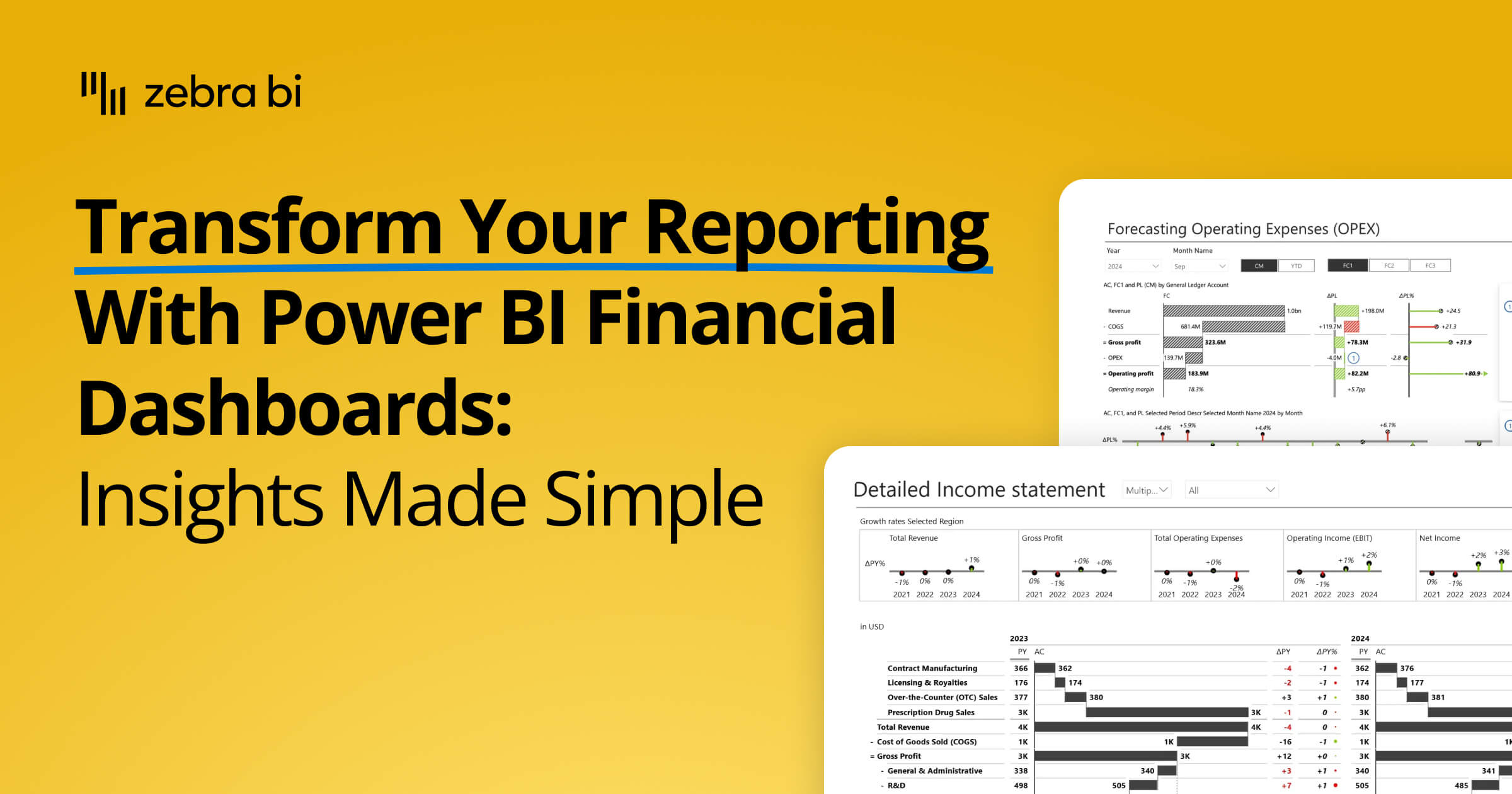
Power BI Financial Dashboard: Examples, KPIs & Free Templates (2026)
PRO Trial
Your financial data has a story to tell - stop hiding it in static rows and columns. Transform your reporting with a Power BI financial dashboard that automates your P&L, tracks real-time variances, and provides the "why" behind your numbers instantly.
This guide explains the essential components of a high-performance financial reporting dashboard, provides real-world examples of P&L and PVM layouts, and offers step-by-step instructions on how to automate your reporting using Zebra BI templates.
What is a Power BI financial dashboard?
A Power BI financial dashboard is an interactive financial reporting dashboard that helps finance teams consolidate, monitor, analyze, and communicate key business metrics in real time.
Built in Microsoft Power BI, these dashboards combine financial data from multiple data sources - ERP systems, accounting software, spreadsheets, and databases - into a single visual environment for reporting and decision-making.
Finance professionals use dashboards to track KPIs such as revenue, operating expenses, EBITDA, cash flow, profitability, plan vs. actual variances, and year-over-year performance.
Unlike static spreadsheets, Power BI dashboards support drill-down analysis, automated refreshes, dynamic filtering, and interactive data exploration.
Why Use Power BI for Your Financial Dashboards?
Modern finance teams need more than static spreadsheets and manually updated reports. A financial reporting dashboard built in Microsoft Power BI gives organizations a centralized, interactive way to monitor performance, analyze trends, and communicate financial results across the business.
Companies use Power BI for financial reporting because it combines data modeling, visualization, automation, and analytics in a single platform. Instead of managing disconnected Excel files and manual reporting cycles, finance teams can connect live data sources, automate refreshes, and deliver real-time insights to executives and stakeholders.
For FP&A teams, controllers, and CFOs, this means faster reporting cycles, more reliable data, and better visibility into key financial KPIs such as revenue, gross profit, operating expenses, EBITDA, cash flow, and budget vs. actual variance.
Excel Cannot Keep Up with Modern Analysis Needs
While Excel remains essential for ad hoc analysis and financial modeling, it is unsuitable for enterprise financial reporting.
As soon as you try to scale up your reporting, you hit upon issues such as version control issues, manual consolidations, broken formulas, and inconsistent formatting.
And then there are the always-present issues of manual work, potential human errors, and sharing difficulties.
Here is how Power BI addresses these shortcomings:
- Centralized and governed data models: Create a single source of truth for financial reporting by consolidating data from different data sources into a single governed model.
- Automated data refreshes: Eliminate manual updates with automated and real-time refreshes that keep dashboards aligned with the latest financial data.
- Interactive drill-down analysis: Allow users to move from high-level KPIs shown in dashboards to transaction-report details.
- Real-time dashboards and KPI tracking: Monitor revenue, cash flow, profitability, operating expenses, and other financial metrics through continuously updated dashboards.
- Standardized reporting across departments: Ensure consistent KPI definitions, report structures, and financial visualizations across finance, operations, and executive teams.
- Collaboration and accessibility: Power BI facilitates seamless collaboration by enabling teams to share and work on dashboards together. To drive even deeper adoption, publish your dashboards across multiple devices, including desktops, tablets, and mobile phones.

Excel is still valuable within finance workflows, but finance dashboards solutions built in Power BI are better suited for recurring management reporting, executive dashboards, and cross-functional financial analysis.
Zebra BI further extends Power BI’s native capabilities with advanced financial visuals designed specifically for variance analysis, P&L reporting, and IBCS-compliant management reporting.
AI Features for Financial Analysis
One of the biggest advantages of Power BI for financial reporting and dashboards is its maturing set of AI-powered capabilities, which are increasingly relevant for finance teams that can use them to explore data faster, identify anomalies, generate insights, and interact with reports using natural language
Finance teams can use AI-powered capabilities to:
- Detect unusual trends and outliers in financial data
- Generate automated summaries and explanations
- Use natural language queries to explore KPIs
- Accelerate DAX and data model development
- Support predictive forecasting and scenario analysis
- Improve productivity when building reports and dashboards
Connect Financial Data from Multiple Sources
A major strength of Microsoft Power BI is its ability to consolidate financial data from multiple business systems into a single financial reporting dashboard.
Finance teams commonly connect Power BI to ERP platforms such as SAP and Oracle, accounting software like QuickBooks and Xero, Microsoft Dynamics 365, SQL databases, Excel workbooks, cloud applications, and enterprise data warehouses.

By centralizing data from multiple sources into a unified semantic model, organizations can create a single source of truth for financial reporting, reduce manual consolidation work, and improve consistency across finance, operations, and executive reporting.
Governance, Security, and Scalability
Financial data requires strict governance, security, and compliance controls, especially in larger organizations processing sensitive financial information.
Microsoft Power BI includes enterprise-grade capabilities such as row-level security (RLS), Microsoft Entra ID integration, role-based permissions, audit logs, usage monitoring, data lineage tracking, and secure sharing through Power BI Service.
These features help organizations maintain control over financial data access while supporting governed self-service reporting across finance teams.
How to Create a Financial Dashboard in Power BI
An actionable financial dashboard in Power BI is about much more than just creating charts and importing data.
Effective financial dashboards require clear reporting objectives, reliable data models, standardized KPI definitions, and visualizations that support decision-makers as they identify trends, risks, and variances.
The process below outlines the key steps for building a scalable and actionable financial dashboard.
1. Define Financial Reporting Goals
Start by identifying the primary purpose of the dashboard and the audience it serves. A balance sheet should be different from a dashboard focused on operational expenses or profit margins. Consider your goals carefully to ensure you deliver an actionable analysis not just data.
Define the business questions the dashboard should answer, target audiences, key KPIs and financial metrics matter and the level of detail that is required.
You don’t want to overwhelm your users with unnecessary data. Clearly defined goals help avoid dashboard clutter and ensure the final financial reporting dashboard focuses on actionable insights.
2. Gather, Validate, and Prepare Financial Data
Financial reporting depends heavily on data quality and this is becoming even more true in the age of AI, where missing data can be falsely interpreted as an anomaly. Before building dashboards, finance teams should consolidate and validate data from ERP systems, accounting platforms, spreadsheets, and operational systems.
Typical data preparation tasks include: data deduplication, standardizing structures, validating currency conversions, mapping cost centers and business units and handling missing or inconsistent values
Where possible, data transformation and cleaning should happen upstream in the BI architecture rather than inside report visuals. This improves report performance, scalability, and long-term maintainability.
3. Connect Power BI to Financial Data Sources
Connect Microsoft Power BI to your systems and data sources. One of the most powerful capabilities of Power BI is its ability to integrate with a wide range of financial and operational platforms, including SAP, Oracle, QuickBooks, Xero, Microsoft Dynamics 365, SQL databases, cloud services, and Excel workbooks.
A centralized connection layer allows organizations to reduce manual reporting work, automate data refreshes, maintain consistent KPI definitions, and create a single source of truth for reporting.
4. Build Financial Data Models
The data model is the cornerstone of every Power BI dashboard finance solution. A well-designed model enables accurate calculations, smoother analysis, faster performance, and improved efficiency.
Poor data modeling often leads to slow reports, inconsistent calculations, and difficult maintenance. Investing time in a scalable semantic model significantly improves dashboard quality and usability.
5. Create Financial Visualizations
Once you have your models ready, start building visualizations that communicate financial performance clearly and consistently.
Power BI offers a wide array of visual tools, including charts, graphs, tables, and matrices, to help businesses present financial data in an engaging way. These visuals enable you to spot trends, analyze performance, and communicate insights effectively to stakeholders.
You can use a range of different visualizations, including waterfall and bridge charts to visualize contributions, small multiples for dense and actionable data storytelling and variance analysis to understand your performance against prior years and plans.
This is where many organizations encounter limitations with native Power BI visuals, especially for financial statements and management reporting layouts. Zebra BI helps address these challenges with purpose-built visuals for variance reporting, waterfall analysis, dynamic commentary, and IBCS-style financial reporting.
Keep in mind that dashboards are not about stuffing as many different charts on a single page. Instead, consider the most appropriate visuals to tell your story and drive decisions.
6. Improve Usability with Interactivity and Consistent Design
Effective dashboards combine analytical depth with intuitive navigation. Features such as slicers, drill-throughs, bookmarks, tooltips, and dynamic filtering help users explore financial data without overwhelming the interface.
Consistent formatting is equally important. Standardized layouts, color semantics, variance indicators, and visual hierarchies make reports easier to interpret and reduce cognitive load for executives and finance teams. IBCS is a standard that ensures your visuals are easy to understand and share across teams.
7. Publish and Govern Securely
After testing and validation, publish the dashboard through Power BI Service and configure sharing, governance, and security settings.
Organizations should define:
- User access permissions
- Row-level security rules
- Data refresh schedules
- Distribution processes
- Certification and governance policies
This ensures stakeholders can access accurate and secure financial reporting dashboards while maintaining compliance and governance standards.
Key KPIs For Every Power BI Finance Dashboard
An effective Power BI financial dashboard solution focuses on the KPIs that clearly indicate whether the organization is meeting its strategic goals.
Here are some of the most commonly used KPIs that you can choose between based on your goals and target audiences.
Core Profitability Metrics
These are the top-line and bottom-line figures that stakeholders prize above all.
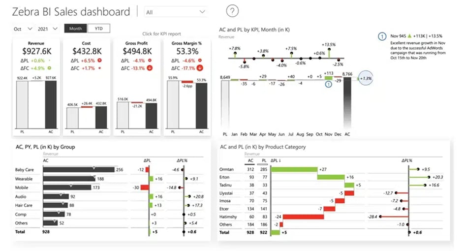
- Revenue: The total income generated by the sale of goods or services.
- Cost of Goods Sold (COGS): The direct costs attributable to the production of the goods sold.
- Gross Profit: Revenue minus COGS, showing the efficiency of production and pricing.
- EBITDA: This is a critical measure of operating performance that excludes non-operating expenses and non-cash accounting entries.
Operational Expense (OpEx) Tracking
Effective management requires a granular view of where the money is going in a business.
- Operating Expenses (OpEx): A high-quality dashboard will use a waterfall chart to show how OpEx impacts the bridge from Gross Profit to EBIT.
- Burn Rate: Especially relevant for high-growth companies, this tracks the rate at which a company uses its cash reserves.
Comparative and Time-Based Analysis
Comparative analysis helps you understand whether a certain result is good or bad and guides you to trends that can help you spot issues in your operations.
- Variance % (Actual vs. Budget/Plan): Variance reports show the difference between the planned or past financial outcomes and the actual financial outcomes. It is simply impossible to make informed decisions without this info.
- Year-To-Date (YTD) Performance: This provides a cumulative view of performance from the start of the fiscal year to the current date. It shows overall performance instead of just a snapshot and improves comparability over time.
- Year-Over-Year (YoY) Growth: Comparing the current period to the same period in the previous year to identify long-term trends and seasonality. It’s a regular benchmark in earnings reports and investor presentations.
Liquidity and Efficiency
Beyond the P&L, your financial reporting dashboard should touch upon the company's ability to meet its obligations.
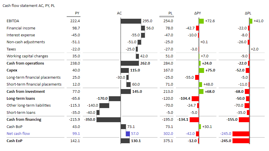
- Accounts Receivable (AR) Turnover: This KPI tells you how quickly the company collects payments so you can plan liquidity or respond to potential cash flow issues.
- Operating Cash Flow: The amount of cash generated by regular business operations. It shows actual liquidity and the health of your operations so you can plan loan repayments, CAPEX expenditures and reserves.
Power BI Financial Dashboard Examples
Seeing a financial dashboard created in Power BI in action is the best way to understand how it transforms raw accounting data into strategic insight. While every organization has unique needs, there are some standard report types that can help you manage the business.
Below are some examples of essential financial dashboards that demonstrate how you can take raw data and turn it into actionable insights.
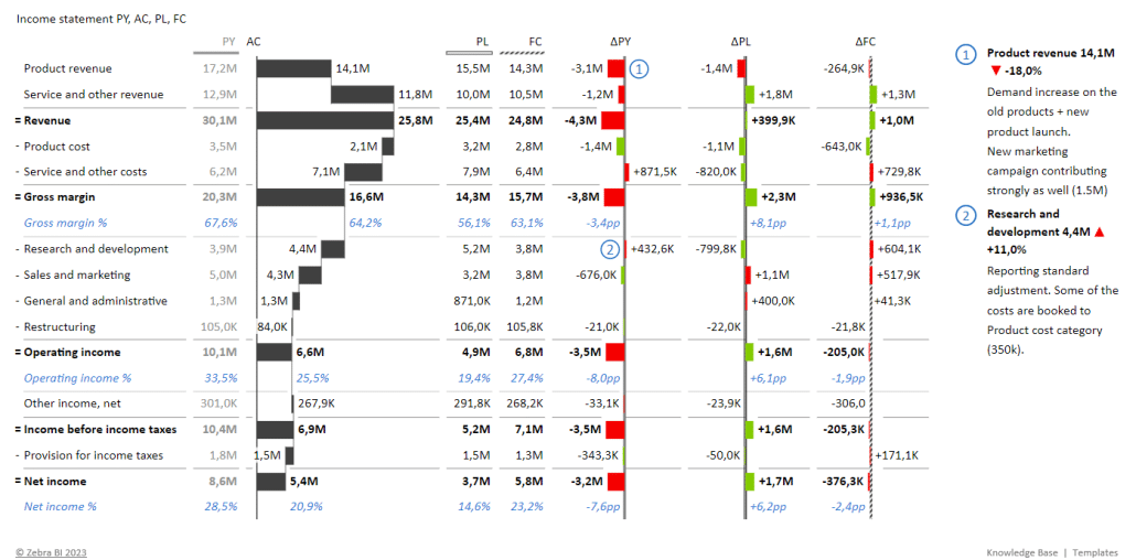
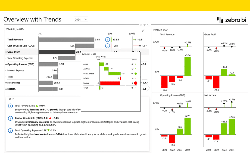
The Executive P&L (Income Statement) Dashboard
The income statement is the heartbeat of financial reporting, showing a company's revenues, expenses, and profits or losses over a specific time period. It answers the most pressing question in any business: “Did we make or lose money during this time?”
Target Audience: CFOs, finance directors, and board members who require a high-level view of company health, as well as department heads responsible for managing specific business unit performance.
Features: Hierarchical rows that allow you to expand from "Gross Profit" down to individual ledger accounts, and integrated variance analysis showing Actual vs. Budget.
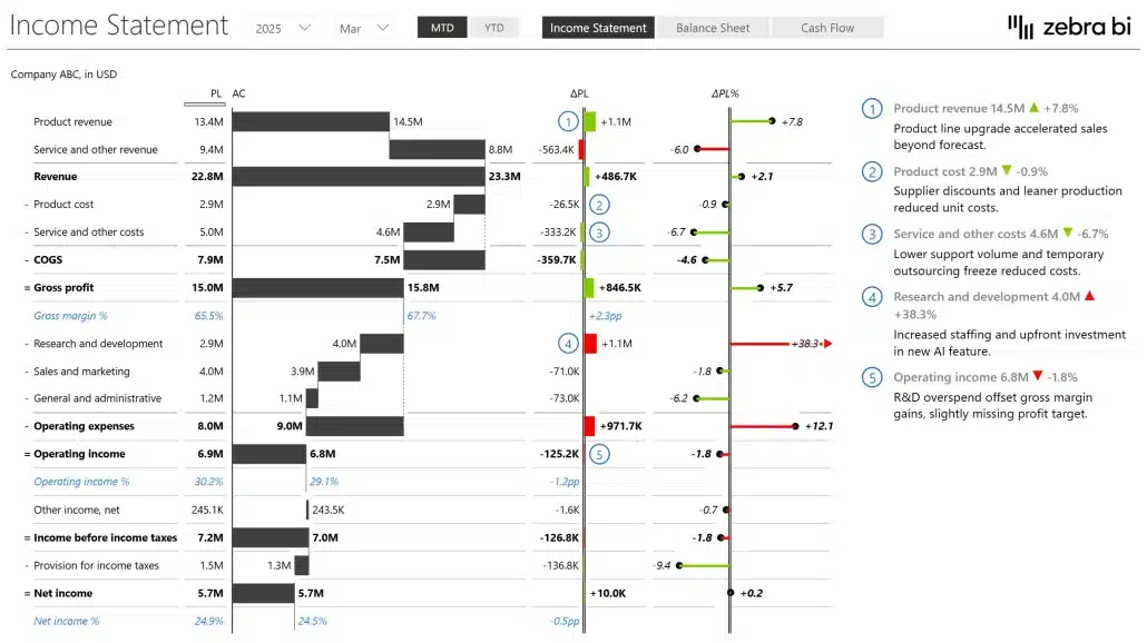
Your income statement should track KPIs, such as revenue, Cost of Goods Sold, gross profit, operating expenses, operating income, and net income.
Useful tools and visuals to show this data include waterfall and bridge charts, variance analysis, and small multiples for increased data density.
Working on your next reports? Download Zebra BI's free income template.
Consolidated Financials
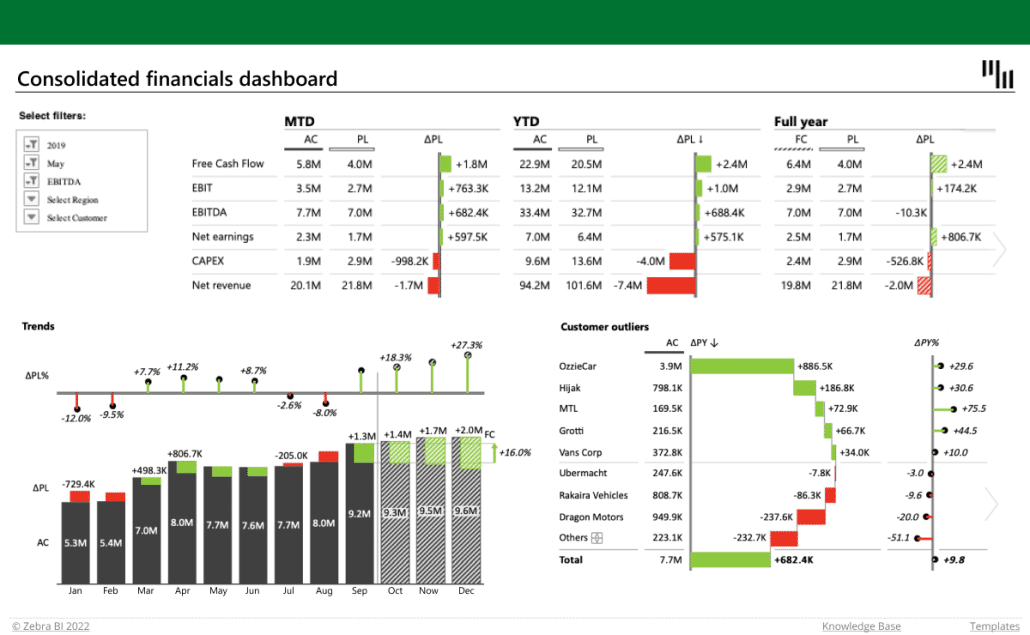
The consolidated financials dashboard aggregates data from various sources into a single, unified view in Power BI.
Target Audience: Analysts and decision makers who need high information density to make informed business and operational decisions.
Features: Individual cards with KPIs to filter the information displayed on the right of the KPIs. A click on the EBITDA card, shows EBITDA details by business units or months, and so on.
Your consolidated financial reporting dashboard should track KPIs such as Consolidated Revenue, EBITDA, operating expenses, capital expenditures and net Income.
Annual Comparative Statement
The annual comparative statement provides a multi-year perspective on performance, contrasting current results with previous years and budget targets.
It answers the critical strategic question: “Are we growing year-over-year, and how do our results compare to our long-term financial plan?”
Target Audience: CFOs, financial analysts, and strategic planners who need to assess long-term trends, as well as stakeholders preparing for year-end reviews or board presentations.
Features: Dynamic time-slicing to toggle between different fiscal years, integrated variance indicators for YoY (Year-over-Year) and Plan-vs-Actual comparisons, and the ability to drill down from high-level group totals into specific quarterly or monthly performance.
Your annual comparative statement should track KPIs such as revenue growth, EBITDA margin, operating expenses, net income, and variances.
Useful tools and visuals to show this data include integrated variance charts, small multiples for period-over-period comparisons, and IBCS-compliant tables that combine raw numbers with visual trend indicators.
Price-Volume-Mix (PVM) Analysis
Price-Volume-Mix (PVM) analysis is a financial technique used to understand drivers behind revenue or profit fluctuations. It answers the critical business questions: “Why exactly did our revenue change?” and “Are we growing because of higher sales volume, or simply because we raised prices?”
Target Audience: CFOs, FP&A teams, sales directors, and product managers who need to understand the underlying mechanics of revenue growth and evaluate the effectiveness of pricing and sales strategies.
Features: Isolated contributions of Price, Volume, and Mix that can help users track the impact of new product launches and discontinued items. Interactive drill-downs allow you to analyze performance by SKU, category, or geography.
Your PVM analysis should track KPIs such as Price Effect, Volume Effect, Mix Effect, and total variance % compared to the previous year or plan.
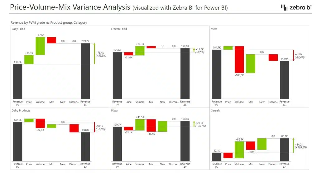
The most effective visuals for this data are waterfall charts (often called bridge charts) that visually reconcile the gap between two periods, showing exactly how much each factor contributed to the final result.
By utilizing small multiples, you can compare these PVM bridges across multiple regions or business units simultaneously, providing a dense yet readable overview of performance drivers.
Cost Management
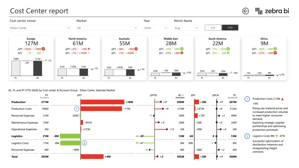
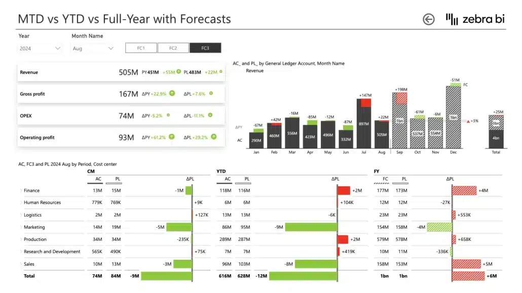
The cost management dashboard is an essential tool for maintaining fiscal discipline and optimizing resource allocation. It answers the fundamental operational question: “Where is our money going, and how does our actual spending align with our departmental budgets?”
Target Audience: Controllers, FP&A professionals, and CFOs who need to streamline month-end closing activities, monitor cost center performance, and identify spending discrepancies before they impact the bottom line.
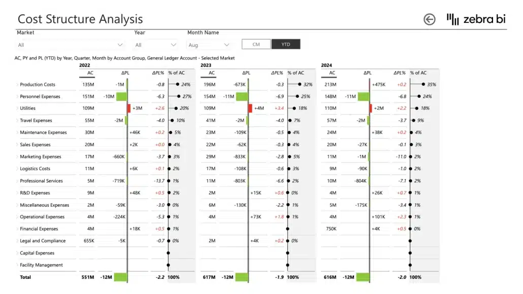
Features: Detailed cost center reports, analysis of vendor costs, and MTD (Month-to-Date) vs. YTD (Year-to-Date) comparisons with full-year forecasts. This dashboard also supports cost structure and profitability analysis.
Your cost management financial reporting dashboard should track KPIs such as total operating expenses, cost center variances, budget utilization %, and profitability by account group.
To make cost structures visible, use waterfall charts to show the breakdown of expenses and small multiples to compare the spending trends of different business units side-by-side.
Cost-Benefit Analysis
The cost-benefit analysis (CBA) dashboard is a critical tool for capital allocation and strategic planning. It provides a systematic approach to estimating the feasibility of projects and investments, answering the fundamental business question: “Will the expected benefits of this initiative outweigh the costs required to implement it?”
Target Audience: Project managers, investment analysts, and CFOs who need to evaluate the feasibility of new ventures, as well as department heads responsible for justifying budget requests for major projects.
Features: Multi-year cost benefit tracking, payback period visualizations, and the ability to compare multiple project scenarios side-by-side.
Your cost-benefit financial reporting dashboard should track KPIs such as cost savings, cost avoidance, total costs and its components, and variance % between different years.
To make these comparisons clear, use tables with visual elements to highlight benefits and potential pitfalls.
Power BI Financial Analysis: Techniques and Best Practices
A strong Power BI financial dashboard should do more than display historical numbers. It should help finance teams understand performance drivers, identify risks, and support faster decision-making through interactive and actionable analysis.
One of the most widely used techniques is variance analysis, where results are compared against Plan, Forecast, or Prior Year values. Variance reporting helps organizations quickly identify deviations in revenue, operating expenses, profitability, or cash flow and investigate the underlying causes.
Trend analysis is another core capability of financial reporting dashboards in Power BI. By analyzing KPIs across monthly, quarterly, and yearly periods, finance teams can detect seasonality, monitor long-term growth patterns, and identify operational inefficiencies before they become larger issues.
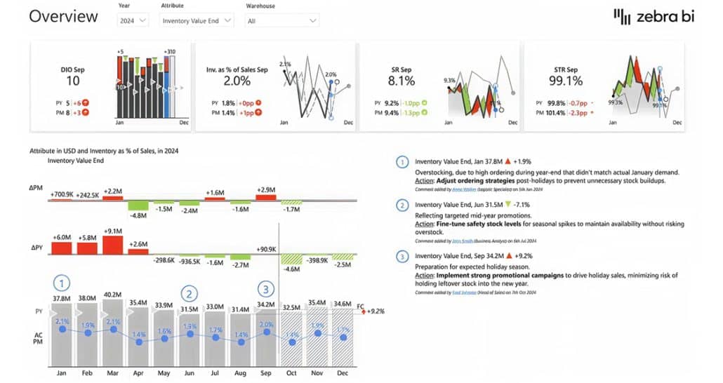
More advanced finance dashboards also support:
- Price-Volume-Mix (PVM) analysis
- Scenario and what-if analysis
- Contribution and profitability analysis
- Forecasting and predictive modeling
- Drill-down analysis by business unit, region, product, or customer
To make these analyses effective, finance teams should focus on clear KPI definitions, consistent visual standards, and intuitive navigation.
Zebra BI visuals help improve financial analysis in Power BI by providing purpose-built variance charts, waterfall visualizations, small multiples, and IBCS-compliant reporting layouts that make complex financial data easier to interpret and communicate.
See our financial benchmarking guide for real-world Fortune 500 examples
Power BI Financial Reporting Templates
Building a dashboard finance in Power BI from a blank canvas is a significant undertaking that requires a deep understanding of both DAX and financial reporting standards. However, many finance teams can take a shortcut with a professionally designed financial reporting dashboard template.
Using a template doesn't just save time; it ensures that your reports follow global best practices like the IBCS (International Business Communication Standards). This means your charts, variances, and tables will be consistent and easy to interpret across the entire organization.
Why Use a Zebra BI Template?
While Power BI is a robust platform, its native visuals can make it hard to create complex financial statements like a P&L or a PVM bridge. Zebra BI templates are pre-configured to handle these challenges out of the box.
You can benefit from standardized layouts that include and highlight the most important KPIs, like EBITDA, operating expenses, and Gross Profit.
These templates make it easy to pull data from SAP, Oracle, Microsoft Dynamics 365, or accounting software like Xero and QuickBooks.
To save you even more time, calculations for YTD (Year-to-Date), YoY (Year-over-Year), and variances are performed automatically, so you don’t have to write DAX code.
How to Use a Zebra BI Financial Dashboard Template
Transitioning from a download to a live, automated report involves three simple steps:
- Download and Explore: Visit the Zebra BI Template Library and choose the report that best fits your current needs.
- Connect Your Data: Open the .pbix file in Power BI Desktop. Most templates come with a "sample data" structure that you can simply replace with your own accounting tables.
- Customize and Refine: While the templates follow strict reporting standards, they are fully customizable. You can adjust colors and visuals, add your company’s specific sub-totals, add commentary and expand the dashboards with additional elements.
By leveraging these templates, finance departments can shift their focus from building tools to generating actionable insights. Financial reporting dashboard in Power BI allows you to deliver executive-ready reports in hours instead of weeks, providing immediate value to the business.
Frequently Asked Questions (FAQ)
To help you get the most out of your power BI financial dashboard journey, we’ve compiled answers to the most common questions finance professionals ask when transitioning to modern reporting.
Is Power BI better than Excel for financial reporting?
While Excel is excellent for ad hoc analysis and complex financial modeling, Power BI is superior for recurring management reporting and executive dashboards. Power BI offers automated data refreshes, robust data governance (a single source of truth), and interactive visualizations that Excel cannot match at scale.
Which accounting systems can I connect to my financial reporting dashboard?
One of the core strengths of Microsoft Power BI is its extensive connectivity. You can connect to enterprise ERPs like SAP and Oracle, mid-market solutions like Microsoft Dynamics 365, and cloud accounting software such as Xero and QuickBooks. Power BI can also pull data from SQL databases, Excel workbooks, and cloud data warehouses to provide a truly consolidated view.
What is the difference between a Power BI Report and a Power BI Dashboard?
A report is a multi-page document that contains detailed data visualizations, filters, and drill-down capabilities, allowing for deep analysis of specific metrics like operating expenses or gross profit. A dashboard is a single-page "canvas" that aggregates the most critical visualizations from various reports into a high-level overview. While a report is for analysis, a dashboard is for monitoring.
What are the most important KPIs for a financial dashboard?
A high-impact Power BI financial dashboard should focus on:
1. Profitability: Revenue, Gross Profit, and EBITDA.
2. Efficiency: Operating Expenses (OpEx) and Operating Margin.
3. Performance: Variance % (Actual vs. Plan) and YTD (Year-to-Date) performance.
4. Liquidity: Operating Cash Flow and Accounts Receivable turnover.
How does Power BI ensure data integrity across different departments?
One of the biggest risks in modern finance is siloed data, where different departments report different figures for the same KPI. Power BI solves this by using a centralized semantic model.
Once your business logic and calculations for KPIs like EBITDA, Revenue, or Gross Profit are defined in this central model, every report and user across the organization draws from that same logic. This creates a single source of truth, ensuring that whether a Board Member is viewing a high-level summary or a Controller is looking at a detailed transaction report, the numbers always align perfectly.
How do I ensure my financial data is secure in Power BI?
Power BI provides enterprise-grade security features, including Row-Level Security (RLS). RLS ensures that users only see the data they are authorized to view—for example, a Regional Manager in Europe would only see European financial data, while the Group CFO can see the consolidated global view.
How does Zebra BI improve on native Power BI visuals for finance?
Zebra BI was built specifically to address the limitations of native Power BI charts in a finance context. It provides out-of-the-box support for IBCS standards, automated variance calculations, waterfall charts for contribution analysis, and flexible table layouts that support subtotals and custom formulas—features that would otherwise require hundreds of lines of complex DAX code.
