 September 8th
 February 22nd
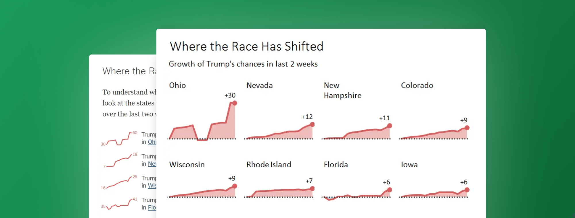
Trump's Chances - Redesign of The New York Times's Infografic
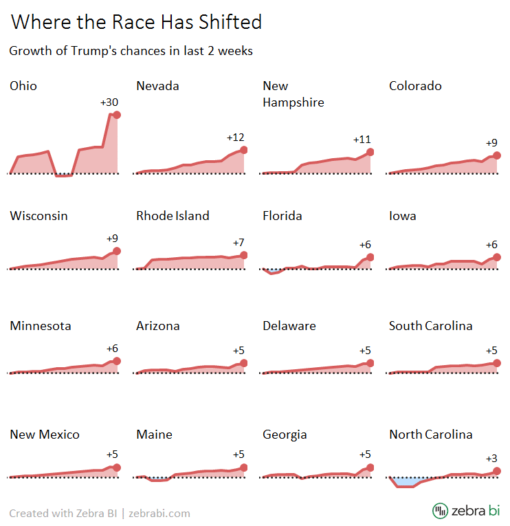
In the recent update of The New York Times's article Who Will Be President? the authors used an interesting and a slightly controversial infografic, consisting of 16 sparklines. The graphic depicts the trends of Donald Trump's winning probabilities in the states, where his chances have increased most over the last two weeks.
Unfortunately, the visualization fails to convey a proper picture of the trends due to inconsistent scaling of charts, proving once more, that the correct scaling is still one of the hardest problems in data visualization. We'll present 3 alternative solutions that allow the readers to properly assess and compare changes across the states.
Here's the original graphic:
Observing the slopes, one can only arrive at one conclusion: the trends are rising in all states at a very similar rate. Everyting is rising and the angles are almost identical. Of course when reading the labels, we understand that that's not really the case.
For example, in South Carolina the chances grew from 84 to 89 (that's +5 percentage points or +6% change) while in Ohio the chances grew from 30 to 60, which constitutes +30 percentage points or +100% change. That's a huge difference in trends, completely obscured by the visualization. A classic "lie factor" that distorts the message that the actual data is telling us.
So what's the correct picture? Let's take a look at our first redesign, which presents the data on a unified scale:
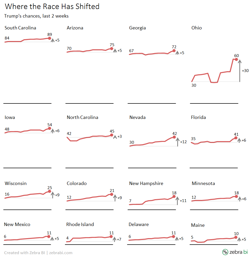
Even though we're still using 16 line charts, this is now a radically different picture. Ohio pops out with a rapidly increasing trend and we can learn about the actual situation in every state as well as make visual comparisons between them. Wouldn't you agree that this picture is much more informative?
So, instead of sparklines, we have used small multiples. In contrast to the original data visualization, our redesign has two features: (1) the scaling is unified and (2) the axes in charts are not cut (broken).
The visualization was produced in MS Excel with the Zebra BI Add-in.
Since the authors' intention with their original graphic was to focus on the changes - after all, it is titled "Where the Race Has Shifted" - let's try another redesign:
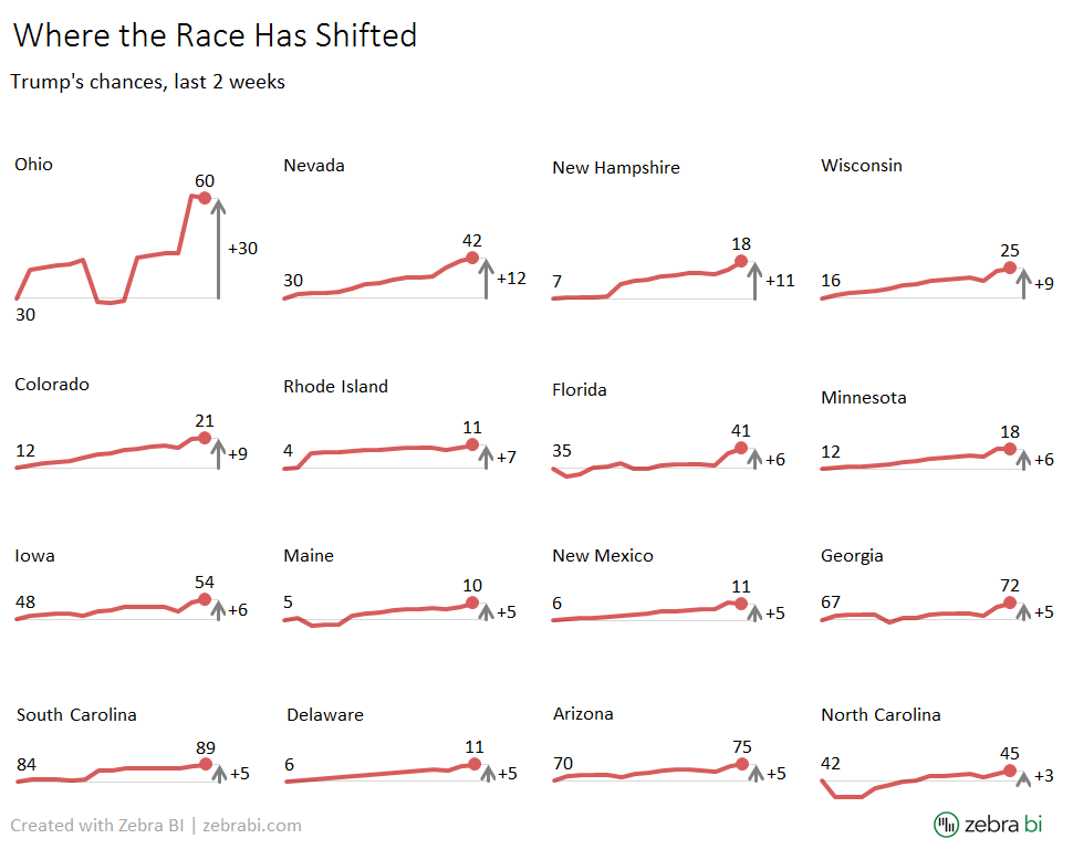
This time all the charts have "broken" Y axis. The axis in charts does not start with 0 but rather with their opening value, much like in sparklines (after all, "sparklines" are basically just line charts with a broken axis). They are also sorted by the amount of change. This option does a better job at presenting the changes, while still offering a proper comparison between the states because all charts are properly scaled. I hope you'll agree that it supports the "Where the Race Has Shifted" message quite well.
However, it does not completely support the "Trump's Chances" part, since we can't visually compare the absolute values. As a consequence, states with extremely low winning probability (e.g. Rhode Island or Delaware) look almost identical to states with very high winning probability, such as South Carolina or Arisona. This was not the case in our 1st redesign.
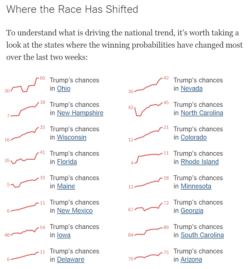
By the way, the sort order of states in The New York Times's original graphic seems a bit odd. One would expect that the charts are ordered by the value of the change, but that's not the case there.
Our 3rd redesign focuses exclusively on the changes. This time we have replaced the line charts with variance area charts (aka "Hills & Valleys"):
To summarize:
- Breaking the axis in charts is a dangerous practice, to say the least.
- Not unifying the scale (for charts with the same KPI or the same KPI unit) is even a greater sin that in vast majority of cases leads to misinterpretations, and in all cases renders the visualization practically useless.
"Sparklines" can work well in cases where we need to embed word-sized graphics of KPIs with different units or where the range of values across multiple charts is similar or where you have the chance to size and scale the charts correctly (as Edward Tufte has demonstrated in his beautiful book "Beautiful Evidence"). However, in most cases, you'll be better off with properly scaled small multiples, as we have demonstrated several times before, in our previous articles, such as Making Small Multiples in Excel, Small Multiples – 16 are better than one or Difference highlight: the fastest way to improve your reports and dashboards.
What is your opinion? Which of the proposed redesigns do you find most efficient?