Making small multiples in Excel
Have you ever tried making small multiples in Excel? I have. Several times. It's possible. Everything is possible in Excel, but some things just take forever. And when you're done and realize you'd like to change it just slightly, it takes forever again.
Countless times I was in a situation where small multiples of, say, 12 waterfall charts would be perfect for my customer's dataset and intended message, but I dismissed the thought in a split of a second. Imagining I have to produce a bunch of Excel formulas for dummy chart series, apply all those hacks and tricks to make the charts effective and visually correct, adjust the labels, apply the design, etc. And do all that 12 times for 12 charts, take care of proper scaling, solve the labelling of categories based on the position of charts within the matrix, ... Huh, just forget about it. It's frustrating.
This time I stumbled upon a twit by Jorge Camoes from ExcelCharts:
My thoughts exactly! I get kind of anxious and decide to write this article (thanks, Jorge!).
First of all: the solution is straightforward if you use the Zebra BI add-in for Excel.
Play this video to see how it works:
So now you can:
- create small multiples in just 1 click,
- switch between different chart types with one click,
- observe the automatically calculated variances,
- analyze perfectly scaled groups,
- and a few more important things, read on below.
Why should you use small multiples in data visualization and business reporting?
We all have multiple profit centers and sell multiple products on several markets. Every company on this planet probably has a bunch of cost centers, accounts, sales managers, sales channels, regions, etc.
Enabling decision-makers to compare those categories on one single page is extremely important and you can only achieve that by increasing the information density: (1) making your charts as clean as possible, (2) reducing their size radically and (3) multiplying them. That's why small multiples are one of the most efficient methods in data visualization:
For a wide range of problems in data presentation, small multiples are the best design solution.
– E. Tufte, Envisioning Information (1990)
(Actually, the inspiration for developing small multiples functionality in Zebra BI comes from our admiration of J. Bertin, but that's another story... you can read it in Four Men and a Zebra.)
Since this functionality is completely missing from Excel, we've added extensive support for making small multiples of any type of business chart in Zebra BI. And we've worked hard to make it as simple as possible for the end-users. It's been one of the core features of Zebra BI from the very beginning.
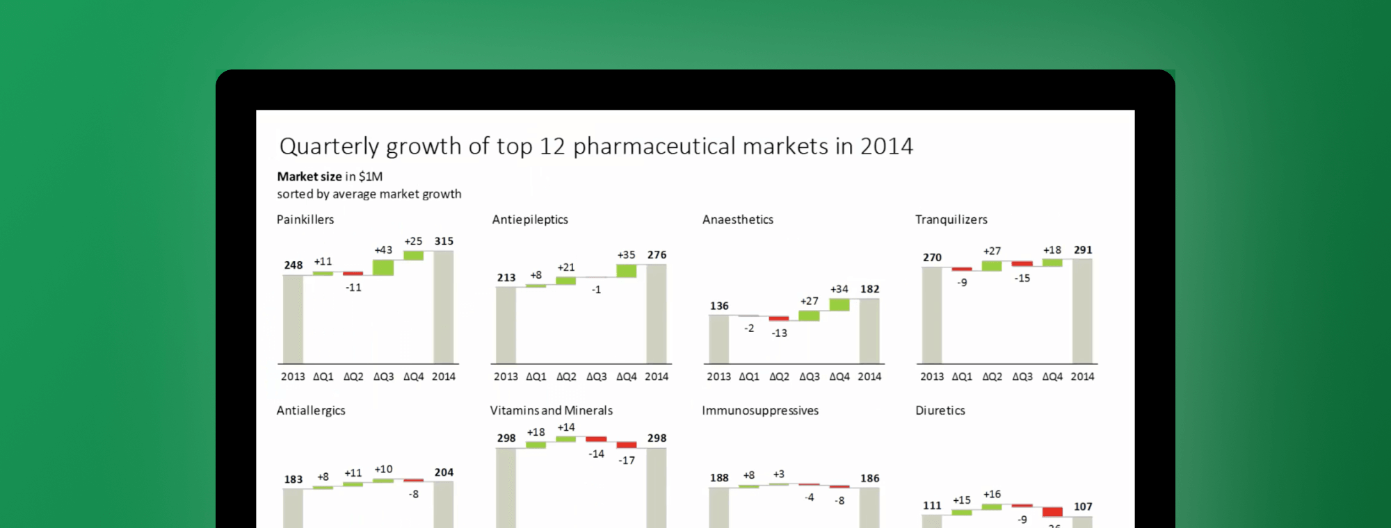
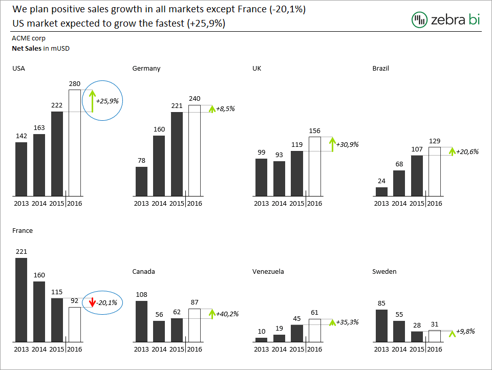
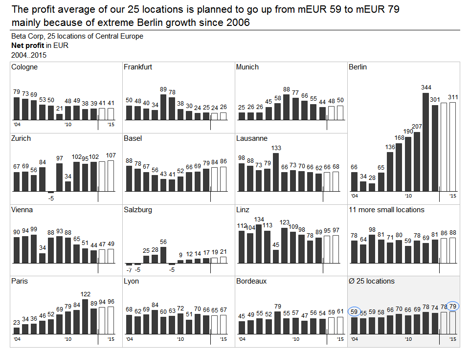
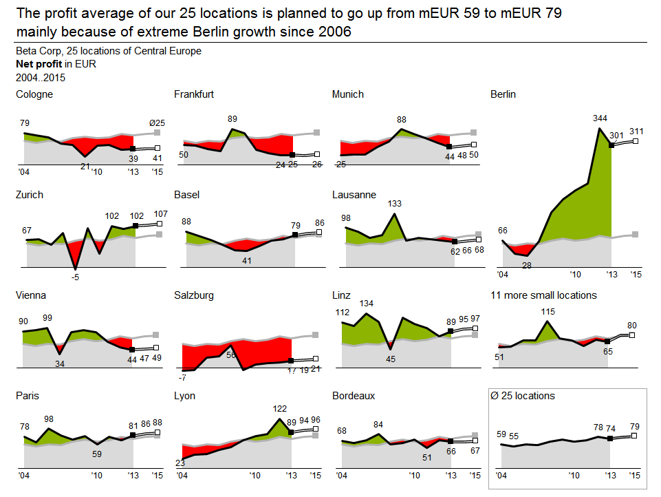
In the following example, Zebra BI detects 12 countries in your dataset, recognises that the data for each country consists of actual and budget values, calculates the variance to budget and produces small multiples to show budget variances for all 12 countries (all charts are scaled by default):
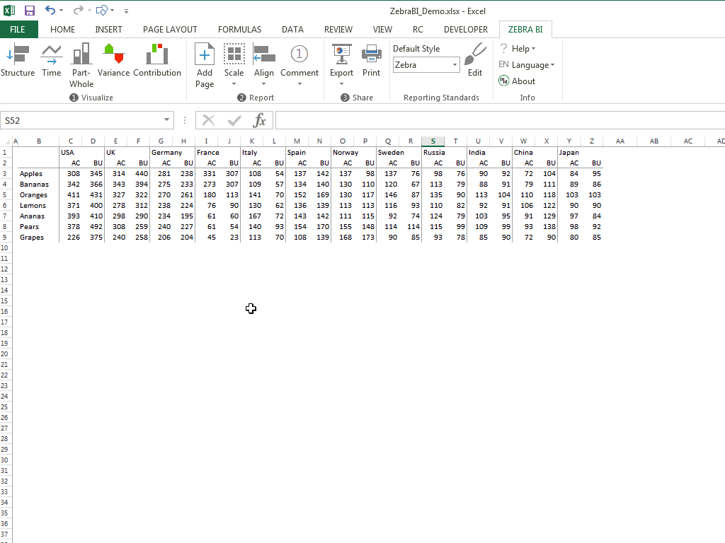
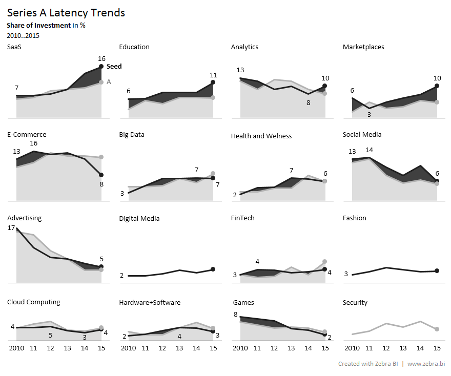
Next, we create multiple line charts for 6 markets to reveal trends in market growth. Each chart shows actual values for the years 2010-2013 (solid line) and the forecast for the next year (dotted line). Then we sort the markets by forecasted values and reduce the display of labels for better visibility:
Any adjustment made on a single chart is automatically applied to all other charts in the group. The following example represents monthly values with actuals up to September and budget values from October till the end of the year. Variance to budget is calculated and visualized at the top of all columns up to the current month.
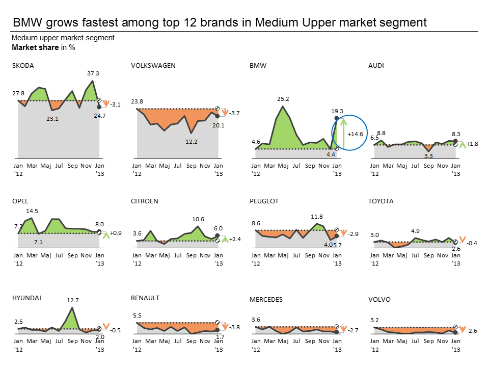
By adjusting a single chart, the user can:
- switch between absolute and relative variance calculation on all charts simultaneously,
- invert colors for "bad" KPIs such as costs (if costs are above the budget, that's a negative thing so colors should be inverted),
- apply a specific style/design to all charts at once, etc.

With that, you can quite easily produce small multiples like this:


To clarify, multiply!
Goodbye 🙂