September 8th
 February 22nd
 05 Mar 2026
 Lesen Sie diese Fallstudie auf Deutsch →
Delica AG, a key player within the Migros Group, has fundamentally transformed its reporting processes through the consistent application of IBCS principles and the use of Zebra BI for Power BI.
Under the leadership of Oliver Schaerer, Manager Business Intelligence & Analytics, internal reporting not only became more efficient, but also set a new standard for professional reporting within Migros Industry.
With clearly structured, consistent dashboards and significantly simplified data interpretation, reporting at Delica is now faster, more meaningful, and fully aligned with IBCS best practices.
Oliver Schaerer’s team developed scalable, decision-oriented dashboards that turn data complexity into clarity: saving time, increasing acceptance, and enabling better, faster decisions.
Delica AG is part of Migros Industry, one of Switzerland’s largest food manufacturers and a central division of the Migros Group, the country’s largest retail organization.
With a broad portfolio – from chocolate and coffee to ice cream – Delica plays a key role in product innovation and supply chain excellence within the group.
With over 2,000 employees and an annual net revenue of more than 1 billion CHF, Delica supplies both Migros-owned retailers and external partners in Switzerland and abroad.
As an innovation leader within Migros Industry, Delica regularly pilots new technologies and processes that are subsequently adopted across the group.
Thanks to the centralized matrix structure of Migros Industry, best practices can be scaled quickly – making Delica’s introduction of Zebra BI a blueprint for broader implementation across the entire network.
Before using Zebra BI, reporting at Delica was time-consuming, fragmented, and visually inconsistent.
Although a Migros Industry template already existed, it did not comply with IBCS standards. The reports used the company colors red, green, and orange – which matched the corporate design, but did not offer a clear, analytical color and meaning system. As a result, comprehensibility, comparability, and a shared visual standard were lacking.
We used reports that didn’t follow any color logic. By using consistent color and visualization concepts and an IBCS notation manual, we were able to make significant progress.
Reports were often created in isolation, using different tools and inconsistent visualization styles. Although Power BI was already available, many reports remained static, overloaded, and difficult to interpret.
In the past, Power BI reports were often just tables – no color markings, no clear variances, no action orientation. People stared at the numbers but couldn’t see the story behind them.
As the person responsible for Power BI, Oliver Schaerer leads a Business Intelligence team of two FTEs (including himself) and three dashboard creators within the organization. In addition to developing reports, he is also responsible for training departments in finance, maintenance, sales/marketing, and supply chain.
The main problems included::
I was a data engineer, Power BI developer, dashboard creator, and trainer in one person. We simply didn’t have the capacity to build everything from scratch or explain every report in detail.
„ I was data engineer, Power BI developer, dashboard creator, and trainer in one person. We simply didn’t have the capacity to build everything from scratch or explain every report in detail.“
— Oliver Schaerer, Manager Business Intelligence & Analytics, Delica AG
These challenges created the need for:
To make reporting more efficient, understandable, and standardized, Delica AG introduced Zebra BI for Power BI and committed fully to the IBCS framework (International Business Communication Standards).
Oliver Schaerer, Manager Business Intelligence & Analytics, took the lead in driving the reporting transformation internally and became a certified IBCS consultant. Together with his team, he established the methodological and visual foundations on which other departments can now build.
Several factors played a central role in the decision to use Zebra BI:
Zebra BI makes it easier to focus on what really matters. It eliminates formatting effort and standardizes everything automatically.
The introduction of IBCS standards was a strategic company-level decision. The goal was to ensure that all users could intuitively understand reports and follow a clear visual standard.
With Zebra BI, IBCS-compliant visuals are available immediately – without manual creation of variance charts, color rules, or notation elements.
Zebra BI allows us to provide IBCS-compliant dashboards by default. It’s built-in. We don’t waste time on formatting, variance calculations, or defending design choices.
Using Zebra BI Charts, Tables, and Cards, the team created interactive, intuitive, and self-explanatory reports – even for non-finance users.
The transformation wasn’t just technical, it was educational as well. People learned how to read visuals correctly. They now understand what a variance means.
Zebra BI supports advanced data storytelling through integrated features such as:
Examples of key reports:
Disclaimer: The data on the image is fictional and intended solely to demonstrate the layout and structure of the dashboard.
At the heart of Delica’s reporting transformation lies a clean, scalable Golden Semantic Model (GSM). This model was designed once and now serves as the central data foundation for multiple reports – including the Maintenance Cockpit and the Spare Parts Report. Both dashboards are connected to the GSM via DirectQuery, accessing centrally maintained and validated data.
Advantages:
The Golden Semantic Model is the foundation for everything. We develop centrally, and the reports just connect to it. That saves time, reduces errors, and ensures a unified logic across all dashboards.
To support company-wide usage – especially at the Italian-speaking sites in Ticino – Delica developed a fully multilingual semantic model. It supports German, English, and Italian, ensuring that all users see the same content in their preferred language.
⚙️ Technical implementation:
We manage just one version – the GSM. The language is controlled by the Power BI user’s profile setting – no toggles, no manual effort.
Disclaimer: The data on the image is fictional and intended solely to demonstrate the layout and structure of the dashboard.
This approach highlights Delica’s commitment to IBCS-standardized, user-centered reporting and creates a harmonized data foundation for unified decision-making across the Migros Industry network.
At the same time, the GSM provides the basis for future expansions – a foundation other teams can build on.
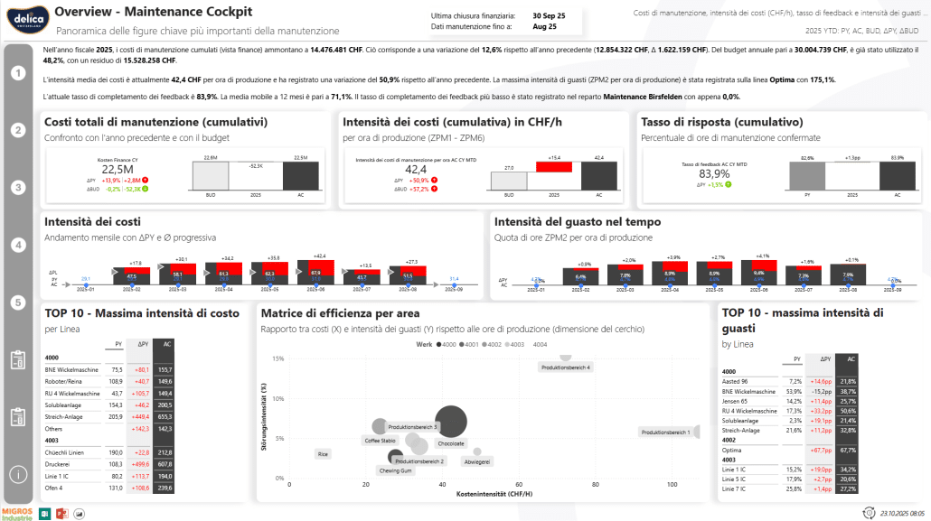
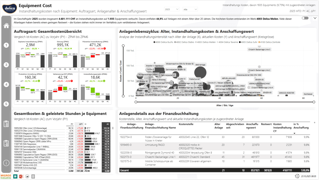
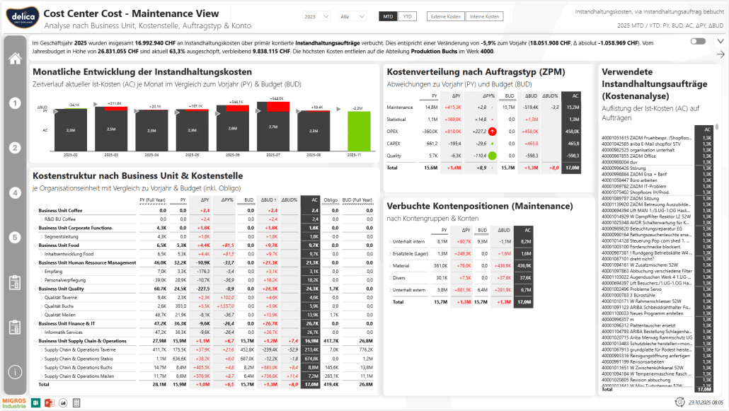
The maintenance reporting developed with Zebra BI is now used in weekly shopfloor meetings at Delica. It provides precise insights into equipment issues, downtimes, and maintenance costs – with clearly defined KPIs, standardized visualizations, and high comprehensibility.
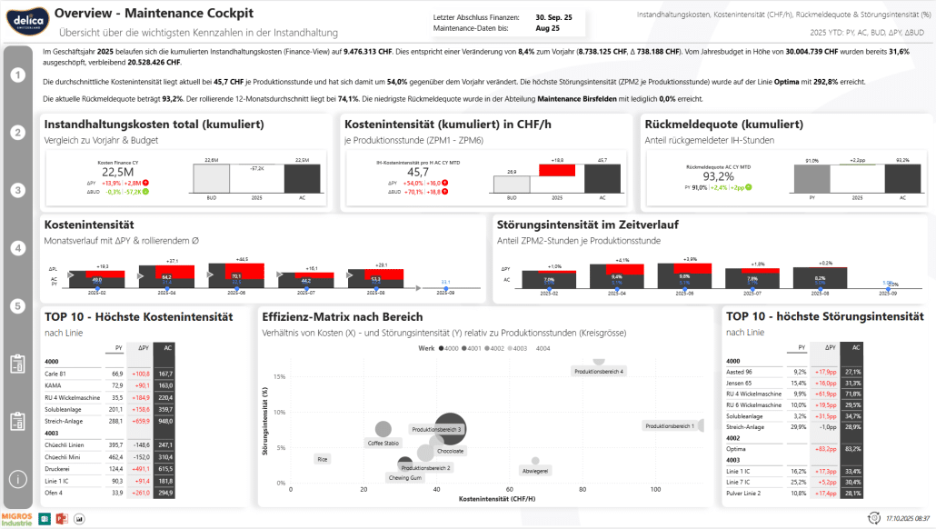
Disclaimer: The data on the image is fictional and intended solely to demonstrate the layout and structure of the dashboard.
In contrast to previous static reports, the current setup enables in-depth operational analysis down to the asset level and supports data-driven decision-making across the entire production environment.
We track every asset: how often it fails, what it costs, and which spare parts it consumes. This isn’t just reporting – it’s operational lifecycle management.
Core functions and benefits:
Disclaimer: The data on the image is fictional and intended solely to demonstrate the layout and structure of the dashboard.
By replacing our manual, error-prone data preparation with an automated and standardized workflow, we now detect variances earlier and gain new insights into misuse and master data issues – ultimately improving both data quality and understanding of maintenance reporting.
Business value:
Disclaimer: The data on the image is fictional and intended solely to demonstrate the layout and structure of the dashboard.
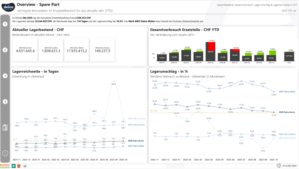
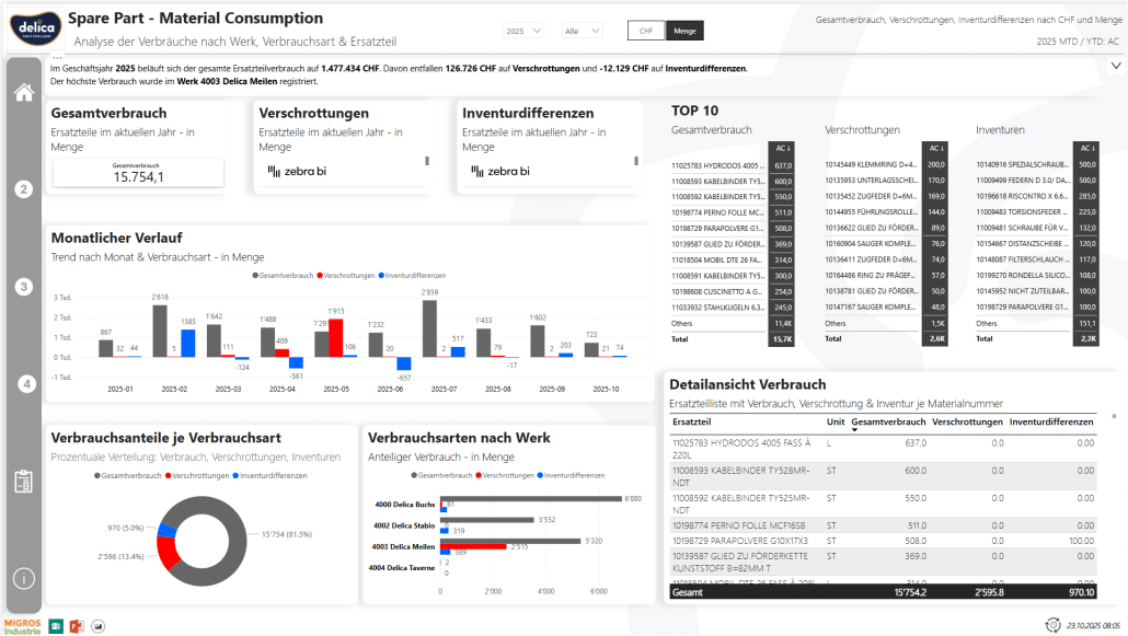
While the Maintenance Cockpit focuses on equipment efficiency and failure patterns, the Spare Parts Report offers a comprehensive view of spare parts consumption, inventory development, and warehouse structure across all production sites.
The report was developed using the same Golden Semantic Model (GSM) as the Maintenance Cockpit. As a result, purchasing, maintenance, and supply chain teams access a shared data foundation and can seamlessly navigate between different levels of analysis.
Disclaimer: The data on the image is fictional and intended solely to demonstrate the layout and structure of the dashboard.
Key areas of analysis:
A central design principle was the shift from static tables to dynamic, IBCS-compliant dashboards, which clearly and interactively visualize monthly consumption, dead stock indicators, and component relevance (e.g., within bills of materials).
Thanks to the semantic model, users can view the same spare part from different perspectives – consumption, inventory, and BOM relevance – in one place. You can easily navigate from the company level down to individual equipment.
Disclaimer: The data on the image is fictional and intended solely to demonstrate the layout and structure of the dashboard.
Functional highlights:
The “Stock & Structure” page allows planners to instantly identify:
The “Usage” page additionally supports:
By combining IBCS-compliant visualization, a semantically consistent data foundation, and interactive analysis capabilities, the Spare Parts Report delivers a unified, data-driven view of the spare parts lifecycle – a crucial step toward more efficient maintenance and sustainable inventory management.
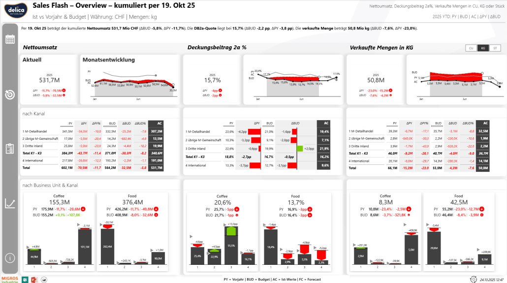
The Sales Flash is an IBCS-compliant, weekly and cumulative performance dashboard, developed with Zebra BI and based on Delica’s Golden Semantic Model (GSM).
It is automatically updated every Monday (business week = Monday to Sunday) and standardizes key metrics such as net revenue, CM2a (contribution margin), and volume (ST / KG / CU) in millions of CHF.
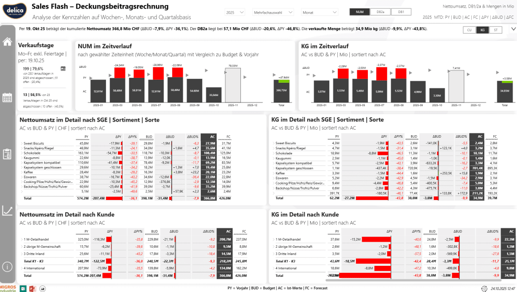
Disclaimer: The data on the image is fictional and intended solely to demonstrate the layout and structure of the dashboard.
Who uses it?
The dashboard is actively used by management, sales management, key account management, product and portfolio management, as well as controlling – for both weekly stand-ups and monthly performance reviews.
You can explore Zebra BI's free daily sales flash template here.
How it’s read
What it shows
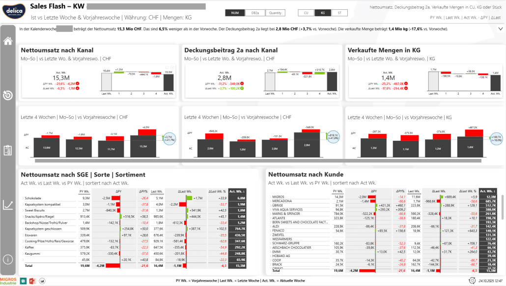
Disclaimer: The data on the image is fictional and intended solely to demonstrate the layout and structure of the dashboard.
Impact
As a business unit manager with a broad and heterogeneous product portfolio in various markets, the cockpit provides me with an efficient and targeted tool to focus on relevant action areas and make well-founded decisions.
The Sales Flash has become a central management tool – connecting operational and strategic perspectives, enabling transparent performance tracking, and strengthening data-driven control across the entire sales organization.
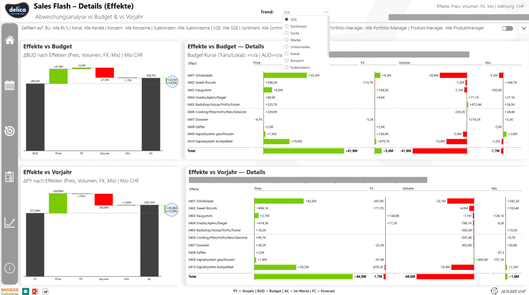
Disclaimer: The data on the image is fictional and intended solely to demonstrate the layout and structure of the dashboard.
The work of Oliver Schaerer and his team did not go unnoticed.
The benefits of the reports created with Zebra BI quickly became apparent in multiple departments – and even in other companies within Migros Industry.
From machine operators to executive management, everyone now benefits from easier interpretation of KPIs and variances.
The spread of standardized dashboards across several departments led to time savings, simplified onboarding, and greater acceptance – even outside of Oliver’s direct area of responsibility. A clear testament to the cross-functional value of this approach.
We’ve set the standard. Now everyone can quickly understand the context behind the numbers, see what’s happening, and act accordingly.
Since introducing Zebra BI and IBCS, Delica has seen measurable improvements in report quality, user engagement, and cross-team collaboration.
When we build something from scratch using Zebra BI, the feedback is overwhelmingly positive. I was one of the first to work with it – now other departments and companies within Migros Industry are adopting what we created.
With Zebra BI, reporting at Delica evolved from static outputs to dynamic insights – driven by clean data models, standardized visuals, and a scalable framework.
But Oliver Schaerer and his team didn’t just build dashboards. They established a process and a culture of data-driven working.
To drive true change within a large organization, the team placed special emphasis on internal training and user acceptance. After a new report was created, it was first tested, then reviewed with stakeholders, and only then introduced in training sessions. Employees learned how to correctly read reports, use filters, and interpret visual variances.
Only after this onboarding did the official rollout take place.
Zebra BI isn’t just a time-saver – it’s a mindset shift. We now speak a shared visual language, and that changes everything.
Turn reporting into a scalable decision-making framework like Delica.