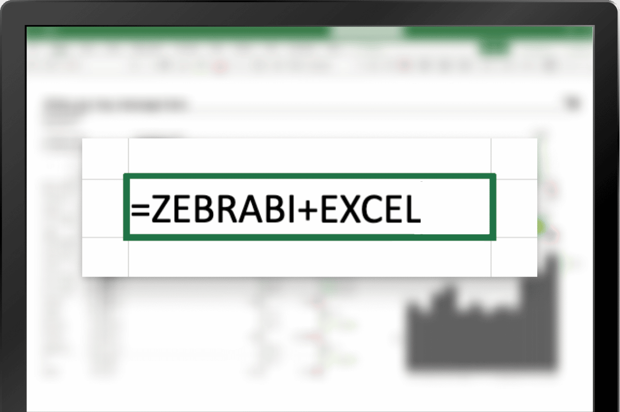
Your reports in Excel will never be the same. Coming soon.
What do marketing, human resources, and finance have in common when it comes to data analysis?
Excel spreadsheets.
No organization can survive today without really good reporting. But still, the majority of big and small companies are struggling to access key business insights immediately.
Top 3 problems:
Messy reports across organization
Everyone is creating their reports however they think is best. Anything goes. From 3D pie charts to dull, poorly formatted tables and everything in between. There’s no consistency, no unified design that would make it all easily understandable.
Poor data visualization
Ever tried creating advanced charts in Excel? Perhaps flexible waterfall charts, variance charts, small multiples, hills&valleys charts, etc.? Or turning a selected column in a pivot table into a chart? Good luck with that!
Lackof context and collaboration
Additional context through dynamic commentary and collaborative meetings in real-time is indispensable in today’s business world. It’s the only way to stay agile and always know what's going on. And, most importantly, why.
What would you say if we told you these problems can be fixed directly in Excel?
The new solution from Zebra BI will facilitate data democratization and allow everybody to ride the Actionable Reporting wave! Creating: professional reports, flexible dashboards, ad-hoc analysis, advanced visualizations, or report prototypes has never been easier whether you are using Power BI, Office 365, or both!
Want to try it before it launches in the Fall? Join the exclusive, invite-only beta program and excel in your reporting game.
Join the waitlist & and truly excel in your reporting.
 September 8th
 February 22nd
 04 Jun 2026