Share this
 September 8th
 February 22nd
 05 Mar 2026
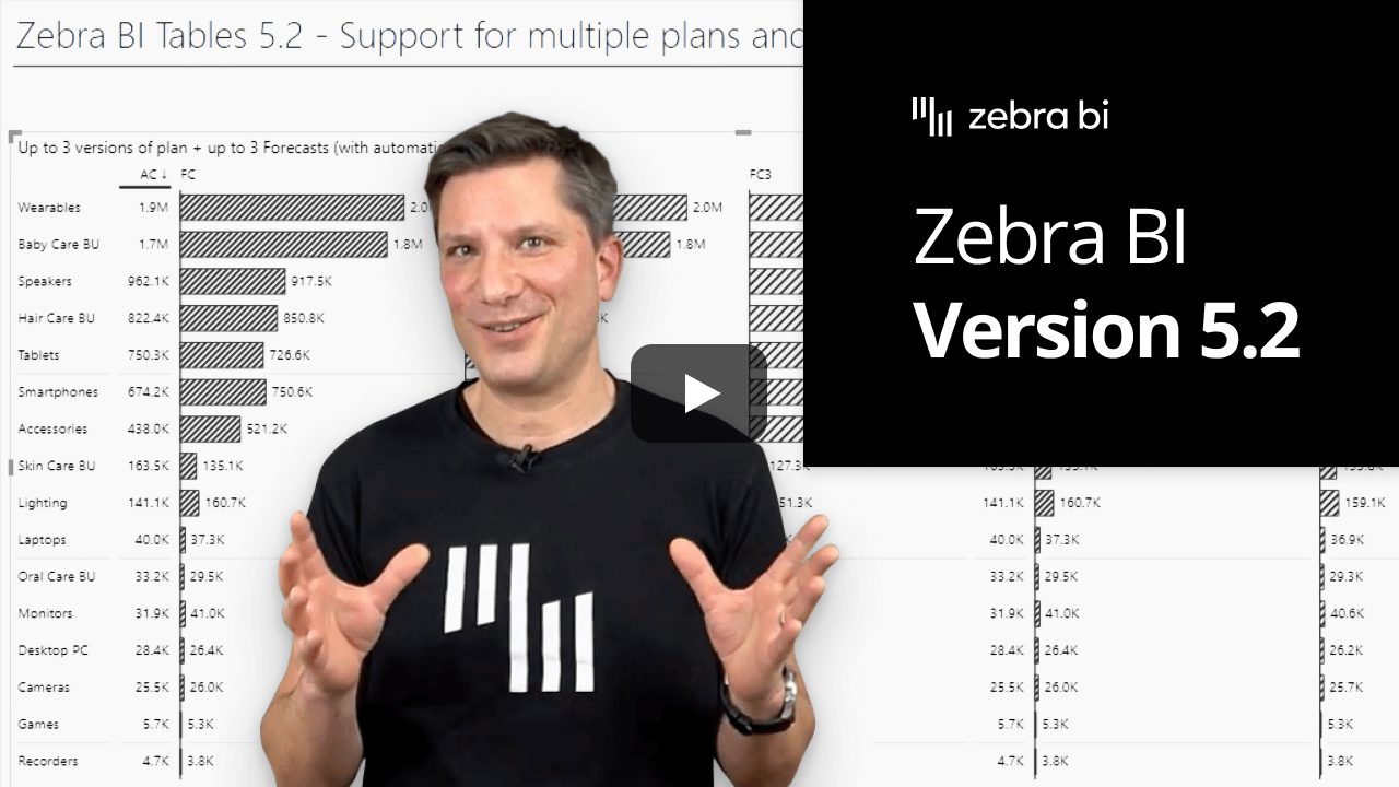
Imagine having multiple business scenarios with several different Plans and/or Forecast measures. Very relatable, right? But how to track them all compared to the performance? Easily, with Zebra BI Tables visual 5.2! 🎉
From now on, you can add up to three different measures for Plan and/or Forecast. Simply put the values into the corresponding placeholder like with the default measure and let Zebra BI do the magic.
Tracking your business performance against various scenarios allows you to stay agile and flexible which gives you an important advantage against your competitors and saves valuable time. 😎
Having the option of saving your current settings in a report view can be a game-changer in many cases. We fully agree and that’s why most of the settings within Zebra BI Charts and Tables visuals are now bookmarkable!
Apply this new feature to almost any of the settings in Tables and Charts visuals and customize different views with different layouts, changing of the titles and column names, different style options (including color deficiency option), customized tooltip, different chart types (simple vs advanced), axis breaks, and other settings listed in the changelog.
You can seamlessly switch between different bookmarks that will display the settings that you saved. This feature allows you to personalize your reports and dashboards, make them more accessible, spotlight certain features, and enhance your storytelling.
Your creativity is the limit here so get inspired and level up your reporting game. 💪
With Zebra BI Charts visual you already have more than 30 different chart types to choose from. On top of that, we added one more: a stacked bar chart.
Simply create a stacked column chart by adding values to the X and Y axis. Then go under Settings > Chart settings and toggle On the option to Show vertical axis. This way only step is keeping you from seamlessly switching between horizontal and vertical charts.
What is more, the new chart type also has all the features available in the stacked column chart and the user can also switch between the stack bar chart and Small multiples view with just one click – even in the view mode!
Think of looking at your monthly data series at the beginning of the current month while Forecast was also added to the report. You observe a big gap between month-to-date value and forecasted value. It can be quite annoying to see this when only a few days of sales have gone by, right?
Making sure your data is always perfectly displayed in your reports and dashboards, Zebra BI Charts visual now gives you the option to control the display of current period variance. This way you can decide whether you want to show the variance always, hide it until the start of the next month or show it conditionally from a specific day on.
Save valuable time, drive attention only to relevant variances and make smarter decisions. 🥳
If you're using the AppSource version of Zebra BI (version 4.0.0 or higher), then your Zebra BI will be updated via Microsoft's AppSource marketplace automatically once processed. Expected release dates according to the Microsoft Power BI team:
If you're using an older (private) version of Zebra BI (e.g. 3.x.x or older), then this is a perfect opportunity to update your Zebra BI! When ready, just shoot us an email at support@zebra.bi and we'll help you migrate to the latest version.
Haven't tried Zebra BI before? Opt-in for our 30-day free Pro trial here: