Top 3 Ways to Report your Variance Analysis in Excel
Most companies create plans and budgets to establish benchmarks for future performance in sales, production, operations, labor, etc. The starting point of these plans and budget are usually estimated cost and revenue figures. The goal is to meet these budgets, but as with all goals - they are not always met. Managers use variance analysis to track the actual performance against these goals. If this analysis is not performed afterwards, then setting budgets is useless.
In other words: after a period (i.e. month, quarter, year) is over, managers, management accountants, controllers and other finance professionals calculate (and then analyze) a number of different types of variance. Variance is defined as the difference between the actual values (costs, revenue, head count, ...) and budgeted, planned or standard values.
Favorable and adverse variance
After a variance is calculated, it falls into one of these two categories:
- Favorable variance (positive; better than planned)
- Adverse variance (negative; worse than planned)
An example of a favorable variance is when actual total costs are lower than the planned total costs. An example of an adverse variance is when the actual revenue is lower than planned.
Note: not all adverse variance is bad and not all favorable variance is good! For example, a variance analysis might show higher production costs than planned (adverse variance). However, a deeper look reveals that the higher costs are a direct consequence of significantly higher sales (favorable variance).
How to perform variance analysis?
There are a couple of different ways to perform variance analysis. Excel spreadsheets are still the most widely used tool for it, so we'll use them in our examples as well. Additionally, here's how to master variance visualization in Power BI if you'd rather do it there.
Here are three examples of variance reports:
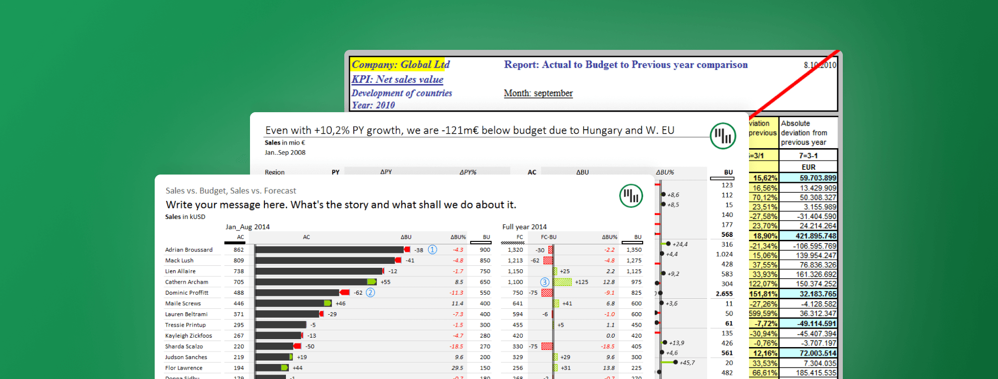
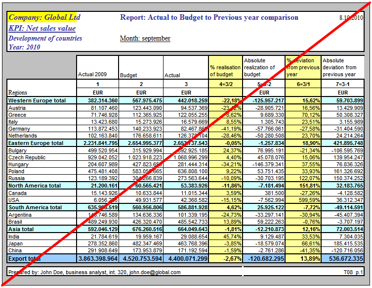
1. The Classic Sales-vs-Plan or Costs-vs-Plan Report
In this most common example, you'd have the planned (or budget) values in one column, the actual values in another column, and the variance in the third column. Add some additional columns for good measure, spice it up with some color and you soon end up with an illegible mess like this:
A much better way to display the variances is using plus-minus variance charts. Following this advice, we can use Zebra BI Tables for Office to present the above data in this way in Excel:
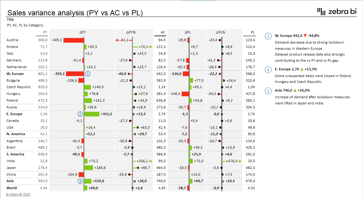
Every variance should provoke questions. Why did we perform poorly in Western Europe and Bulgaria? Is this negative variance a change in plans, an execution failure, an advertising campaign gone wrong, or a certain move from one of the competitors, or was the budget unrealistic at the start?
The answers to questions like these should be written on the report itself (using a couple of short comments as you see above). Variance reports are often poorly designed; turn yours into a clean, easy-to-read report in 8 simple steps.
Without this data and without these answers, the management can't make the right decisions for the future of the company. They will ask the question why anyway, so it's better to include the answer right from the start.
Do you want to create a sales variance report like the one in the second image? Download a free template, simply change the demo data with your own and start looking for business insights.
Note: The data in the above report represents sales. If we report on costs, the red/green colors in the charts must be inverted. Lower costs than planned is a good thing (green), higher costs is bad (red).
And by the way, if you want to learn how to create waterfall charts in Excel, we have a guide for that. Check it out!
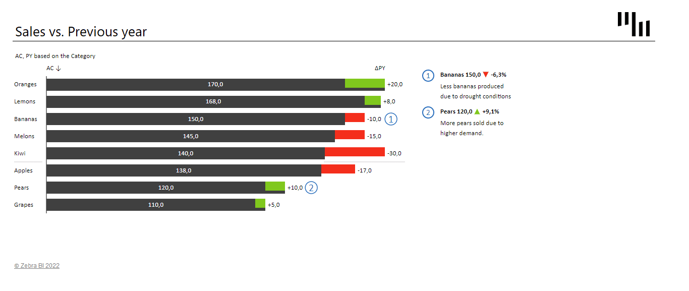
2. Direct comparison of categories: actual vs. previous year
If we have a flat structure (without subtotals), a good way to compare the elements is to use integrated variance charts. They display the actual values as bars (or columns) while the absolute variances are integrated into the bars (or columns) themselves.
We can also add Zebra BI lollipop charts to display relative variances. Of course, don't forget to write a descriptive title and comments!
3. Forecasting: year-to-date monthly variance with end-of-year forecast
When it comes to forecasting in variance reports, management is mainly interested in two things:
- how we're doing so far in the current year and
- are we on track to meet our yearly goals.
To visualize this we use the same type of report as above, but divide it into two parts.
The left part is the year-to-date part where we display the actual results compared to the budget. This part is about the past.
The right part is about the future. Here we compare the approved yearly budget with the latest forecast. These are end-of-year (EoY) figures and the variance chart in between shows whether according to the latest estimation we will meet the annual plan or not for each data element (in our case for each account manager):
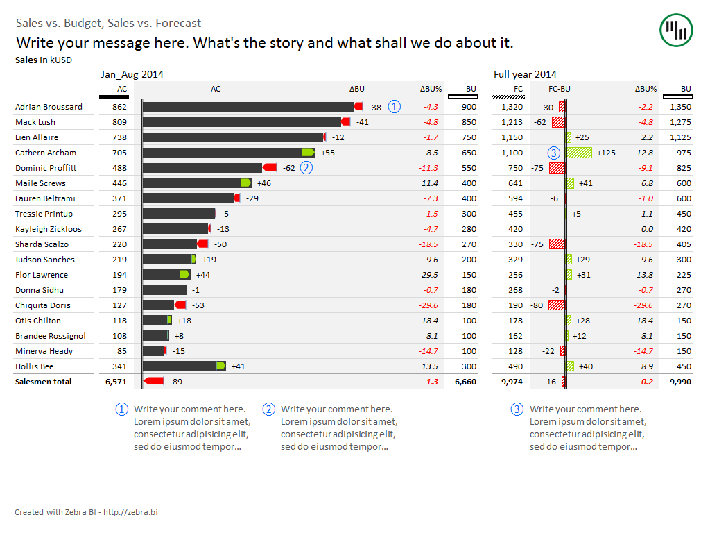
Note: Because we're comparing forecast vs. budget and not actual vs. budget, the bars in the right-hand chart are visualized differently. The IBCS recommends a diagonal-striped pattern fill (automatically applied by Zebra BI).
The above variance report serves as an indicator of our performance against the yearly plan. The two-part nature of the report gives management a look at the recent past - The company's cumulative results from the start of the year - as well as a view into the future - how the company is expected to perform until the end of the year. Equipped with this data, they can make the correct decisions.
To take things one step further, we can add the actual figures from the current month. Our report now consists of three parts:
- current month performance,
- year-to-date performance and
- full year forecast

Need a differently structured report? Explore more best practice variance analysis report templates for Excel.
The limitations and shortcomings of variance analysis
Here are some of the problems of variance analysis that companies must be aware of:
- Time delay. The analysts typically calculate and analyze the variances at the end of each period and then report the results to the management. In a fast-paced environment (like manufacturing etc.), management needs feedback much faster than once a month, and tends to rely upon measurements and warnings that are produced on the spot.
- Effort required. In order for analysts to really do their job well, they must dig deep to find the underlying causes for the variances. This includes sorting through a lot of different sources of information. The extra work if only cost-effective when management is capable of acting accordingly to fix the issues.
- Setting budgets. Since variance analysis is essentially comparing actual results with planned ones, it is necessary that these plans were sound in the first place. If they are a result of using some arbitrary standards, political bargaining or even blindly relying on data from previous periods, they are actually of very little use.
The solution to these problems is to use trend analysis in conjunction with variance analysis. In trend analysis, the results of multiple periods are listed side by side, making it easy to detect trends. Also consider a Price Volume Mix analysis to improve your understanding of your business.
Remember: Although variance analysis can become very complex, the main guide is always common sense. Yes, lower actual costs than planned is a positive variance, and higher costs than planned is a negative variance. But the real question that needs to be answered is whether or not the result was good for business.
Want to insert charts like these in your variance analysis reports with Zebra BI for Office?
The new Zebra BI for Office lets you visualize your data with just one click. This way you can get to the right business insights faster and spend more time on making the correct business decisions.